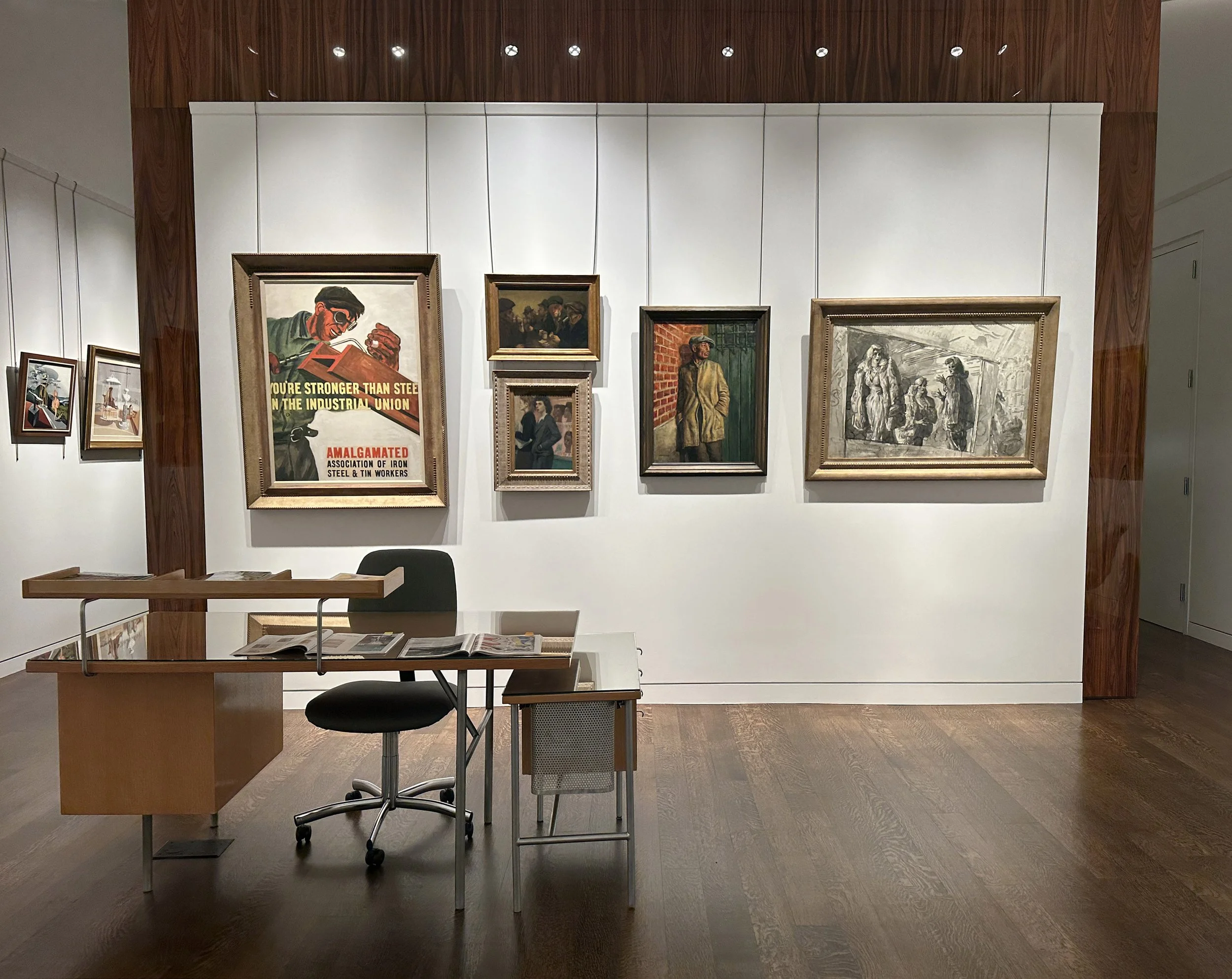
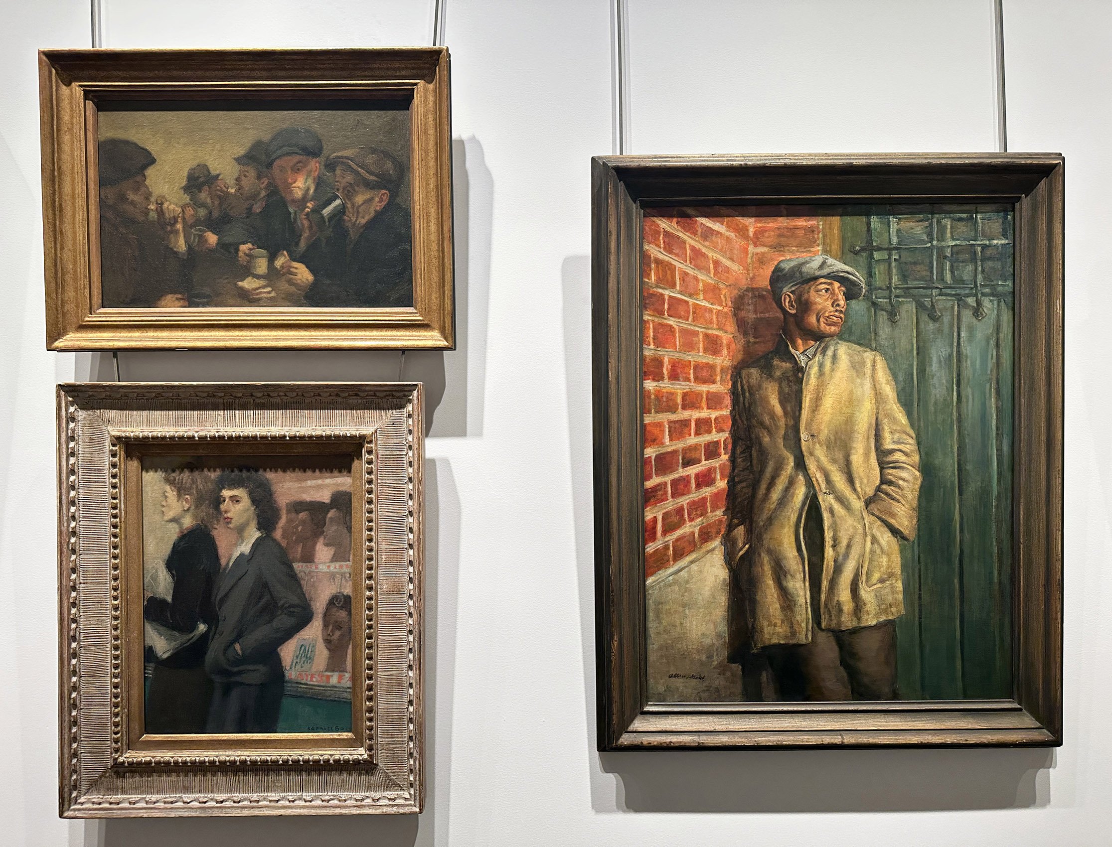
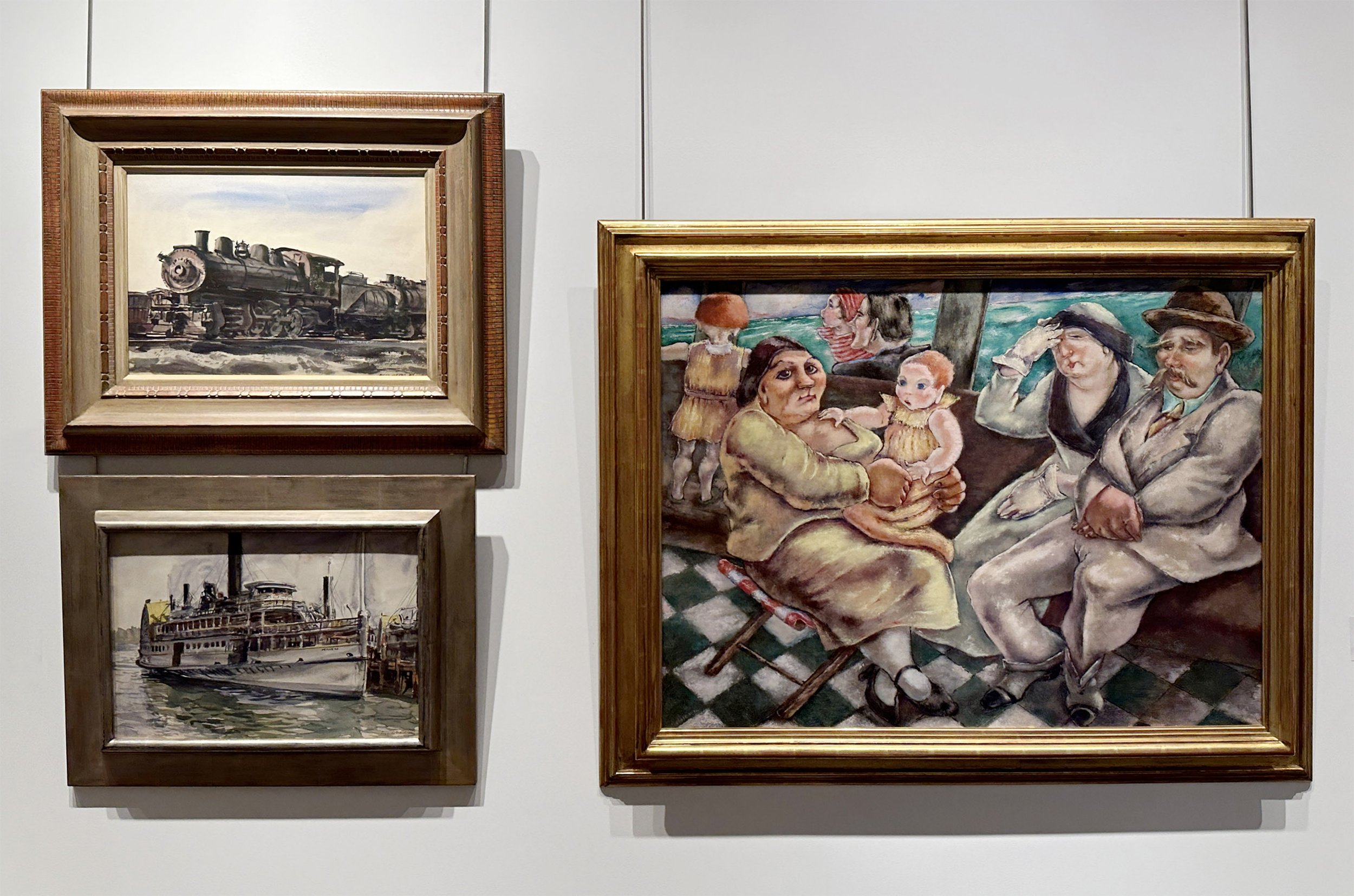
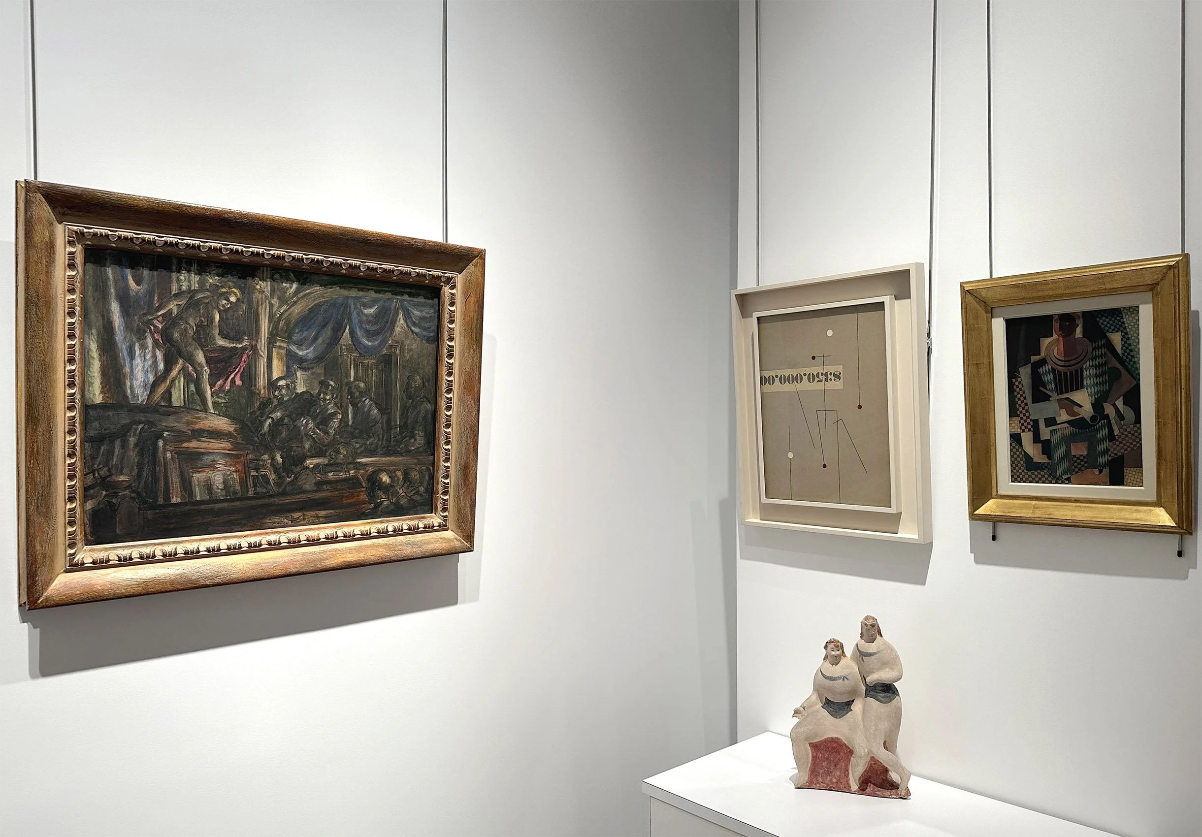
PAUL REED (1919-2015):

FROM BIOMORPHIC TO GEOMETRIC, 1962-1969

December 4, 2025 - February 13, 2026

Installation Views | Essay | For availability and pricing, call 212-581-1657.


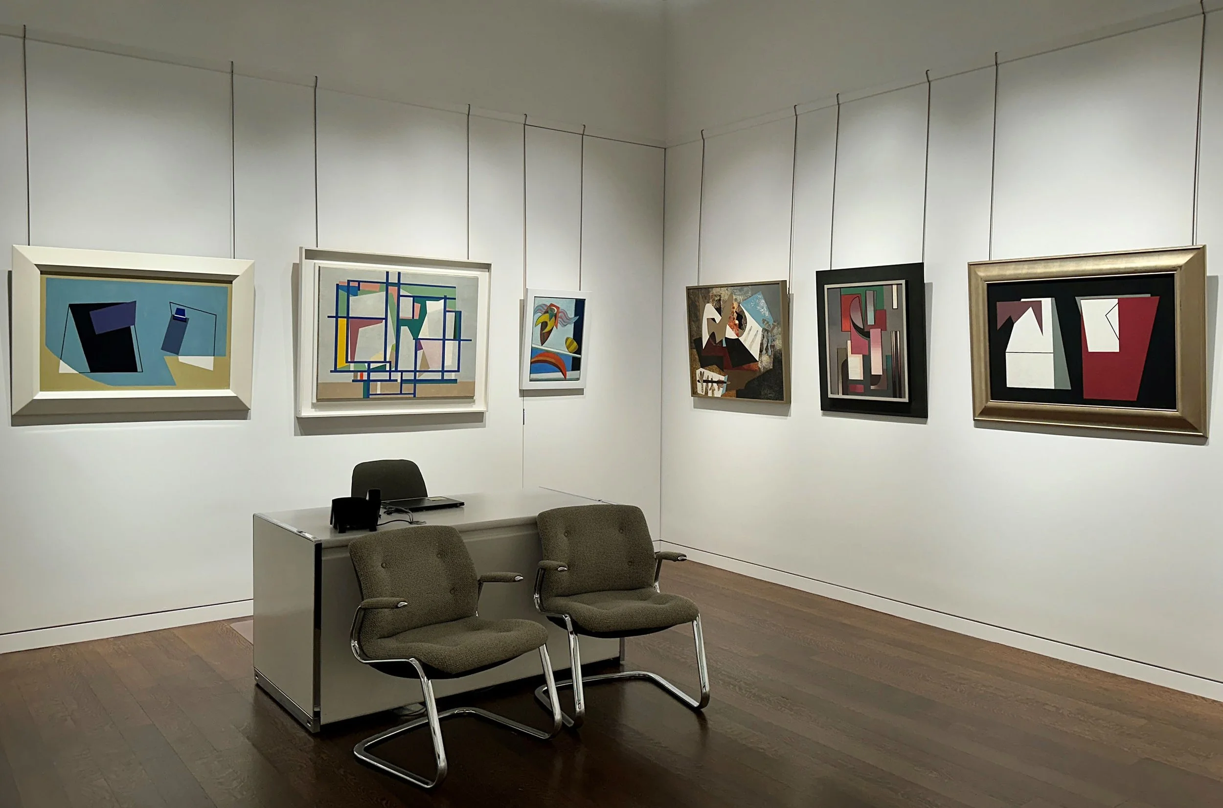
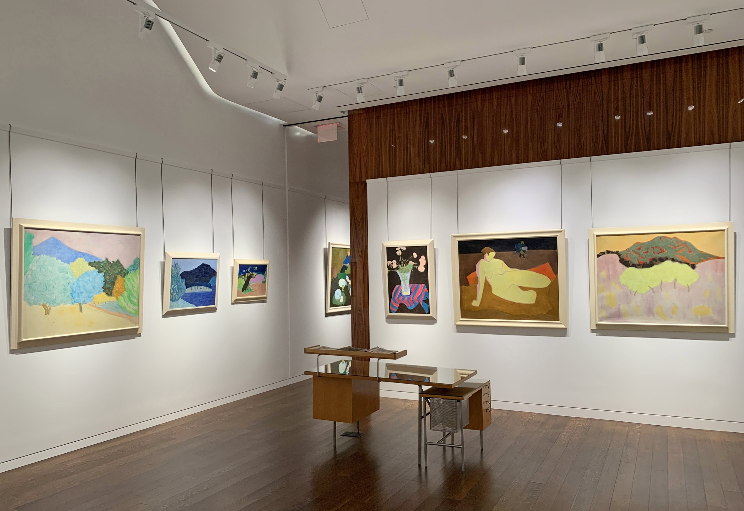
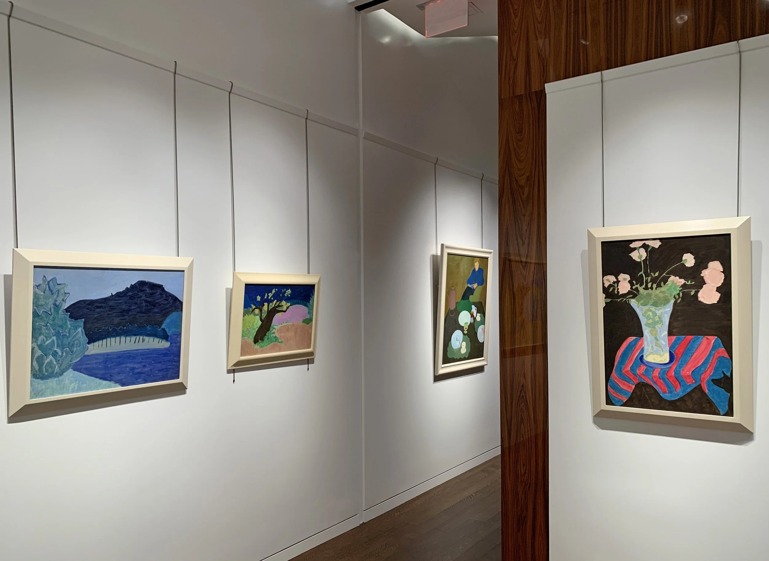
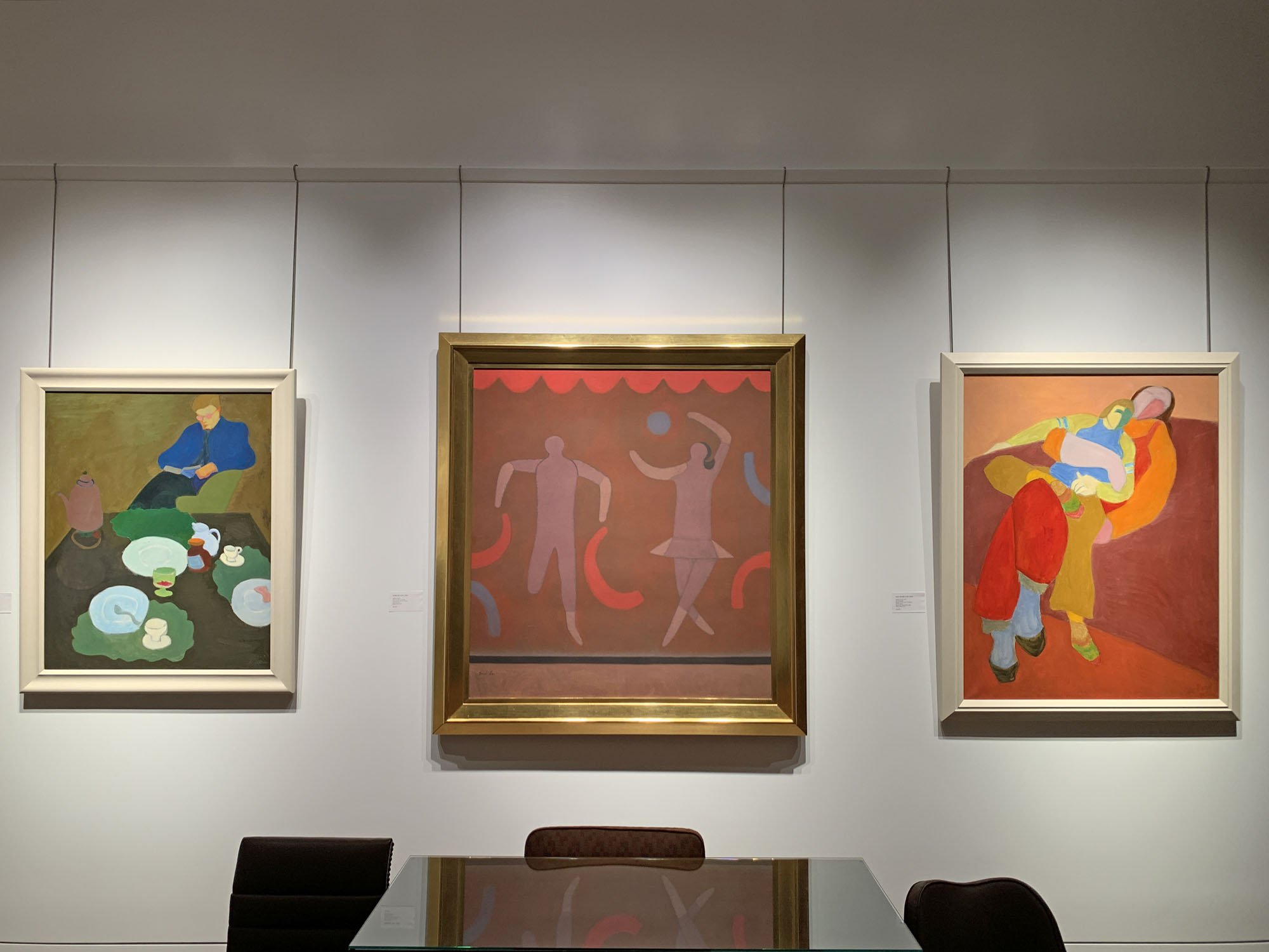
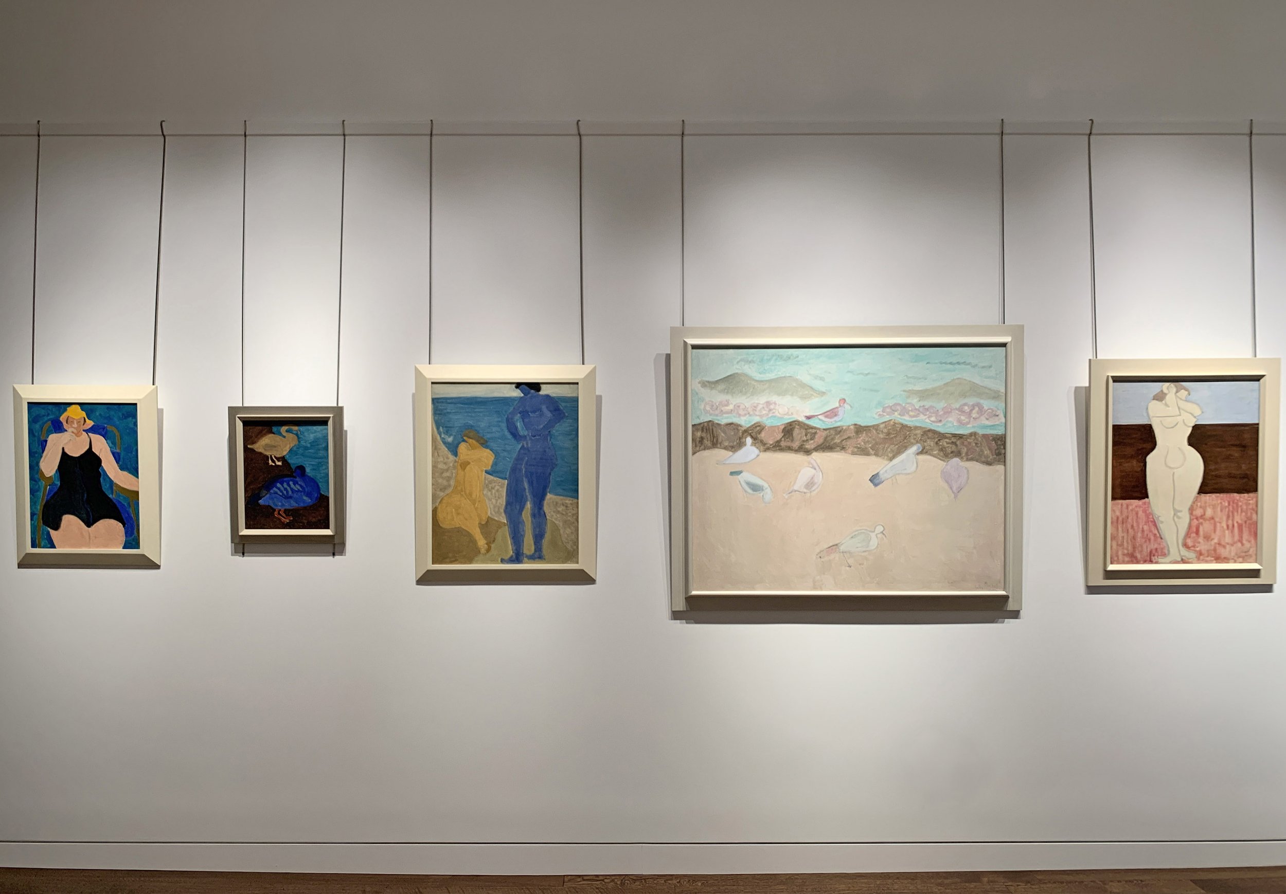
Installation Views

Essay by Emily Lenz

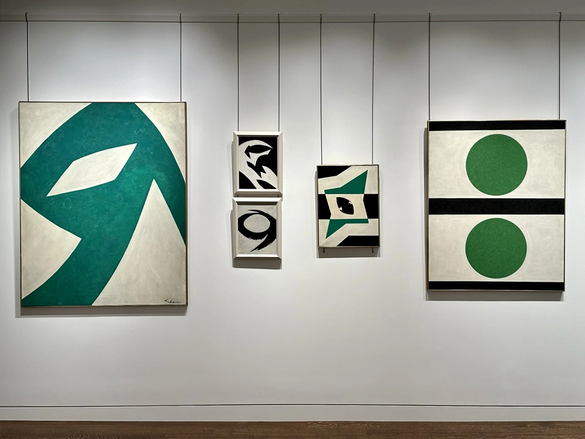
Our exhibition at the gallery complements Paul Reed's major retrospective at the Oklahoma City Museum of Art curated by David Gariff, senior lecturer at the National Gallery of Art. The retrospective includes over one hundred paintings, sculptures, and works on paper drawn from the Oklahoma City Museum of Art's holdings, several DC museums, and private collections across the country. The retrospective runs from November 22, 2025 to April 12, 2026.

The Oklahoma City Museum of Art has a long history with the Washington Color School artists, which includes Morris Louis, Kenneth Noland, Gene Davis, Thomas Downing, Howard Mehring, and Paul Reed. In 1968 the museum purchased the entire collection of the Washington Gallery of Modern Art, founded in 1961 to increase attention given to contemporary art in the nation's capital. Facing closure due to poor finances, the Washington Gallery had to settle its debts to merge with the Corcoran Gallery of Art and have its building serve as an annex. J. Robert Porter, a museum board trustee born and raised in Oklahoma City, coordinated the sale of 154 works to the then Oklahoma Art Center. The history of the Washington Gallery of Modern Art and how its collection came to Oklahoma was covered in the 2007 exhibition catalogue Breaking the Mold: Selections from the Washington Gallery of Modern Art, 1961-1968 and further discussed in the new Paul Reed exhibition catalogue.

In 1965, the Washington Gallery of Modern Art’s director Gerald Nordland organized the landmark exhibition Washington Color Painters featuring Paul Reed, Morris Louis, Kenneth Noland, Gene Davis, Thomas Downing, and Howard Mehring. These DC-based artists used recently developed acrylic paints directly on unprimed canvas, embedding or staining the color into the painting’s surface. This approach created a new sense of color that glowed and seemed to float. The Washington Color Painters exhibition traveled across the country bringing the group national recognition. The venues included: the University of Texas Art Galleries (now the Blanton Museum) in Austin, the University of California in Santa Barbara, the Rose Art Gallery at Brandeis University, and the Walker Art Center in Minneapolis. The six Washington Color painters first formed connections in the 1950s through DC art organizations. Kenneth Noland and Morris Louis both taught at the Washington Workshop for the Arts in 1952. Howard Mehring and Thomas Downing studied with Noland at Catholic University in 1953. Gene Davis and Paul Reed were childhood friends and met regularly at the Phillips Collection beginning in 1952. The six Washington artists became aware of each other’s works in the mid-1950s with their inclusion in exhibitions at Barnett-Aden Gallery, associated with Howard University, and later exhibitions at Jefferson Place Gallery, associated with American University. Noland first exhibited his Target paintings at Jefferson Place Gallery in 1958.

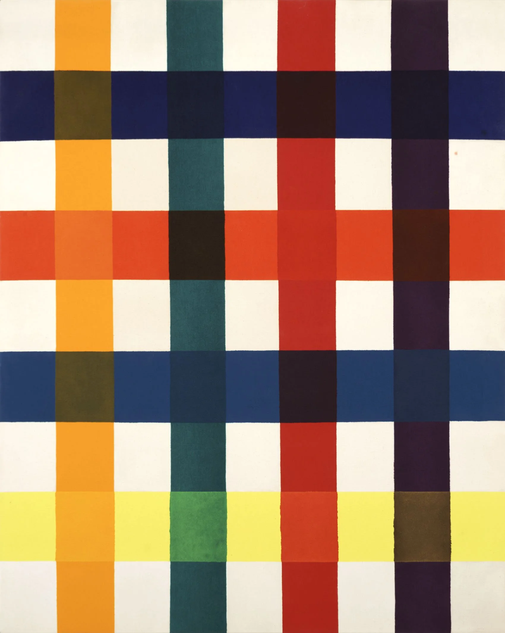
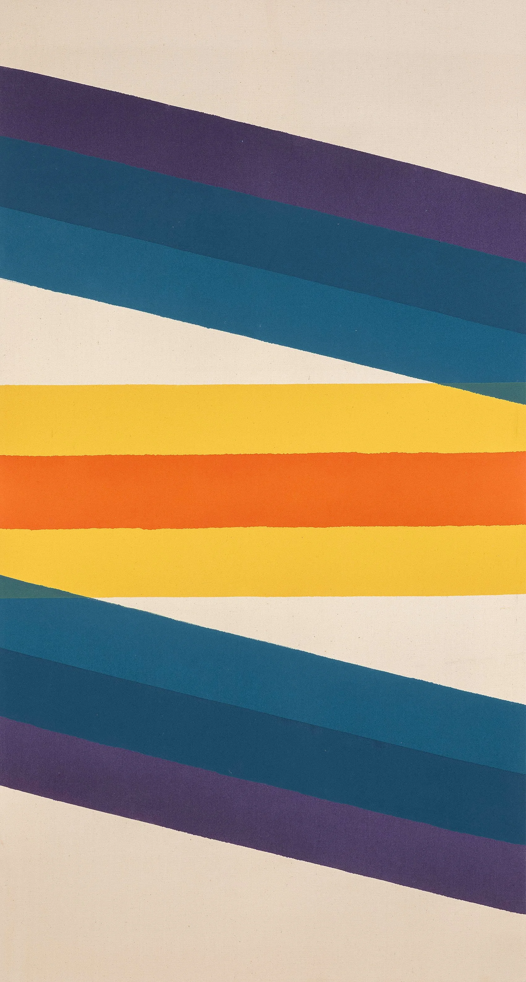
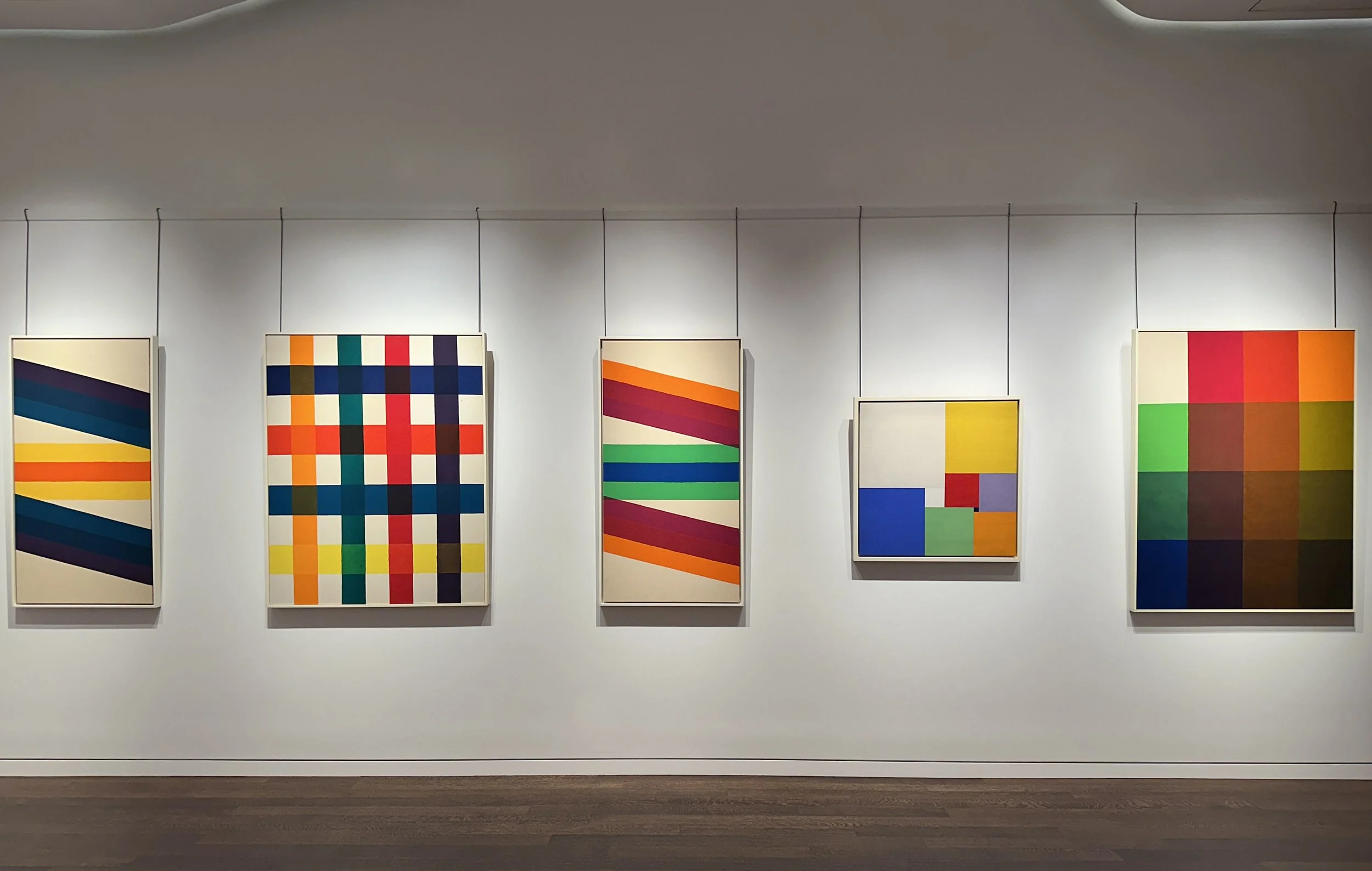
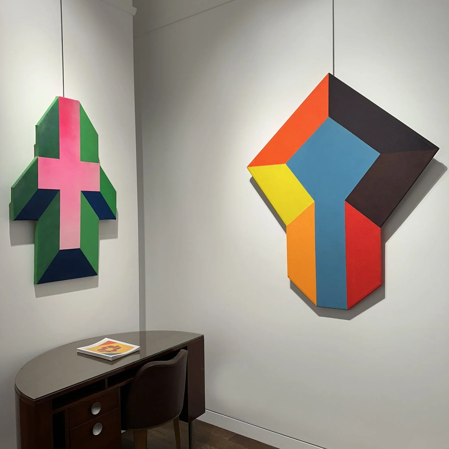
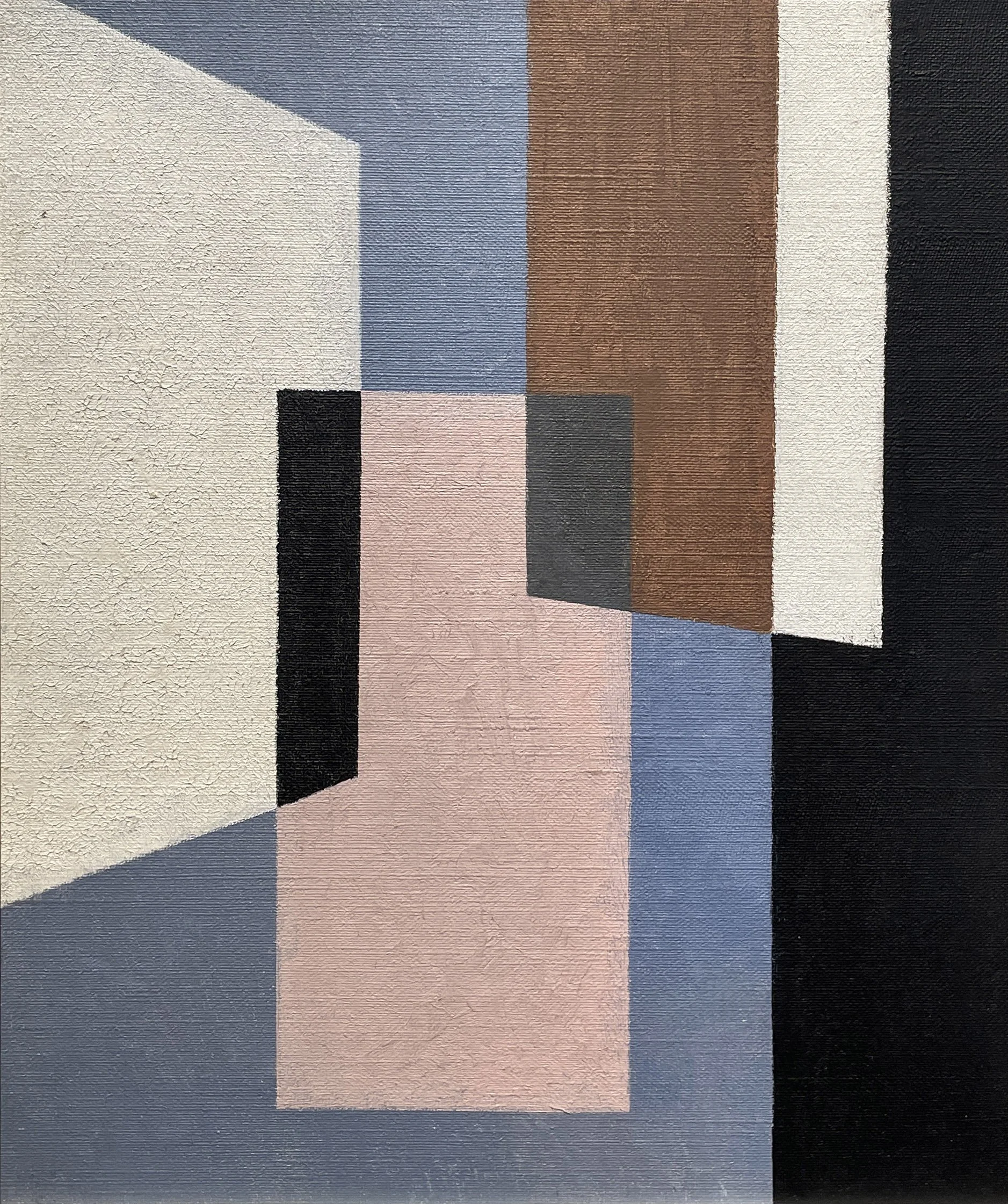
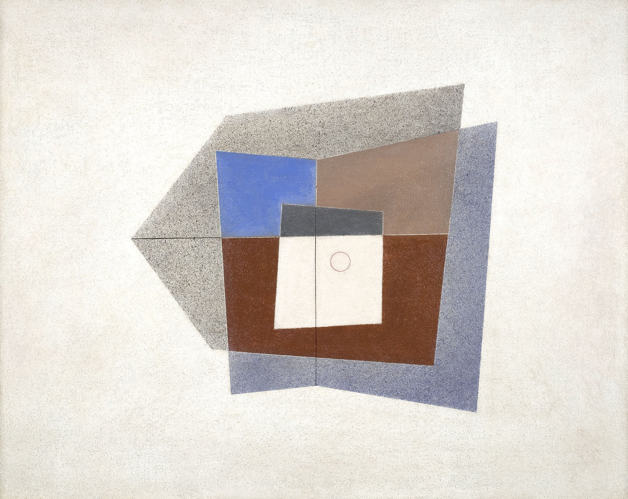
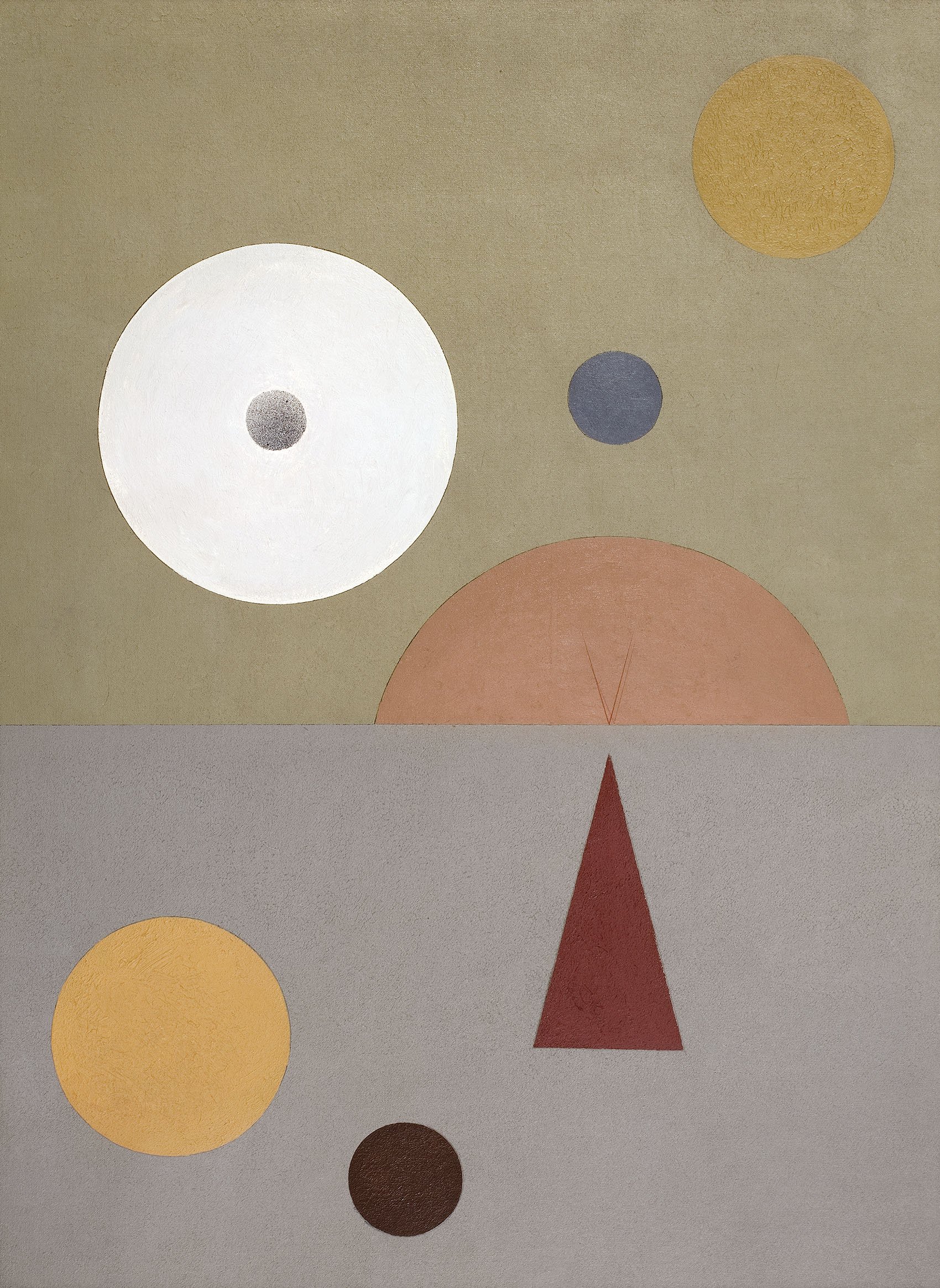
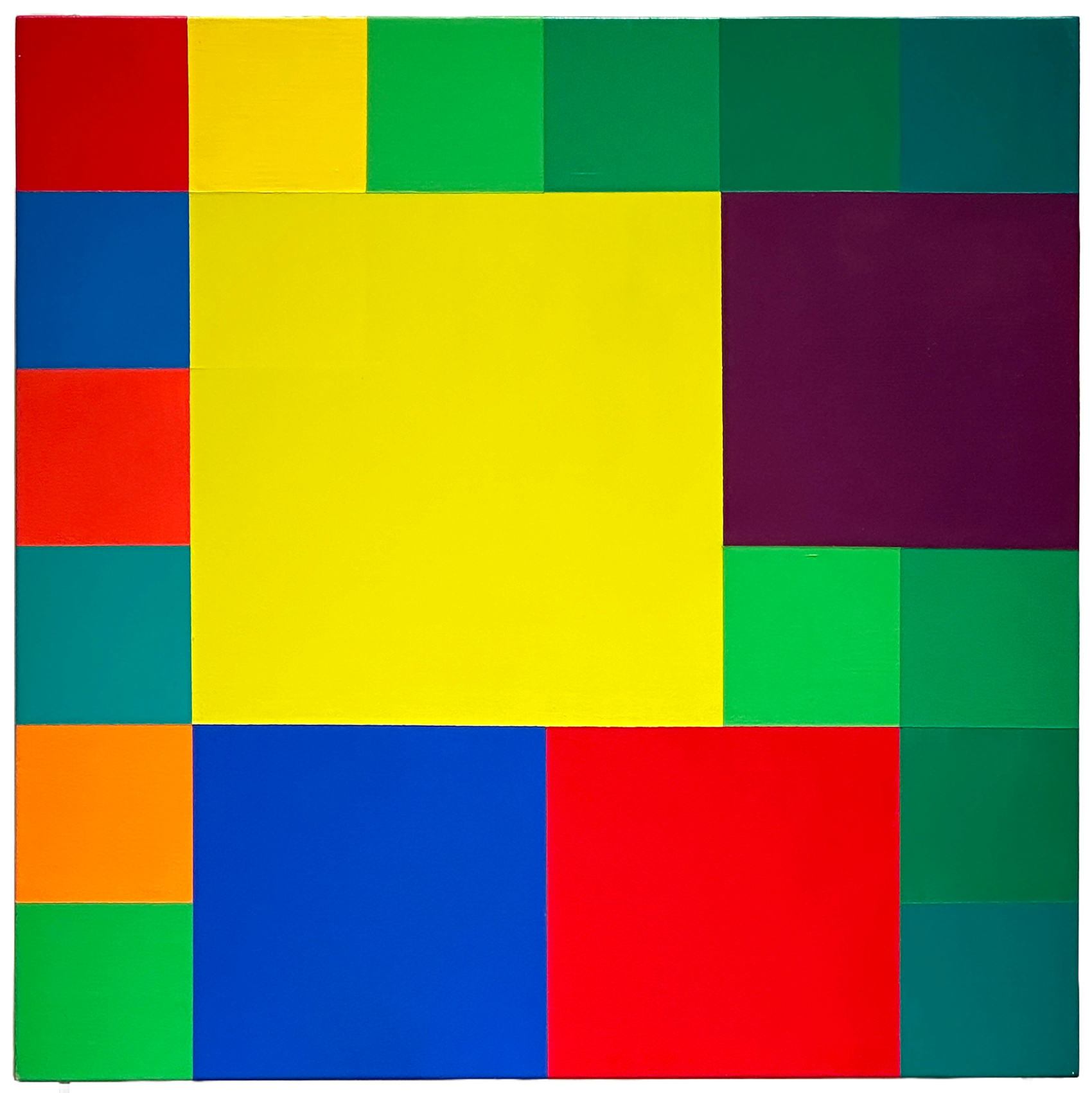
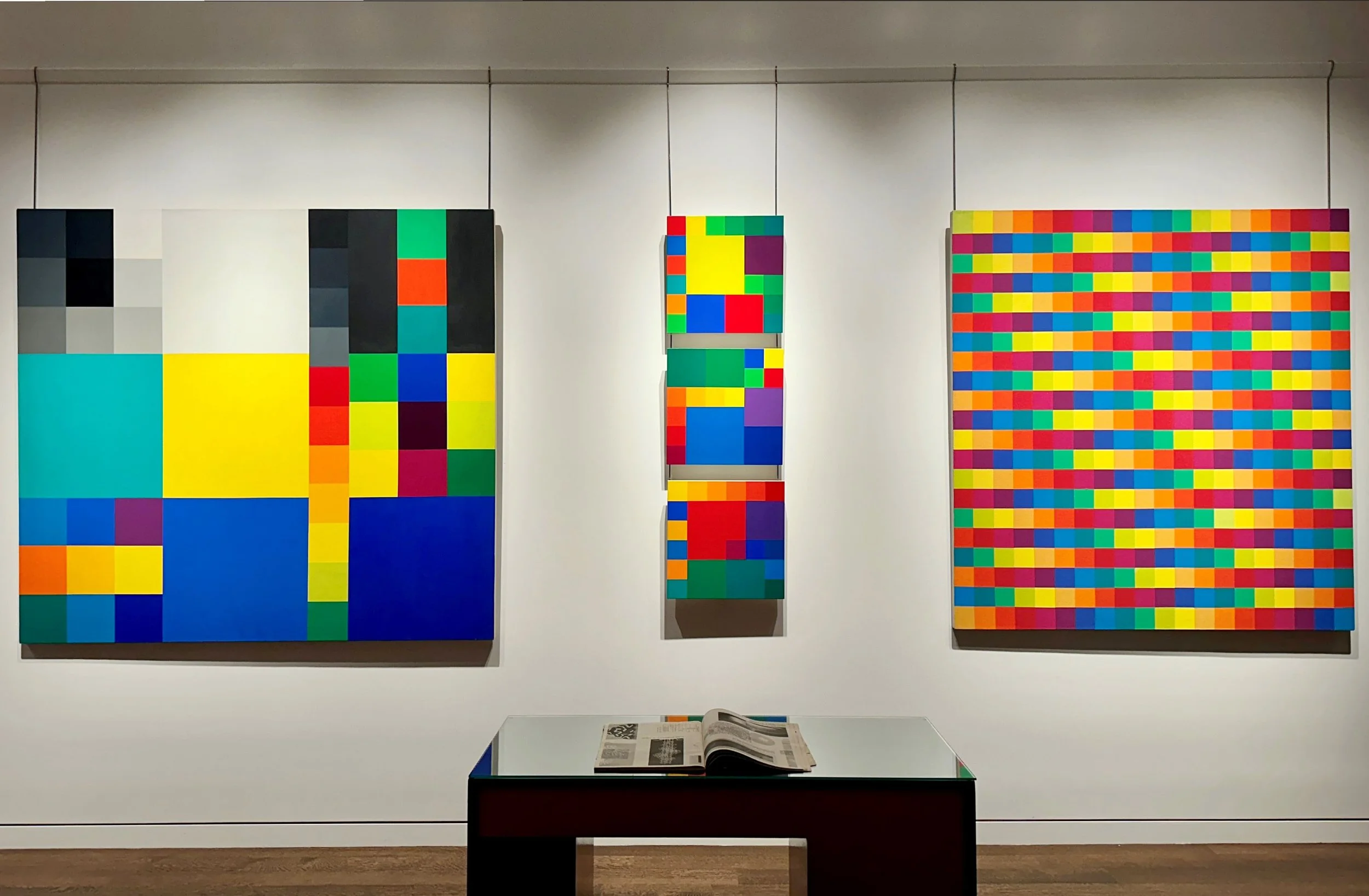
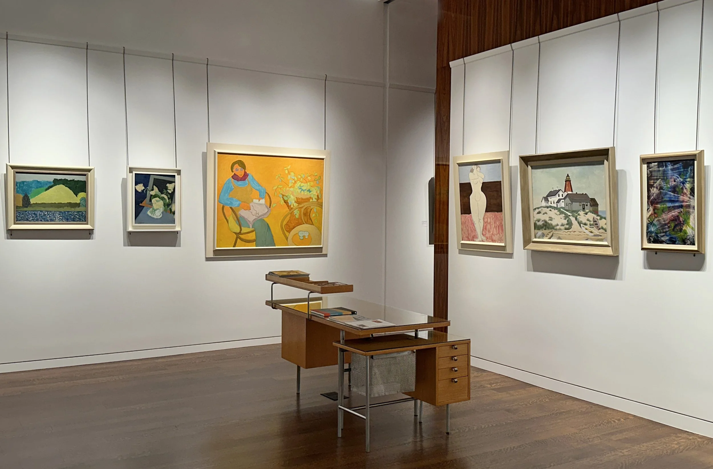
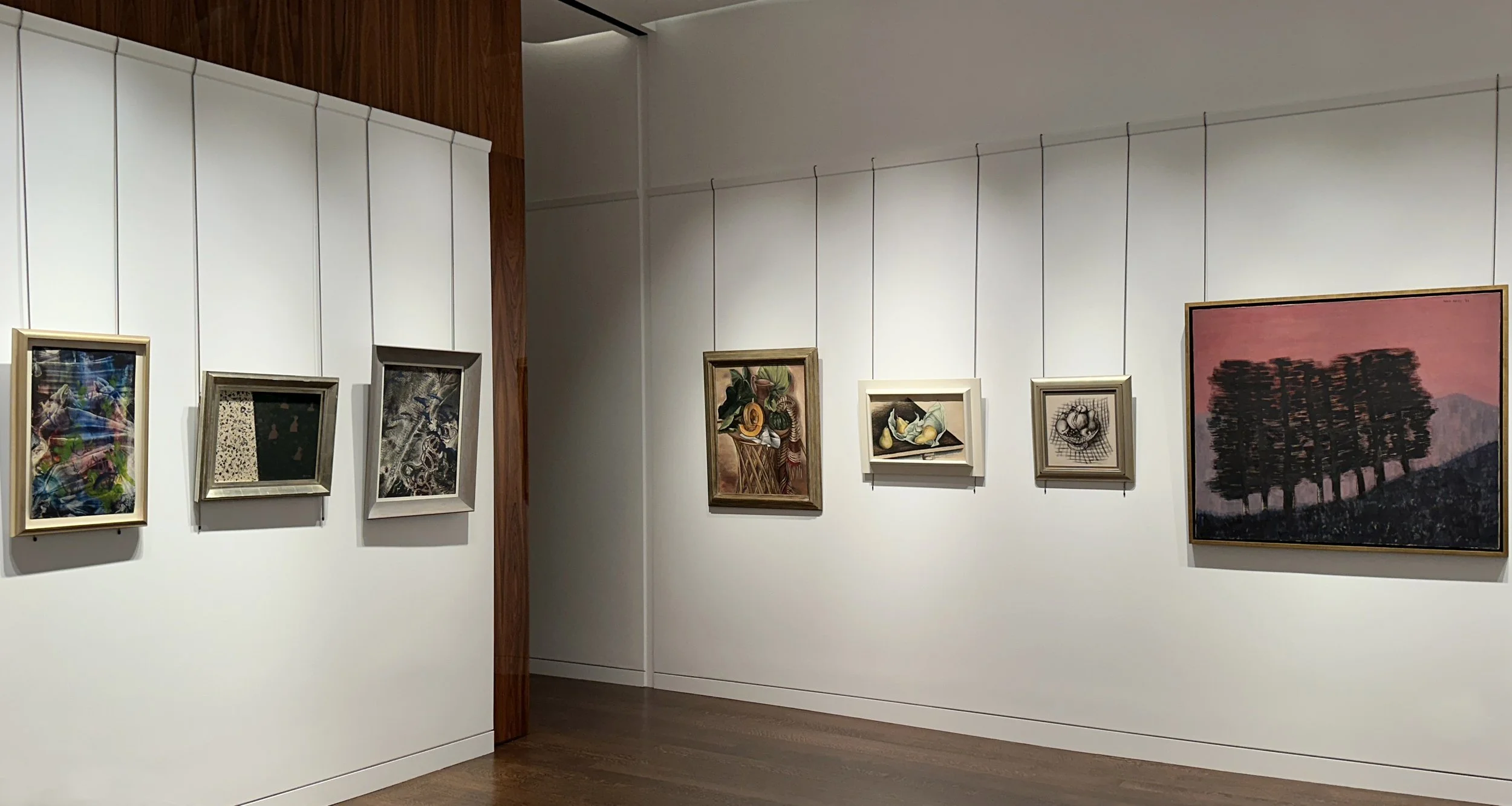
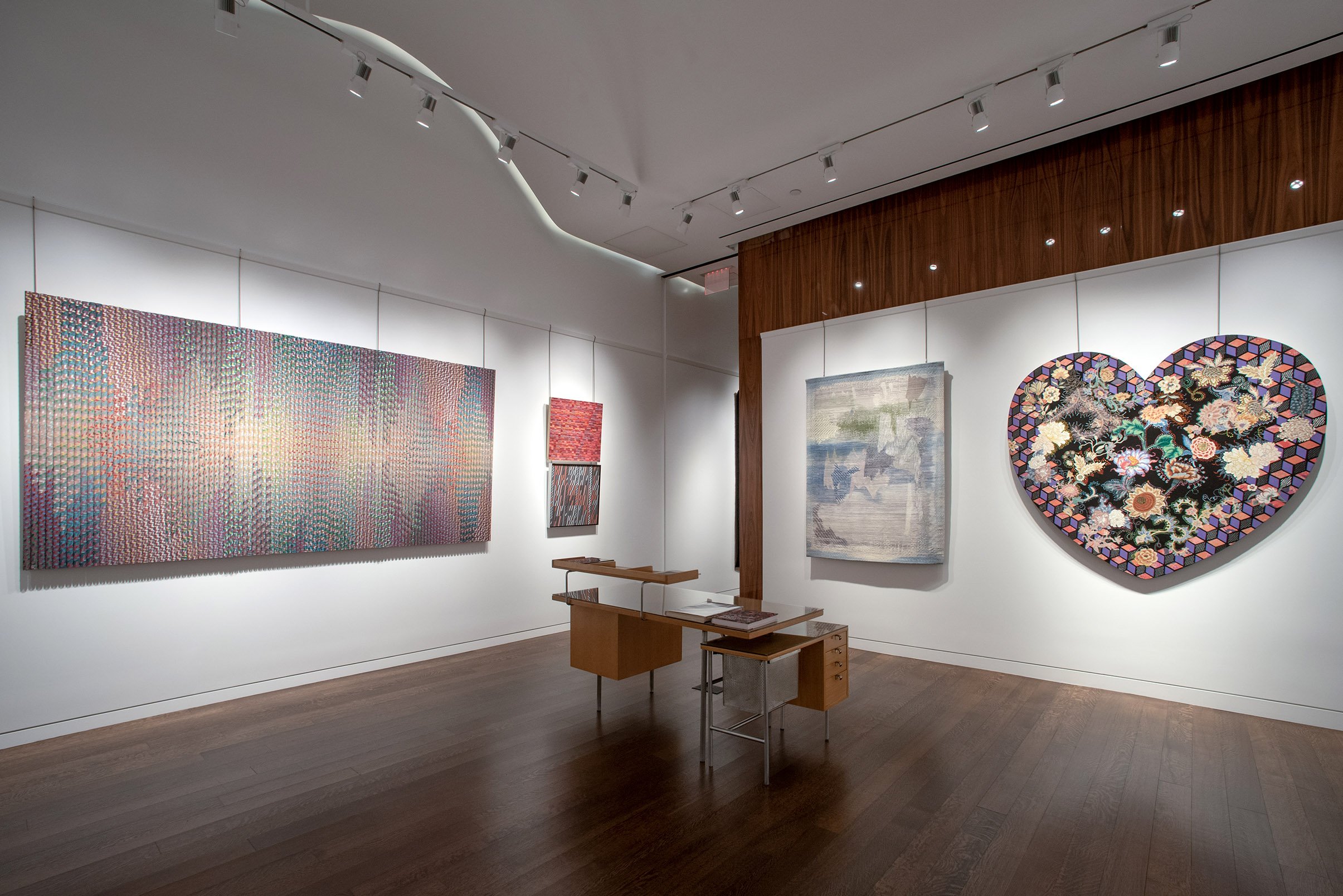
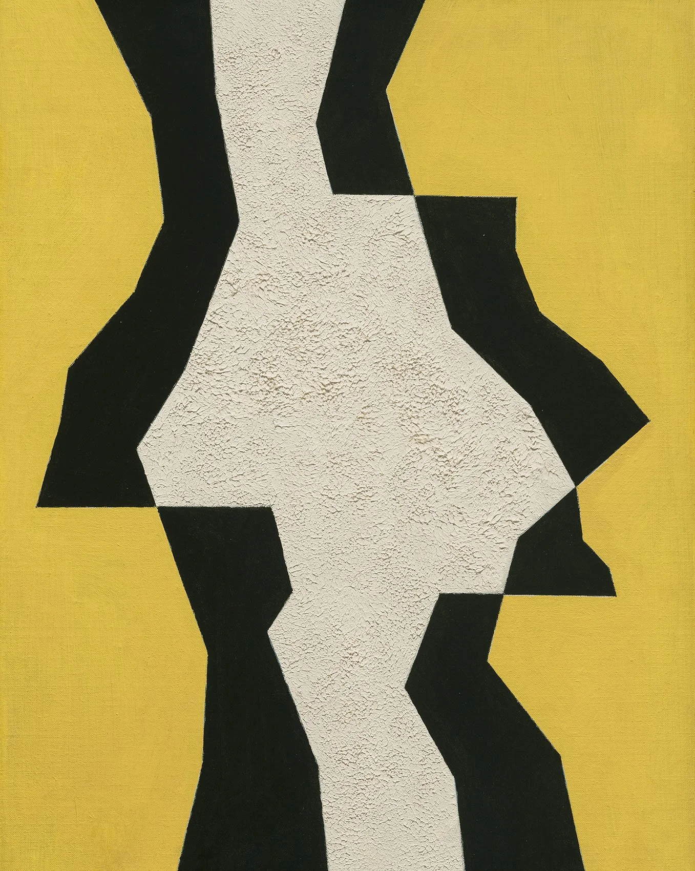
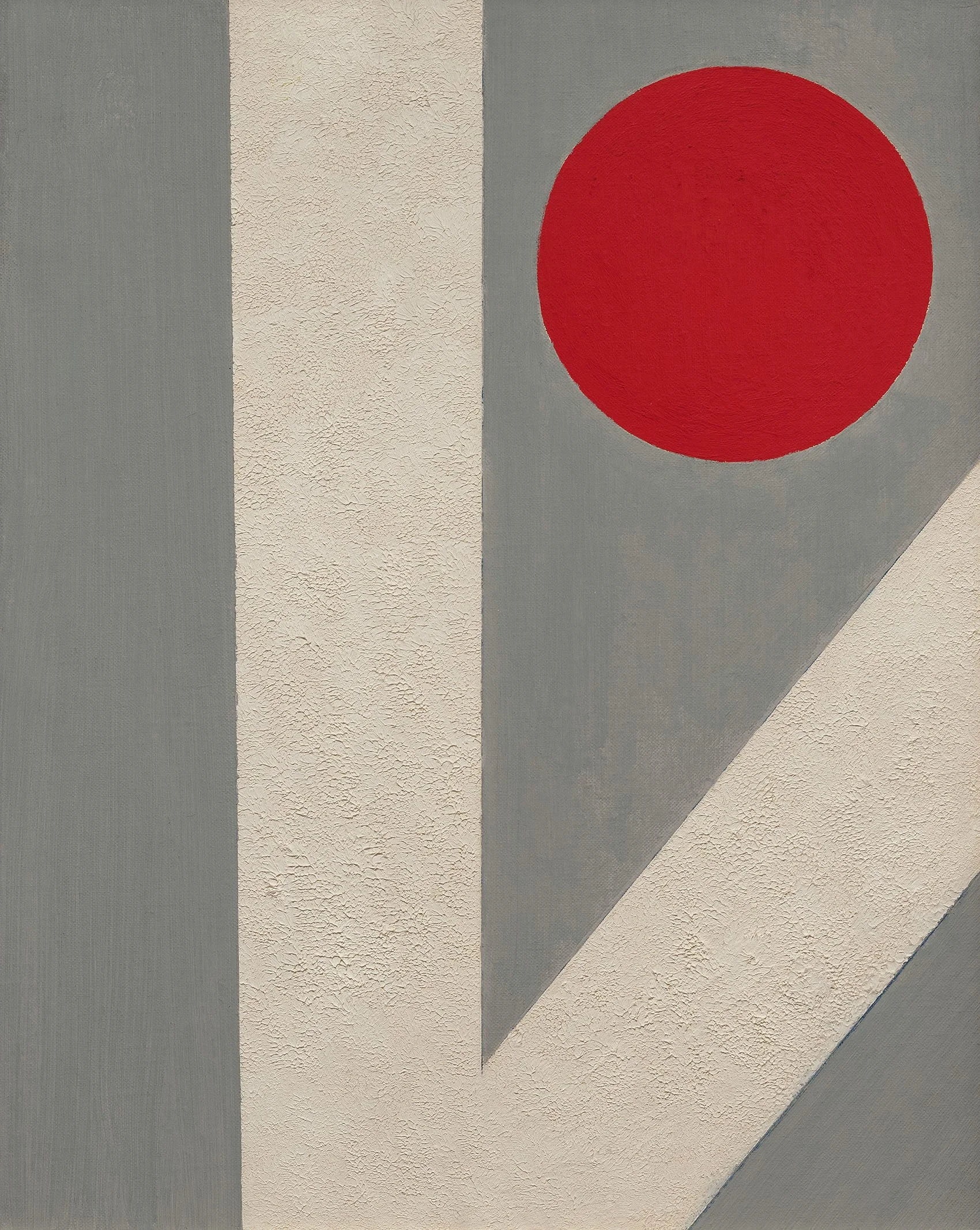
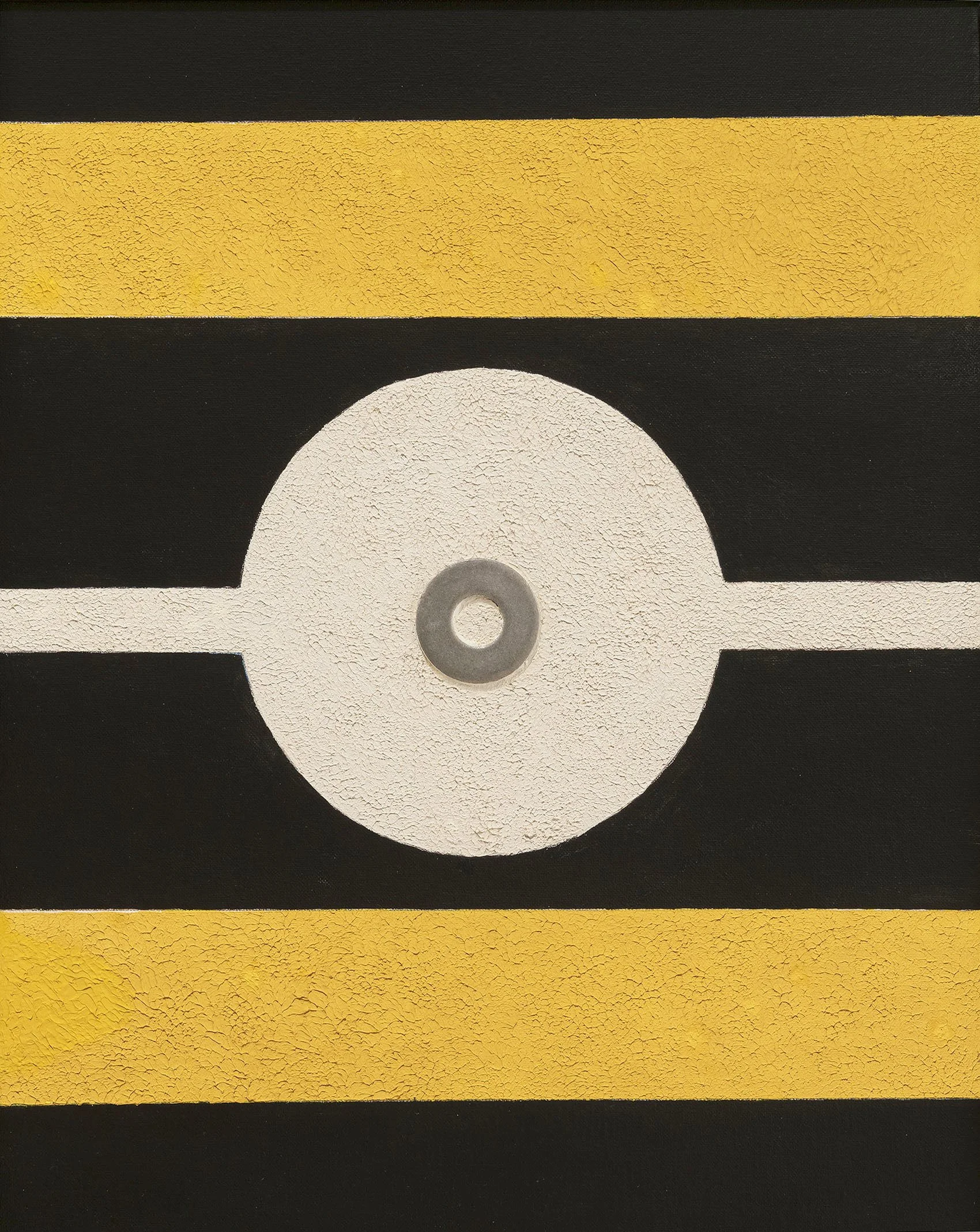
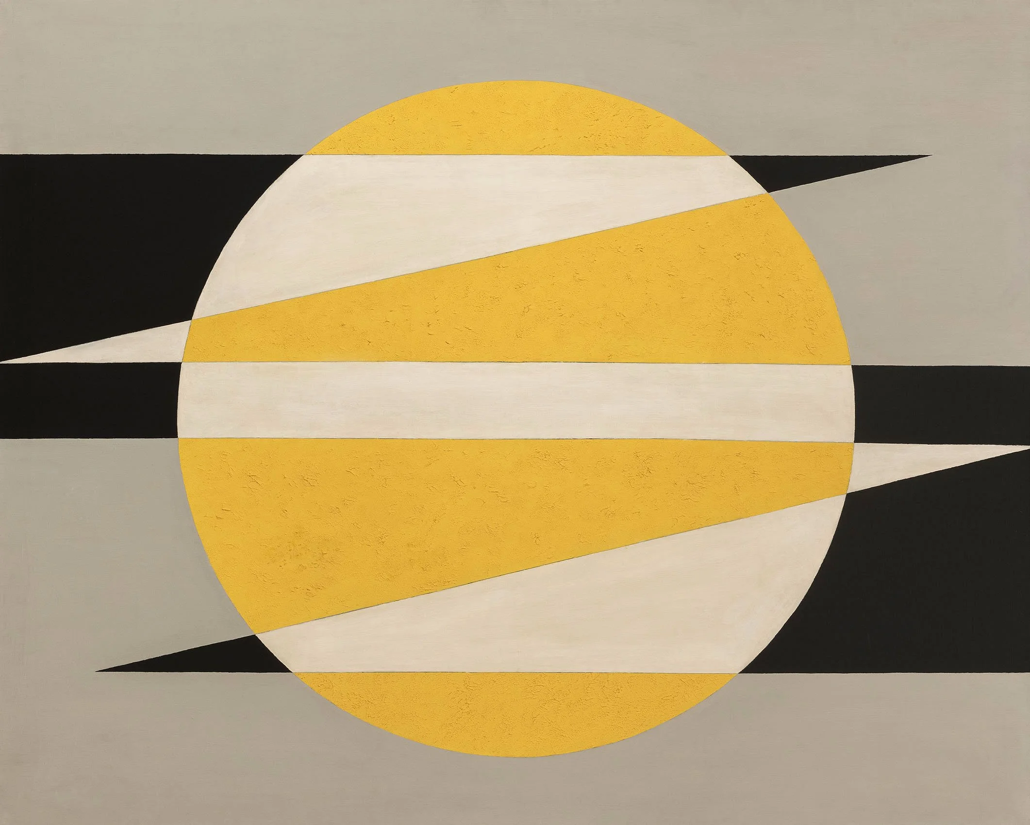
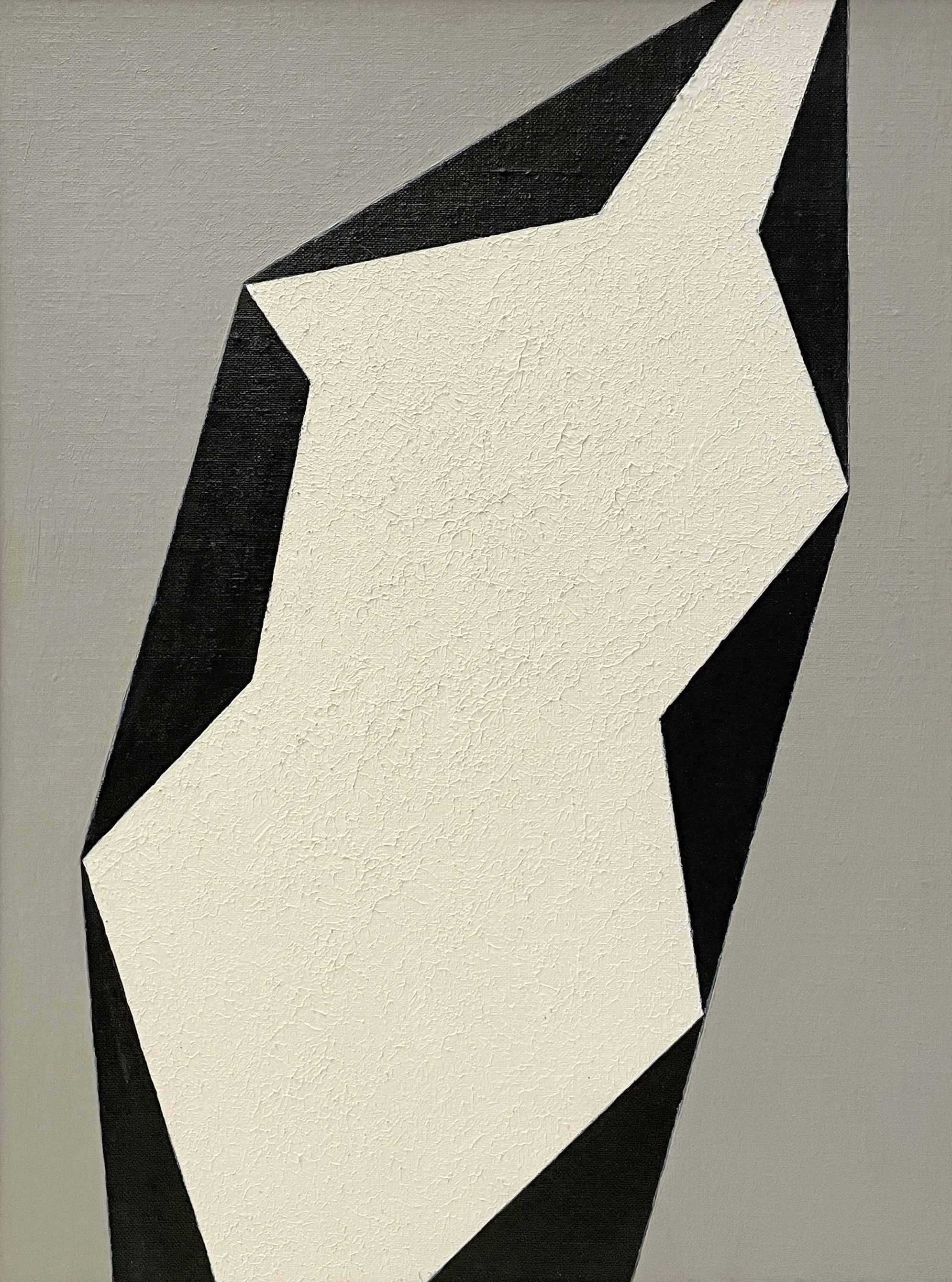
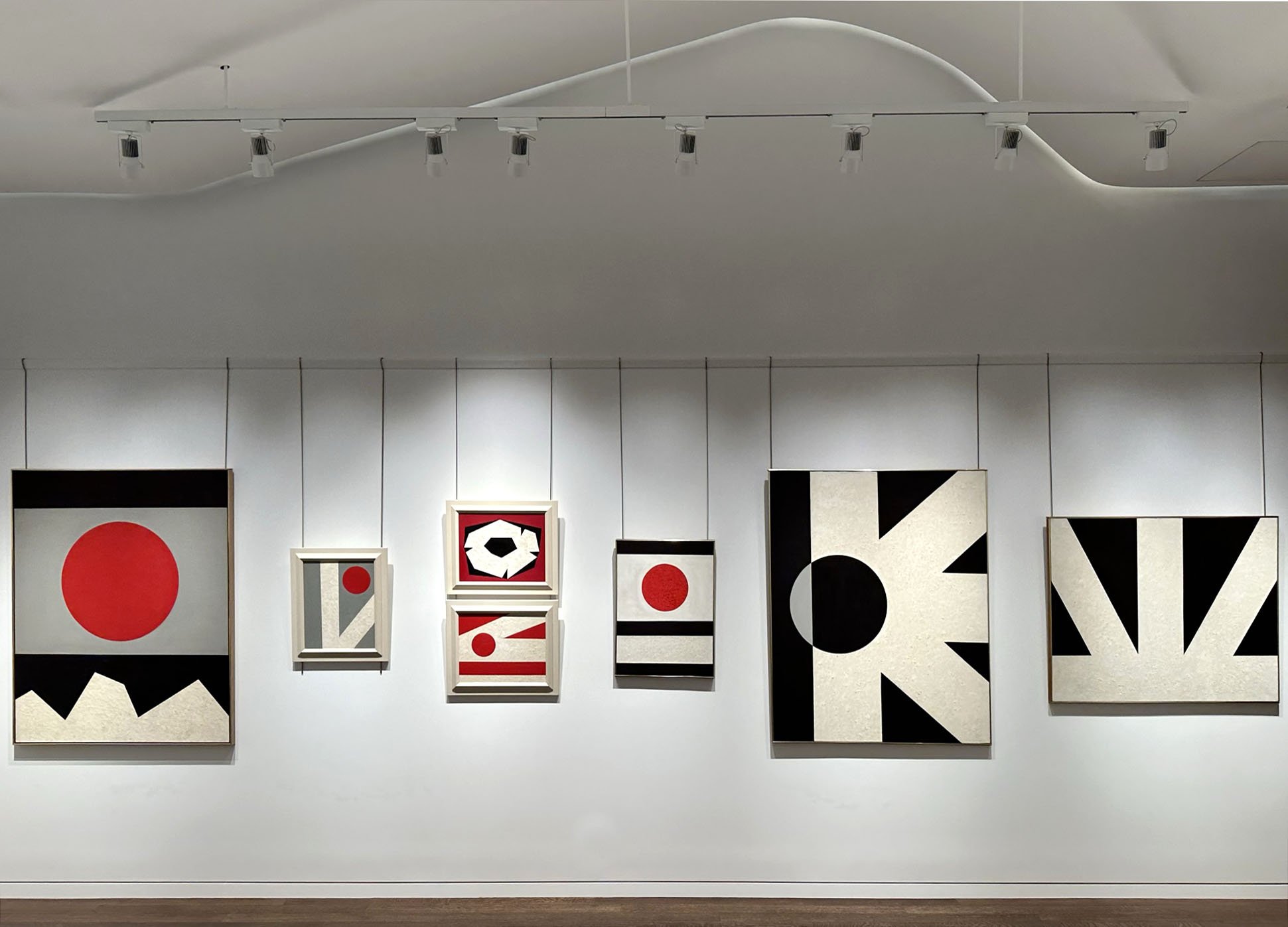
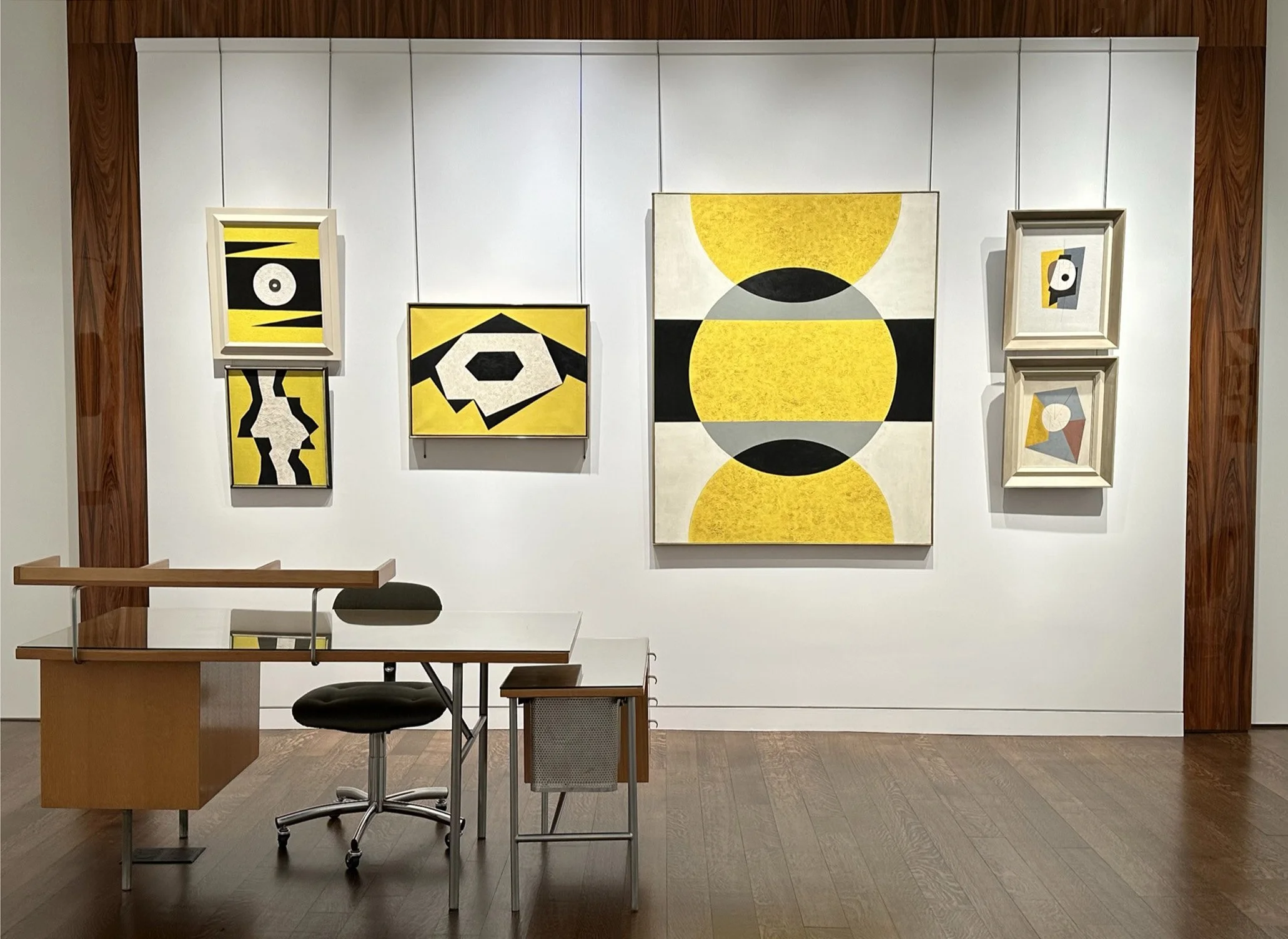
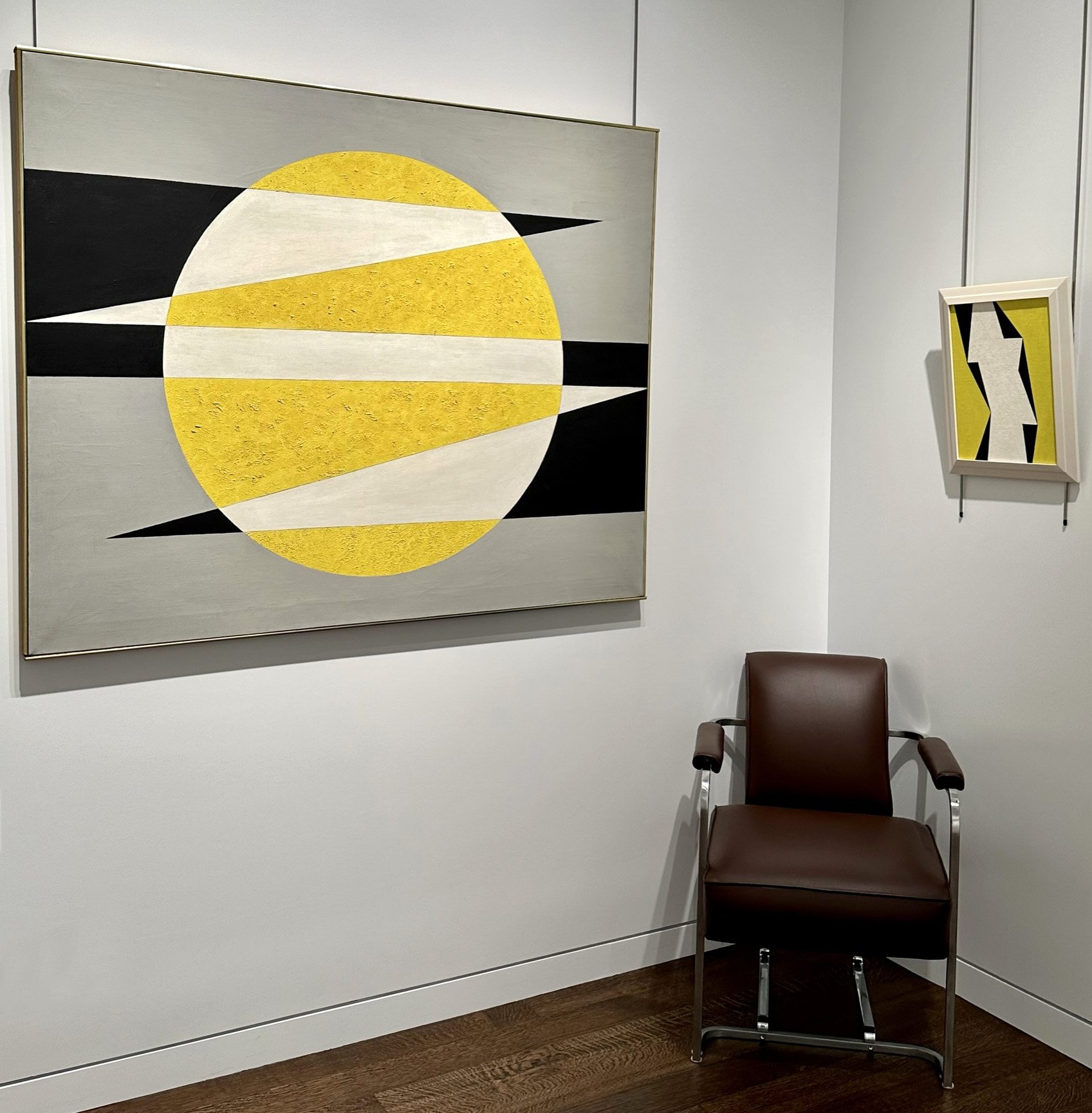
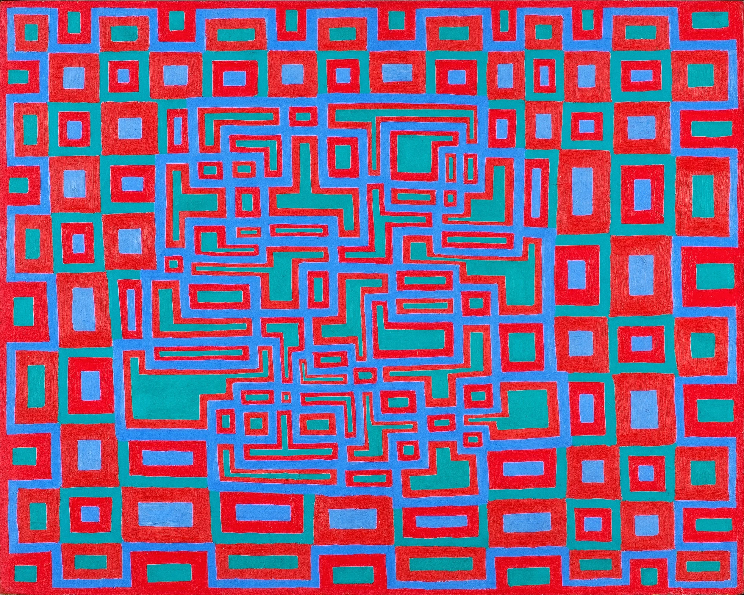
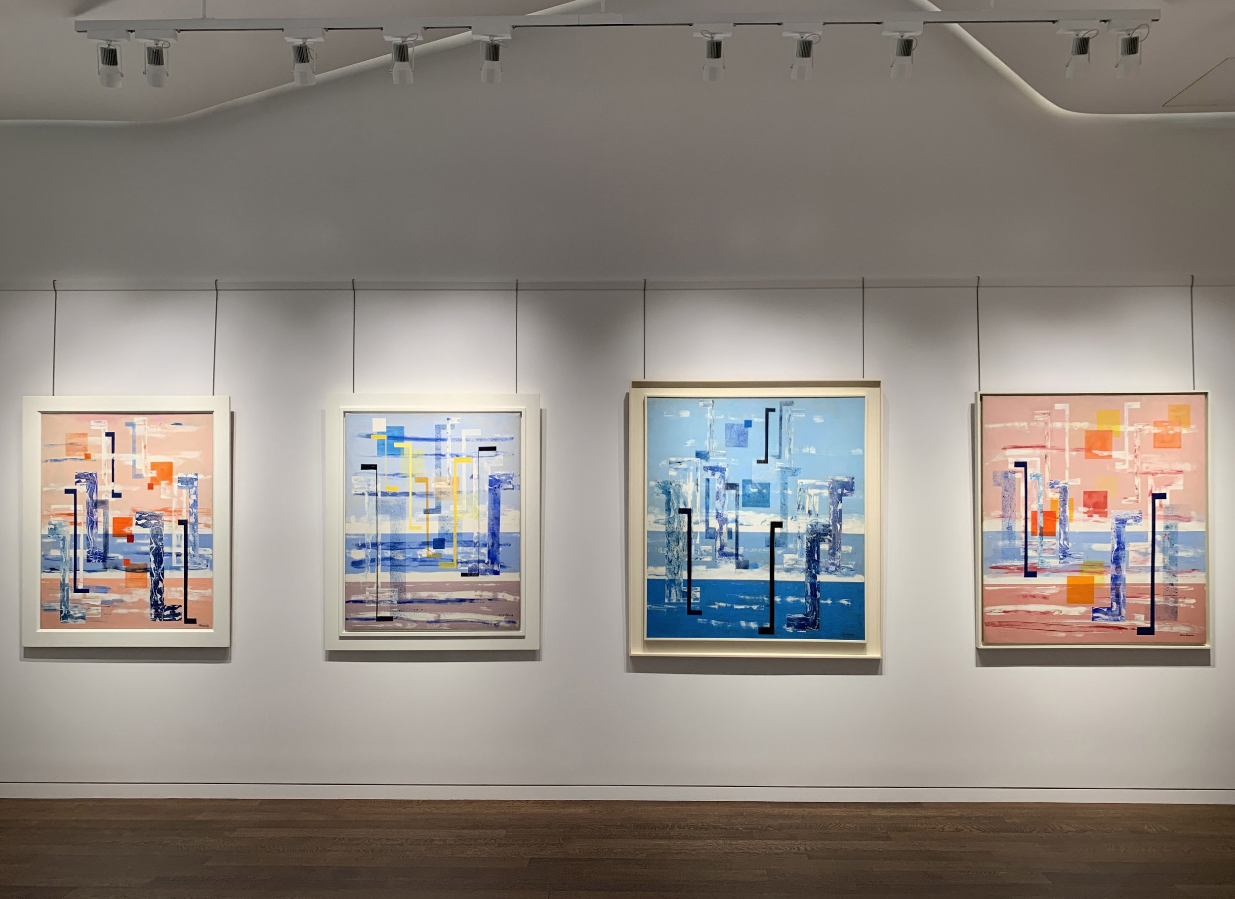
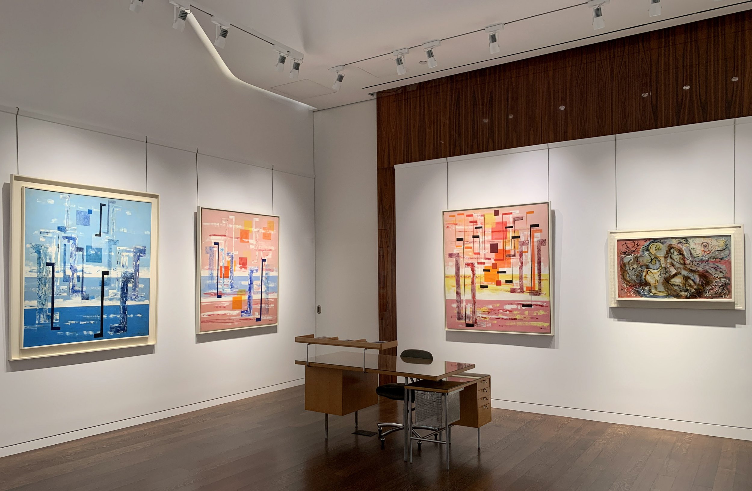
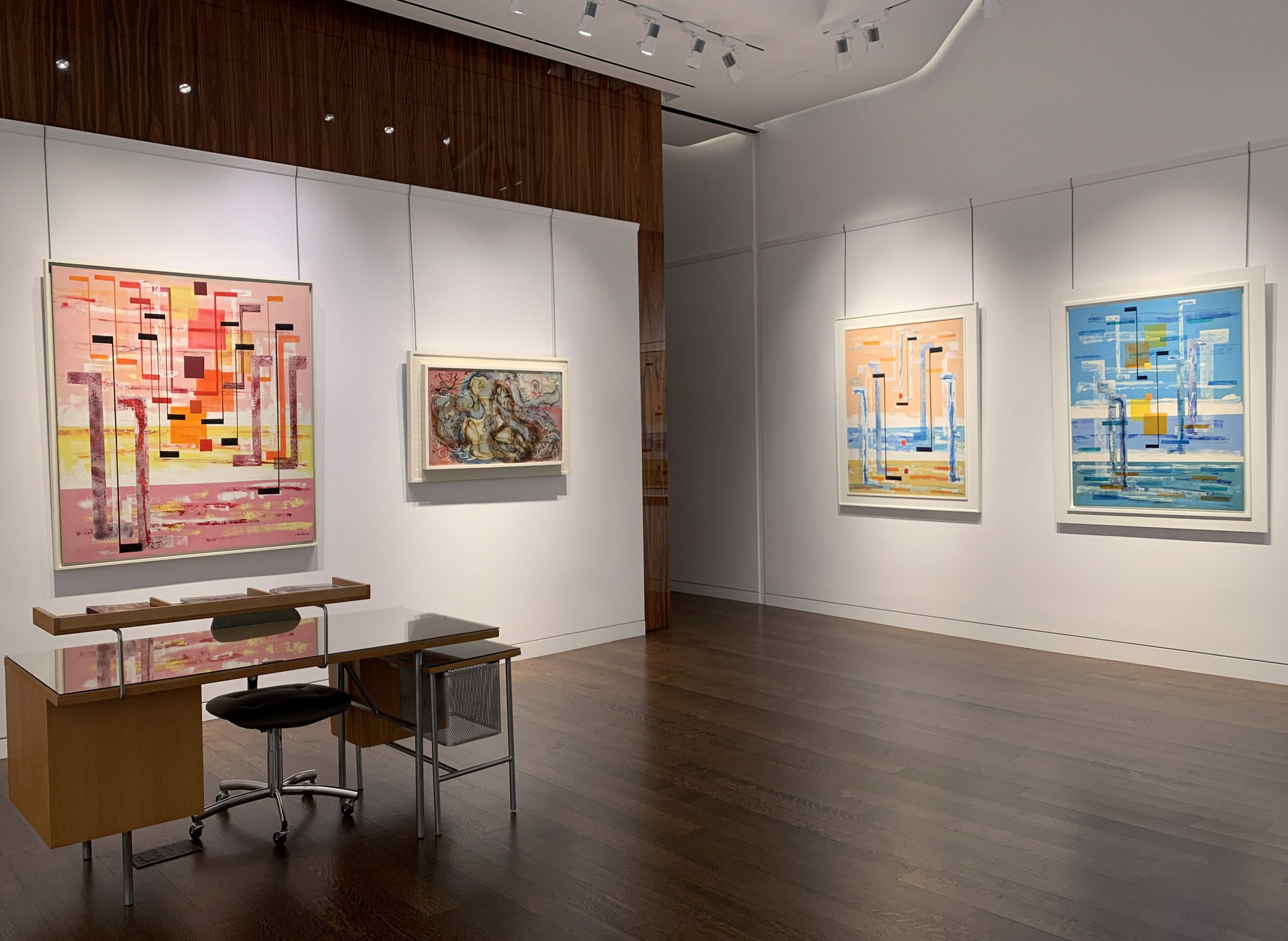
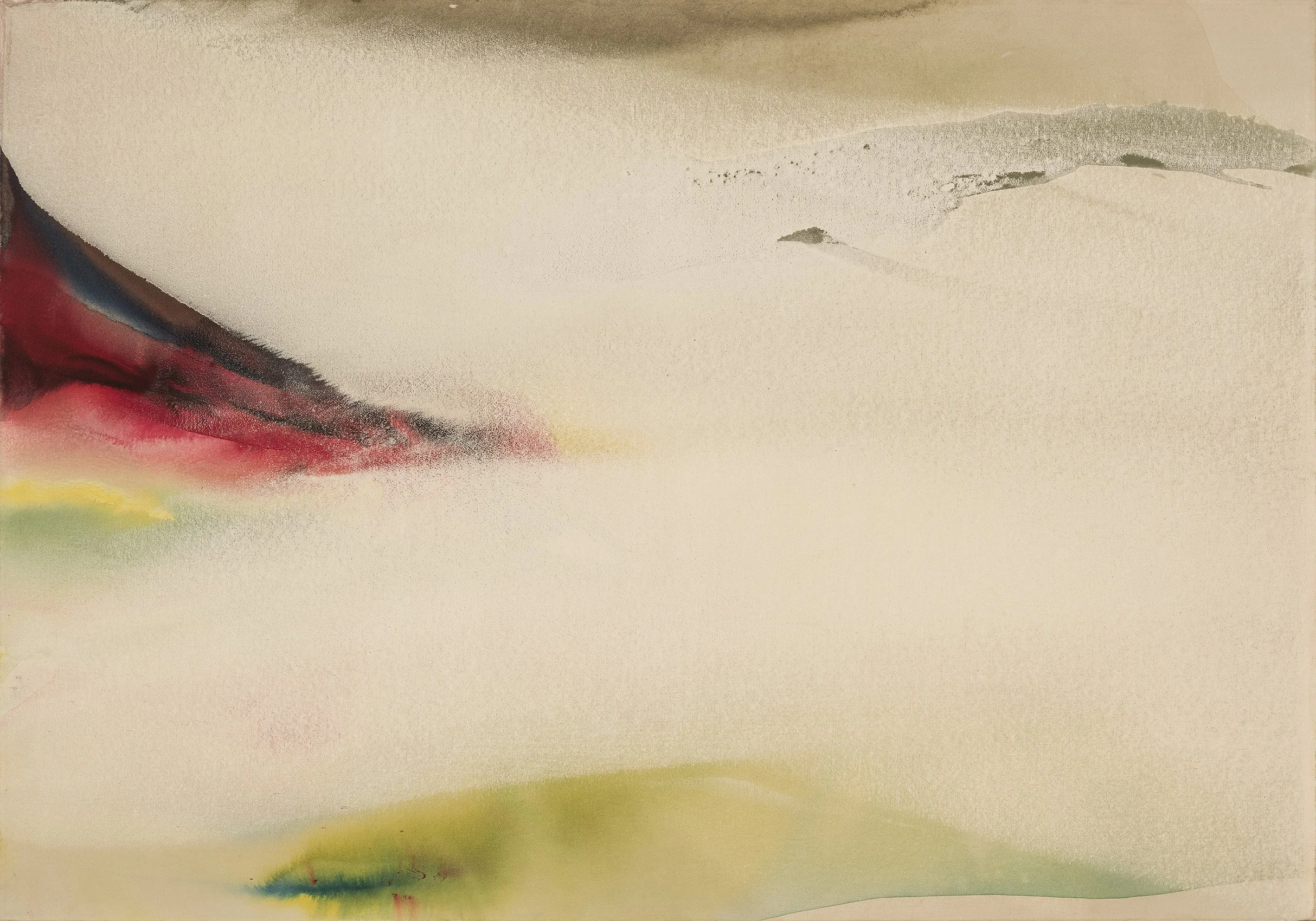
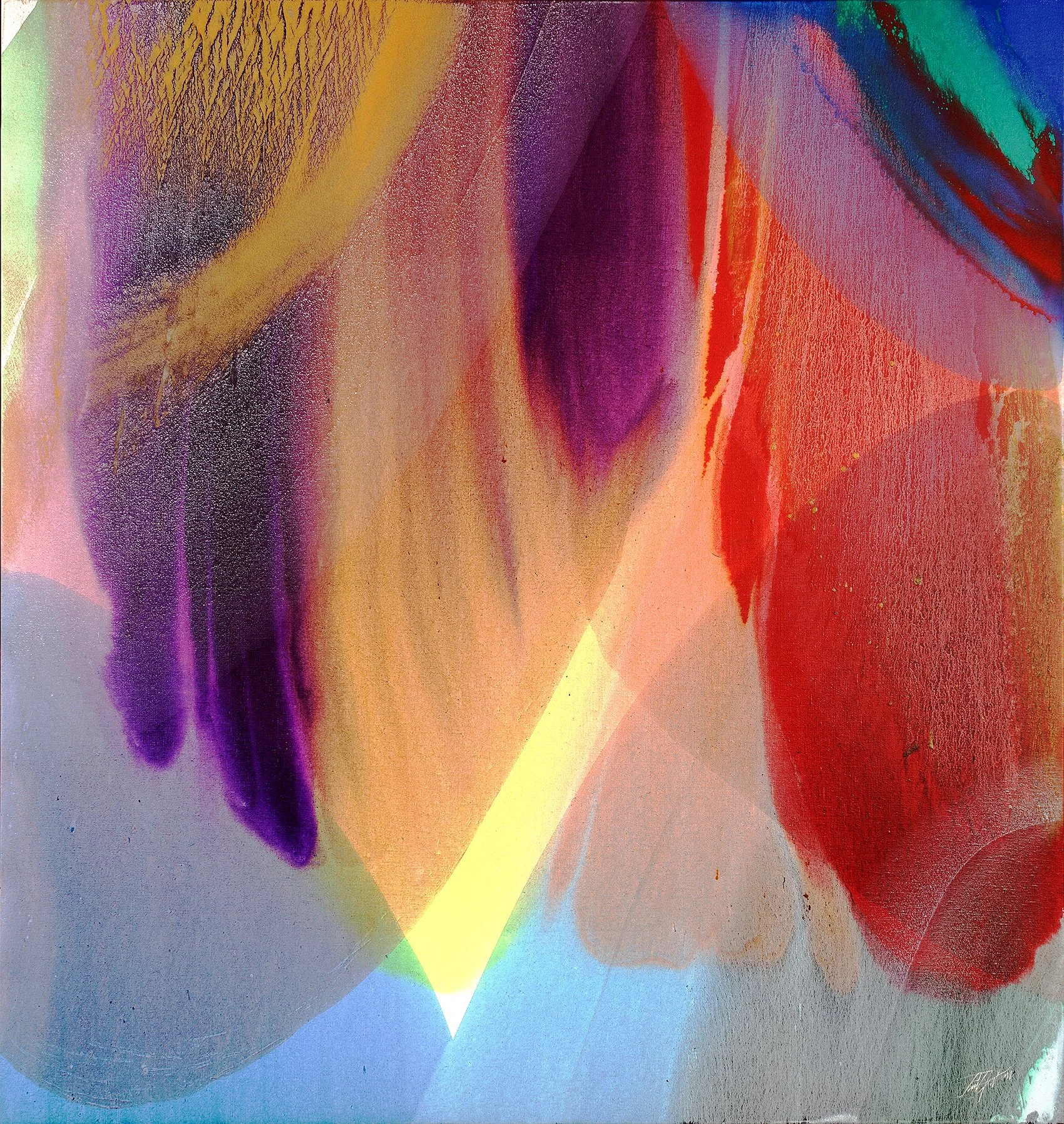
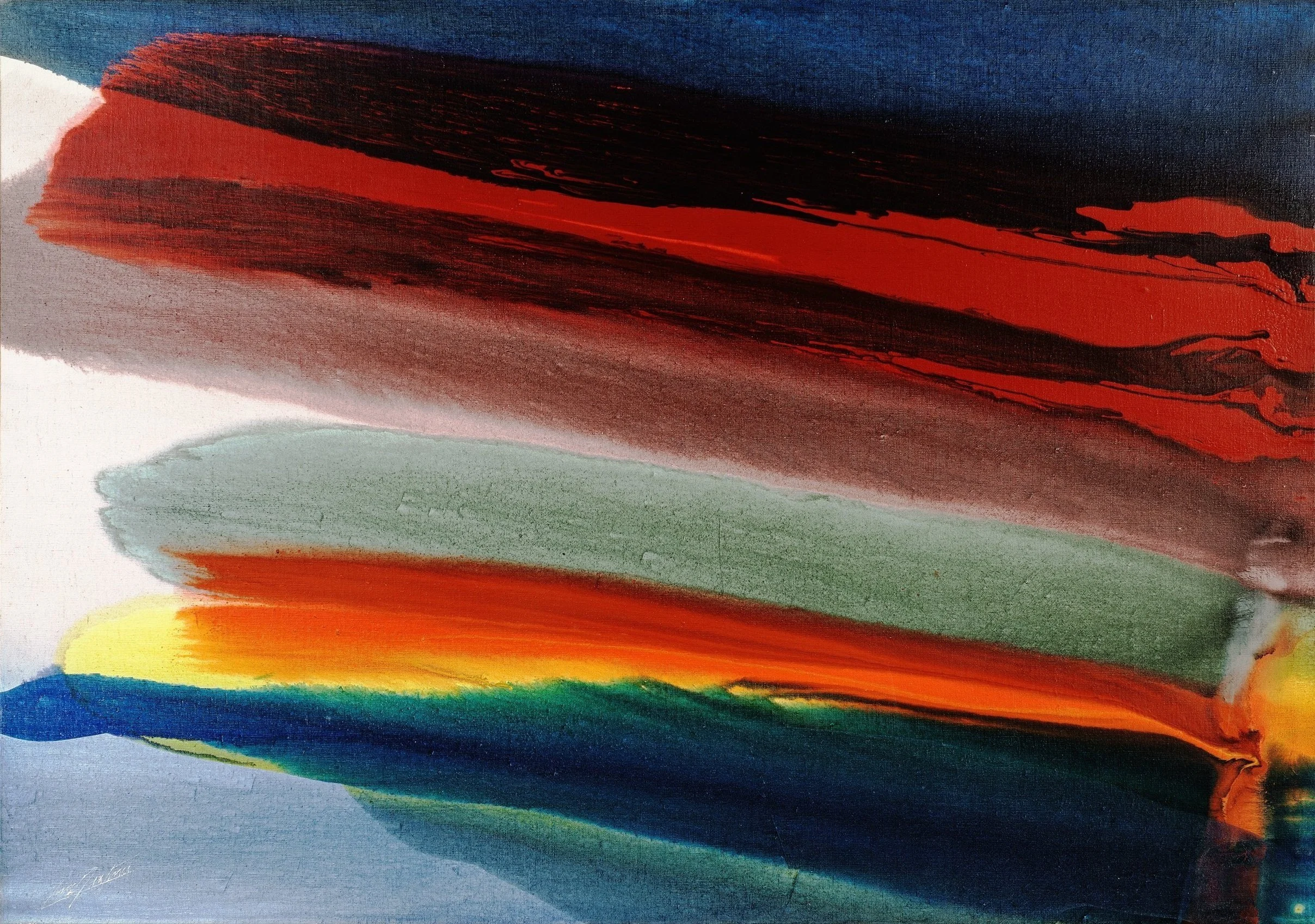
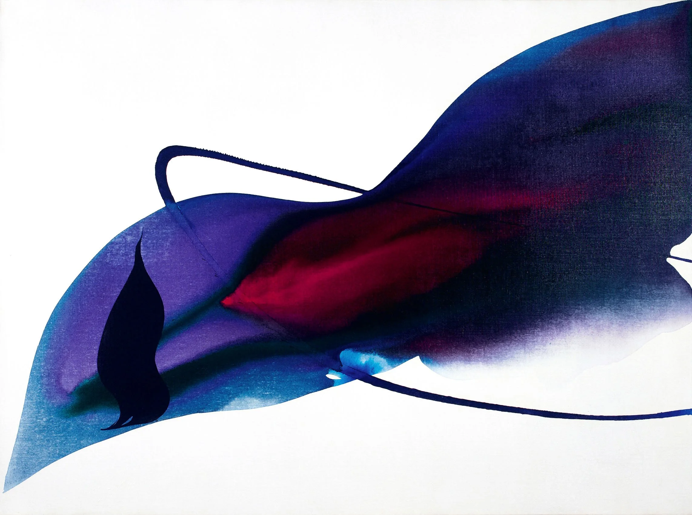
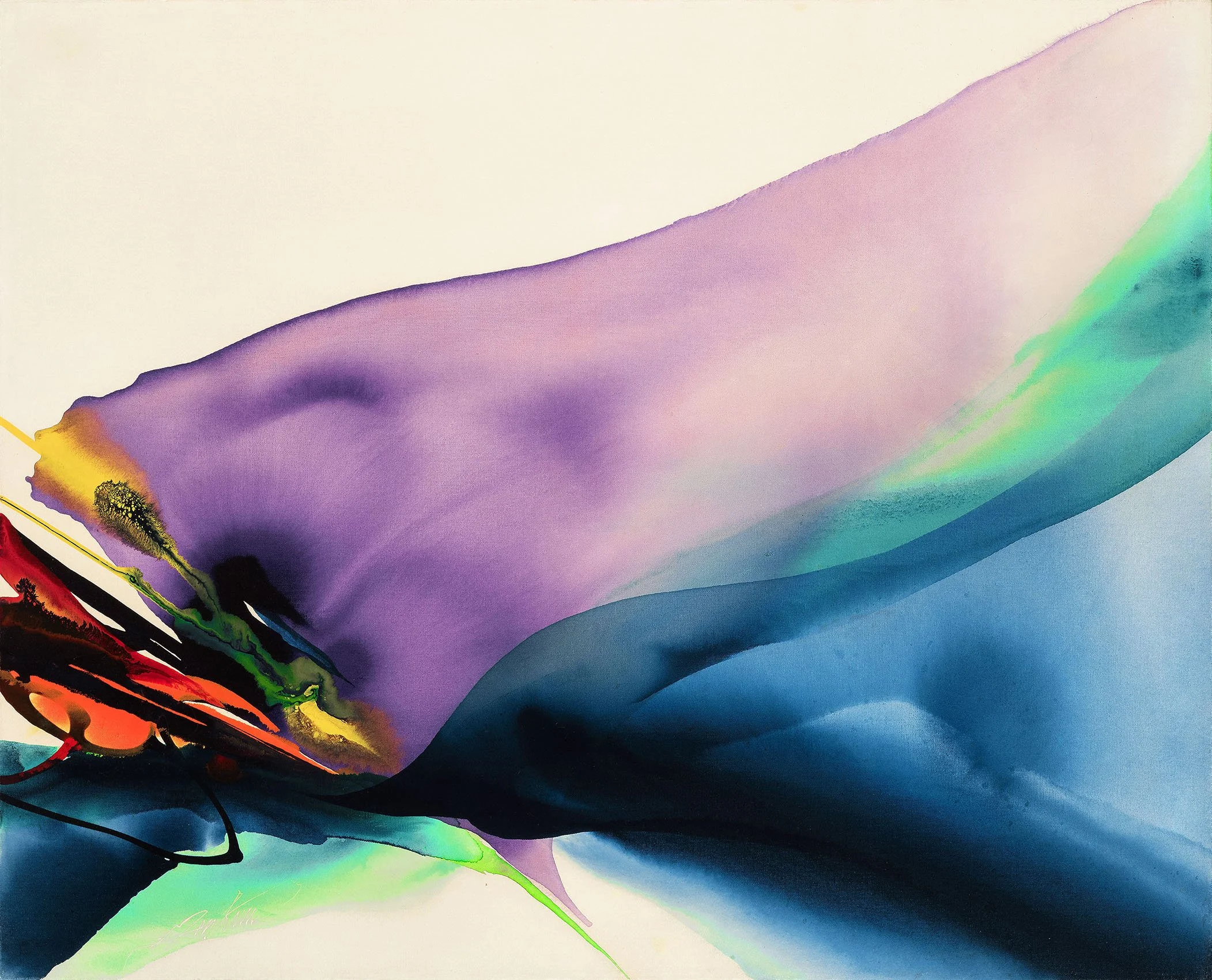
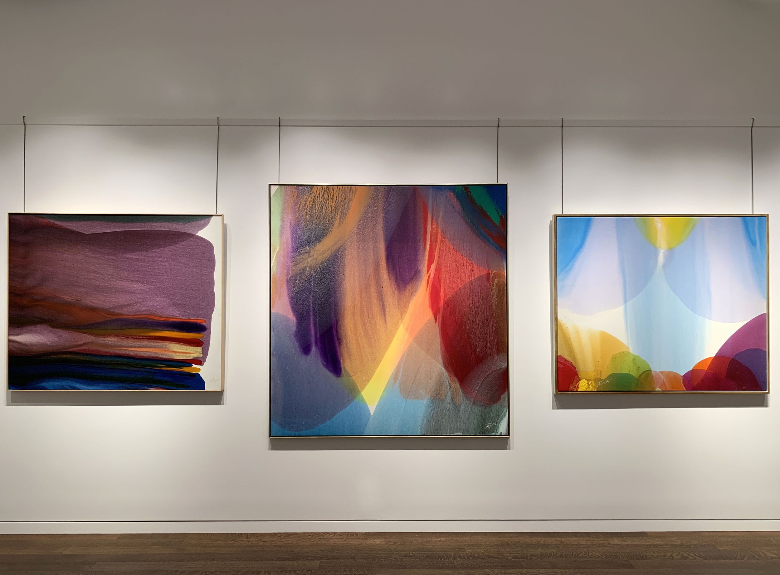
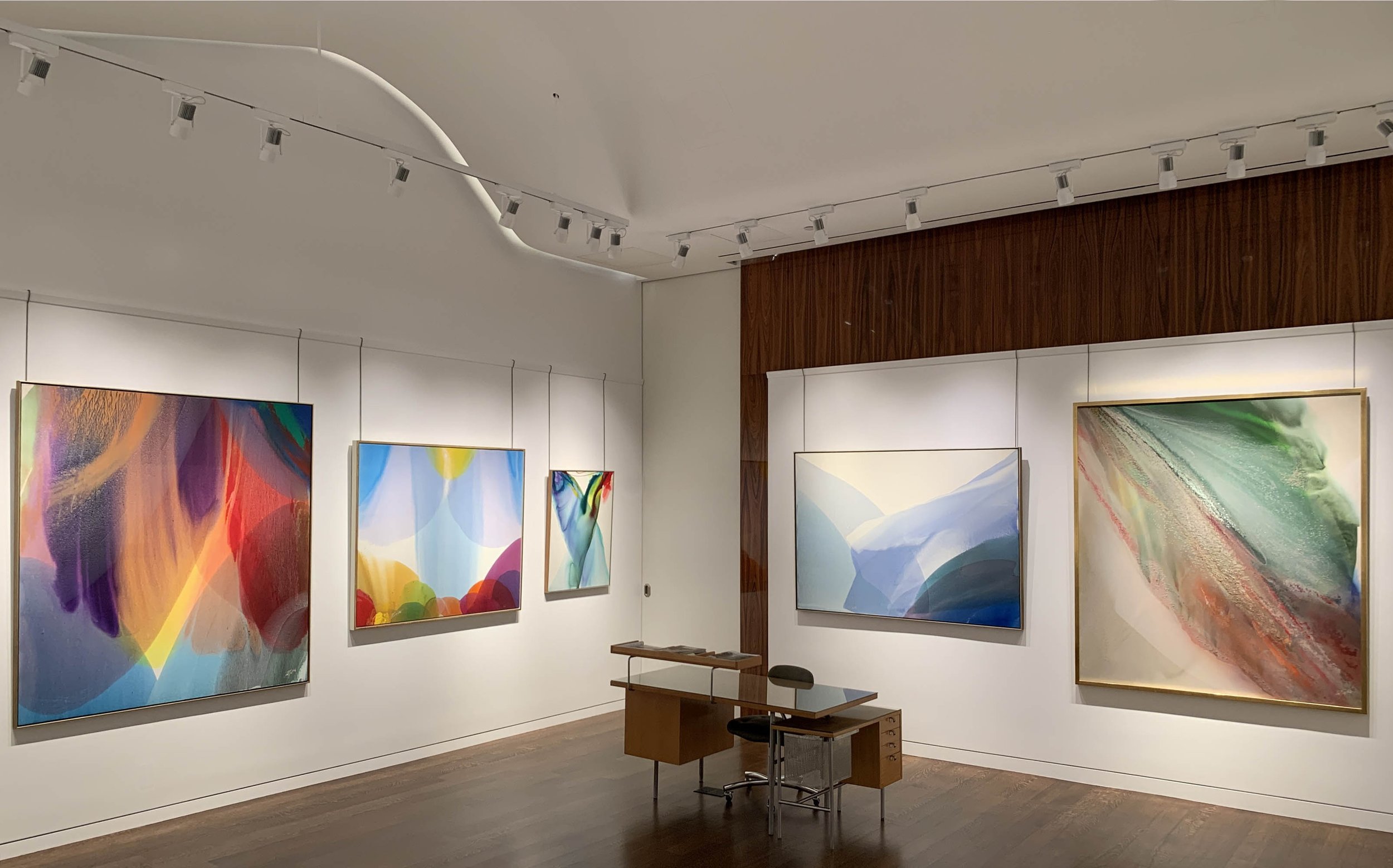
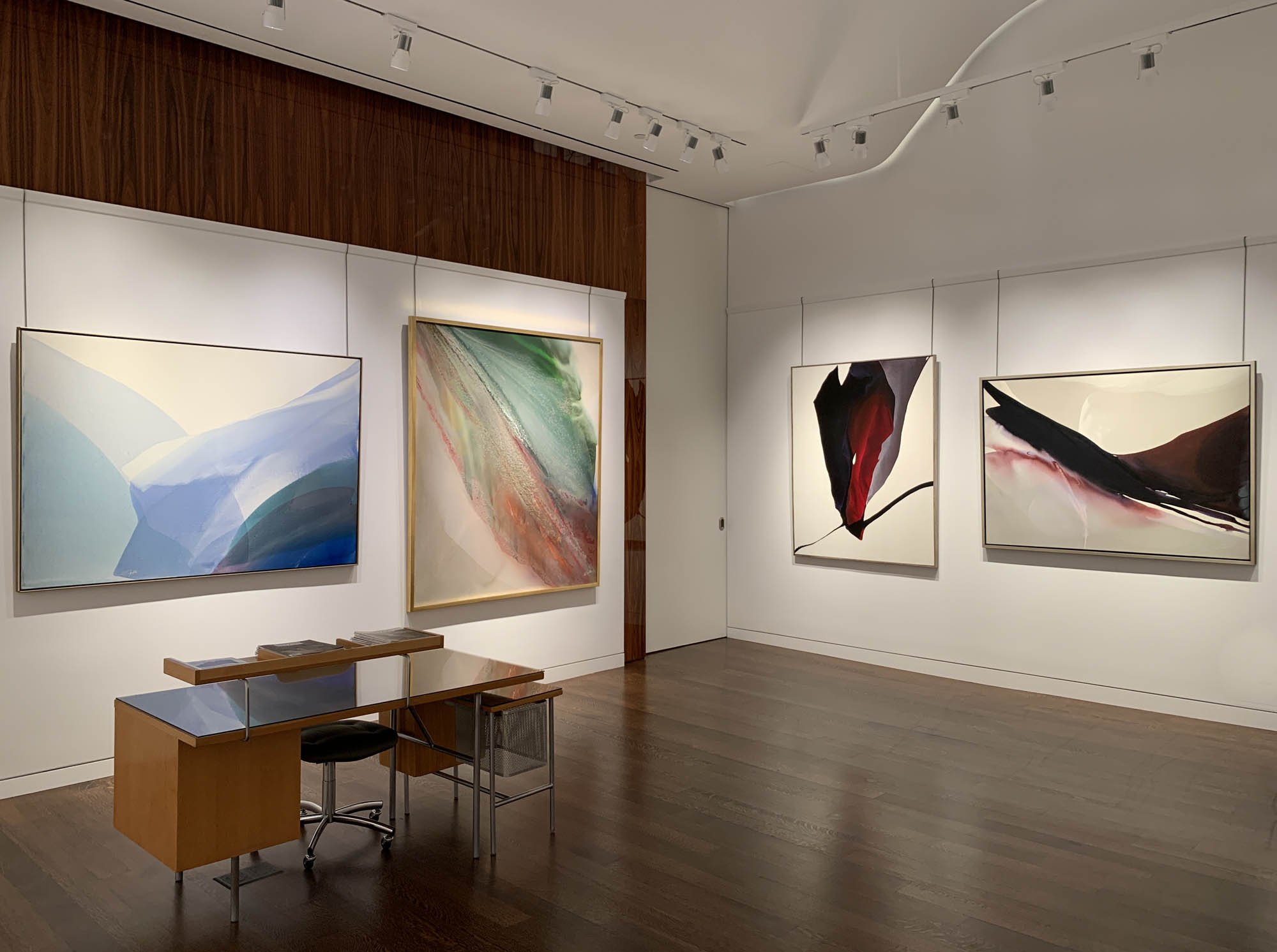
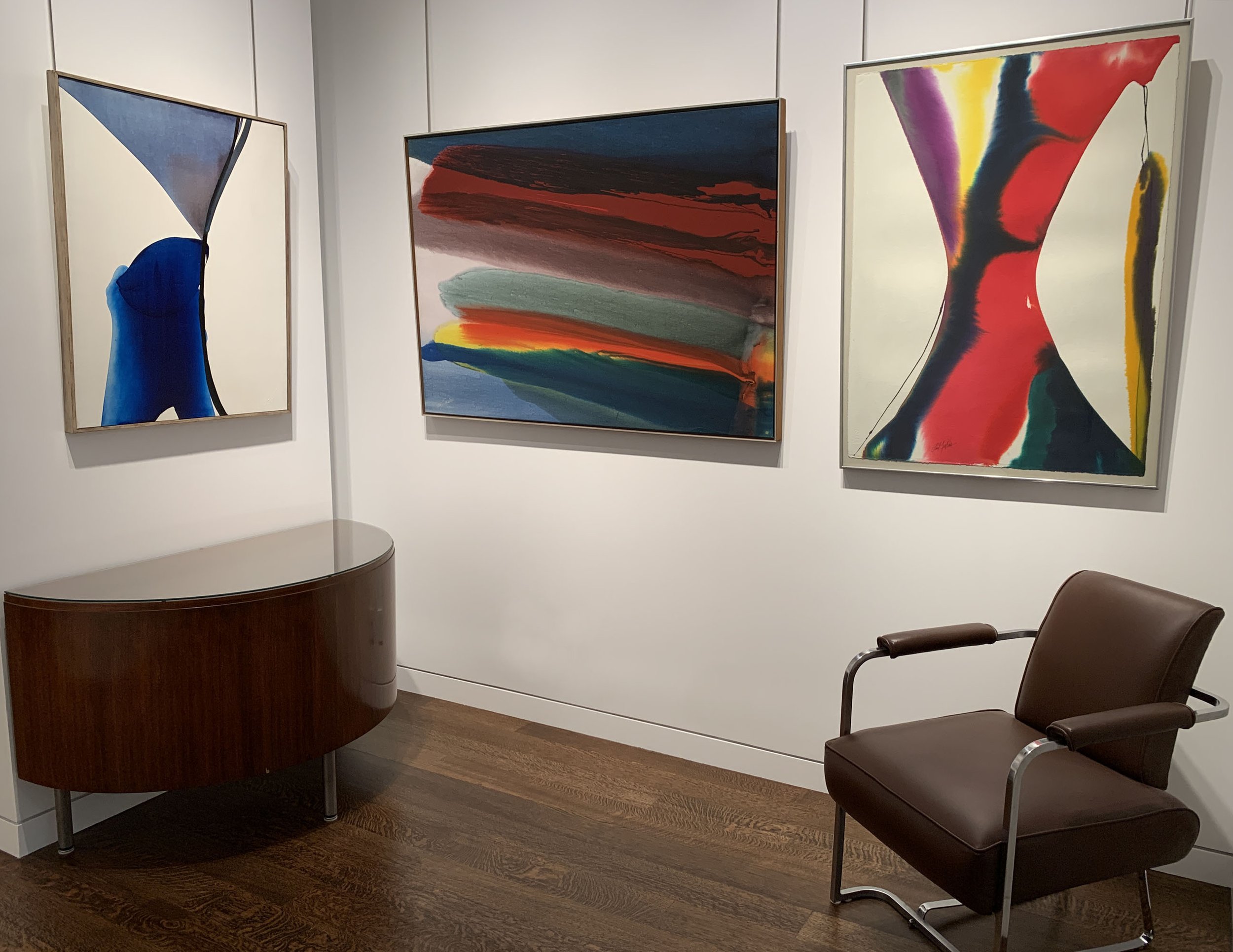
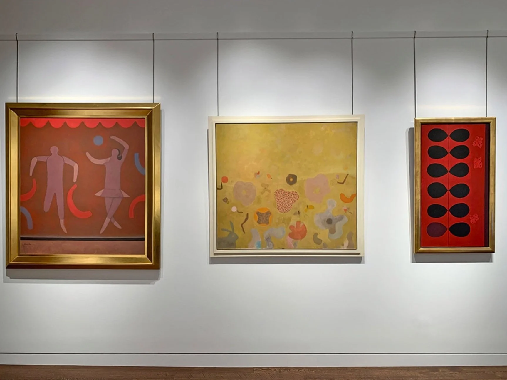
Our exhibition Paul Reed (1919-2015): From Biomorphic to Geometric includes 18 works executed from 1962 to 1969. The selection aims to show Paul Reed’s exploration of color and transparency to achieve movement in evolving series. Reed began with biomorphic shapes in circular motion (1962 to 1964), then he explored geometric structures (1964 to 1965) that crystallize into grids (1966), which then twist and stretch into shaped canvases (1967-1970). Reed worked experimentally through each series to investigate the properties of color as he moved from biomorphic to geometric paintings in the Sixties. Trained as a graphic designer, Reed settled on his compositions through calculated steps. First, he drew shapes until he settled on a form that would hold his envisioned color exercise. Second, he worked in collage and colored tissue paper to see how the color and transparency might work. Third, he applied the form to canvas, now intuitively seeing where he could take the color. Once he achieved the most complex and sophisticated colors for that form, the series was over. Reed said all his ideas were built on lessons learned from previous forms.

#12, 1962

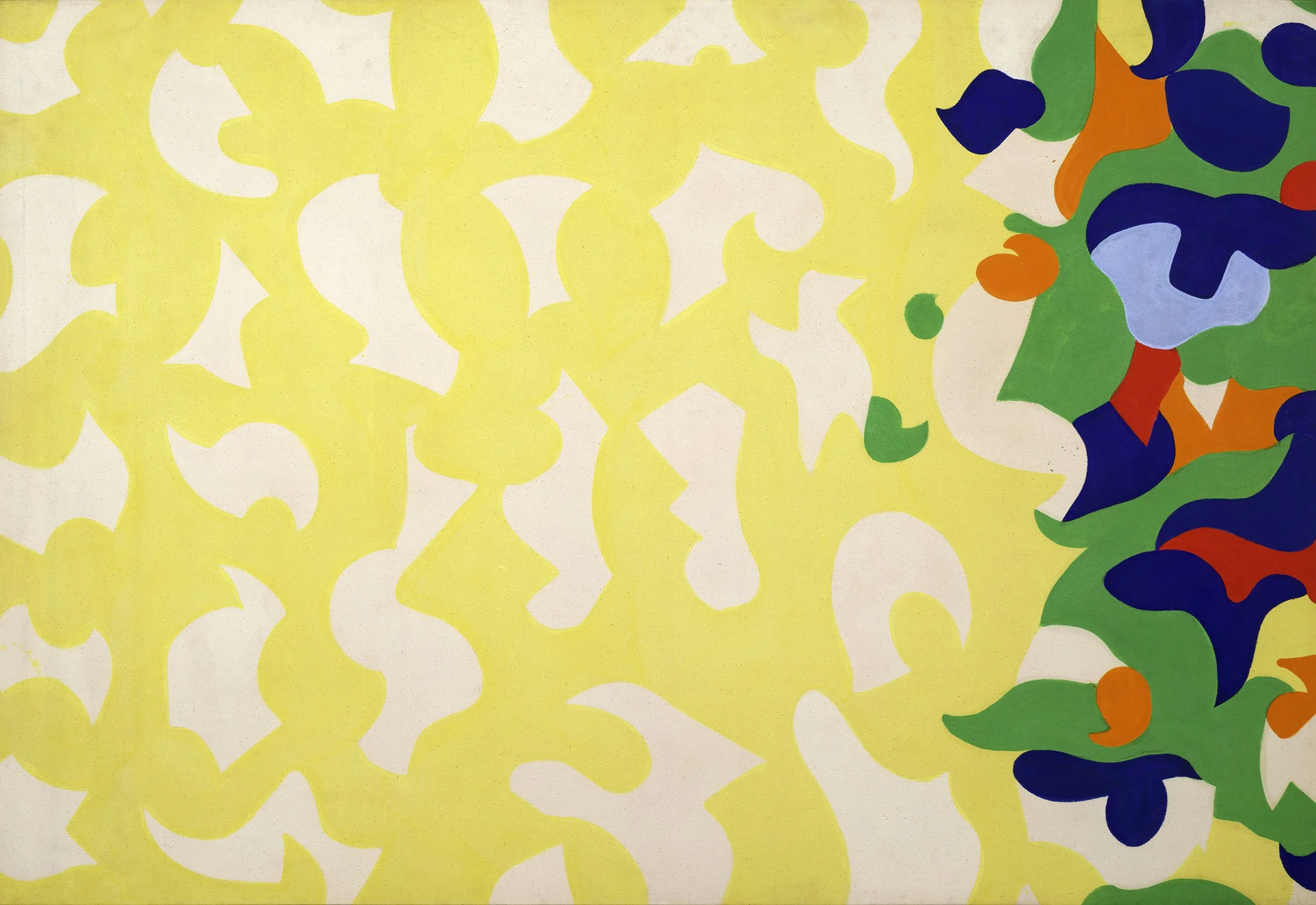
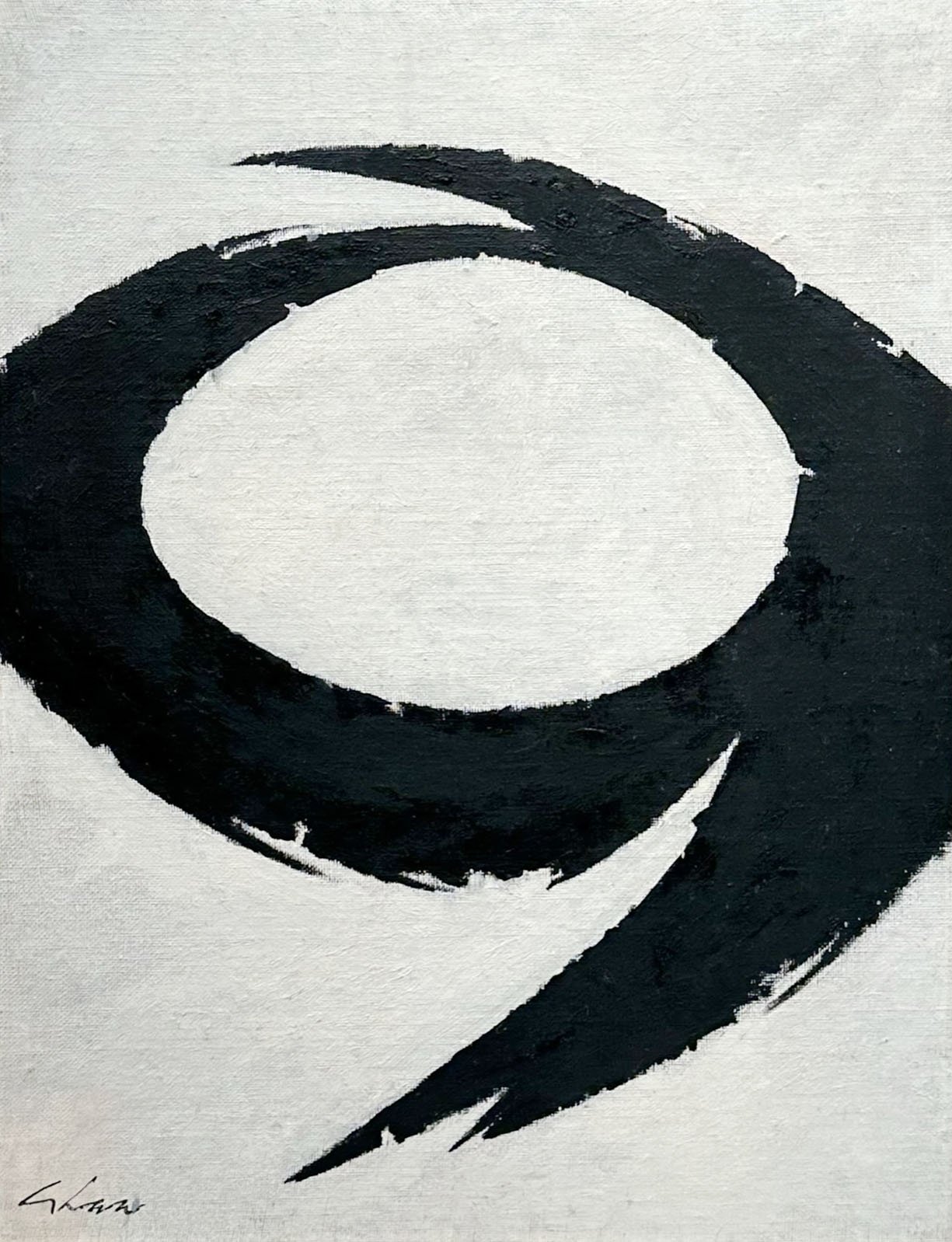
Paul Reed found his own style in 1962 using interlocking forms based loosely on a grid. He first used these shapes in all-over compositions then moved to centered compositions on a field of raw canvas. In #12, 1962 in our exhibition, raw canvas shapes float above a yellow field with a mass of colorful forms to one side. There is a strong sense of Matisse’s late cut-out works in the shapes and movement. Comparisons to Matisse are felt in many of Reed’s colorful biomorphic works. Matisse’s cut-outs were the subject of a 1961 exhibition at MoMA in New York. The Reed family gifted a significant body of work to Oklahoma City Museum of Art after the museum pushed to include their Reed painting in the 2016 loan exhibition Matisse in His Time, drawn from the collection of the Centre Pompidou in Paris.

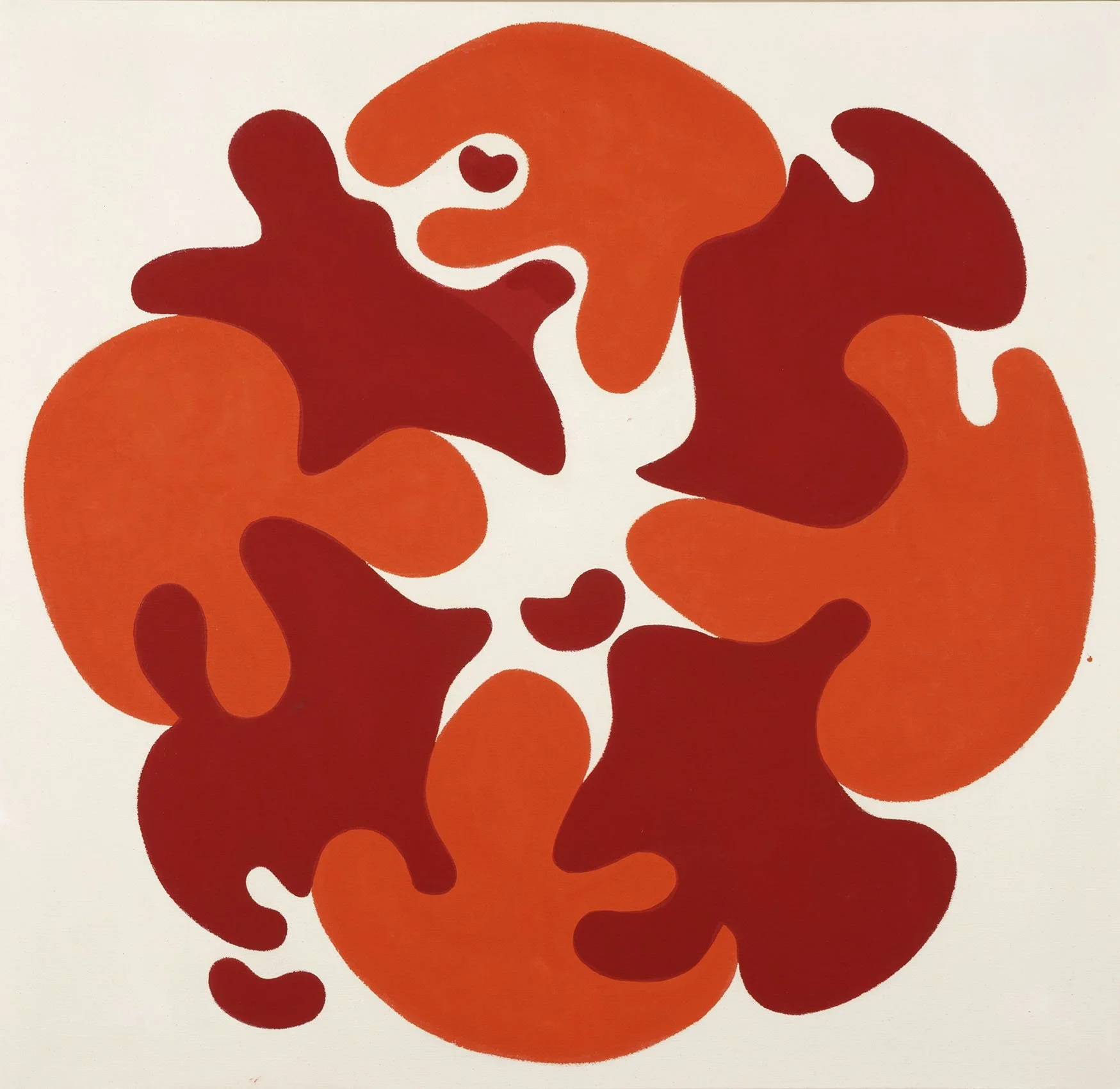
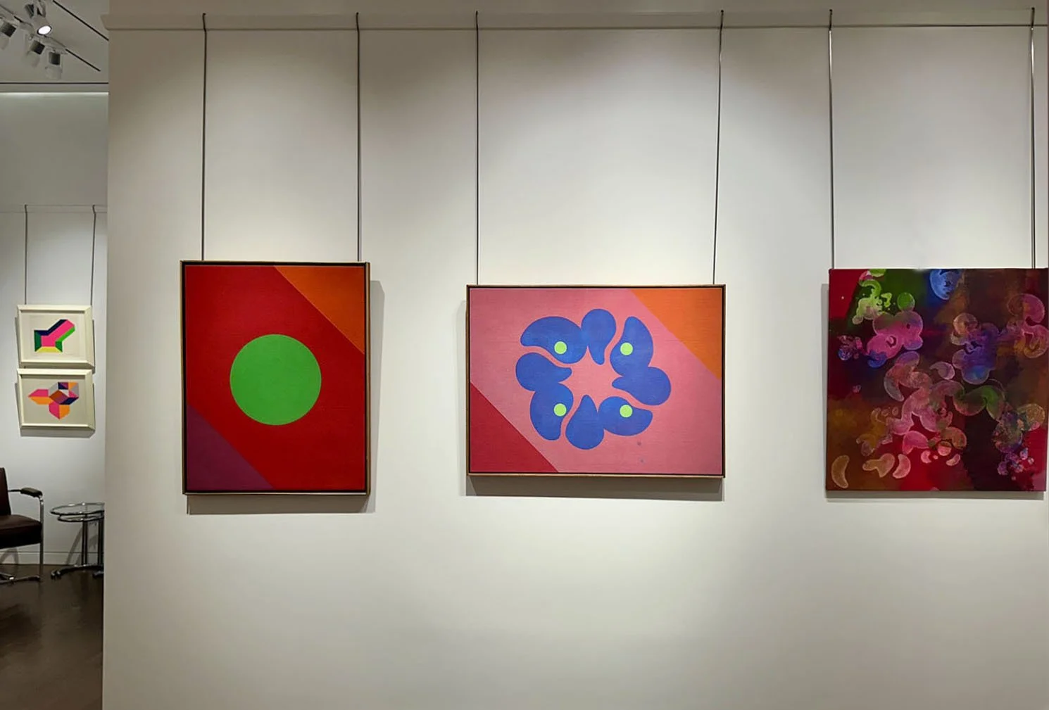
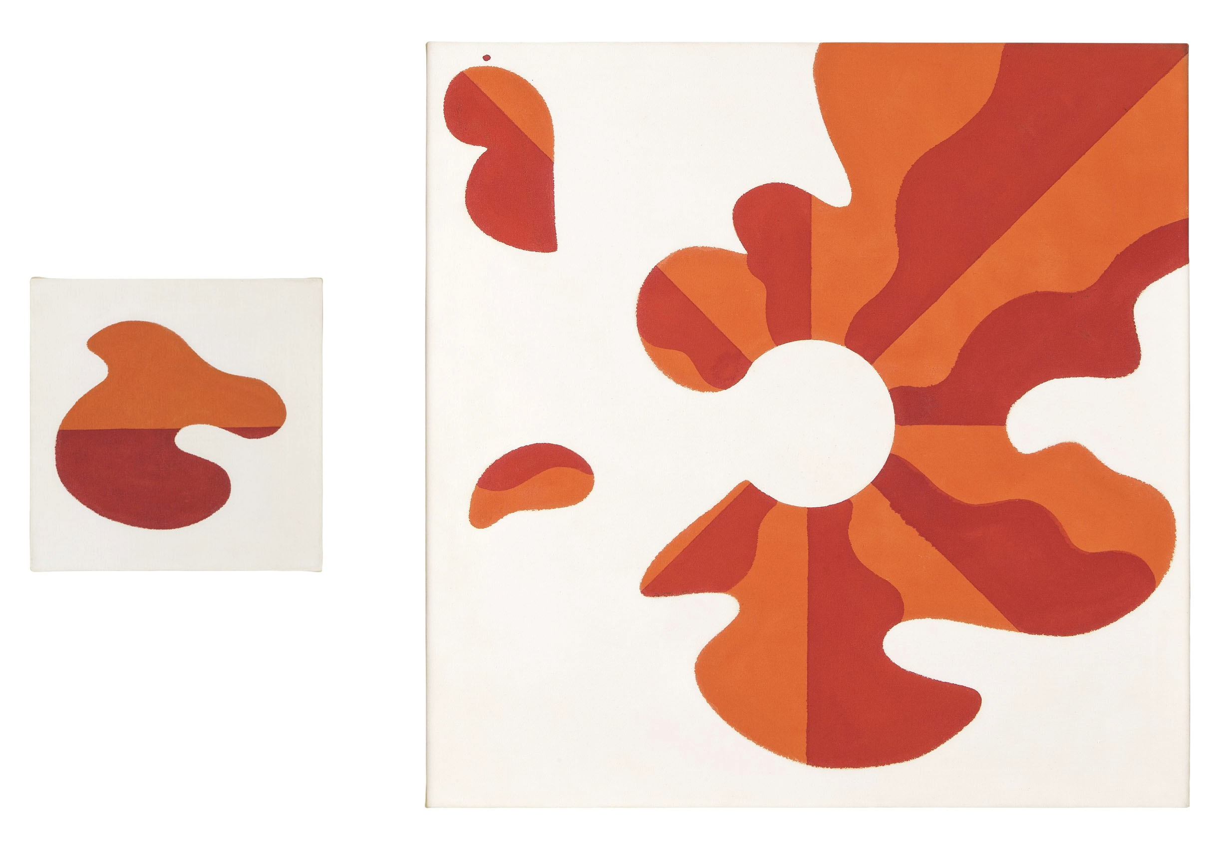
Another important artist to Paul Reed was Josef Albers and his theory of simultaneous contrast in color theory. The Washington Gallery of Modern Art noted the importance of Albers on young American artists with the exhibition Albers: The American Years in 1965. To create a new type of movement, Reed applied Albers’ color theory to curved forms to pair the energy of color contrasts with the energy of a curve. In #20C, 1963, alternating red and orange forms revolve around a raw canvas center. Three small offshoots emphasize the movement. This feeling of centrifugal force led Reed to the Satellite Paintings, such as #13, where a single form breaks out of the central painting to become a smaller canvas nearby. In the introductory text for Reed's first solo exhibition in DC at the Adams-Morgan Gallery in January of 1963, fellow artist Howard Mehring wrote, "He has chosen a curved energized shape as a vehicle for color, a shape which itself seems to express the properties of color vibration and pulsation….They move and play freely or converge on a center gently touching and overlapping. We catch their joy and their sense of play, their friendliness." 

Satellite Painting #13, 1963

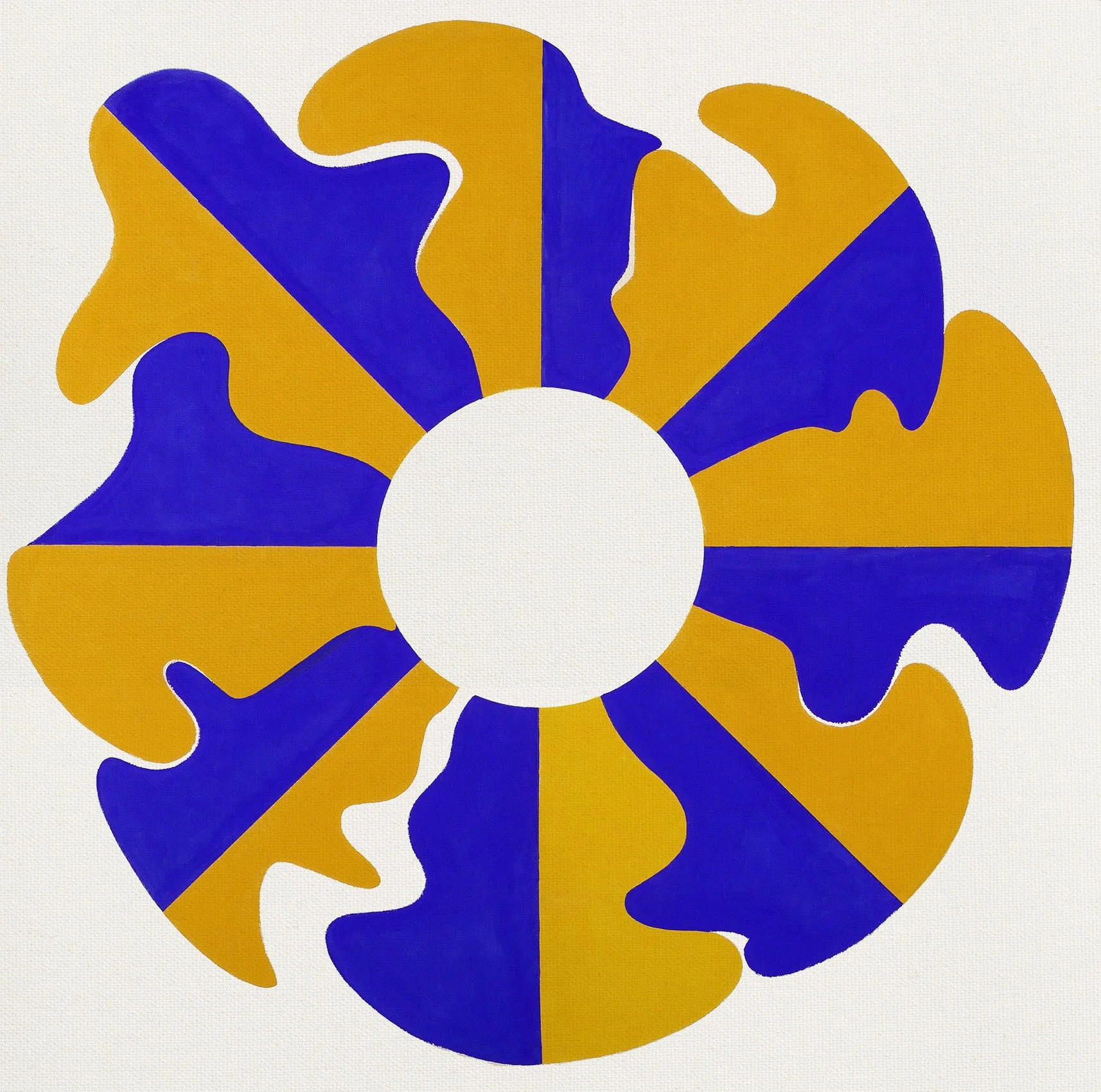
In 1964 Paul Reed introduced more geometry into his paintings by adding triangles of colors to the corners of his compositions. This is seen in #25C in which a flower-like form of eight mauve petals on a yellow field are anchored by orange and blue corners that add an ambiguous reading of figure and ground. 1965 marked Reed’s pivot from biomorphic to geometric. He simplified his compositions by keeping the triangles at the corners but turning the central arrangement of multiple shapes into a single circle which he called Disk Paintings. In these paintings, he could investigate the transparent qualities of water-based acrylic paints in overlapping some colors (the background and triangles) and not others (the central circle). #14B in our exhibition was owned by Phillips Collection curator Jim McLaughlin (1909–1982). The Corcoran Gallery of Art had an exhibition of the Disk Paintings in 1966.

Paul Reed applied this new knowledge on transparency in the grid paintings of 1966. Lattices of colors draw attention to the transparency of acrylic paint and how overlapping paint layers create color differently when staining into raw canvas. In Intersection XII, 1966 in our exhibition the same three colors are used in the horizontal and vertical bands. The verticals are slightly lighter yet when two bands of the same color meet, a richer-toned square is created given the second layer sits “above” rather than “in” the raw canvas.

Interchange E, 1966

Paul Reed next looked for new ways to incorporate movement into geometric compositions. He found inspiration in Jackson Pollock’s Blue Poles, 1952. Reed noted that the strong diagonal blue lines determined how the viewer’s eye moved across the canvas. This observation caused Reed to consider how cadences of color could guide the viewer in his own work. Reed found that zigzagging lines of color provided a simple, direct way for the eye to relate bands of color to the canvas support. The bands are made by overlapping two colors to create a third as seen in Interchange E, 1966 where purple and teal overlap to create a central navy blue. In these geometric works, Reed began to consider the overall form of the painting and how a shaped canvas could emphasize the power of color.

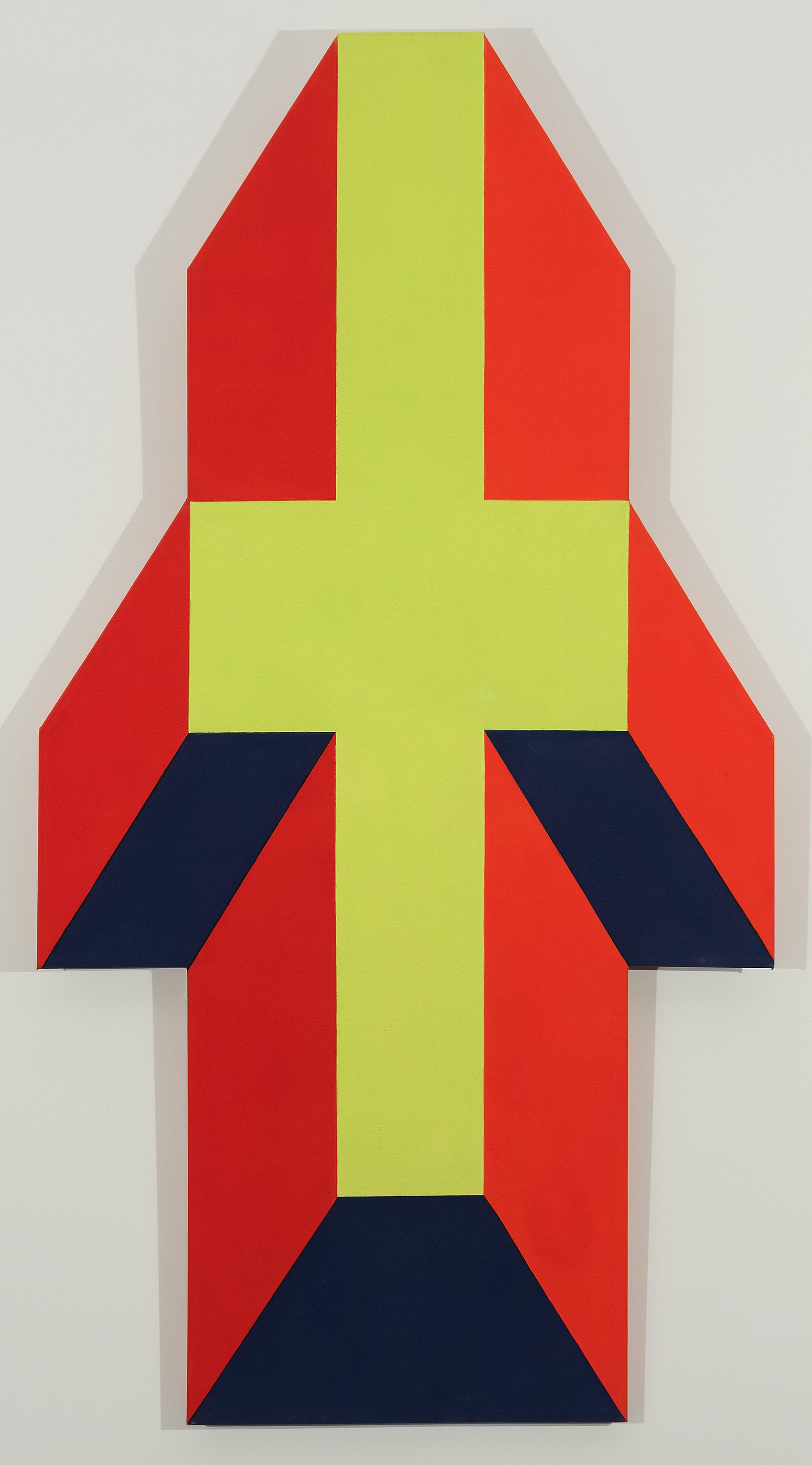
After working in diamond and lozenge shapes, Paul Reed was introduced to the work of California artist Ron Davis in the 1967 Washington Gallery of Modern Art exhibition A New Aesthetic curated by Barbara Rose. The exhibition of Minimalist sculpture with an emphasis on California artists included Ron Davis’ isometric projection shaped canvases in molded polyester resin and fiberglass. These works inspired Reed to twist and pull his grids to form a five-sided shape. The effect of color pushing out beyond the constraints of the canvas interested Reed so much, he experimented with increasingly complex shaped canvases through 1970. Our gallery exhibition has 2 shaped canvas works as well as related collages. We have loaned the large painting Safid to the Oklahoma City Museum exhibition.


A RETURN TO BEAUTY

THE PATTERN & DECORATION MOVEMENT, 1975-1985

Extended through November 25, 2025

Installation Views | Essay | For availability and pricing, call 212-581-1657.


Installation Views

Essay by Emily Lenz

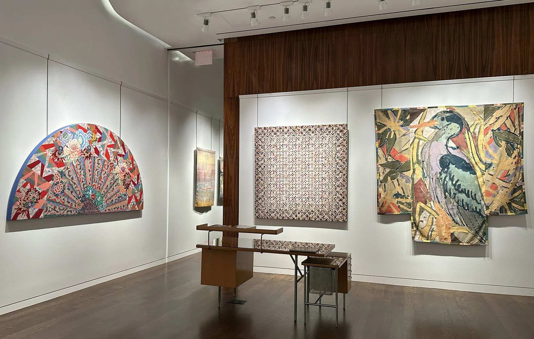
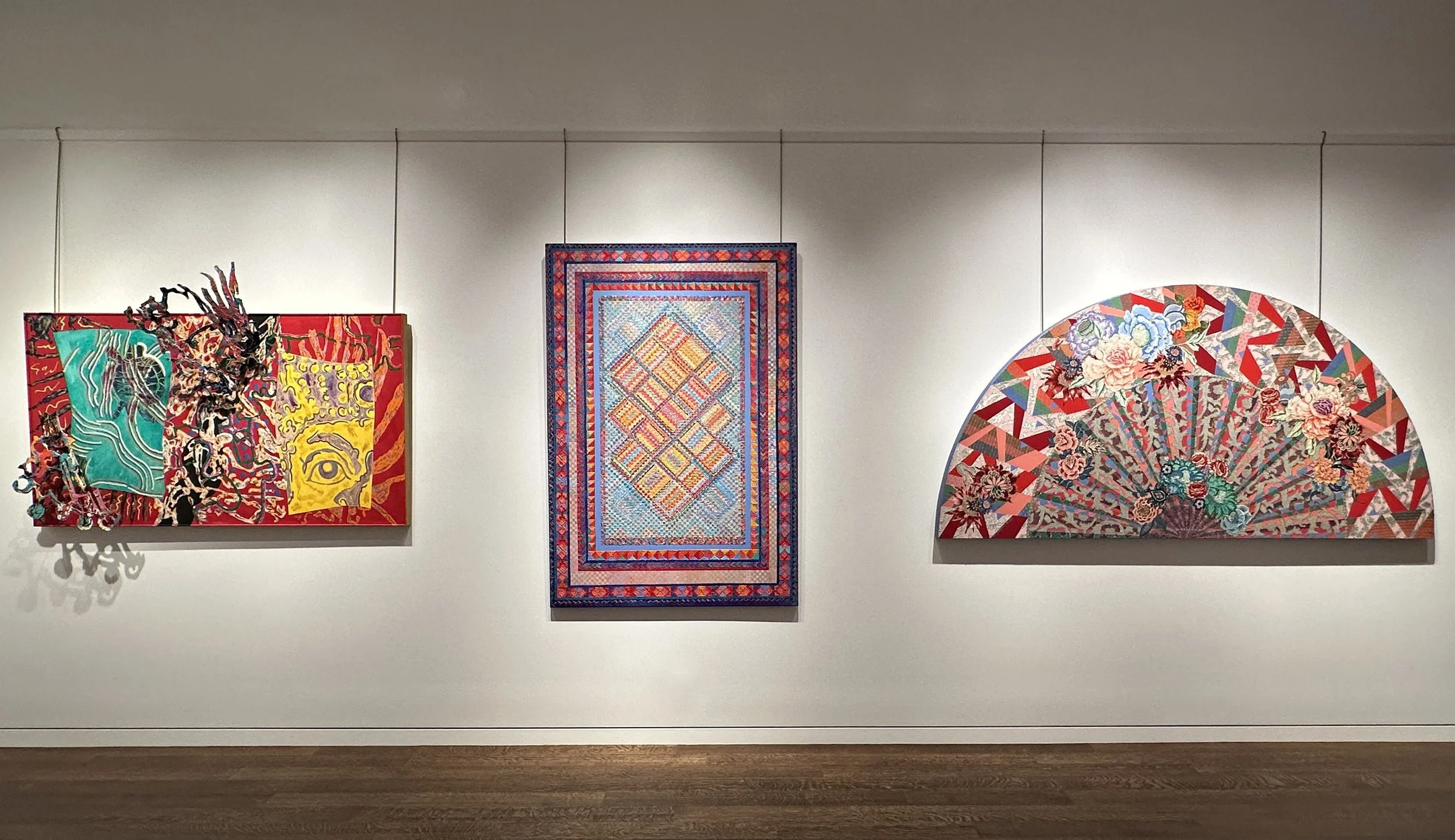
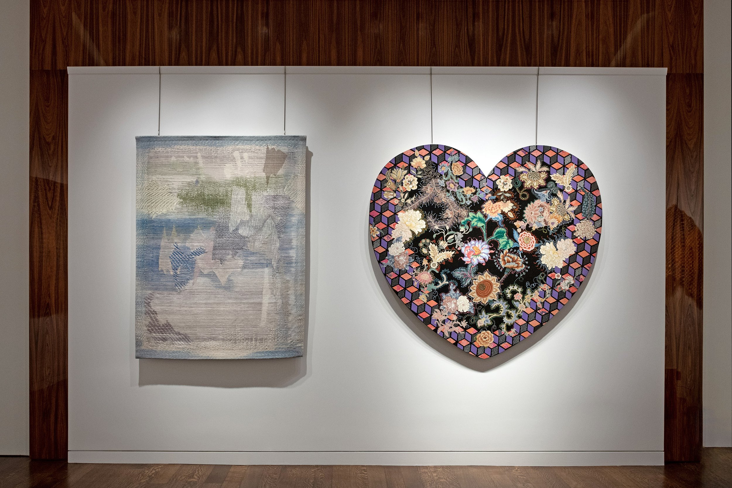
The exhibition A Return to Beauty: The Pattern and Decoration Movement, 1975–1985 celebrates the birth of a new art style with 23 works by 9 artists. The Pattern & Decoration (P&D) artists insisted that beauty, pattern, and ornament were not embellishments but central to artistic expression. This challenged both the reductive aesthetics of Modernism and the hierarchy of art materials. These artists elevated craft techniques by referencing them in their paintings, sculptures, and textile work. Minimalism dominated the art world in the 1970s but three key events in the decade provided opportunities to re-evaluate the place of pattern and decoration. First, the Freer Gallery in Washington, DC expanded the collection of Japanese vases in James McNeil Whistler’s Aesthetic interior, the Peacock Room (1877), to look closer to the artist’s original decorative intention. Next, the first Islamic Art galleries opened at the Metropolitan Museum of Art in 1975 with mosaics, tiling, objects, and rugs installed to give a sense of its architecture. Finally, The National Gallery’s Matisse cut-out exhibition in 1977 presented the joy of colorful floating shapes and repeating patterns.

The Pattern and Decoration artists embraced multiplicity and sensory richness. They drew inspiration from sources historically excluded from the canon of Western Modernism like Islamic tiles, Japanese Kimono patterns, Persian miniatures, American quilting, Mexican folk art, and Baroque ornament. Rather than restricting themselves to the materials and techniques of fine art, P&D artists drew freely from the visual languages of craft, architecture, and functional objects from around the globe. Instead of seeing pattern as ornamental “surface,” they understood it as a structure or organizing grid used across cultures and time. Quilting, embroidery, weaving, and mosaic were brought into direct dialogue with painting and sculpture. The P & D artists reveled in repetition, layering, surface interest, kaleidoscopic color, and intricate design.

The artists Miriam Schapiro (1923-2015), Robert Kushner (b. 1949), and Kendall Shaw (1924-2019) in our exhibition were present at the early gatherings held at Robert Zakanitch’s New York studio, where the ideas that shaped Pattern & Decoration were first discussed. Dee Shapiro (b. 1936) joined Schapiro, Kushner, and Shaw in Pattern Painting at P.S.1 Contemporary Art Center in 1977. Diane Itter (1946-1989) was included along with Schapiro, Kusher, and Shapiro in Patterns Plus at the Dayton Art Institute in 1979. Nancy Graves (1939-1995) was included along with Schapiro and Kushner in New Decorative Art at the Berkshire Museum in 1983.

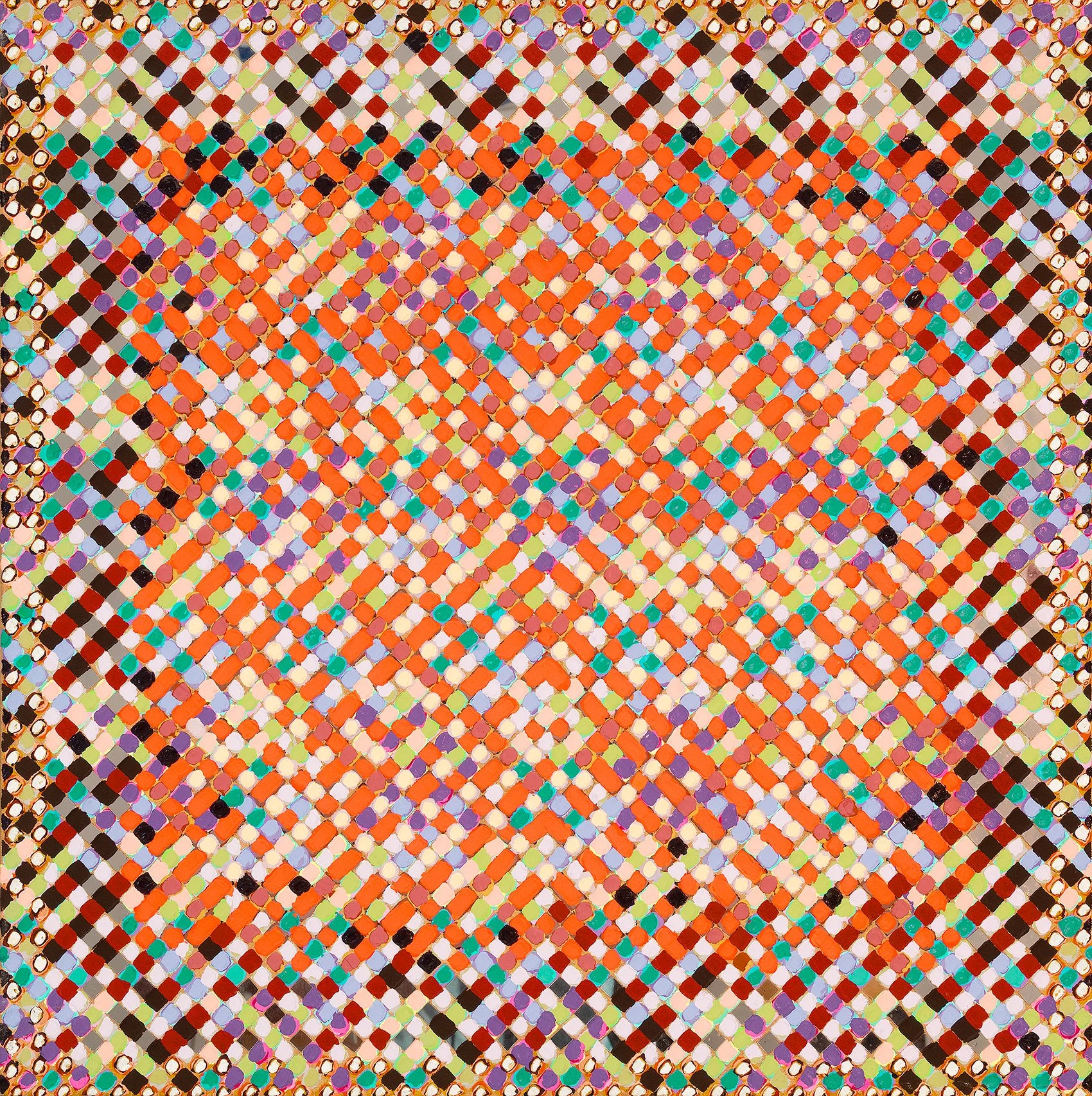
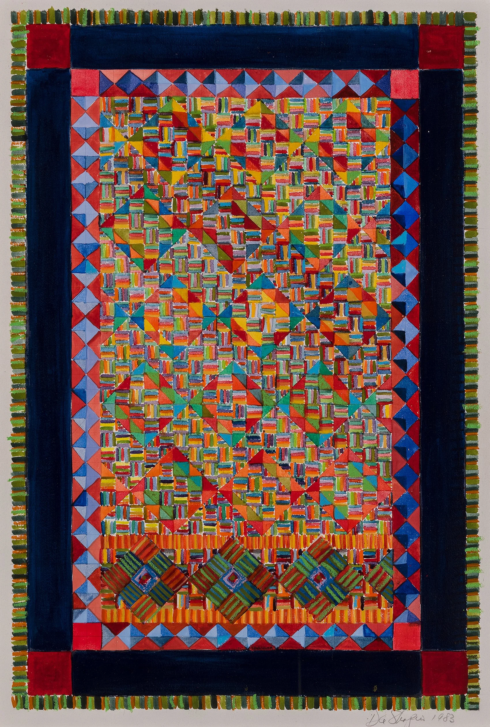
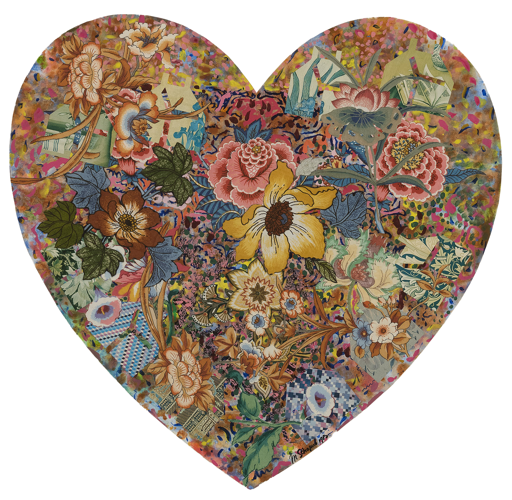
Miriam Schapiro’s femmages, which combined painting with floral fabrics, beading, and glitter, made the language of domestic craft inseparable from that of high modernist collage. Dee Shapiro used the colorful hatchmarks of her earlier Fibonacci series to create multi-bordered geometric compositions that resemble Persian rugs. Kendall Shaw merged bold abstraction with decorative motifs in Bayou Pom Pom, 1980-81 and Mochica, 1981. His distinct dabs of paint and embedded squares of mirror look like mosaics. In Mochica, Shaw finishes the large-scale painting with a velvet ribbon along the depth of the canvas edge. This adds to the reading of the painting as a craft object. Nancy Graves combines painting and sculpture in her Australia Series. In Dandenong (Australia Series), 1985, she adds painted aluminum sculptural elements to heighten the energetic lines snaking through the painting.

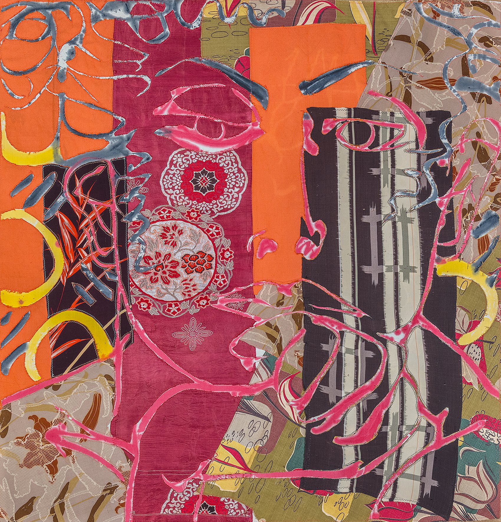
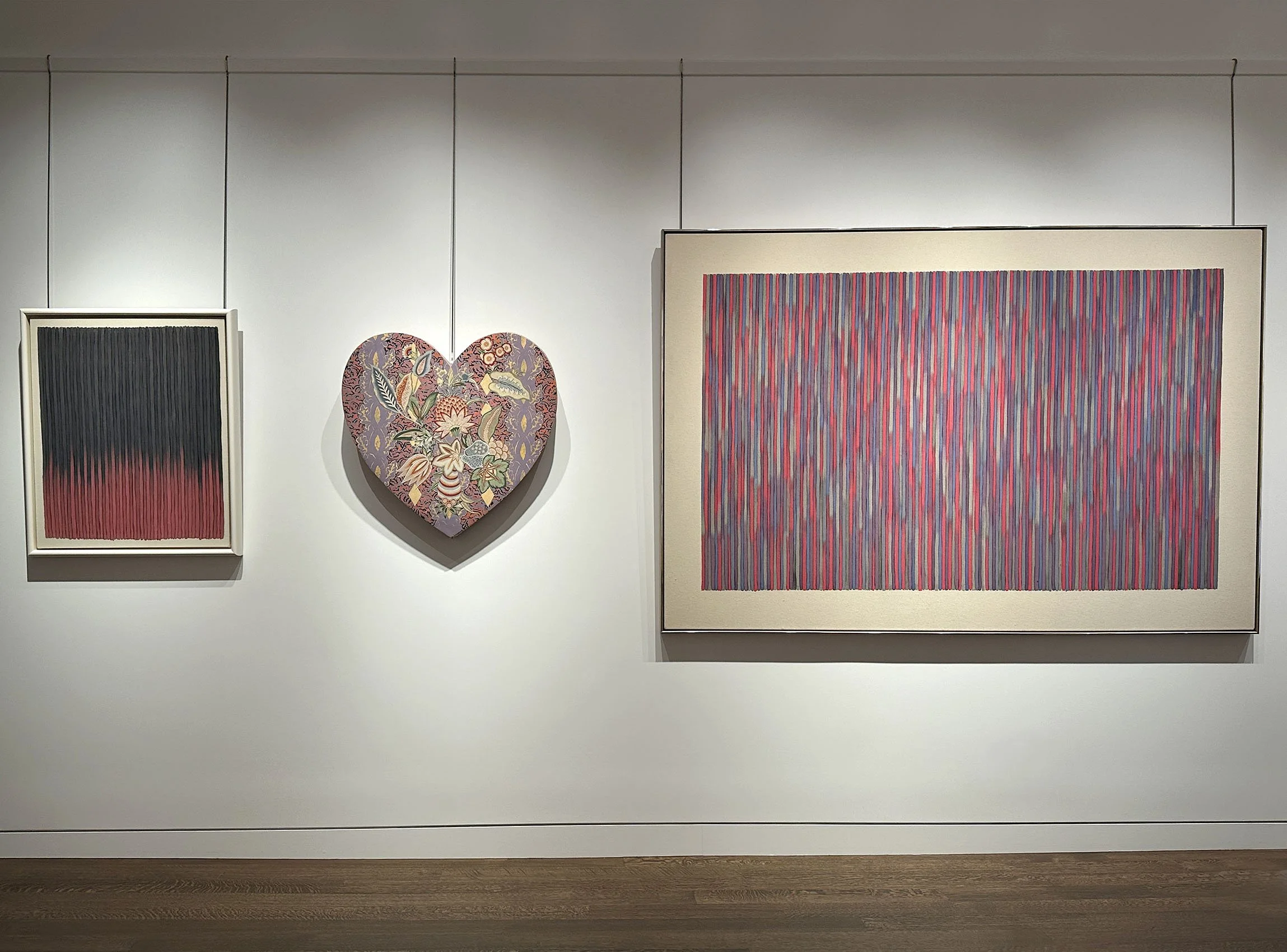
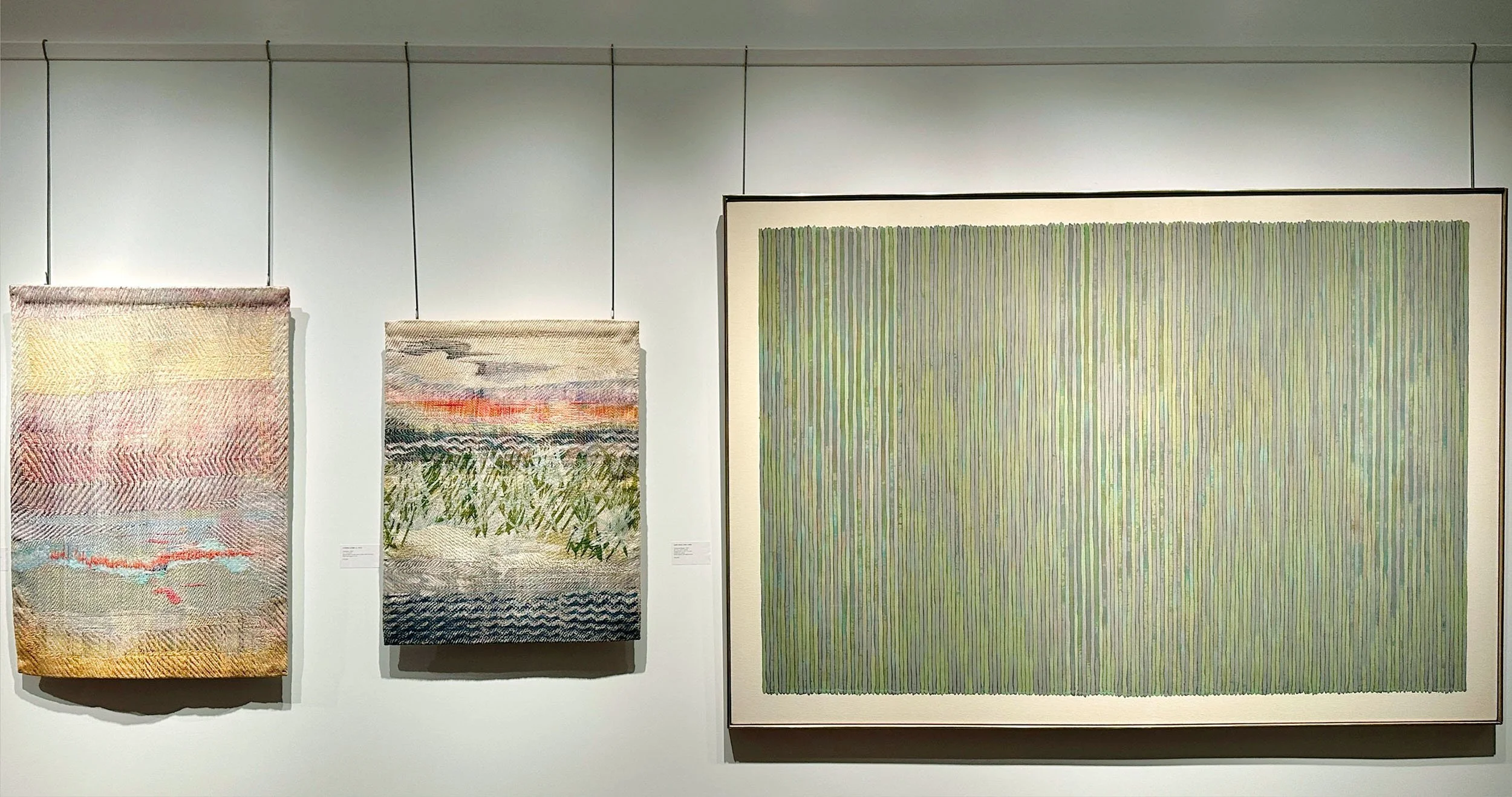
Robert Kushner painted robes to use in performances that he then hung on the wall, collapsing boundaries between painting and garment. The shape of Kushner’s Blue Heron, 1978 references the kimono with its long side panels (or sleeves) yet adheres to traditional painting as a single layer of canvas. The flatness in Kushner’s painting is achieved by staining directly into the canvas. This recalls Clement Greenberg’s writing regarding the 1960s Color School and their activation of the painting surface by leaving the raw canvas exposed. In a way, these 1960s artists were the first to draw attention to the intimate connection between painting and textile. For this reason, we include three 1980s paintings by Washington Color School artist Gene Davis (1920-1985) in our exhibition. These Davis works also show the broad reach of textiles in the 1980s as his loosely stained stripes of alternating colors suggest the in-and-out process of weaving canvas from thread.

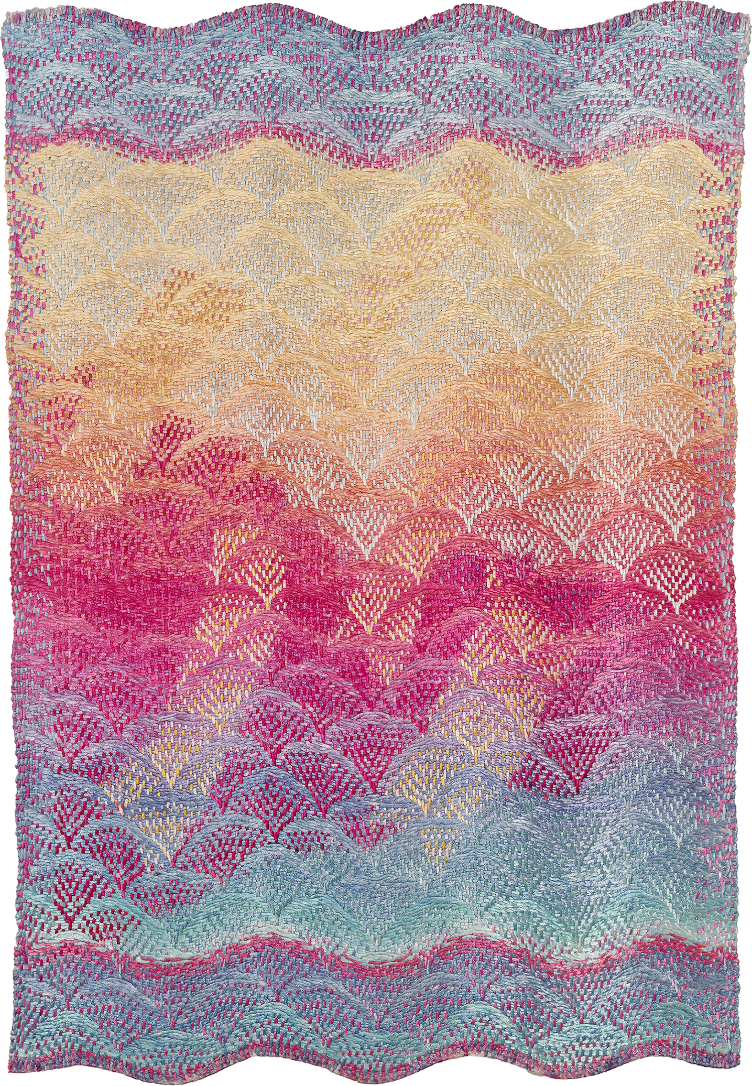
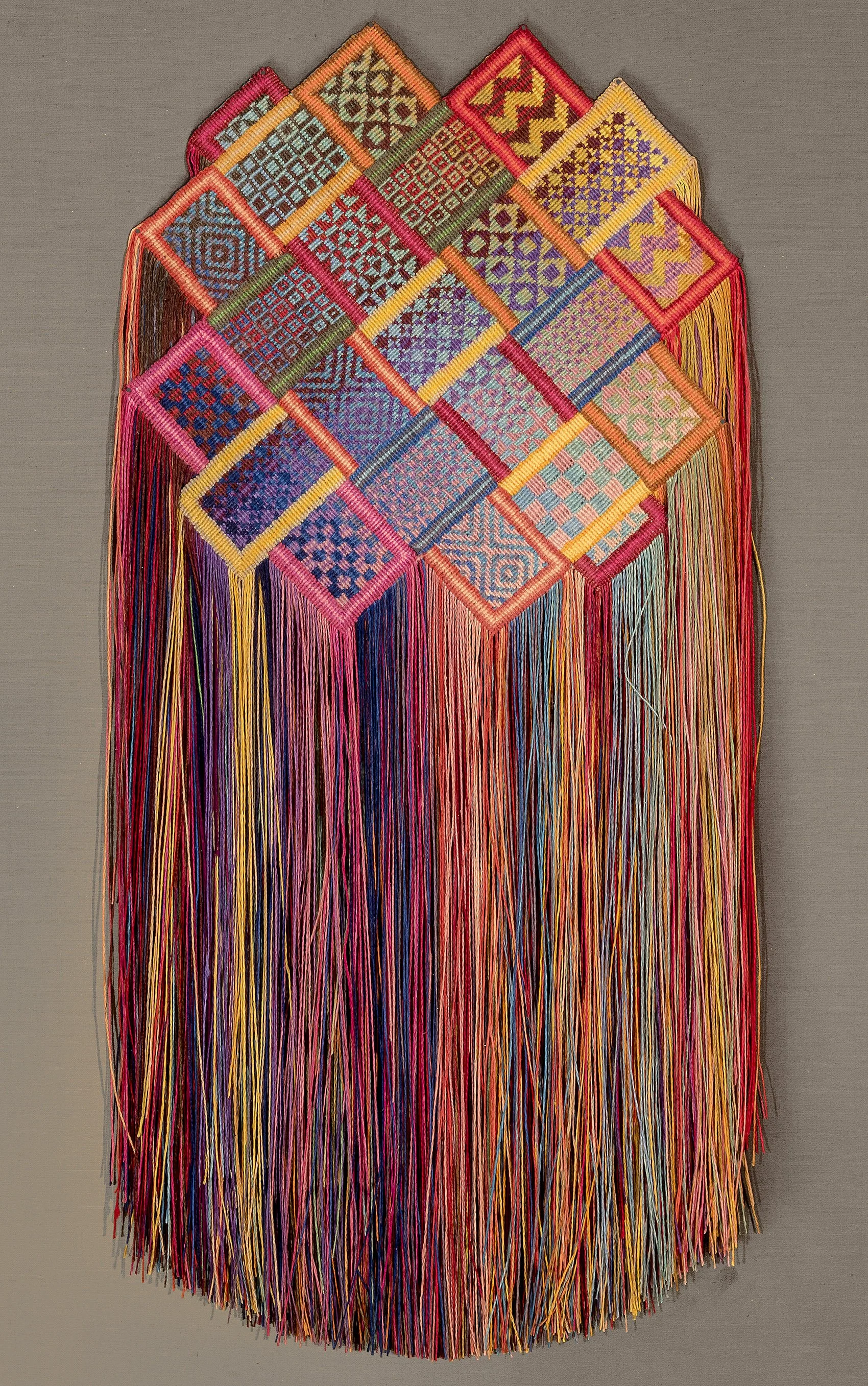
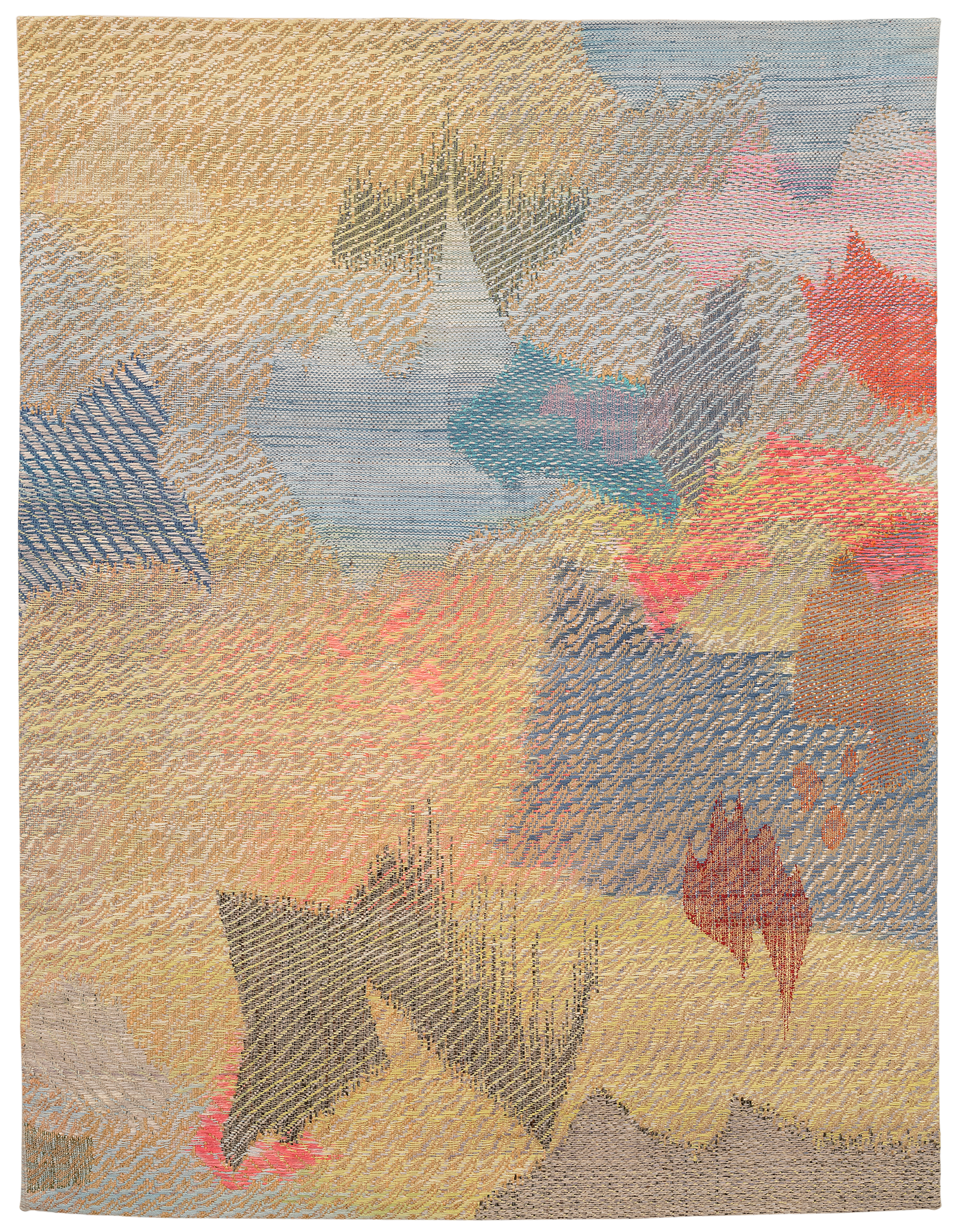
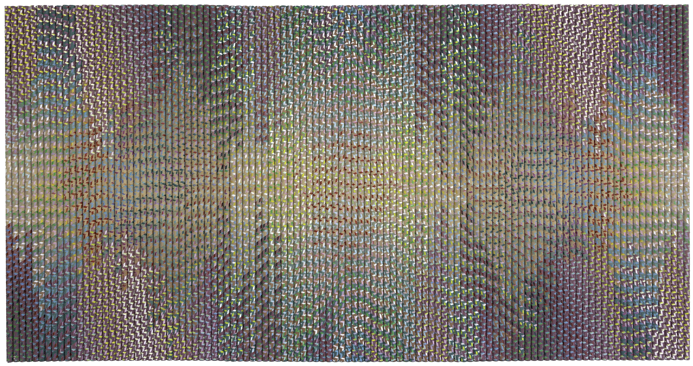
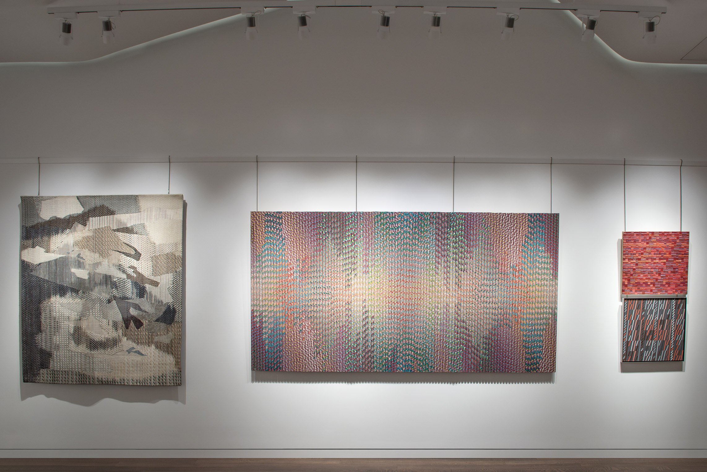
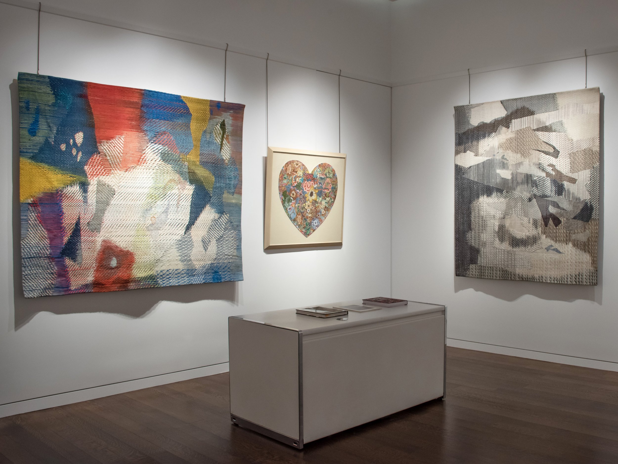
Three fiber artists in our exhibition used craft techniques in painterly ways while demonstrating the underlying patterning of weaving. Diane Itter, working with intricate knotted threads, incorporated patterns from across the world into her gem-like works. Itter mounted and framed her weavings to emphasize their pictorial presence rather than her craft technique. Cynthia Schira (b. 1934) used an early computerized loom to expand the complexity of her compositions while allowing her to develop the imagery throughout the process like a painter. Lia Cook (b. 1942) integrated loom-based traditions with new materials (rayon) and techniques; she flattened her weavings in an etching press to enhance their pictorial quality. Her piece in our exhibition Through the Curtain and Up from the Sea (1985) was included in the 2019-2021 exhibition With Pleasure: Pattern and Decoration in American Art, 1972–1985 at the Museum of Contemporary Art, Los Angeles and the Hessel Museum of Art at Bard College.

Starting in the late 1970s, the Pattern and Decoration movement was institutionally recognized, critically received, and commercially successful. The movement was seen as a radical redefinition of what modern art could look like and which histories and techniques it could honor. In recent years the Pattern & Decoration movement has undergone a reevaluation in museum exhibitions in the US and Europe including Surface/Depth: The Decorative after Miriam Schapiro at the Museum of Art and Design, New York, 2018; Pattern and Decoration: Ornament as Promise at Mumok (Museum of Modern Art), Vienna, 2019; and With Pleasure: Pattern and Decoration in American Art, 1972–1985 at MOCA, Los Angeles and Hessel Museum of Art from 2019-2021. The first reappraisal Pattern and Decoration: An Ideal Vision in American Art was curated by Anne Swartz at the Hudson River Museum in 2007. In today’s art we see the movement's embrace of cross-cultural sources, its dismantling of the hierarchy between fine art and craft, and its celebration of beauty.


SOIL AND SPIRIT

May 1 - August 15, 2025

Installation Views | Essay | For availability and pricing, please contact the gallery at 212-581-1657

Installation Views


Essay by Deedee Wigmore

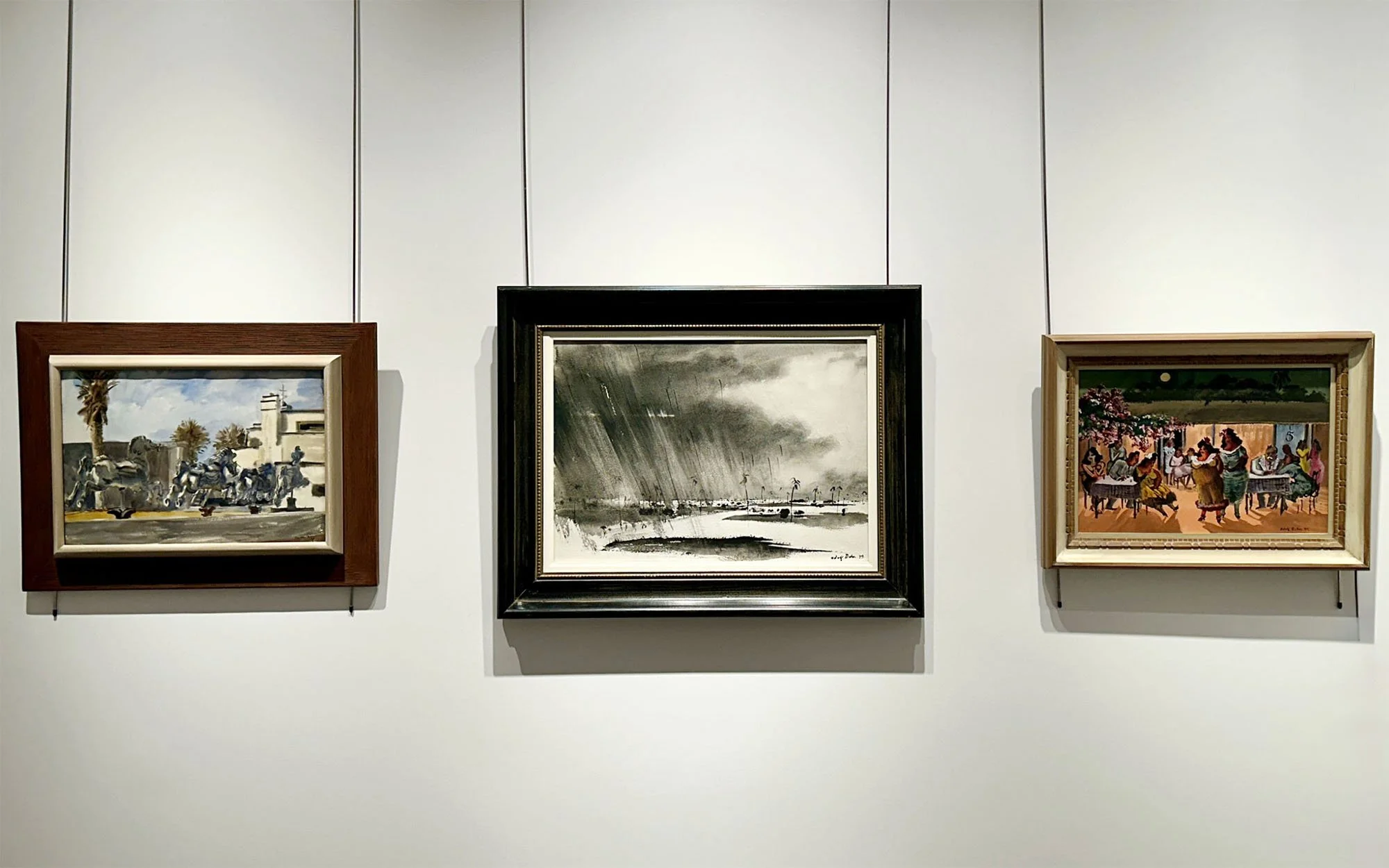
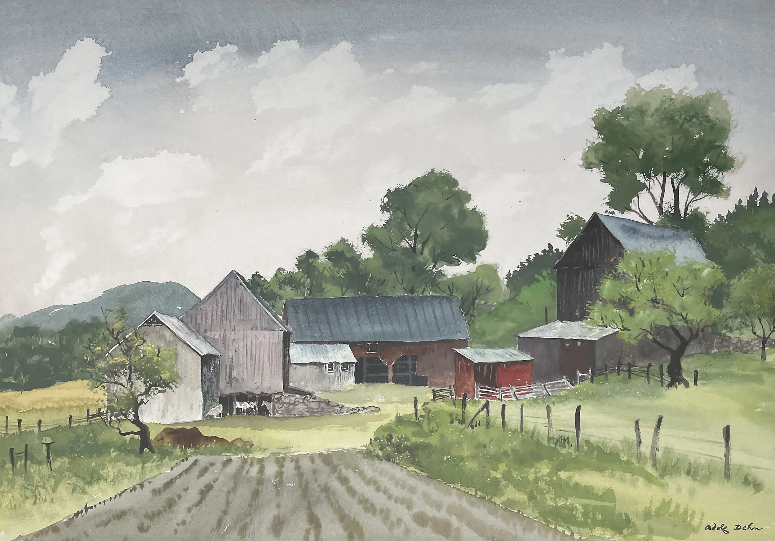
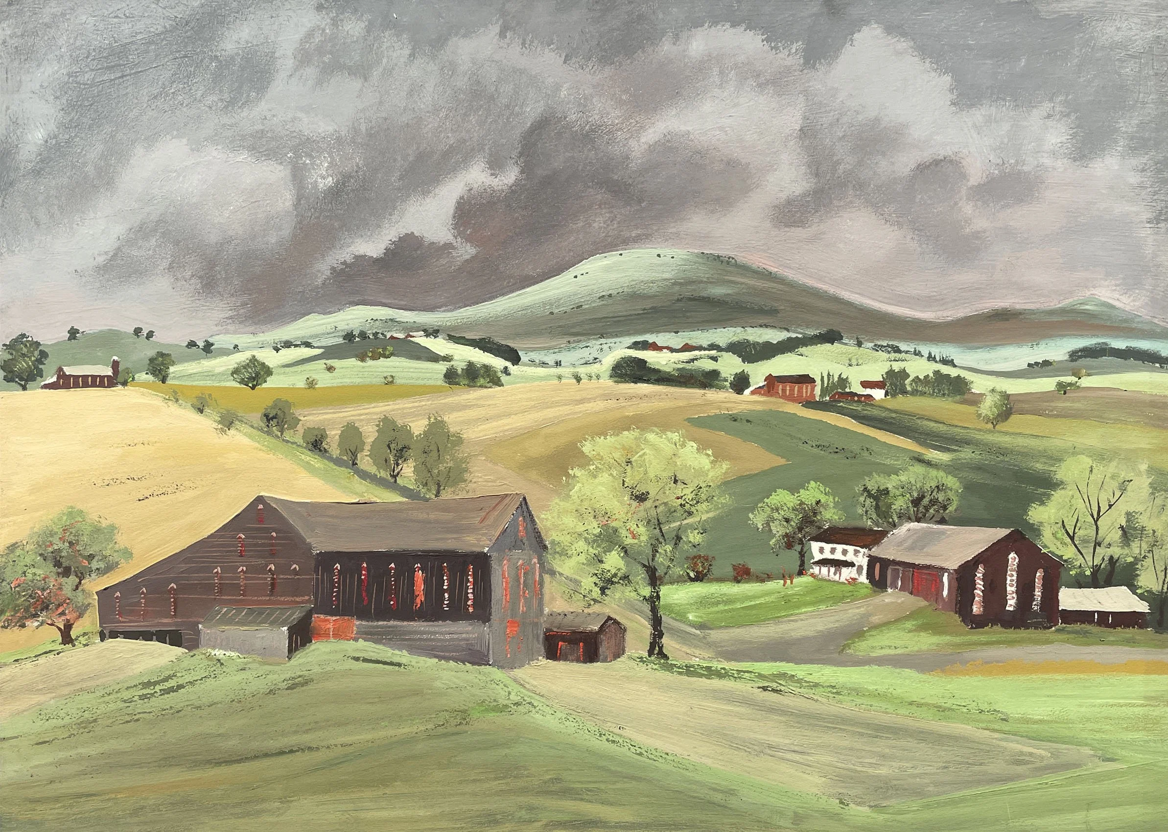
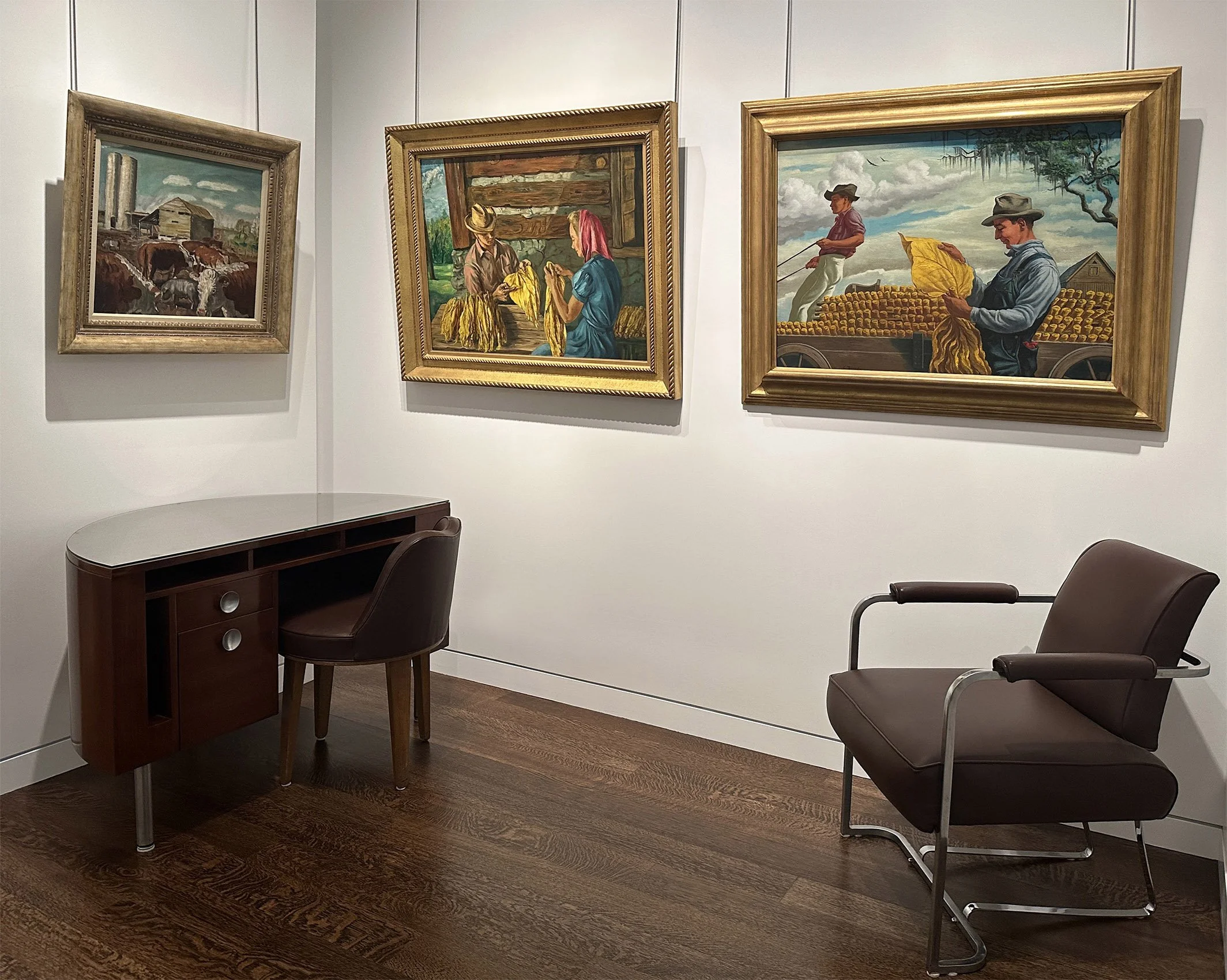
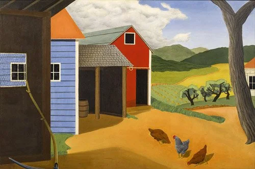
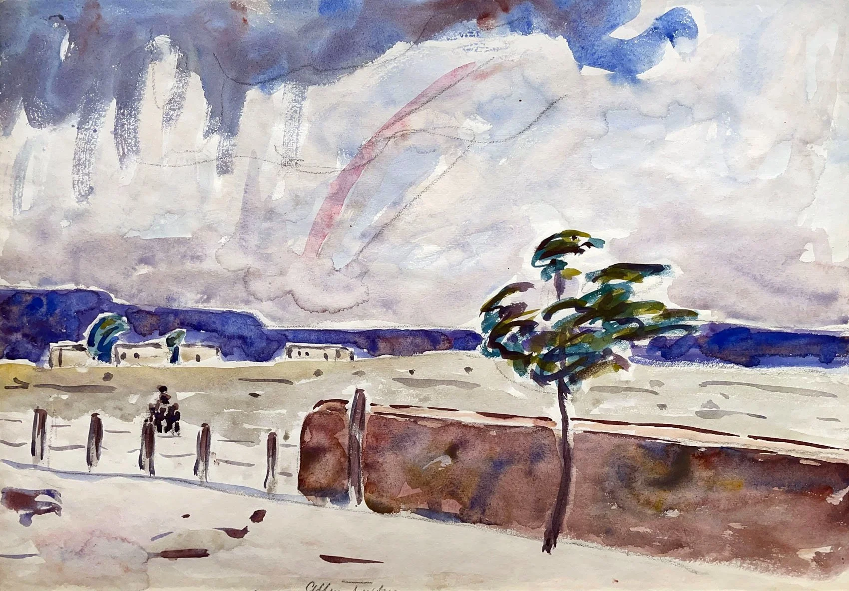
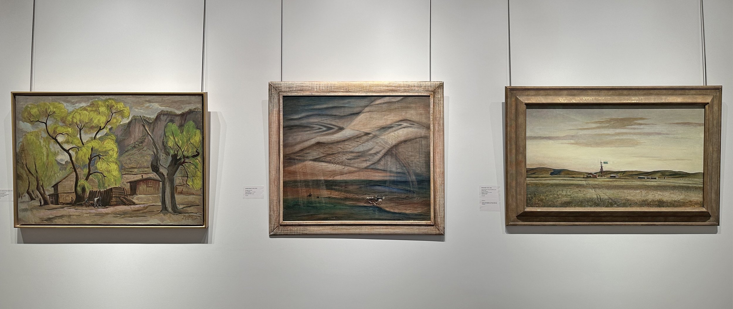
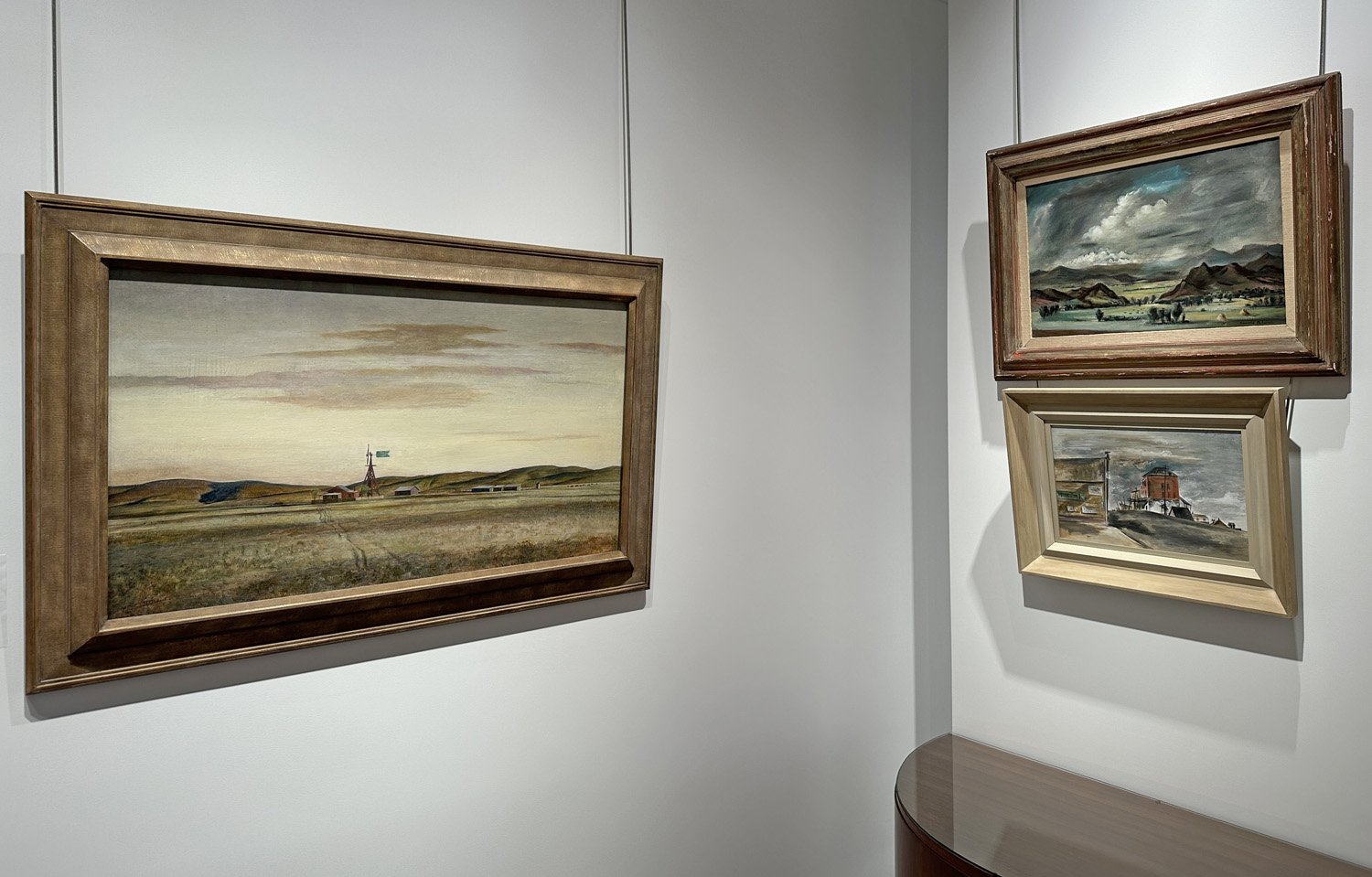
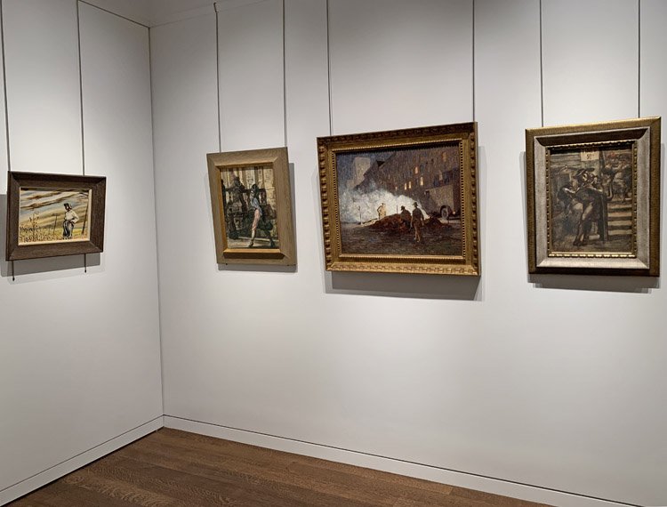
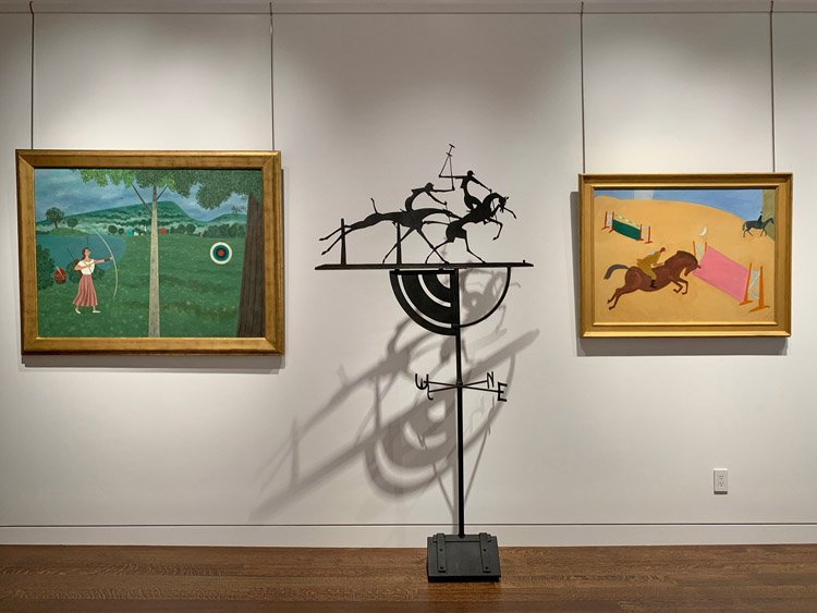
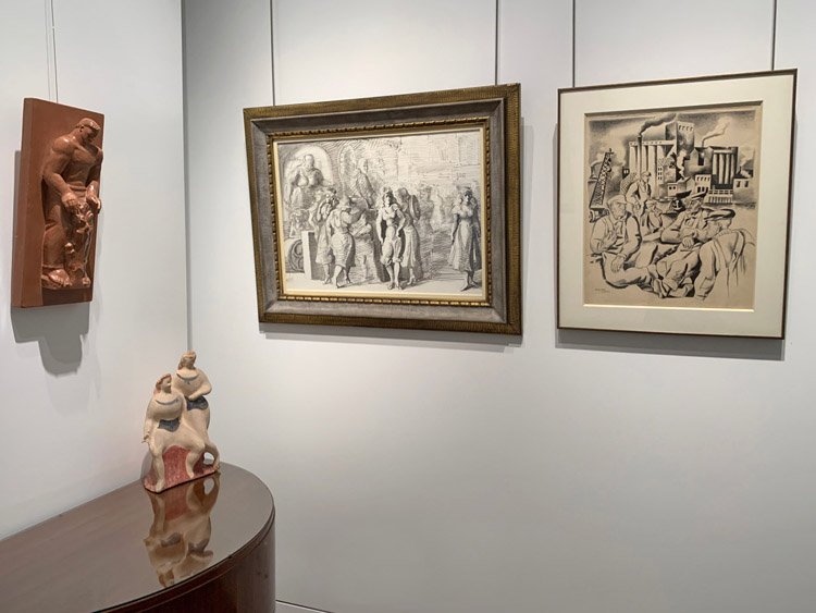
This exhibition titled Soil and Spirit came out of the opportunity to work again with the estate of Adolf Dehn (1895-1968). I planned to show a dozen of Dehn’s farm scenes, a natural subject for Adolf Dehn who was born and raised in Waterville, Minnesota. His art education began at the Minneapolis School of Art in 1914 and continued at The Art Students League in New York. By 1921, Dehn was represented by the print dealer Weyhe Gallery. To gain more experience Adolf Dehn went to Europe where he gained skill in satirical ink drawings. Dehn’s economic struggle during the 1930s made him nostalgic for Minnesota. He began to visit his hometown of Waterville with both his printmaking tools and watercolor brushes to capture scenes of man’s relationship with the land, an important topic during the Great Depression. Dehn’s sister Viola drove him around the area to farms he might wish to paint. Adolf Dehn went on to paint farm scenes in New York, Pennsylvania, Missouri, and Colorado as well.

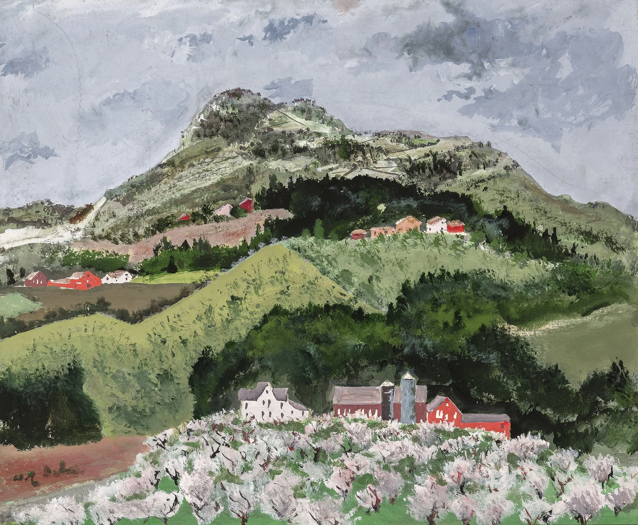
The eight Adolf Dehn farm paintings in our exhibition are all views of arrival. What interested Dehn was the way a farm fits into the land and conveys its beauty and purpose. Dehn experimented with materials to capture the interplay of light and dark areas that would achieve a three-dimensional feeling. For example, one of Dehn’s casein paintings, Green Landscape with Red Barns, alternates groupings of dark and light green trees and adds further contrast with dark red barns and light white houses nestled in the trees. The open fields of Green Landscape continue the contrast with light and dark grass areas to achieve a feeling of rolling land. Adolf Dehn sketched each farm scene out-of-doors then took his drawings into the studio to develop them. To convey what he felt for each farm, Dehn experimented with materials. Dehn mastered opaque white, black ink, pastel, casein, and crayon with watercolor to achieve a rich effect. He learned how to retain fluidity using dry pigments for weight and body texture in painting the farm subjects. In repeating the farm subject Dehn gained new forms of expression. Because Dehn was a natural satirist, he occasionally added details to his painting that commented on the scene. In the casein titled Love, Labor, Leisure, 1944, Dehn replaced the environment of heavy farm work with one full of leisure for all but the artist who labors to capture the action. Acquiring Love, Labor, Leisure caused me to expand my planned exhibition of Adolf Dehn’s farm scenes to include 1930s-1940s agricultural paintings by other artists to see what they express.

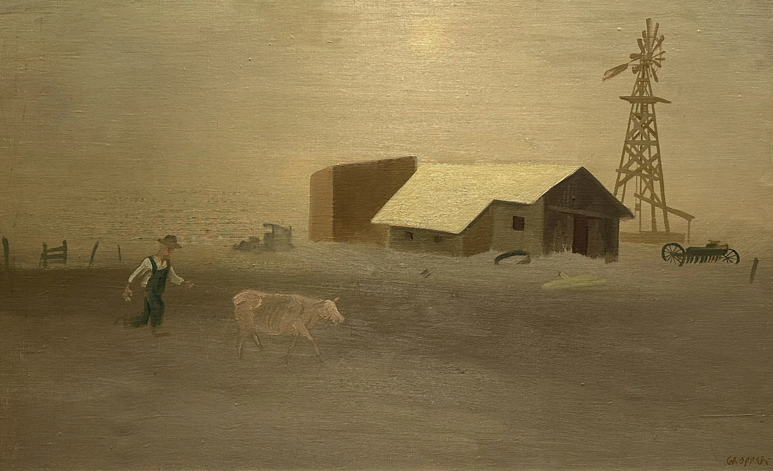
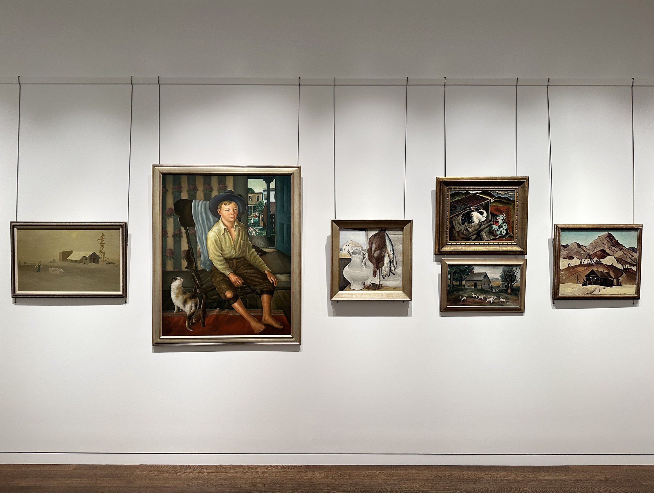
Paintings of farming subjects were popular because farming had an historic place in the American imagination. Farm work stood for values of self-reliance, industriousness, and public spirit.  When Europe was at war from 1914 to 1918, the United States became the breadbasket of the world. As Europe recovered from World War I commodity prices fell and farmers who had borrowed to buy new machinery or land struggled. The Depression for farmers occurred between 1919 and 1932 when their net income fell 70%. In the 1930s the Dust Bowl covered parts of Kansas, Colorado, Oklahoma, Texas, and New Mexico. It was caused by poor land use practices coupled with wind and drought. In our exhibition, The Last Cow, 1937 by William Gropper (1897-1977) pictures the tragedy of a farmer in the Dust Bowl. Gropper was born in New York and raised in a Jewish immigrant family on the Lower East Side. His art education began at the Ferrer School where he studied with Robert Henri and George Bellows. From 1917 through the 1920s, he earned a living doing cartoons for various newspapers and Vanity Fair magazine. In 1936 ACA Galleries in New York became his dealer. Gropper used a Guggenheim Fellowship to travel west in 1937 to see the Dust Bowl area as well as the Hoover and Grand Coulee dams. In addition to Last Cow, our exhibition includes Colorado Landscape from this trip. After the trip west, Gropper did a series of paintings and murals for the Department of Interior in Washington DC and participated in the New York World’s Fair. 

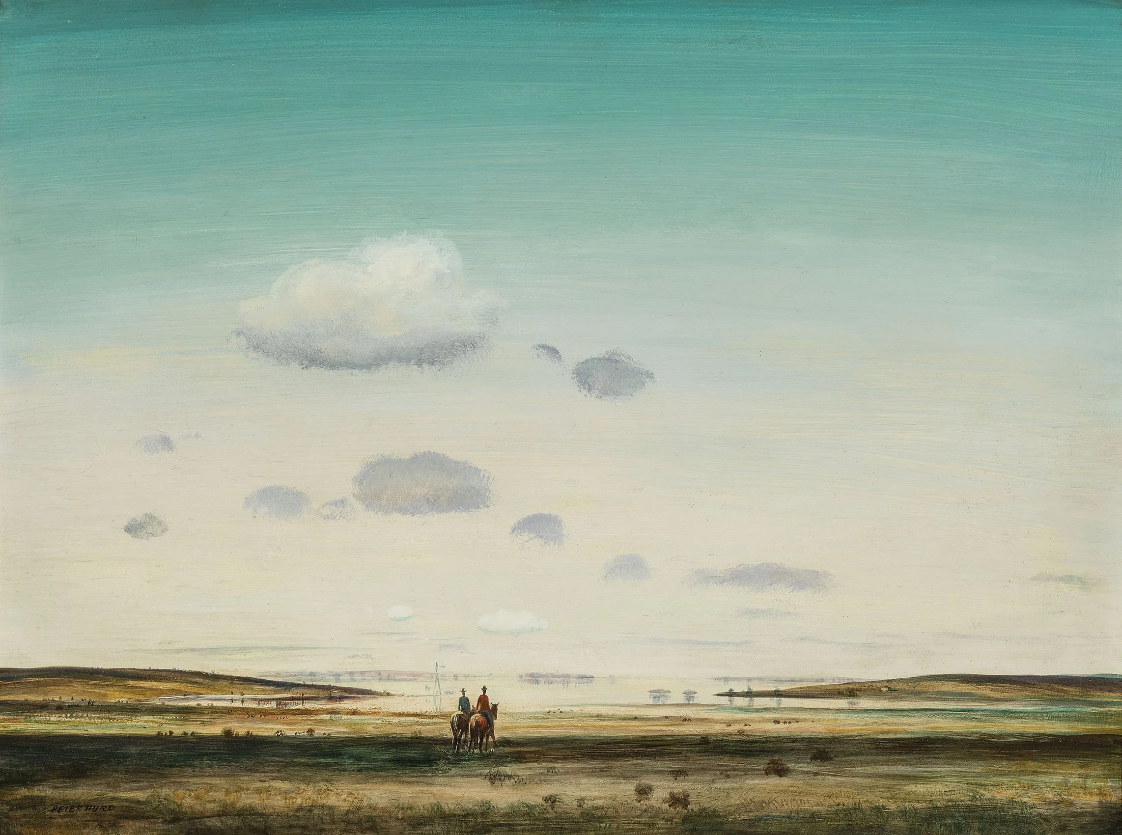
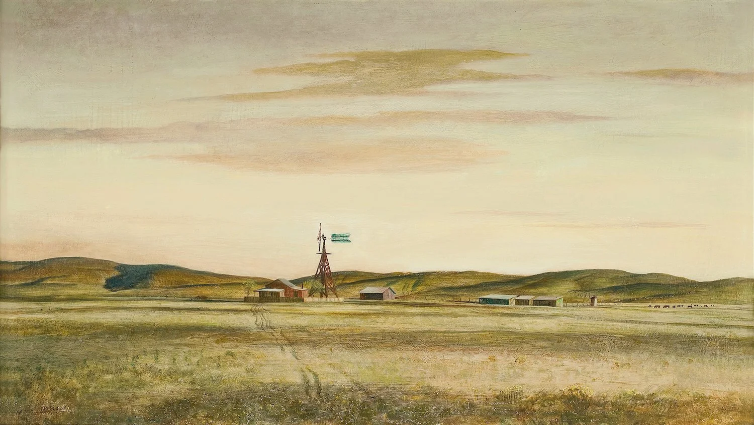
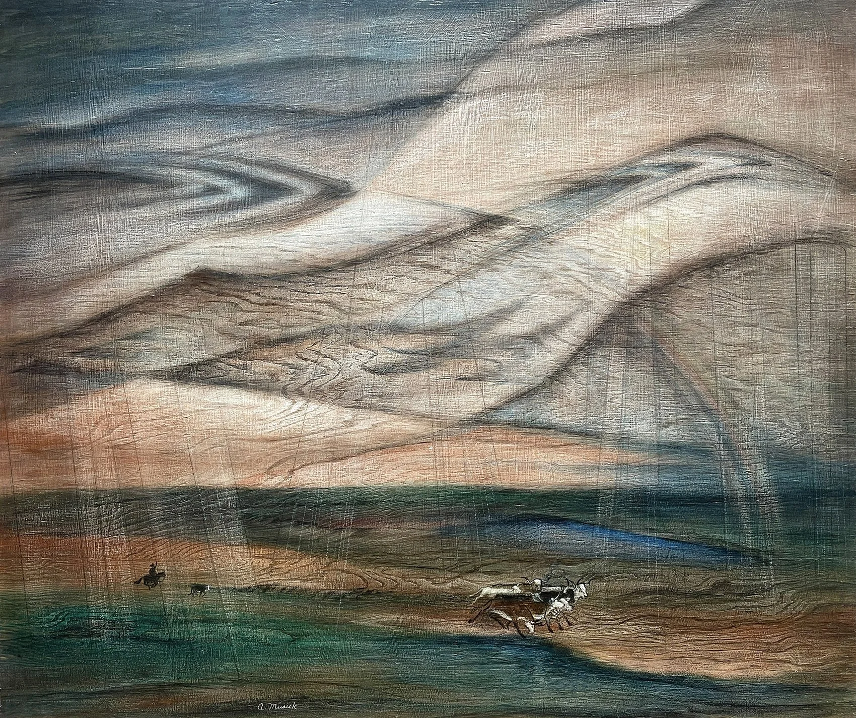
The far west is represented in our exhibition with works by Peter Hurd (1904-1984) and Dale Nichols (1904-1995). Peter Hurd presents the dry land used by cattle ranchers in New Mexico. The Mirage, 1947 speaks of the illusion of water. El Papalote focuses on a lone water tank and windmill at day’s end. Dusty Afternoon pictures dust rising around a New Mexican ranch set in low hills. Raised in Roswell, New Mexico, Hurd attended West Point Military Academy for two years before pursuing a career in art. In 1924, he persuaded N. C. Wyeth to give him private lessons and then attended the Pennsylvania Academy of Fine Arts with Wyeth’s oldest child, Henriette. The two married in 1929 and Hurd bought land in San Patricio, New Mexico, fifty miles west of Roswell, which he called Sentinel Ranch. Commissions for post office murals in Big Springs, Texas; Alamogordo, New Mexico; and Dallas, Texas funded Hurd’s development of the ranch and studio. Hurd’s distinct technique involved painting thin washes of oil and tempera over egg tempera on gessoed panels, as seen in The Mirage, 1947. Hurd also worked in wash drawings which he developed into gouaches and watercolor, as seen in El Papalote and Dusty Afternoon. Through his brother-in-law Andrew Wyeth, Hurd maintained relations with New York dealers, including MacBeth Gallery where he had solo exhibitions in 1934 and 1944. A Life magazine article in 1939 titled “Peter Hurd Paints His Own Ranch in New Mexico” brought him national attention.

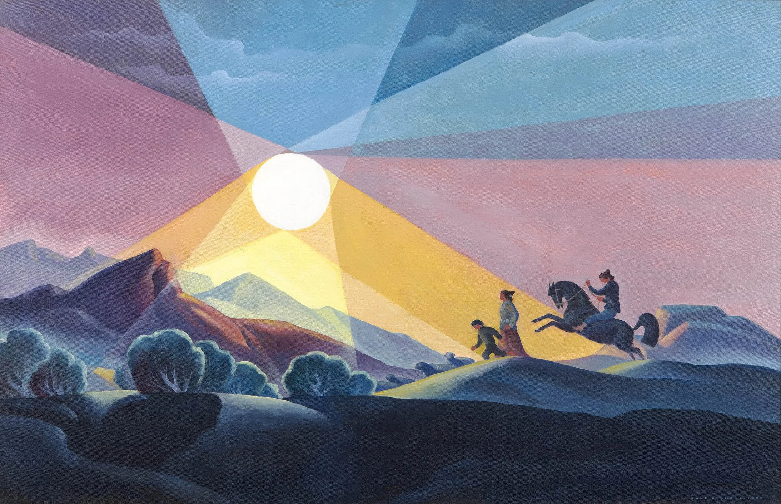
Dale Nichols (1904-1995) grew up on a grain and livestock farm in David City, Nebraska.  His depiction of the American landscape and its people idealized farmers and conveyed the grandeur and loneliness of the plains landscape they cultivated. Nichols left the farm to study art in Chicago which became his base from 1930 to 1945. His first New York solo exhibition was in 1938 at MacBeth Gallery, which continued to represent Dale Nichols throughout the 1940s. Nichols became an illustrator in 1942 and then art editor in 1945 for the Encyclopedia Britannica at its Chicago headquarters. In the 1940s Nichols divided his time between his ranch in Arizona and trips to Nebraska, Alaska, and Mexico. Our exhibition includes two oils: an Arizona ranching scene titled Morning, 1945 and a Nebraska homecoming scene titled Fall, 1946.

Different crops require different kinds of workers. Many are seasonal and migrate to the fields for work. Field Workers, 1930 by Peppino Mangravite (1896-1978) depicts migrant woman doing the harvesting. Born in Lipari, Italy, Peppino Mangravite immigrated to the United States at 14, where he studied at the Cooper Union and Art Students League in New York. He applied a modernist style to regional subjects which brought him early success with exhibitions at Dudensing Gallery in New York in 1929 and 1931. Two scenes of field work by Aiden Lassell Ripley (1896-1969) set in Massachusetts provide a view of New England market gardening. Planting Time, 1946 and Rhubarb Farmers, 1949 show vegetable crops being planted and harvested. Born in Boston and raised in nearby Wakefield, Ripley studied at the Fenway School of Illustration and then the Boston Museum of Art School. By the 1930s Ripley was known for his sporting paintings with dog and bird subjects, though he also painted landscapes, gardens, and farm scenes to show another aspect of rural life.

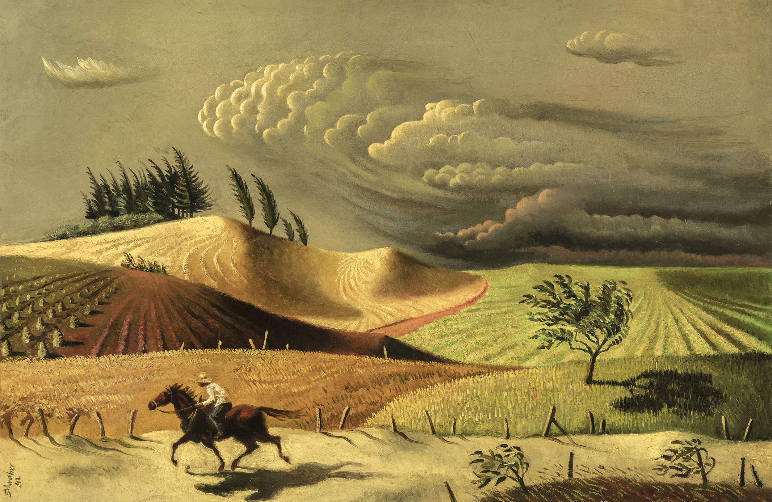
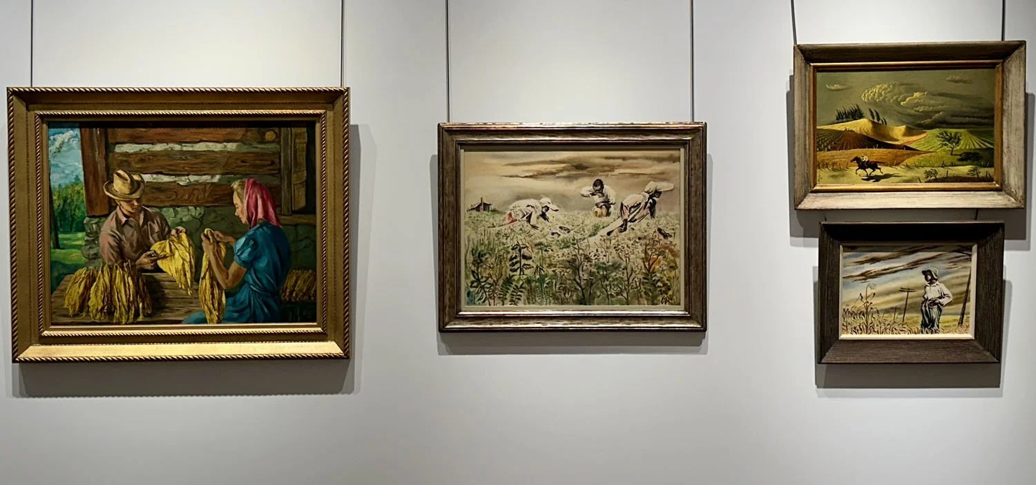
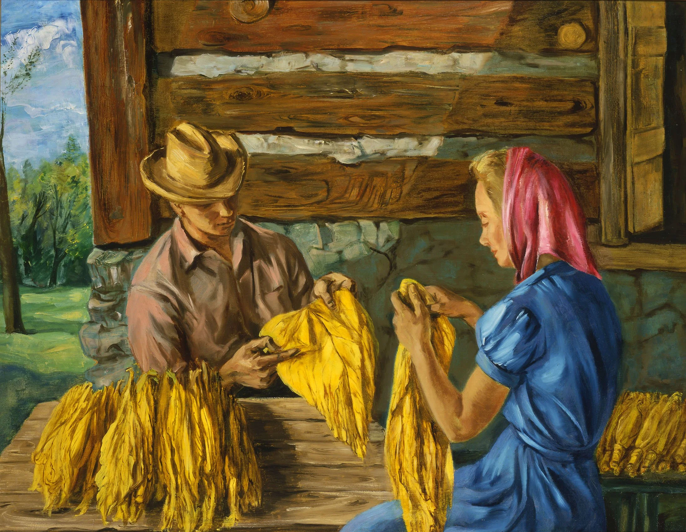
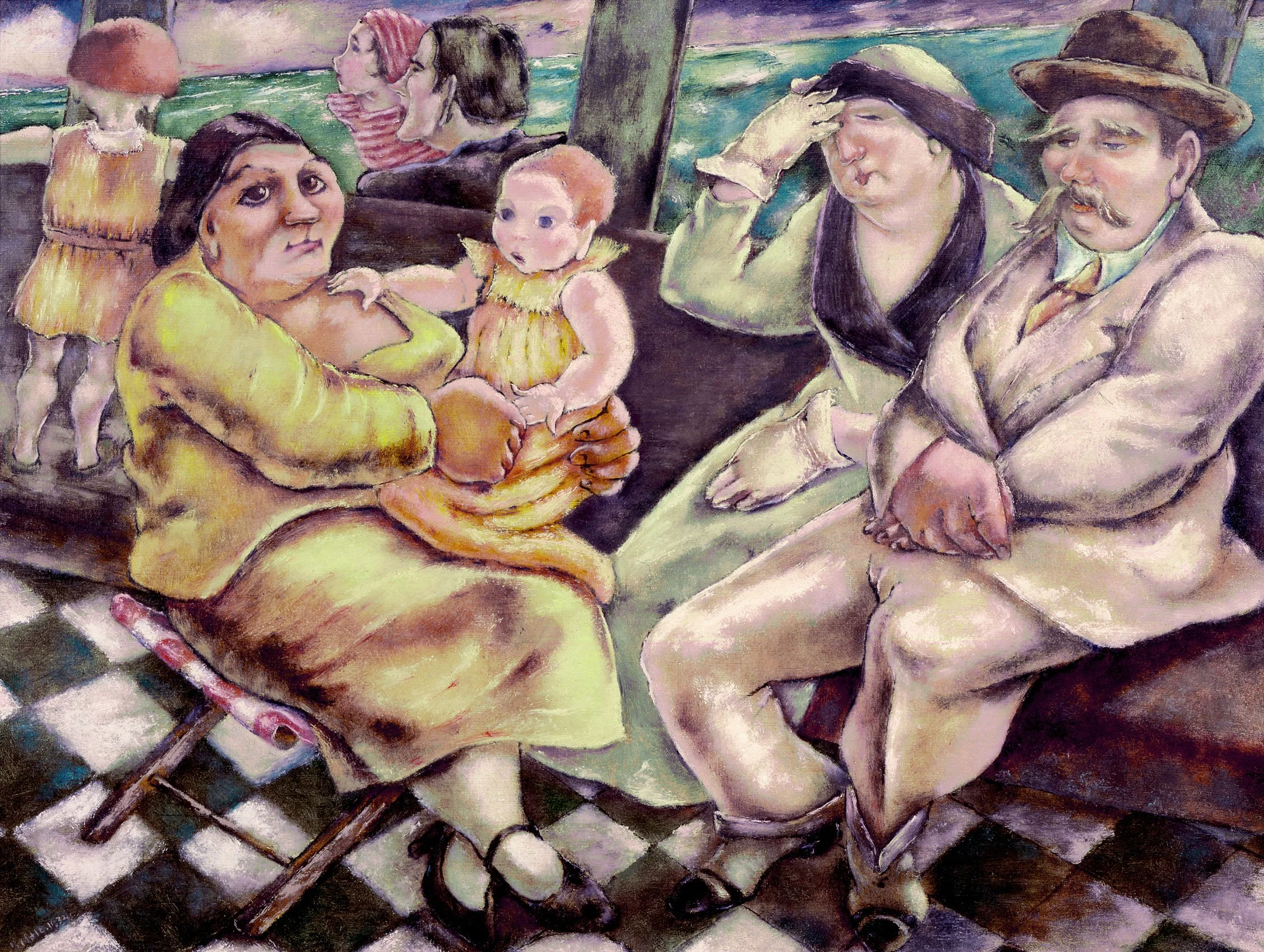
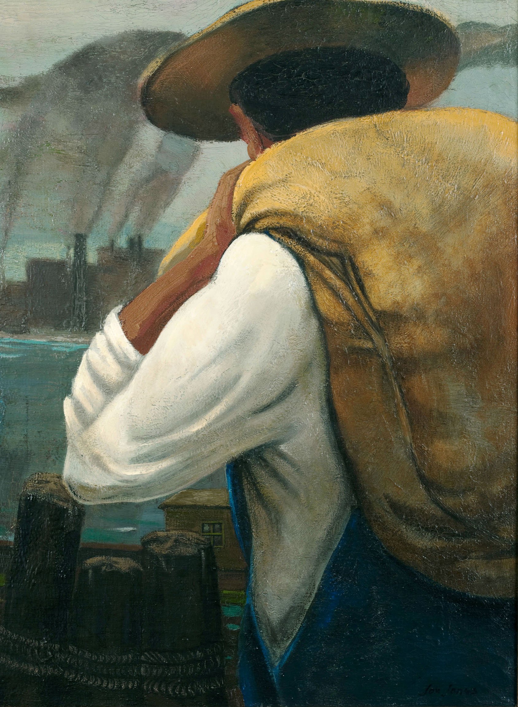
I chose a selection of Southern farm subjects including three paintings with farm and field workers by Georges Schreiber (1904-1977). Schreiber immigrated to America in 1928 from Brussels, Belgium and when he first arrived in New York, he did freelance illustration for newspapers and books. Dehn and Schreiber were both represented by Associated American Artists and likely traveled the most broadly across America of the gallery’s artists for both personal and commissioned work. From 1936 to 1939, Georges Schreiber made six cross-country trips to record American life. In our exhibition Cotton Pickers, Louisiana is from these travels and was selected for the Whitney Museum of American Art’s 1939 annual for watercolors. Also in 1939, Schreiber had his first solo exhibition at Associated American Artists titled Panorama of America that included 44 oils and watercolors representing 27 states. Our exhibition offers a watercolor titled Boy in Cornfield and an oil titled Spring Storm Over Virginia from Schreiber’s 1942 southern travels on an American Tobacco Company commission that took Schreiber, Thomas Hart Benton, and Ernest Fiene on a road trip to Georgia. Schreiber’s 1943 exhibition at Associated American Artists was titled Southern Journey. Schreiber used all three works in our exhibition to create prints published with Associated American Artists. Schreiber’s travel paintings developed a wide audience as they depicted rural America’s landscape, regional culture, and specific crops. His paintings were frequently reproduced in Life and Fortune magazines. To support Georges Schreiber’s Southern fields of cotton and corn in the exhibition, I added a painting of farm workers topping tobacco by L.J. Cowgill, a Virginia artist, and paintings about grading the tobacco harvest by Frederic Taubes (1900-1981) and Ernest Fiene (1894-1965). South Carolina Tobacco Farm by Oscar Wetherington (1921-1998) shows curing barns for the tobacco crop.

The artists in this exhibition made important records of rural America that preserved knowledge of landscape, work, stock, farm architecture, and specific crops harvested.

[ TOP ]

Modernism 1913-1950 | Realism of the 1930s and 1940s | Abstraction of the 1930s and 1940s | Post-War | Selected Biographies

THE TIMELESS ADIRONDACKS

February 20 - April 24, 2025

Installation Views | Essay | For availability and pricing, please contact the gallery at 212-581-1657

Installation Views


Essay by Deedee Wigmore

As a dealer in historic American art, it is a pleasure to review different parts of our country whose spirit and beauty has been captured by artists. From February 20th to April 25th, D. Wigmore Fine Art dedicates an exhibition to the Adirondacks, a range of mountains in northeastern New York with 3,000 lakes, as well as impetuous rivers and streams, that has been legislated as “Forever Wild.” The Adirondacks’ high-peaked mountains inspired artists, photographers, and geologists to survey and document it. The story of art in the Adirondacks began in 1837 with the painting The Great Adirondack Pass executed on the spot by the artist Charles C. Ingham (1796-1863). Ingham came to the region accompanying Ebenezer Emmons’ survey party. The Adirondack Pass painting was purchased by New York State Senator Archibald McIntyre, who owned mines in the area. Senator McIntyre’s descendants, Mr. and Mrs. Harold Grout, gave The Great Adirondack Pass painting to the Adirondack Experience museum.

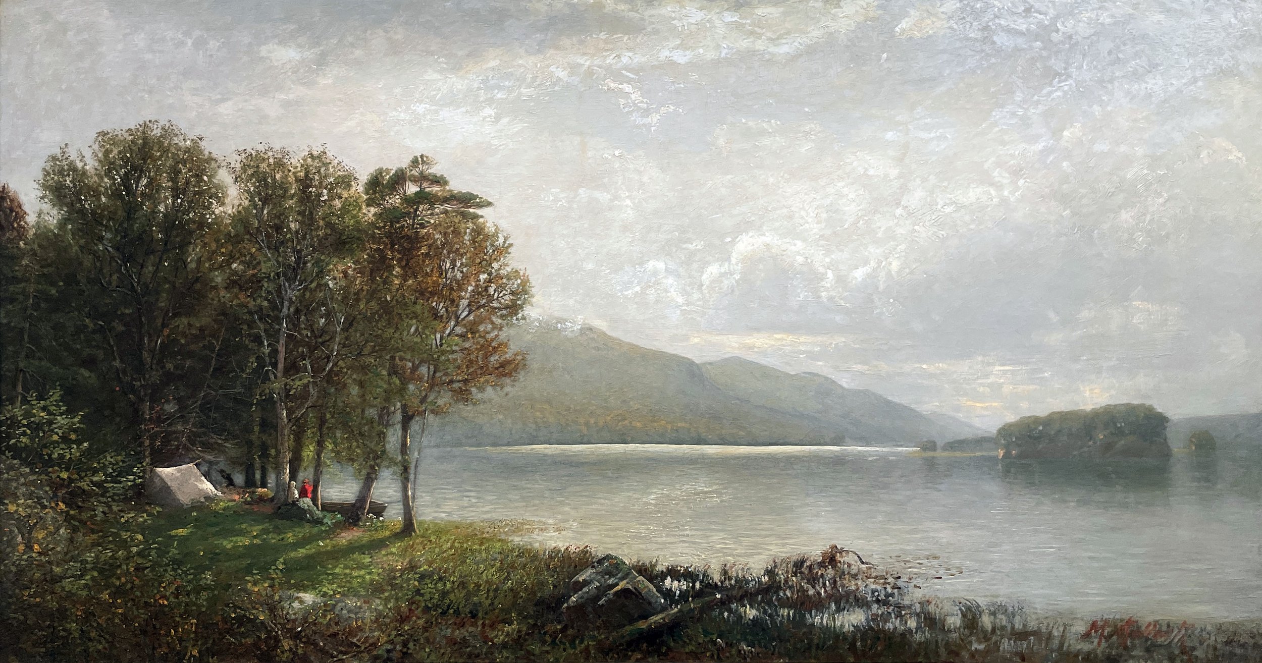
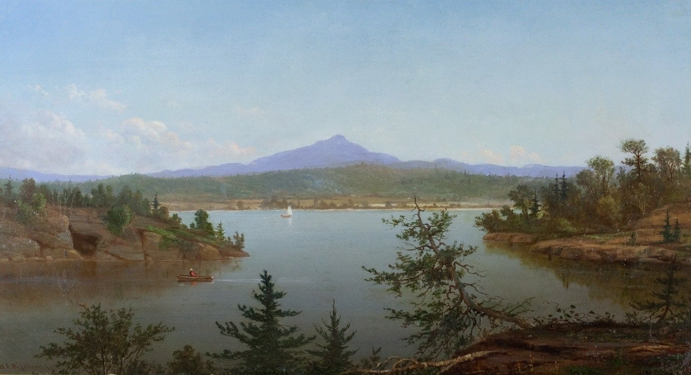
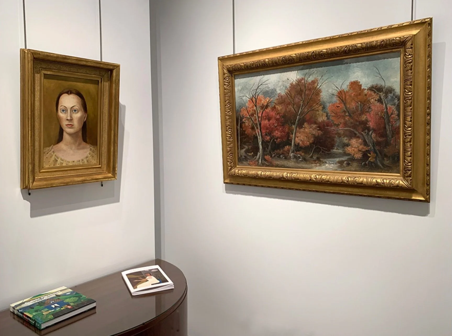
The title Timeless Adirondacks was chosen because our exhibition includes works by artists from the 19th century to the present. In the 19th century artists traveled to the Adirondacks for its unspoiled scenery and their admired paintings reinforced the location as a touring destination. View of Schroon Lake, 1846 by Asher B. Durand (1796-1886) resulted from an earlier sketching trip with Thomas Cole in 1837.  Alexander Wyant (1836-1892) visited the Adirondacks and built his home on a mountainside in Keene Valley. Two paintings by Wyant - The Ausable River in Flood and Morning, Keene Valley resulted from Wyant’s daily observations. Drama is recorded by James M. Hart (1828-1901) in his painting Approaching Storm, Adirondacks, 1866 which captures a sudden change in weather that could mean danger.  Hart’s deer stand on alert ready to flee as they sense a coming storm. View of the Upper Ausable Lake by John Bunyan Bristol (1826-1909) provides a contrasting calm with a figure seated on a boulder sketching the mountains and lake.  Keene Valley was such a popular destination for artists that at times it seemed to be a virtual artist colony.  Essex County’s lake and mountain views also attracted artists. William Richardson Tyler (1825-1896), who lived in Troy, New York and Daniel Folger Bigelow (1823-1910) found inspiration there. Popular monthly magazines provided commissions for artists to travel to the Adirondacks to illustrate articles on the amenities which included accommodations, sporting opportunities, and healthful locations. The 19th century paintings in our exhibition were executed before the Adirondack Park was established in 1892.

Jonas Lie (1880-1940) represents the next generation of artists. His style of naturalism is combined with the coloristic innovation of Impressionism. Lie came to the Adirondacks in 1921 as his wife Inga Sontum, a Norwegian ballet dancer, received treatment for tuberculosis at the Trudeau Sanatorium. Lie purchased Howland Cottage nearby in Saranac Lake and resided there as a painter and teacher until 1926 when Inga died. Our exhibition offers a rare painting titled Frosty Morning, 1923, which includes snowy hillside houses around the town of Saranac Lake. Lie became famous for painting snow-covered terrain, frigid waters, and sun-dappled birch trees. He returned to the Adirondacks in 1928 to execute a commission of ten painting depicting the summer residence Kamp Kill Kare on Lake Kora for the Francis Garvan family.

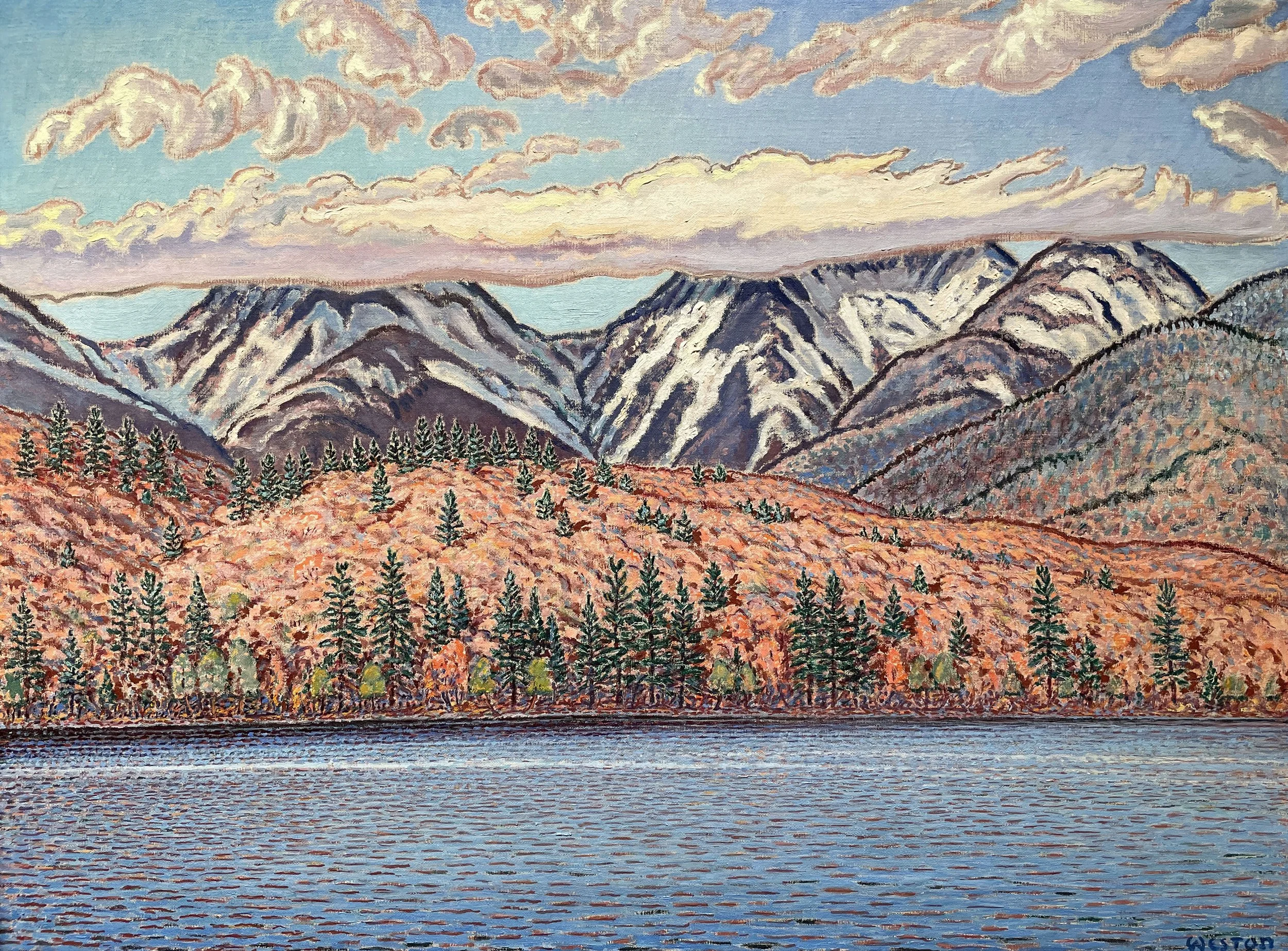
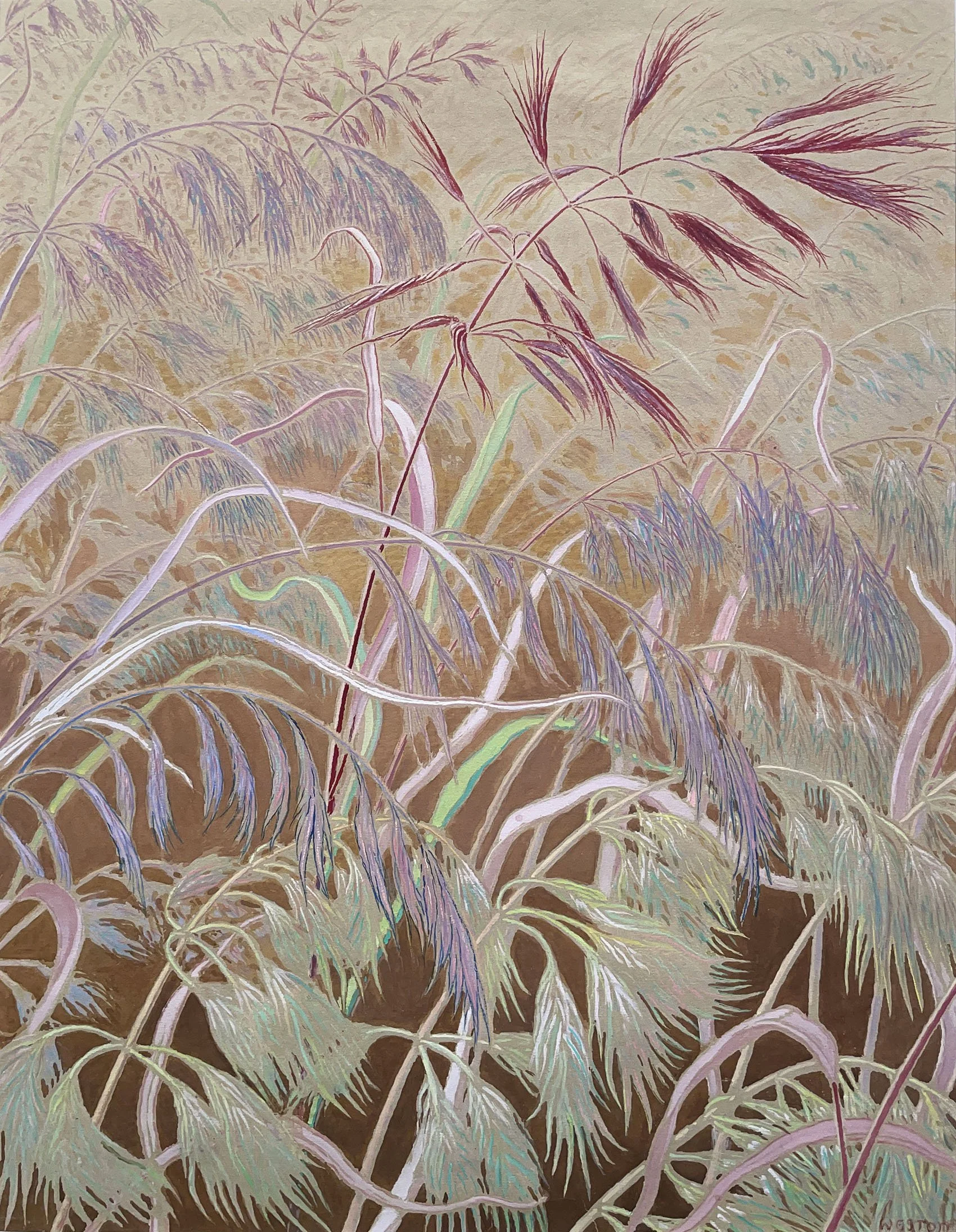
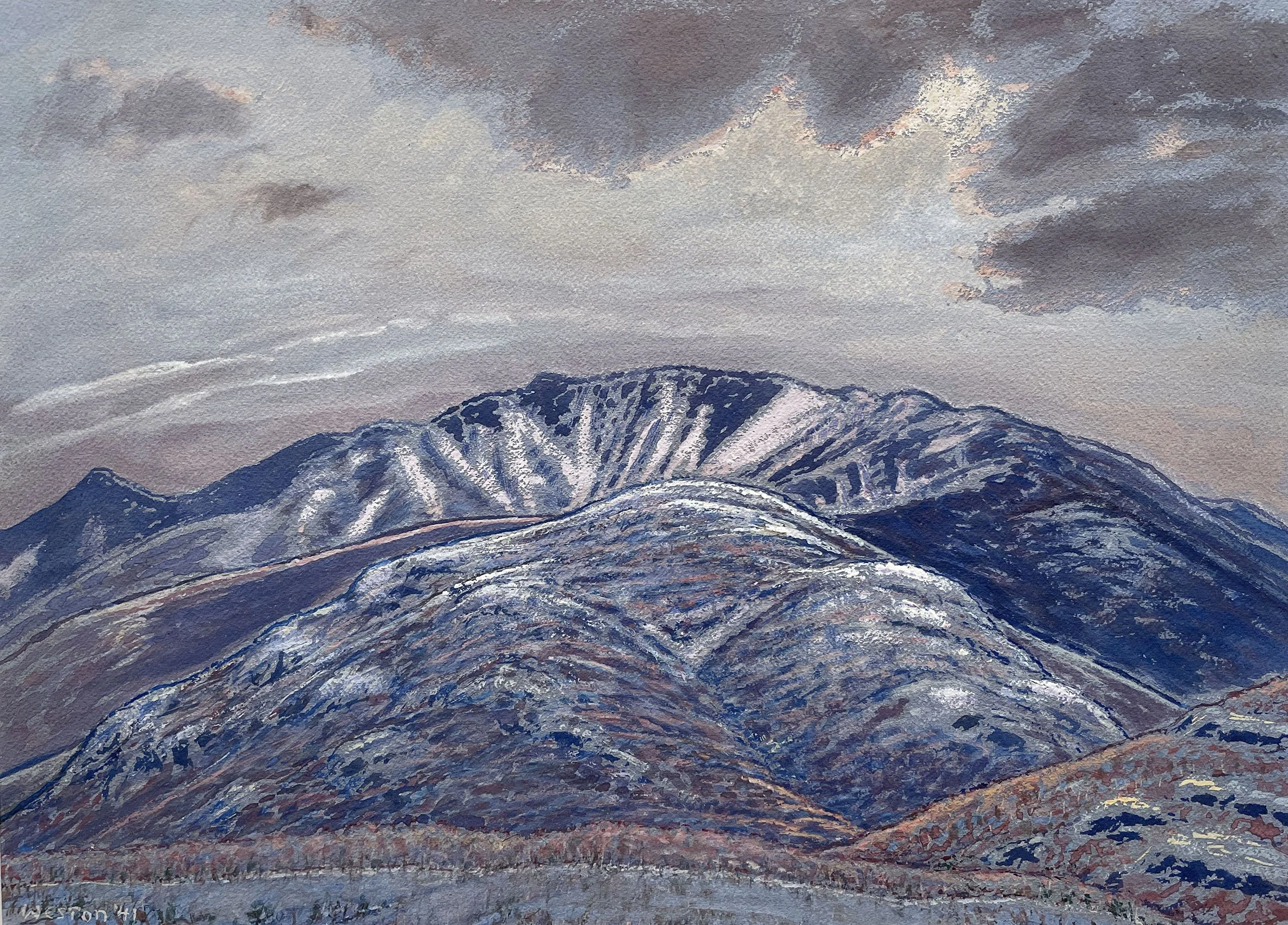
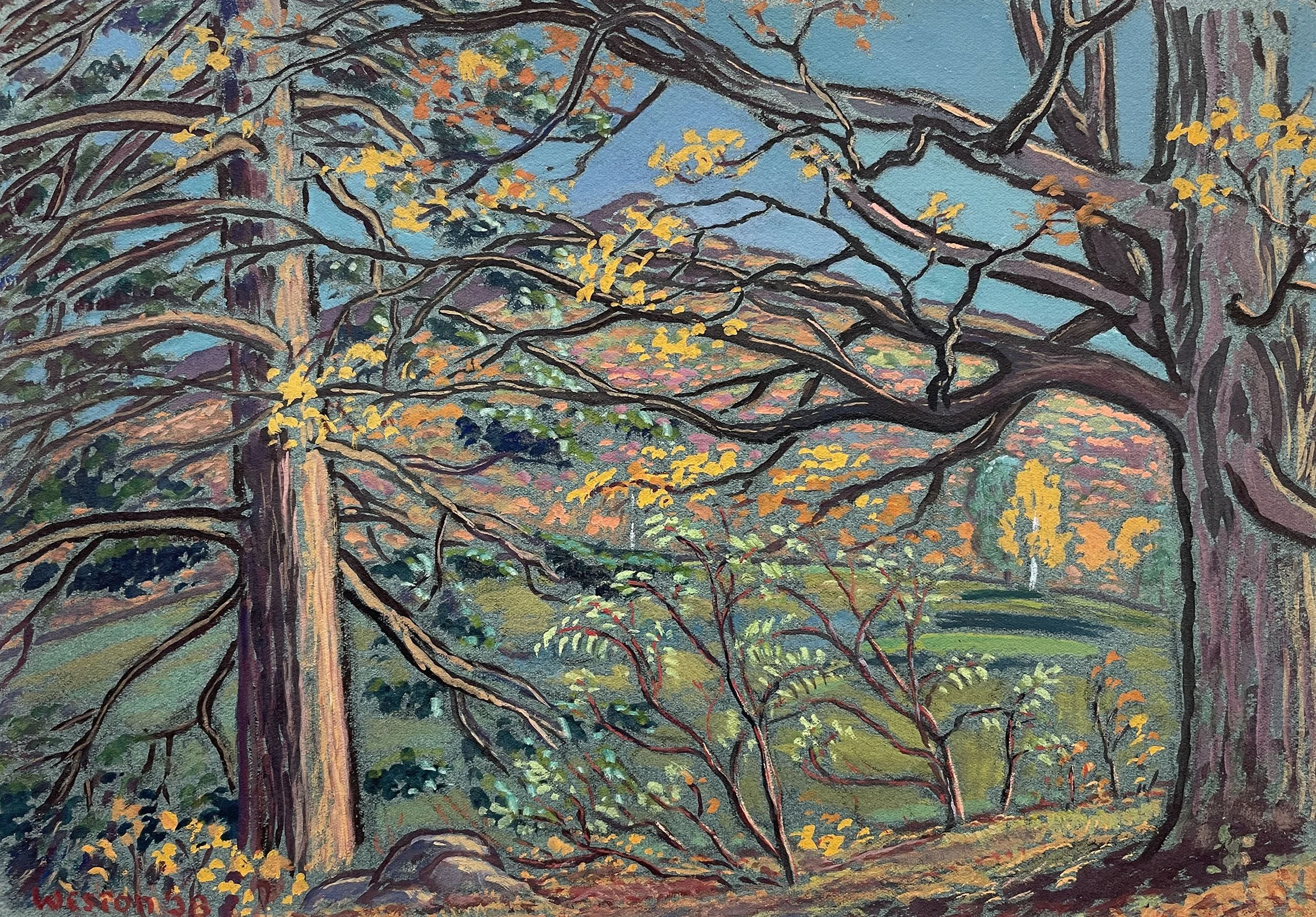
Modernist Adirondack landscapes by Harold Weston (1894-1972) executed from 1938 to 1959 are offered in our exhibition. Weston’s father built on land purchased beside Icy Brook in Keene Vally in 1883. As a child, Weston spent summers at Icy Brook Camp and in 1920 built a studio there for painting. Weston’s first solo exhibition of Adirondack paintings was in 1922 at the Montross Gallery in New York City.

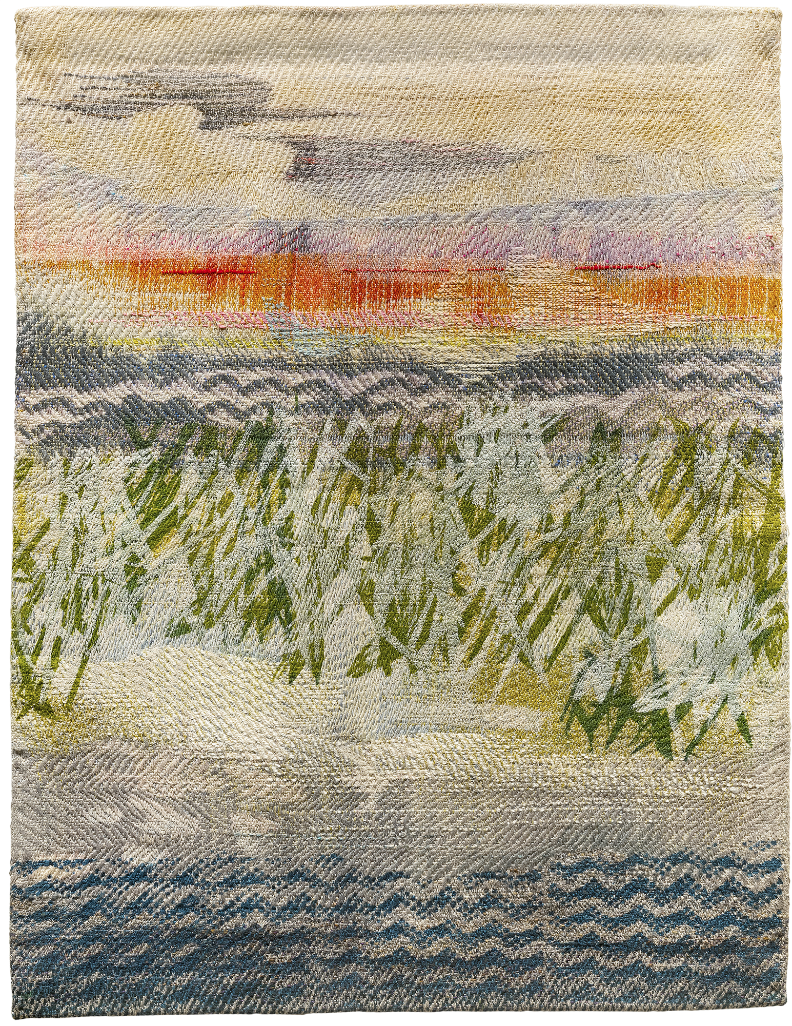
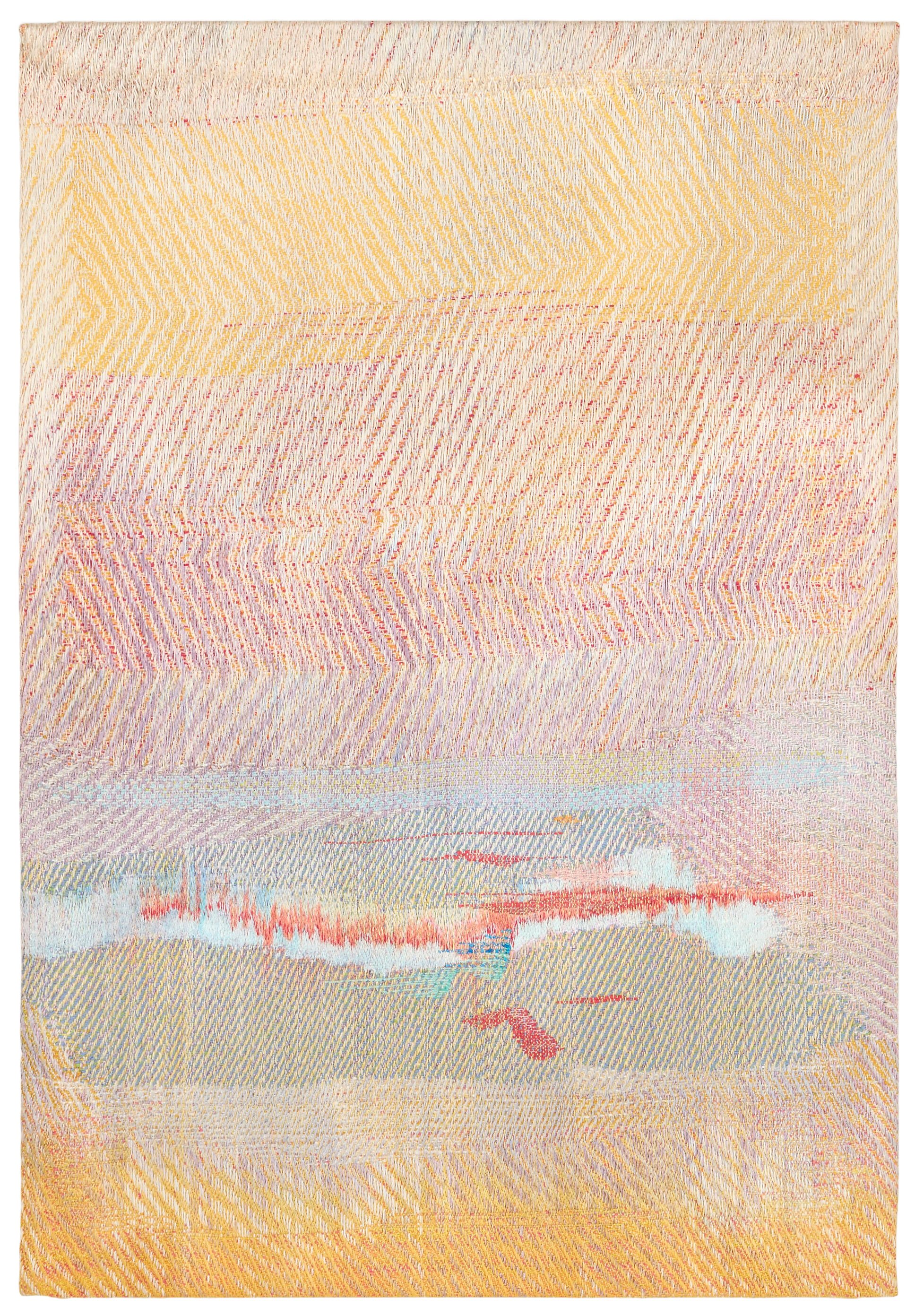
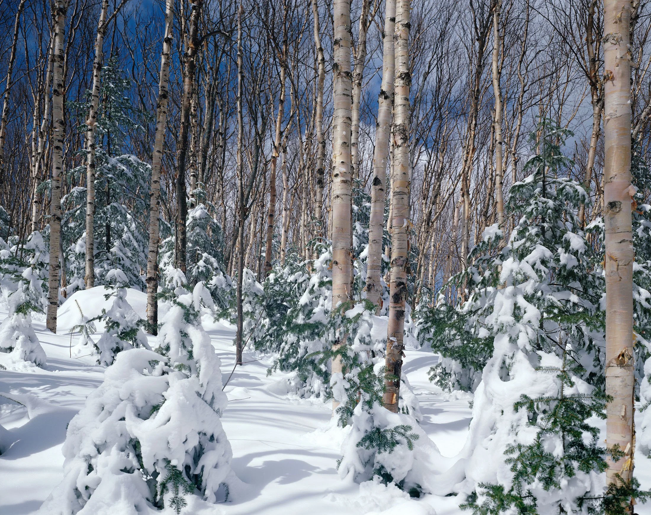
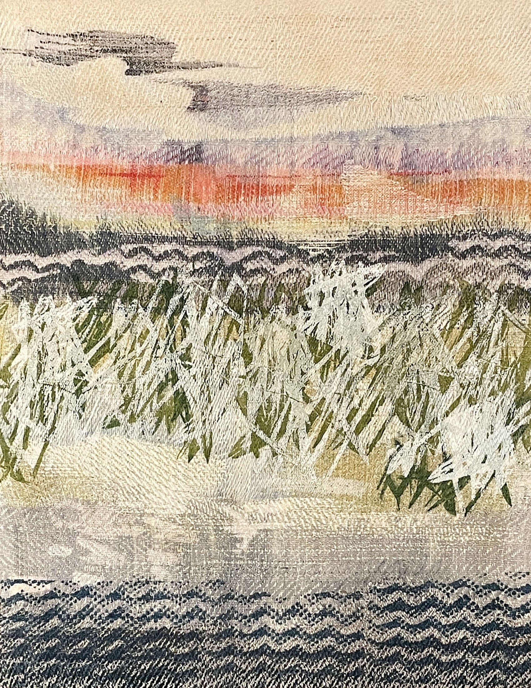
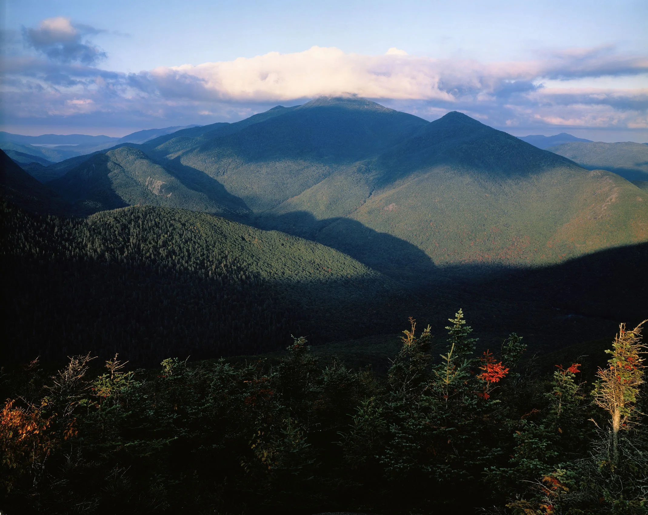
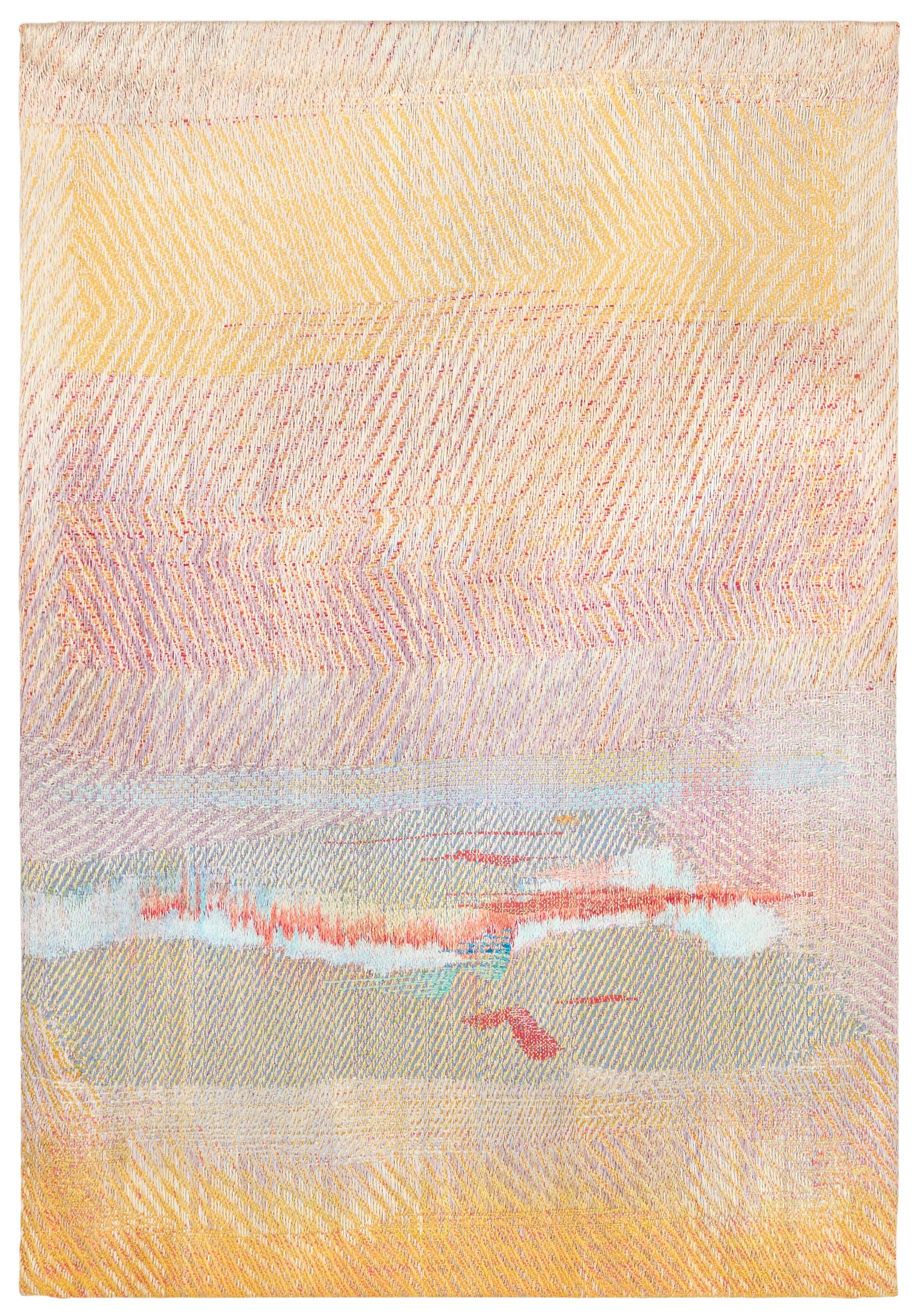
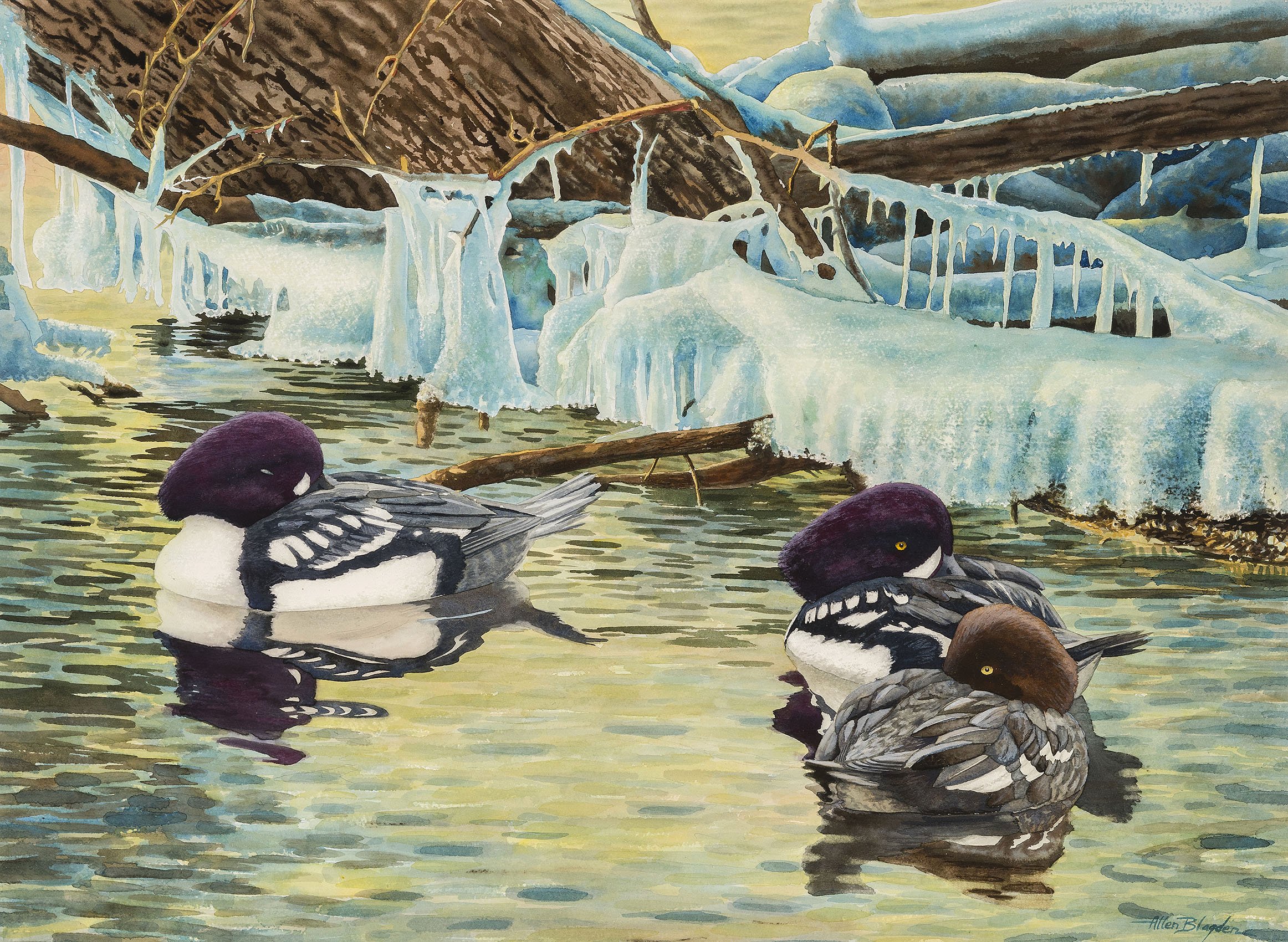
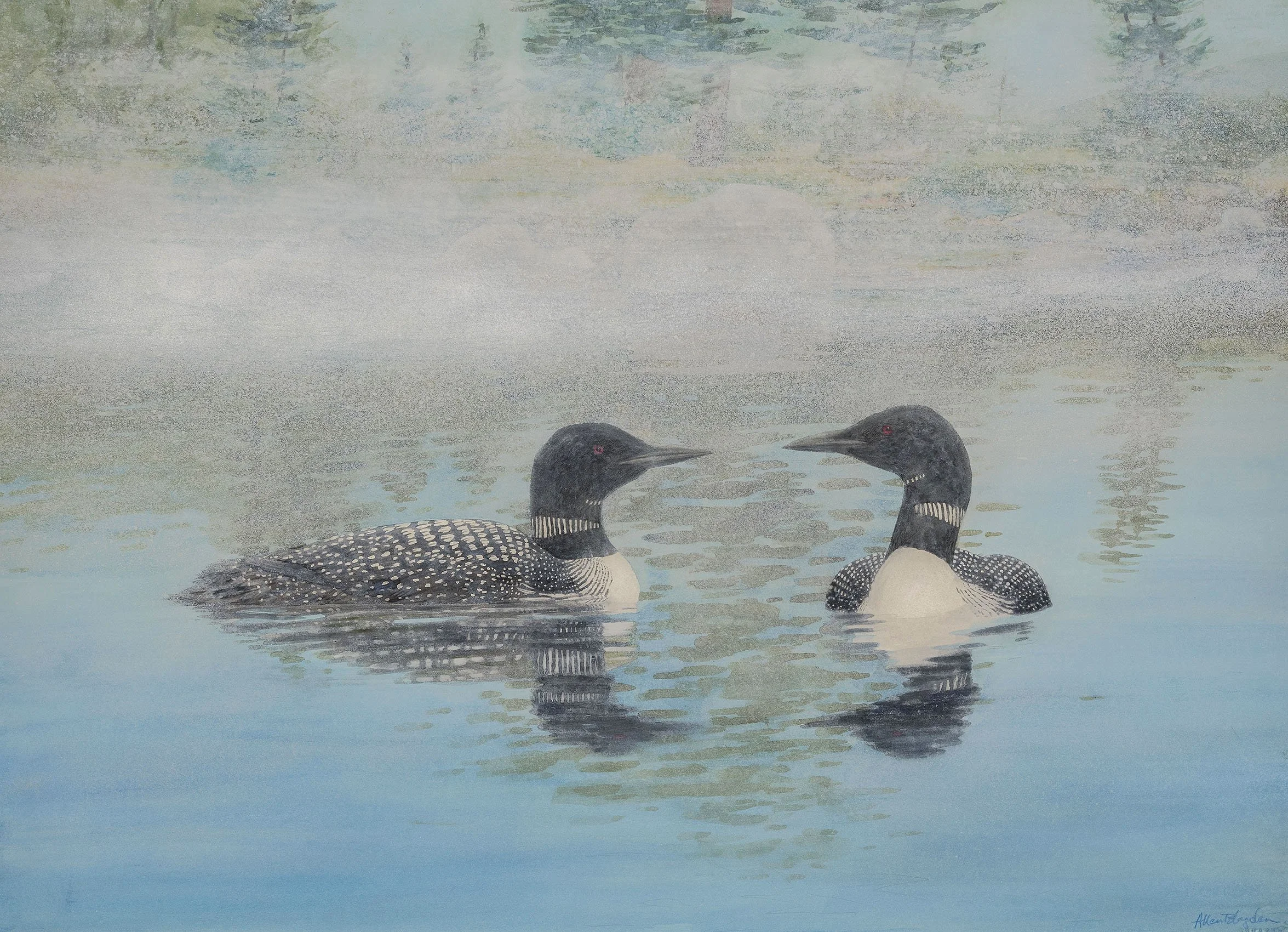
The artist Allen Blagden (b. 1938) and the photographer Nathan Farb (b. 1941) both grew up in the Adirondacks. Blagden spent summers on Upper Lake Saranac and Farb full-time in the Lake Placid area. Having a home in the Adirondacks enabled both artists to experience and present all four seasons. Our exhibition pairs Nathan Farb’s photographs with Allen Blagden’s watercolors. Blagden pays close attention to birds and wildlife in his Adirondack paintings, capturing quiet moments of the animals in their habitats. Farb achieved his amazing Adirondack views by carrying his large-format camera to the top of mountains, into the forests, and via canoe to lakes and ponds then using his long exposure technique. Farb’s photography of nature makes one pause to think about how natural change is to living things. Westport weaver Cynthia Schira (b. 1934) touches on seasonal change with a tapestry titled August which presents the shimmer of Lake Champlain almost submerged by late summer’s soft orange color. Another Schira weaving titled Daybreak presents a scene of changing light looking past wild grasses on a sandy shore as dawn arrives over the lake. Harold Weston’s painting Grasses joins in this conversation.

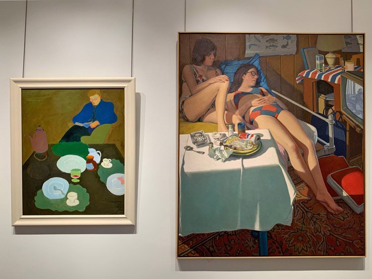
Don Wynn, an artist who lived in the Blue Mountain Lake area of the Adirondacks, recorded the pleasures of summer in his painting On Vacation, 1975. Wynn, a photorealist in the 1970s, sculpts human form with light. Opening Day, 1973 portrays the eager fisherman’s preparation as he sets out his poles in a simple Adirondack cottage. The natural beauty of the Adirondack region continues to capture artists today.  Andrew Thompson, who has a house on the north end of Lake George, enjoys fishing as much as Don Wynn.  Andrew’s painting Smelt Dreams, 2022 and sculpture Brook Trout and Green Drakes, 2024 reflect this interest.  

The wild beauty of the Adirondacks speaks to us in images of its distinctive forests, rivers, gorges, wildlife, birds, and fish captured in paintings, photography, and weavings that present the light, line, and color of the area. It gives me pleasure to share with you generations of artists who touch us with their responses to the Adirondacks.

[ TOP ]

Modernism 1913-1950 | Realism of the 1930s and 1940s | Abstraction of the 1930s and 1940s | Post-War | Selected Biographies

EVOLVING AMERICAN ABSTRACTION

November 14, 2024 - February 14, 2025

Installation Views | Essay | For availability and pricing, please contact the gallery at 212-581-1657

Installation Views


Essay by Emily Lenz

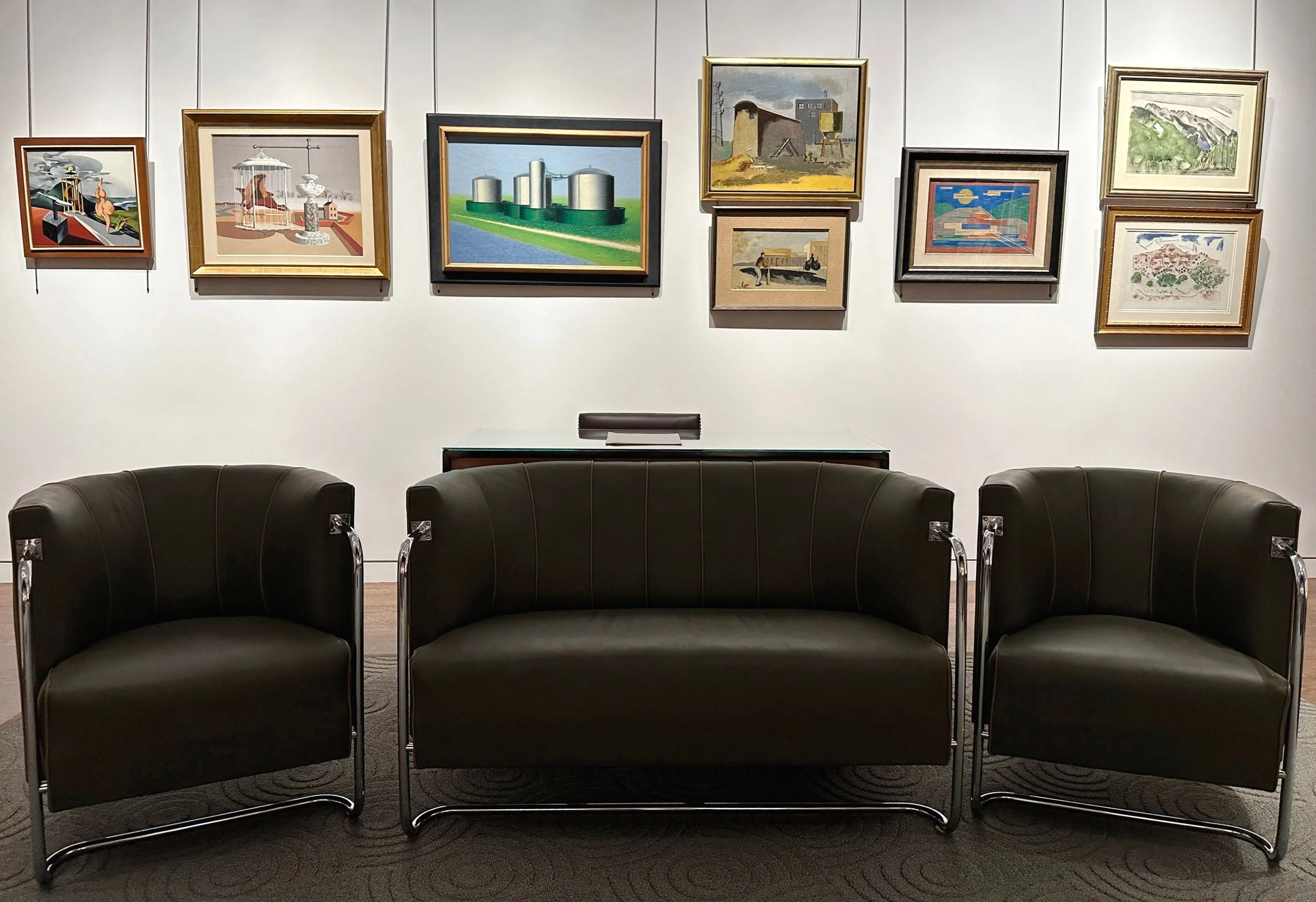
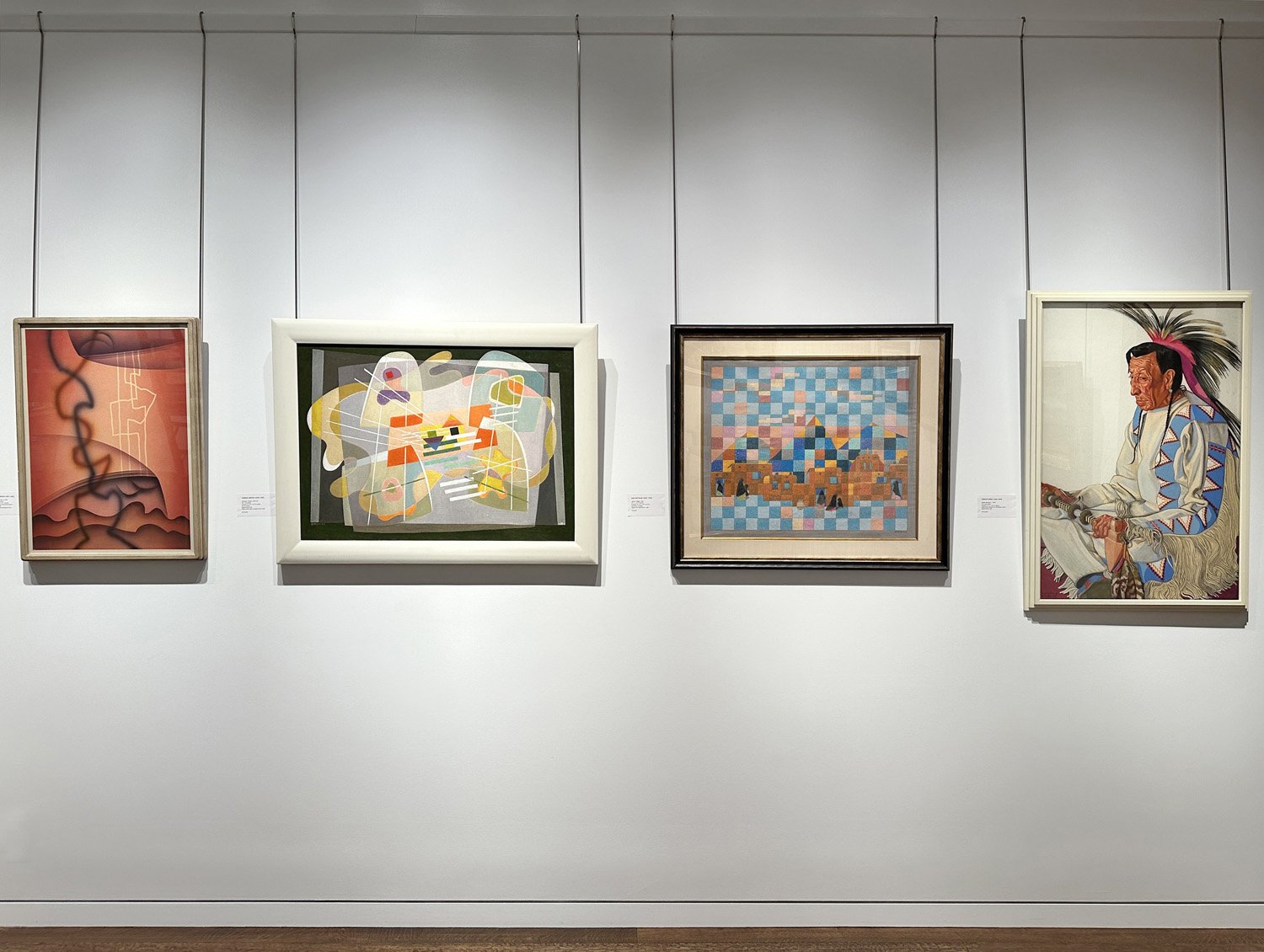
This exhibition considers how artists developed American abstraction in the 1930s and 1940s. Some were able to spend time in Paris while most followed developments through black and white reproductions in European art magazines. New York artists could see examples of European modernism at A. E. Gallatin’s Gallery of Living Art at NYU (opened 1927) or the Museum of Modern Art (opened 1929). In the early Thirties dealers like Valentine Dudensing and Pierre Matisse held exhibitions for Pablo Picasso, Joan Miró and other European modernists. The influential German painter Hans Hofmann held classes at the Art Students League in 1932 before setting up his own school in New York. He taught that the artist’s goal is to express the tension between three-dimensional forms and the two-dimensional surface of the canvas. Within the government-sponsored WPA, Burgoyne Diller’s New York City mural division was the only group that accepted abstraction. Like-minded artists met there and began discussing how to build an American audience for abstraction. This developed into the American Abstract Artists group founded in 1936. By its first annual exhibition in April of 1937, the group had 39 members. Each contributed non-figurative work in any abstract style including biomorphic and geometric. In 1939 the Museum of Non-Objective Painting (the early Guggenheim Museum) opened and became another place where New York abstractionists could show their work.

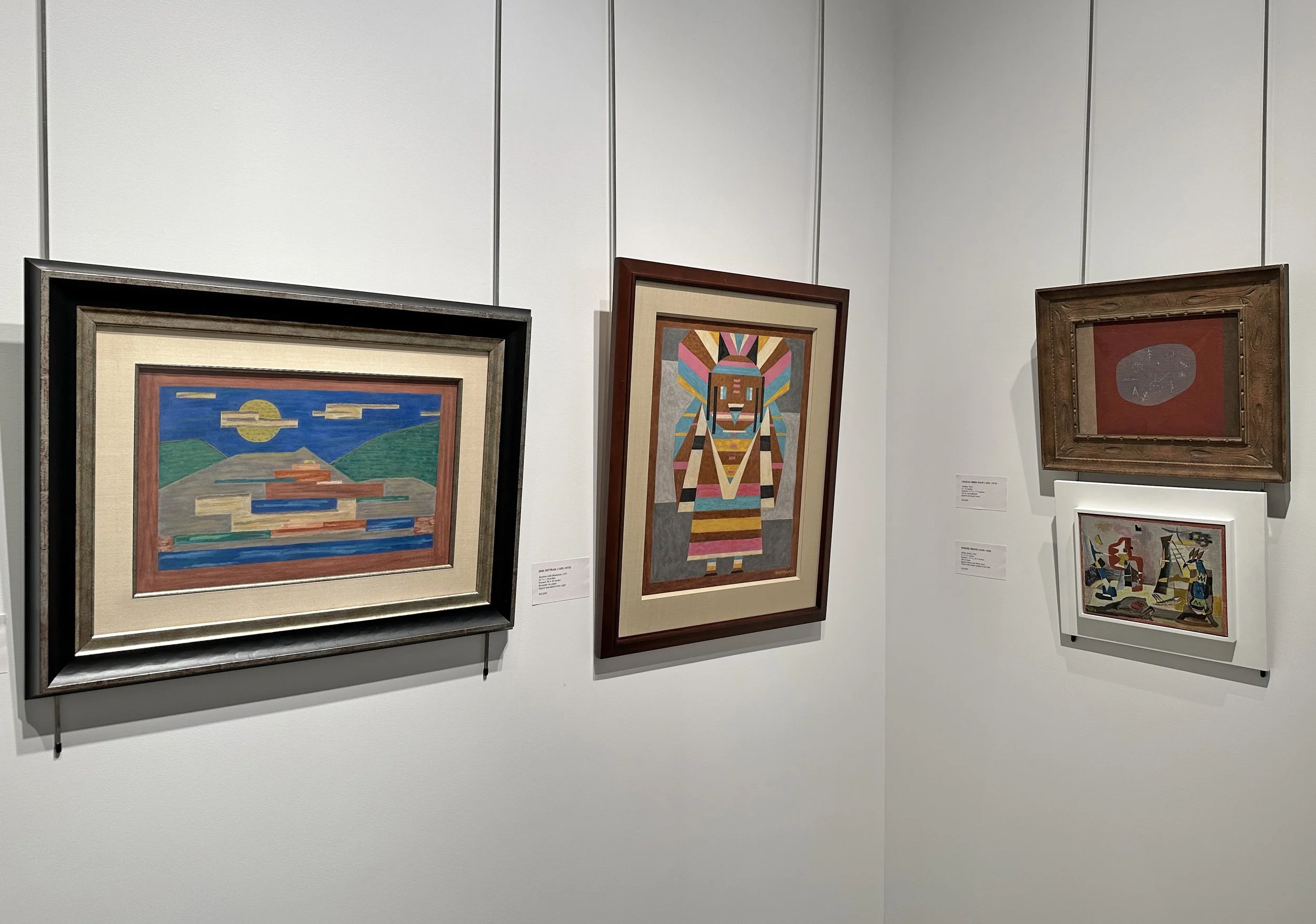
Twentieth century European artists distinguished their styles by developing theoretical distinctions and manifestos. For them, Cubism opened the door to many new branches of abstraction including De Stijl (Piet Mondrian), the Bauhaus (Wassily Kandinsky, Josef Albers, László Moholy-Nagy), and Abstract Surrealism (Miró). The Americans were more interested in ideas than theories and thus felt free to sample different styles and fuse together elements they liked. For example, the Russian-born painter Ilya Bolotowsky (1907-1981) saw Mondrian’s work at the Gallery of Living Art followed by Miró’s first exhibition at Pierre Matisse Gallery in 1932 and experimented with how to combine them, blending the restrained grid of Mondrian with the colorful biomorphic forms of Miró. This openness to synthesize two opposing styles demonstrates why American abstraction can be so fresh and innovative. The artists in our exhibition fall into three styles: biomorphic, geometric and spiritual. They all used the same formal elements of line, shape and color. The principal distinction is how each group treated depth in their paintings.

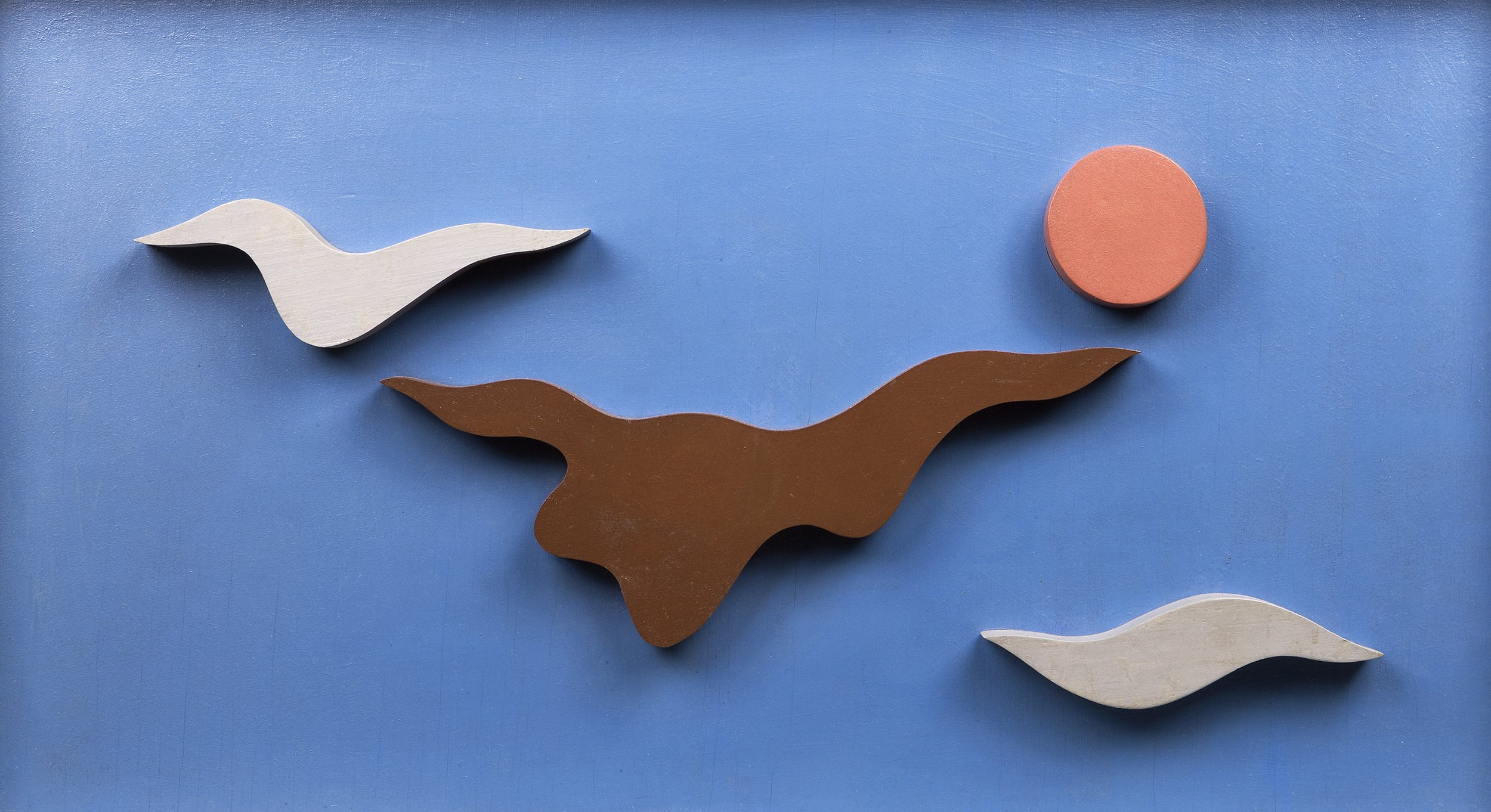
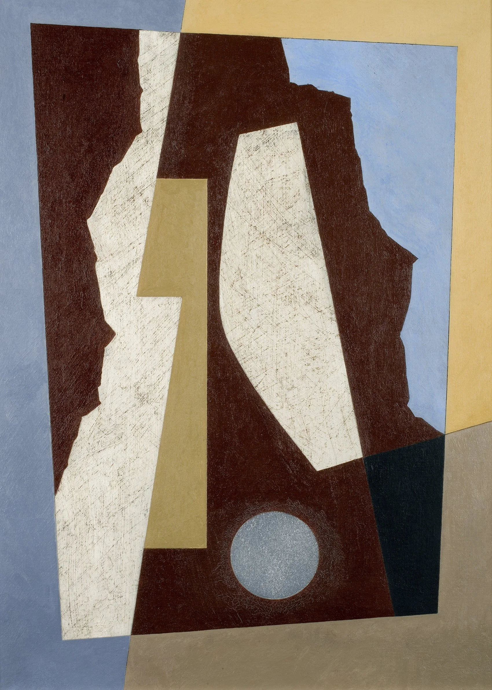
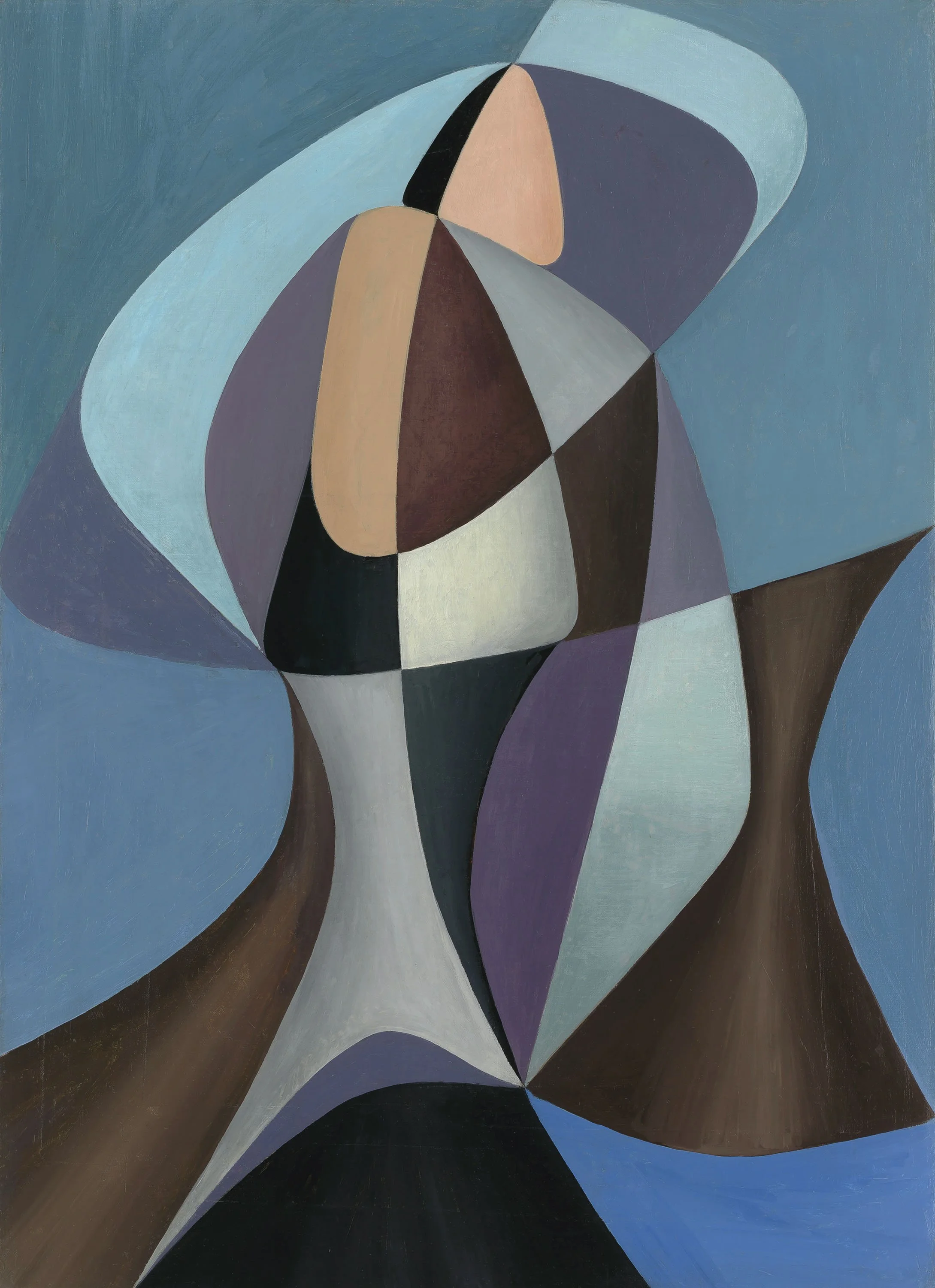
While Cubism set the path for abstraction, it was still based on observed figures or objects abstracted from something seen. Of the abstract styles, biomorphism is the closest to painting things seen as the term describes shapes that resemble but do not replicate natural forms. It is an organic rather than geometric approach to abstraction influenced by Miró. The Americans used biomorphism to explore sculptural form in the shallow depth of the picture plane. It helped many move through Cubism, taking from Picasso’s paintings symbols, shapes and lines to rearrange into their own compositions. The artists in our exhibition that most evidently evolved out of Cubism using biomorphism are Byron Browne (1907-1961) and George L.K. Morris (1905-1975). In Browne’s Still Life on Gray, 1945, the artist builds tension between depth and flatness with black calligraphic lines that form a structure accented by flat shapes in red, blue and white. The title suggests a tabletop arrangement, which the biomorphic forms make difficult to identify. In Morris’s two 1938 works Baroque and Concretion, shadows add a sense of realism to the flattened arrangements of shapes. In Baroque, the polka dots and patterns suggest Cubist collage. In Concretion, the black placed near the birch bark shifts the minimal shapes into three-dimensional forms in an indeterminate space. Both Browne and Morris used black lines throughout their compositions to provide structure to the layered biomorphic forms. Our exhibition offers two significant paintings with sculptural form by Charles Biederman (1906-2004). His floating forms suggest plant or sea life. The shallow depth of the picture plane emphasizes their volume. Biederman’s paintings show how the biomorphic style can be seen as Abstract Surrealism when the shapes and coloring feel otherworldly.

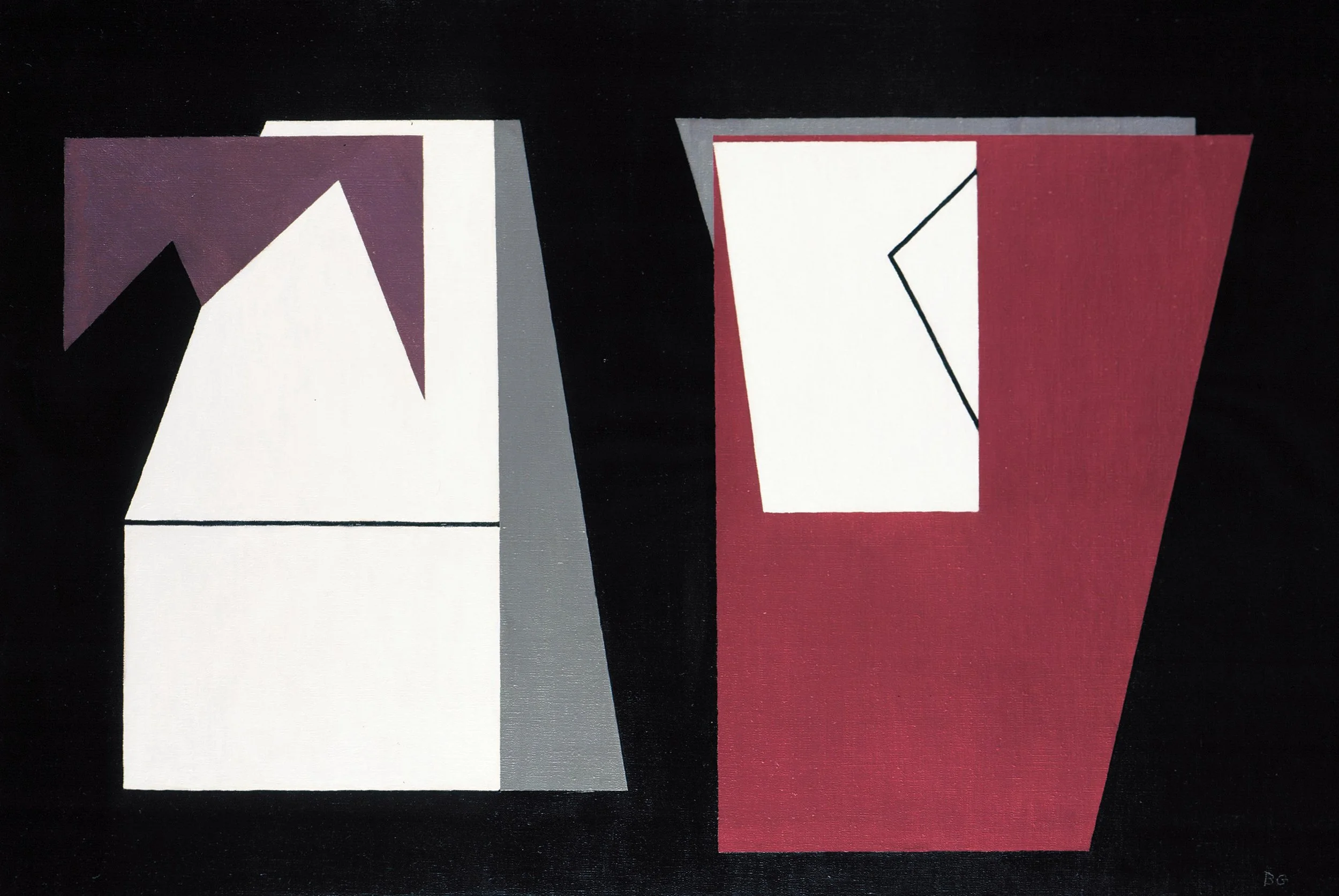
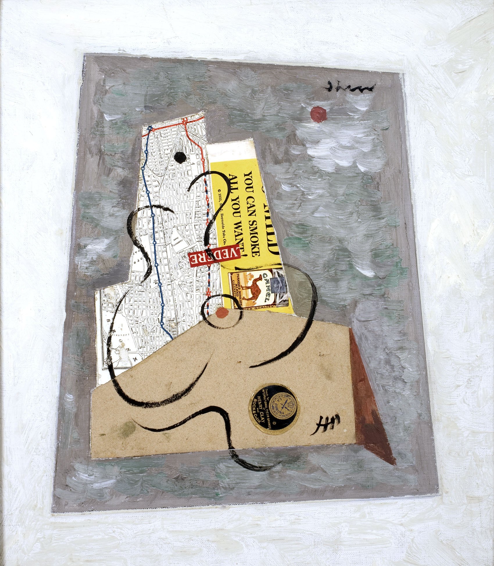
Geometric abstraction can be defined as the arrangement of shapes and colors within a flat picture plane.  Artists working in this style in both Paris and New York in the Thirties called their work non-objective or concrete. They aimed for a universal language of lines, shapes and colors without connection to people, places or things. This style gained prominence as Bauhaus teachers Albers and Moholy-Nagy came to the US in 1933 and 1937 respectively, followed by De Stijl artist Mondrian in 1940. All three joined the American Abstract Artists and participated in their annual exhibitions. Charles Green Shaw (1892-1974) used the geometry of the city to evolve out of Cubism. We see this in the 1936 paintings Interplay and Structured Composition where overlapping vertical shapes rely on their relationship to neighboring forms to create surface tension instead of traditional shadows or receding colors. In Interplay, Shaw enlivens the gray field around the central rectangles by adding sand for texture. In Structured Composition, he activates the entire canvas with quadrilaterals extending to the edge, moving away from Cubism’s centered composition. Jean Xceron (1890-1967) uses shifting colors within each rectangle’s strong black outline as its own effect rather than creating three-dimensional form in Peinture No. 211, 1937. By filling the canvas with action from edge to edge, Xceron breaks the tradition of figure-ground realism. Our exhibition includes two paintings by Ilya Bolotowsky (1907-1981) that show his evolution into a more severe geometry in the Forties after Mondrian’s arrival in New York. In Blue Structure, exhibited at the Museum of Non-Objective Art in 1946, the buoyant and colorful planes reference Miró while the blue structure containing them has Mondrian’s rectilinear restraint. In Centennial, 1949, the grid extends across the full canvas and each rectangle contains complex color arrangements. This painting is surprisingly an abstract portrait of a mining town near where Bolotowsky taught in Laramie, WY.

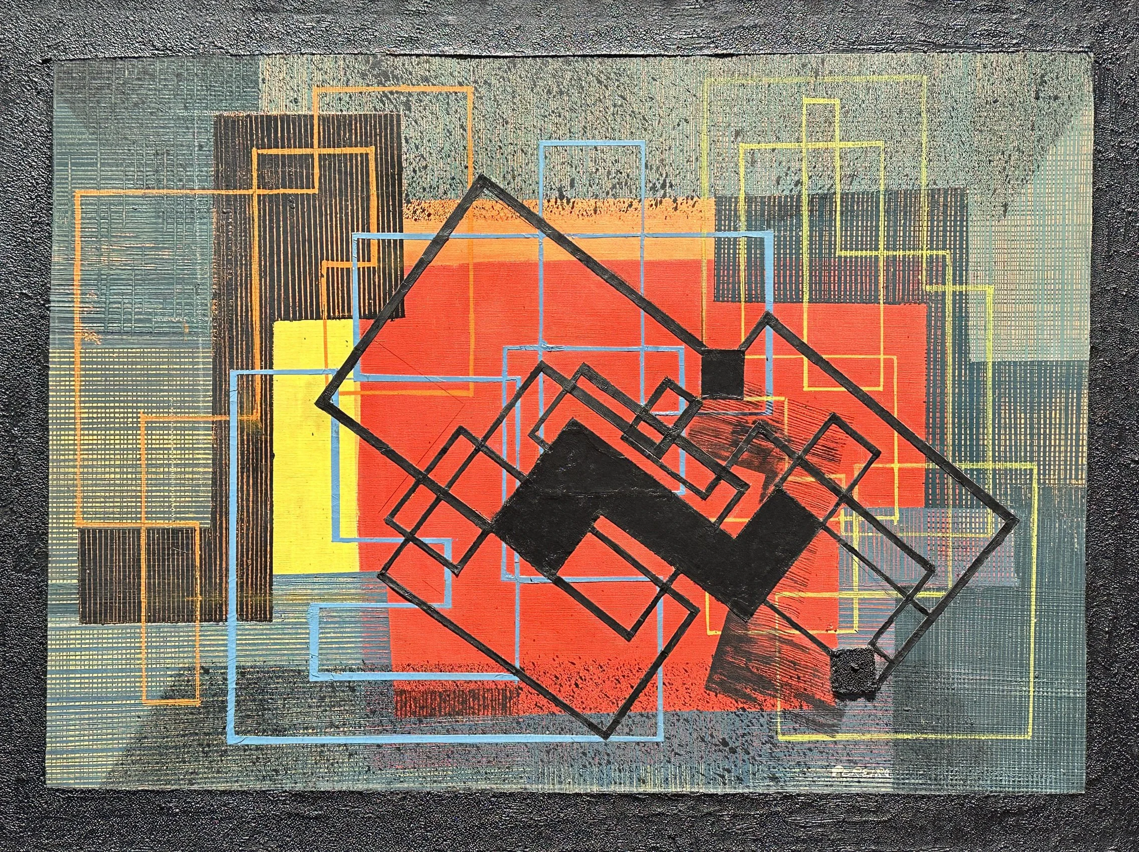
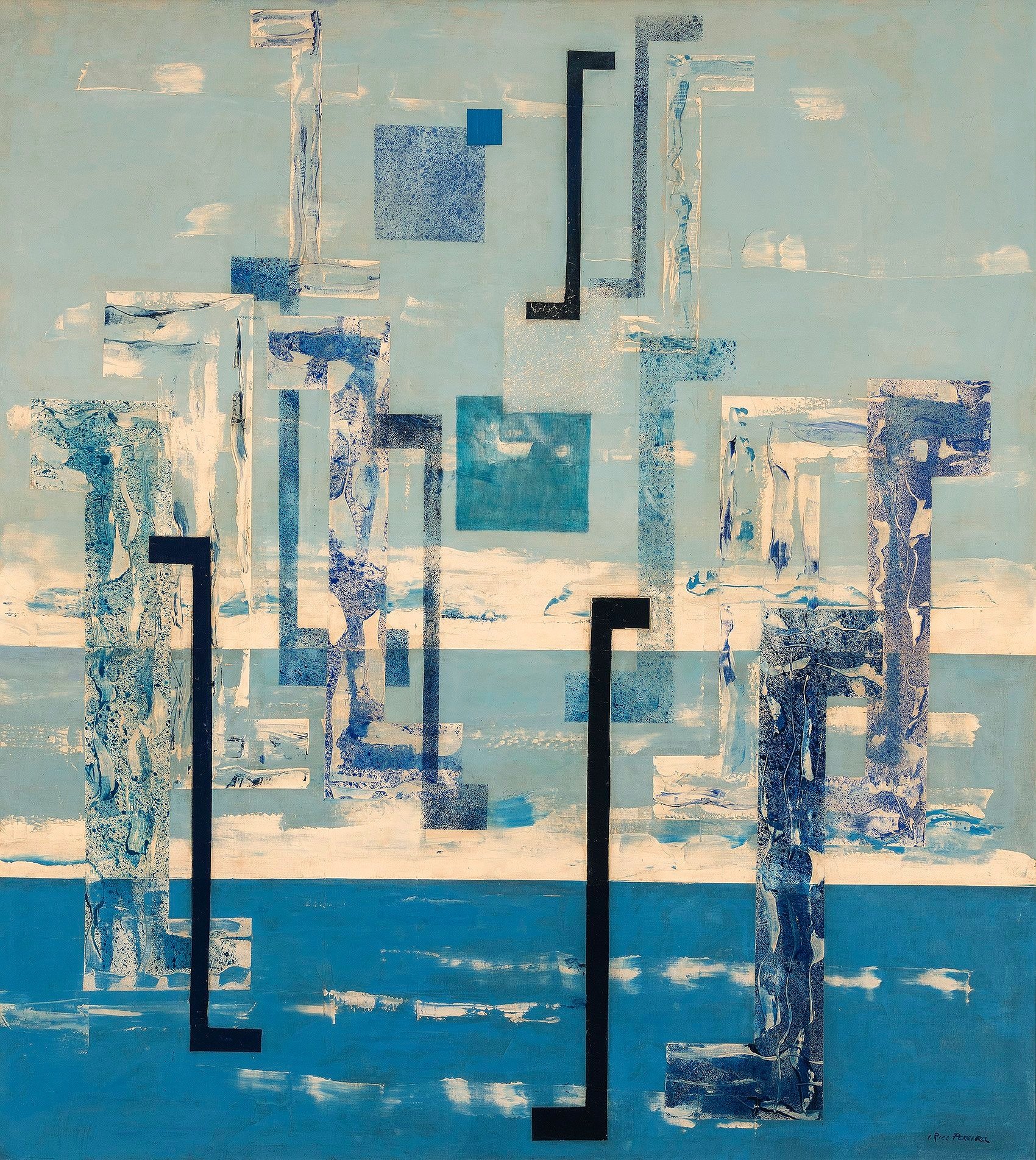
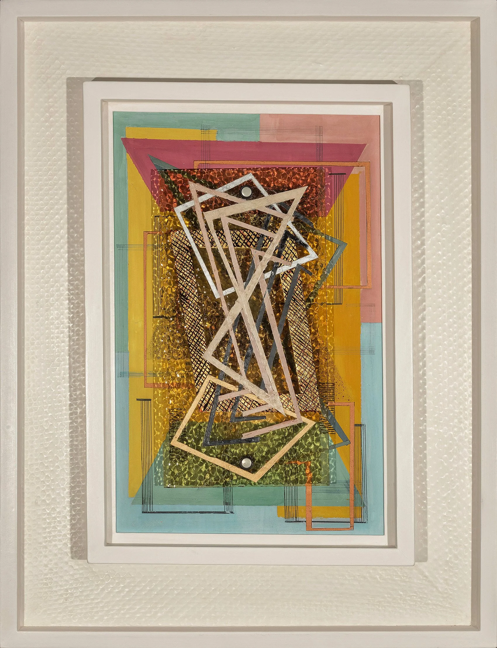
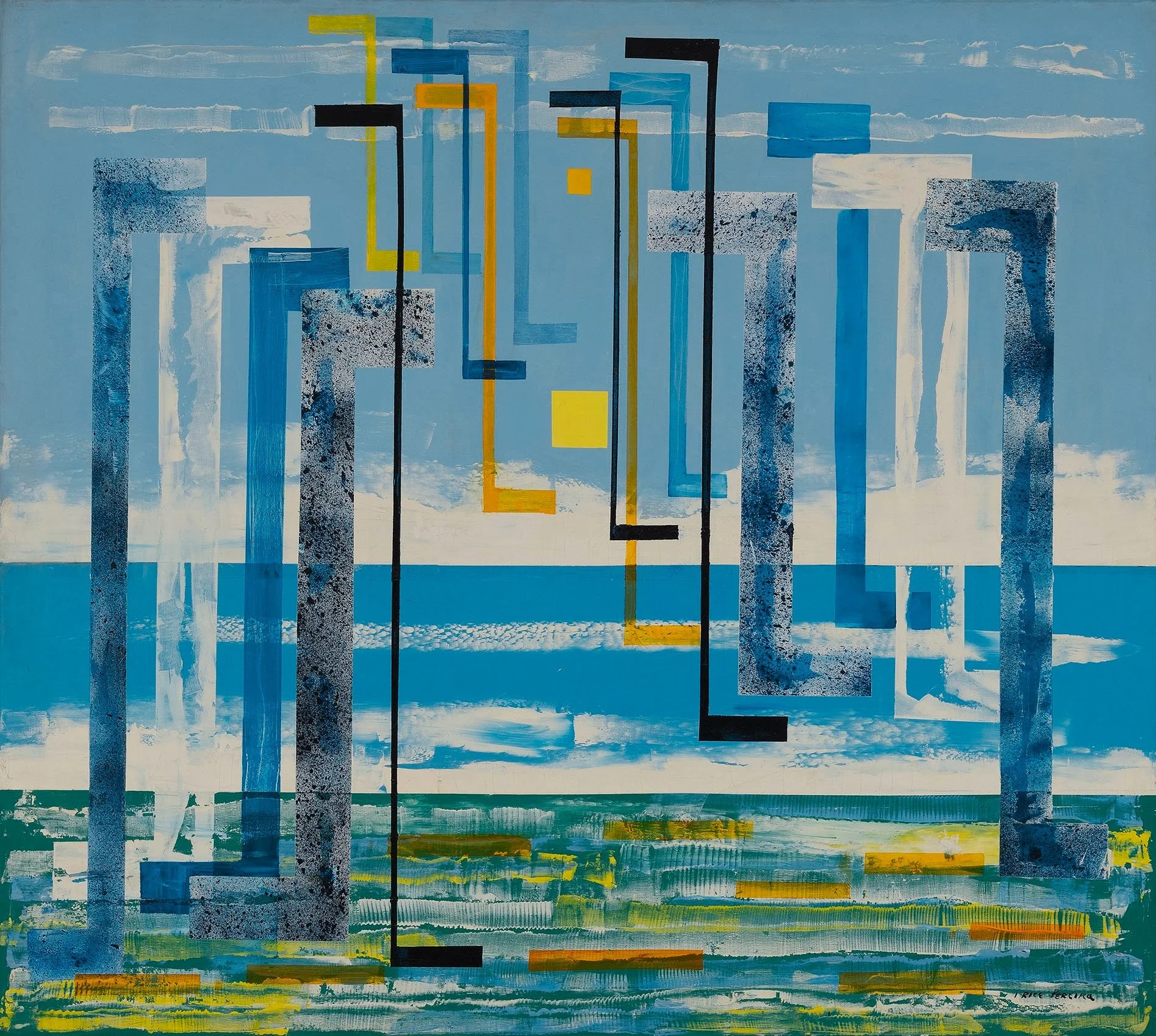
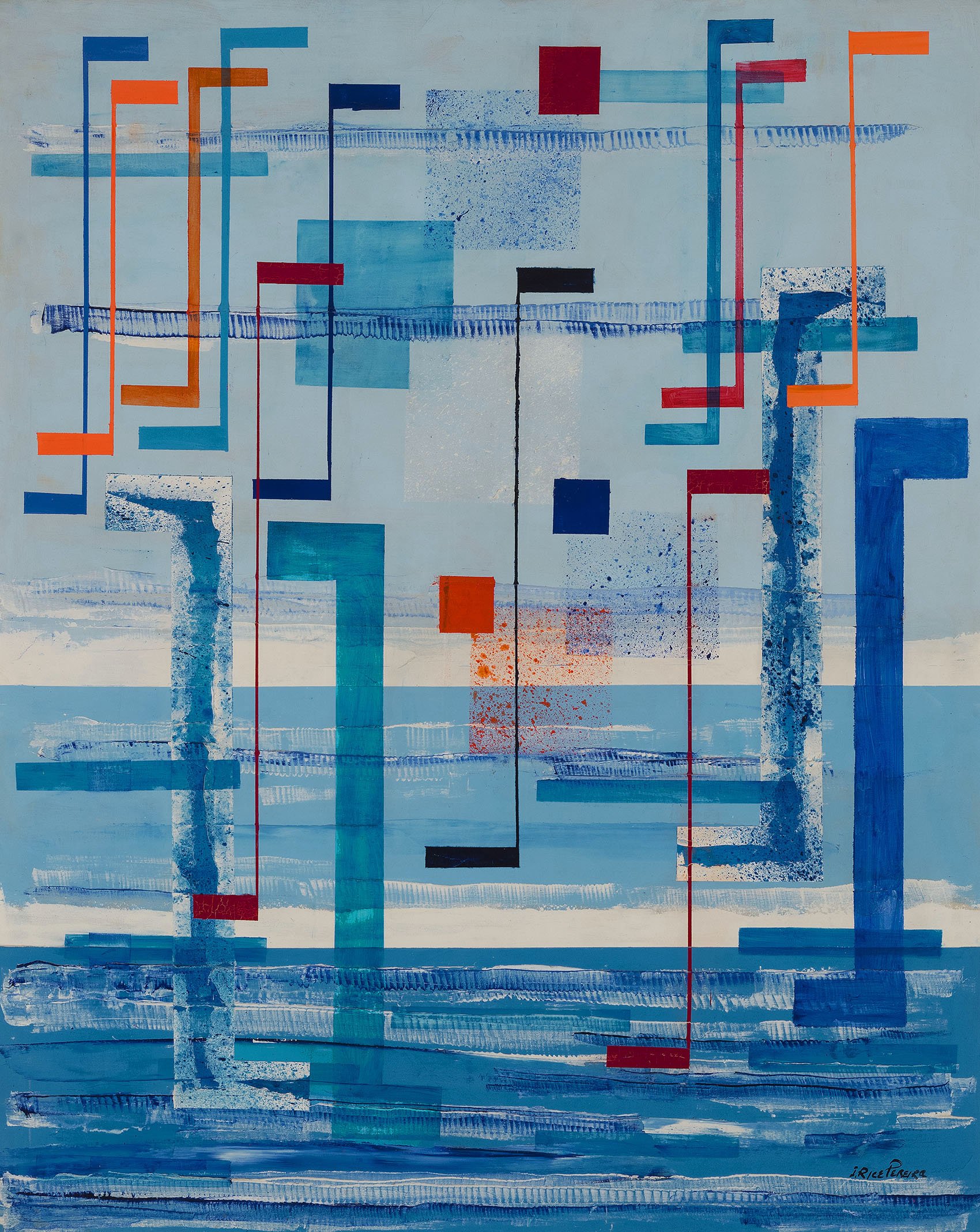
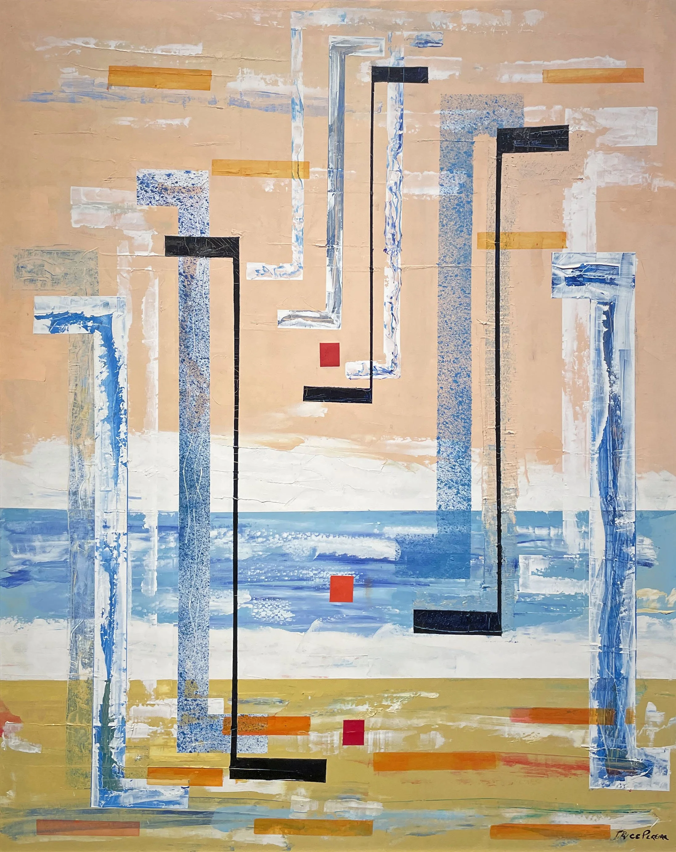
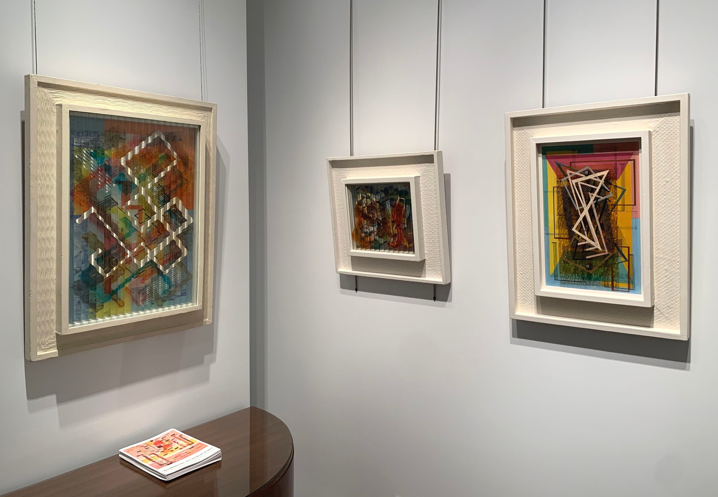
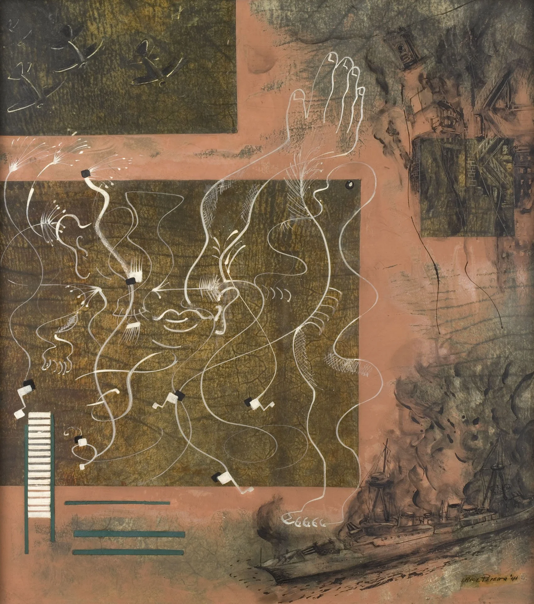
By 1940, a new development in geometric abstraction was spraying paint to experiment with depth and transparency. Harry Holtzman introduced the technique to Raymond Jonson and Charles Green Shaw in 1937-1938. At the same time, Moholy-Nagy arrived in Chicago and shared his vision of the future where artists use light and shadow effects projected onto a screen in place of paintings on canvas. This inspired artists to consider how to incorporate transparency into their current work. Shaw found the airbrush and motor too expensive, so he used stipple and spatter brushes instead in a 1941-1942 series including Square Divisions. Irene Rice Pereira (1902-1971) created her first pure abstractions in 1937-1938 as an instructor at the Design Laboratory, a WPA effort to create a New York Bauhaus for industrial design. Teaching from 1935 to 1939, Pereira used lessons from Moholy-Nagy’s The New Vision, translated into English in 1930, to make her students adept at working in a broad range of materials. Her students assembled collages that included rubbings of textured surfaces. Pereira incorporated these varied patterns into her first abstractions, distinguishing squares and rectangles in a composition with changes in texture. Pereira investigated transparency in her multilayered glass constructions starting in 1939 and then with translucent parchment in 1941. Pereira applied her new knowledge to paintings, as seen in Pendulum, c.1942 and Yellow Oblongs, 1945. In Pendulum, a solid black S-shape at the painting’s center is repeated as a transparent version at a different angle to imply a swinging movement. Another layer is made up of thin grid lines of orange, blue and yellow. Behind the S-shape and the grids is an arrangement of bold red flanked by orange and yellow. Pereira adds further complexity by spraying black trapezoids at top and bottom to emphasis the overall depth. In Yellow Oblongs, 1945, Pereira expertly uses sprayed and translucent layers to distort space, achieving on a single surface the same movement experienced in front of her layered glass works.

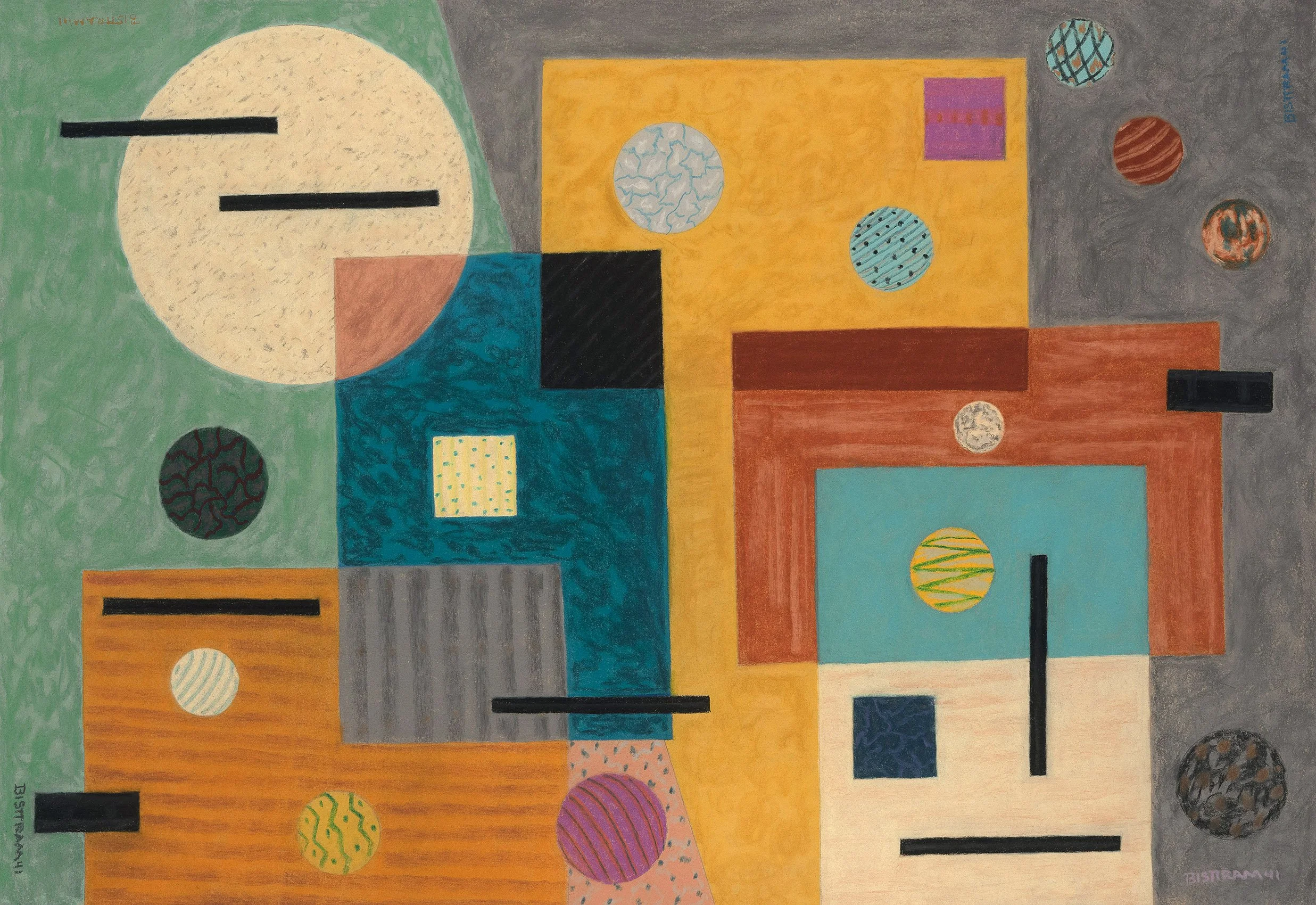
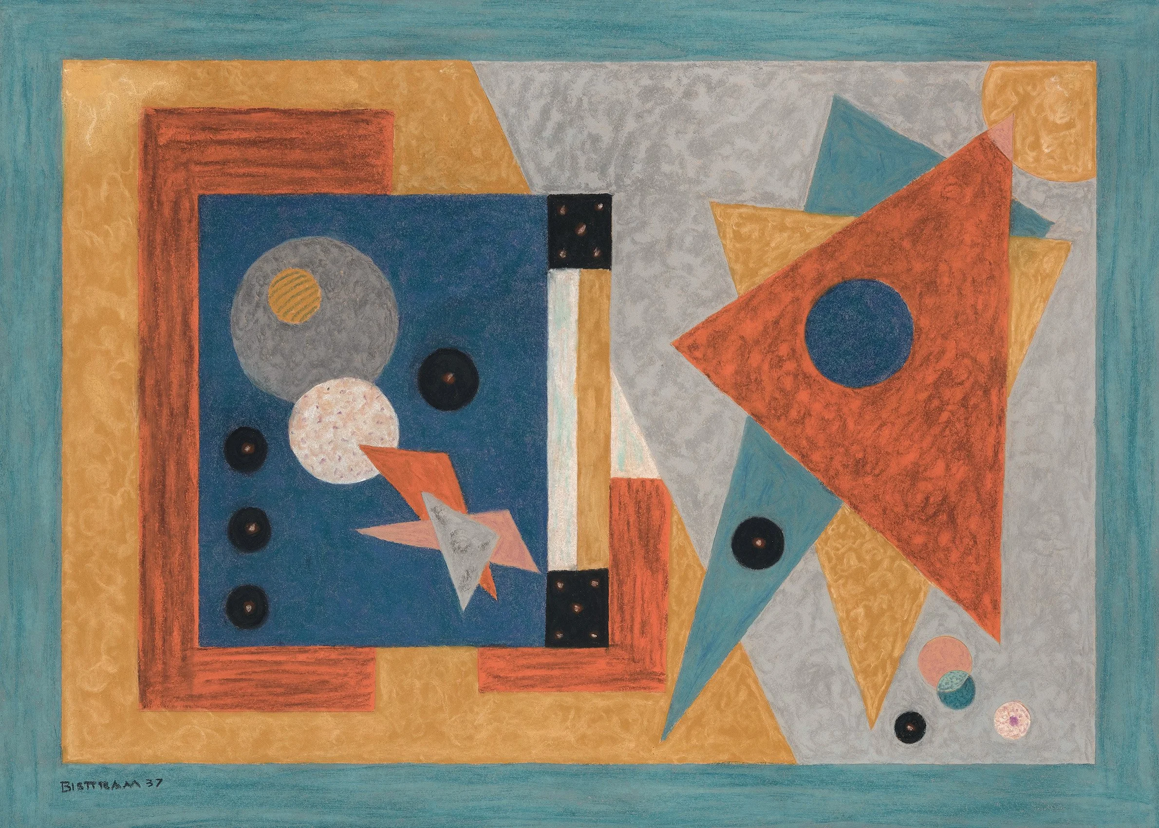
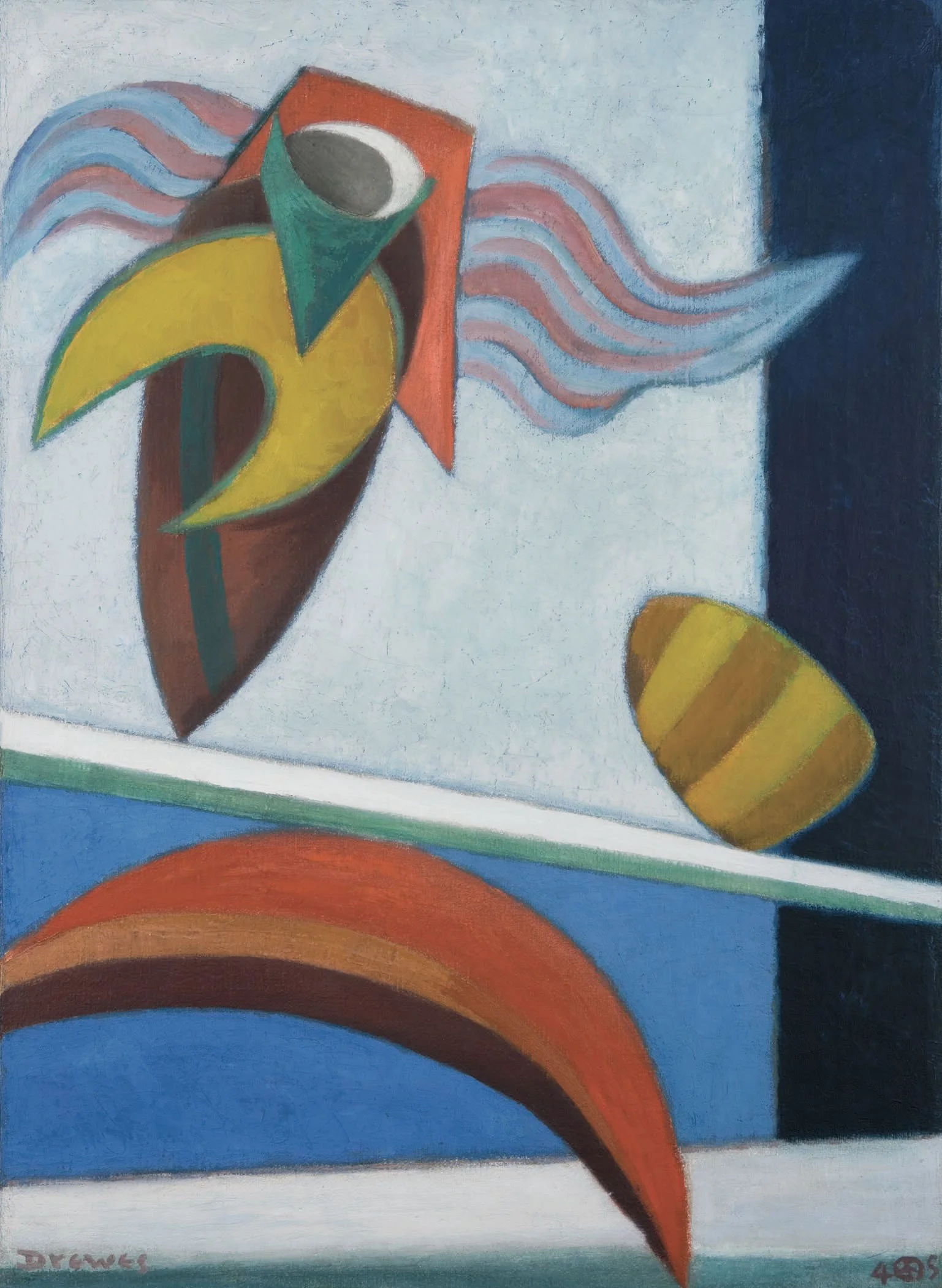
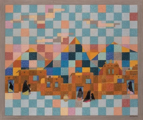
The artists that aimed for spirituality in their abstraction emphasized vertical movement to guide the viewer into higher realms of consciousness. The space in which the shapes and colors are contained is often indeterminant rather than flat or shallow. Kandinsky’s art was a source for this group. Kandinsky’s work was consistently shown from 1913 on; first at The Armory Show and then with Stieglitz in the Teens, with Katherine Dreier’s Société Anonyme in the Twenties, and by 1939 in the Guggenheim collection at the Museum of Non-Objective Painting. Many American artists working in the spiritual style exhibited alongside Europeans at the Museum of Non-Objective Painting in the Forties. The American artists read broadly, including on Theosophy and the teaching of Nicholas Roerich who established the Master Institute of United Arts in New York in 1920. Emil Bisttram (1895-1976) taught there and brought his learning to New Mexico where a group of artists formed the Transcendental Painting Group in 1938. Bisttram’s Celestial Alignment conveys this interest in broad spirituality as the light-filled circles reference the chakras while the vertical lines recall light seen through a prism. Our exhibition also includes Bisttram’s encaustic works that reference symbols and designs of Southwest Native American cultures. Werner Drewes (1899-1985) studied with Kandinsky at the Bauhaus in 1928 and the two exchanged letters until Kandinsky’s death in 1944. In Dynamic Center, 1940, arrows emphasize vertical motion and groups of short lines could be seen as steps to ascend, while the bright palette and circular movement of the biomorphic shapes create a sense of joy. Hilla Rebay (1890-1967) was an artist as well as the director of the Museum of Non-Objective Painting. She is represented by Delight, c. 1950 which lives up to its title with floating colorful orbs and moving ribbons of red and green. Rebay uses an atmospheric field of color as the background in which glowing yellow suggests dawn in the indefinite space. Maude Kerns (1876-1965), a West Coast artist, treats in a similar way her arrangement of geometric shapes that evoke Northwest designs, placing them at the center of a light-filled sky. Through their palette and forms these works are meant to provide the viewer with hope and a visualization of a greater universe around us.

While American abstraction of the 1930s-1940s mainly fits into the biomorphic, geometric or spiritual styles, the artists chose an abstract vocabulary rather than a strict philosophy, so in true American style many artists moved between these groups.

[ TOP ]

Modernism 1913-1950 | Realism of the 1930s and 1940s | Abstraction of the 1930s and 1940s | Post-War | Selected Biographies

GABRIELE EVERTZ: WORKS FROM 1987 TO 1995

September 4 - November 8, 2024

For availability and pricing, call 212-581-1657.


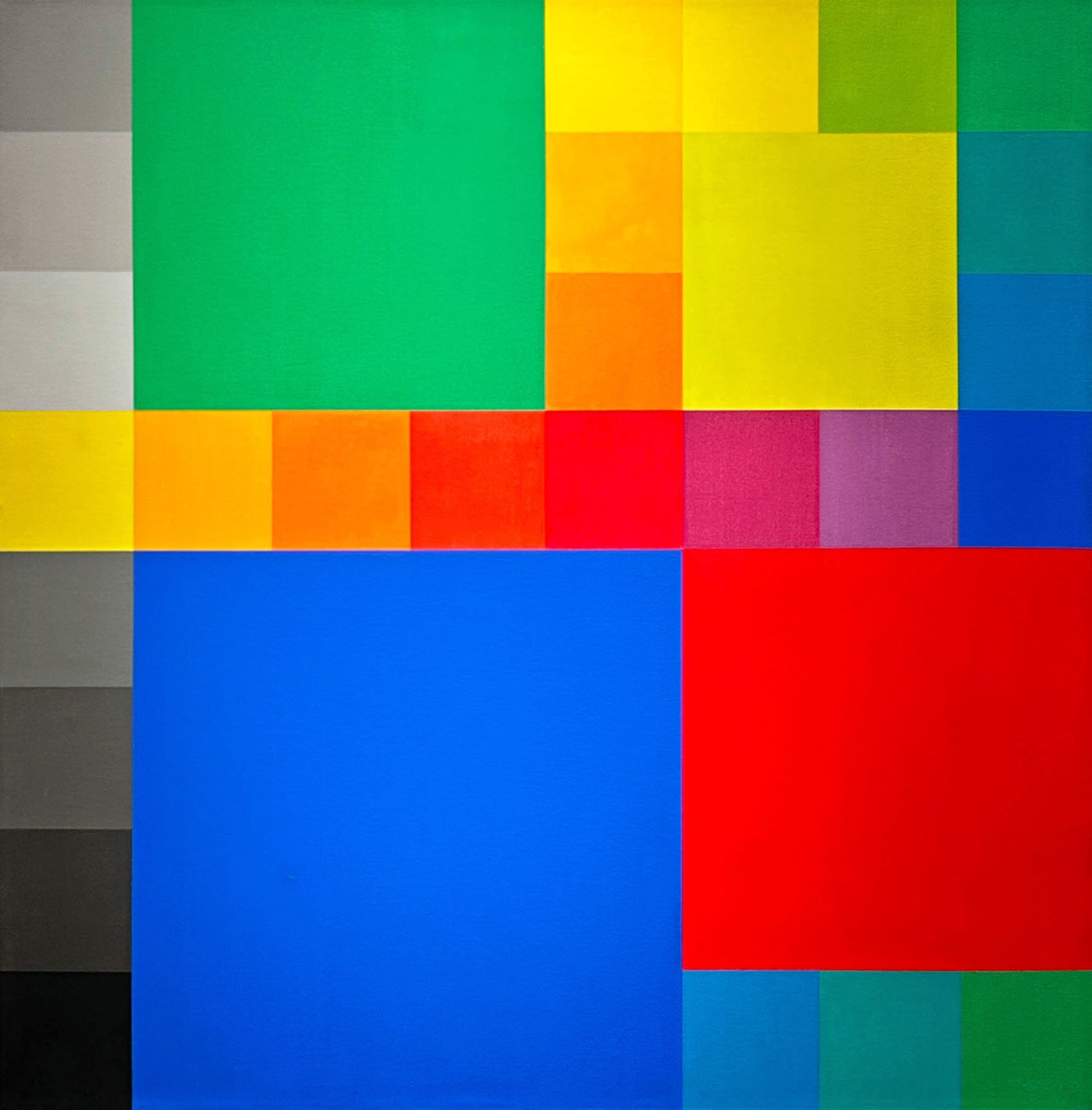
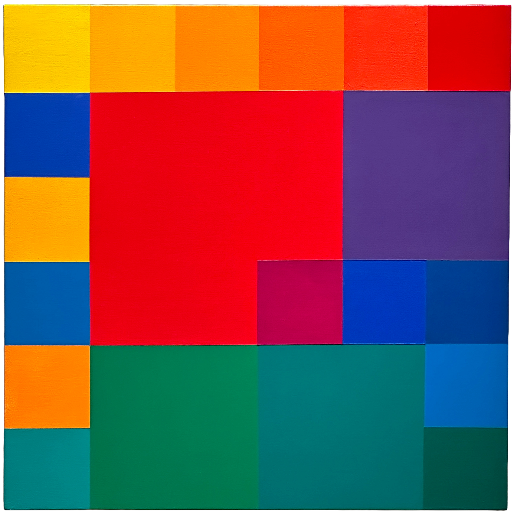
For this introduction to the works of Gabriele Evertz we have selected two significantly sized paintings from 1990 and three small paintings from 1987 to 1995. During this period, Evertz used collage to test color relations. She found the square as a basic formal unit de-emphasizes the viewer’s concern for shape while maximizing color interaction. 

Evertz was included in the important catalogue The Optic Nerve accompanying the 2007 exhibition at the Columbus Museum of Art, Ohio to show the study of perception and color theory remains relevant. The same year she was in Optical Edge at the Pratt Manhattan Gallery.  

Evertz’s work investigates sensations and perceptions. She uses the history and theory of color as basic tools of organization. She chose a uniform painting surface so the viewer can focus on the energy and relationships between the colors, effects which can shift over the course of observation. Informed by neuroscience and intuition, Evertz aims to reveal in her painting a new visual experience for the viewer in the universal language of color. She is open to the viewer’s response ranging from reason to rapture as her color brings a heightened awareness of being in the world.

In Evertz’s early works seen in our exhibition she uses a color system organized around Johannes Itten’s twelve hues of the color wheel plus black and white. Evertz settled on this system after years of experimentation. The rare use of gray in Painting Type III, 1990 presages her use of the value in more recent years as she discovered it is a very active, not neutral, tool in her progressions of chromatic hues. In the 1993 exhibition Presentation Painting at the Hunter College Art Gallery, her work is described as a marriage between color theory and intuition. In more recent years as the definitions and theories of abstraction have loosened, Evertz has been more open about the influence of nature and poetry. Her recent work of vertical and diagonal lines which she describes as edges of colors can reflect her daily observations of nature within the city.

Gabriele Evertz was born in Berlin and emigrated to the US at 19. After a career in architecture, Evertz moved into painting. She completed a BA in Art History followed by an MFA at Hunter, graduating in 1990. She frequently exhibited at Hunter College Art Gallery and with the American Abstract Artists since she was elected a member in 1996. In addition to her painting practice, Evertz was Professor of Art, Painting in Hunter College’s Department of Art & Art History, New York from 1990 to 2018. She is part of the Hunter Color School, alongside other color painters, including Vincent Longo, Doug Ohlson, Robert Swain, and Sanford Wurmfeld. She was a visiting critic at the Yale School of Architecture in 2002.


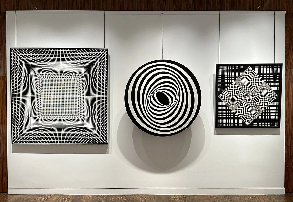
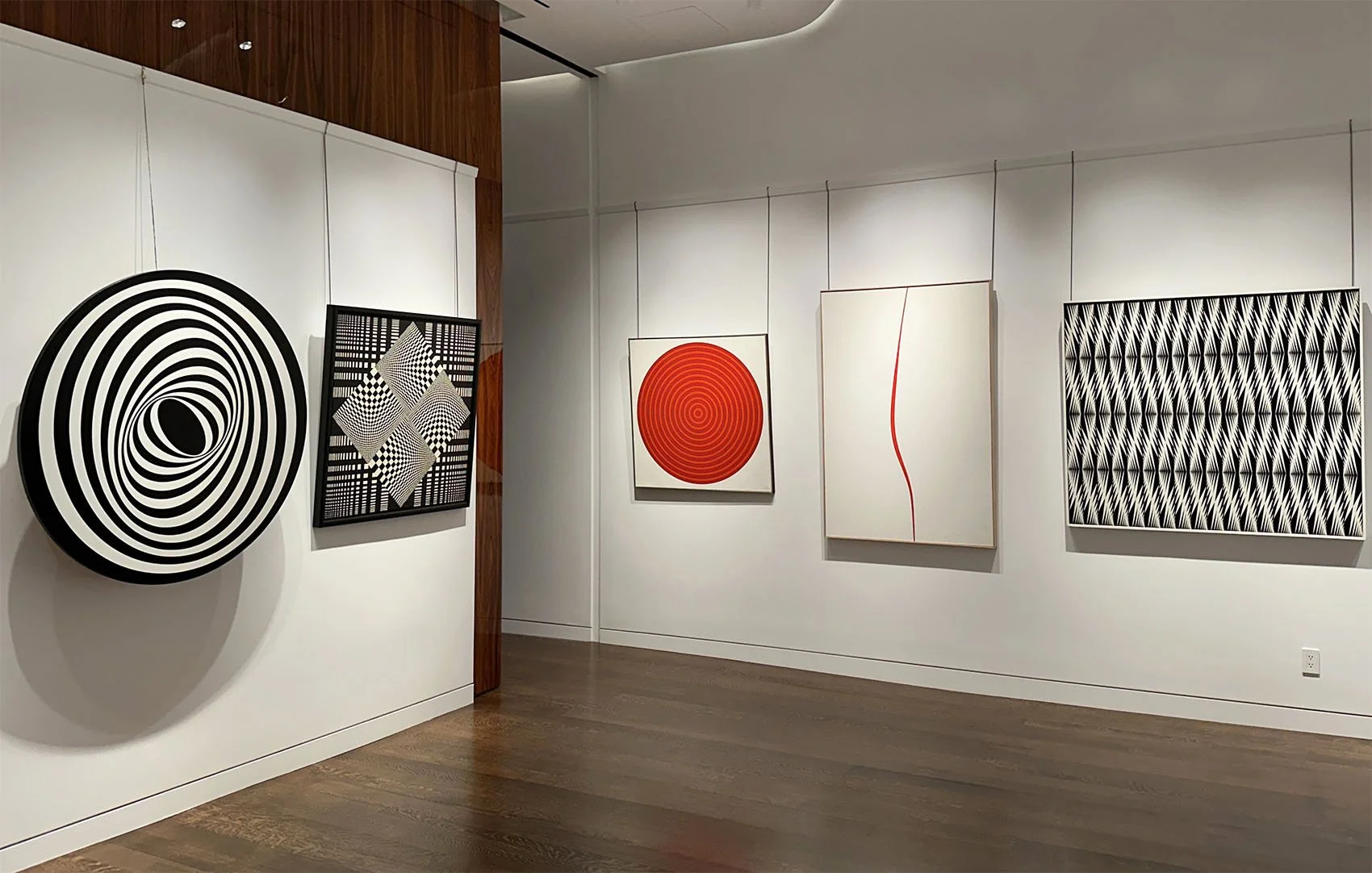
AMERICAN OP ART: SYSTEMS, PATTERNS, AND LIGHT

September 4 - November 8, 2024

Installation Views | Essay | Artists in Electric Op | For availability and pricing, call 212-581-1657.


Installation Views

Essay by Emily Lenz

Our gallery first exhibited Op art in 2005 because we saw its importance as a connection between the pioneers of geometric abstraction in the 1930s and contemporary art. In today’s digital, installation, and interactive art, we see Op’s influence in the engagement of the viewer as it was the first movement to explore new understandings of the psychology and science of perception. Many Op artists were trained by Bauhaus teachers or influenced by international Constructivists so they combined traditional methods of painting and sculpture with developments in materials, particularly plastic, to achieve new crispness and light. Op art had a role in the shift from art as object to art as experience that remains relevant today.

Our gallery exhibition supports two museum exhibitions that will look at Op art’s relationship to the computer: Electric Op at the Buffalo AKG Art Museum (September 27, 2024 – February 3, 2025) and Electric Dreams at the Tate Modern, London (November 24, 2024 – June 1, 2025). These exhibitions will focus on how Op art set the foundation for programmed and digital art. Both exhibitions will consider how the use of mathematical principles, motorized components, and new industrial processes like Plexiglas, by the Op artists set precedents for experimenting with digital technology in the 1970s and 1980s using early computing systems.

The first American exhibition of computer art Computer-Generated Pictures included black and white prints by engineers A. Michael Noll and Bela Julesz. It was held at the Howard Wise Gallery in 1965. Our artists Francis Celentano and Bill Komodore were represented by the Wise gallery, having their first exhibition there jointly in 1964. During the computer exhibition, Celentano’s hard edge paintings hung on the surrounding gallery walls suggesting an early affinity between Op and digital art. The 1968 exhibition Cybernetic Serendipity: The Computer and the Arts at the Institute of Contemporary Arts in London was the first international exhibition of computer art. 60,000 visitors came to see computer-aided creative activity in visual art, music, poetry, dance, sculpture and animation. The exhibition traveled to the Corcoran Gallery of Art in Washington, DC and the Exploratorium in San Francisco. In 1970, the Jewish Museum held the exhibition Software – Information Technology: Its New Meaning for Art. It included the work of conceptual artists John Baldessari, Nam June Paik and Lawrence Weiner among others. These exhibitions introduced the potential of computers in art.

In 1960s, the idea of programmatic thinking was more on artists’ minds than actual computer use. Computers were still institutional; artists accessed university computers after-hours or paired up with corporations through projects like Billy Kluver’s Experiments in Art and Technology (E.A.T) launched in 1967 and LACMA’s Art & Technology Program. Art was programmed in terms of artists setting up systems whereby a work could be reconstructed if the same rules were followed, but much of the work was done by hand or simple motors.

The works selected for our gallery exhibition demonstrate the use of systems, patterns, and light to investigate perception. Each artist in our exhibition might use systems, patterns, and light, but we have placed them into the category we think most essential to their work.

System
1.a set of things working together as parts of a mechanism or a interconnecting network.
2. a set of principles or procedures according to which something is done; an organized framework or method.

In our exhibition, three of the artists Tadasky, Gene Davis, and Leroy Lamis built systems that hypothetically could be replicated through simple instructions. However, the artist’s individual skill was required for execution. For example, Lamis received a commission to make 13 New York State Council for the Arts prizes in 1970. Unable to find any fabricator to his liking, he made each by hand. A basic framework allowed for a deeper investigation of color with each subsequent work. Davis’s stripes act as containers of color to test out daring color arrangements that defy color theory. In Tadasky’s concentric circles, he investigates movement, depth and dimension. They achieved a machine-aesthetic though all were done by hand.

Our exhibition includes Tadasky’s MA-105 made shortly after he arrived in New York from Japan in 1961. It shows his early interest in dimensionality and predates Tadasky’s system of perfect circles contained within a square canvas, as seen in C-185, 1965. Tadasky used fine Japanese brushes and a turntable for these later works. While Tadasky’s paintings appear to have mechanical precision, the slight wobbles of the rings give the painting a distinct vibration and energy.

New technologies are best introduced in simplified forms with few functions and Op artists often worked the same way. Many worked out compositions in black and white since color adds its own dynamics and interpretation. This allowed a focus on movement using positive and negative space, without color adding another element of push-pull.

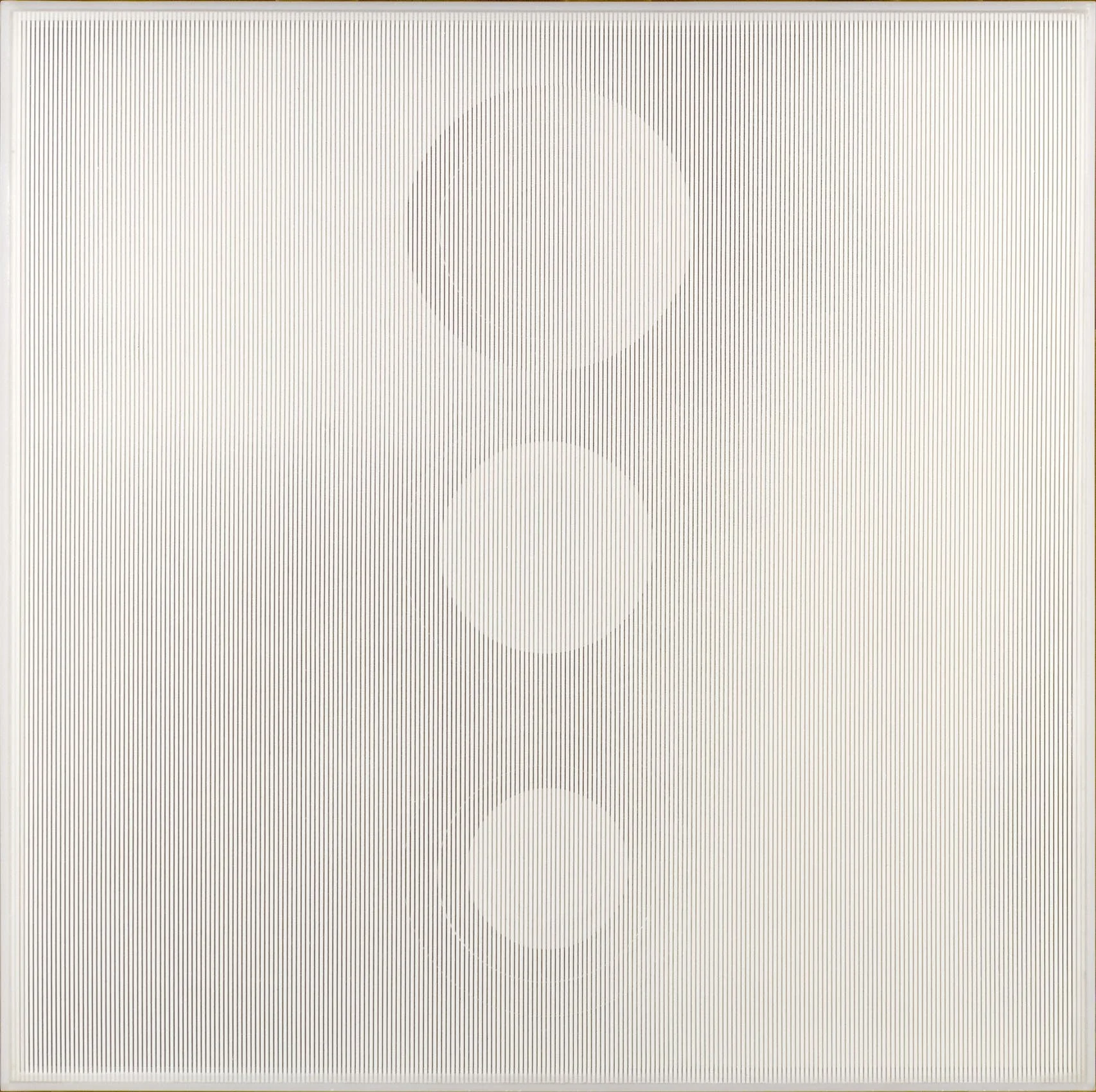
Francis Celentano moved from Hard Edge into Op through black and white works. From 1965 to 1968, he manipulated opposing black and white shapes to work out “visual destabilization” in his paintings. Our exhibition includes Elliptical Kinetic Painting, 1967, one of the five kinetic paintings Celentano made. Another is featured in the Albright-Knox exhibition. In them, Celentano experimented with an arrangement of concentric ellipses bounded by a circle. He used studies and collages to find the exact arrangement of his composition. To radiate a specific pulsing rhythm for each kinetic work, he designed, constructed, and timed the motor. In 1990 Celentano used Targa software to map out varied arrangements of small squares of color in the Electra series. Up close the squares resemble pixels and work in the same way creating an overall field of glowing uniform color when the viewer steps back. One of these works is also in the Albright-Knox exhibition.

In the early 1960s, three artists, Frank Hewitt, Ernst Benkert and Ed Mieczkowski, formed The Anonima Group in Cleveland to investigate the psychology of perception. They set a program of limits for each project that the artists explored separately. This demonstrated the characteristic problem of the painter who was to produce with the same materials something different each time. The instructions for their 1965 project also served as the title for their exhibition Black/White and Gray 24” Square. Each artist contributed ten paintings for the New York exhibition that traveled to the Institute of Contemporary Arts, London and Galeria Foksal in Warsaw in 1966. Pursed and Munchin Henries were part of this project. While the artists were programmatic by setting shared limits on their work, the parameters of each project led to a variety of colors, patterns, and arrangements in their paintings.

Another part of systems is the inherit structure they can give a work. Both Frederick Hammersley and Leroy Lamis were minimal in their use of colors and more interested in form. Lamis was limited to the available colors offered by Plexiglas in his concentric cubes sculptures and Hammersley preferred to work in two or three colors. Both adopted early computing which could demonstrate process and shape but came up short on color.

Our exhibition includes the painting Sanforized which Frederick Hammersley discussed in the MIT journal Leonardo focused on the use of science and developing technologies in the arts. Hammersley wrote in the April 1970 issue: "The title Sanforized means preshrunk and suggests stability. At the same time, there is a switch of positions in the parts. Usually at first the black squares appear on top of the white. And then, the white can appear as if it were on top of a black field. There is a third shift in emphasis: the central vertical row of squares can appear as a column across which there are three horizontal white bands, the ends of which are black squares." Hammersley took advantage of our unstable reading of black and white to create movement within a restrained composition. Hammersley was introduced to Art1, an early program for making art using a computer, when he began teaching at the University of New Mexico in 1968. He made many computer-generated drawings from late 1968 to early 1970. Screens were not yet part of a computer set up so images were generated through plotters where an armature moved across a surface as it was fed data. This resulted in early computational art being inevitably geometric.

In the late 1970s Leory Lamis started using computer software to activate his cubes into progressions of color, pattern and transparency. He exhibited his software programs as an installation of computers and monitors on metal bases he painted and designed. Once he got an inkjet printer in the early 2000s, he printed screenshots of his programmed drawings to record them for the long term.

Pattern
1. any regularly repeated arrangement, especially a design made from repeated lines, shapes, or colors on a surface.
2. a particular way in which something is done or organized, or in which something happens.

To some extent all of the artists in our exhibition use pattern. We distinguish patterns from systems for the artists whose compositions change from one to the next. Our system artists still used the viewer’s tendency for pattern recognition. For example, Gene Davis used the viewer’s expectation of pattern to activate his paintings with unexpected colors bright colors to add rhythm and juxtaposition. In Black Staccato, c. 1965, turquoise, lime green, pink, and orange add beats of vibrancy in an arrangement of black, gray and blue stripes.

Margaret Wenstrup studied art in New York with Ralston Crawford in 1953. She returned to Cincinnati and began to work in geometric abstraction. In Whirligig, 1964, she layers patterns in paint. Against a backdrop of woven black lines, four square twisting units make up a central diamond. Combining her art training with her interest in the folk art of quilts and weaving, Wenstrup developed her own form of Op art before its popularity spread in 1965 when the Museum of Modern Art’s Responsive Eye exhibition traveled.

Bill Komodore used repetition of forms to create movement and animate a flat matte surface. He explored the tension between the center and edges of a canvas to draw attention to its surface as a dynamic space of indeterminate depth. Komodore addressed this by creating a single central field activated by the contrast of light and dark along the canvas edge as seen in Ten Ten Fifth Avenue, 1967. Komodore explores the ambiguity between movement and stillness and closed and open spaces in an overall minimal composition.

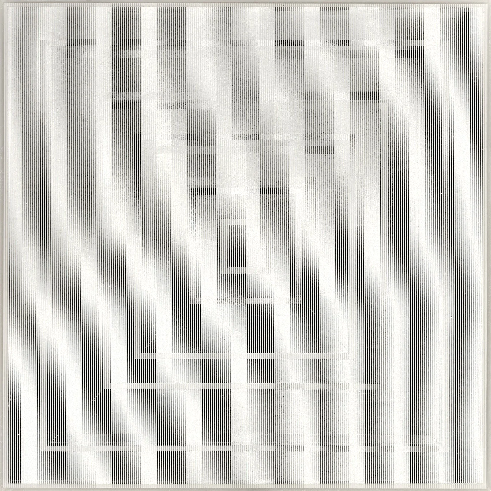
Both Mon Levinson and Reginald Neal used screen printing for its efficiency and uniformity for their materials, maximizing their ability to explore the effects of patterns. The transparency of Plexiglas allowed both Levinson and Neal to investigate the moiré effect caused when two sets of parallel lines overlap. The resulting simulation of movement occurs as the viewer’s sightline changes, generating new patterns as the eye unconsciously ties together new points of intersection. In 1964 Levinson started to make Plexiglas construction in black and white to examine how the intensity of the moiré effect could be controlled by the width, tone, and distance between the sets of lines. He investigated this with a series of geometric construction between 1964 and 1967 including Passing the Squares, 1966 and Switched on Squares: Stacked, 1966. In the 1950s Reginald Neal was an established artist and printmaker credited with advancing the development of color lithography. In 1964 he started cutting his prints into arrangements of symmetrical patterns, incorporated color by working in colored inks for his lines or incorporating different colored plastics as the backing. The efficiency of screen-printed lines allowed Neal to experiment more easily with the patterns and color changes.

Light
1. something that makes vision possible
2. the sensation aroused by stimulation of the visual receptors

Artists have always used new technology to achieve their vision, such as the camera obscura for Vermeer or the portable Kodak Brownie for the Precisionists. By the 1960s both the Second World War and the Space Race produced new technological processes and materials. This opened the door to exploration of both real illumination and implied light through color theory. Our Op artists use both real and perceived light. The high contrast of black and white can create flashes of yellow or blue more luminous than a painted color can achieve. The sculptor Leroy Lamis chose Plexiglas for his material because of both its translucency and its distinct way of transferring light through its edges.

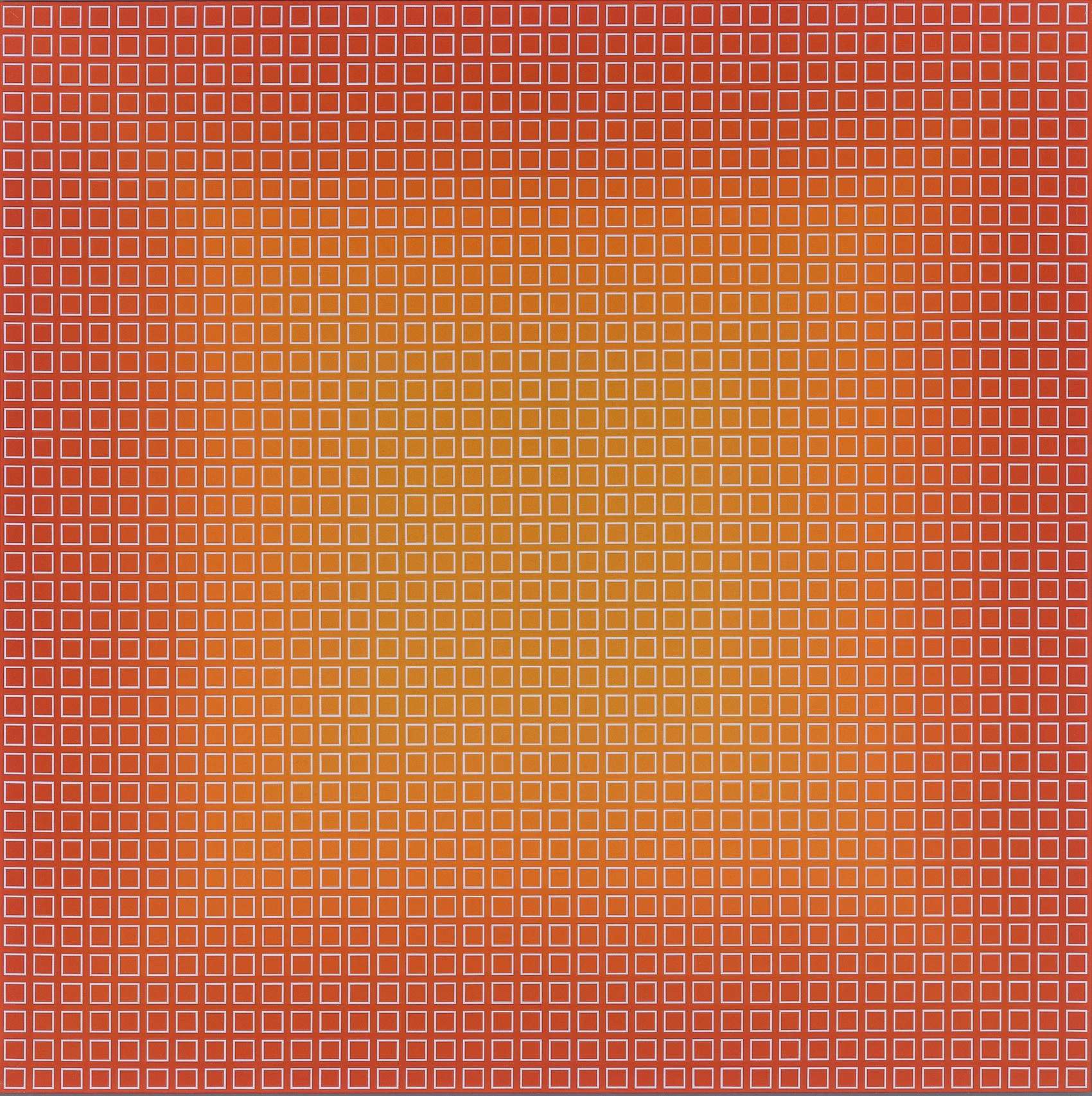
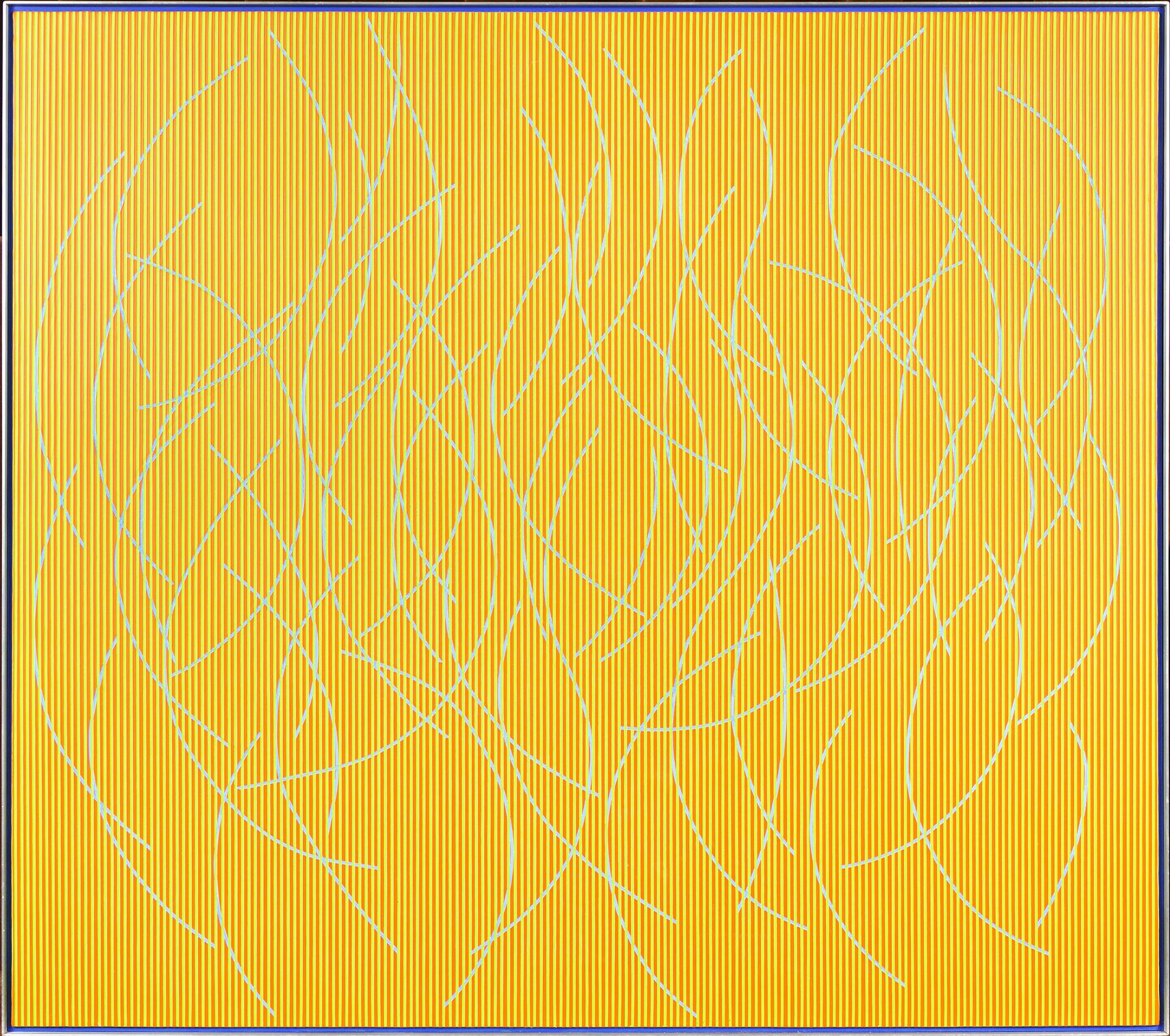
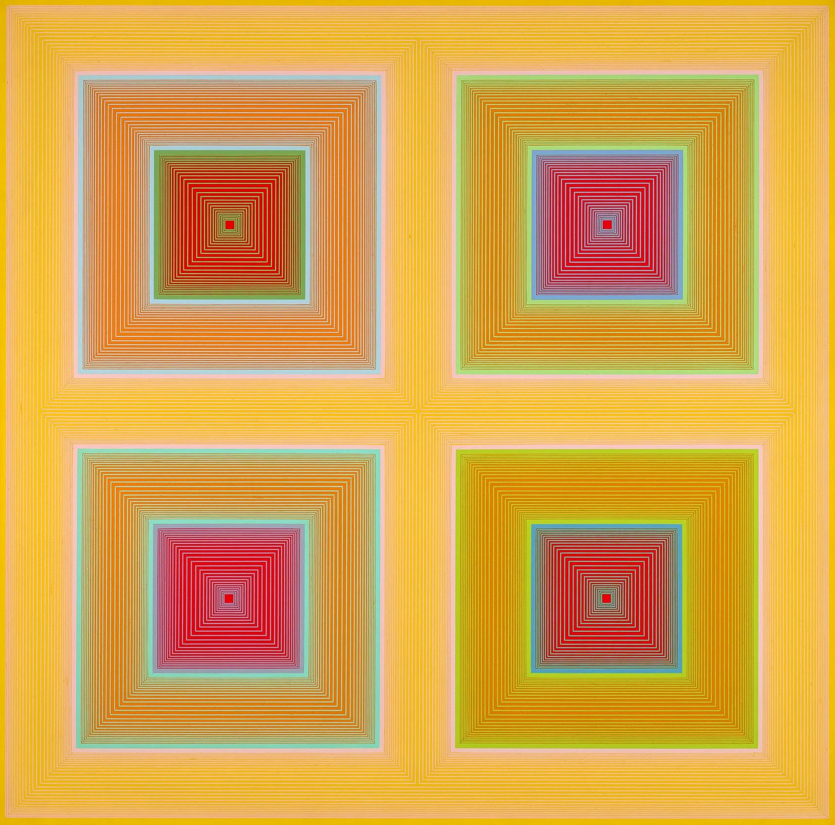
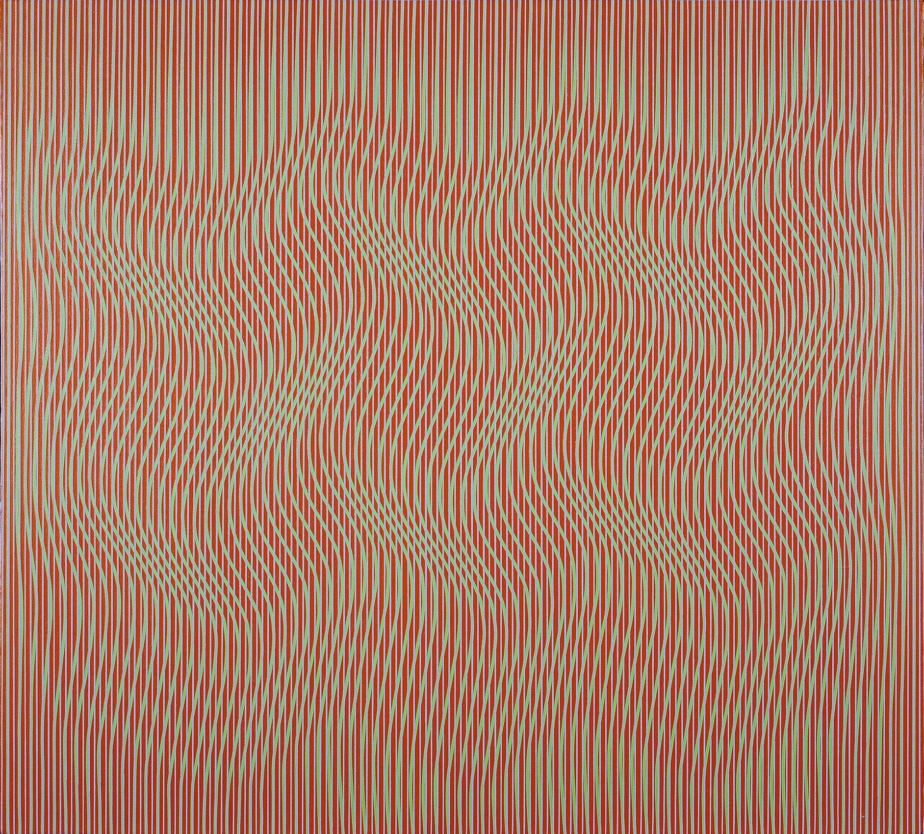
Richard Anuszkiewicz and Julian Stanczak studied with Josef Albers at Yale and expanded on his color theory to create works that show how we perceive color. The reading of light in their paintings transfers a flat surface into an environment or experience. Anuszkiewicz applied Albers’ theories on color interaction to measured, geometric compositions of precise linear patterns within gridded or square formats. In Intra-Yellow, 1970 he made four central red squares appear different colors because of their neighboring colors. The contrast of high-keyed colors creates a vibrational glow that hovers beyond the canvas surface. In Fenced, 1966, Anuszkiewicz pinched and expanded the sense of space by changing the density of the white lines on a black field. The result is a center square that seems to emit light as it either recedes or projects depending on the viewer’s reading. Stanczak is unique within the American Op artists for his use of curved lines to provide organic rather than geometric movement. His paintings radiate energy and internal illumination. In Permutation, 1967, the repeated wave motion comes from shifting curving green lines along a path of consistently wide red and blue lines. Stanczak’s method of taping allowed him to examine how the density of lines produced the sensation of measured space and unlimited movement. The high contrast of actual color versus the impression of overall color the viewer sees gives the painting luminosity and dimension beyond its edges. Hannes Beckmann studied at the Bauhaus from 1928 to 1932. Like Albers, Beckmann works in oil, a difficult medium for achieving crisp lines. In The Wave, he conveys a twisting movement by making tonal shifts in color from the dark exterior into light center. Once Beckmann came to the US in 1948, he worked as a photographer at the early Guggenheim. In his paintings, he transforms the light and dark tones of the black and white camera into color.

Mon Levinson is the only artist in our exhibition who worked with actual light, working with electroluminescent panels developed for landing planes in the Pacific during World War II. His studio was near Canal Street where he saw the commercial use of plastics for sign making and lighting. Attracted to its transparency and luminosity, Levinson began working with plastic around 1960. Exchanges with manufacturers provided him with experimental materials. In Light Diamond, Levinson backs the construction with one of these lighting sheets and paints out much of a Plexi sheet on top of it. Light comes through the edges of Plexi in the center which glows brightly. Levinson was included in the E.A.T. (Experiments in Art and Technology) 1969 exhibition Some More Beginnings at the Brooklyn Museum. There he exhibited a Plexi construction with an electroluminescent panel like Light Diamond in our exhibition. No engineer was involved and it was one of the few pieces that worked throughout the run of the Brooklyn Museum exhibition.   

Artists in Electric Op


WOMEN PAINT SUMMER

Installation Views | For availability and pricing, call 212-581-1657


Installation Views


SALLY MICHEL: STRUCTURED BEAUTY

May 8 - June 28, 2024

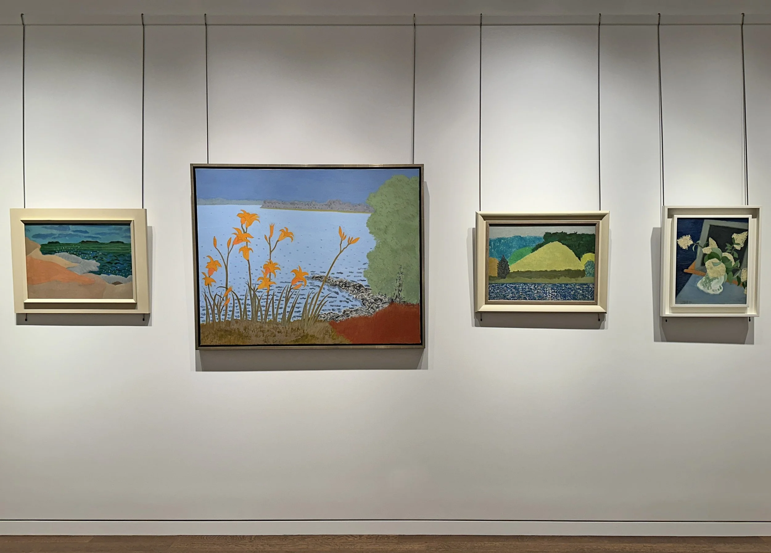
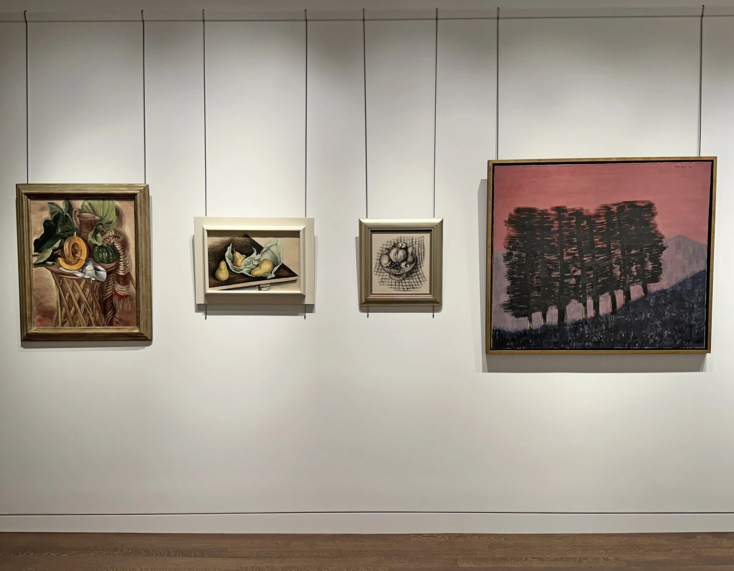
Installation Views | Essay | Exhibition History | Museum Collections | For availability and pricing, call 212-581-1657


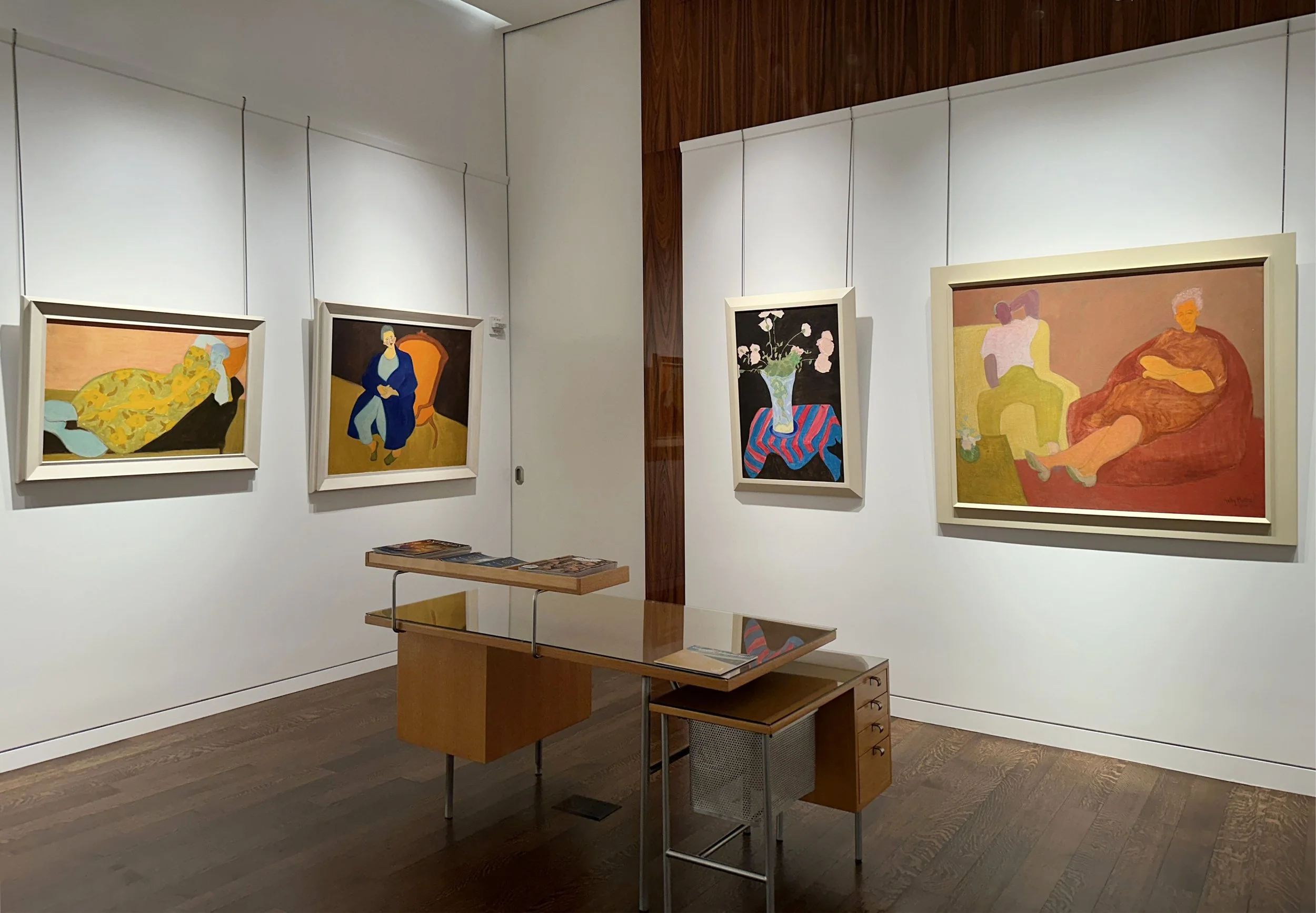
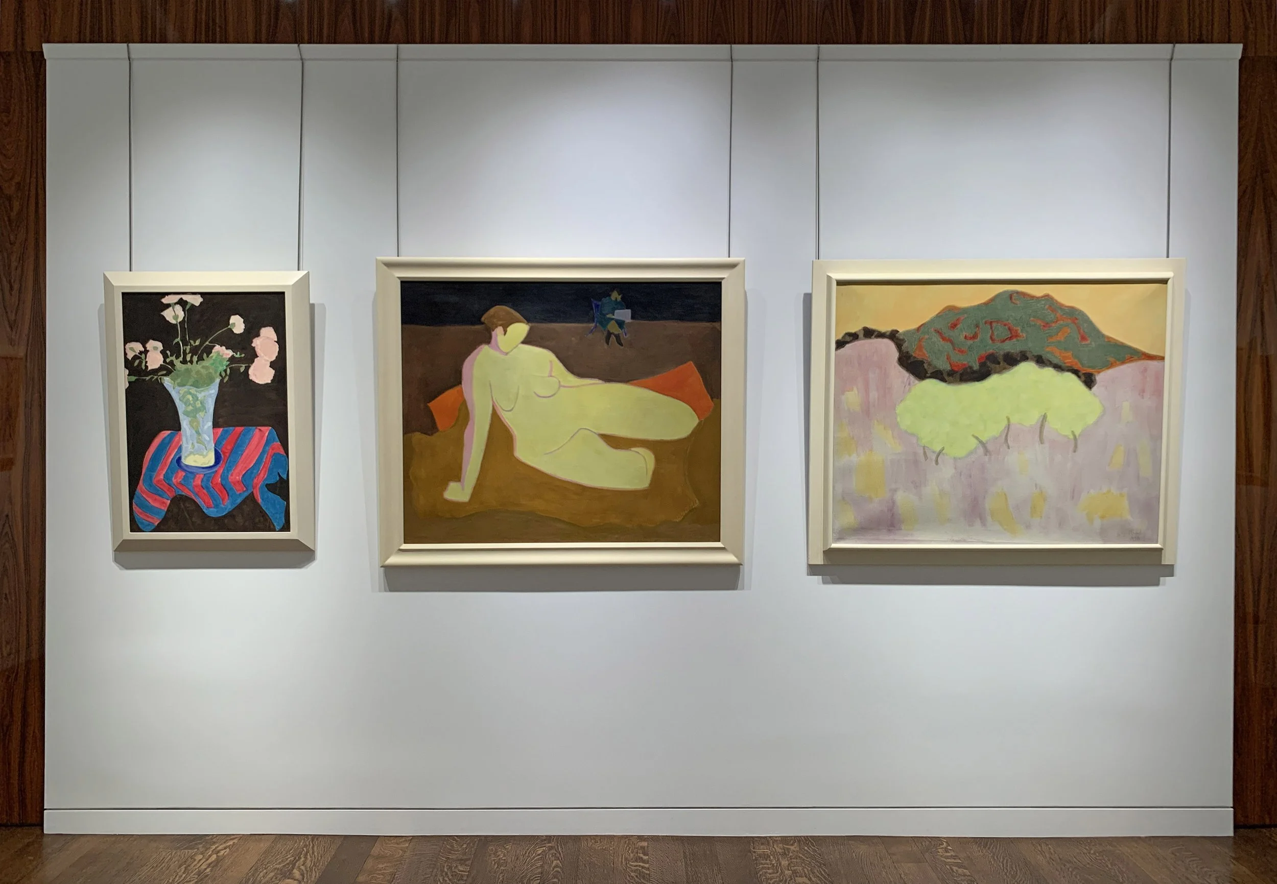
Installation Views

Essay by Deedee Wigmore

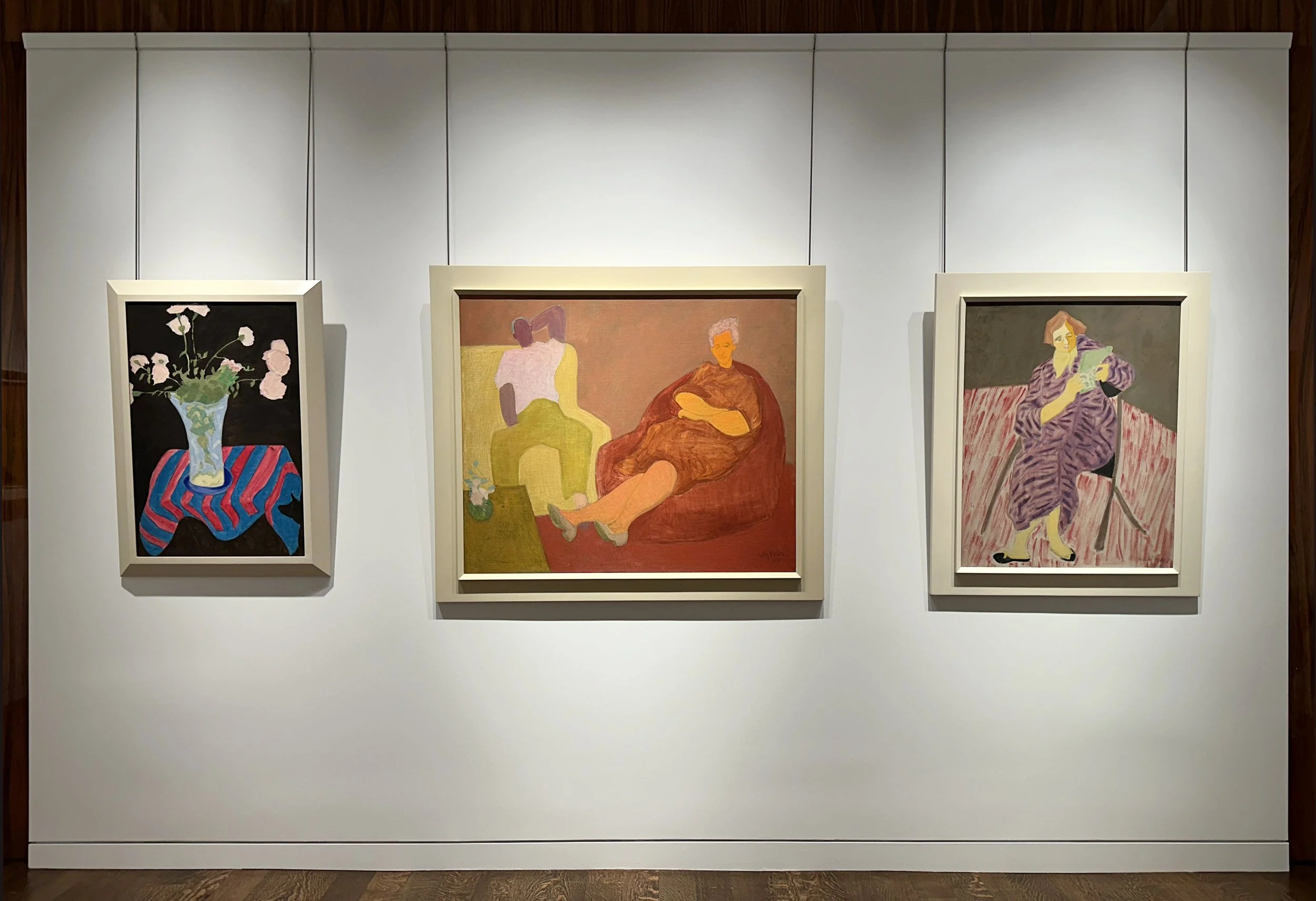
In the 1940s when Abstract Expressionism was gaining recognition, it was argued that the subconscious was the source of all art. Sally Michel and her husband Milton Avery did not agree with this. They felt that the natural world offered a constantly changing supply of art ideas and focused on how to make representational paintings comparably modern. To achieve this the Averys had to find a way to paint figuration, landscapes, seascapes, and still lifes that bridged the gap between representational and abstract painting. To refresh and move realism forward, they discovered areas in which the opposing styles of realism and abstraction shared artistic problems- areas in which artists in both styles were seeking solutions to achieve exciting compositions. Over time, the Averys found their answer in the simplification of forms, new uses of color, and a modern feeling of flatness. These changes allowed realism to absorb new life and transform without losing its distinctive qualities.

Milton Avery (1885-1965) and Sally Michel (1902-2003) met painting in Gloucester, Massachusetts in 1924. They admired each other’s dedication to art. Married in 1926, Sally and Milton worked in New York as a unit until Milton’s death in 1965. To provide support, Sally worked as a freelance illustrator, an occupation she could pursue at home. This allowed her to remain with Milton and their young daughter and continue to develop her own painting. The couple would rise at six in the morning and draw or paint straight through to dinner. Sally was gregarious and Milton was taciturn, so she became his spokesman. Saturdays were spent in New York’s galleries and museums. To continue developing skills and new directions they sketched from a model at the Art Students League and later with a group of their friends at each other’s studios. Through the 1930s, fellow artists of Sally’s generation, including Mark Rothko, Adolph Gottlieb, and Barnett Newman, frequently came to the Avery home to discuss art. By the mid-1940s Milton and Sally each developed their own parallel but unique approaches to painting.

Choppy Lake, c. 1950s

The refinement of their artistic visions evolved over many years of sketching, painting, looking, and sharing ideas on art. The Averys structured their year so that summers were spent on long sketching trips of non-stop drawing to gather source material for future paintings to be executed in the studio. With limited funds the Averys drove to summer locations in Connecticut (1930), Gloucester, Massachusetts (1926-1933), Vermont (1937, 1939, 1940), and the Gaspé Peninsula, Québec (1938). In the 1940s they traveled further: California with stops in Yellowstone and Glacier National Parks (1941); Mexico (1946); and the Canadian Northwest and Oregon (1947). After their 1952 trip to Europe, the Averys’ later years saw summers spent closer to home: Woodstock, New York; the art colonies Yaddo (1955) and MacDowell (1953, 1954, 1956); and Provincetown, Massachusetts (1957-1961). Under doctor’s orders, Milton spent the winters of 1949-1950 and 1950-1951 recuperating from a heart attack in Maitland, Florida where he and Sally were Bok Fellows at The Research Studio. Later they wintered in Key West, Florida in 1959.

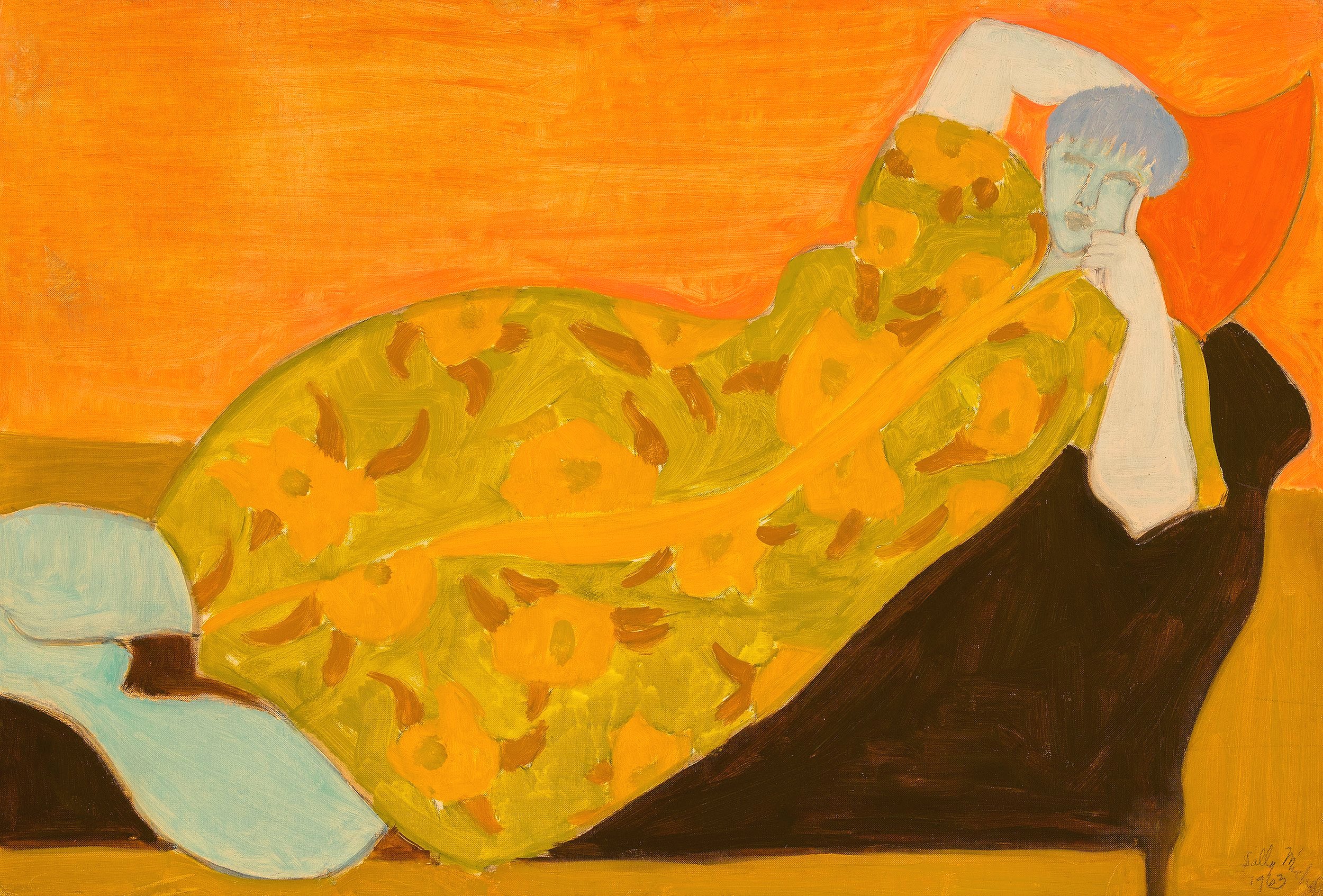
Flowered Kimono, 1963

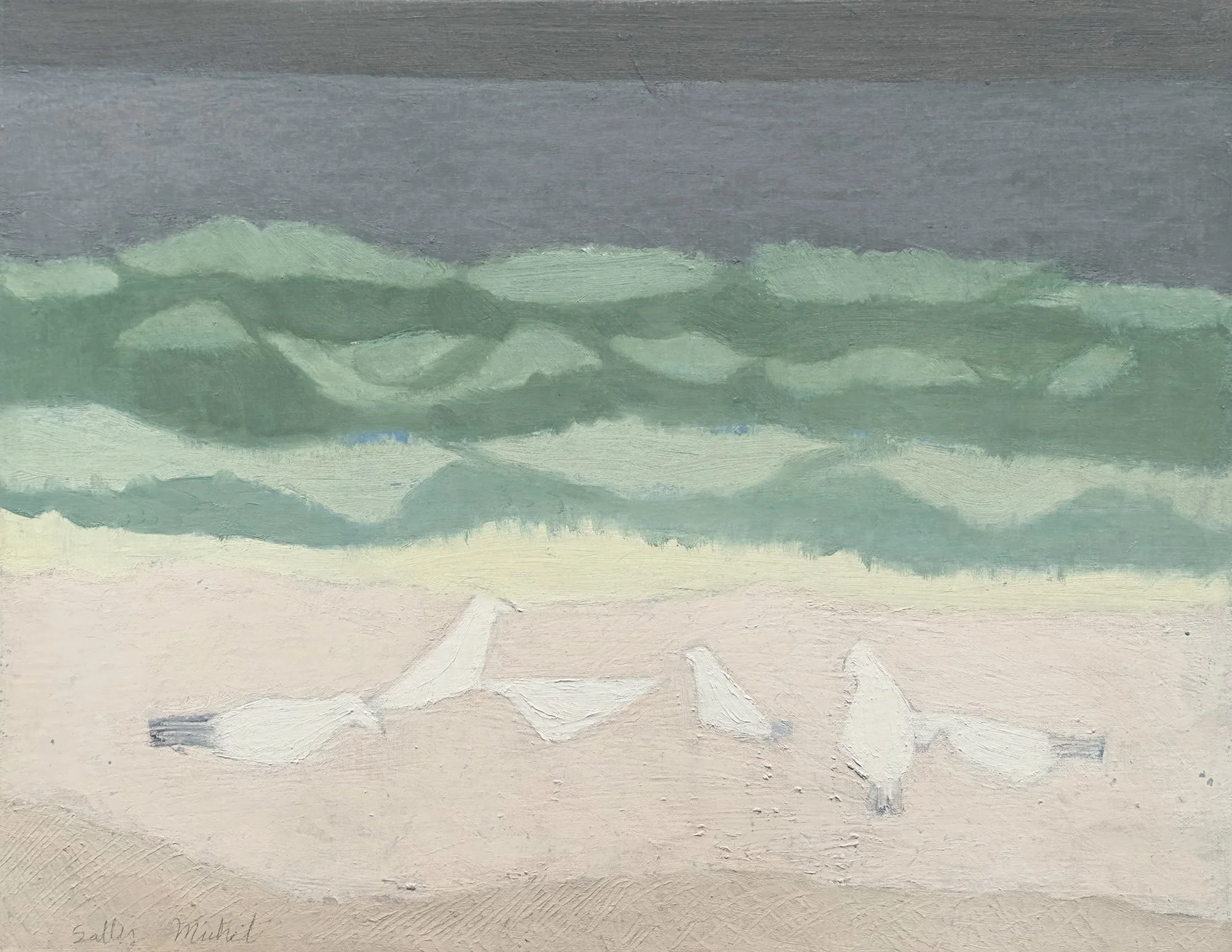
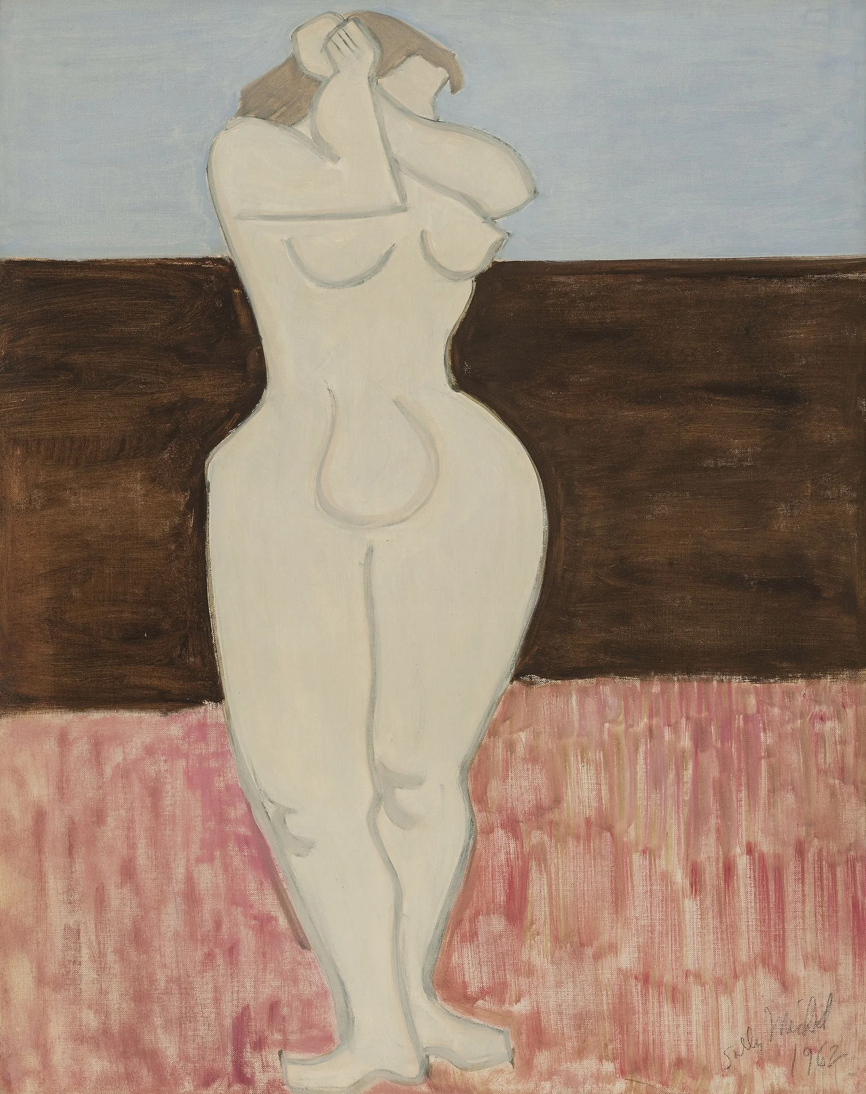
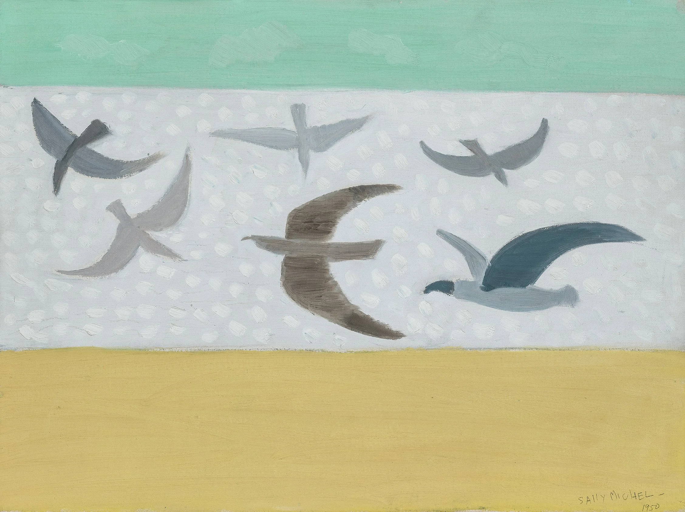
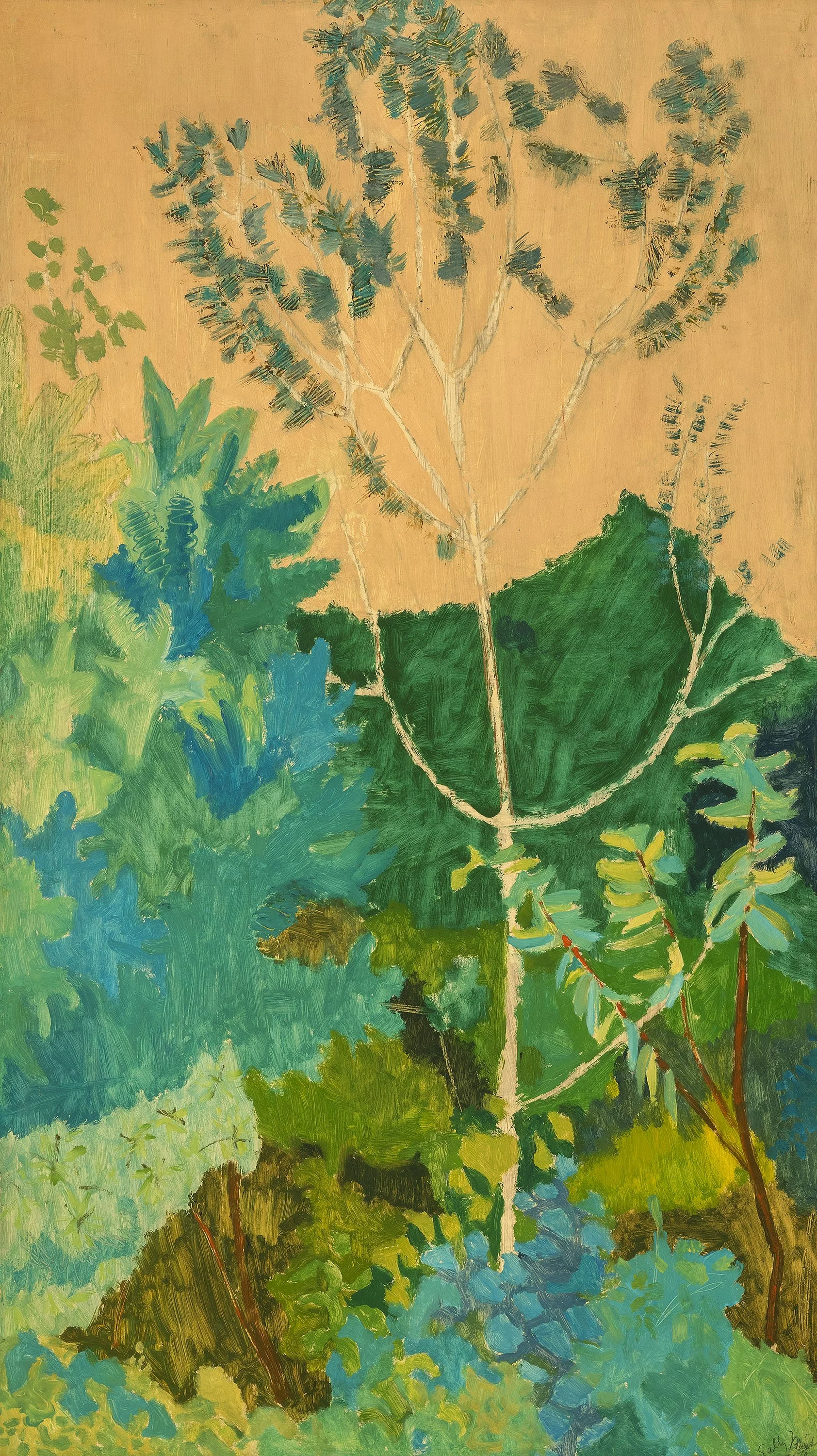
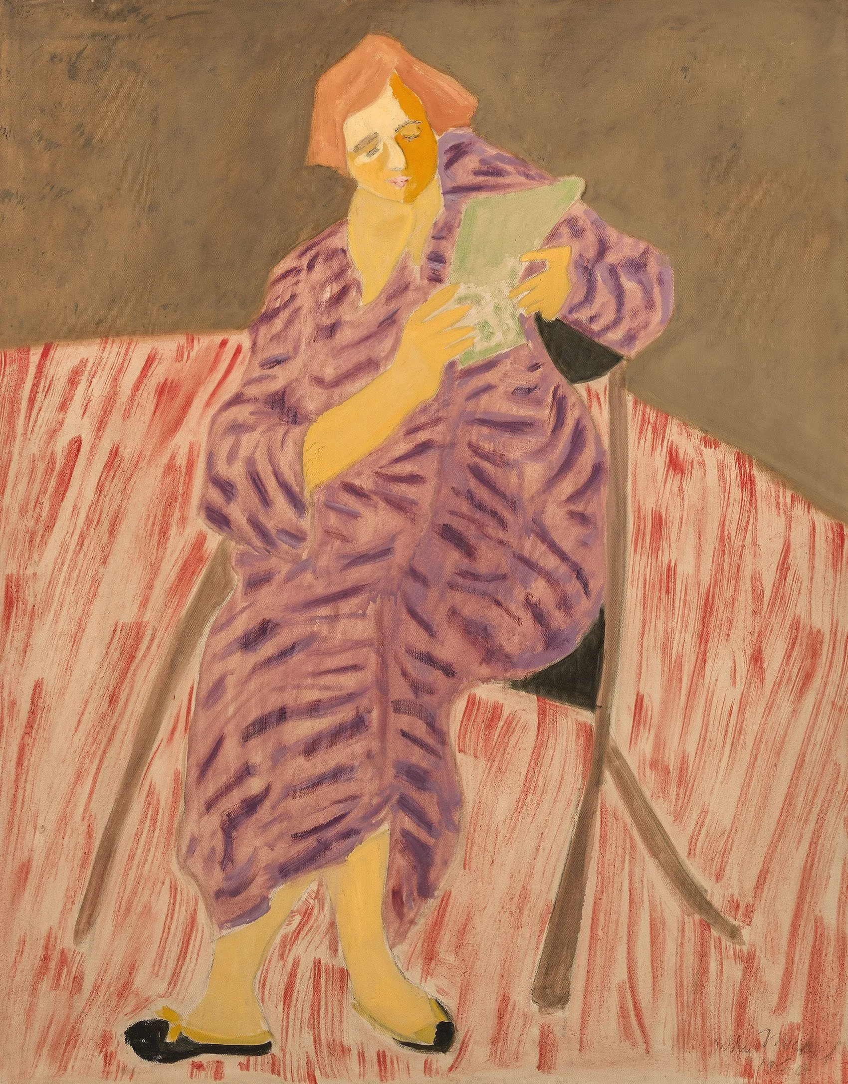
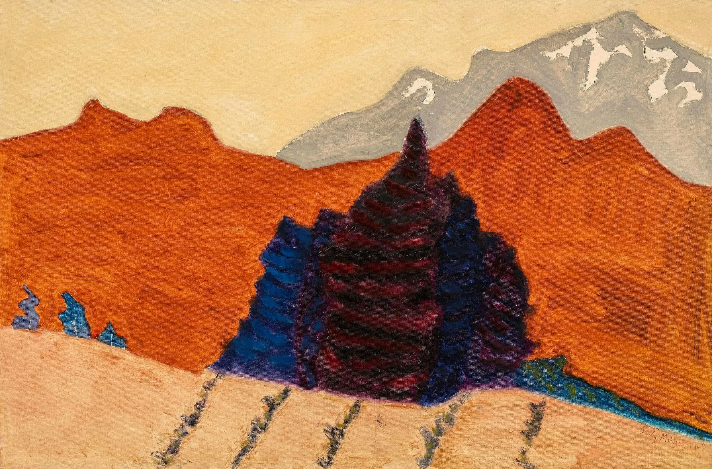
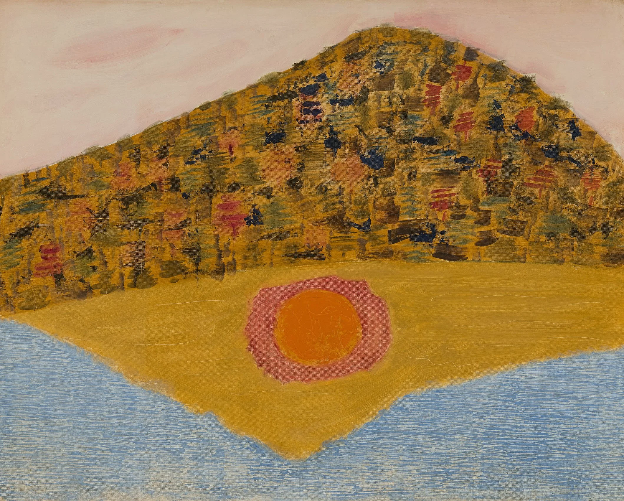
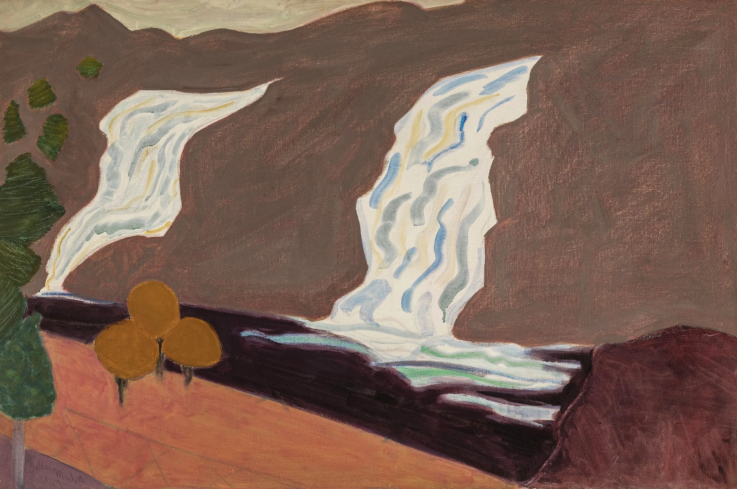
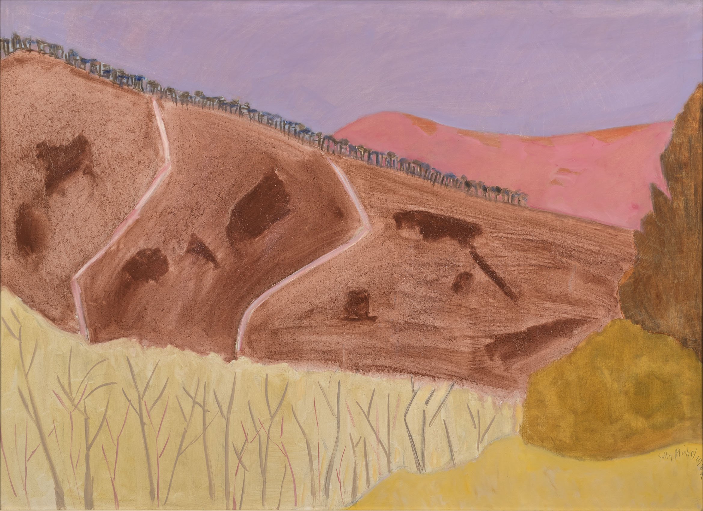
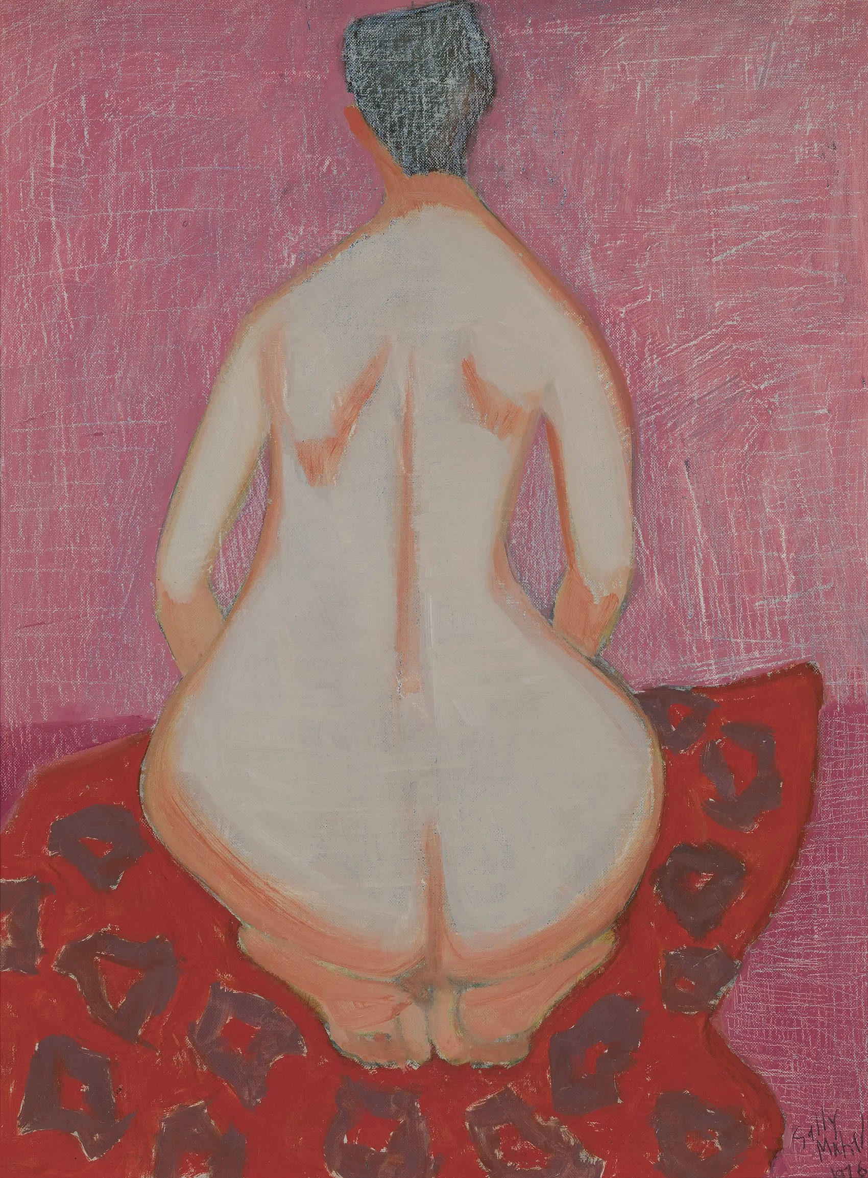
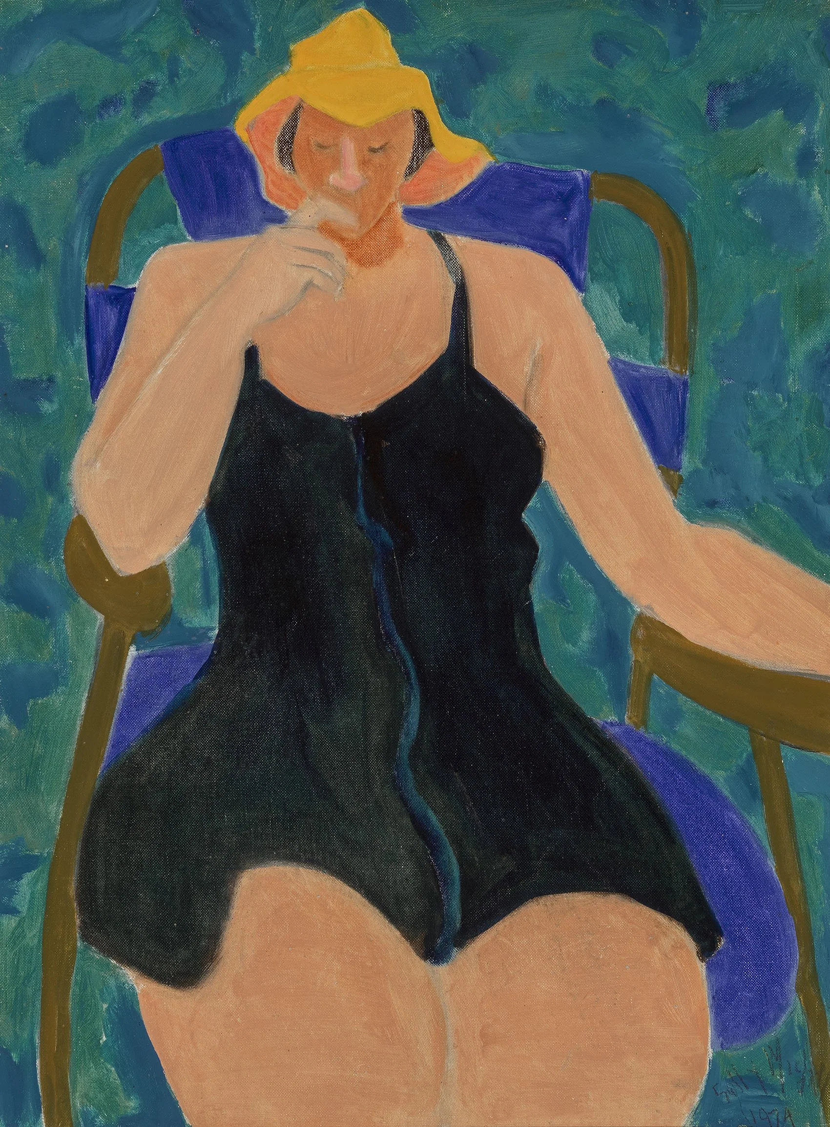
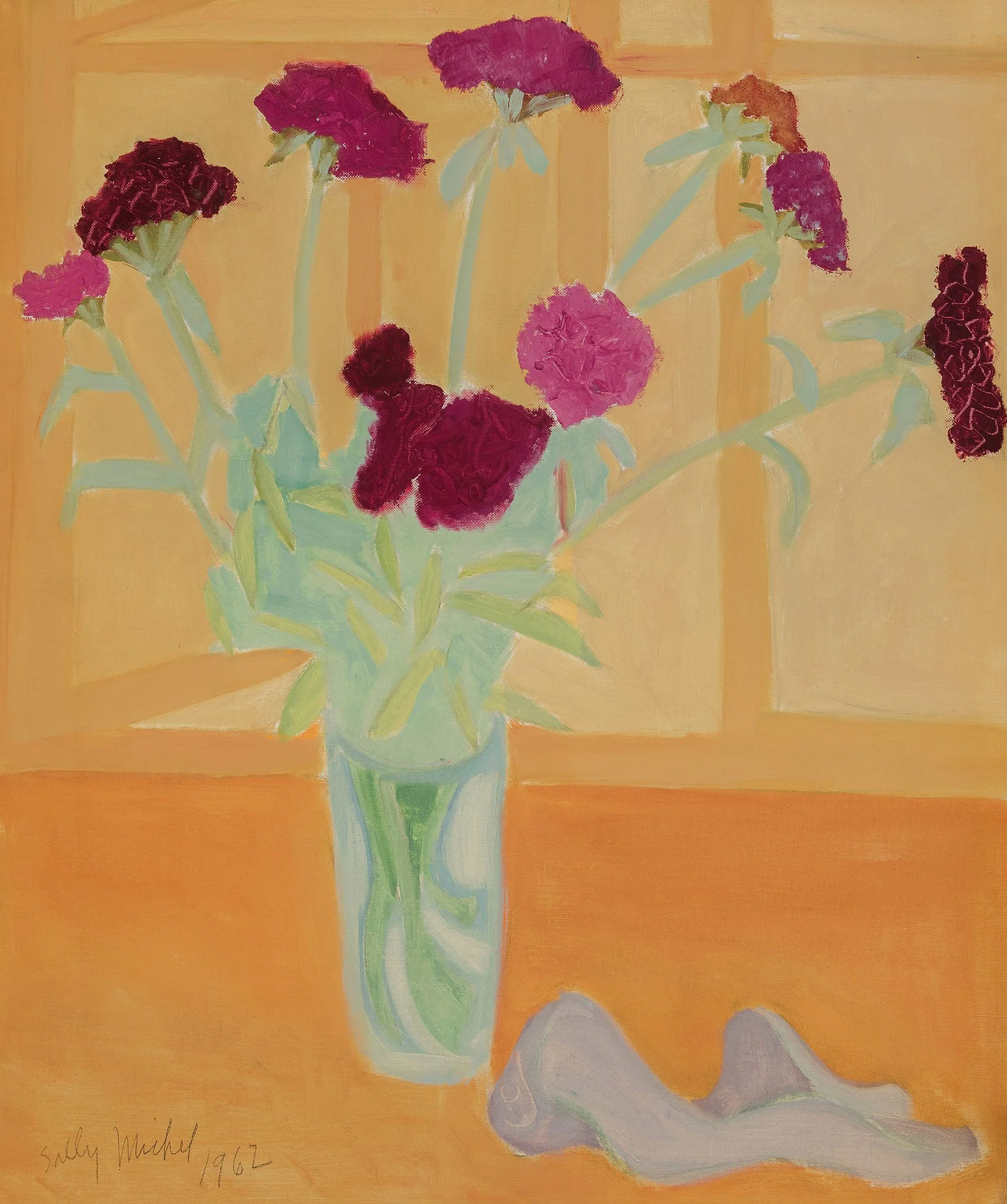
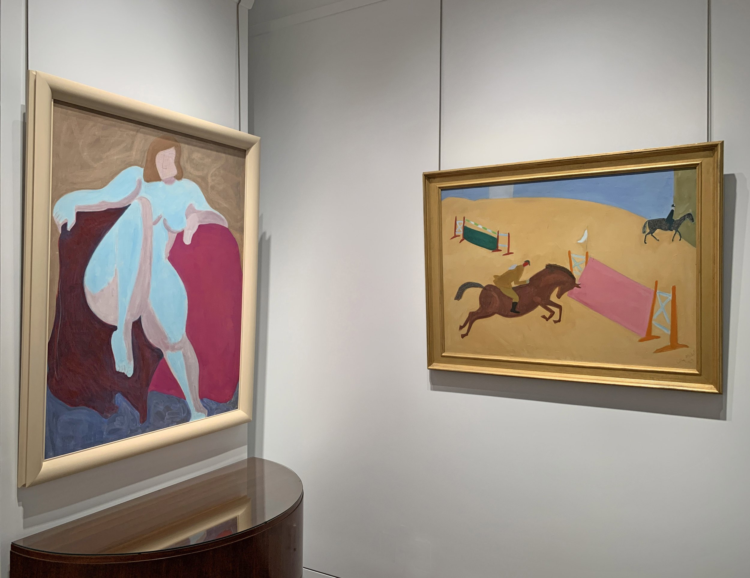
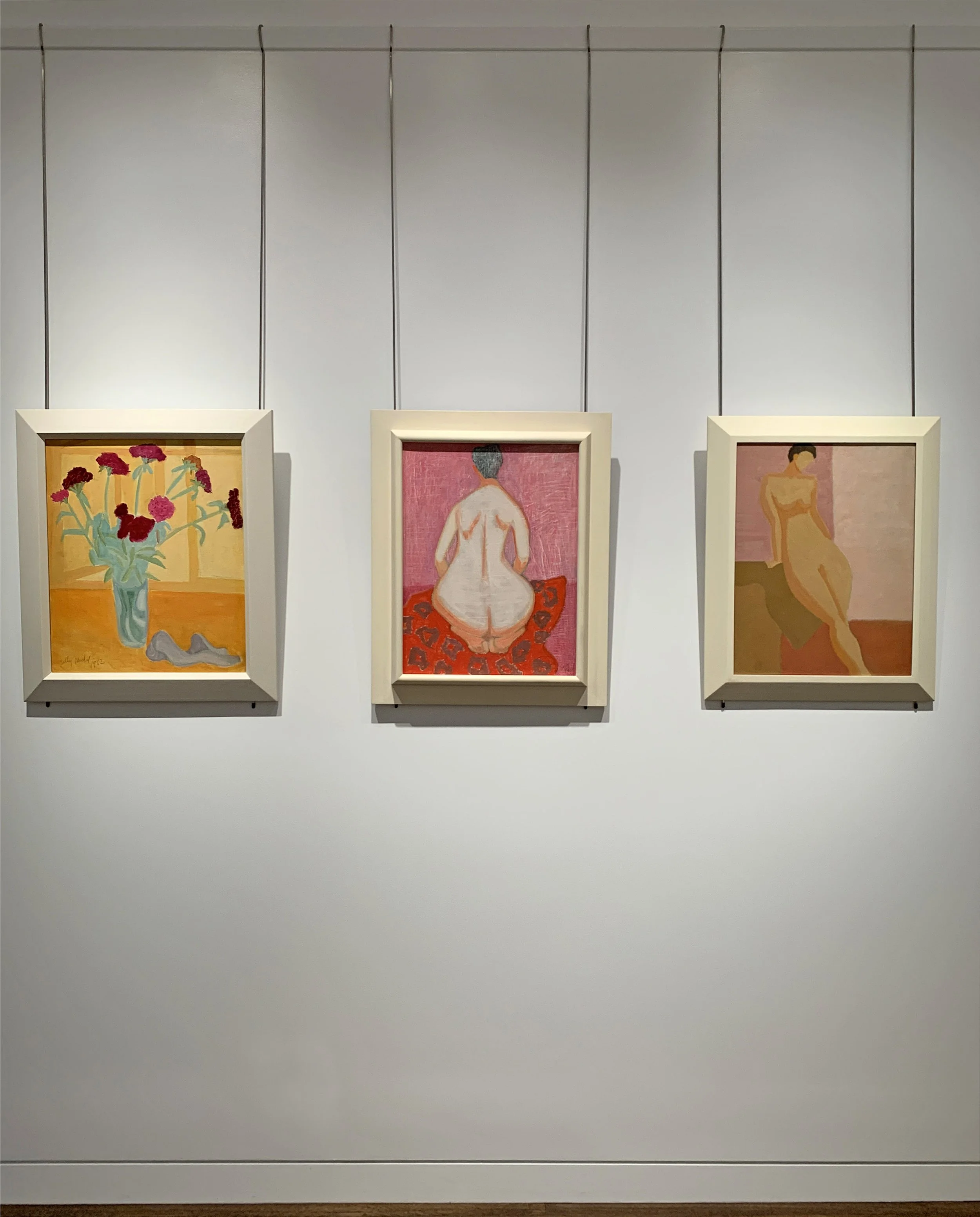
This exhibition presents Sally Michel’s oil paintings from 1950 to 1986. Sally painted directly from nature throughout her career, using sketches to further develop paintings in the studio. The verdant Mountain Landscape (1959) and seaside activities in Provincetown Pier (c. 1957-61) reflect summer sketching trips made to the art colonies of MacDowell, Yaddo, Provincetown, and Woodstock. In the studio an intermediary watercolor or gouache could recall a location and inform the finished oil by transmitting a mood, time of day, weather, or season. The fluidity and luminosity of gouache and watercolor provided freedom to experiment with color and tone for a new sensual approach to color. The desired effects of color and light found in the use of watercolor and gouache could be duplicated in oil on canvas by painting with thinned pigments. For overall softness, Sally used a stiff brush to apply matte paint in thin layers. For textural contrasts, Sally would scrape or scratch into thick paint, as seen in the water of Choppy Lake. In reviewing sketches to select one to paint, Sally considered different views, straight or curving lines, and scale. Patterning was used for movement or to imply actual motion. The patterned dress in Flowered Kimono (1963) moves the viewer from the lower left corner to the upper right corner. In Violet (1966), the patterns of the carpet and dress suggest the sitter is an energetic dynamo. Sally’s portraits of individuals were often close-ups isolated against flat backgrounds. Scale distortion, exaggerated color, or caricature could provide social commentary when she desired it. Sally Michel’s sketch-to-painting approach aided her to find simplified and abstracted shapes that locked together in finely balanced compositions.

Landscape, 1953-1955

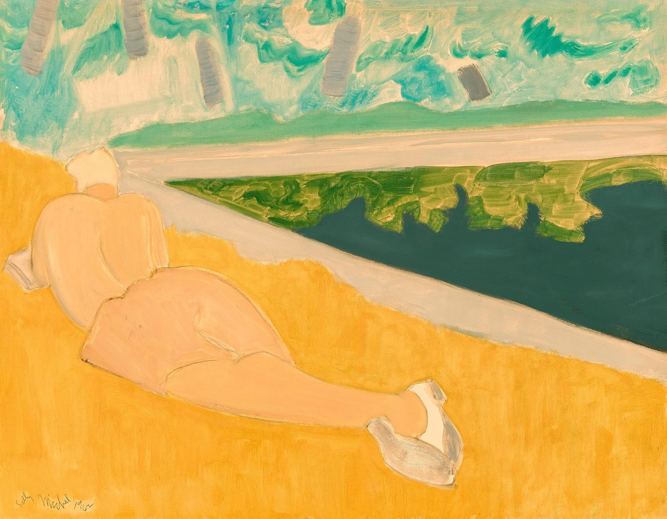
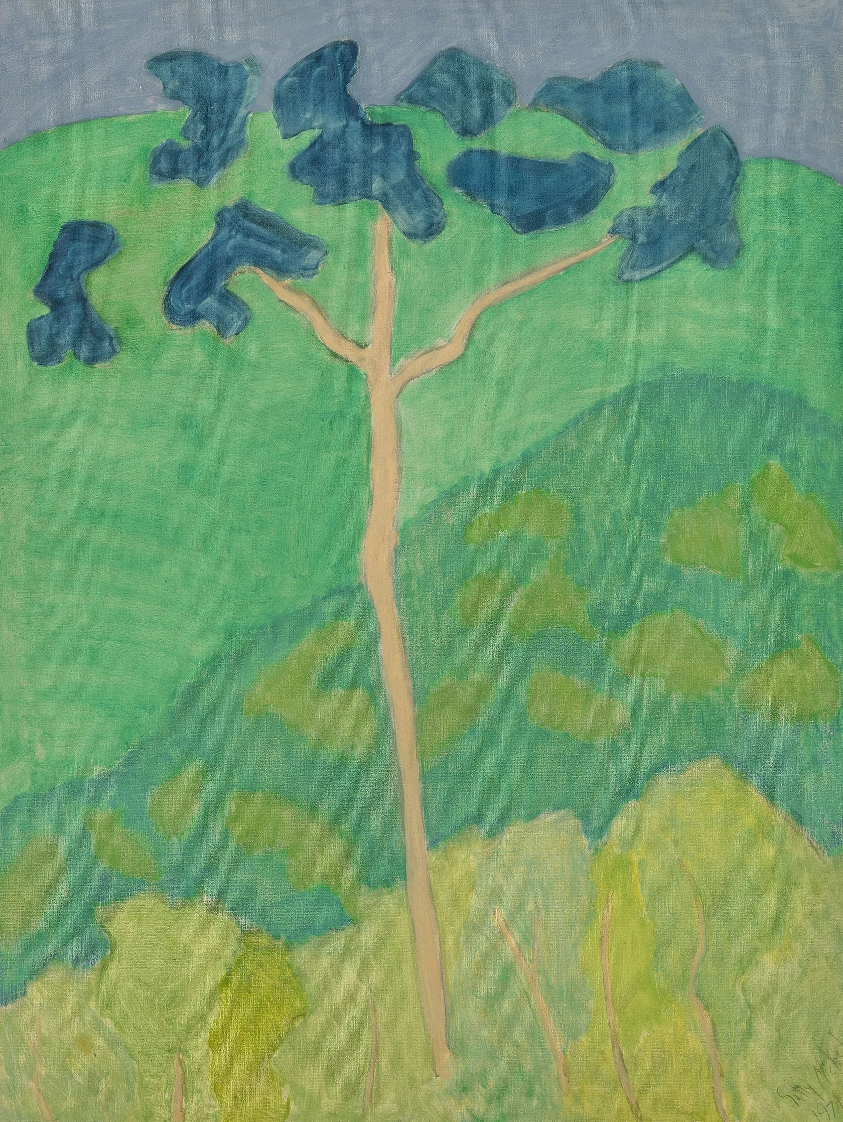
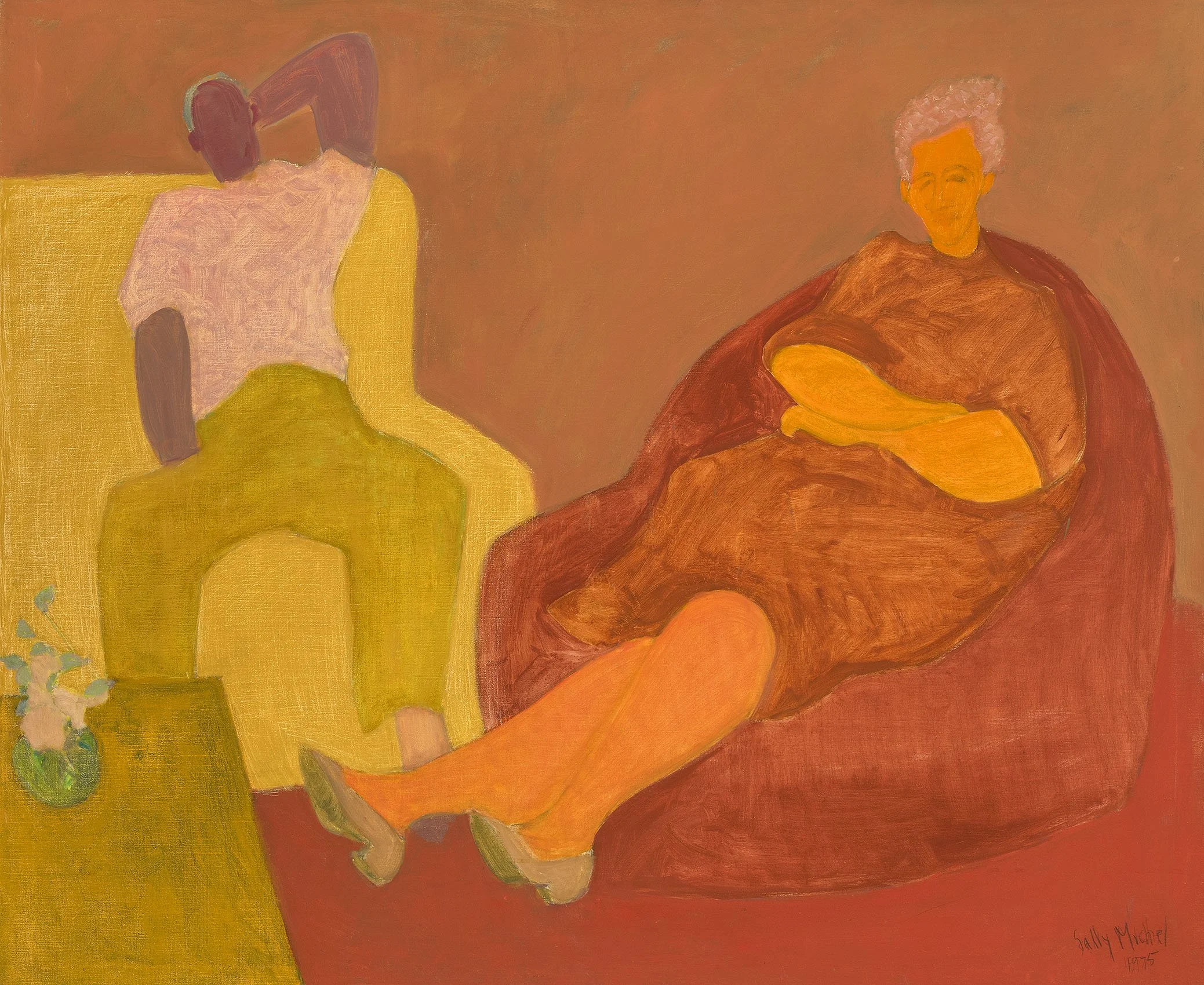
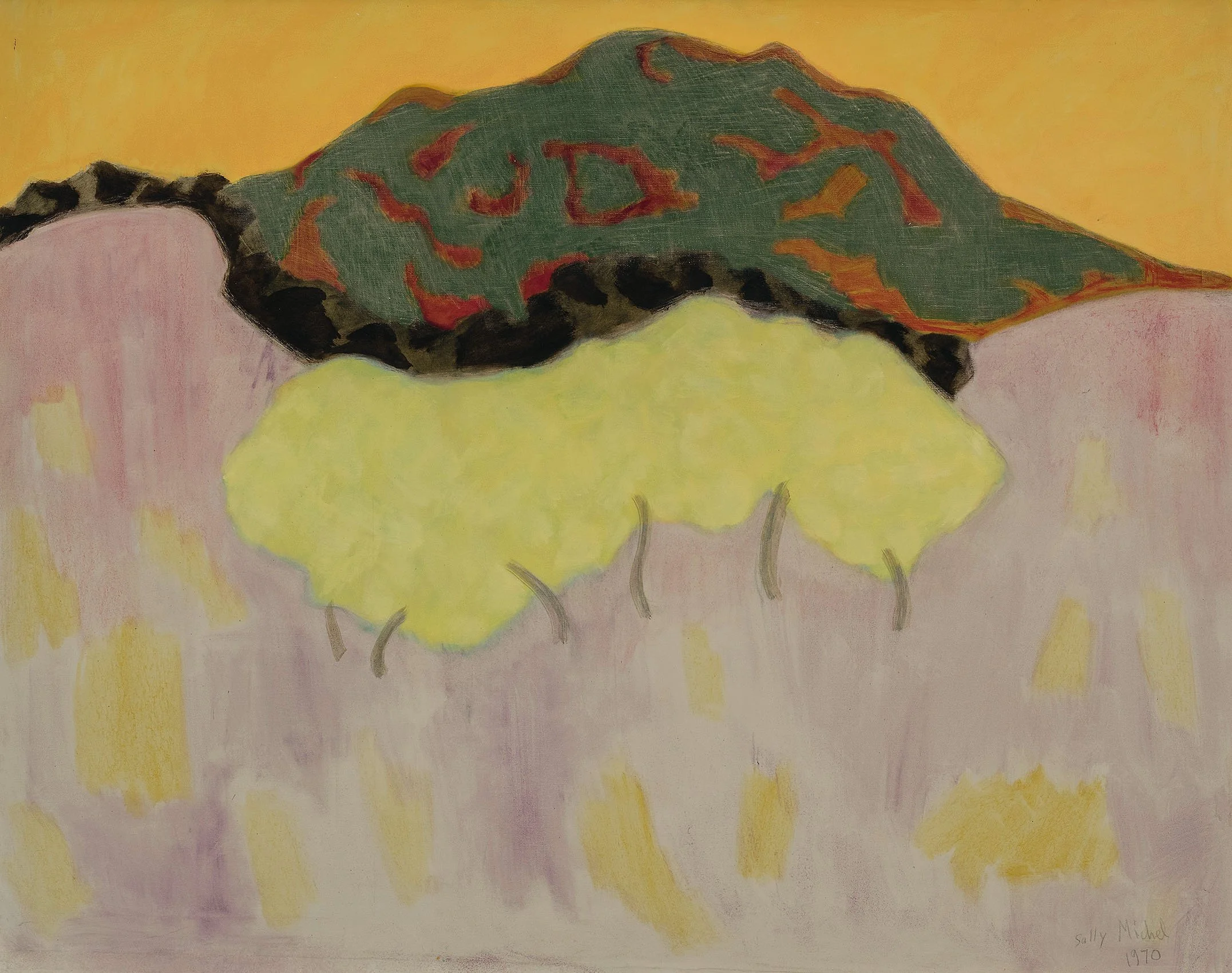
Milton Avery and Sally Michel were dedicated to painting what they saw at a time when realism as a style was not deemed modern. They found bridges between realism and abstraction in color, structure, and light. Sally’s paintings Shore (c. 1950s) and Delicate Tree (1974) demonstrate that shapes, spaces, and color form their own relationships independent of subject matter. The Averys modernized realism by using the shapes of things and the spaces around them in new ways. Colors were selected to reflect mood and transcend the specific subjects depicted. Realism traditionally relies on light and dark contrasts to create depth. The use of non-associative color suppresses that contrast and creates a new challenge to find another way to produce depth, as seen in Landscape (1953-55). The Averys found that a highly structured composition would still be read as a landscape, still life, or figure. Poolside Reader (1962) and Orchard in Bloom (1956) are examples of this. With careful attention to shapes and their edges in paintings, Sally and Milton were able to capture further universality and interconnections. Their use of thinly applied paint so the canvas ground was revealed around the edges of shapes allowed the bare canvas to function as color. The intricate color shifts of land, sand, and sea in Sally’s Shore demonstrate how the boundaries of soft shapes help the viewer determine transitions that imply depth. These adjustments to solve artistic problems led to a new and important discovery; that the distinctions between objects in a painting are fundamentally illusions and the borders between shapes are what create representational art. The Averys achieved further modernity by reducing the number of shapes and colors in a painting and eliminating illusionistic rounded volumes and modeled forms. When the Averys began to use shapes as containers of color in both figuration and landscape, shape and color became equal. Examples of this include Evening Relaxation (1975) and Western Landscape (1968). Containers of color could be stacked as abstract signs of foreground, middle ground, distance, and sky. Organic and geometric patterns, as well as liquid or transparent areas of paint, could express the forces of wind and water as well as the light and forms of nature. In their paintings, Milton Avery and Sally Michel demonstrated that art movements as far apart as Abstract Expressionism and realism have overlapping aims, attitudes, and methods and that new ideas about style can be absorbed and transformed without losing the distinctive qualities of either realism or abstraction.

Sketcher with Plant, 1975

After Milton’s passing in January of 1965, Sally worked tirelessly to ensure Milton’s legacy and continued to evolve her use of art materials for another twenty-five years. To develop her dry surface and characteristic soft matte feel, Sally mixed large amounts of turpentine with her paint. Always frugal with pigment, Sally used rags to moderate layers of color in a shape and provide contrasts in texture. When she wanted textural interest or to bring attention to the two-dimensional surface of a canvas, she scratched into the paint. All of this can be seen in the carefully structured colors and the contrasting textures in Twilight (1974). Sally added luminosity by tinting colors with white pigment. She also made daring experiments with color harmonies seen in paintings like Sketcher With Plant (1975). Sally Michel worked to achieve mood and movement rather than detailed representation in her paintings. She continued the careful selection and placement of the elements of her subject, use of non-associative color choices, and attention to the edges of her reductive forms to achieve flattened compositions. Sally found her imagery in the visible world, often inspired by her own travels. By understanding and adapting elements from the two streams of art -representation and abstraction- Sally Michel was able to keep realism relevant and modern.

The Mennello Museum of American Art in Orlando, FL will open an exhibition with catalogue on Sally Michel in September 2024. Both Sally and Milton were artists-in-residence at The Research Studio nearby in Maitland the winters of 1950-51 and 1951-52.

Exhibition History

Selected Solo Exhibitions

1957
Village Art Center, New York, NY

1979
Sally Michel: Mountain Landscapes, The Erpf Catskill Cultural Center, Arkville, NY.

1982
Ulster County Council for the Arts, Kingston, NY.

1985
Kleinert Gallery, Woodstock, NY (now the Byrdcliffe Kleinert/James Center for the Arts).

1987
Sally Michel: The Other Avery, University of Iowa Museum of Art, Iowa City, IA. Robert Hobbs, curator. Exhibition traveled through 1988.

1990
Fresno Art Museum, California. Catalogue with essay by Nancy Acord.

1999-2000
Sally Michel: Retrospective, Danforth Museum of Art, Framingham, MA.

2024
Sally Michel: Abstracting Tonalism, Mennello Museum of American Art, Orlando, FL. Opens September 20th.

Selected Group Exhibitions

1933
Painting and Sculpture by Wives of Painters and Sculptors, Contemporary Arts Gallery, New York.

1950
New York City Center Gallery, New York, NY.
Woodstock Art Center, New York.
Sid Deutsch Gallery, New York, NY.

1956
Village Art Center, New York, NY (First Prize – oil paintings).

1957
Village Art Center, New York, NY (Second Prize – drawings).

1959
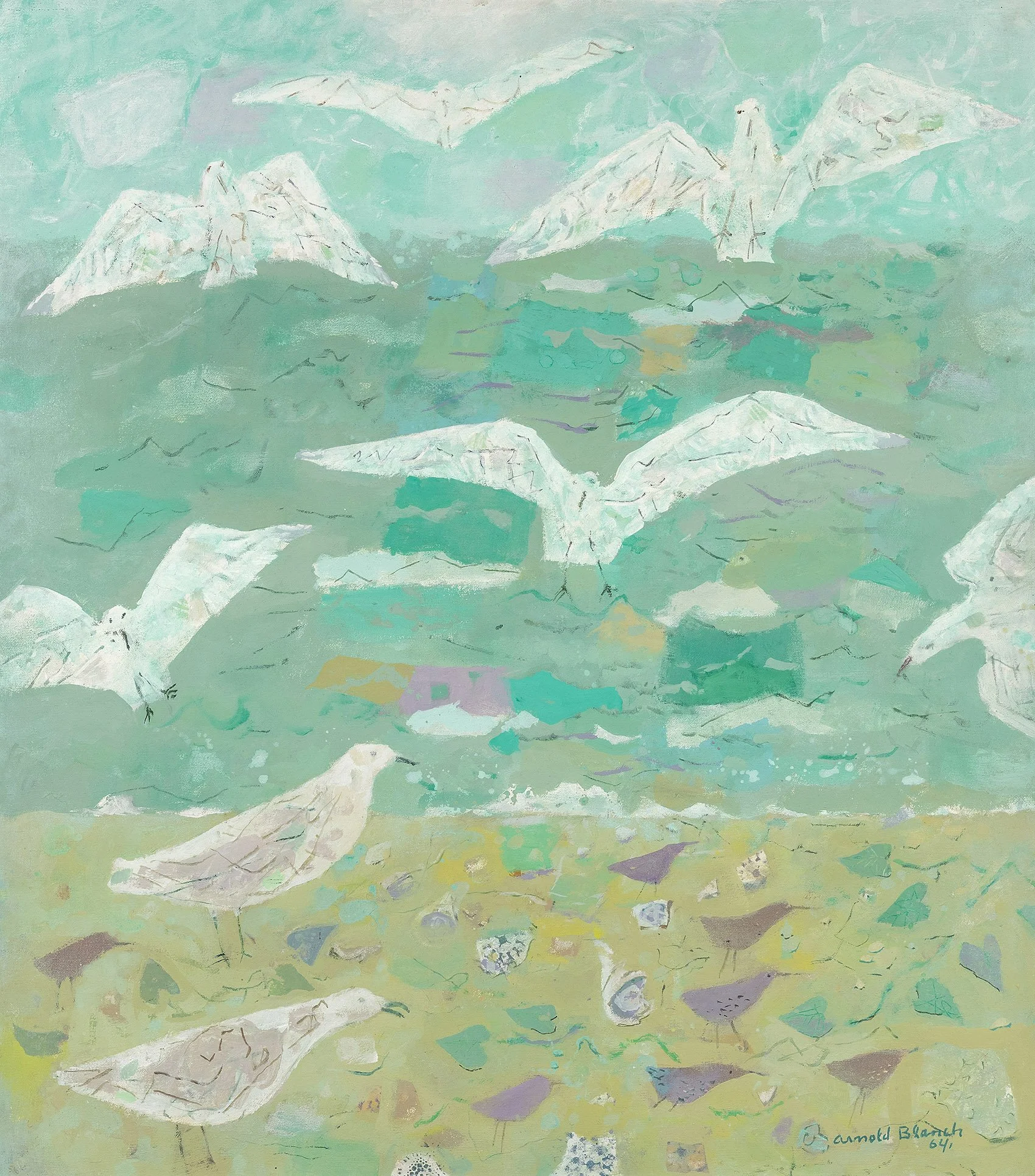
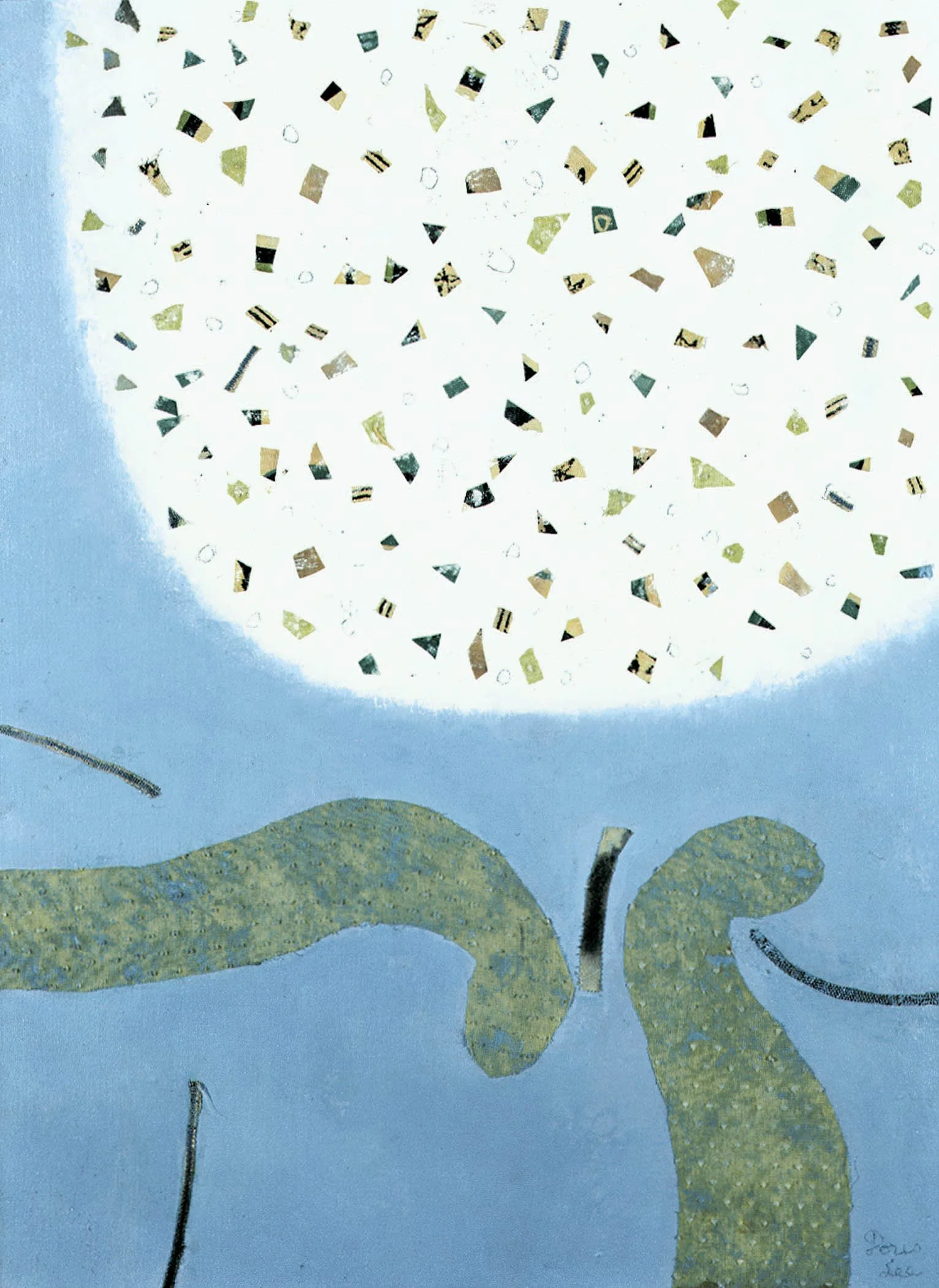
Two Husband and Wife Painting Teams, Rudolph Galleries, Coral Gables, FL (Sally Michel, Milton Avery, Arnold Blanch, and Doris Lee).
Paul Kessler Gallery, Provincetown, MA (also 1965-1967).

1962
Milton Avery, Sally Michel, March Avery, New Arts Gallery, Atlanta, GA.
Mr. and Mrs. Show, Gallery 14, Inc., Palm, Beach, FL (c. 1962).

1963
Avery Family Group Show. Rye Free Reading Room, New York.

1966
Milton Avery and Family: “An Album of a Contemporary Family of Artists,” Gallery Reese Palley, Atlantic City, NJ. Catalogue.

1968
The Milton Avery Family, The New Britain Museum of American Art, Connecticut. Catalogue.

1971
Paintings by Milton Avery and His Family, Allentown Art Museum, Pennsylvania. Catalogue with text by Frank Getlein.

1977
Woodstock, An American Art Colony, 1902-1977, Vassar College Art Gallery, Poughkeepsie, NY.

1985
The Avery Family: Milton Avery, Sally Michel, March Avery– An Exhibition of Paintings, Saint Joseph College, West Hartford, CT.

1986
American Masters: Works on Paper from The Corcoran Gallery of Art, Smithsonian Institution Traveling Exhibition Service and Corcoran Gallery of Art, Washington, DC, 1986. Traveled to: Oklahoma Museum of Art, Oklahoma City, OK; Queens Museum, Flushing, NY; Corcoran Gallery of Art, Washington, DC; Burling Library, Grinnell, IA; Cincinnati Art Museum, Ohio; The Society of the Four Arts, Palm Beach, FL. Catalogue with essays by Edward J. Nygren and Linda Crocker Simmons.

1987
Seventy-five American Modernists, Corcoran Gallery of Art, Washington, DC.

1989-90
American Women Artists: The Twentieth Century, Knoxville Museum of Art, Tennessee. In conjunction with Bennett Galleries, Knoxville, TN. Traveled to Queensborough Community College Art Gallery, Bayside, NY. Catalogue with text by Elsa Honig Fine and essay on Sally Michel by Robert Hobbs.

1994-96
Relatively Speaking: Mothers and Daughters in Art, Sweet Briar College Art Gallery, Virginia, 1994; The Newhouse Center for Contemporary Art, Snug Harbor Cultural Center, Staten Island, NY, 1994-1995; Rockford Museum of Art, IL, 1995; Rahr-West Museum, Manitowoc, WI, 1995; Hofstra Museum, Hofstra University, Hempstead, NY, 1996. Catalogue with essays by Charlotta Kotik and Judith Swirsky.

1997-98
Preserving the Past, Securing the Future: Donations of Art, 1987-1997, National Museum of Women in the Arts, Washington, DC.

2001
Celebration of the Horse, Marietta/Cobb Museum of Art, Atlanta, GA.

2003
Sally Michel/Milton Avery: A Portrait, Knoedler & Company, New York, NY.

2015-16
Provincetown Artists: A Survey of American Modern to Abstract Art, Walter J. Manninen Center for the Arts, Endicott College, Beverly, MA.

2019
Summer with the Averys: Milton / Sally / March, Bruce Museum, Greenwich, Connecticut. Catalogue with text by Kenneth E. Silver and interview with March Avery by Stephanie Guyet.

2022
Arriving at Byrdcliffe, Kleinert/James Center for the Arts, Woodstock Byrdcliffe Guild, New York.

2023
In Care of the Historical Society of Woodstock: Selected Survey of Woodstock Art Colony Works on Paper, Historical Society of Woodstock, NY.

Fellowships

Bok Fellows, The Research Studio, Maitland, FL (1949/1950, 1950/1951)
MacDowell Colony Fellowship, Peterborough, NH (1953, 1954, and 1956)
Yaddo Fellowship, Saratoga Springs, NY (1955)

Museum Collections

Albuquerque Museum, New Mexico
Art & History Museums, Maitland, FL
Art Museum, University of Saint Joseph, Hartford, CT
Brooklyn Museum, New York
Bryn Mawr College Art & Artifacts Collections, Pennsylvania
Cape Ann Museum, Gloucester, MA
Chrysler Museum of Art, Norfolk, VA
Fresno Art Museum, California
Harn Museum of Art, Gainesville, FL
Housatonic Museum of Art, Bridgeport, CT
Israel Museum, Jerusalem
Kemper Museum of Contemporary Art, Kansas City, MO
Mattatuck Museum, Waterbury, CT
Mennello Museum of American Art, Orlando, FL
Metropolitan Museum of Art, New York, NY
Mount Holyoke College Art Museum, South Hadley, MA
National Gallery of Art (Corcoran Collection), Washington, DC
National Museum of Women in the Arts, Washington, DC
National Portrait Gallery, Washington, DC
New Britain Museum of American Art, Connecticut
Pennsylvania Academy of the Fine Arts, Philadelphia
Provincetown Art Association and Museum, Massachusetts
Reading Public Museum, Pennsylvania
Smith College Museum of Art, Northampton, MA
University of Iowa Museum of Art, Iowa City, IA
University of St. Thomas–Minnesota, Saint Paul, MN
Wadsworth Atheneum Museum of Art, Hartford, CT
Westmoreland Museum of American Art, Greensburg, PA
Woodstock Artists Association and Museum, New York


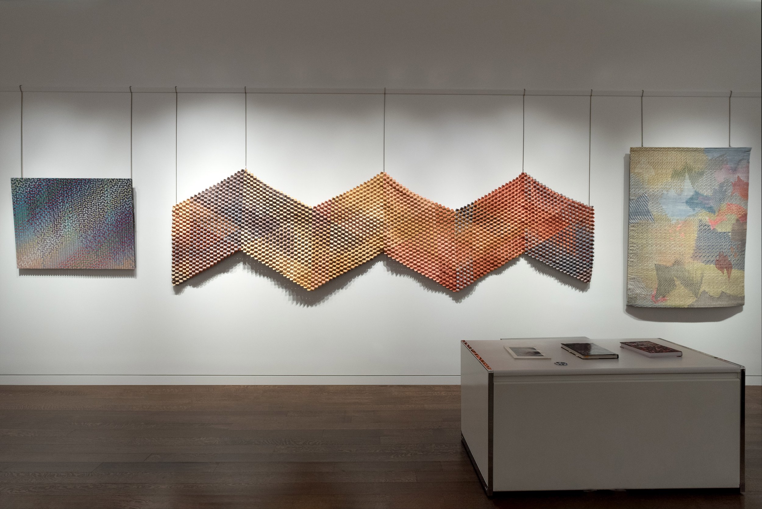
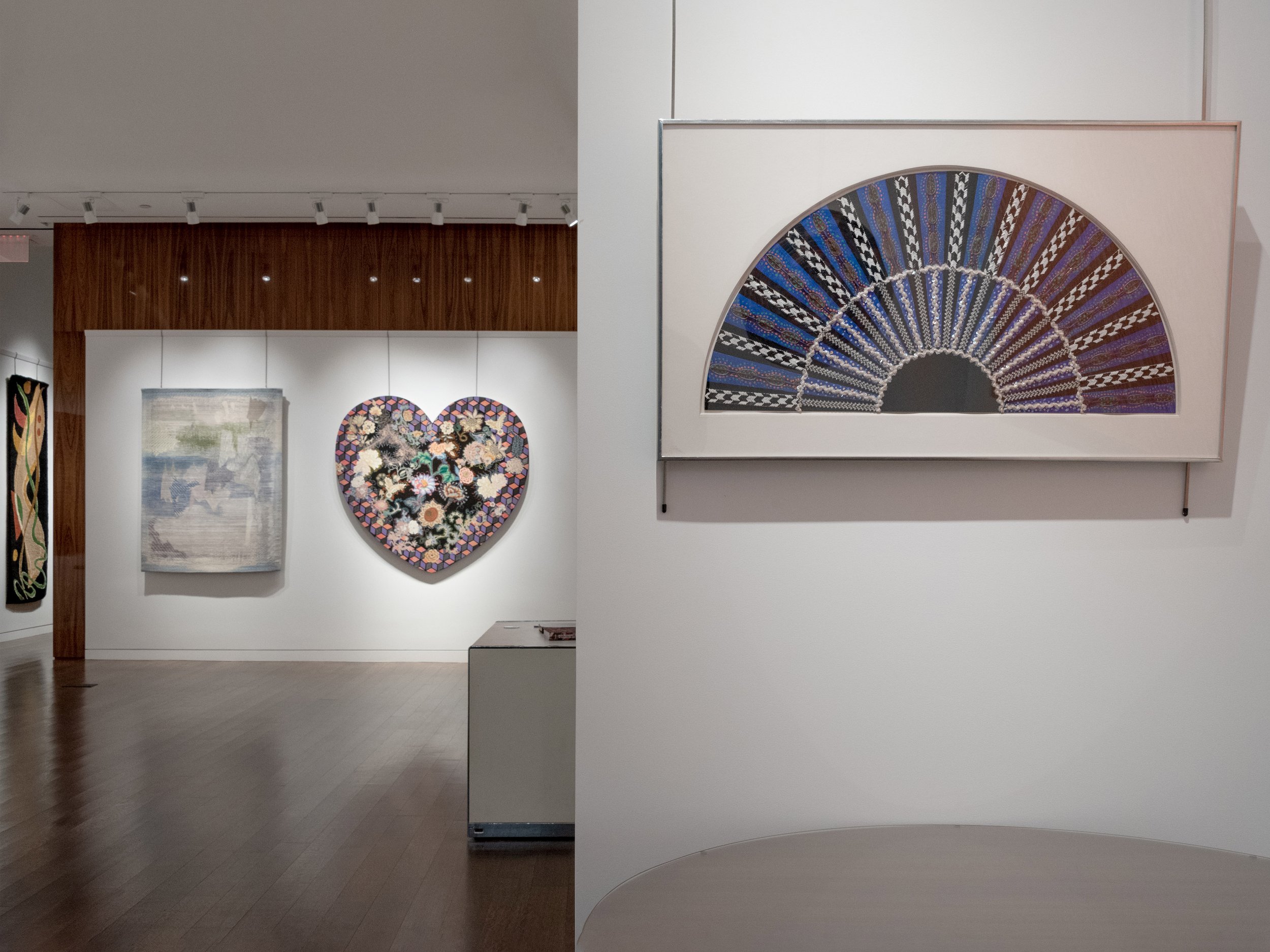
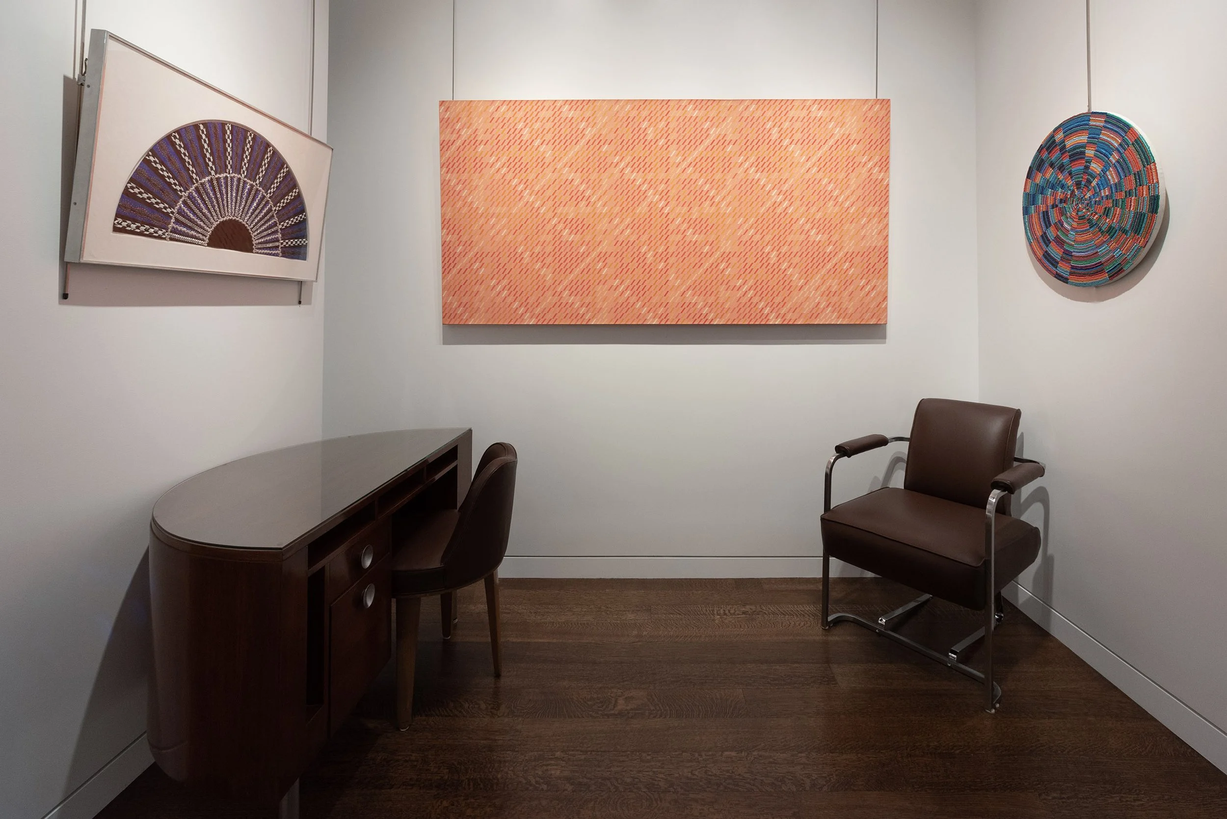
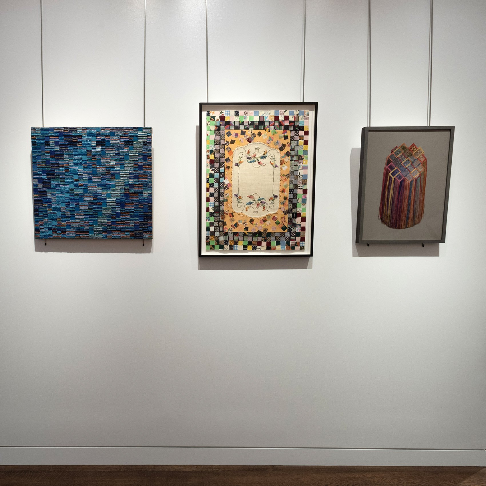
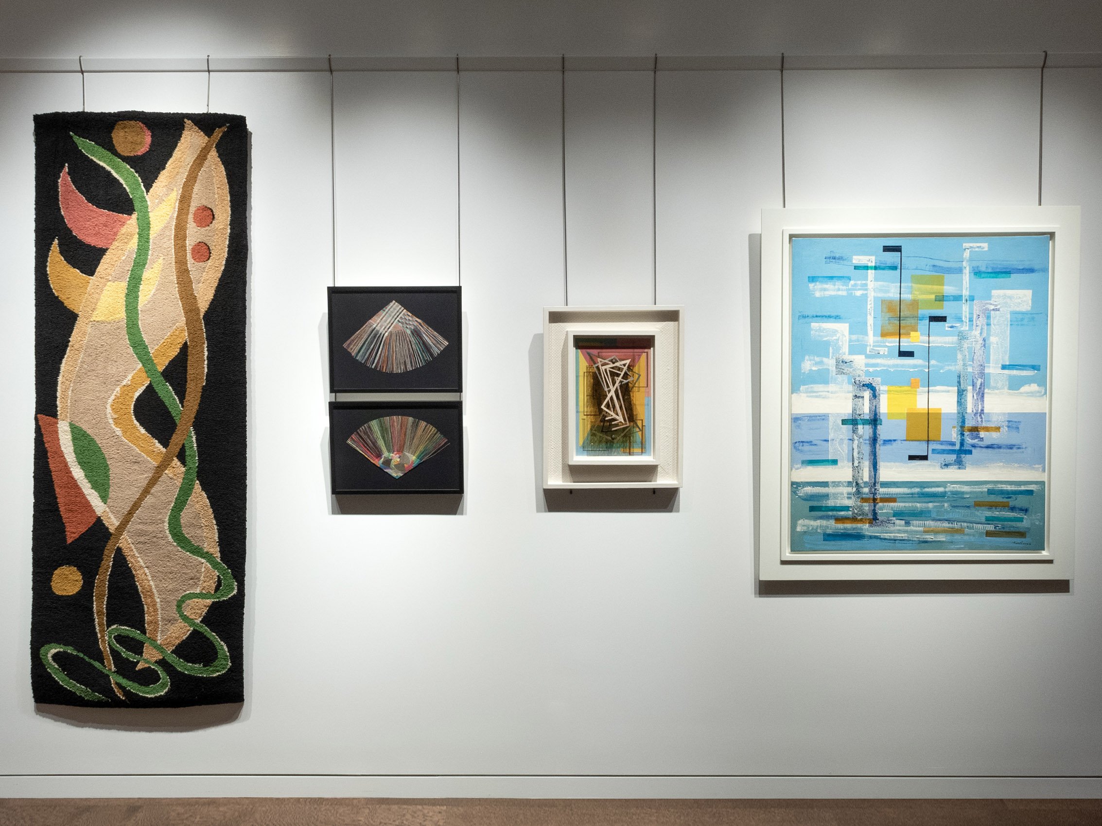
ABSTRACTION IN FIBER AND PAINT, 1976-1989

7 WOMEN RETHINK FINE ART AND CRAFT

February 1 - April 26, 2024

Installation Views | Essay | Biographies | For availability and pricing, call 212-581-1657.


Installation Views

Photography by Renan Teuman

Essay by Emily Lenz

Abstraction in Fiber and Paint, 1976-1989

This exhibition looks at the blending of fine art and craft by women artists in the 1970s and 1980s working in abstraction. Anchored by the work of Miriam Schapiro, a leader of Feminist Art and the Pattern & Decoration group (P&D), the exhibition looks at painters who use or reference fabric and fiber artists who work in painterly ways. All the artists in our exhibition use abstraction as a universal language and a means to explore color. The connection between abstraction and textiles is ancient; the warp and weft of woven textiles are the earliest examples of grids dating back 24,000 years. In the 1970s, the incorporation of craft into fine art was a feminist statement to acknowledge centuries of anonymous women’s work. The artists in our exhibition looked back and forward in time, embracing references to craft and nature while using computers or algorithms to achieve their vision. They embraced the plurality of materials and content seen in contemporary art today.

In addition to Miriam Schapiro, we include the painters Gloria Klein and Dee Shapiro who set up systems to determine their compositions, resulting in patterned paintings that recall woven textiles. Both Klein and Shapiro were part of the Criss-Cross Artist Collective focused on algorithmic approaches to painting and were included in the first significant exhibition on Pattern Painting held at PS1 (now part of MoMA) in 1977, along with Miriam Schapiro. Both the Criss-Cross and the P & D artists were interested in the use of repeated patterns to move beyond the Minimalist grid and cover their painting surfaces with bold moving color. All three artists were also contributors to the Feminist art publication Heresies. The fiber artists selected for our exhibition Cynthia Schira, Sherri Smith, Kris Dey, and Diane Itter each used grids, geometric color progressions, and paint or dyes to create their works. They were included in significant museum exhibitions in the 1970s and 1980s as they pushed their art form beyond craft through ambitious scale, new techniques, and unexpected materials. They all were in The Art Fabric: Mainstream, a 1981 publication by Mildred Constantine and Jack Lenor Larsen that identified 125 international artists key to fiber art. The accompanying exhibition opened at the San Francisco Museum of Modern Art and traveled to nine other American museums. These artists proved false the notion that craft begins with material and technique while art starts with an idea, fusing the two to offer contemplation and awe to the viewer.

Art that crosses categories or definitions remains fresh today. Many of our gallery exhibitions identify moments when new materials or techniques advance art forward. The gallery has shown abstract painters taking on sculptural form in constructions in the 1930s and shaped canvases in the 1960s. Our study of new materials has led to exhibitions on how the development of acrylic paints led to hard edge, flow, and staining in the 1960s. In this exhibition, the treatment of dyed or painted fabric is a natural extension of 1960s stained and Op paintings. In a way, the 1960s formalist discussions on the stained canvas are realized by our fiber artists as their process, materials, and color are inseparable.

In past exhibitions, the gallery has highlighted the influence of Bauhaus artist Josef Albers’ color theory on generations of artists. In this exhibition, the importance of both Josef Albers and his wife Anni as teachers is evident. Anni Albers published a book on weaving in 1965, introducing a younger generation to her Black Mountain College teachings. When Anni went to study at the Bauhaus in 1922, she was pushed into weaving as even in that idealistic school, women were encouraged to enter fields of craft rather than painting, sculpture, or architecture. She went on to show how weaving exemplified the height of modernity, encouraging her students to study and experiment with the interaction between medium and process that leads to form. Anni Albers’ teaching from the 1930s to the 1960s was integral to the development of fiber art as its own art form.

The fiber artists included in this exhibition worked parallel to the Pattern and Decoration (P&D) group of post-modern painters who also looked globally and historically for decorative patterns to use in their art. Both the painters and fiber artists shared an interest in pre-industrial textiles of Africa, Asia, Indonesia, and of course the Americas with Peruvian textiles and American quilts. Textiles as an art form began in the 1960s when artists moved away from the wall, scaled up their work, and used natural fibers to make works without function. In the 1970s there was a noted return to order, structure, and beauty in fiber art. This new Classicism built on advancement in artistic intent while returning works back to the wall. The P & D group aimed to make beauty their subject as well. In the 2008 exhibition Pattern and Decoration: An Ideal Vision in America, held at the Hudson River Museum, critic John Perreault said P&D “reintroduced beauty, particularly historical, non-Western, and populist beauty, into art. With its valorization of the floral, the lush, the colorful, and the complicated, the movement was in part a response to the cool Puritanism of minimalism in painting and sculpture.”

In the early 1970s, Miriam Schapiro developed her personal style, femmage, incorporating found fabrics and materials considered decorative into her paintings. With all their flourishes, the paintings maintain an underlying grid, developed out of her 1960s abstractions mapped out with early computer imagery. In A Garden in Paradise, 1982, Schapiro outlined her heart-shaped canvas with a border of cubes in purple, pink, and black as a nod to her hard-edge past. Schapiro selected shapes like hearts and fans as references to feminine and decorative traditions, as well as the body. Schapiro’s 1980s shaped works use abstraction, decoration, fabric, and figuration to create subversive feminist statements and alluring beauty.

Gloria Klein was a member of Criss-Cross, a collective of pattern painters based in New York and Colorado. She developed a system of diagonal lines of varying lengths to distribute color across the painting’s surface marked out in a grid of 1-inch squares. This system of set lengths and positions freed Klein to focus on the application of color. She first set out pieces of ¼ inch tape across the canvas, painted the field a monochrome color, and then removed the tape to add hatch-marks of colors. She applied the brightest colors first across the surface according to the factorials of the painting’s width. She then intuitively invented patterns filling in the remaining hatch-marks to create clusters of color. In a 1981 Criss-Cross publication she described her paintings as “interwoven surfaces of complex density”. A 1980 review notes in Klein’s work that “geometric bits of color make up computeresque but ultimately sensuous surfaces.”

Dee Shapiro also described her work as interwoven. A fellow member of Criss-Cross, Shapiro first explored the Fibonacci series, used in the Golden Ratio, to determine the color arrangements of her compositions. Shapiro acknowledges the importance of domestic skills in her art, remembering how the counting and patterns of knitting captured her attention as a child. In the series Chromatism from 1978 to 1980, Shapiro’s patterns are intuitive, no longer mathematical, as she followed Josef Albers’ lessons in color interaction. She squeezed paint out of a tube directly onto the canvas, giving her surface a woven or beaded texture that is often confused at first sight with a weaving.

Sherri Smith was included in the Museum of Modern Art’s landmark 1969 exhibition Wall Hangings, credited with establishing fiber art as an art form. She braided hand-dyed industrial cotton webbing into box-like units that combine a geometric three-dimensional surface with planes of intersecting and shifting colors. Her choice to weave 1-inch wide fabric rather than thread translated into works of monumental scale. After graduating with an MFA from Cranbrook Academy of Art, Smith designed jacquard-woven textiles for Dorothy Liebes and Knoll Fabrics in New York. She maintained her own studio and explored color in part out of an interest in nature, eschewing popular neutral coarse fibers. Her piece Volcano No. 10 was noted in the Wall Hangings catalogue for its gradation of color (orange, red, lavender, and purple) to reinforce its three-dimensional effect. In 1971 Smith left the textile industry and went on to start the first fiber arts program at the University of Michigan in 1974. In her process, Smith mapped out her geometric composition first, dyed the cotton webbing accordingly, and then began braiding. To obtain the desired result, Smith carefully worked out the patterning to maintain a single overall effect. Each side of the “cube” unit is differently colored creating prismatic patterns that shift as the viewer moves around the piece, as seen in Carnelian Tapestry, 1979 in our exhibition.

In contrast to the wide industrial bands Sherri Smith used, Diane Itter knotted fine linen threads usually associated with weaving or embroidery. She incorporated the geometry of Native American, Peruvian, and Ghanaian textiles into tightly composed arrangements of linen half-hitch knots. By the time Itter studied at Indiana University (graduating in 1974), hand-knot works by fellow students were made of coarse materials at a large-scale reflecting 1960s style developments. Instead Itter decided to work in a small scale using brightly colored threads. Her work was described as “miniature mosaics” in The Art Fabric: Mainstream. Every knot in Diane Itter’s work acts like a pixel; there are 400 knots per square inch (high-quality printed images are 300 dots per inch). Itter mapped out her geometric arrangements before starting a piece, which took over a week to complete. She pieced together small units of geometric arrangements to create a sense of overlapping and collage. Itter saw herself as both painter and sculptor, saying in a 1983 artist statement, “I paint with threads where color and structure are totally integrated and dependent upon one another.”

Cynthia Schira was an early adopter of the computerized loom which allowed her to weave in and out of three separate painted warps with discontinuous wefts of varying materials, colors, and sizes. Schira studied textiles at Rhode Island School of Design in the Fifties when the program trained students for the textile industry. This education exposed Schira to industrial processes like jacquard weaving, often said to be the first form of computing. In the 1980s Schira was one of the first weavers to use a computerized handloom. Her computer-assisted weaving (the computer handled the mechanical processes, not the design) freed her to use a painterly approach in finding her imagery as she worked. Schira had no issue with using computers in her practice, as she said “If you’re a weaver, you are using technology right from the very beginning. Every loom is a technological thing.” Schira’s work embraces innovative visual programs and complex weave structures, yet the impression for the viewer is poetry. Her multi-layered weavings expand beyond the grid to create an abstracted atmosphere that references nature without specific imagery.

Kris Dey was included in MoMA’s second major fiber exhibition Wall Hangings: The New Classicism in 1977. She used abstraction to convey the constantly shifting visuals of nature. In wrapping painted fabric, Dey expresses the changing patterns of nature without reference to identifiable forms. Both she and Cynthia Schira create an evocation of nature, rather than a replication. Dey studied at UCLA with Bernard Kester, a textile scholar who in 1971 organized Deliberate Entanglements at the UCLA Art Galleries, considered the first West Coast fiber art exhibition. That exhibition led Dey to make large, three-dimensional works at first, but with time she found herself focusing on color more than sculpture. Dey developed her technique of wrapping airbrushed fabric strips around contiguous tubes to create a luminous, atmospheric color field. She layered pattern and color by combining multiple designs with successive applications of paint. Using a repeating geometric pattern like Klein and Shapiro, Dey’s work emanates light because of the optic mixing of a limited range of colors. Her style is almost Pointillist. The unusual technique of hand wrapping and the vibrancy of her colors were a noted departure from fiber art in the 1960s.

Current exhibitions that confirm our interest in this period include Subversive, Skilled, Sublime: Fiber Art by Women (Smithsonian American Art Museum, May 31, 2024 – January 5, 2025, will include Miriam Schapiro and Cynthia Schira); Woven Histories: Textiles and Modern Abstraction (National Gallery of Art, Washington, DC, March 17 - July 28, 2024); and Weaving Abstraction in Ancient and Modern Art (Metropolitan Museum of Art, March 5 - June 16, 2024). With Pleasure: Pattern and Decoration in American Art 1972–1985 (MOCA, Los Angeles, 2019-2020 and Hessel Museum of Art, Bard College, 2021) included Diane Itter, Gloria Klein, Miriam Schapiro, and Dee Shapiro.

Biographies


SUN, SEA AND DORIS LEE

November 17, 2023 - January 26, 2024

Installation Views | Essay | For availability and pricing, call 212-581-1657.


Installation Views

D. Wigmore Fine Art presents Sun, Sea and Doris Lee, an exhibition of over thirty paintings by ten artists that show their creative responses to different aspects of Florida. The artists in our exhibition are Doris Lee (1904-1983), Virginia Berresford (1904-1995), Francis Chapin (1899-1965), Adolf Dehn (1895-1968), Lucy L’Engle (1889-1978), Witold Gordon (1885-1968), Reginald Marsh (1898-1954), Frederick Dana Marsh (1872-1961), Jan Matulka (1890-1972), and Sally Michel Avery (1902-2003)

We have singled out Doris Lee as she fell under Florida’s spell on her first visit in 1940.  She purchased a home in Key West in 1941 and with her husband, Arnold Blanch, spent January through April each year in Florida. Blanch taught at New York’s Art Students League and in art programs across Florida. Birds, fishermen and bathers by Blanch and Lee add joy to this exhibition. As artist-in-residence at the Research Studio in Maitland, Florida, Lee developed a friendship with Milton and Sally Avery who also spent the winters of 1950 and 1951 there. A Sally Michel bather and a floral still life stand out in the exhibition. Watercolors by Virginia Berresford reflect her interest in the intense light and shadow found in Florida’s exotic flora and fauna and underwater with coral and fish. Berresford wintered in Florida from 1934 to 1950 in Miami and then Key West where her husband was stationed at Fort Taylor during World War II. Lucy L’Engle, one of Provincetown’s modernists, painted a palm frond she used as a fan in St. Augustine. Reginald Marsh visited Ormond Beach regularly after his father, Frederick Dana Marsh, retired there in 1928.  We feature Reginald Marsh’s portrait of “The Battleship,” his father’s Ormond Beach house named for its streamlined modern architecture. In the foreground Marsh includes the carousel horses on the lawn that they rescued from the town dump. A real find in our exhibition is Dana Marsh’s plan for a mural in the “The Battleship,” which features different Florida Indians and a notation that Doris Lee liked the design. Several ocean and beachside subjects by Adolf Dehn speak of changeable Florida weather with a hurricane approaching Palm Beach, as well as paintings in which mists or sunny bird life are seen along the coast. We hope Sun, Sea and Doris Lee will bring you some sunshine.


AMERICAN STYLES OF THE 1930s

September 14 - November 10, 2023

Installation Views | Essay | For availability and pricing, call 212-581-1657.


Installation Views

Essay by Deedee Wigmore

There is a relationship between style and societal dynamics, as seen in the variety of art made by American artists in the 1930s. In the past American art had been adaptive of the styles developed by artists in other countries. Art was a luxury for the few and like all luxuries in a depression, art suffered. Art served a national function in the 1930s and was fused into a product with an American identity. To serve this cultural purpose in a decade of social and aesthetic changes, mainstream American art was realistic and its representations of familiar scenes in American life effectively functioned to validate the country’s nationalistic spirit. The Stock Market Crash of 1929 ended the prosperity of the 1920s. Industrial development declined steadily, mortgages were foreclosed and the dispossessed could be seen camped out or on the road looking for work. The problem of relief was passed onto the states and private charity.

William Gropper, The Last Cow, 1937

The enactment of a multi-phased six-month program of New Deal relief for the arts began in 1933 with the Public Works of Art Project. It supplied work for unemployed qualified artists in decorating non-Federal public buildings. In 1934 a second program, the Section of Painting and Sculpture of the Treasury Department, began and continued through 1943. This second program provided relief by employing artists to produce murals and sculptures for existing Federal Buildings. It was more than a relief program, it became a cultural one with regional competitions and centers for creating, exhibiting, teaching, and recording art under Holger Cahill. This program broke the narrow boundaries of connoisseurship and created a national reservoir of art appreciation. Rigid control of style and subject matter were not conditions for this relief. These government employment programs made the artists feel needed to paint what the Depression meant to America. Their art said, “This is my country” and it was called art of The American Scene. It expressed in the descriptive language of representational realism a firm belief that it was the social responsibility of the artist to communicate through a language understandable to the public. The American Scene was made up of different groups of realists: Regionalists, Social Realists, and Modernists, an umbrella term for art that retained elements inspired by older styles such as Precisionists, Magic Realists, and folk art. This sanctioned diversity of styles operating within realism allowed artists to appropriate ideas and fuse them into something new with an American identity, key to the dynamism that allows us to move forward so creatively.

Clyde Singer, Jim, 1936

The largest group of representational artists were the Regionalists. They painted rural American scenes that glorified the simple mode of life lived in a community close to the soil. Their paintings reflected a desire to rediscover the history and regional achievements of each state. Urban realists could be counted as Regionalists when their keen observation of urban living expressed an appreciation of the opportunities city life provided.  

Raphael Soyer, Men at the Mission, 1935

Another group called the Social Realists focused their art on appeals for economic equality. This group were often immigrants striving to succeed in America and become a part of the mainstream. Class consciousness was replacing ethnic consciousness for some in this group. Anger against the idealized majority culture was expressed in their art. The art of social protest was as much a part of the American Scene as Regionalism. Its realism differed in subject matter and attitude. The Social Realists painted unemployment, strikes, and lynching subjects. Depending on the subject, a painting’s mood was expressed in color selection, such as somber colors to suggest sadness and resignation or bright strong colors to indicate action and sound. The Social Realists could also surprise you with a positive statement about the history, habits, or environment they felt should be noted.         

Allan Gould, American Farm, 1930

Emil Bisttram, Adobe Village, 1936

Modernism continued to evolve in the 1930s even though it was pushed out of the mainstream as the country turned away from Europe, not just its art style but its problems of war and revolutionary ideology. American Nationalism in the 1930s was focused inward on building and rediscovering what was American. Folk art was praised as a symbol of American self-sufficiency. It was a product of a time when the artist-craftsman was linked to his local community through the production of artful objects available to all. The rediscovery of American folk art paintings attracted Modernists who began to collect it and found its direct simplicity influenced their style. The Modernists did not forget conceptual tenants of art absorbed and transmitted by Americans visiting or studying in Europe before 1930; their knowledge continued to be taught, evolve, and be transformed into American statements. New York’s Museum of Modern Art, founded in 1929, continued exhibitions focused on diverse sources of Modernism throughout the 1930s including American folk art, Abstraction and Surrealism. American Modernist artists felt that socially relevant art could be made without using art as propaganda.  

The Modernists argued Abstraction and Surrealism allowed for the discovery of new possibilities which would create a renewed dynamic America. Modernists combined an American subject executed realistically with their interest in aesthetic dimensions - texture, form, color, and organization. The Transcendental Painting Group, a loose organization of New Mexico artists, explored the projection of spiritual and imaginative qualities into art with an emphasis on the formal and emotional elements rather than the subject matter. Another group that evolved out of European Surrealism in the 1930s were the Magic Realists. They created a dream-like world to bring to the surface internalized experiences. Depictions of familiar objects in new spaces, forms, and relationships were used to comment on or question reality. Pure Abstraction was not a part of the American Scene movement, but was a growing force during the 1930s. So, it is not surprising that elements of abstraction were incorporated into realistic works by some of the American Scene artists. 

At the close of the 1930s, these artists working in different styles of realism as part of the American Scene movement were exhibited together in the 1939 New York World’s Fair to reflect the American democratic spirit.  Our exhibition of art styles in the 1930s includes mural studies, paintings, and sculpture by Regionalists, Social Realists, and Modernists handling topics of employment, immigration, industry, and the varied landscape of America. 


CHARLES GREEN SHAW (1892-1974): THE BERTHA SCHAEFER YEARS

May 23rd - September 8th, 2023

Installation Views | Essay | For availability and pricing, call 212-581-1657.


Installation Views

The Bertha Schaefer Gallery gave Charles Green Shaw 6 solo exhibitions from 1963 to 1973. Each catalogue listed 22 to 30 large works with a note that smaller paintings were available. As a founding member, Shaw continued to exhibit with the American Abstract Artists and the Federation of Modern Painters and Sculptors in the 1960s. Shaw was included in the Whitney Museum’s 1962 traveling exhibition Geometric Abstraction in America.

Shaw’s work is in over 50 museums. His 1960s works are in the following collections: Brooklyn Museum, Joslyn Museum of Art, Sheldon Museum of Art, Smithsonian American Art Museum, Telfair Museums, Ulrich Museum of Art, and Yale University Art Gallery. In addition to art, Shaw had 4 books of poetry published from 1959 to 1969.

Essay by Emily Lenz

Charles Green Shaw (1892-1974) had his first exhibition in New York in 1934 (Manhattan Patterns at Valentine Dudensing Gallery) and his last in 1973 at Bertha Schaefer Gallery. For four decades, Shaw had solo exhibitions with top New York galleries and while styles came in and out of fashion he continued to work in abstraction. Our exhibition presents works from his years with Bertha Schaefer Gallery, 1963-1973. In the six solo exhibitions there, Shaw exhibited the largest canvases he ever executed, an impressive feat for a man in his seventies. In the 1960s there was finally an appreciation and market for the hard-edge style Shaw first used in the 1930s.

In joining Bertha Schaefer Gallery in 1962, Shaw connected with another generation of young artists, such as Will Barnet. Shaw had close relationships with each of his art dealers and often accompanied Schaefer to openings and parties. Shaw frequently dropped in on his first dealer Valentine Dudensing in the 1930s to see the great Europeans he handled such as Picasso, Miro, and Mondrian. The Dudensings and Shaw socialized in New York and Paris and when war broke out in Europe the Dudensings took Shaw to Bermuda in 1941. When the Dudensings retired to France in 1947, Shaw showed with Georgette Passedoit until her retirement in 1960. Bertha Schaefer visited Shaw in 1962 and gave him his first exhibition in January 1963. In the 1930s, faced with few sales due to the Depression and a small audience for American abstraction, Shaw made only a few 40 x 30 canvases each year, preferring 16 x 20 works on canvasboard he could easily store. He increased the number slightly in the 1940s as the early Guggenheim Museum and the Federation of Modern Painters and Sculptors created exhibition opportunities. Schaefer’s gallery had room to exhibit 20 large scale works each exhibition and Shaw enjoyed having a market for large works. 

Admiring the work of Ellsworth Kelly (1923-2015) and Frank Stella (b. 1936), Shaw pared down his geometric compositions to polygons, circles, and lines in the 1960s. He aimed for the works to have solidity and impact, as well as balance while simplifying the shapes. Yet Shaw’s canvases differ from the 1960s hard-edge style in their painterliness. While artists like Kelly and Stella were erasing the artist’s hand in their flat paintings, Shaw built up texture in large areas of his canvas. This stippled texture first appeared in Shaw’s 1930s compositions as a nod to Cubism. The texture in the 1960s works adds dimension and draws the viewer in while the large forms powerfully push out. Shaw has a limited palette during this time of green, red, and yellow along with black and white. Yet variation in hue is achieved through underlayers of another color, often blue. Shaw discovered in taping out his shapes that he could allow the underpaint to show just slightly along the edges of the shapes. These nearly imperceptible borders give the compositions vibrancy and tension in the balance of large shapes. While the works first appear minimalist, the added texture and colorful outline makes the paintings dynamic.

In the press release for Shaw’s first Bertha Schaefer exhibition, he said: 

In all I have sought the cadence of color and curve of movement, combining an organized rhythm with the impact of mass and pull. In none of them has purpose yielded to chance nor has accident played a major role. This work is not the result of a year or two of painting, during which period it was conceived, but rather of some thirty years’ trial and experimentation, whose empirical efforts have culminated in these canvases.

Shaw was most productive in generating ideas in the summer. Starting in 1944, Shaw spent much of the summer on Nantucket, sketching and writing poetry at the beach. He drew in pencil, refining the proportions of a shape over many sketches, going through three 30-page sketchbooks a month. Settling on a shape, he would make a watercolor or tempera study on a 9 x 12 inch sketch pad. Back in New York in the fall Shaw reviewed the tempera sketches, which he called documents, with friends and his dealers Passedoit and Schaefer to select compositions to execute in oil. First Shaw would paint a 12 x 16 inch canvas based off a sketch then select the best to build up into exhibition-size canvases. Shaw’s methodical process created large scale paintings that are assured and bold with meticulous straight edges and varying textures.

At the height of the Space Race in the 1960s, Shaw explored flight and space with openings and voids within amorphous shapes. In the Silhouette paintings, the central image appears both sculptural and as an opening. Exploring optics and perception, Shaw created compositions that draw the viewer in or push out into the viewer’s space, as seen in the bisected black circle in Breakthrough. Shaw’s highly calculated and refined composition use the push-pull of postwar painting to create a balance of tension and solidity in his dynamic works that engage the viewer.


THE CHANGING WEST: 1865-1965

Feb. 22 - May 19, 2023

Installation Views | Essay | For availability and pricing, call 212-581-1657.


Installation Views

Essay by Deedee Wigmore

Art has a role in expressing our national identity, values, and aspirations. The western states of Arizona, California, Colorado, Idaho, Montana, New Mexico, Texas, Utah, Washington, and Wyoming all have a particular fascination as their histories connect with frontier America and its Native American peoples. The first Americans to travel west and start new lives inspired successive generations and shaped the national imagination- ultimately the American character which is individualistic, self-reliant, and democratic. The America spirit was formed in the crucible of the west. For Americans the west was seen as a mythical land of personal and economic opportunity.

THE FIRST ARTISTS TO TRAVEL WEST

ALBERT BIERSTADT

In the 1850s the Western Territories of the United States awaited both settlers and its visual historians. The way west was by inland waterways. In 1859 Albert Bierstadt (1830-1902), a German-born artist based in New York, traveled to St. Joseph, Missouri to join Colonel Frederick Lander’s party planning the Pacific Railway Survey. Bierstadt made it to the south pass of the continental divide and returned to New York with sketches, photographs, and Indian artifacts. As it was unsafe to travel without a military escort, Bierstadt’s second trip west was not until 1863, this time going overland to California following the old Oregon Trail. Bierstadt returned to California for a two year stay in 1871 and in 1880 visited Yosemite for the first time. Bierstadt is represented in our exhibition by Western Mountain Scene.

WORTHINGTON WHITTREDGE

Worthington Whittredge (1820-1910), born near Springfield, Ohio accompanied General John Pope on a survey of Colorado and New Mexico in 1866. Whittredge made a second journey west in 1870 to Colorado and Wyoming with Sanford R. Gifford and John F. Kensett. A further trip west to the Platte River region of Colorado in 1871 was followed by trips to Mexico in 1893 and with Frederic Church in 1896. The painting Platte River from Whittredge’s first trip west is included in our exhibition.

RALPH BLAKELOCK

Ralph Blakelock (1847-1919), a native New York artist, made a trip up the Missouri River through the territories of the Lakota Sioux, Arikara, Mandan, Assiniboine, and Gros Ventre Indian lands unaided by military escort. At Fort Pierre Blakelock hooked up with government-contracted trappers who moved between military forts. Where the Missouri meets the Yellowstone in Montana Territory, Blakelock stayed with the Assiniboines. Perhaps this stay caused Blakelock to adopt the Indian arrowhead as part of his signature and to paint Indians in a peaceful setting where they exist in harmony with nature. By 1870 Blakelock was able to make his way by train to Colorado and then traveled by horse through Wind River and the Teton Range. In the Snake River Valley, Blakelock lived with the Uintah Indians. In Blakelock’s third trip west in 1871, he traveled through southern and central Colorado to the Paiute Indians of the Nevada desert.

In executing detailed panoramic views of unspoiled American wilderness, each of these artists paid homage to the Hudson River School. However, by 1884 Ralph Blakelock has become interested in Tonalism. His friends in the Tenth Street Studio Building had become John Francis Murphy, George Inness, Alexander Wyant, and Dwight Tryon. This group of artists endeavored to capture depth, different times of light and shadow, and a new kind of color and tone. Blakelock’s Indian Encampment in our exhibition embraces this new style with loose brushwork, informal composition, and atmospheric use of color aimed to combine both the real and the ideal to convey a spiritual correspondence between art and nature.

INCREASING ACCESSIBILITY TO THE WEST

ERNEST LAWSON

As the West became accessible by rail and telegraph, western art developed new patterns of expression that were more Impressionist. Although born in Halifax, Canada, Ernest Lawson (1873-1939) grew up in Kansas City, Missouri and spent time in France where he began to apply the Impressionist style to modern urban scenes and landscapes. Lawson traveled west in 1927 to teach at the Broadmoor Art Academy in Colorado Springs. While there, he captured Colorado’s mining and ranching life in glowing transparent color with a paint application that gives a sensuous quality and tactile feel to the flat decorative surface, as seen in Little Ranch, Colorado.

JOHN SLOAN

John Sloan (1871-1951) was born in Lock Haven, Pennsylvania and developed as an artist in Philadelphia at the Pennsylvania Academy of the Fine Arts. By 1909 Sloan was applying a realist style to a broad array of urban subjects for which he became famous. Sloan first visited the Southwest at the suggestion of Robert Henri the summer of 1919. In Santa Fe, John Sloan found a region of incredible color and startling natural grandeur that caused him to see landscape itself as his subject. Culebra Range, Early Autumn, 1923 reflects the variety and complexity of the landscape. From 1919 to 1950, Sloan spent half the year in New Mexico. In the beginning, Sloan had a free studio space built for visiting artists in the courtyard of the Museum of New Mexico. The museum offered this to nationally known artists to draw attention to the region and culture. A change in attitude to Indian culture took place between 1920 and 1930 and there were now efforts to preserve it through education, training programs, and sales outlets for self-sufficiency. Eventually Sloan purchased an adobe house, adding a studio and viewing tower. He traveled out to paint geometric formations and portrayed the surviving customs of the Indians and the Anglo or Mexican cultures with monumental figures anchored in the landscape. Sloan’s New Mexico paintings executed with bold color started with a monochromatic underpainting upon which oil varnish glazes were superimposed. This technique allowed separation of form and color. Immersed in the cultural life of Santa Fe with full sympathy and respect, Sloan arranged the first exhibition of contemporary Indian paintings in New York in 1920 at the Society of Independent Artists, where he was president from 1918 to 1945. 

JOHN MARIN

John Marin (1870-1953), a native New Jersey artist, traveled to Taos, New Mexico with his wife and son the summers of 1929 and 1930. He was 49 years old and an established artist. As a guest of Mabel Dodge Luhan, Marin borrowed her car to explore the surrounding area. He had been told the Taos scene would suit him as it fostered experimentation across artistic media and particularly in watercolor. Marin quickly adjusted his eyes and used his rare genius for locating the right place within the landscape to create a strong composition. Marin executed map-like portraits of the Taos area in watercolors filled with light and space. These works connected to Pueblo Indian watercolors, which had a distinctive style that relied on outline and color without modeling or perspective. Marin’s watercolors are quite specific as landscapes, while focused on line, pattern, color, arrangement, and structure. John Marin created 94 New Mexico watercolors out of his two visits to Taos. In them one gets a sense of the eternal through natural earthbound symbols.     

THE AMERICAN SCENE IN WESTERN STATES

ARNOLD BLANCH, ADOLF DEHN, WILLIAM GROPPER, PETER HURD, YASUO KUNIYOSHI, ARCHIE MUSICK, DALE NICHOLS, AND WINOLD REISS

During the period 1930-1945 there was much debate about what constituted an American place. Regionalism or American Scene art aimed to rediscover America with art dedicated to embodying the values, aspirations, and past achievements of its people. This kind of realism became the mission statement of the federally funded national arts program of the Depression era. The program called for images of daily life or historical events presented in a realistic style with a message that all Americans could understand. Although demographics had shifted from farms and small towns to cities, regionalist subjects in the American Scene style were the central art story from 1930 to 1945. Many significant artists traveled to paint and teach in our western states. Adolf Dehn (1895-1968), Arnold Blanch (1896-1968), and William Gropper (1897-1977) all painted Colorado. Yasuo Kuniyoshi (1889-1953) showed us Virginia City, Nevada. Winold Reiss (1886-1953) painted the cowboys and Indians he knew in Montana. Dale Nichols (1904-1995) and Peter Hurd (1904-1984) painted the landscape, bright light, and changeable weather of Arizona and New Mexico.

ABSTRACT VISIONS OF THE WEST: FROM NEW YORK AND NEW MEXICO

Significant changes in art styles occurred between 1913 and 1930 in America. The emphasis on the geometry of Cubism and the exploration of color relationships resulted in an effort to paint nature’s underlying structure. Modernism became a march to abstraction. The first exhibition of French Surrealism was held at the Wadsworth Atheneum in 1931. Surrealism created elements of surprise through unexpected juxtapositions, which produce unconscious associations allowing the incorporation of movement, chance, and time into art works. Surrealism helped develop a more systematic and serious attitude towards the subconscious as an essential source of art and influenced some artists to challenge the assumption that a geometric abstraction had to be mathematical and rational. By 1937 European abstraction had developed a following in America, which led to the founding of the New York group American Abstract Artists. By exhibiting together, these forty artists aimed to build an audience for abstraction in America. They were greatly aided by Hilla Rebay’s development of the Museum of Non–Objective Painting which gave them additional opportunities to exhibit their work.

ILYA BOLOTOWSKY, WERNER DREWES, AND CHARLES GREEN SHAW

Ilya Bolotowsky (1907-1981), a Russian immigrant who grew up in New York and was a founding member of the American Abstract Artists, is represented in our exhibition by Centennial, 1949, which was inspired by the abandoned Wyoming mining town of Centennial. Bolotowsky headed the art department at the University of Wyoming from 1948 to 1957 after teaching at Black Mountain College, Ashville, North Carolina in 1946-48.

The development of abstraction in America widened the acceptance and interest in Native American Indian culture. Our exhibition offers paintings by two other member of the American Abstract Artists group: Artifact, 1941 by Charles Green Shaw (1892-1974) and Indian Motif, 1943 by Werner Drewes (1899-1985). These paintings evoke Indian design ideas.

EMIL BISTTRAM AND RAYMOND JONSON

In New Mexico the Transcendental Painting Group was active from 1938 to 1942. The group included ten artists: Raymond Jonson, Agnes Pelton, Emil Bisttram, Lawren Harris, Florence Miller Pierce, Ed Garman, Horace Towner Pierce, Robert Gribbroek, Stuart Walker, William Lumpkins, and Dane Rudhyar. Hilla Rebay saw the Transcendental Painting Group at the 1939 Golden Gate International Exposition in San Francisco and invited them to exhibit at The Museum of Non-Objective Painting. The group’s goal was to carry painting beyond the appearance of the physical world through new concepts of space, color, light, and design to help imagine an idealistic and spiritual world. In Santa Fe exposure to Indian prayer dances underlined the awareness of powerful forces in the world that connected with Surrealist thought. Our exhibition offers examples by the two founders of the Transcendental Painting Group: Raymond Jonson (1891-1982), an Iowa artist, who first visited Santa Fe in 1922 and Emil Bisttram (1895-1976), a New York artist born in Hungary, who first visited Taos in 1930.

Emil Bisttram settled in Taos, New Mexico in 1932 and founded the Taos School of Art. He had been in Mexico in 1931 supported by a Guggenheim Fellowship to study fresco painting with Diego Rivera. This experience allowed Bisttram to compete successfully for and achieve murals for various public buildings in a representational style for the Works Progress Administration. At the same time Bisttram was evolving abstract images of Indian design such as Kachina With Headdress and landscapes like Woven Landscape. The abstraction titled Adobe Village, 1936 was developed by Bisttram out of Pointillism, replacing the dots of pure color with squares to express in a geometric way an adobe community. Raymond Jonson settled permanently in Santa Fe in 1924. As he acquainted himself with the landscape and changing light, his landscapes evolved from modernly representational to pure abstraction. In our exhibition, Jonson’s Casein Tempera No. 5, 1938 offers a feeling of the desert’s response to extremes of weather as symbolized lightning strikes and both land and air respond. Like Emil Bisttram, Raymond Jonson was able to compete for and achieve two representational murals in New Mexico in 1934 under the auspices of the Public Works of Art Project. Both of these artists used abstract symbols to represent invisible life forces. 

THE WEST IN POSTWAR ABSTRACTION

RICHARD ANUSZKIEWICZ, JIMMY ERNST, PAUL REED, AND STEVE WHEELER

Between 1930 and 1941, a wave of German and French abstract artists immigrated to the United States including Josef and Anni Albers, Werner Drewes, Herbert Bayer, and Laszlo Moholy-Nagy. These artists and Bauhaus teachers taught the next generation of American artists. Max Ernst, an orthodox Surrealist arrived in New York in 1941 and with his son Jimmy created Surrealist expressions of the New Mexico landscape.

By the end of World War II international styles became more attractive to Americans. By 1953 there was both an aesthetic and conceptual shift evident in western art. The expression of inner feelings in gestural abstraction seemed a natural evolution from Surrealism and Zen thinking. The new larger scale and working in a related series of paintings became accepted. Compositions became more reductive, hard edge, and were rooted in formal and conceptual concerns. Richard Anuszkiewicz (1930-2020), a student of Josef Albers, became fascinated with the new understanding of how the eye perceives space and using the interaction of color created a new kind of optical movement in his art. Untitled, 1961 in our exhibition is an example of Anuszkiewicz’s proto-Op style adapted from Indian symbols. In another style of geometric abstraction, Paul Reed (1919-2015), a member of the Washington Color School, made a shaped canvas of a monumental cross, evoking a New Mexican adobe church and creating a spiritual response for the viewer. Steve Wheeler (1912-1992), the Indian Space Group artist, uses ancient native symbols full of pattern, message, and color in rhythmic, flat design to give the viewer both emotional feelings and technical realism. Primitivism is an important but elusive element.

These western-inspired American paintings speak to art’s role to build bridges between cultures across space and time.

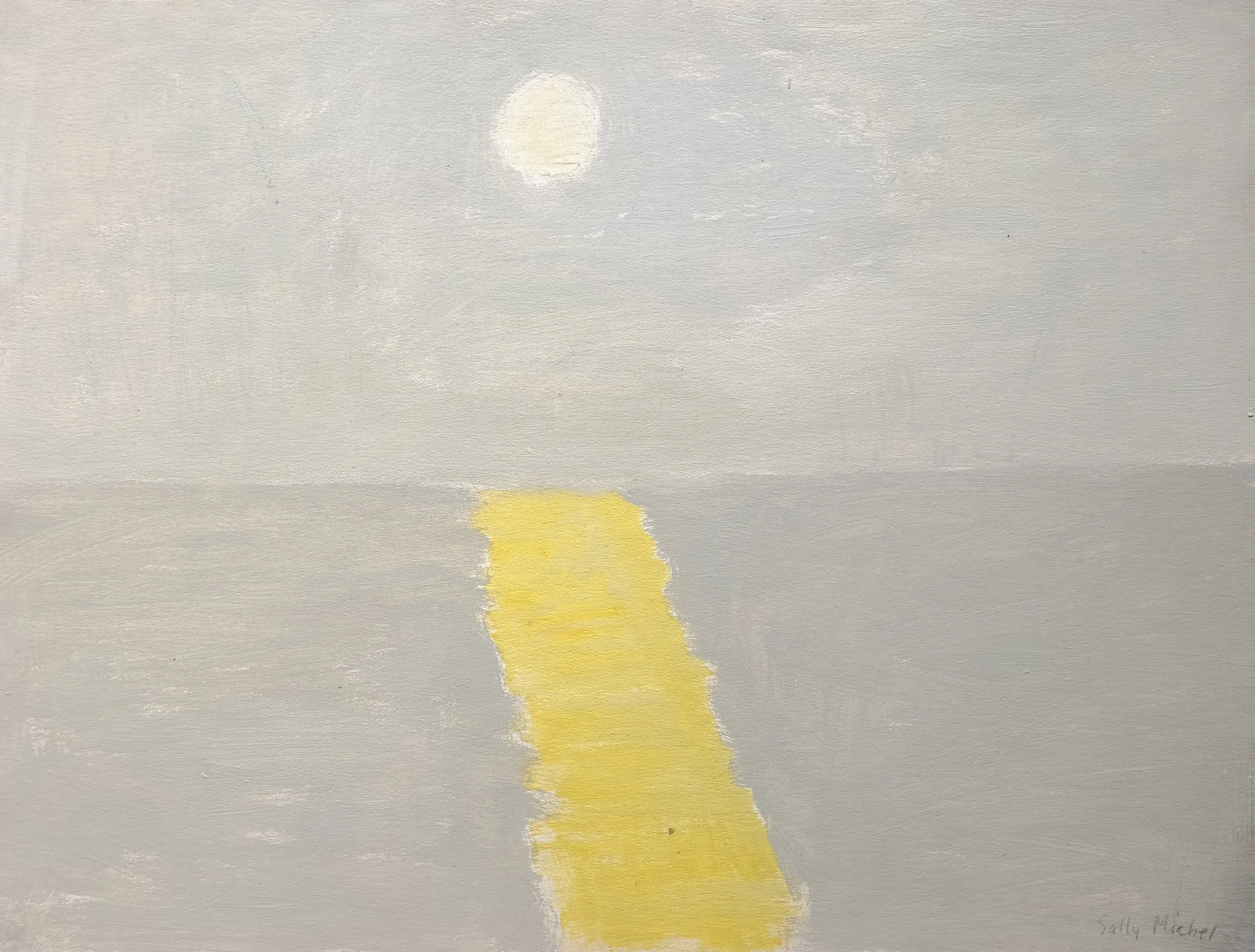
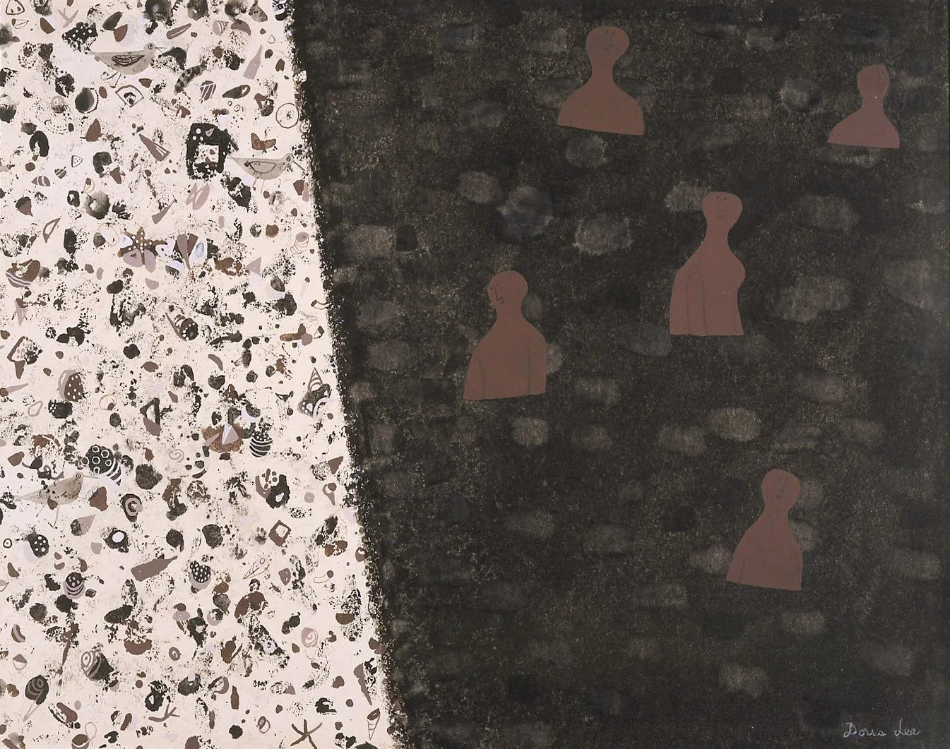
I. RICE PEREIRA: THE NATURE OF SPACE

Nov. 15, 2022 - Jan. 27, 2023, extended through Feb. 17, 2023

Installation Views | Essay | For availability and pricing, call 212-581-1657.


Installation Views

Essay by Emily Lenz

I. Rice Pereira (1902-1971): The Nature of Space, an exhibition of 1940s glass constructions and 1960s Lapis paintings runs November 15, 2022 through January 27, 2023. With 5 glass constructions from 1944-1952 and 12 significantly sized paintings from 1960-1970, the exhibition shows how abstract artist Irene Rice Pereira’s exploration of light and space in her groundbreaking glass constructions was applied to her later paintings.

Pereira first worked in glass in 1939 while teaching at the Design Laboratory, a WPA effort to establish a Bauhaus-style school in New York. There she had access to industrial designers, a workshop, and a variety of materials. Pereira painted geometric compositions on clear, hammered or fluted glass which she layered to capture light and movement. Six constructions were exhibited at Peggy Guggenheim’s Art of This Century in a solo exhibition in 1944.  About 40 glass constructions from 1939-1952 have been identified; many were acquired by museums when first exhibited.

Irene Rice Pereira received a solo exhibition (held jointly with one for Loren McIver) at the Whitney Museum of American Art in 1953. They were the first women to receive solo exhibitions at the institution. Ahead of the Whitney exhibition, both Life and Artnews featured articles on how Pereira made her glass constructions.

At the height of her fame in the early 1950s, Pereira returned to painting in oil on canvas. Pereira applied knowledge from the glass constructions onto a single surface, using varying textures and degrees of transparency in her paint application. Returning to traditional materials allowed Pereira to scale up her work. The glass constructions were limited in size- the largest glass pieces were 24 1/2 x 40 inches (such as Shooting Stars, 1952 at the Metropolitan Museum of Art and Mirror Image, 1952 in our exhibition). Through the 1950s Pereira distilled her geometry while increasing the size of her canvases. Many 1960s Lapis paintings measure 50 x 56 inches.

Irene Rice Pereira understood the Atomic Age required a new understanding of man’s place in the world and expanding universe. She synthesized her theory on the nature of space in the 1950s, collecting the ideas of ancient philosophers like Euclid and Plotinus, Enlightenment thinkers like Kant, 19th century mathematicians including Charles Howard Hinton, and recent theories by Carl Jung in organized notebooks, recorded alongside notations on her paintings and poems. In 1956, Pereira published excerpts from her book The Nature of Space in the catalogue for her Wellons Gallery exhibition in New York. 

By the late 1950s, Pereira found her approach to transform her writing into visual form. First she extracted her philosophical ideas into poetry and then slowly the poems inspired paintings. One poem The Word, written in 1958, stimulated 33 paintings over the next three years, each titled with the specific line that provided the inspiration. Pereira knew her writing may not be accessible to all, so she relied on the beauty of her paintings to reach more people.

As the world entered the Space Race, Pereira felt the single-point perspective of the Renaissance and a static horizon line no longer applied. In 1957, she published a portfolio of writing and diagrams titled The Lapis, which demonstrated the evolution of man’s perception of space from primitive through ancient and medieval to Renaissance eras. Over the next few years she explored how to convey the new perception of space into paintings. In 1960, Pereira settled on a structured composition with a limited vocabulary of symbols (z-shaped lines, squares, rectangles, and long brush strokes) on a tripartite field. With these symbols, Pereira explored how adjustments in their color, texture, transparency, and placement create a sense of infinite depth and mood. In the Lapis paintings, Pereira found a way to synthesize her artmaking, poetry, and philosophy.

Pereira’s drive to create resulted from seeing so much fracturing in the postwar period. She felt a higher art was needed to elevate humankind to a peaceful unity that could only be achieved with a new understanding of man and his place in the universe. In Pereira’s own words, she described her philosophy as:

It is a new orientation in relation to the space age. The mind perceives the object, the world, the universe and the cosmos as spatial imagery. The barriers of 2500 years of a closed-in finite universe are removed, as well as contradictions between the finite and the infinite. There is no duality. Man’s destiny in the space age is assured. The structure of the new optic demonstrates that we do not perceive solids as concrete mass but in a dematerialized form, a spatial imagery as light is deflected on contact with objects and a spatial imagery is reflected or mirrored back in successive wave formations. Descartes shows objects as chunks of space or geometry incarnate. This study shows space as the geometry of light.

The Transcendental Formal Logic of the Infinite, the Evolution of Cultural Forms, 1966

In 1968 an exhibition of Lapis paintings and meditative drawings toured North Carolina institutions (Wilmington College, the Weatherspoon Art Gallery and the Mint Museum). Pereira was featured in the 1969 Corcoran Biennial with 5 Lapis paintings dating from 1962 to 1967 (including Primordial Blaze of the Absolute, 1962 in our exhibition). The Corcoran republished The Nature of Space in 1968 with a foreword from director James Harithas and The Lapis portfolio in 1970.  

Public institutions with Lapis paintings include: Arkansas Museum of Fine Arts; Blanton Museum of Art; Brooklyn Museum; Lowe Art Museum; National Gallery of Art (Corcoran Collection); Rhode Island School of Design; Rose Art Museum; Skidmore College; Smithsonian American Art Museum; Syracuse Museum of Art; and University of Arizona Museum of Art.


PAUL JENKINS: LYRICAL ABSTRACTION

September 7 - November 11, 2022

Installation Views | Essay | For availability and pricing, call 212-581-1657.


Installation Views

Essay by Deedee Wigmore

D. Wigmore Fine Art presents Paul Jenkins (1923-2012): Lyrical Abstraction with 15 acrylics on canvas and 3 watercolors executed between 1960 and 1979. This exhibition focuses on Paul Jenkins’ mature work which arrived with the introduction of water-based acrylic paint around 1960. To give viewers an idea of why Paul Jenkins deserves their attention, here is a list of some of Jenkins’ most important museum exhibitions during the 1960s and 1970s. Below you’ll find the story of how Paul Jenkins developed his unique style as an Abstract Expressionist.


1960 - Important Launch
60 American Painters, Walker Art Center, Minneapolis

1961   
Abstract Expressionists and Imagists, Solomon R. Guggenheim, New York

1962   
Art Since 1950, World’s Fair, Seattle

1962 -1964
Art USA Now travels to museums in America, Europe and Japan

1963   
New Acquisitions, Solomon R. Guggenheim Museum, New York

1964   
Painting and Sculpture of a Decade, 1954-1964, Tate Museum, London

1965   
Painting without a Brush, Institute of Contemporary Art, Boston, also includes: Chamberlain, Frankenthaler, Louis, Noland, Olitski, Pollock, Riopelle

1967   
The 1960s: Paintings and Sculpture from the Museum of Modern Art Collection, MoMA, New York

1968   
Dada, Surrealism, and their Heritage, Museum of Modern Art, Art Institute of Chicago, and Los Angeles County Museum of Art

1971   
First American museum retrospective, Museum of Fine Arts, Houston, travels to the San Francisco Museum of Art

1972   
Paul Jenkins, Discoveries in Watercolor, Corcoran Gallery of Art, Washington, DC, travels to museums across the United States through 1974

Abstract Expressionism: The First and Second Generations in the Albright-Knox Art Gallery, Buffalo, also includes: Gorky, Gottlieb, Graves, Hartigan, Hofmann, Kline, de Kooning, Marca-Relli, Mitchell, Motherwell, Rothko

1974   
Inaugural Exhibition, Hirshhorn Museum and Sculpture Garden, Washington, DC

The 1960’s: Color Painting in the U.S., University Art Museum (now the Blanton), University of Texas, Austin

1977   
Selections from the Lawrence H. Bloedel Bequest, Whitney Museum of American Art, New York


Born and raised in Kansas City, Missouri, Paul Jenkins’ interest in art began with frequent visits to the Nelson-Atkins Museum of Art where he was drawn to its Asian art collection. While a high school student, Jenkins experienced the chemistry of painting working summers in a ceramics factory. Watching expert artisans at work, Jenkins witnessed the tension in timing the correct moment to add something in an artistic creation. After serving in World War II, Jenkins used his military service benefit to attend the Art Students League in New York from 1948 to 1952. Jenkins’ four year course at the League occurred during the advent of Abstract Expressionism, a style which saw painting not as a recording of an object or place but as an emotional event. Meeting Jackson Pollock, Mark Rothko, and Barnett Newman, Jenkins realized his own artistic goal was to transform intangible feeling into valid pictorial forms. He saw that Pollock did this in woven webs of paint while Rothko achieved it using tonal fields of color as containers of light. Jenkins noted that both Pollock and Rothko achieved structure while leaving no trace of brushstrokes. In becoming an Abstract Expressionist, Jenkins discarded deeper perspective, recognizable subject matter, a contained composition, and standard brush use. Perhaps remembering the glazes melting, flowing, and interacting in the kiln at the ceramics factory helped Jenkins discover his unique painting technique.

Paul Jenkins worked flat, pouring layers of liquid enamel paint onto primed and gessoed canvas. He thinned his pigments so the paint could flow and spread, manipulating the paint and canvas using brushes and gravity within the time it took to dry. In 1956 he discovered that chrysochrome enamel out of a tube could be used to create a precise line. New materials along with techniques were acquired by experimenting with dripping, staining, and achieving contrasts between thickened and thinned pigments. Painting wet on wet, the colors interacted to suggest an imaginary space. As Jenkins developed the ability to guide the colors in a controlled improvisation, he could make forms appear in that imaginary space. Over the 1950s, Jenkins mastered both the creation of projecting masses and the manipulation of puddling, melting, and blending of colors to suggest movement not only across the surface but also beneath it.  He courted chance occurrences or accidents and incorporated them into his compositions. Jenkins recognized that change and transformation underlies all existence and strove to communicate this in his art.          

Around 1959-1960 Paul Jenkins made a gradual change from oil paint into newly developed water-based acrylics. With this development, artists no longer had to thin their paints with turpentine, which dampened the color; paint could now be both vibrant and transparent. This allowed Jenkins to explore luminous transparency and gain even more fluidity. His use of thinned flows and veils of color to consolidate his composition made Paul Jenkins different. He worked with paint factories in New York, London, and Germany to find paints that offered consistency and longevity. Also in 1959, Jenkins began to work consistently in watercolor on white rag paper. This led him to discover the paper added another kind of light to a painting, which added impact to the image set against the white ground. This experience with watercolors led Jenkins to use the white ground of his primed canvas in the same way.

Paul Jenkins began to preface the titles of his white ground paintings with the word Phenomena followed by a poetic expression of the attitude he felt his painting stated. The Phenomena paintings executed in acrylic were controlled with the use of a new tool, an ivory Eskimo knife. The ivory knife could be pressed against the sensitive tooth of the canvas without abrasion while allowing shaping and control of the acrylic paint flow. If brushwork was needed to perfect a shape, it was applied carefully to eliminate any trace of strokes. By 1960 Jenkins had a range and repertoire of skills that allowed his gestures while painting to be intuitive, free, and liberating. Chance still played an important role as the shape or image in a composition was discovered while working the ebb and flow of translucent pools of thinned poured pigment. The placement of compositional forms within the canvas edges was another result of courting chance in Jenkins’ creative process. Jenkins’ imagery was a fusion of observation and response emerging as if it just happened­-­ like a phenomenon. 

In the first years working in the new acrylic paint, Jenkins had a minimal palette, predominantly red and blue. This can be seen in Phenomena Play of Trance (1962) and Phenomena Wand Passing (1963) in our exhibition where strong calligraphic forms are set off by the white ground. By the mid-1960s Jenkins expanded his palette, loosened his shapes, and the white ground takes a lesser role as seen in Phenomena Violet Contour (1966) and Phenomena Welsh Banner (1967). The use of the ivory knife is evident in the crisp edges of the flowing color and thin lines of denser paint. In the 1970s paintings in our exhibition, one sees an artist who has mastered his craft, working in compositions of all-over color or layered veils in varying densities of paint. In Phenomena Frigate Dawn (1977-1978) Jenkins layered transparent veils of color horizontally in subtle shifts of blue and green and in Phenomena Land in Sight (1978) he used the full spectrum of colors in veils coming from all directions. Some of the paintings have a granular texture to bring attention to the paint surface. Jenkins uses this heavily for a ceramic-like quality in Phenomena Wind Buttress (1977-1978) and lightly like silt in Phenomena Place of Three Rivers (1978).    

Paul Jenkins’ career was long and international. His first solo exhibition was in 1954 at Studio Facchetti in Paris, where Jackson Pollock had exhibited two years earlier. This brought further European exhibitions and proceeds from sales allowed Jenkins to set up a studio on rue Decrès. While living in Paris, Jenkins met Mark Tobey, Ellsworth Kelly, and Joan Mitchell. In 1957, Jenkins exchanged his Paris studio for Mitchell’s New York studio at St Marks Place. The dealer Zoe Dusanne in Seattle gave Jenkins his first American solo exhibition in 1955, from which three works were purchased by the Seattle Art Museum. The same year Martha Jackson became his New York dealer. Jenkins had ten solo exhibitions at her gallery over the next 20 years. Jackson’s passionate commitment to artists, both young and mature, and her bold introduction of new experimental works attracted collectors, museum curators, and critics. In her 1956 exhibition Oils by Paul Jenkins, the Whitney Museum purchased Divining Rod. Jenkins also regularly exhibited in Paris (Galerie Karl Flinker), London (Arthur Tooth & Sons then Gimpel & Fils), Los Angeles (Ester Robles Gallery), and Detroit (Gertrude Kasle) throughout the 1960s and 1970s.

In 1964-1965 Martha Jackson’s film production company, Red Parrot Films, Ltd. documented Paul Jenkin at work in his studio. The film, The Ivory Knife, was shown at The Museum of Modern Art and received the Golden Eagle Award at the Venice International Film Festival in 1966. In the early 1960s Jenkins kept a small studio at 537 East 12th Street and in 1963 rented a more spacious, light-filled workspace at 831 Broadway from William de Kooning, where he continued to work until 2000. Jenkins’ Broadway studio became a magnet for artists and dignitaries. Jenkins gave a party for France’s first lady Danielle Mitterrand which was attended by Paloma Picasso, Robert Motherwell, and Berenice Abbott. The 1978 film An Unmarried Woman was filmed in Jenkins’ studio and the actor Alan Bates studied Jenkins’ technique for his character. The Strand bookstore located across the street from 831 Broadway dedicated a window to their old customer in 2012 on the occasion of Paul Jenkins’ death.

[ TOP ]

Modernism 1913-1950 | Realism of the 1930s and 1940s | Abstraction of the 1930s and 1940s | Post-War | Selected Biographies

THE FIGURE TELLS THE STORY

June 16 - August 12, 2022

Installation Views | For availability and pricing, call 212-581-1657.


Installation Views

SALLY MICHEL: RESHAPING REALISM, 1950-1985

March 2 - May 18, 2022, extended through June 10
Essay | Installation Views | Exhibitions and Museum Collections
2016 New York Times Review | For further inquiries, call 212-581-1657.


Installation Views

Essay by Deedee Wigmore

This exhibition of thirty paintings by Sally Michel, created between 1950 and 1985, aims to show how her art bridged the gap between representational and abstract painting, in a style that successfully refreshed and moved realism forward. Sally Michel’s story cannot be told without bringing in her life partner, Milton Avery.

Milton Avery (1885-1965) and Sally Michel (1902-2003) met painting in Gloucester, Massachusetts in 1924. They admired each other’s dedication to sketching all day. Married in 1926, Sally and Milton worked in New York as a unit until Milton’s death in 1965. To provide support, Sally worked as a freelance illustrator, an occupation she could pursue at home. This allowed her to remain by the side of Milton and their young daughter, while continuing to develop her own painting. The couple would rise at six in the morning and draw or paint straight through to dinner. Sally was gregarious and Milton was taciturn, so she became his spokesman. Every Saturday they went to New York’s galleries and museums. They continued to sketch from a model at the Art Students League and later with a group of their artist-friends, at each other’s studios. Through the 1930s, fellow artists of Sally’s generation, including Mark Rothko, Adolph Gottlieb, and Barnett Newman frequently came to the Avery home to discuss art. By the mid-1940s Milton and Sally had each developed their own parallel but unique approaches to painting.
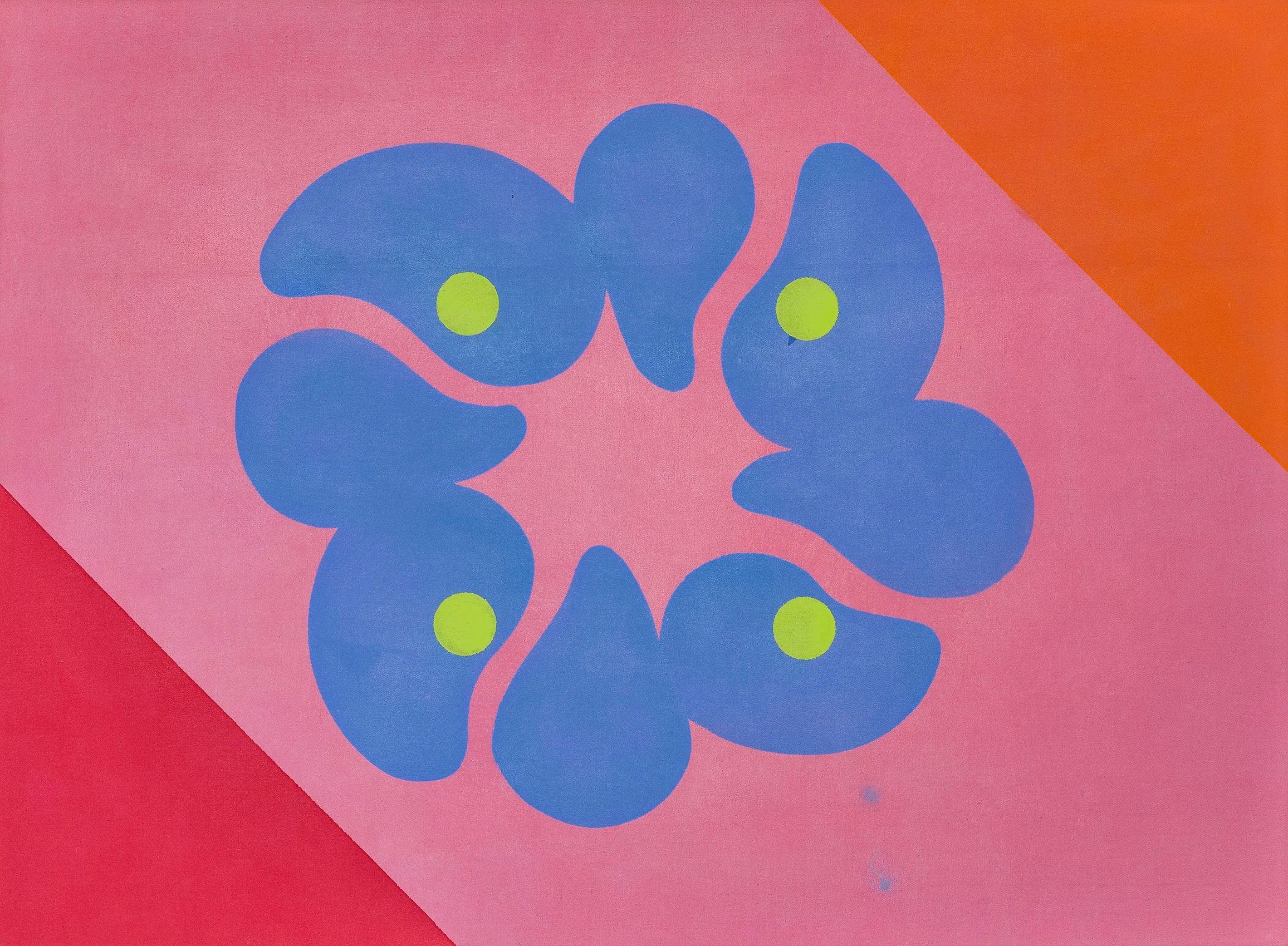
The refinement of their artistic visions evolved over many years of sketching, painting, looking, and sharing ideas on art. The Averys structured their year so that summers could be shared creating together and later with their artist-daughter March (b. 1932). Because rental apartments in New York were plentiful, Milton and Sally were able to leave the City each summer and return in the fall. They sketched non-stop on their trips, gathering source material for future paintings to be executed in the studio. A list of the summer trips gives some indication of which location inspired a painting’s subject. With limited funds in the 1930s, the Averys drove to summer locations in Connecticut (1930), Gloucester, Massachusetts (1926-1933), Vermont (1937, 1939, 1940), and the Gaspé Peninsula, Québec (1938). In the 1940s they traveled further: to California with stops in Yellowstone and Glacier National Parks (1941); Mexico (1946); and the Canadian Northwest and Oregon (1947). After their 1952 trip to Europe, the Averys’ later years saw summers spent closer to home: Woodstock, New York; the art colonies Yaddo (1955) and MacDowell (1953, 1954, 1956); and Provincetown, Massachusetts (1957-1961). Under doctor’s orders, Milton spent the winters of 1949-1950 and 1950-1951 recuperating in Maitland, Florida where he and Sally were Bok Fellows at The Research Studio. Later they wintered again in Florida (Key West) in 1959.

Sally Michel did paint directly from nature throughout her career, but developed most of her artwork from sketches. She often created an intermediary watercolor or gouache that then informed the finished oil, transmitting a mood, time of day, weather, or season. The fluidity and luminosity of gouache and watercolor provided freedom to experiment with color and tone, which could be duplicated on canvas by painting with thinned pigments. To create an overall textural softness, Sally used a stiff brush to apply matte pigments in thin layers. If a pigment became too thick it could be scraped from the canvas to reveal lower coats of pigment and achieve the desired tone. In looking over a group of sketches to select one to paint, Sally considered contrasts between straight and curving lines, discrepancies in scale, and different views of a single scene. Sally’s portraits of individuals were often close-ups isolated against flat backgrounds. Scale distortion, exaggerated color, or caricature could provide social commentary when she desired it. This sketch-to-painting approach allowed Sally to achieve simplified and abstracted shapes locked together into finely balanced compositions.

Milton and Sally Michel Avery were artists dedicated to painting what they saw at a time of uncertainty for realism in American art. From 1946 to 1958 Abstract Expressionism, a gestural or action painting style with roots in European Surrealism, was at its height of popularity. Abstract Expressionists considered any reference to recognizable imagery to be parochial, out of date, and taboo. The Averys saw that bridges between realism and abstraction can go both ways and color, structure, and light are the common denominators. This realization led to recognizing that shapes, spaces, and color form a set of unique relationships independent of any subject matter. The Averys modernized realism by using the shapes of things, the spaces around them, and color in new ways. They treated color less naturalistically to reflect mood and transcend the factual aspects of realistic subjects. Realism traditionally relies on light and dark contrasts to create depth. They found the use of non-naturalistic color suppressed that contrast and led to a new challenge of how else to produce depth. The solution they found was that a highly structured composition would still be read as a landscape, still life, or figure. To capture further universality and interconnections in their paintings, the Averys worked with shapes and their edges. They used thinly applied paint so the canvas ground was revealed around the edges of shapes, making the bare canvas function as color. The boundaries of soft shapes could be achieved through intricate color transitions, creating contiguous forms that blend into one another. This approach led to a new and important discovery that the distinctions between objects in a painting are fundamentally illusions and that the borders between shapes are what create representational art. The Averys also found that reducing the number of shapes and colors in a painting and eliminating illusionistic rounded volumes and modeled forms added modernity to a scene. Shape and color could become equal when shapes were used as containers of color and that areas of color could be stacked as abstract signs of foreground, middle ground, distance, and sky. The Averys used patterns, organic or geometric, to express the forces as well as the forms of nature. Liquid or transparent areas of paint could embody the forces of wind and water. This demonstrated that painterly surfaces associated with the Abstract Expressionists could be used in realism to express more than angst.

In March of 1964 Milton’s health put him in a New York hospital where he died in January of 1965. Sally worked tirelessly to ensure Milton’s legacy while also continuing to paint and evolve the way she used materials for another twenty-five years. To achieve a dry paint surface with a soft matte feel, she mixed large amounts of turpentine with her paint rather than linseed oil. Always frugal with pigment, Sally used rags to moderate layers of color in a shape, and added luminosity by tinting colors with white pigment. Her experimentation with color harmonies was often daring. When she wanted textural interest or to bring attention to the two-dimensional surface of a canvas, she scratched into the paint. In the figures, animals, still lifes, and landscapes she painted, Sally worked to achieve mood and movement rather than detailed representation. She continued to find her imagery in the visible world, often inspired by her own travels abroad. To present it in a modern way took careful consideration and skill in her non-associative color choices for mood, selection and placement of realistic shapes, and attention to the edges of her reductive forms to achieve flattened compositions. In her art, Sally Michel understood and adapted elements from the two streams of representation and abstraction to refresh realism, keeping it relevant after Abstract Expressionism.

[ TOP ]

DORIS LEE: AMERICAN STORYTELLER

November 11, 2021 - January 28, 2022
Read essay here. | Installation Views | For pricing and availability please call the gallery at 212-581-1657


Installation Views

Essay

As the exhibition Simple Pleasures: The Art of Doris Lee begins its four museum tour, D. Wigmore Fine Art offers an exhibition of artworks in oil, watercolor, gouache, pencil, and pastel executed between 1932-1967 to complement the museum exhibition.

Doris Lee joined one of America’s leading art colonies located in Woodstock, New York in 1931. Artists were newly focusing on social scenes of everyday life, both on the farm and in the city, as expressions of the shared history and support for Americans at a time of national instability. A rural landscape of this type by Lee titled Early Spring Landscape is in our exhibition. It was accepted for the Whitney Museum of American Art’s First Biennial Exhibition in 1932 and requested for the 1933 Annual Exhibition at the Pennsylvania Academy of the Fine Arts. We are also showing Landscape with Hunter, which was exhibited in the 1937 Corcoran Biennial Exhibition and reproduced in the 1945 American Artists Group monograph on Lee. Landscape with Hunter is rich in both autumn color and game as the hunter is provided with a choice of a fox or a stag. In 1936 Lee had a solo exhibition at the Phillips Memorial Art Gallery, Washington, DC and Maynard Walker Galleries became her dealer. With a museum exhibition and a leading New York dealer, Doris Lee at the age of 32 was now a prominent American artist.

In the Woodstock art colony, stylistic and ideological differences were accepted as vital to moving art forward. While surrounded by farms, mountains, and lakes, Woodstock was close enough to New York City that artists could keep a studio in the city and be in Woodstock during the summer. This proximity allowed Doris Lee to visit art galleries and museums and be known to dealers and curators. Each summer in Woodstock, Lee connected with other artists and they shared what they saw as important. In New York three major exhibitions at the Museum of Modern Art during the 1930s had an impact on Lee and other artists. The exhibitions were: The Art of the Common Man in America: 1750-1900 in 1932; Cubism and Abstract Art in 1936; and Masters of Popular Painting: Modern Primitives of Europe and America in 1938. One result of these exhibitions was artists began to consider folk art as a way into modernism. Lee and her husband Arnold Blanch became collectors of early Americana, as did their Woodstock artists friends Konrad Cramer and Yasuo Kuniyoshi. These exhibitions also helped Lee shift her focus in the 1940s to subjects that were part of her everyday life of friends, community, gardening, sewing, games, and travel. A painting in our exhibition that shows the transition Lee made from American Scene painting’s tighter realism to Americana appears in Vase of Flowers, a portrait of a country vase filled with colorful simple flowers placed on a floral patterned cloth executed around 1940. As Lee continued to paint still life, she focused on the abstract structure of a subject to flatten space and play with perspective. Our gallery exhibition includes several still lifes, such as Flower Box Still Life, Magnifying Glass with Sunflower Seeds, Summer Souvenirs, and Lilacs. They are offered to show Doris Lee’s continued stylistic evolution. In subjects such as Carolers, Memorial Day, and Cottage Country, Lee uses memory as a tool to clarify some elements and eliminate others. These paintings are each simplified stories told from a woman’s point of view with decoration and figuration that embrace pattern.

From 1941 on, Doris Lee was represented by Associated American Artists, led by Reeves Lewenthal, a dealer who negotiated commissions between his artists and corporations. This arrangement created more opportunities for Lee to travel nationally and internationally. Lee remained busy through the 1950s with exhibitions and commissions. For instance in the period 1950-1951, Lee’s schedule included: a solo exhibition at Associated American Artists Galleries, New York; an artist-in-residence at the Maitland Research Studio, Florida over the winter; a panel at the Third Woodstock Art Conference; inclusion in the major exhibition American Painting Today at the Metropolitan Museum of Art; and an application for a Guggenheim Fellowship. Also in 1950-1951, Lee received prizes for both her Abbott Laboratories advertisement and Seventeen magazine illustrations and received commissions to illustrate The Rogers and Hart Song Book, design ceramics for Stonelain, and travel for two months through North Africa for Life magazine.

We have selected Young Harpist as the cover of our gallery exhibition catalogue as it was shown in Lee’s 1950 solo exhibition of 22 oil paintings and 5 gouaches at Associated American Artists Galleries. In Young Harpist, a Doris Lee-like figure plays a musical composition for the viewer. A window with a country view behind the harpist suggests a fuller story is being told. Further works in our exhibition that deserve mention are Country Schoolhouse which was part of an 8 painting commission Lee received from J. L. Hudson Co. on contemporary life in Michigan and High Flying Picnic which received the award of merit at the Art Directors Club in 1950, submitted for consideration by art director of Seventeen magazine Cipe Pineles. Two further examples of Lee’s storytelling feature fun happenings in Woodstock are Dark Pool with an evening picnic and skinny dip and The Archer representing the women’s archery club to speak of the skills and strengths of women.

There are many fine paintings and drawings in our exhibition. We hope you will enjoy them. Like Doris Lee, our aim is to give you moments of joy.

[ TOP ]

Modernism 1913-1950 | Realism of the 1930s and 1940s | Abstraction of the 1930s and 1940s | Post-War | Selected Biographies

TADASKY: EXPANDING VISION, 1964-1970

Sept 8 - Nov 5, 2021

Essay | Installation Views | Artist Statement
For pricing and availabilty, please contact the gallery at 212-581-1657


Installation Views


Essay by Emily Lenz

Our exhibition focuses on the years 1964 to 1970 when Tadasky (Tadasuke Kuwayama, b.1935) developed his distinct style and was exhibited widely in New York with Sam Kootz and Fischbach galleries and in Japan with the Tokyo Gallery and the Gutai. In the 1960s Tadasky’s paintings went from bright targets and flat spinning discs in the A, B, and C series to pulsating rings in the D series to glowing orbs in the E and F series. Tadasky numbers rather than titles his works as he wants them to be universal and timeless.

Tadasky painted about 100 paintings before showing his work to anybody. In 1964 Ivan Karp was one of the first to view Tadasky’s work and he spread the word to Leo Castelli and the Museum of Modern Art. The more aggressive dealer Sam Kootz visited the studio, purchased paintings, and offered Tadasky a solo exhibition. Tadasky accepted, pleased to have the same New York dealer as Picasso. Over the next two years until Kootz’s retirement in 1966, he sold over 80 of Tadasky’s paintings to many important collectors, including Larry Aldrich, David Rockefeller, Frederic Weisman, and James Michener.

Tadasky’s work was identified as Op art when curator William Seitz included him in the Museum of Modern Art’s 1965 exhibition The Responsive Eye of international Op art. Tadasky’s work demonstrates Op’s characteristic openness to viewer interaction. With an investigative approach in their studios, Tadasky and his peers including Richard Anuszkiewicz (1930-2020) and Julian Stanczak (1928-2017) applied new understandings of perception to create a new model of depicting space. These artists explored the relationship of color and line to achieve movement that projects and recedes. The viewer’s participation in an active visual dialogue was fundamental to the work; the ultimate goal was to create a heightened awareness of what it means to see and a new way to evoke nature’s energy.

Arriving in New York from Japan in 1961, Tadasky developed his distinctive technique to create precise concentric rings of vibrant color. Inspired by the potter’s wheel, he built a turntable easel that rotated the canvas beneath him. Using traditional Japanese calligraphy brushes, Tadasky painted thin lines that build up to the broader rings we see in the paintings. This requires deep focus as he carefully calibrated the paint flow onto the undulating surface of the rotating canvas. In the 1960s Tadasky used 10 colors – first making his own paint by mixing pigments into newly available acrylic emulsions then moving to commercially made tubes when success permitted the expense.

In the A series, Tadasky applies rings of raw color using their proximity to create optical blending. In both B-181, 1964 and C-162, 1965, Tadasky repeats a four-color pattern. The equal width and vibrancy of the colors intensify the color interaction, causing a spinning and flickering effect. While the works are very active, they are also flat. A new element of dimension occurs in our exhibition with C-200, 1965 marking a pivot point. Red, blue, and yellow are arranged without pattern in varying widths divided by spaces of white that allow the colors to breathe. The painting can read as either spinning flat or pulsing in and out, a new element of dimension.

In the second half of the Sixties, Tadasky explored how his paintings could create expansive vision regardless of size. As Tadasky said, I work with a limited space – the surface of the canvas. Yet I can create depth, through which you can enter the painting. The works from this period are ethereal and bold. One can see this transformation comparing D-109, 1966 and D-212, 1970. In D-109 the gradation of color from yellow at its center to red at the edge produces a luminous heat. Drawn out of a black background, the color increases in vibrancy at the center when the black circles thin out producing a radiant effect. Tadasky uses black in a new way in D-212, applying it with an airbrush to the edge of each ring, achieving a new level of volume in the buoyant pile of inner-tubes.

While painting the late D series, Tadasky noticed the occasional blobs of paint on the canvas when his airbrush got backed up and realized he could slowly build up a textured surface by using his airbrush at low pressure. The result was the E series in which Tadasky develops great depth with floating spheres and atmospheric ground. While predominantly monochrome, the E series has shimmers of different colors achieved by spraying paint in a single direction, as seen in the umber halo in E-119, 1969 created by a light spray of red across the blue crags of the ground layer.

For Tadasky, the square format of his paintings allows each one to be a transformative space. The circle-in-the-square format parallels the clarity and symmetry Tadasky feels upon entering a Shinto shrine. Each painting is its own world and Tadasky strives to make it all-encompassing.

Artist Statement

I use the circle to create my own world, a world that no one has seen before, my own universe. The closest comparison for me is the experience of entering a traditional Shinto shrine: because they are both so simple and symmetrical, the impact is very powerful.

The circle is of course something from nature. But I have no desire to depict nature; rather, I want to reproduce that power, that “vibration” that we experience in viewing nature’s beauty.

If a painting is good, it explains itself, it lasts. My paintings are not meant to refer to anything, and there is no philosophy or theory involved. People are free to look at my work in many different ways.

Color helps to create depth. I work with a limited space—the surface of the canvas. Yet I can create depth, through which you can enter the painting.

I love trying new ideas and approaches. But at the same time, each work evolves from the one before. I have learned that when you polish something over and over, it shines in its own way.

I spend a lot of time thinking before I paint. I wait until an idea is very clear in my mind. When I begin to paint, I know precisely what colors I will use, what width of line, what shapes. I don’t change anything once I begin to paint. To change the idea along the way is “taboo” for me.

It is always wonderfully exciting to see the painting complete. Indeed the entire process is full of joy – if I didn’t enjoy painting, the result would never be good.
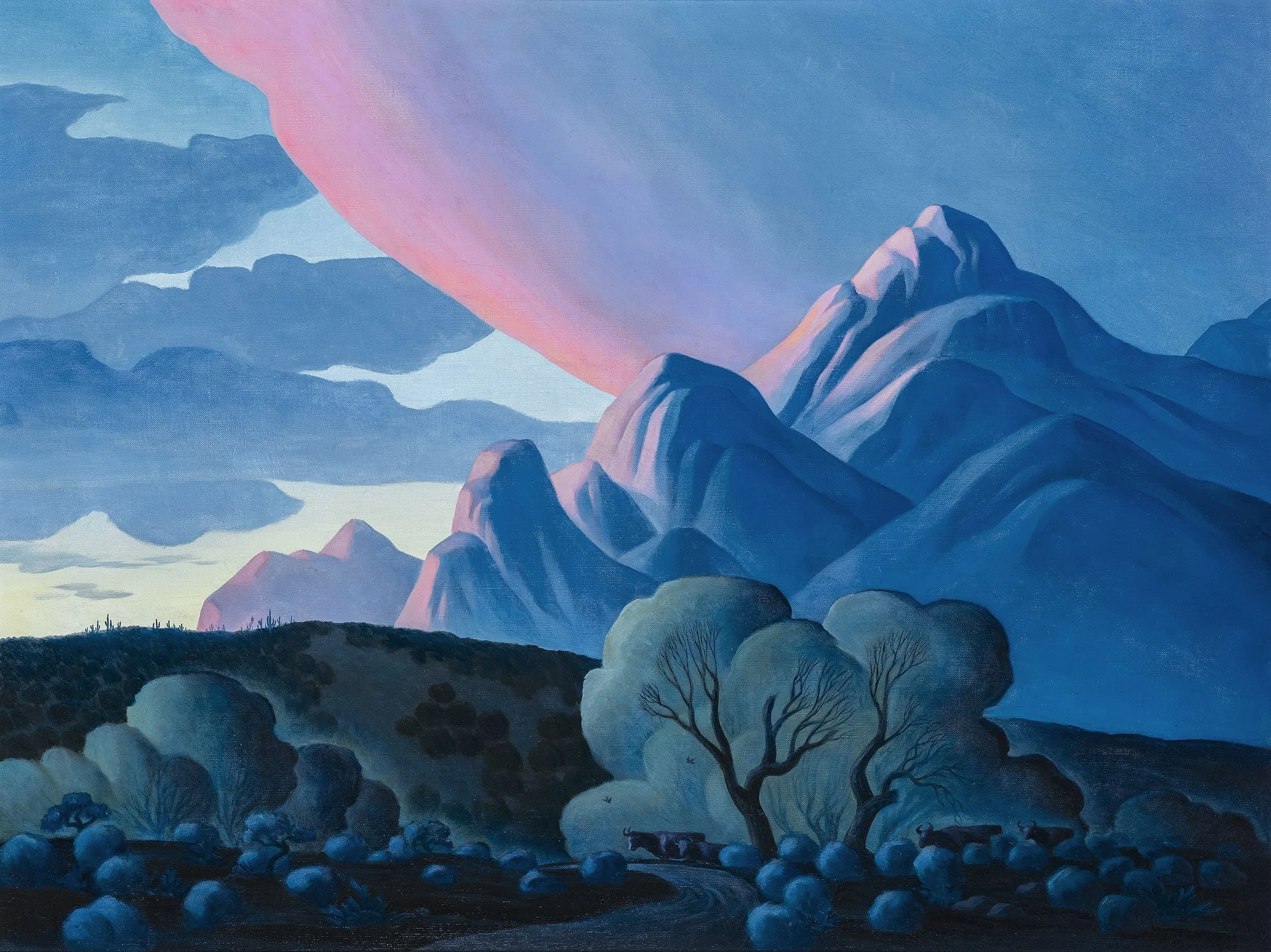
-Tadasky, 2015

[ TOP ]

Modernism 1913-1950 | Realism of the 1930s and 1940s | Abstraction of the 1930s and 1940s | Post-War | Selected Biographies