Sept 14 - Nov 16, 2018
Essay | Artist’s Series | For availability, contact gallery at 212-581-1657.


Essay by Emily Lenz
For our first solo exhibition for Francis Celentano, we have selected two bodies of work, the Alpha series (1968-1971) and the Electra series (1990-1992) to demonstrate the artist's use of color and structure, often through patterning, to create a unique viewing experience. In the two series, we see Celentano's methodical development for each series, his embrace of technology available at the time, and his ceaseless exploring of the endless possibilities of color.
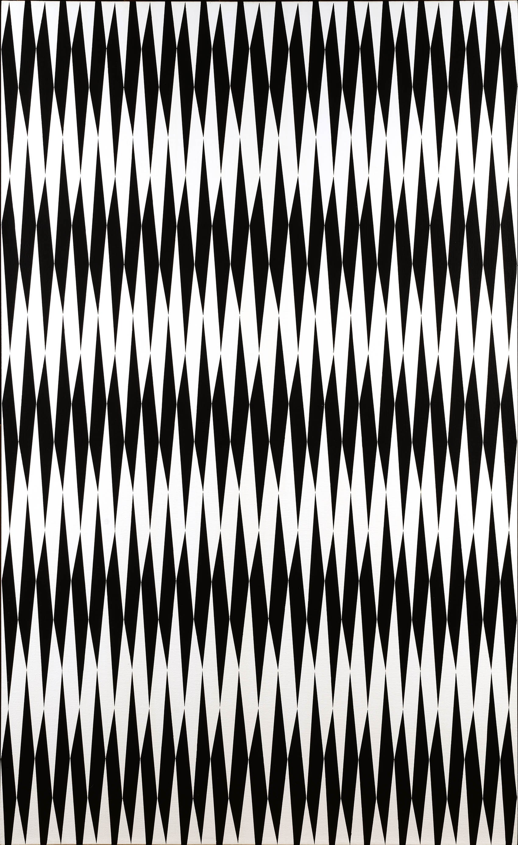
Francis Celentano came to national attention with his painting Lavender Creed (1964) in MoMA's 1965 exhibition The Responsive Eye, which announced the new international style Op Art. His style at the time, like Screen (1965), was more Hard Edge than Op with repeating bold forms in subdued colors of navy blue, purple, and black. Celentano wrote that in these works, he desired to evoke a mood using "carefully calculated, premeditated, and visually measured (intuitively)" forms. He found each compositions through small progressive changes in sketches, something he considered a complete rejection of the spontaneous Abstract Expressionist style. Celentano and other Op Art painters' focus on the audience rather than self was considered another rejection of Abstract Expressionism.
Celentano also used studies to establish a technical approach for every series he did. Screen printing, stencils, and an airbrush were key to his 1960s compositions as computer programs would later be. Celentano embraced available technology to assist him in executing his vision. This was noticed and his New York dealer in the 1960s was the Howard Wise Gallery, known for its focus on art and technology. His paintings were, in fact, support for the first computer-generated art exhibition, organized by the Howard Wise Gallery in 1965. The importance of screen printing in the Op works can be seen in a collage study for Zilos (1966). Celentano first created a screen print of a row of increasingly larger black triangles which he then collaged in mirrored, rotated, and repeated strips to find his composition. He scaled up his study for the painting using stencils to maintain the crisp edges of the intricate arrangement.
An important step in Celentano's development was his participation in the International Artists' Seminar in 1965, where he got to know Polish artist Wojciech Fangor (1922-2015). The program, held at Fairleigh-Dickinson University in New Jersey, brought international and American artists together in a residential program for the exchange of ideas about new artistic practices. The focus of the 1965 seminar was Op art and ten artists were selected, including Celentano, Fangor, and the Paris-based Groupe de Recherche d'Art Visuel (GRAV) artists Yvaral (1934-2002) and Horacio Garcia Rossi (1929-2012). Half of the artists had been in MoMA's The Responsive Eye exhibition earlier that year. Vasarely wrote the opening text for the traveling exhibition of works made at the Seminar. He called for Op art to be the art of the time, to reflect the new knowledge that emotions were the result of biochemistry and the experience of art was no longer felt in the heart but through the retina. Most impactful for Celentano was seeing how Fangor's gradient transitions of sprayed color and the resulting color pulses provided an alternative to the severity of Op's black and white contrasts. The work Celentano created during his residence at Fairleigh Dickinson and his subsequent work for the next two years remained classically Op, like Zilos (1966), but the idea of painting sensuous color was percolating.
In his kinetic paintings from 1967-1968, Celentano used drawings and collage to determine the progression of black ellipses on a white circular canvas that would have the desired effect of warping and undulating when rotated by motor. In the kinetic paintings, Celetano felt he had created "a viable, physical presence in which the spectator responds more to the whole and less to elemental parts." The viewer seeing a work as the whole was one influence that encouraged Celentano to investigate pure color as a controlled experience.
Celentano found his third influence for color upon moving to Seattle, where he accepted a position at the School of Art at University of Washington in 1966. Celentano was hired by Spencer Moseley, director of the School, who was interested in M. E. Chevreul, the 19th century theorist who held that the juxtaposition of two complementary tones heightened both their intensities. Chevreul's writings, Fangor's soft approach to Op, and his own desire for his paintings to be experiences led Celentano in 1968 to formulate his own strategy for color.
The Alpha Series, 1968-1972
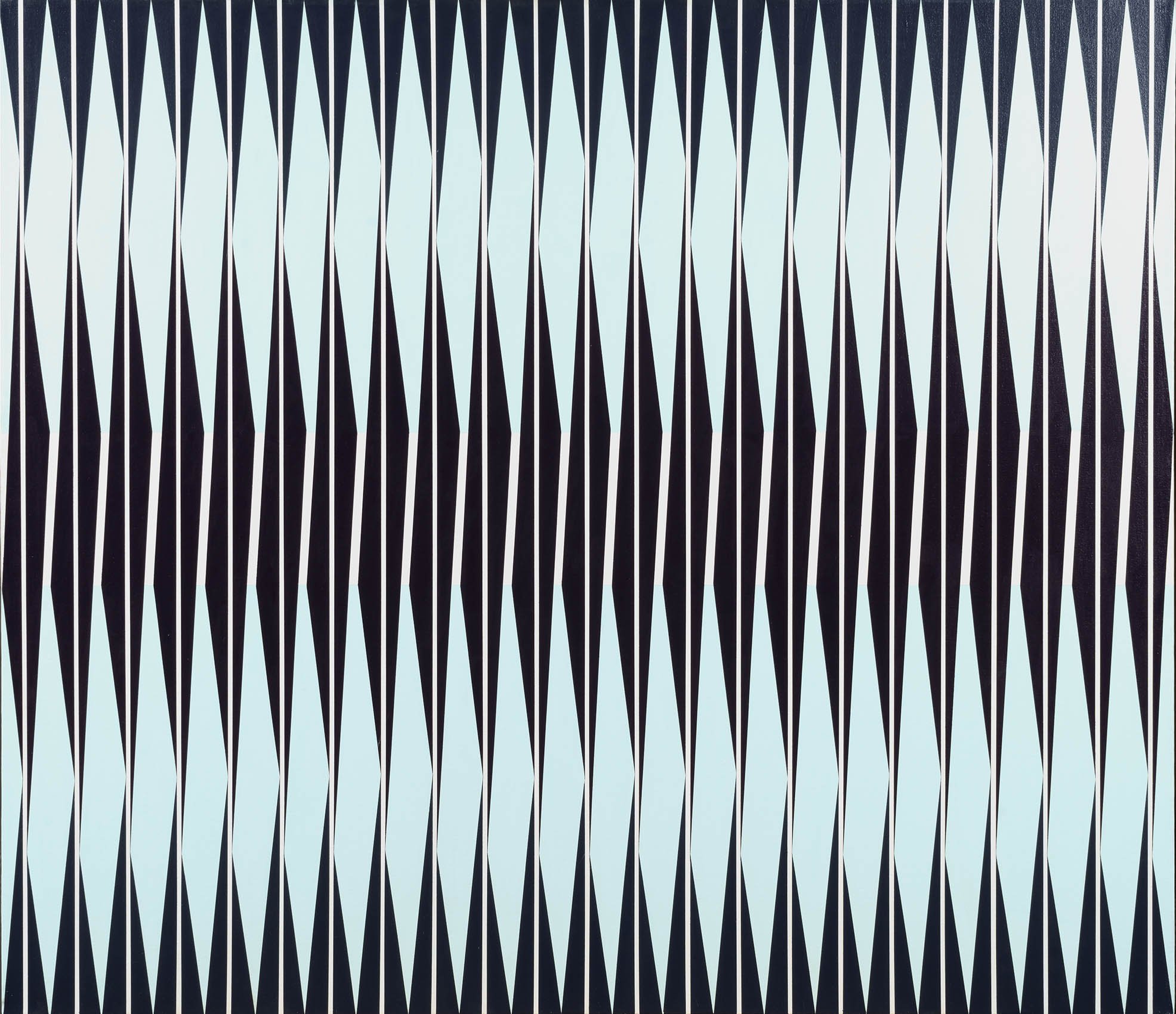
For the Alpha series, Celentano used vertical sequences of color bands in a horizontal format with alternating stripes of gradient and uniform color. He used an airbrush, a popular tool for artists at the time, to soften the many color transitions within a single stripe. The striped structure holds the color while the interaction of sprayed saturated colors creates dramatic tension. With continued looking, the stripes disappear and waves of color ebb and flow in the viewer’s space. With close looking, the viewer's eye cannot pin the color down. Instead the color shimmies across the canvas as even the crisp edges of stripes blur. The lively color zips back and forth across the highlighted horizon evident in each work, like the streak of vibrant red in Alpha Blue (1969).
All of this is achieved through Celentano's meticulous technique. In the Alpha paintings, Celentano first sets down vertical stripes of a single color or white. Next Celentano used an airbrush to spray gradations of high-keyed color in an even and consistent surface on every other stripe. He used a watered down paint to allow the white gesso underneath provide additional luminosity. So seamless are Celentano's transitions from green to purple to red then yellow and back again in Alpha Prime (1968), it is difficult to sense which colors were laid down first. The result is shimmering color that expands beyond its structure. In Alpha Prime, particles of green paint at top and bottom melt into the purple next to it, as if the viewer is falling down the stripe into a hot yellow center. Celentano's choice of airbrush to apply the paint in very fine particles of pure color adds to the sense of the painting as an atmosphere rather than an object. Unlike most Op artists, Celentano frequently worked with the rectangular canvas rather than the square. This heightens the experience for the viewer as the shape mimics the field of vision, resulting in color extending beyond viewer's peripheral vision.
The Electra Series, 1990-1992
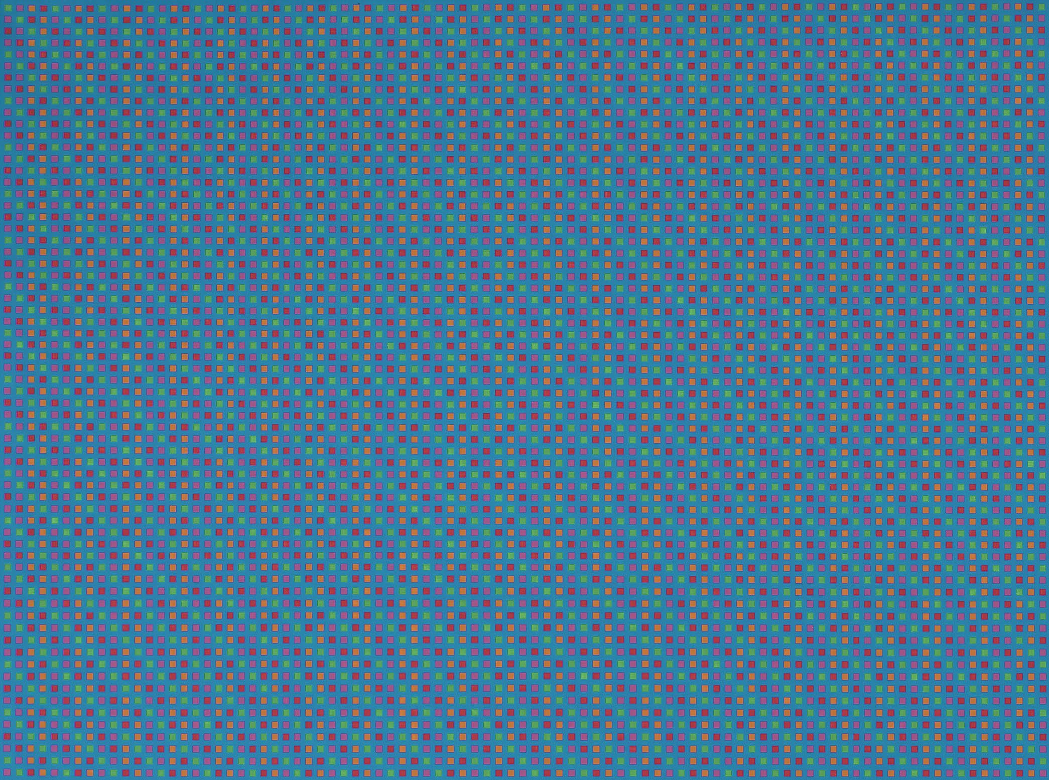
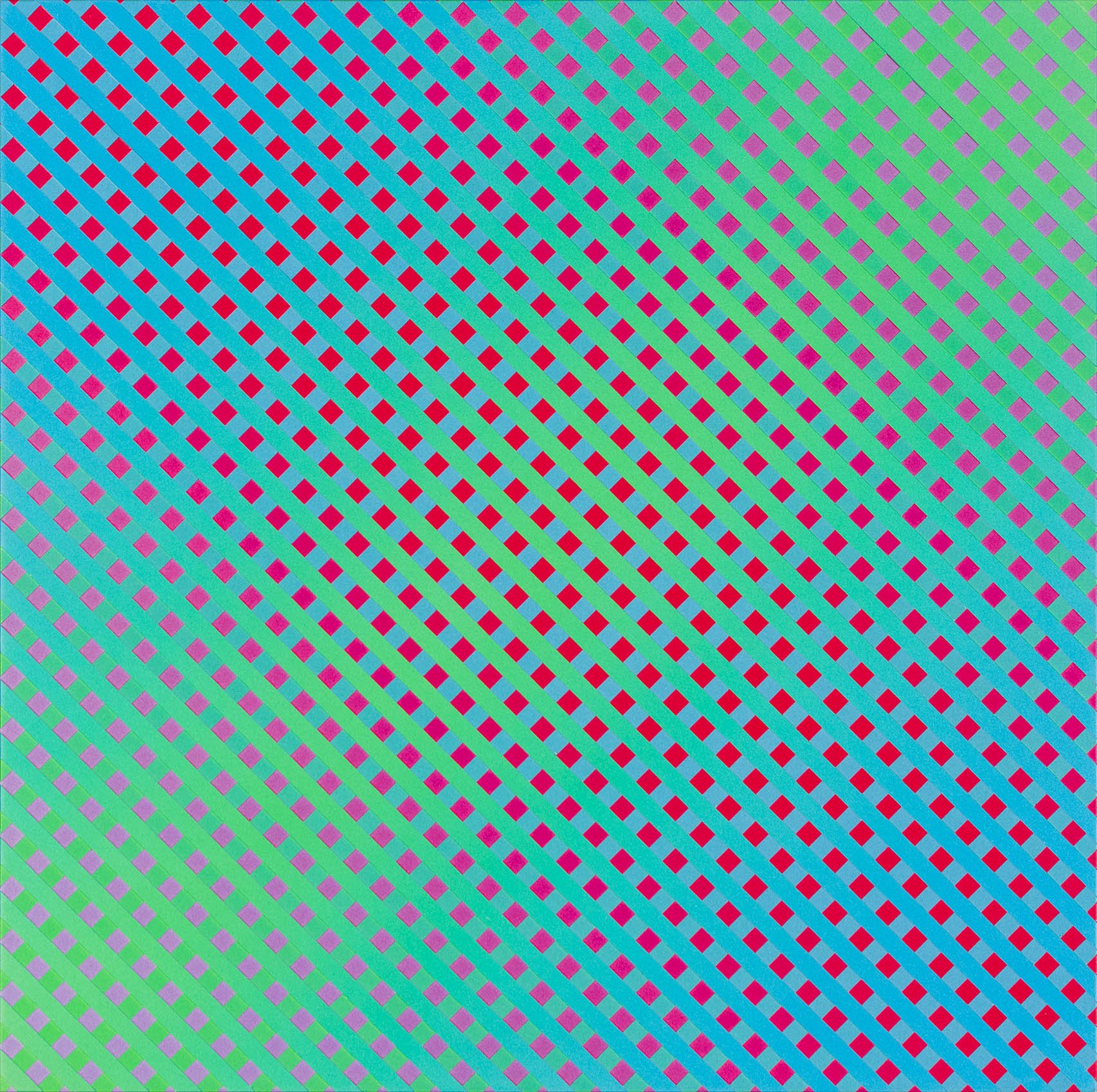
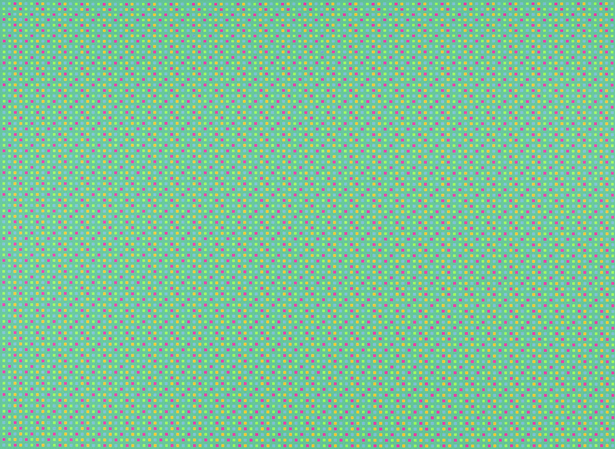
The 1990s brought the age of the pixel with the expansion of personal computers. Imaging programs improved immensely, like Targa, an early version of Photoshop. In the late 1980s, computer monitors went from displaying about 30,000 colors to nearly 17 million. Celentano, not shy about using technology, set out to see how the computer could help him. For Celentano the particles of color in his Alpha paintings became pixels in his Electra series. He used the computer program to generate colors within an array of squares on a continuous ground. He selected four colors for the pattern and one as background. Two colors were in the same tone as the background and two in sharp contrast. He arranged the colors into units of four squares, which he flipped and mirrored to create a larger unit of 16 squares which he repeated throughout the composition. The act of mirroring, flipping and repeating recalls Celentano's Op paintings. He also used the program to determine the scale of the squares to the background color, as he was interested in how a viewer's distance effects the reading of a painting.
Once Celentano had settled on a color arrangement and scale, he applied the colors selected on the computer monitor to paint on canvas. He created the grids by taping out 1/4 squares in the case of Electra #10 (1991) or 3/16 squares in the other Electras. Only after removing the tape from the canvas could Celentano see if his computer studies translated to traditional materials. The effect is dazzling. The viewer perceives a pattern but the colors trick the eye, resulting in random light pulses and seemingly endless paths through the painting. From across a room, the Electra painting look like a single field of color, difficult to hold down but overall the background color dominates. Moving closer, the viewer sees varying lines such as diagonals, zigzags, and more complicated paths moving through the image, the result of the mirroring and reversing patterns. Up close, the viewer discovers the lines and dots are in fact pixel-like patterns of squares in four colors. Here Celentano allows the viewer to understand the mystery of the color interactions that creates the sense of an electric field with infinite movement.
Celentano's work across six decades considered in an intellectual, structured approach the emotional effects of color, its sensuous qualities. By identifying patterns and economic ways to execute intricate paintings, Celentano continued to find new series to expand his understanding of color and its effect on all of us. Critic Suzi Gablik said of his paintings, "Color is an event, not a fact." In both the Alpha and Electra series, Celentano makes this clear.
FRANCIS CELENTANO EXPLAINS HIS SERIES, 1963-2015
1. Hard Edge Painting 1963-1965
The images are a priori, symmetrically ordered and refined. They evoke an implacable, timeless presence and a ponderous, aggressive sense of weight conveyed by large areas of black and dark gray and smaller contrasting white shapes that suggest compressed light.
2. Optical Painting 1965-1968
By designing units or elements relative to others in a particular way, an optically expressive result is shorn of all references. The paintings generate an aggressive immediacy in which the units almost dissolve in perception as they fuse together on a super-visual level distorting the observer's normal perception. For example, Reversible Units consists of an array of alternating black and white asymmetrical units that are repeated, rotated, mirrored, and locked together in a unified field of absolute opposition, totalized and immediate.
3. Kinetic Paintings 1967-1968
These were in part inspired by my take on surrealist concepts that inform aspects of my position in art up to the present. I designed, constructed, and timed each of their motors so that undulating movements would radiate from each surface creating a pulsing rhythm. The repetitive rotations seem almost organic and alive, generating a hallucinatory and destabilizing experience.
4. Alpha, Delta, Kappa Paintings 1968-1972
In l968 as a reaction to black and white, I got involved with systems of color, subtractive (pigment mixtures), additive color (mixtures of light), and human visual responses. I began painting with color on canvas and called the first series Alpha. In this series I used vertical sequences of color bands in a horizontal format. Bands of gradient colors alternated with bands of uniform color ranging from opposition to harmony varying the
perception of the uniform color bands. Kappa is a more complex variation of Alpha. In the Delta series the bands are the same, alternating inversely so the visual effect, fixed to the center, is more intense.
5. Iota, Epsilon, Theta Paintings 1973-1975
From l973 to l974, I executed vertical paintings consisting of strips of plastic cut at first from two and later one pre-painted surface with gradient color. The cut strips were then rotated and/or displaced in relation to each other. I called this first series using precut bands of color Iota. I used the same method for the Epsilon series. In the Theta series that followed, I generated two paintings with two sets of the same color bands each sequenced differently. Additional Iota paintings were made in 1994.
6. Diamorphus Paintings 1977
This series represents another variation of sequencing a pattern of painted bands of color. In this series the painting is cut in pairs of the same color gradients and then rotated in alternating pairs, each pair selected from the opposite inverted sequence of the same painting.
7. Pendenza Paintings 1978-1980
I used the same method of sequencing as in Diamorphus but reduced the color bands to eight strips and for the first time tapered them. The top and bottom edges of the strips were cut at an angle so all together they formed a long tall parallelogram, eight to ten feet high slightly tipped and leaning from the floor against the wall. Backs of the Pendenzas were painted a color that reflected back from the surface of the wall behind and around the painting creating a subtle halo effect. This series was a precursor to the columns that would follow the Isis series right after Pendenza.
8. Isis Paintings 1982-1987
This series as the Theta series earlier dealt with recombinations of bands of the same color ordered differently to generate different paintings. These improvisations or sets of paintings were named Curve, Alternate, Wing and Step and in l987 I added Syncopated. The shape of these paintings and their serrated edges are determined by the order of the displaced and tapered strips that carry the bands of interactive color.
9. Spira Paintings 1988
I generated three sets of paintings much as I did with the Isis series and named them Harmonic, Alternate and Syncopated. But the tapered strips that carry the graded color are shorter, the formats in all the sets are narrow verticals and their serrated edges describing the displaced strips are characterized by a subtle, undulating rhythm.
10. Trizazz Paintings 1989
With this series, I divided each painting into three parts and in each I explored the contrast of graded color in tapered strips with two outer tapered strips of solid color, one different from the other. There are no sets in this series.
11. Electra Paintings 1990-92
I produced this series, working with Targa, a computer program. It permitted me to generate color within an array of squares on a continuous ground. In this way I arranged 4 colors in patterns of squares and combined them to play against each other as well that of the background. The observer's shifting eye movements and focus results in a continually changing illusion of random light pulses along the plane of the picture. In this structure I also explored the perception of color and shape variations as a function of distance from the work.
12. Exana Paintings 1993
Using a vertical format, I produced three gradient color planes. After deploying the initial gradient on the entire surface, I masked out alternately and deployed another color gradient. Without removing the first masking I did the same thing the second time after masking out with diagonals in the opposite direction and painted the third gradient. Depending on the interaction of color, I was able to generate a variety of shapes: diamonds, stripes and gradual transitions between them.
13. Serpa Paintings 2002
I did a series in a narrow format with undulating strips. I used a CAD program (computer assisted design) to cut strips of plastic into wave-like rhythms that meshed neatly one into the other. The method of deploying color and painting the strips was similar to that of several of the earlier series described above. The wave-like shapes add another dimension of visual experience, enhancing the rhythm of color and form.
14. Le Cirque Paintings 2003-2004 and Cirque Variations 2005-2007
In this series I returned to spraying paint on canvas using a horizontal format. These paintings continue my interest in wave-like shapes as in my sculpture series but in a more traditional manner on a flat continuous plane. Each consists of a number of repeated vertical modules organized in shape and color to evoke a dramatic visual sense of totality.
15. Radial Paintings 2008-2010
These were brush painted either on canvas or plastic surfaces in a variety of shapes: diamonds, circles, scallops, and an ellipse and all have a radiating center. Shapes that make up the image move about the center in a variety of ways, displacing, rotating, radiating, and so on. Initially they began in 2008 as black, white, and gray, or just black and white. In 2009, I included color as an additional element to contrast and balance with the black, white, and gray components. These geometric images emerged from my mind automatically. I enhanced them by exploiting their character in the media of painting to convey a clear, precise, and dramatic impression.
16. Gemini Paintings 2010-2012
This series continues an interest that first began in 1990 in composing paintings with the assistance of a computer program. In this case it involved the overlapping of two identical patterns. Each pattern is first painted in black and white on canvas or plastic and then fed into a computer program, converted into a transparent white and gray image and then duplicated and overlapped in a number of ways, displaced, rotated or flipped. Transparent gray and white checkerboard patterns that overlap produce additional black shapes. These shapes are then converted to color. The image is printed out and an acrylic painting on canvas or plastic is generated from them. In a sense the painting is an altered portrait of the computer image. The last paintings in the series are based on undulating patterns and the omission of black shapes that occur when grays overlap. These former black shapes become white shapes and join the white of the ground simplifying the pattern dramatically and producing a strong rhythm throughout the painting. These fused patterns produce a variety of visually intriguing images as a result of combining painting techniques with opportunities afforded by a sophisticated computer program.
17. Triangle Overlays 2013-2015
I used the same methods as the Gemini series now applied to a triangle shape instead of a square. As in theGemini series I overlapped duplicate images by rotating mostly and in some cases displacing one in relation to the other. The resulting extended array of triangle shape fragments was selectively reframed to arbitrarily emphasize what I considered to be the salient features of the automated pattern.
[ TOP ]
Modernism 1913-1950 | Realism of the 1930s and 1940s | Abstraction of the 1930s and 1940s | Post-War | Selected Biographies