DOT, STRIPE, DIP: WASHINGTON COLOR PAINTERS

Feb 20 - May 8, 2020

Essay | Some works may still be available, please contact the gallery at 212-581-1657

Installation Views

Essay by Deedee Wigmore

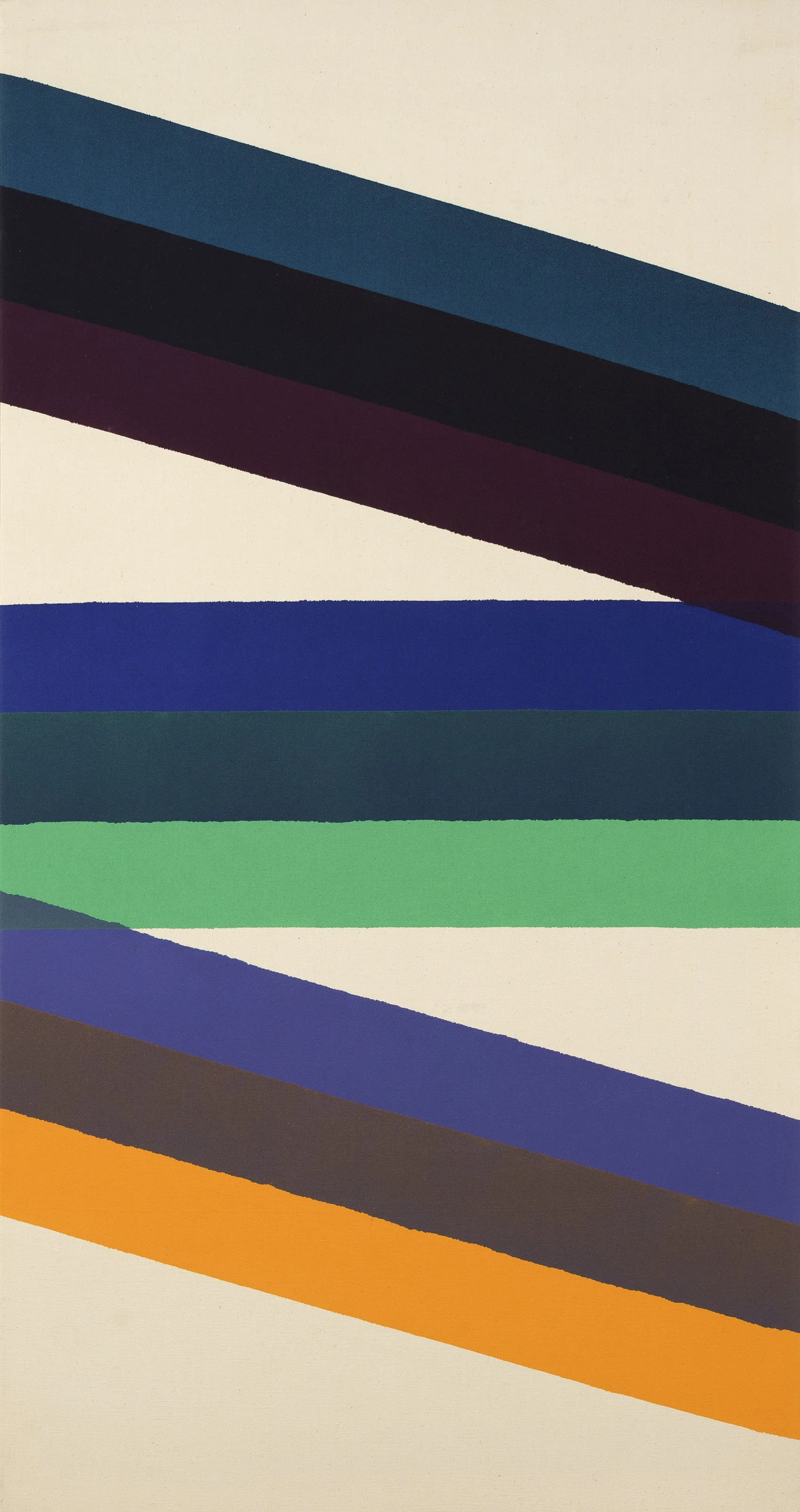
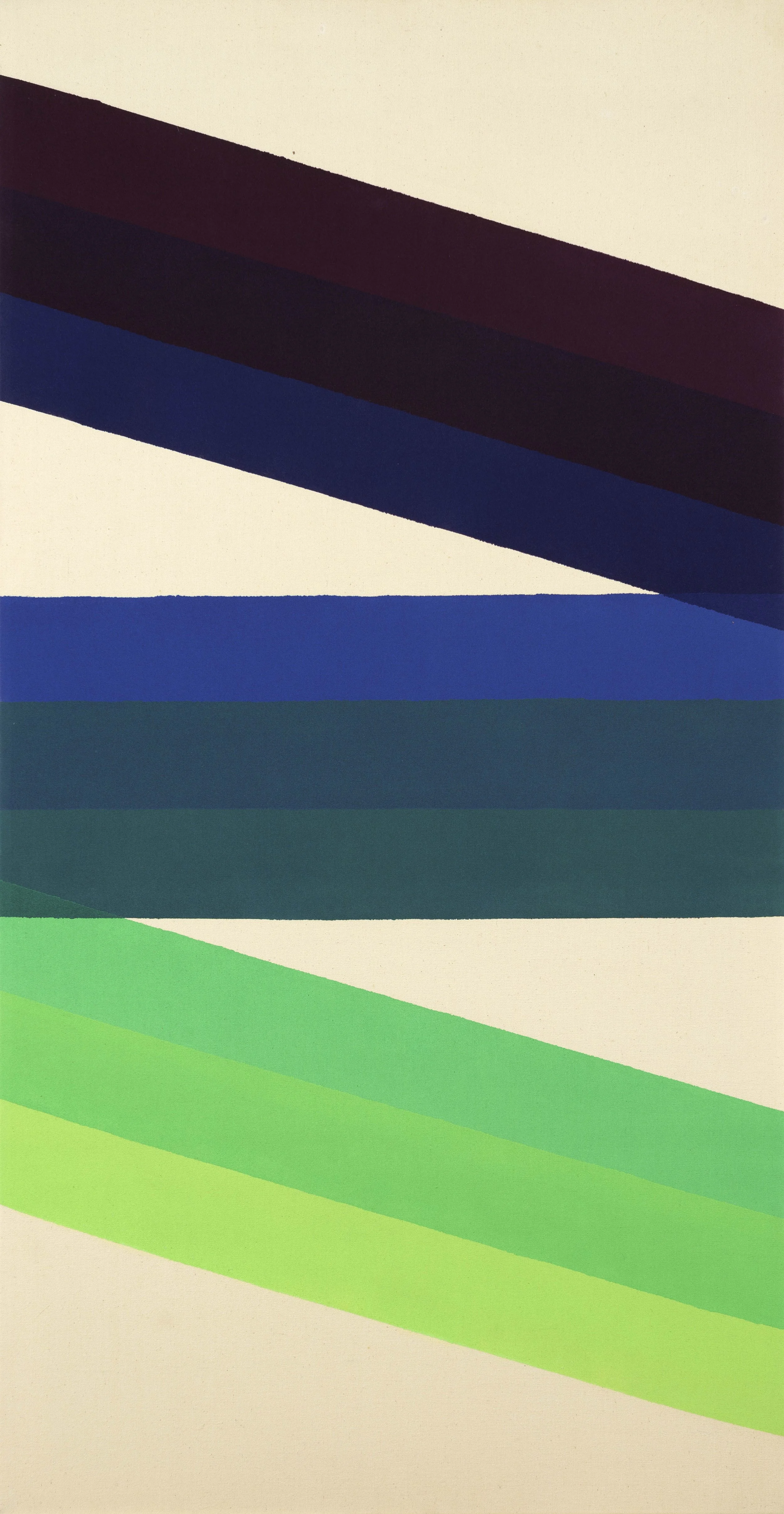
The Washington Color School was a group of artists connected by location, materials, and style. Their distance from New York allowed them to experiment with an opening up of color using new acrylic paints stained into raw canvas that broke with the heavy gesture of Abstract Expressionism. Morris Louis (1912-1962) and Kenneth Noland (1924-2010) met while teaching at the Washington Workshop Center for the Arts in 1952. Clement Greenberg, the New York art critic and regular visitor to DC, brought Louis and Noland to Helen Frankenthaler’s New York studio in 1953 to see her stained canvas Mountains and Sea (1952). Louis had worked in the new acrylic paint Magna since 1948 as its creator Lenny Bocour was a friend from his time in New York (1936-1943), but had not yet stained into raw canvas. Inspired by Mountain and Sea, Louis and Noland collaborated on paintings, pouring large quantities of Magna onto raw canvas. Noland taught at Catholic University from 1951 to 1960. He took his student Howard Mehring (1931-1978) to see Frankenthaler’s Mountain and Sea in 1955. Thomas Downing (1928-1985) connected to the group through Noland as well, taking his Noland’s summer course at Catholic University in 1954. Mehring and Downing met at the Sculptors Studio in 1955 and shared a studio through 1956 where they poured enamel and metallic paints. Gene Davis (1920-1985) and Paul Reed (1919-2015) were high school friends that reconnected in the early 1950s. They visited DC’s wealth of art museums together, taking time off from their jobs as graphic designers. Noland gave Davis a solo exhibition at Catholic University in 1953. The 1950s was a period of experimentation for all of the Washington Color School, but by 1959 each artist worked in thinned acrylic paint poured, rolled, or dripped onto raw canvas. They were formally brought together by Gerald Nordland for the 1965 exhibition The Washington Color Painters that gave the group its name. The exhibition took place at the Washington Gallery of Modern Art, established in 1961.

Although Morris Louis had passed away from lung cancer in 1962 and Kenneth Noland had moved to New York, Gerald Nordland identified them as part of the group of six artists connected by consistency of materials, style, serial exploration of color, and all-over rhythmic compositions. Each Washington Color Painter worked with Magna diluted with solvents in the 1950s and some by 1960 moved to new water-based acrylics, staining or soaking the thinned paint into unprimed cotton duck canvas. The staining technique produced a uniform matte surface of vibrant color, which seemed to float forward while the raw canvas background receded. Unlike Helen Frankenthaler, the artists all worked in geometric series to deeply explore color. Yet compared to the Hard Edge painters of the time, the flow of color and intervals of blank raw canvas soften the geometric structure of their compositions. One reason for pursuing geometric painting was Kenneth Noland’s time at Black Mountain College (1946-1948) where he studied with geometric artists Josef Albers (1888-1976) and Ilya Bolotowsky (1907-1981). Clement Greenberg approved of the group’s geometric focus and included Louis, Noland, Davis, Downing, and Mehring in his exhibition Post Painterly Abstraction at the Los Angeles County Museum of Art in 1964.

For our exhibition, we focus on the four artists that remained in DC in the 1960s: Gene Davis, Paul Reed, Thomas Downing, and Howard Mehring. The four artists made their impact in DC both by exhibiting and teaching. Artists like Alma Thomas and Sam Gilliam came into their own styles after the 1965 Washington Gallery of Modern Art’s exhibition. Thomas and Gilliam were well received as DC had been primed for experimental techniques and materials with a focus on rich color.

Gene Davis

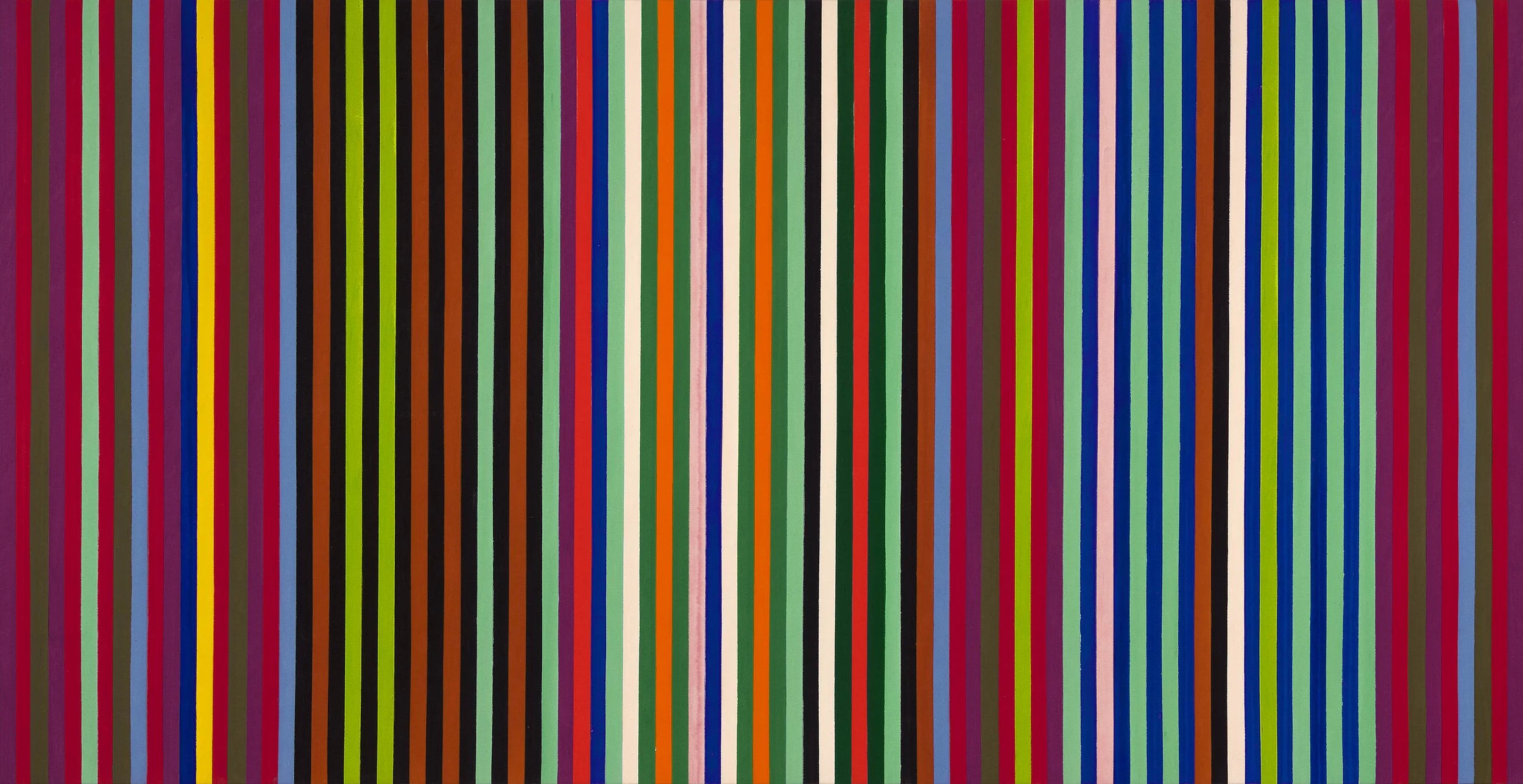
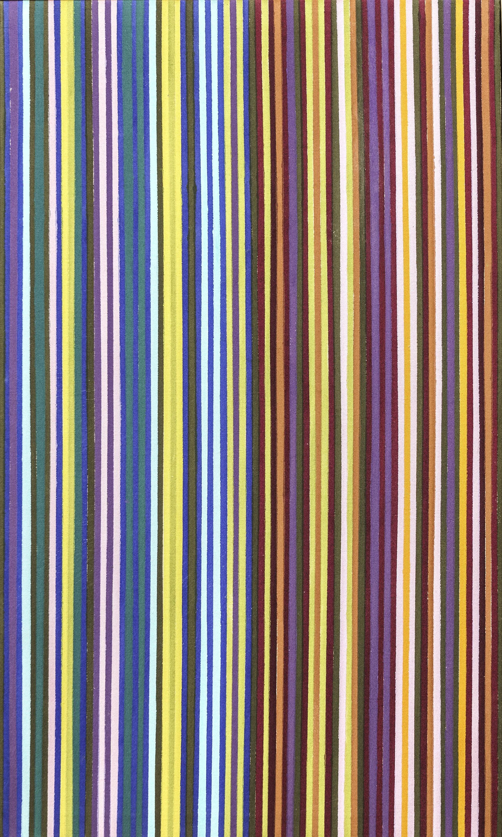
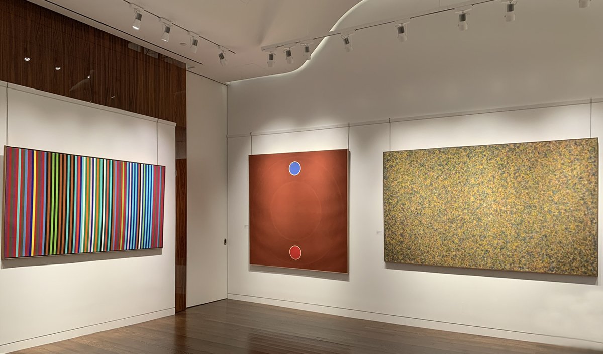
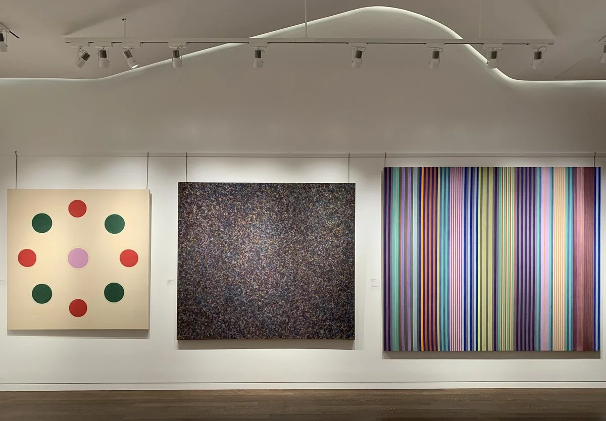
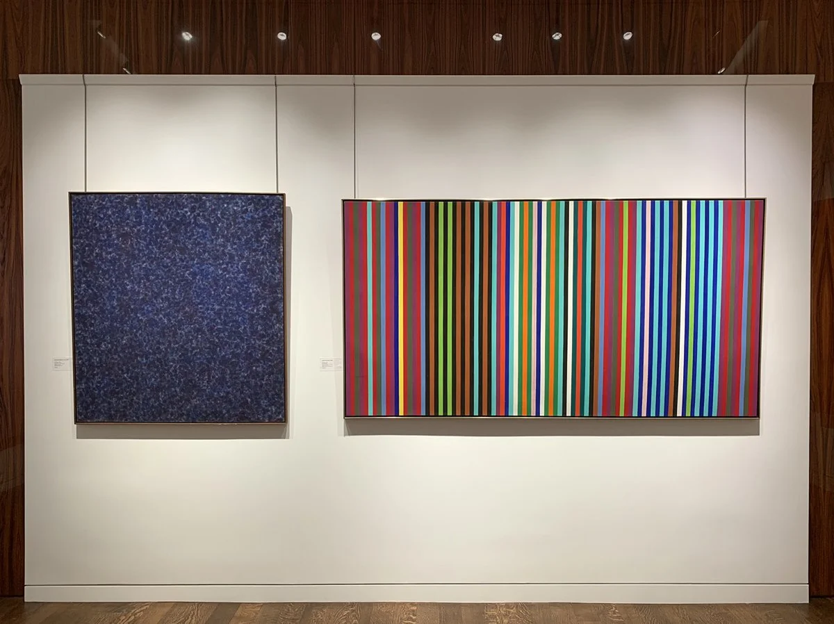
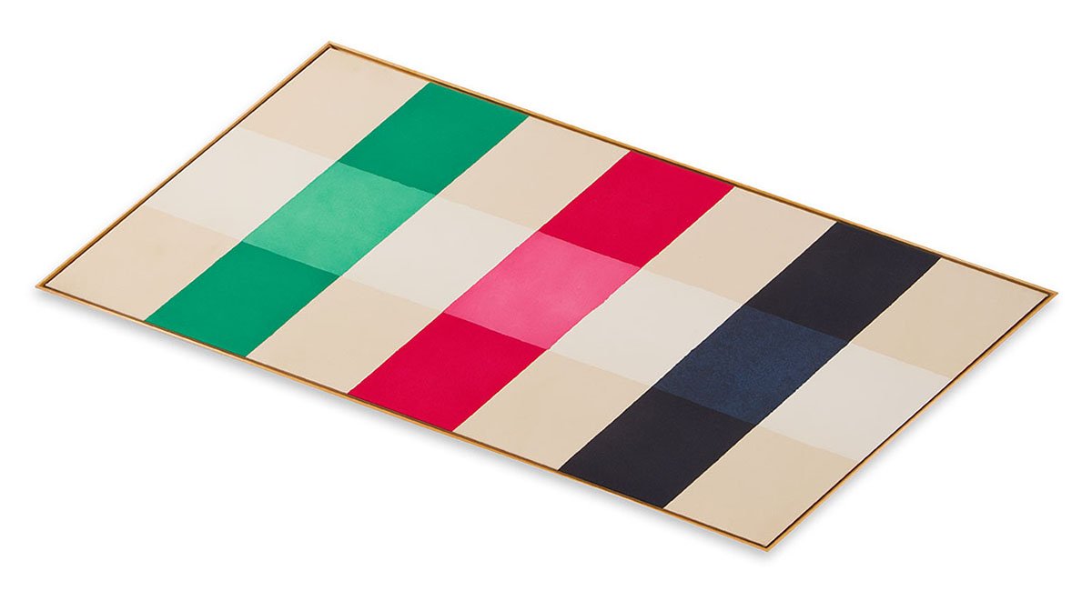
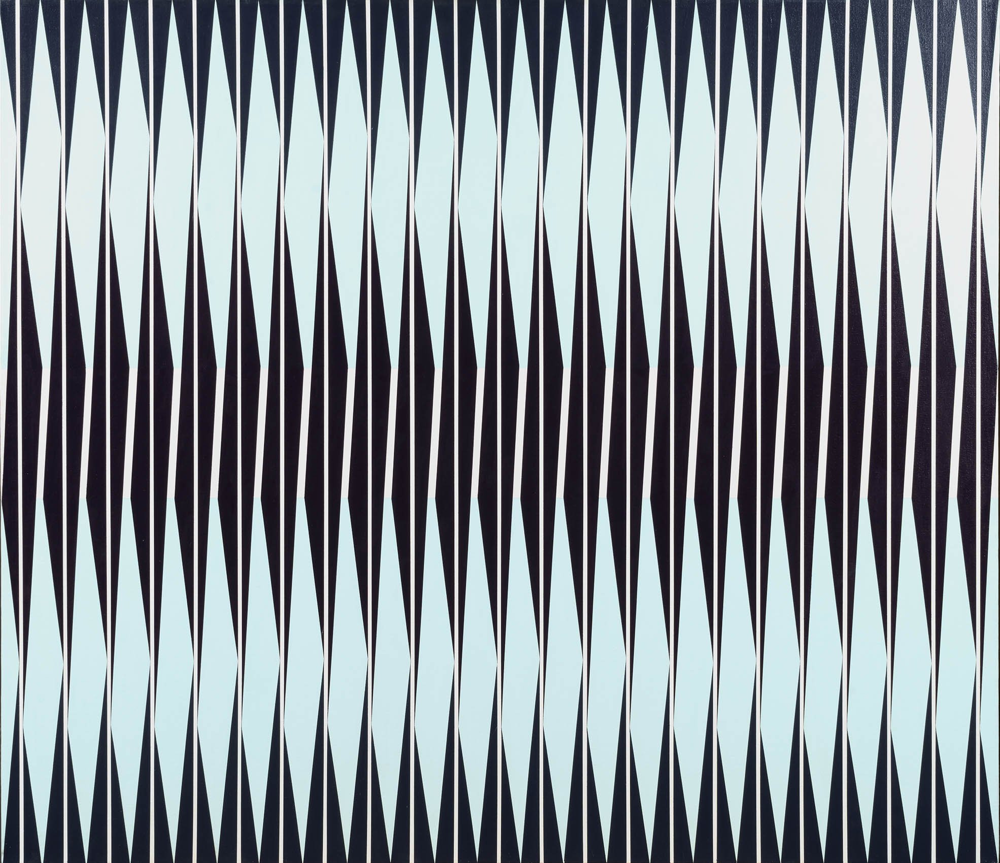
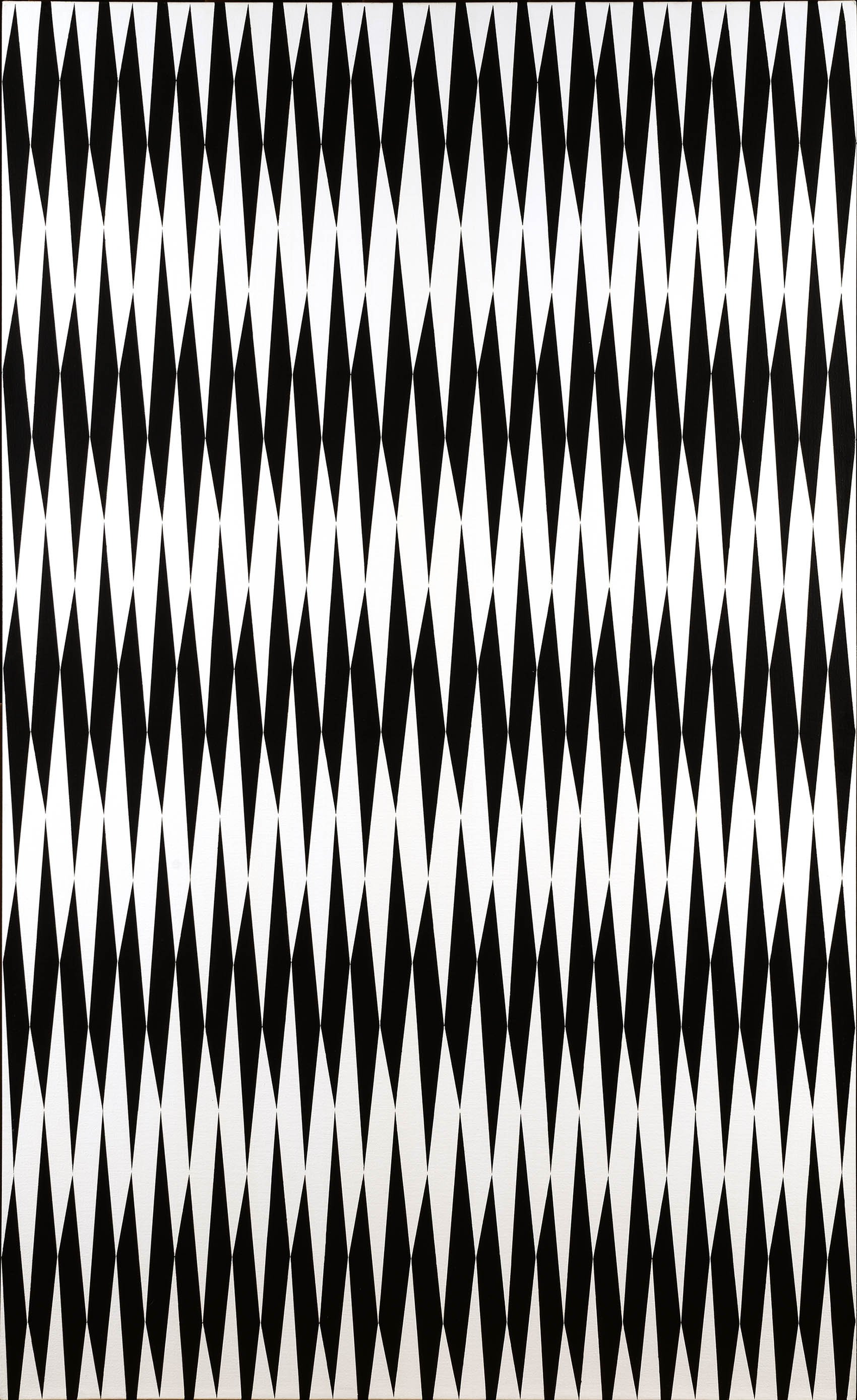
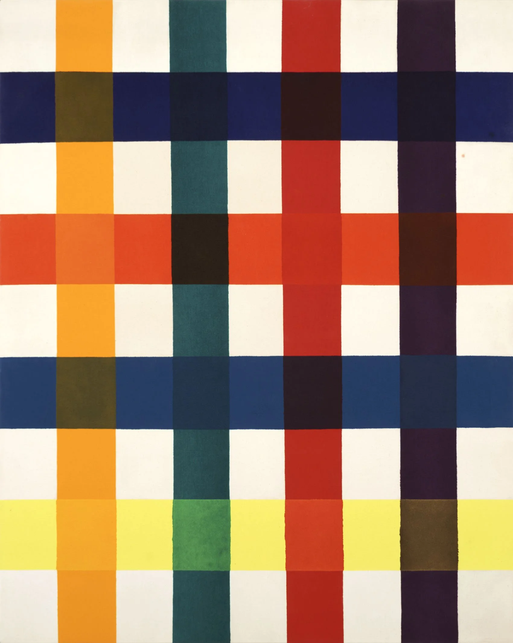
Three events resulted in Gene Davis beginning his signature stripe paintings: Barnett Newman’s 1951 exhibition of stripe paintings at the Betty Parson Gallery in New York; his introduction to Magna paint in 1954; and Jasper Johns’ target painting on the cover of ArtNews in 1958. Once Davis settled on the vertical stripe in 1959, he used the format for the rest of his life. Davis chose to work in rhythmic vertical lines as he saw his work paralleling literature or music and horizontal bands were too strongly tied to landscapes. The earliest stripe paintings were freehand then Davis methodically laid out the width of his stripes in pencil before applying color intuitively back and forth across the canvas. Davis wanted each painting to act as a world into which one could enter and stroll around visually. By 1962 Davis had systemized his approach to each painting by using vertical stripes of uniform width. The penciled stripes were masked out with tape and the first color was applied to some stripes across the painting. Then Davis moved on to a second color, purposely leaving some stripes raw as future “escape valves” to adjust the balance of the painting. Davis felt the dramatic impact of his paintings came from finding the right color to hold the painting together. The escape valves lead to the creative leap that produced the painting’s tension and thereby its success. Davis worked in this way until 1969. In Firebox, 1964, black is used for every third stripe on the left and every other stripe on the right side of the canvas. Bright blue, pink, turquoise, and yellow act as accent colors breaking the pattern of dark colors. The different patterns of stripes on the left and right sides of Firebox were a way to test the balance and unity of a painting through asymmetry. Davis encouraged the viewer to experience the painting one color at a time, moving back and forth across the canvas to see how a single color reacts to its neighbors. This replicated Davis’s own working method and allowed the viewer to relive the painting process. In the 1970s works, Davis began to complicate his compositions by working in a variety of stripe widths from thin lines to broader fields of color as seen in Green Stripes, 1970.

Paul Reed

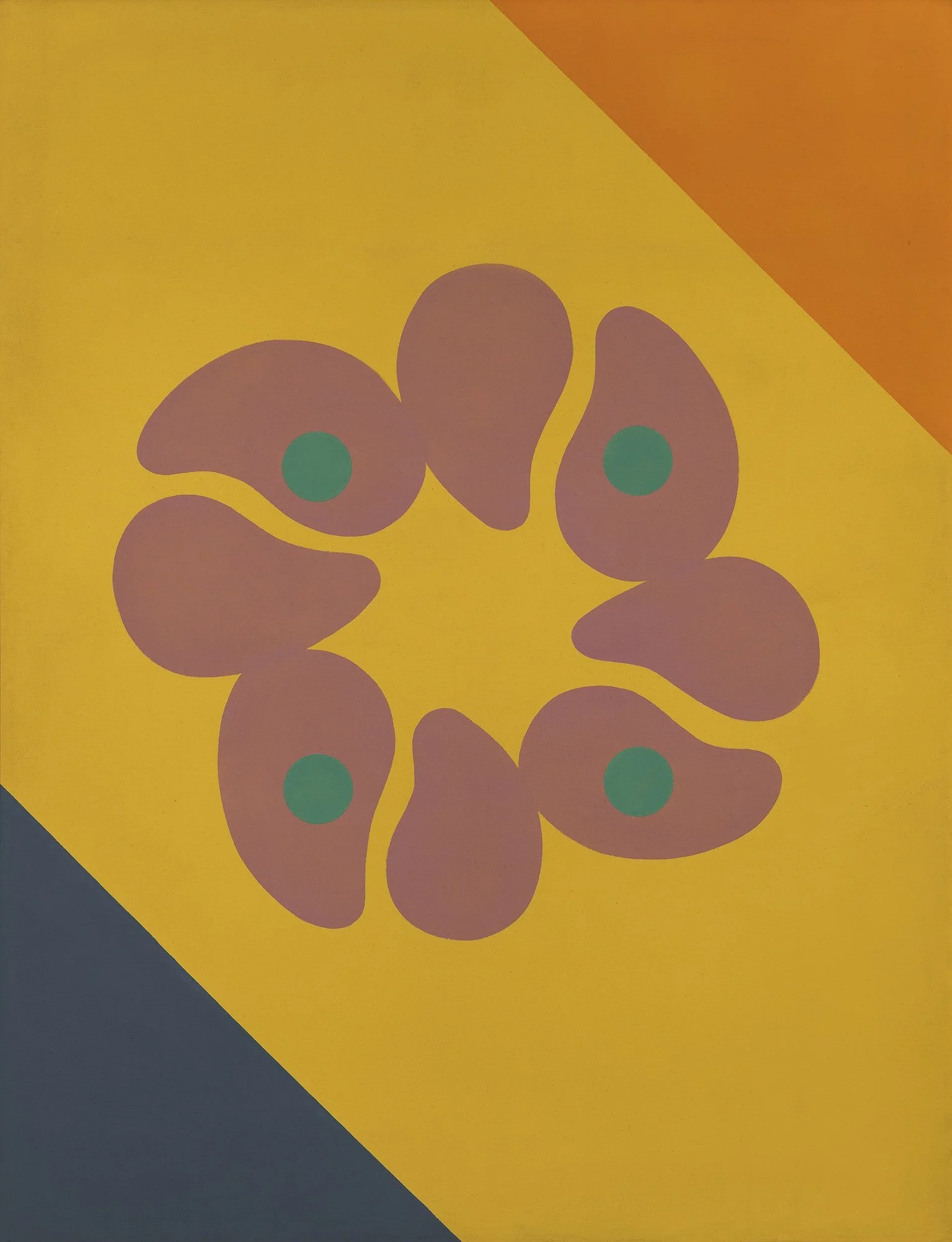
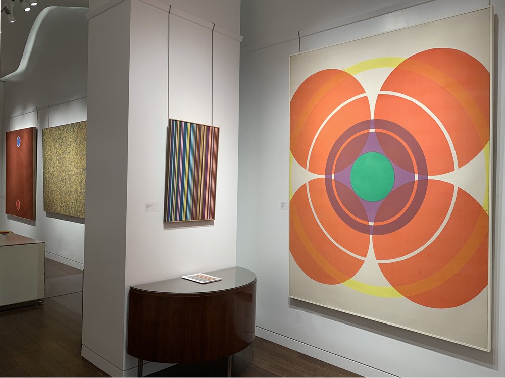
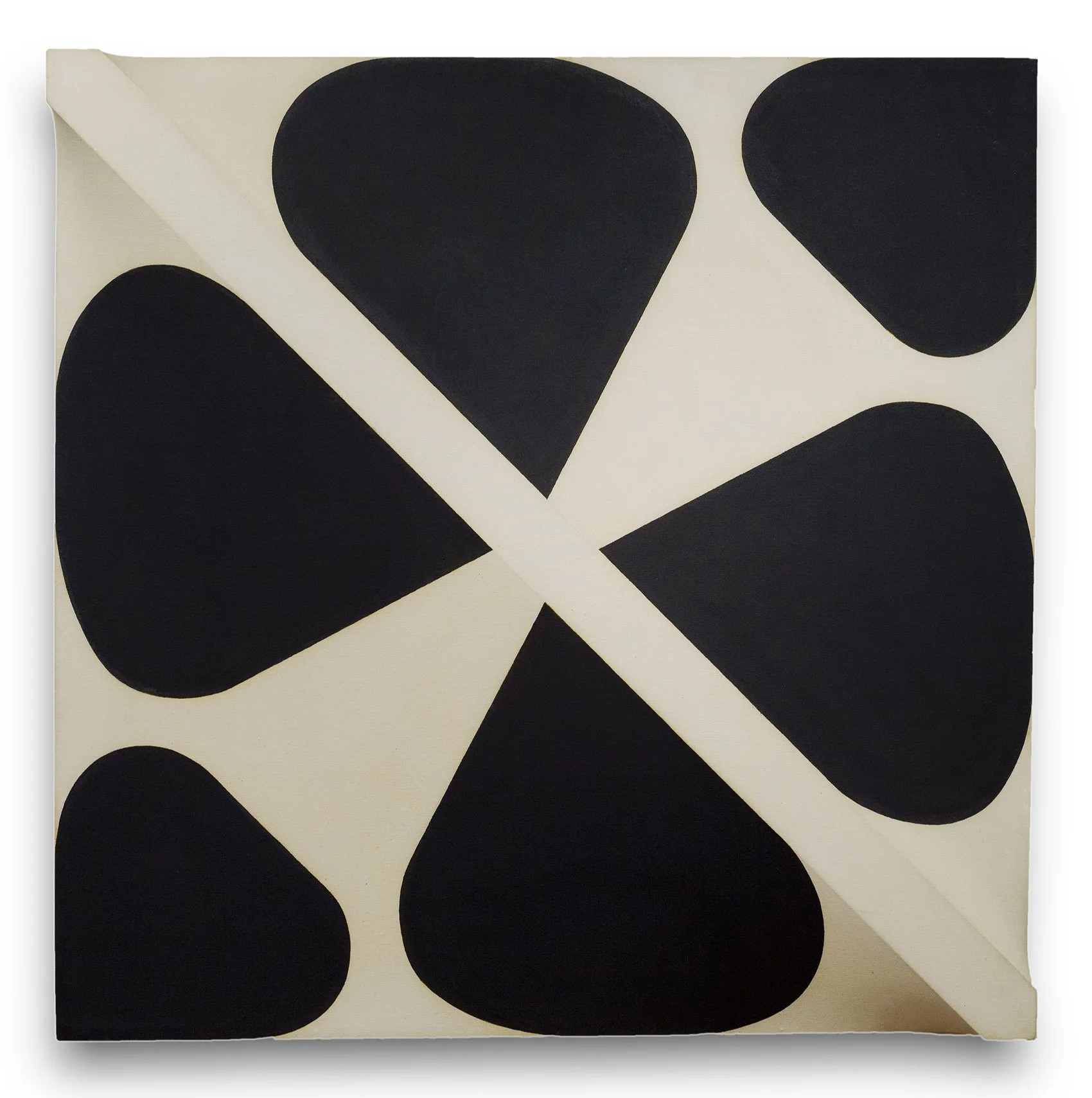
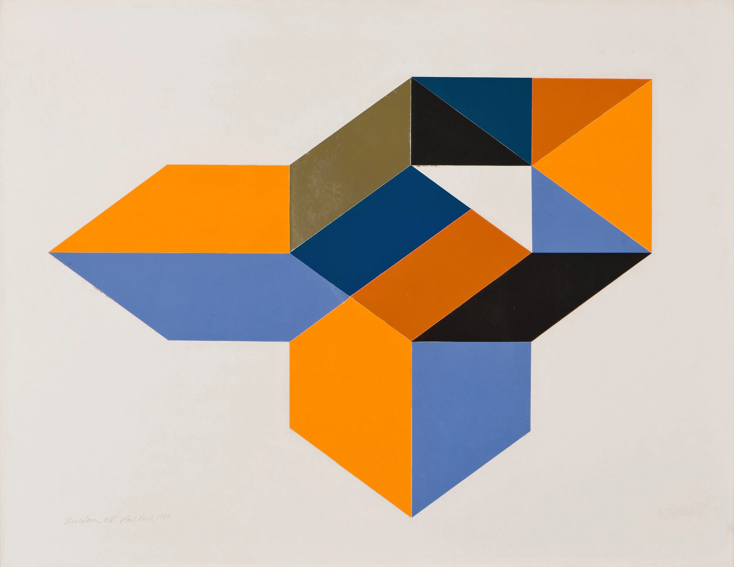
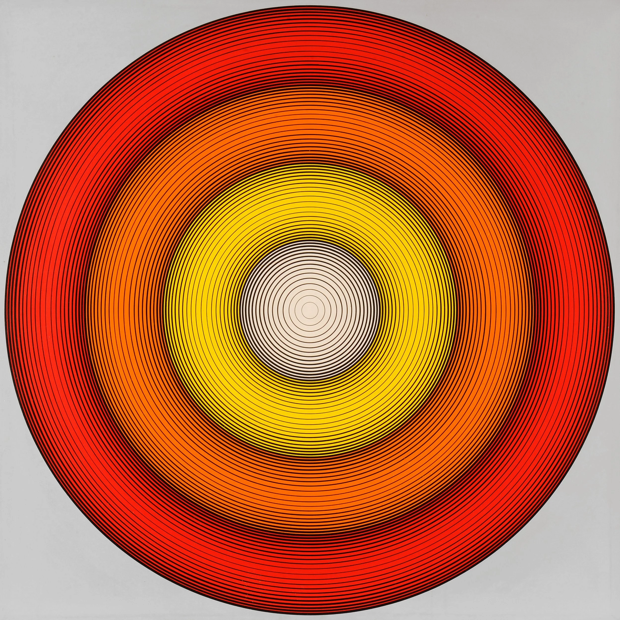
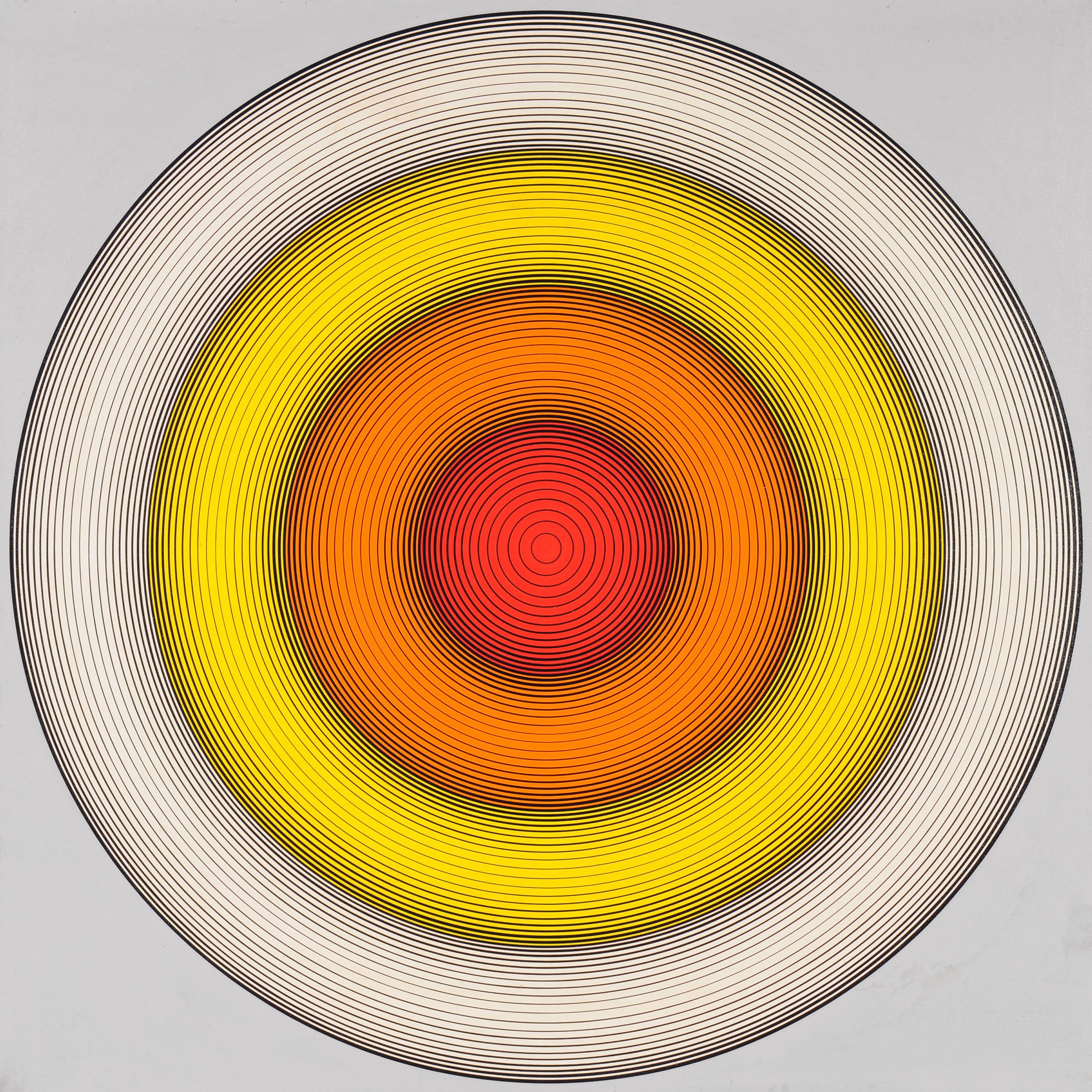
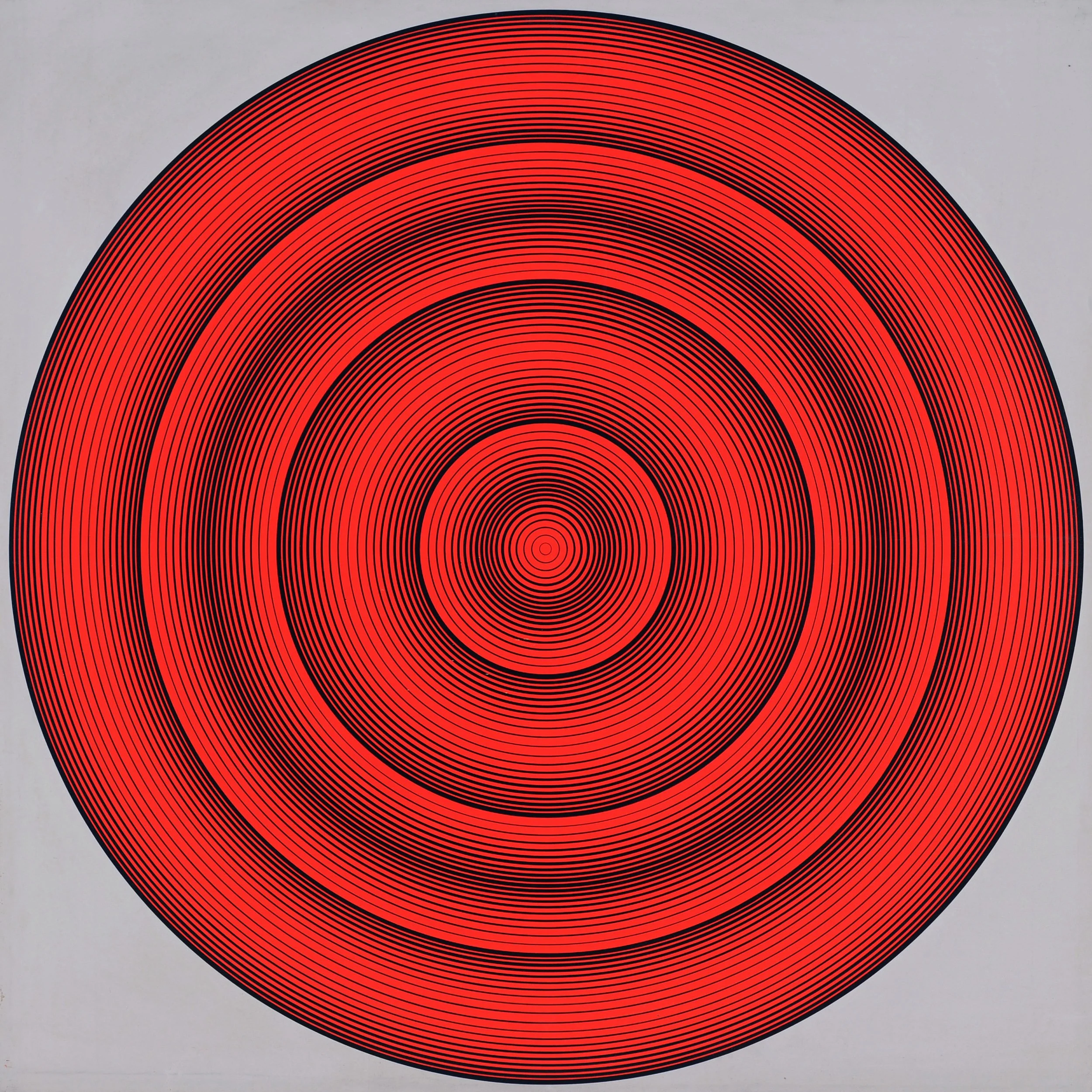
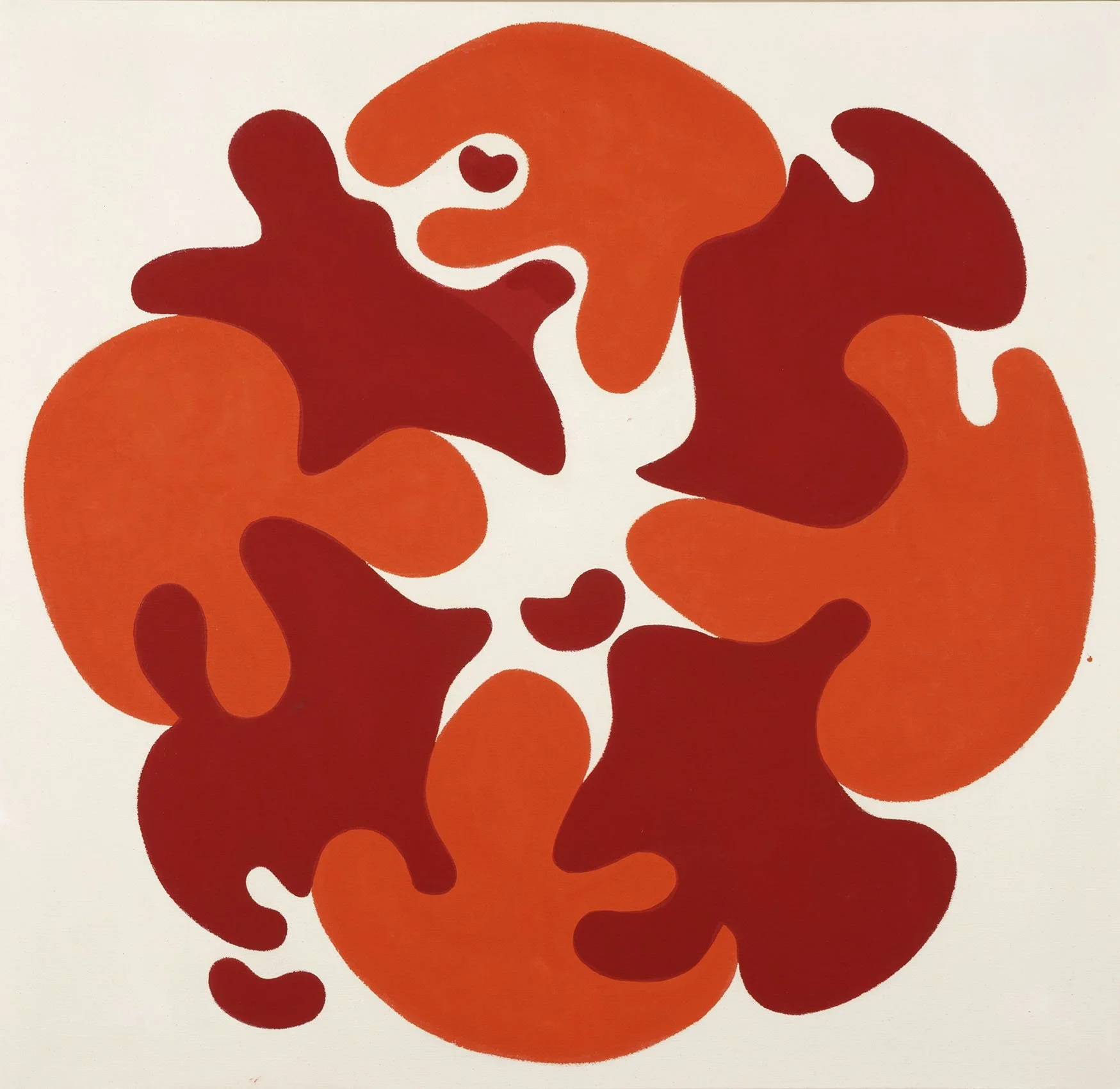
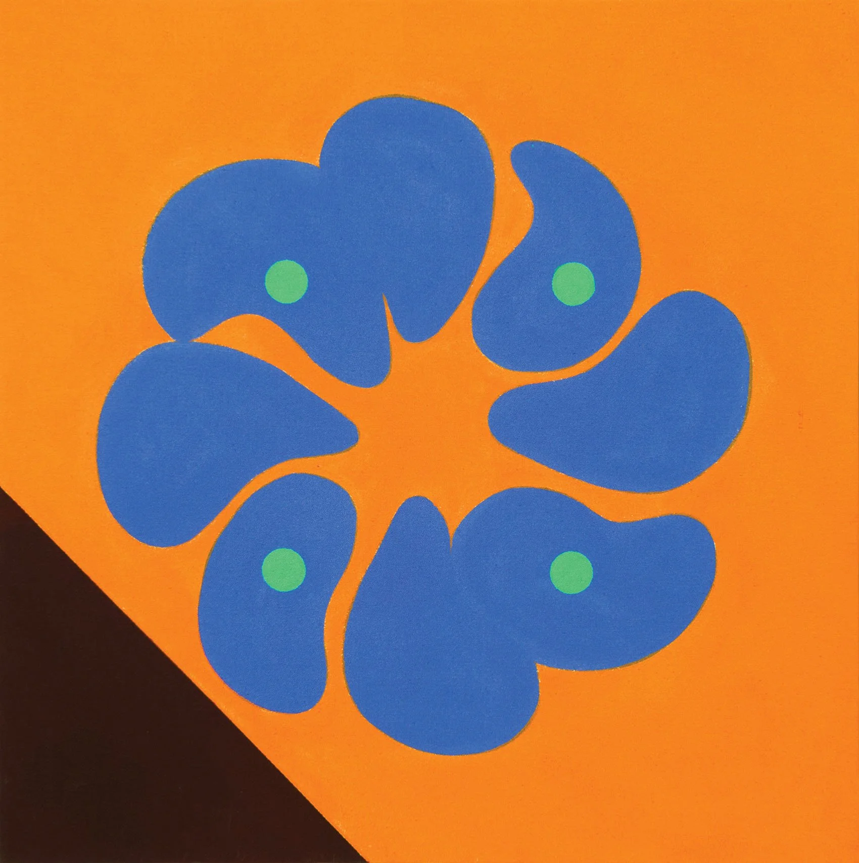
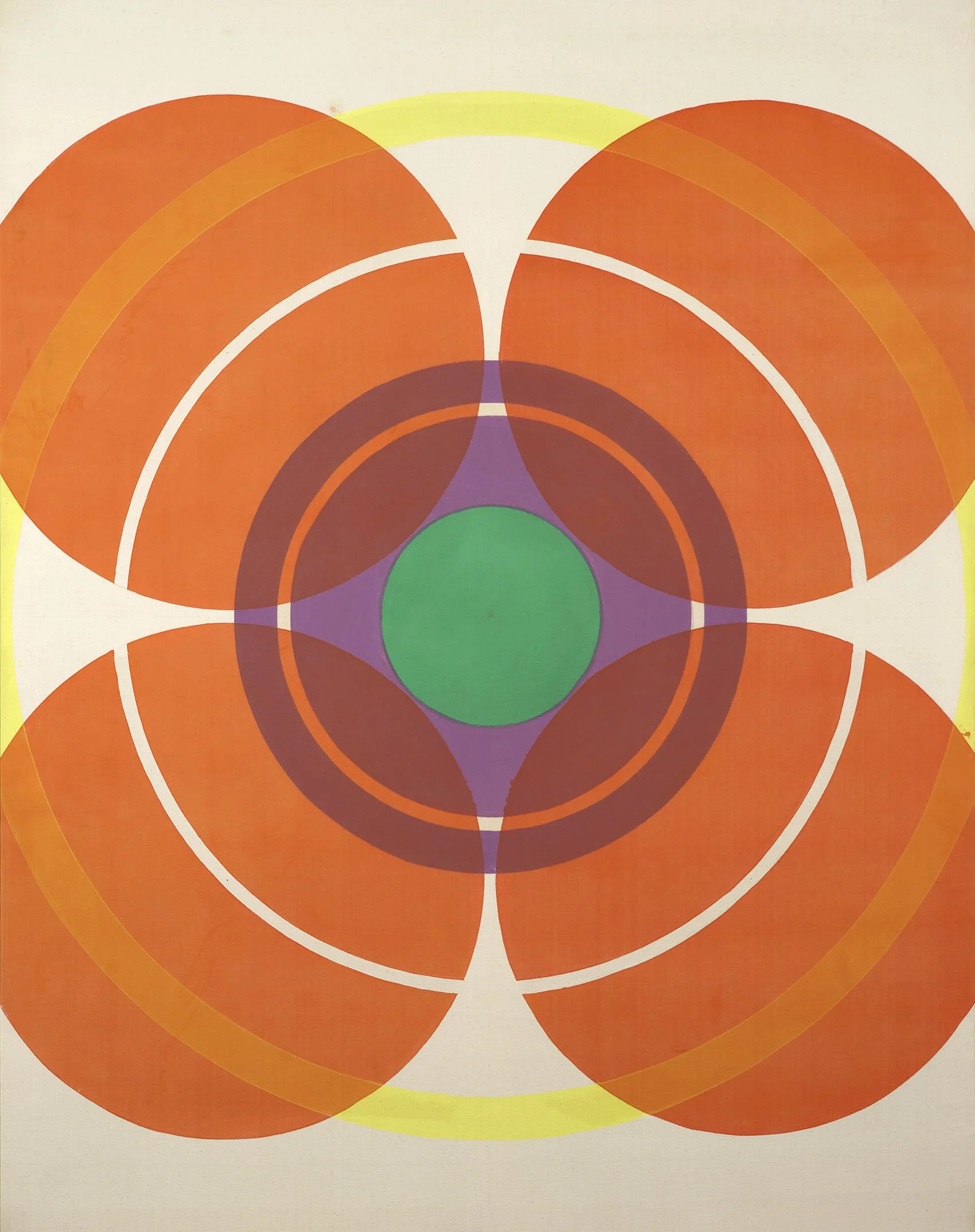
Paul Reed was introduced to Magna in 1954 by Gene Davis, but held off working in acrylics until a water-based paint was introduced in 1958. Magna was thinned with solvents like turpentine which made it a toxic medium. After years of broadly experimenting, Reed began to work systematically in series in 1962, exploring the function of color in its ability to define form and create structure. In each series, he used the transparent nature of acrylic painting. Reed had the broadest range of series within the Washington Color School. The composition of each evolving series came out of small adjustments made in preparatory thumbnail studies and collages. From 1962 to 1965, Reed focused on the centralized image as seen in the painting #25C, 1964 in our exhibition. It has an 8-petal arrangement of biomorphic shapes at its center on a field of yellow anchored by two corners of complementary colors, orange and blue. #25C shows Reed’s movement out of his 1963-64 “petal paintings” (biomorphic shapes in a circular arrangement) into his Disk paintings of 1965. #25C was reproduced in Donald Judd’s Arts Magazine review of Paul Reed’s 1965 exhibition at East Hampton Gallery in New York. The centralized image paintings became more geometric as seen in Kumquad, 1964, which radiates out in rings around a central green dot. Reed received his first solo exhibition in DC at the Adams-Morgan Gallery in 1963 and Howard Mehring wrote the catalogue text noting the feeling of color vibration and joy in Reed’s work. After 1965 Reed explored the stripe in lattice structures to examine how a vertical or horizontal stripe influenced a viewer to focus on color, canvas, or shape. This investigation led to Reed’s shaped canvases from 1967 to 1970 which were featured in Paul Reed and the Shaped Canvas at our gallery in 2013.

Thomas Downing

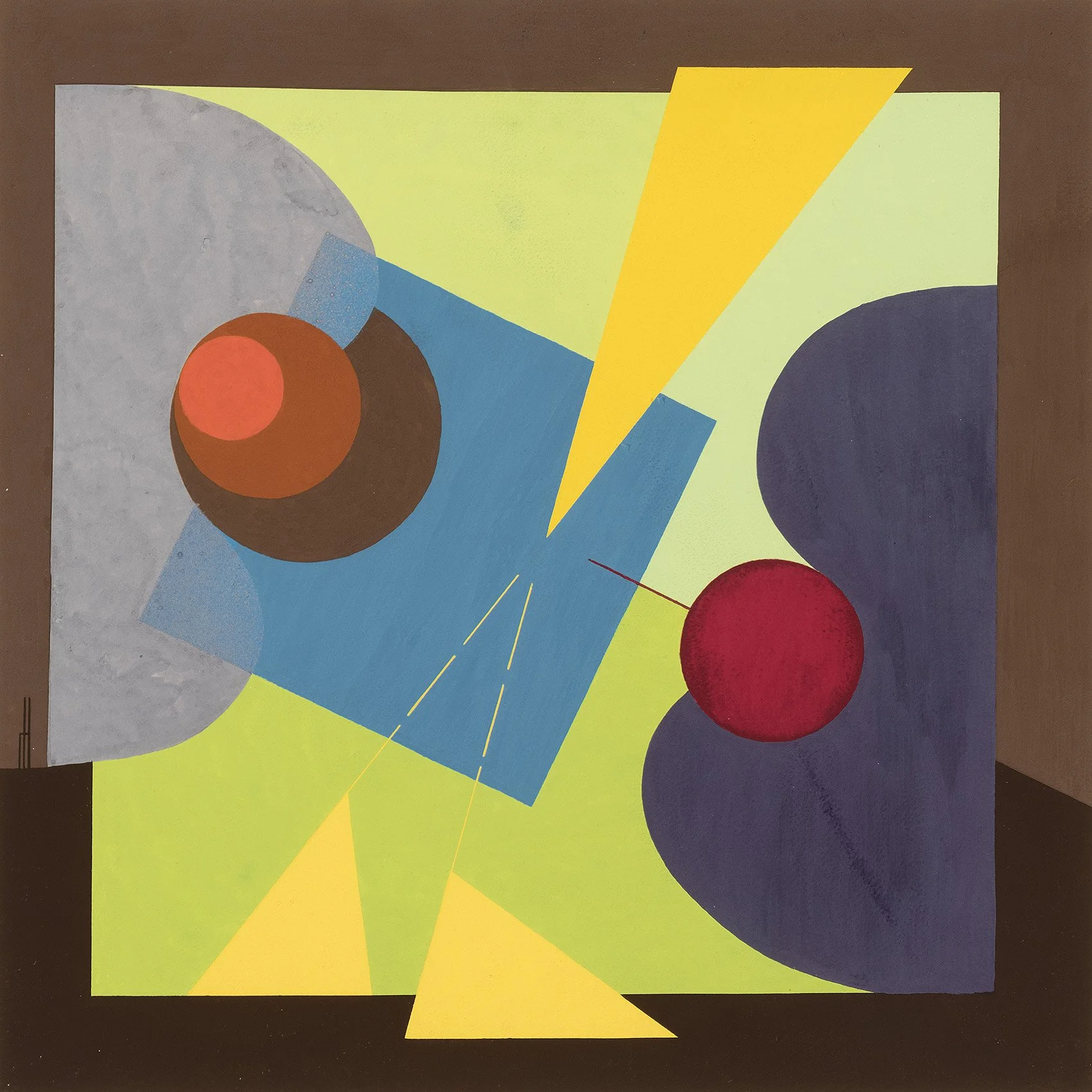
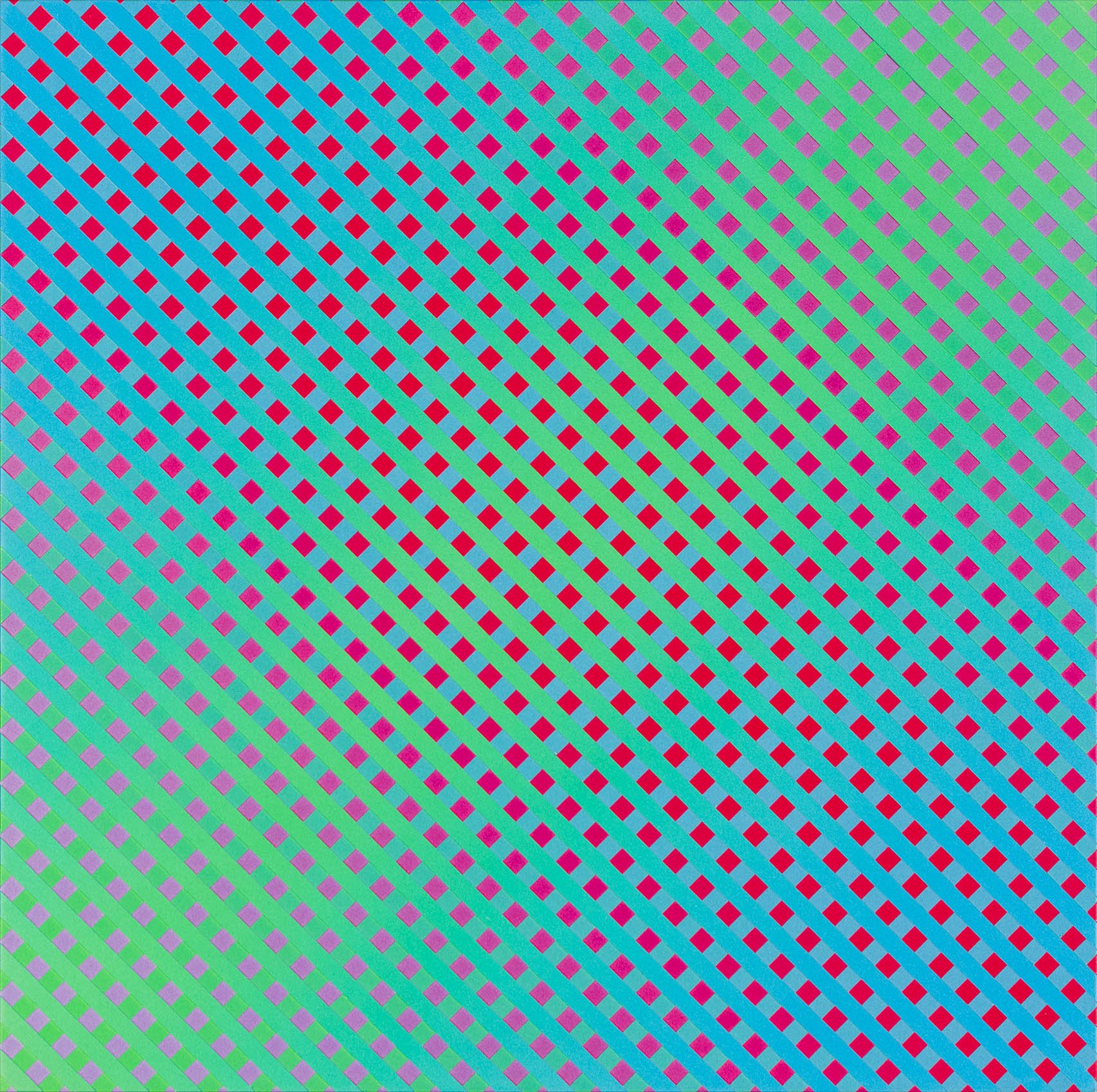
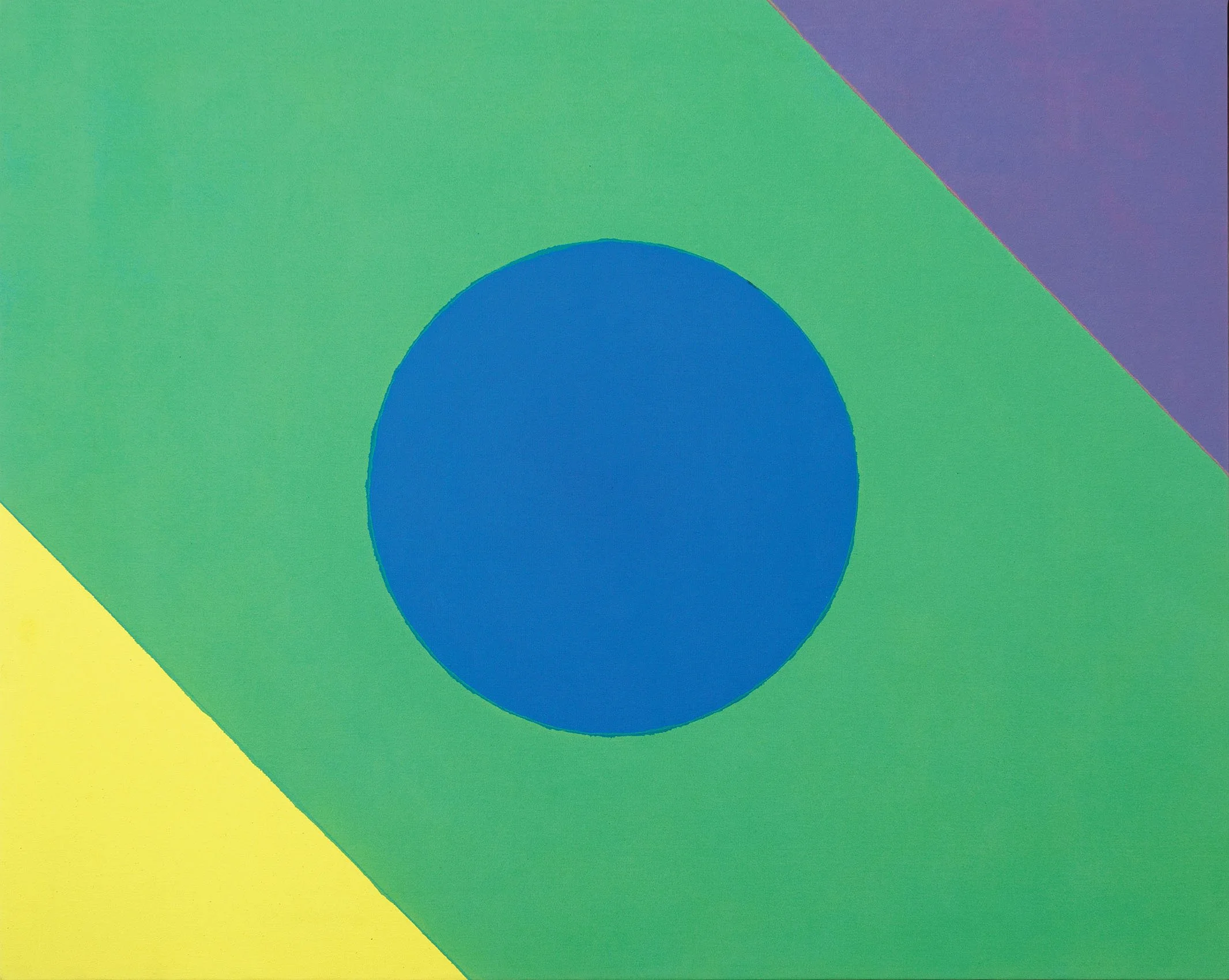
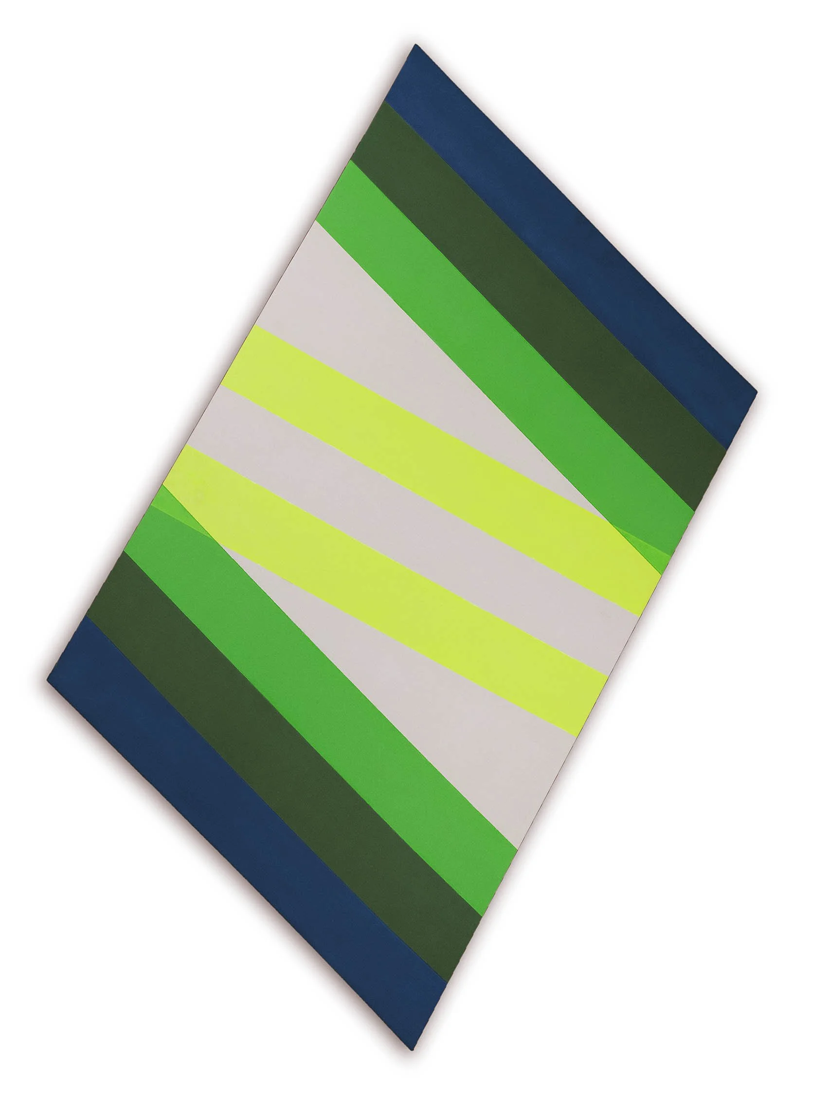
Thomas Downing settled in DC after studying at Pratt in New York and traveling through Europe on a grant from the Virginia Museum of Fine Art. Downing used his GI Bill to attend a summer course at Catholic University taught by Kenneth Noland in 1954 and met Howard Mehring the following year at the Sculptors Studio. Downing was impacted by Noland’s target paintings shown at Jefferson Place Gallery in 1958 and settled on the dot as his motif the following year. From 1959 to 1965, Downing organized dots into separate series of grids, dials, and rings. The grid series show how closely arranged dots produce the appearance of floating color, the dial series radiate color outward, and the ring series use a larger range of colors to push the dots off the canvas. Our exhibition offers Red Arc, 1964, a limited arrangement of two dots, one red and the other blue, on a rust red square canvas. A halo within the field of rust red holds the bright red and blue dots in orbit. The Dot series was shown in Downing’s 1968 La Jolla Museum exhibition. Related dot paintings are Blue Spell in the Phillips Collection and Green Melt at the Harvard Art Museums. Downing’s experiments in color and composition in square format dot paintings led him to produce related shaped canvases starting in 1965. In one series of shaped canvases made in 1965 - 1966, Downing placed grids of circles within a parallelogram shape, such as Untitled (Variations in Red). These shaped canvas were developed in gradations of one hue- often red, blue, or green - with each dot’s color chosen to work with the shades of its neighboring colors. Downing achieved his greatest perspective illusion in the 1968 Fold shaped canvas series of three paintings. In our exhibition we offer Fold Three in which Downing used unusual color arrangements that seem to fold and project, causing the view to question whether the painting has actual depth. The Fold works were exhibited at the A.M. Sachs Gallery in New York in October-November of 1968 and in the Aldrich Contemporary Art Museum exhibition Highlights of the 1968-69 Art Season in June-September 1969.

Howard Mehring

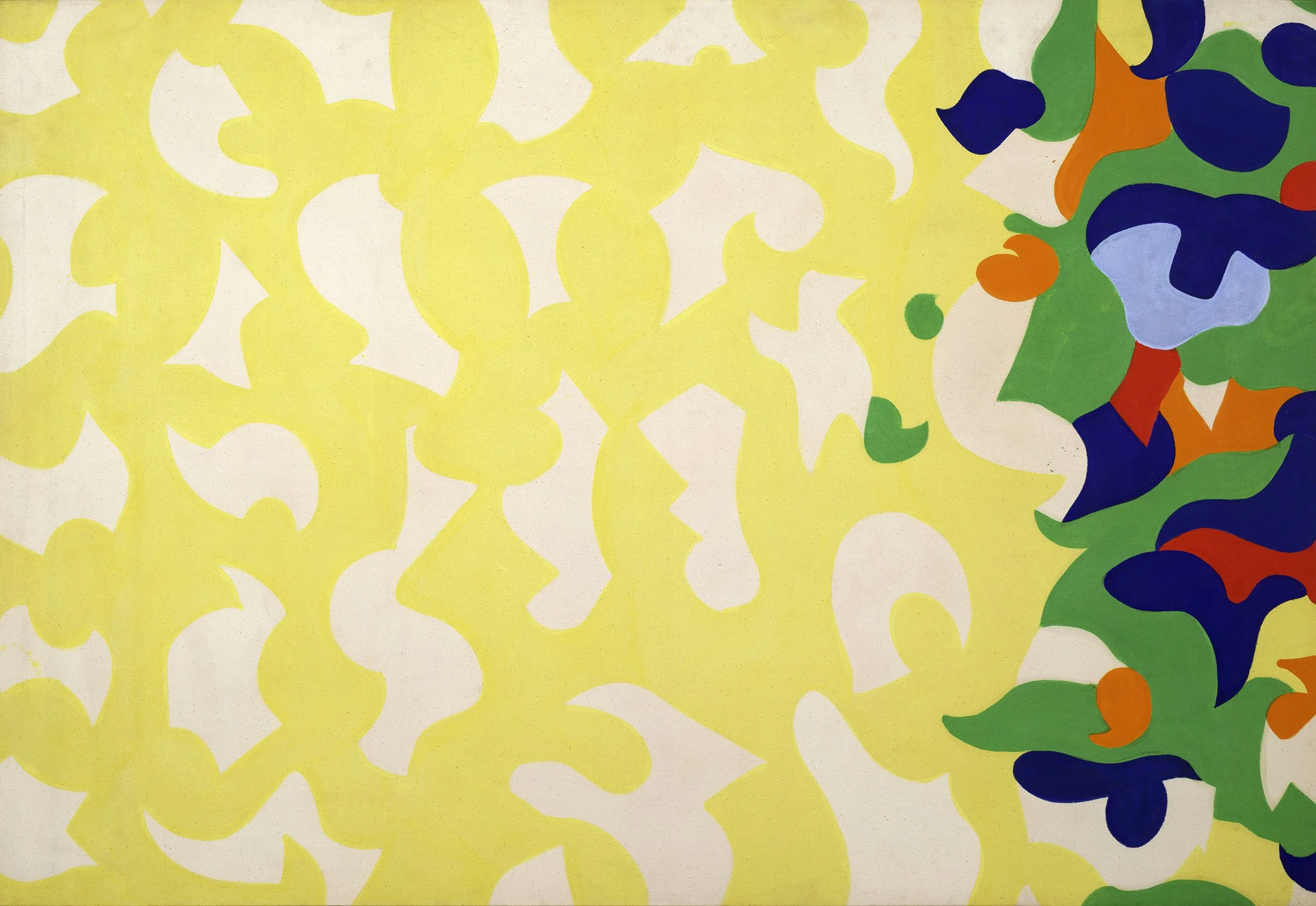
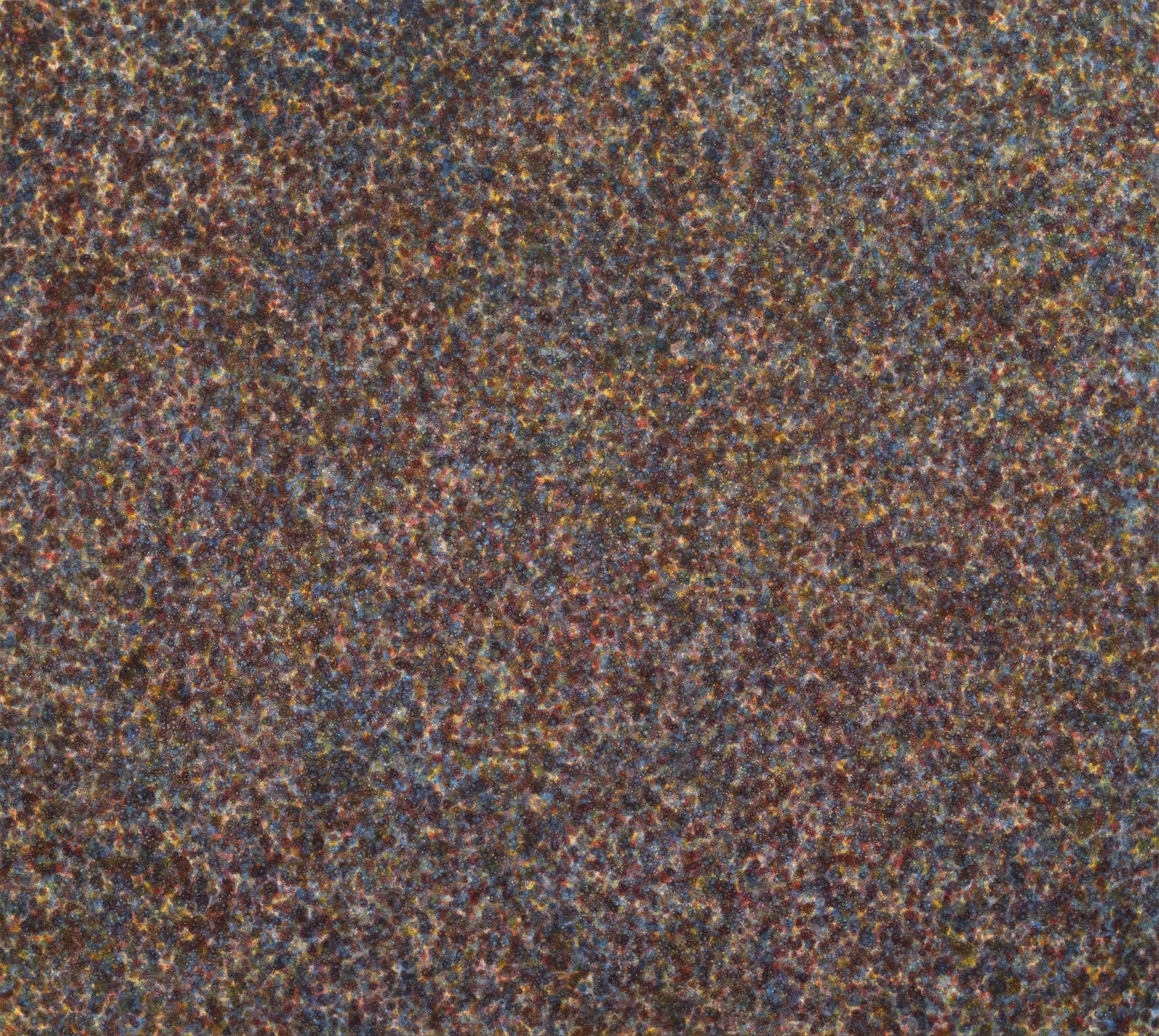
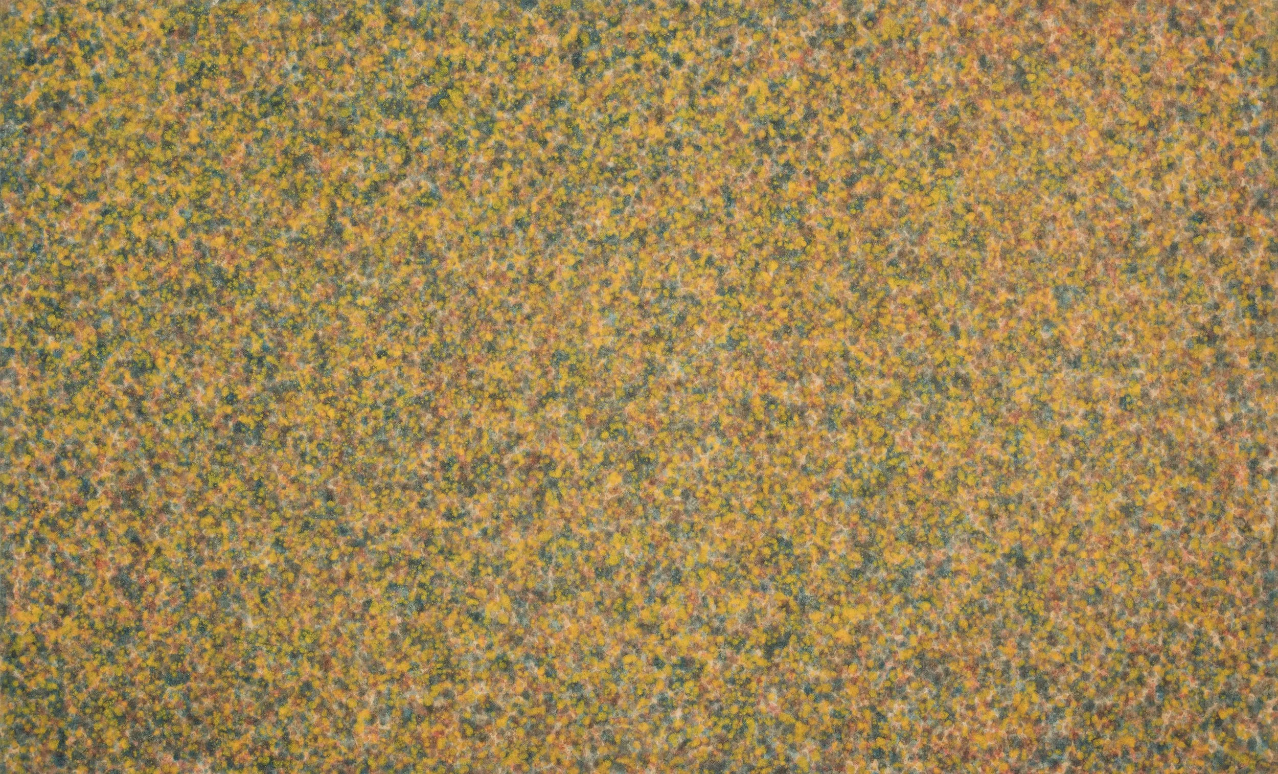
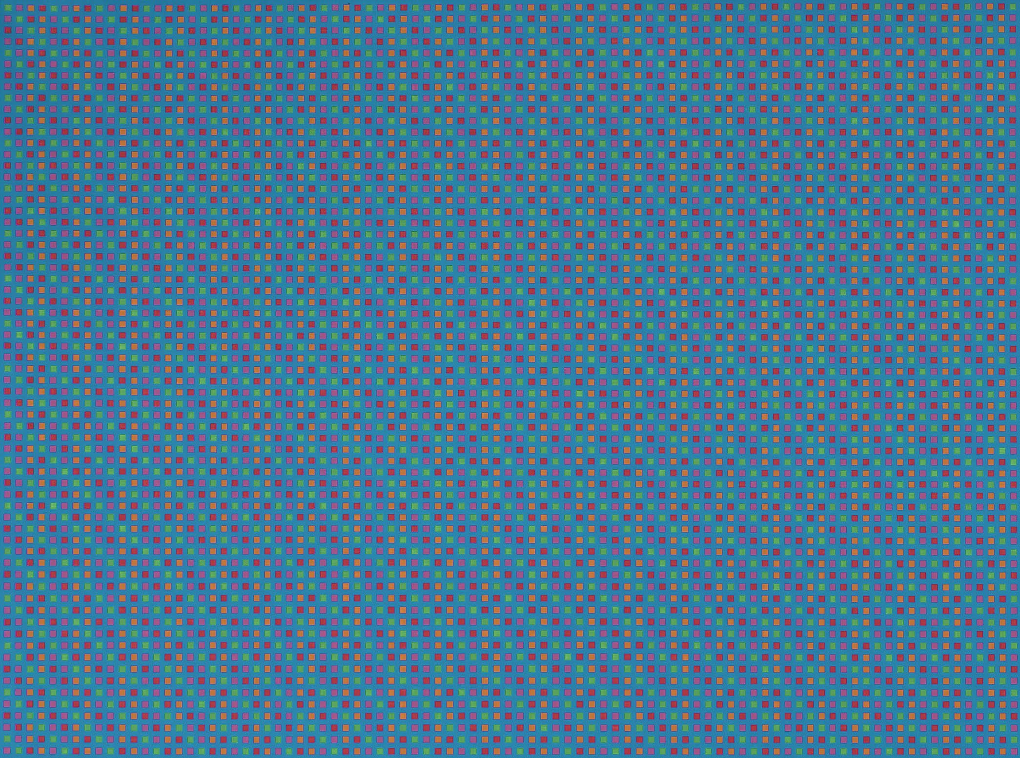
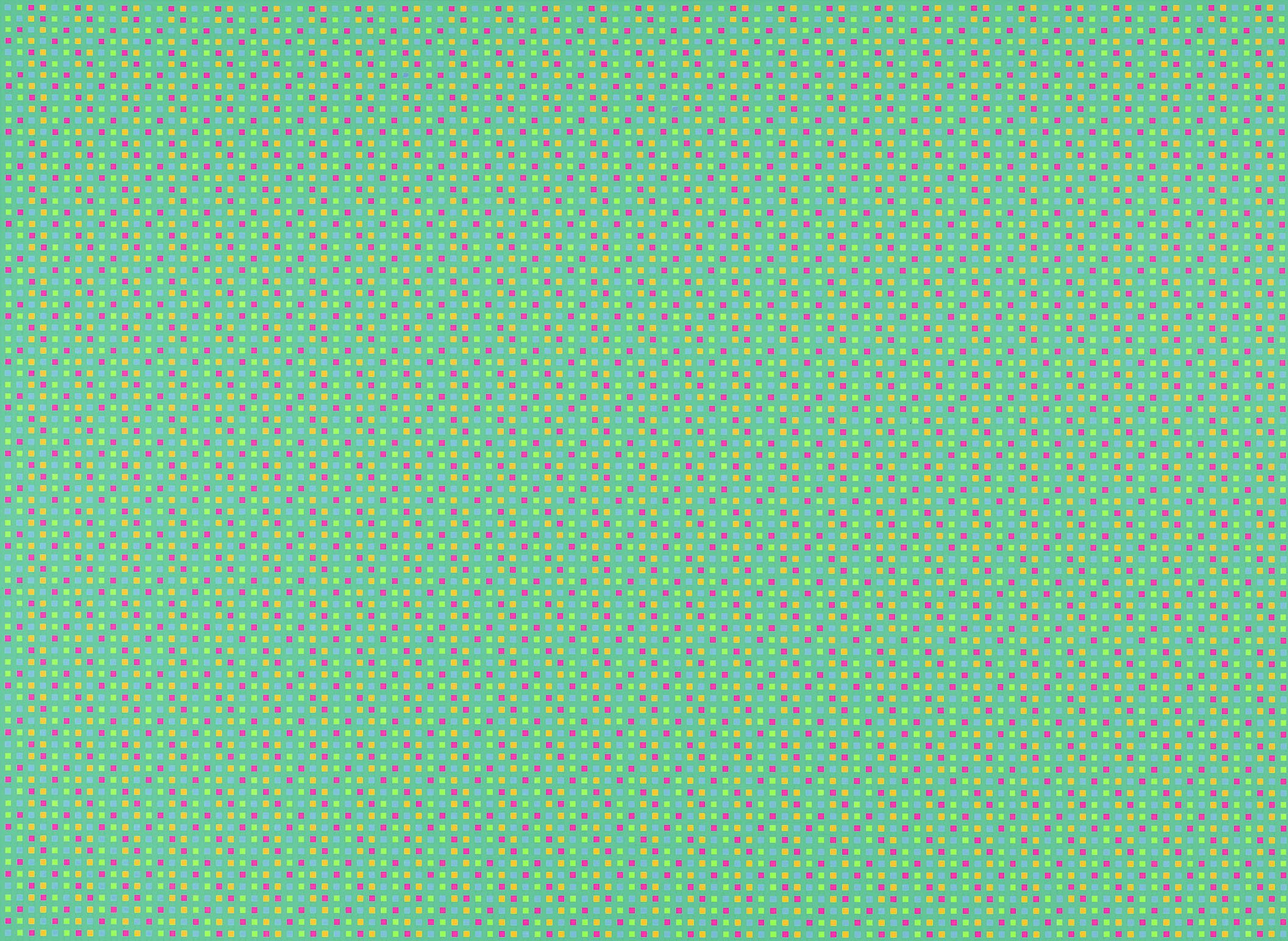
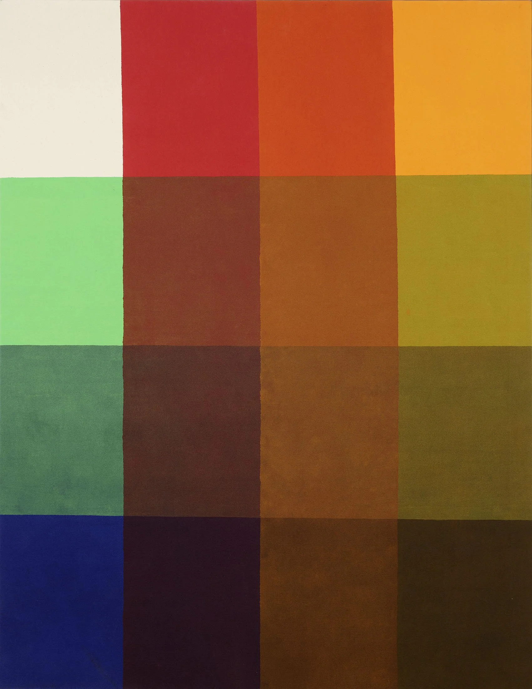
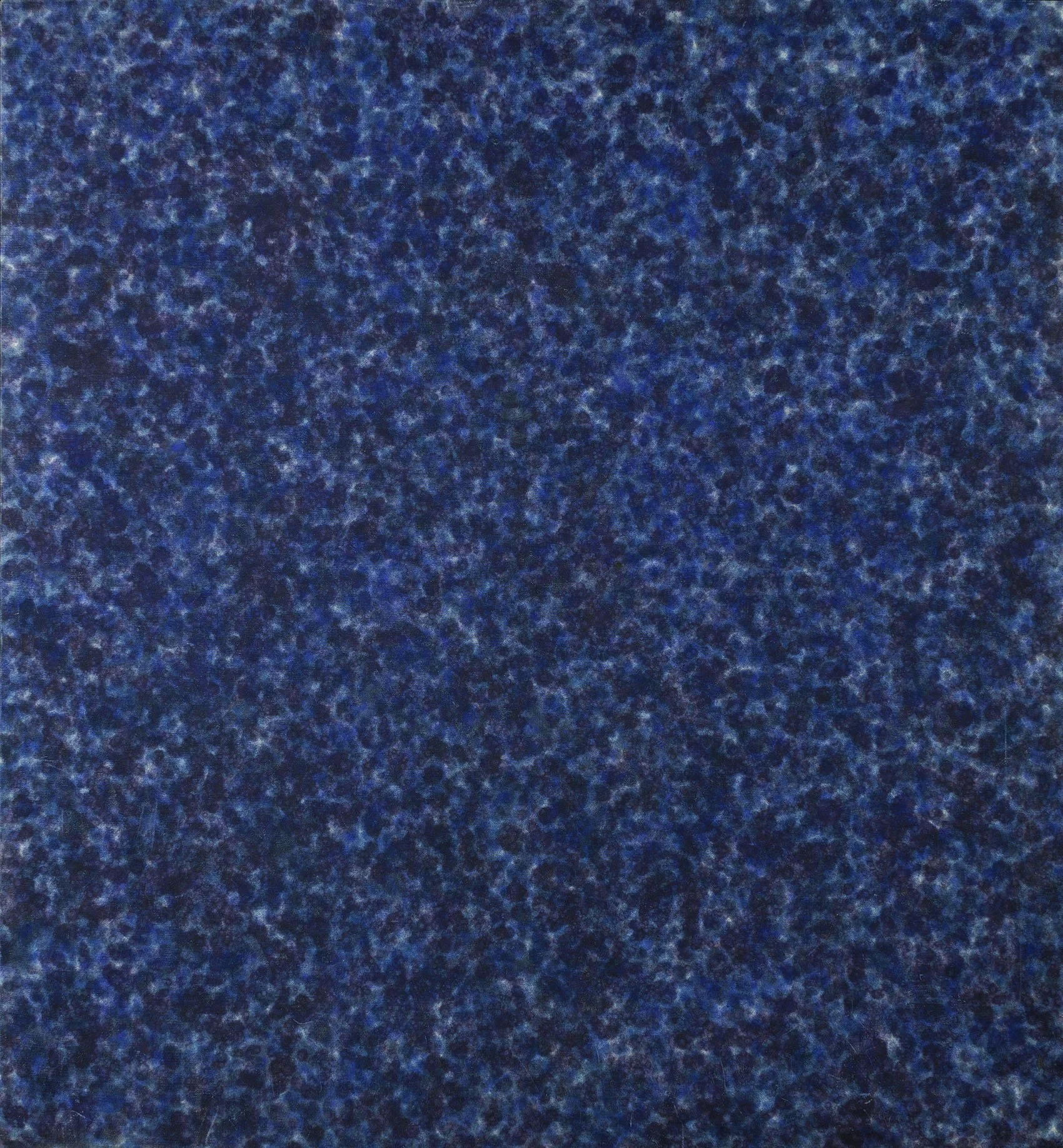
Howard Mehring enrolled at Catholic University in 1953 in its MFA program. Kenneth Noland was an important instructor there and became a good friend with whom he shared a love of progressive jazz. After graduation, Mehring met Thomas Downing at the Sculptors Studio and the two shared a studio through 1956. Mehring first poured enamel and metallic paints, moving to Magna stained into the canvas in 1957. Mehring had his first solo exhibition in 1959 at the cooperative Origo Gallery he co-founded, which included his first all-over paintings of poured and loose marks. The Origo Gallery was short lived and Mehring and Downing joined Jefferson Place Gallery by 1960. From 1960 to 1961, Mehring painted an all-over series of small spots of color, which he felt maintained attention across the entire canvas. He dripped or stippled dots in layers of color to create a surface that opened up and breathed, looking for a way to have the color expand and contract in front of the viewer. In our exhibition we have three of the 1960-1961 all-over paintings. In Untitled (Forsythia Spring), Mehring drips bright yellow over thinned blue and red, creating an experience that parallels how we see color in nature with the dominant yellow interrupted here and there with other colors. A more geometric style focused on the edge of the paintings began in 1962. In these Mehring collaged pieces of his all-over canvases into geometric arrangements. Mehring liked the break between colors that the collaged canvas edge provided as well as the energy the arrangement brought into the center of his symmetrical compositions. These works were exhibited at the Jefferson Place Gallery. By 1965 Mehring was working with a saturated brush in his stripe series of T and Z paintings, which continued until Mehring stopped painting in 1968. His mature work in total spans just eleven years.

[ TOP ]

Modernism 1913-1950 | Realism of the 1930s and 1940s | Abstraction of the 1930s and 1940s | Post-War | Selected Biographies

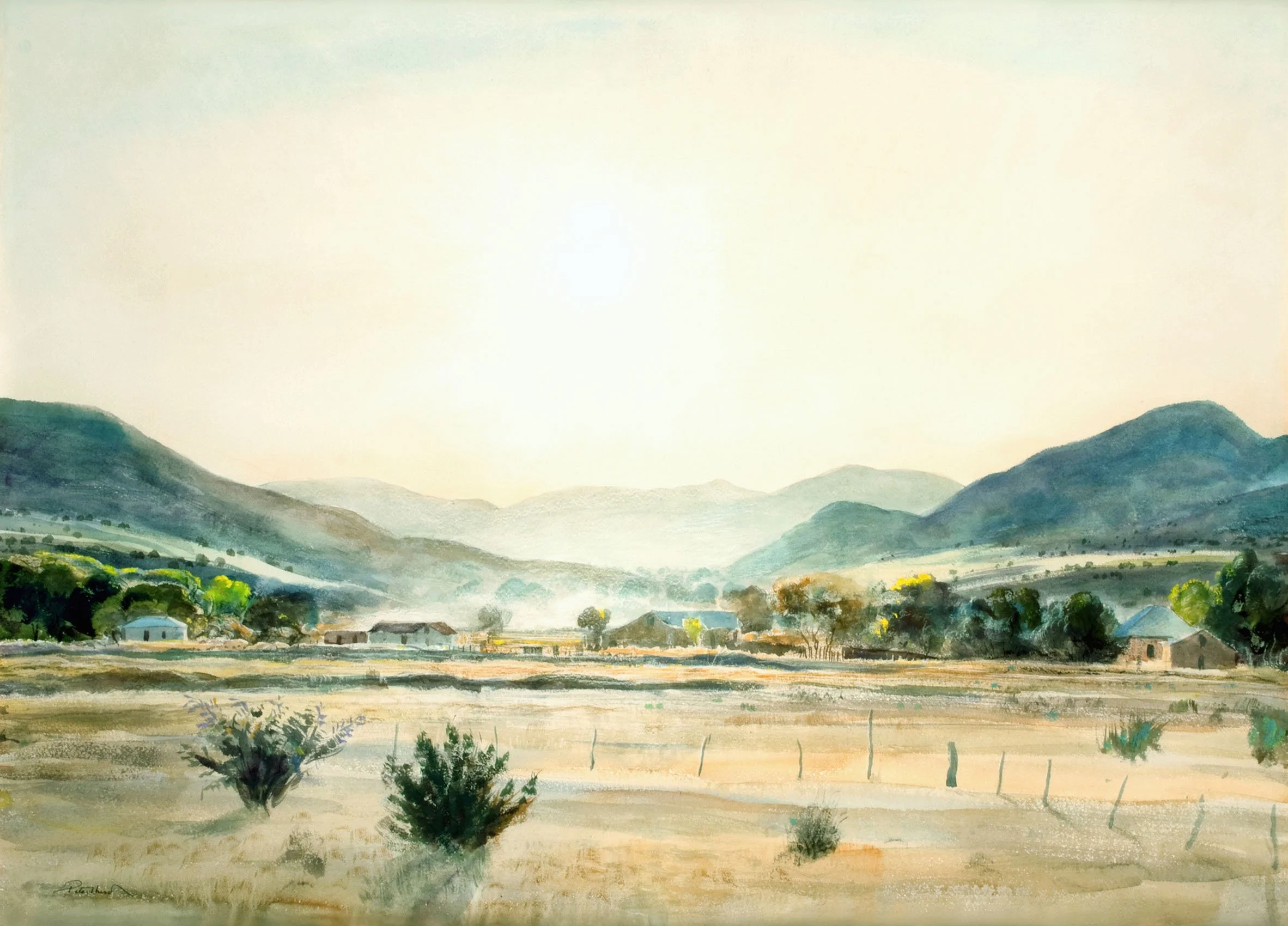
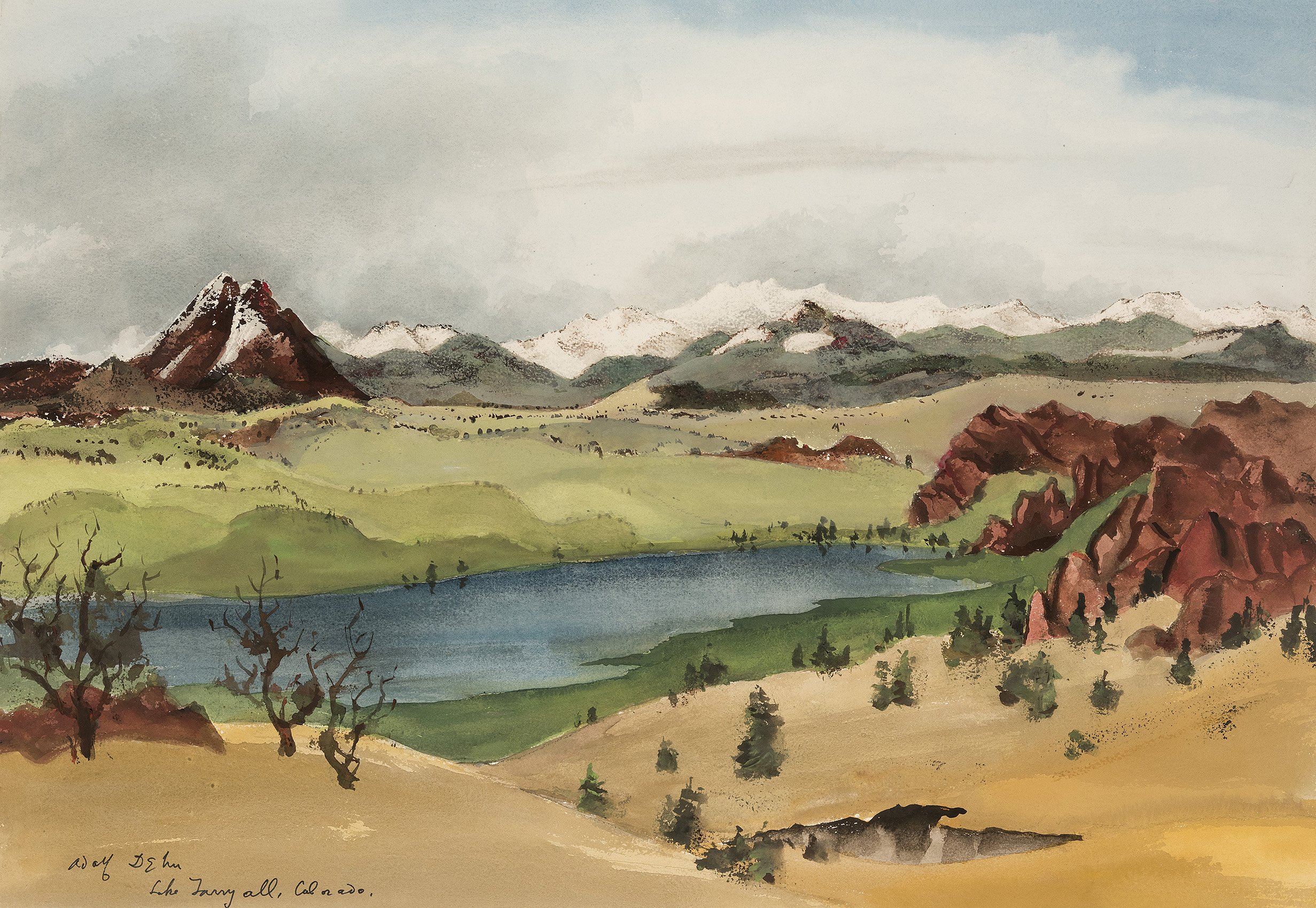
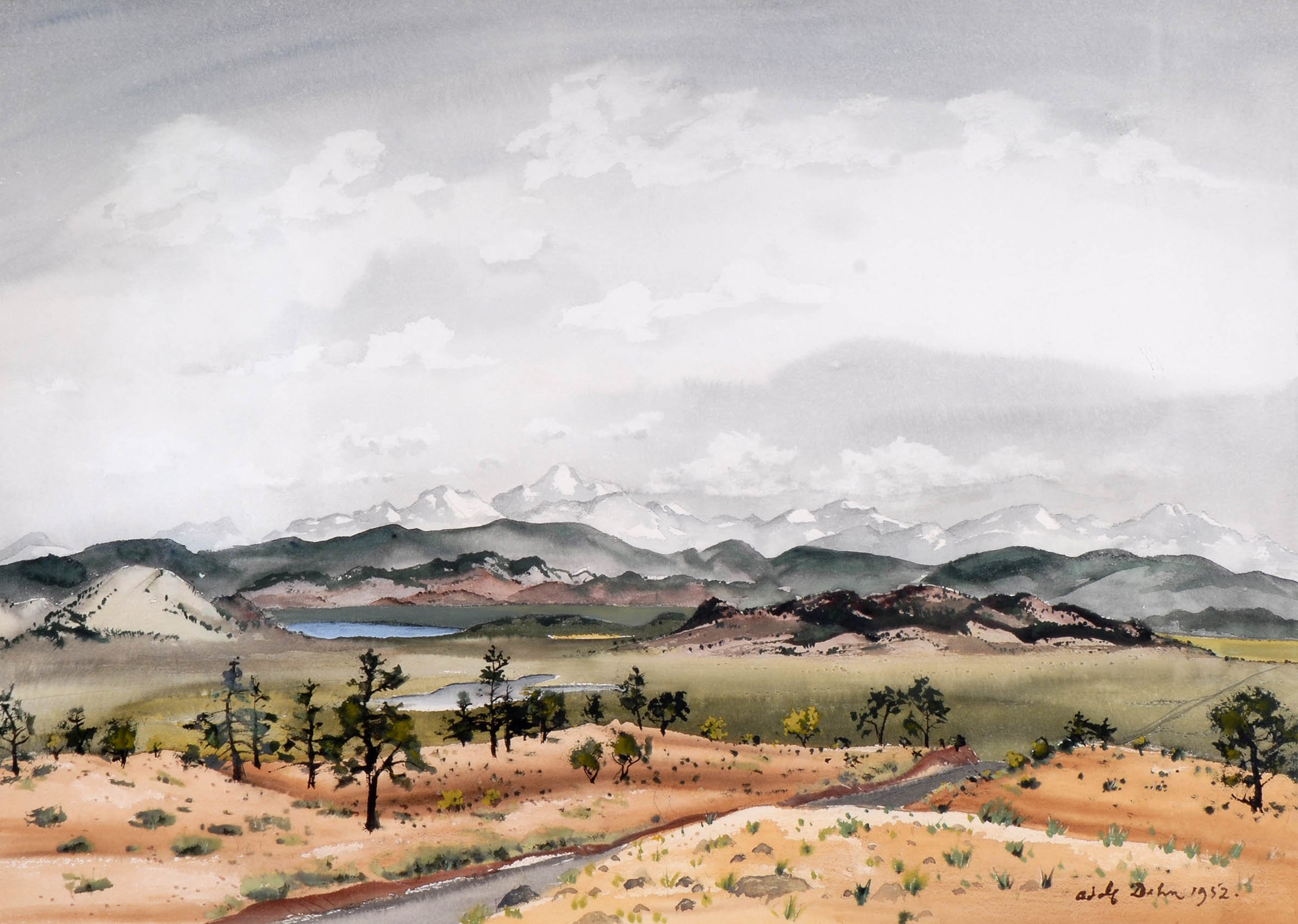
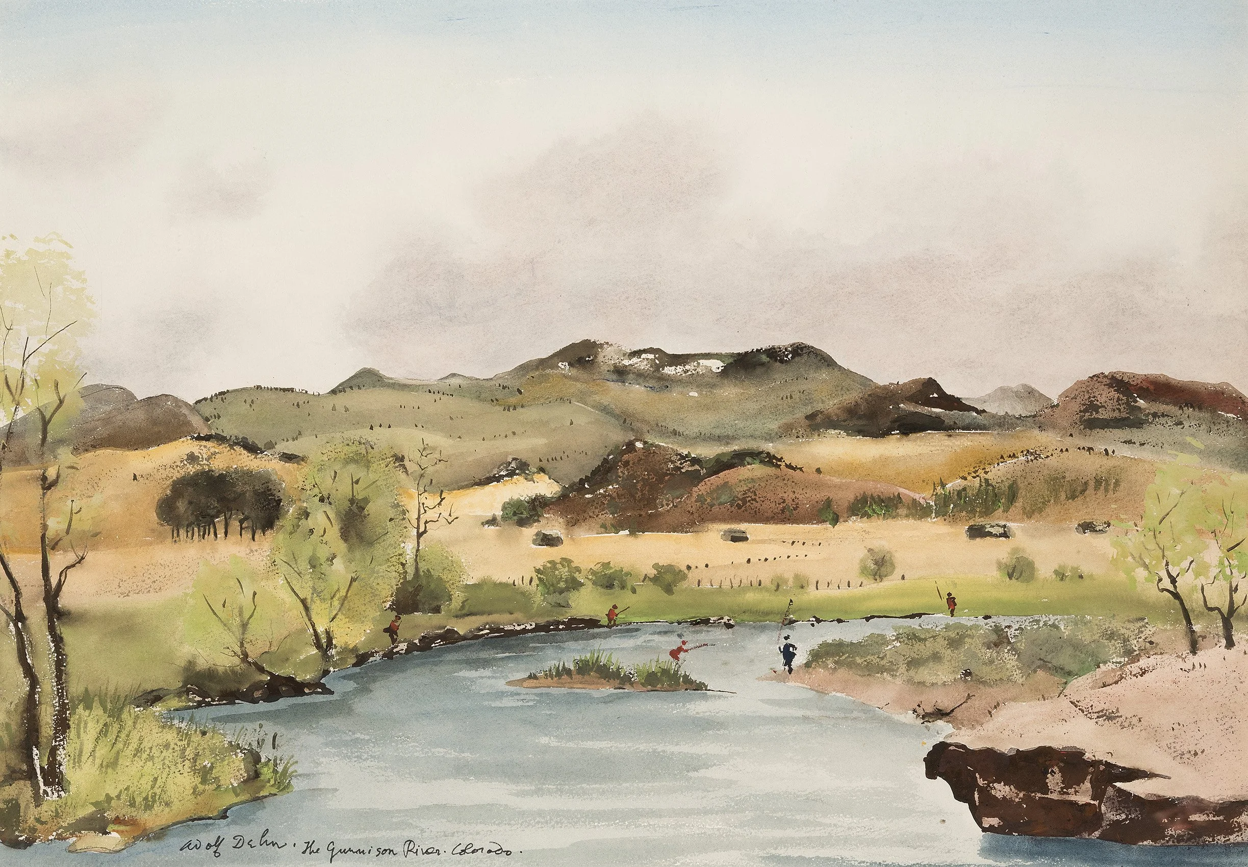
ENGAGING THE FAR WEST: ADOLF DEHN'S COLORADO AND PETER HURD'S NEW MEXICO

Dec 4, 2019 - Feb 14, 2020

Essay | Some works may still be available, please contact the gallery at 212-581-1657
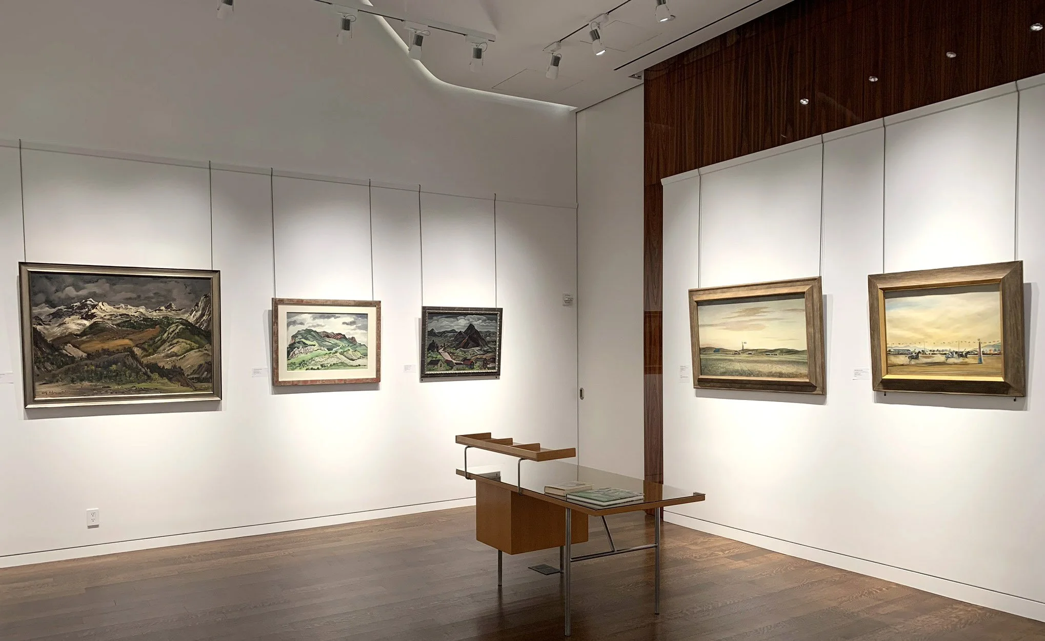
Installation Views

Essay by Deedee Wigmore

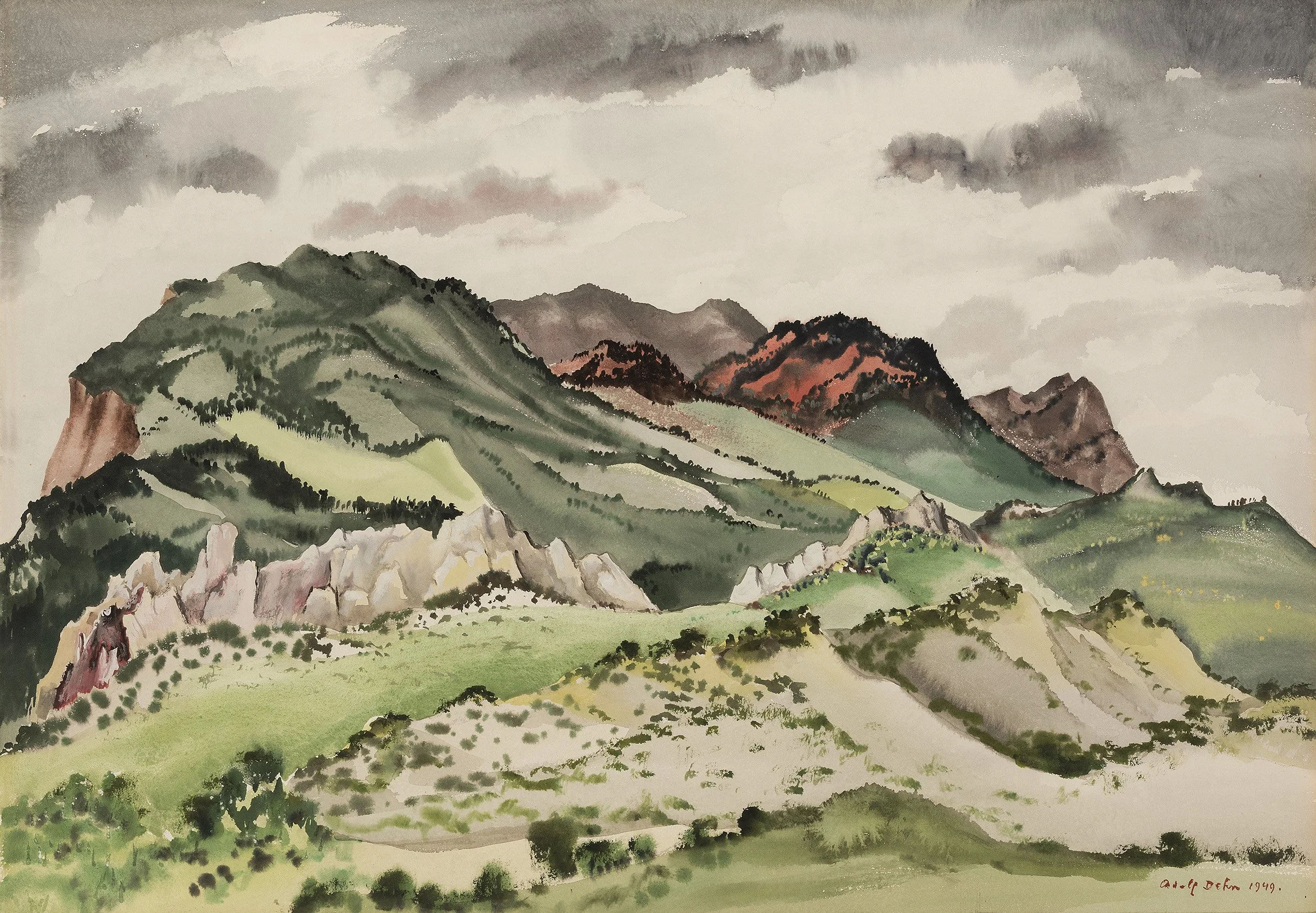
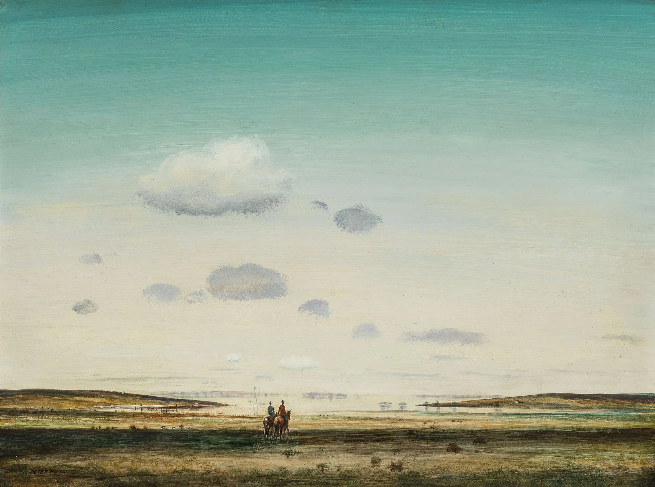
Artists of different traditions and backgrounds reflect and shape our view of the American West, land of the rancher and the cowboy. So, when I was given the opportunity to offer collectors the western paintings of two successful American artists working during the Great Depression and World War II, I could not resist. The resulting exhibition is an exploration of the paintings of Adolf Dehn (1895-1968) in Colorado from 1938 into the 1960s and Peter Hurd (1904-1984) in New Mexico from 1928 forward. The 25 paintings hung in our gallery create a kind of a conversation between two artists who both captured the authentic West. These paintings provide more than a comparison and contrast of two very different western landscapes, they are a narrative of an artist's journey. Looking outward to select what the artist wants you to see, the artist also takes a journey inward. That journey reveals each artist's personality expressed through his selection of subject, painting style, artist tools, and choice of medium. The journey sculpts and shapes the art. These two artists stretch our thinking about western landscapes. In December, the Colorado Springs Fine Arts Center held a symposium on "The Landscape Tradition Continued in the Western States" so we feel our exhibition of Adolf Dehn and Peter Hurd is timely.

As a youth in Waterville, Minnesota, Adolf Dehn knew he wanted to be an artist. He attended the Minneapolis School of Art from 1914-1917 and then accepted a scholarship to the Art Students League in New York, which he attended from 1917-1919. In 1939 Dehn was awarded a Guggenheim Fellowship for travel in the Far West and Mexico. One of Dehn's stops was a visit to Boardman Robinson who was teaching art at the Fountain Valley School and heading the art program at the Broadmoor Art Academy (now the Colorado Springs Fine Arts Center), which combined an art school, museum, and theater. This ambitious program was successful because Colorado Springs was a major cure center for tuberculosis filled with wealthy patrons. Dehn had been a summer art instructor at Stephens College in Columbia, Missouri in 1938 and 1939 so Boardman Robinson invited Dehn to teach at Colorado Springs Fine Arts Center the summers of 1940-1942.

At the Colorado Springs Fine Arts Center, Boardman Robinson created an art print shop run by Lawrence Barrett, a master printer, who had come to Colorado Springs to recover from tuberculosis and stayed. Adolf Dehn had come to Colorado already a printmaker as well as a painter. At the Fine Arts Center, Dehn and Barrett connected and experimented with varied textures in Dehn's lithographs to enhance their realism. The work forged a partnership between Dehn and Barrett that lasted a lifetime. Dehn returned to Colorado regularly through the 1960s to pull prints with Barrett, leading to a body of Colorado subjects in watercolor and casein as well.

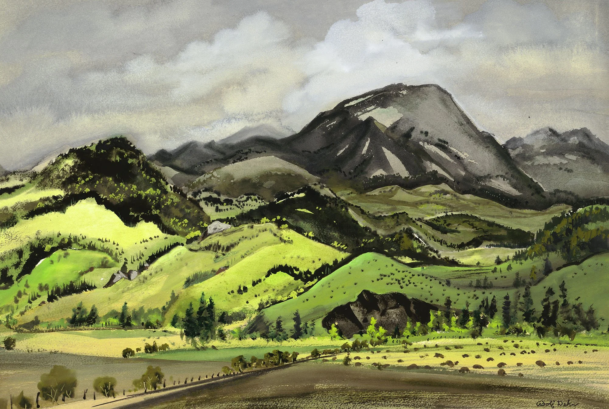
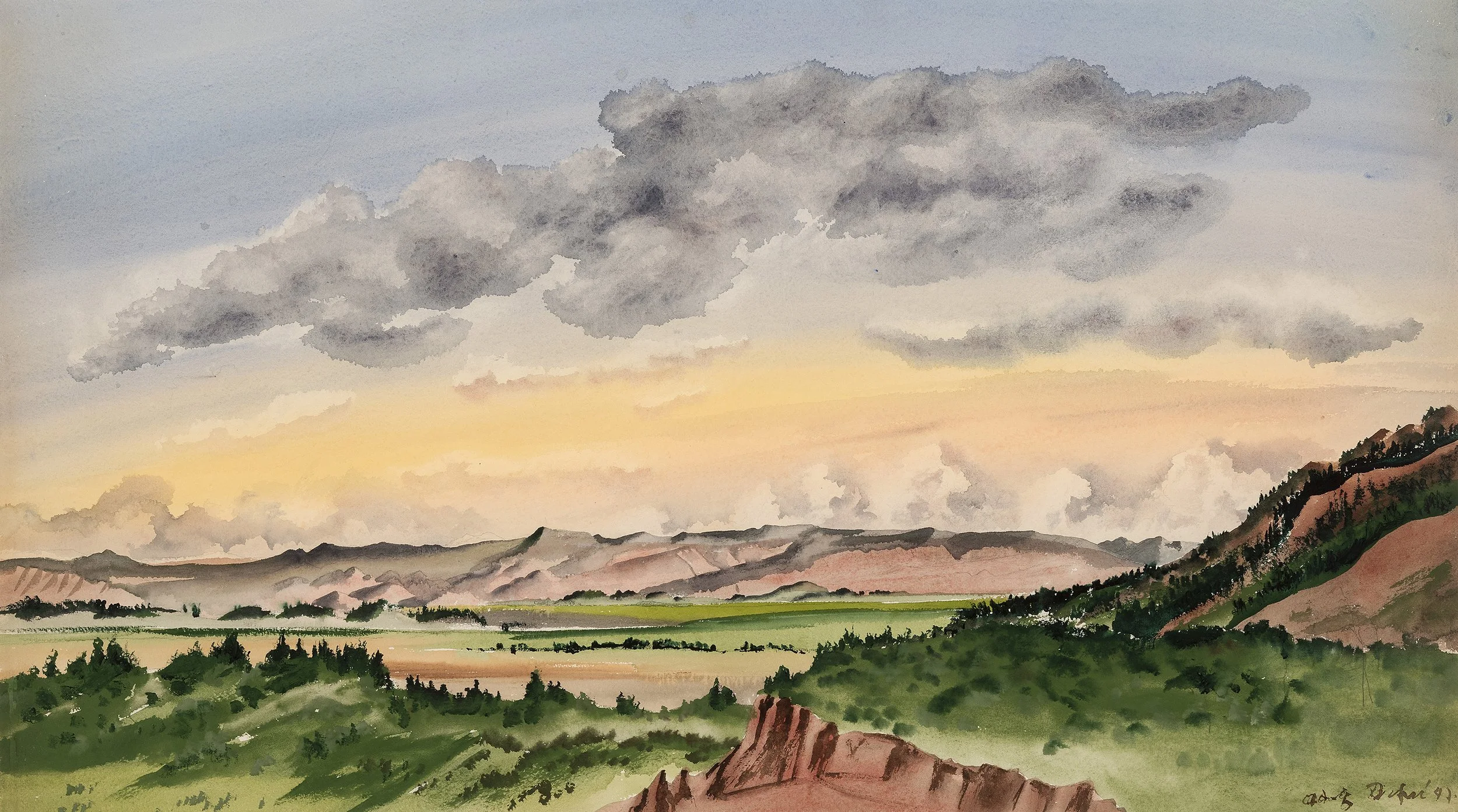
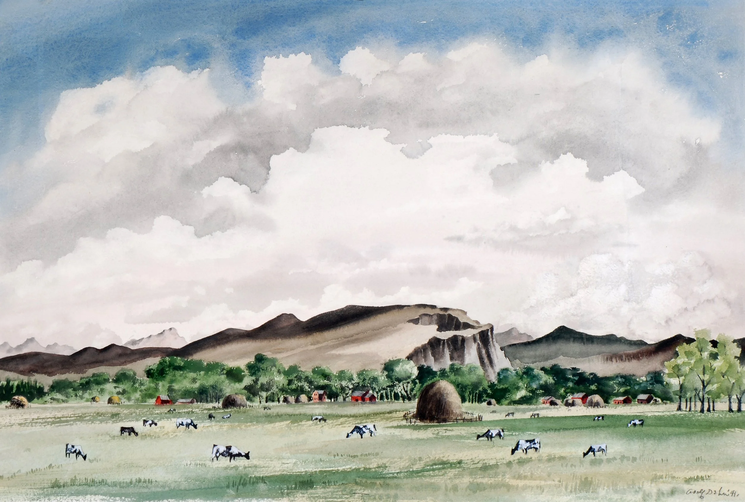
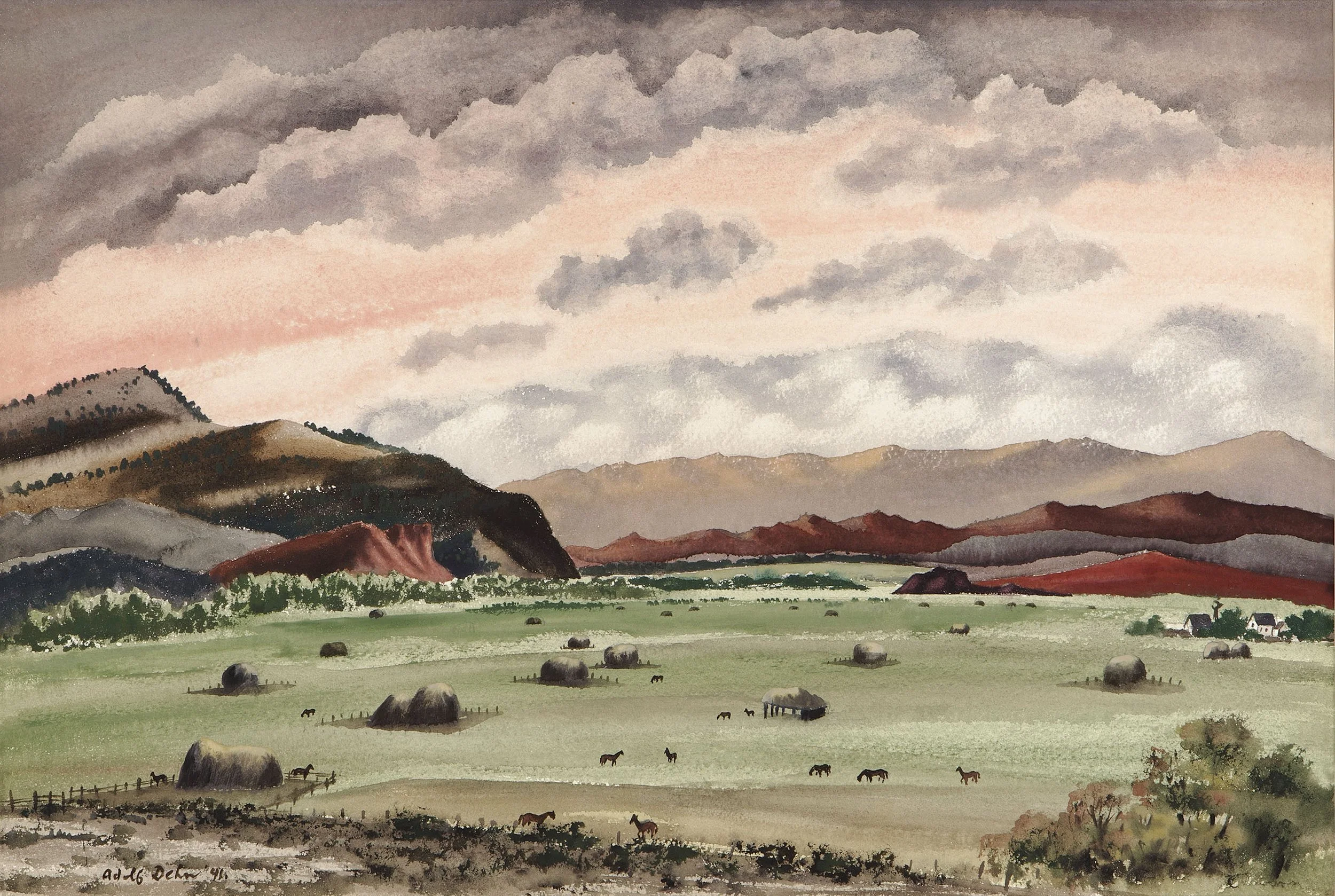
In Colorado Springs, Adolf Dehn reshaped his art from European-inspired figural social satire into landscape art of the new American Scene style as seen in Cows Grazing in Gunnison Valley, 1941. With Pikes Peak, the Garden of the Gods, and the Rocky Mountains at its door, Dehn could paint an America that exists outside of time, class, or political affiliation. Dehn's style transformation was aided by the Colorado Springs Fine Arts Center's Artist-in-Residence Program which attracted artists who were instrumental in developing the American Scene style. At the Fine Arts Center, Dehn knew several of the visiting artists: Arnold Blanch (1896-1968) taught 1939-1942; David Fredenthal (1914-1958) assisted Boardman Robinson on a mural in the summer of 1936 and then taught the summers of 1940-1941; Yasuo Kuniyoshi (1893-1953) was a visiting artist the summer of 1941; and Doris Lee (1904-1983) was a guest artist from 1939 to 1941.

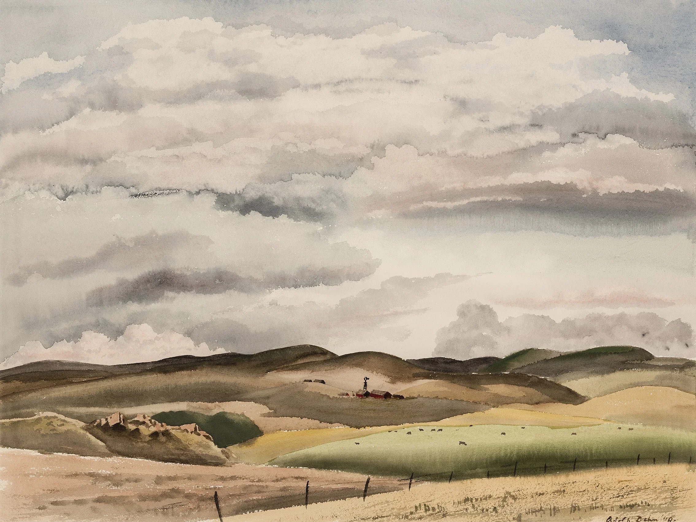
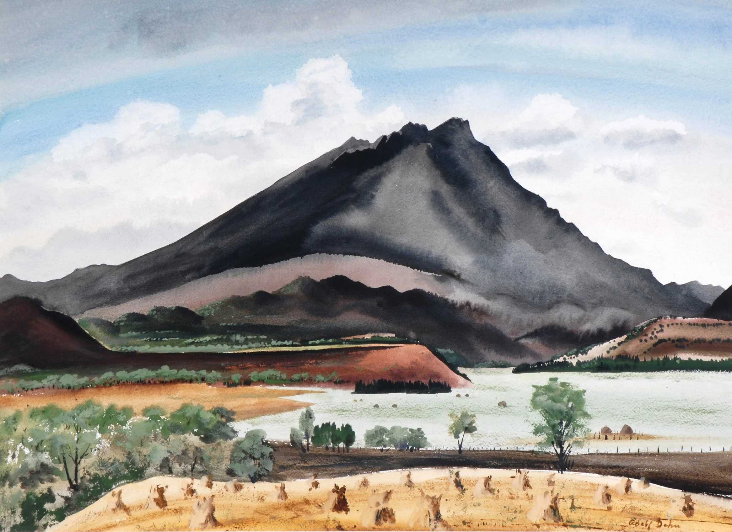
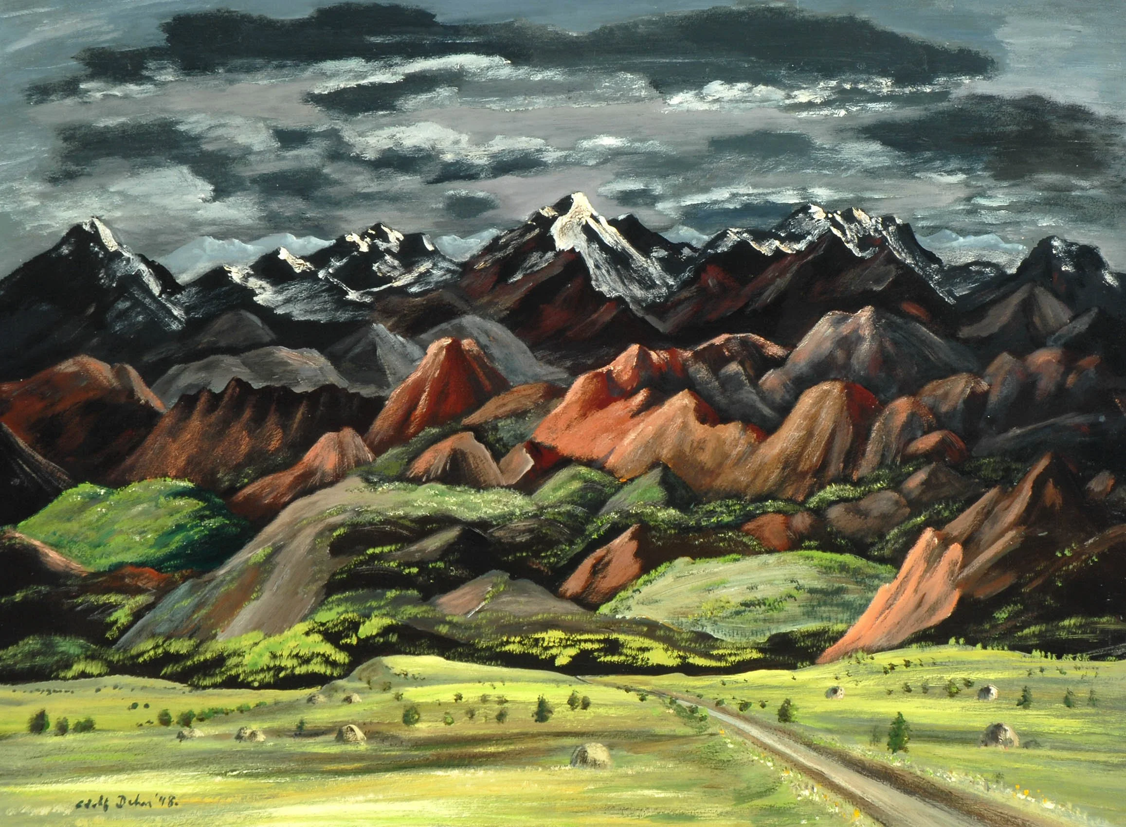
Painting the mountains and lakes required Dehn to go beyond the subject. He needed to think of big masses of color, light and dark, eliminating some detail for the sake of the composition, and even ignore the color before him at times to create a more exciting arrangement of color to evoke a certain mood or reaction to a scene. Dehn worked from an outdoor sketch, taking from ten minutes to two hours, depending on the complexities of the subject. He used either a soft pencil or lithographic crayon and a sketch book of smooth paper. Generally he did not make a finished drawing as his main interest was recording data for the painting he would later execute in the studio. Any part of the scene that was complex or difficult in its construction, he developed more completely. Color notes were written on the drawing. Sketching, rather than painting on the spot, allowed Dehn to develop a feeling about his subject and focus on the big picture without worry of changing light or weather. In the studio, Dehn considered the result of his color choices in different kinds of lighting, judging how a color and its different shades looked in the subdued light of a room, harsh light of overhead lighting, and in daylight. For the Colorado paintings, Dehn developed skill in the mediums of casein such as Mountain Landscape and watercolor such as Remote Ranch. Dehn found casein, a form of watercolor thickened with sour milk, gave paintings more body, a perfect medium for painting the crusty rock surfaces around Colorado Springs. As a printmaker he was already a master of ink wash, charcoal, and pencil drawing. Printmaking had taught Dehn to achieve a rich spectrum of tonalities and textures that blossomed in his Colorado paintings as seen in Gunnison Valley. By 1941 Dehn had such a sure hand as a painter that Life magazine made his art a feature in its August issue.

Peter Hurd (1904-1984) grew up in Roswell, New Mexico. His father Harold Hurd, a Boston lawyer, came to Roswell as he was threatened with developing tuberculosis. Peter Hurd focused on painting and drawing from youth. His education at the New Mexico Military Institute led him to spend two years at West Point as a cadet in 1921-1922. In 1923 Hurd transferred to Haverford College realizing he did not want a military career. While there, Hurd met N.C. Wyeth and with persistence became his apprentice. To improve his drawing, Hurd enrolled at the Pennsylvania Academy of the Fine Arts along with N.C. Wyeth's daughter, Henriette. In 1927 Hurd became engaged to Henriette and began to exhibit his paintings at the New Mexico Military Institute and the Wilmington Society of the Fine Arts.

Peter Hurd brought his new bride, Henriette Wyeth, to New Mexico in 1929. He had achieved some success as an artist and was able to come up with $2,600 to purchase in May of 1934 a ranch of forty acres on the Rio Ruidoso with two adobe houses and an adobe barn. The ranch had water rights from the river to eight acres of orchards with apples and pears stored in one of the four adobe rooms. San Patricio was a village of a few families fifty miles west of Roswell. San Patricio's ranch country and people became Hurd's subject. All through the 1930s the Hurds traveled east to Chadds Ford for Wyeth family visits or to fulfill commissions for portraits, advertising, and book illustration. In the 1930s Hurd could not afford to do full time what he most wanted to do - paint the New Mexico landscape. He had to paint New Mexico when he could.

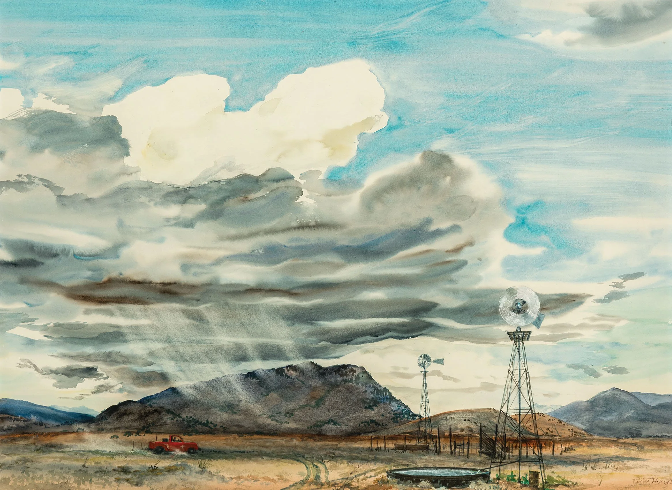
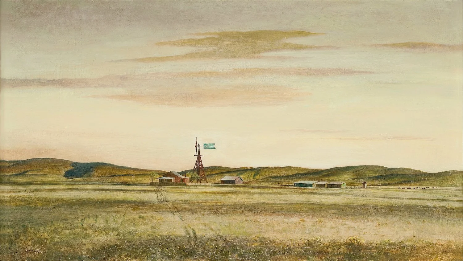
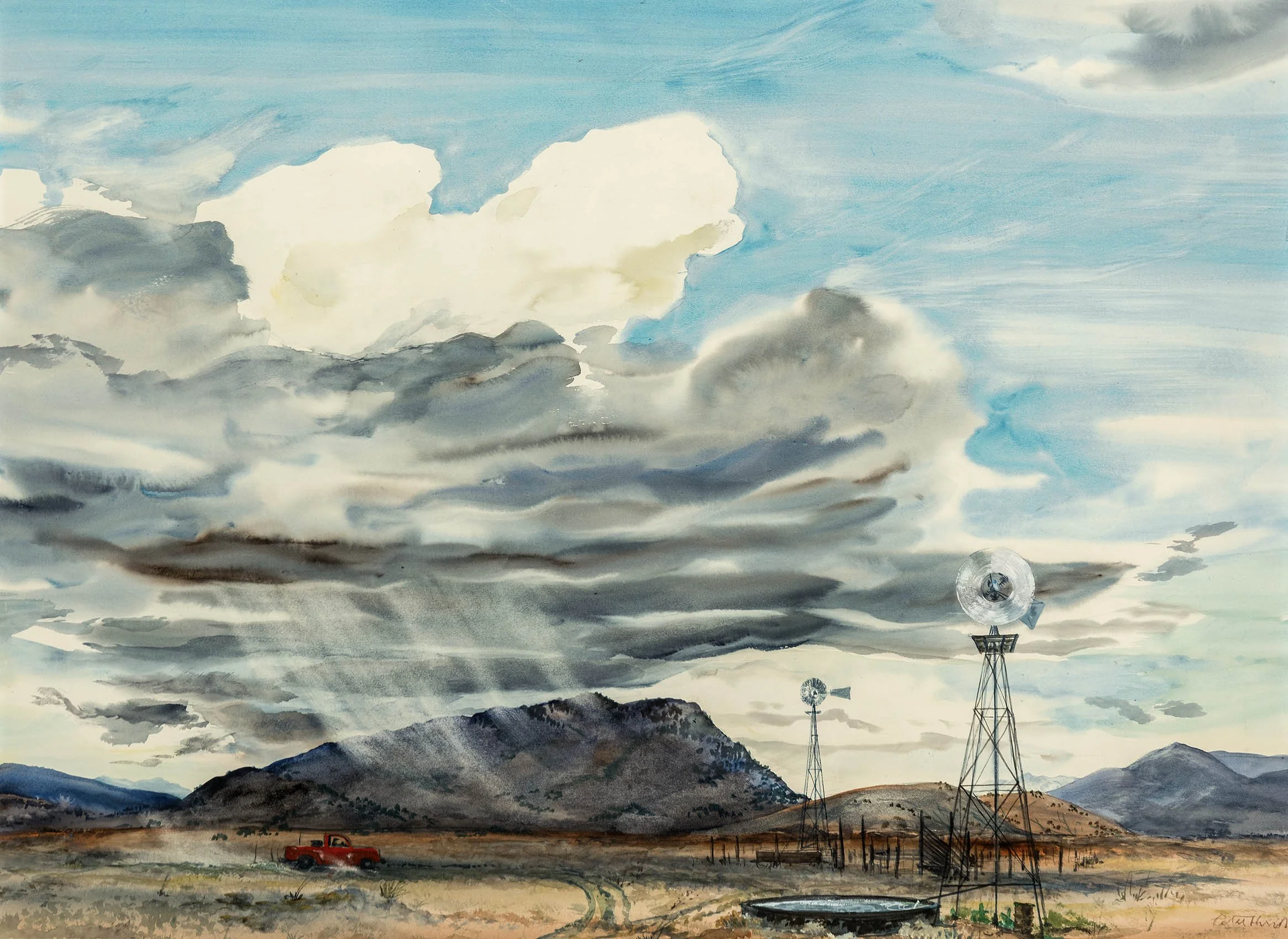
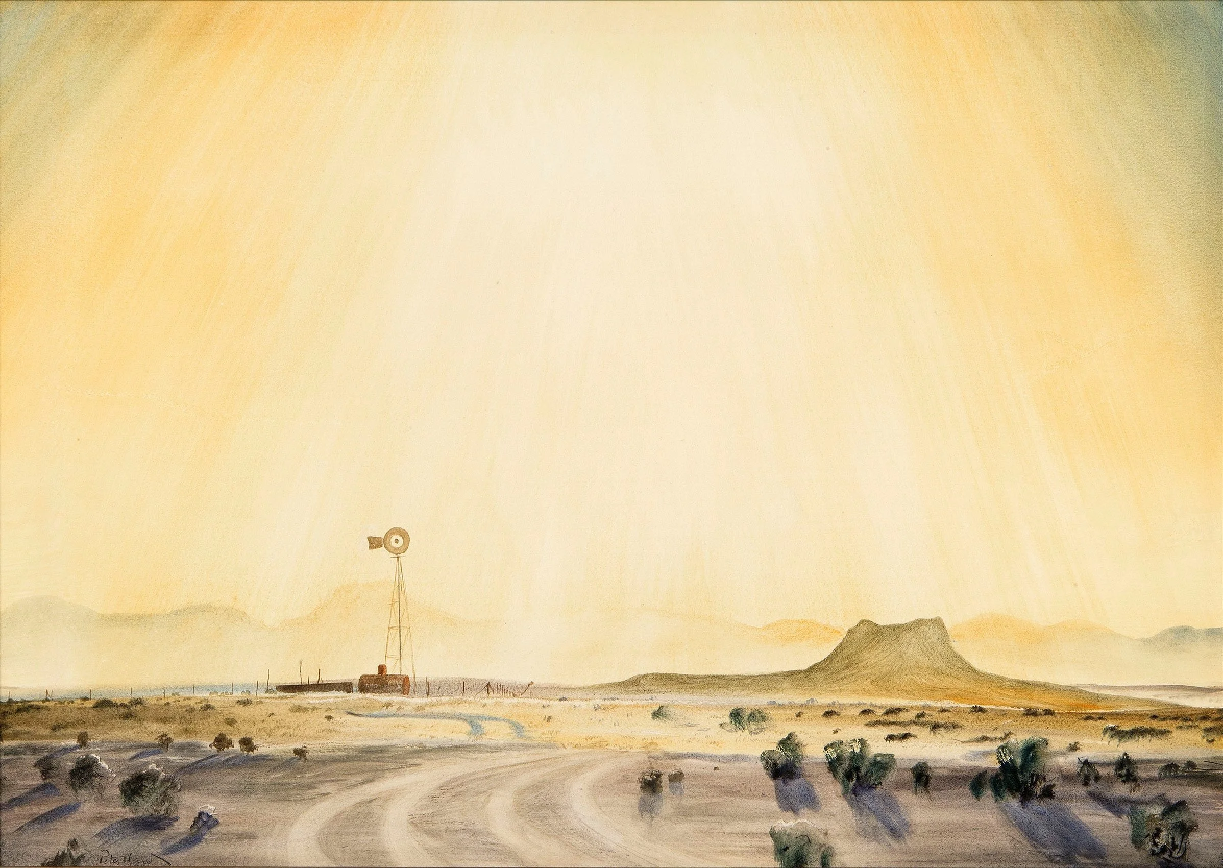
Like Adolf Dehn, Pete Hurd was a painter of the American Scene. To paint New Mexico Hurd had to develop practices and materials that gave him what he wanted. In New Mexico the earth forms assume a sharper contour, shadows are denser. Sunward surfaces are fixed in a dazzle of light. Heat waves in the summer make roads shimmer. The light makes color remain clear even at a distance. The sky is vast and may show several weathers at the same time. In the spring, winds bring weeks of heavy blowing dust. Our exhibition includes several paintings that speak of these moments of change so common in New Mexico. They include The Mirage and Finishing Chores Before the Rain. Peter Hurd described himself as "a painter of what occurs around me." The spirit of his landscapes is one of lyrical delight in the un-posed form, movements, and designs found in real life. From N.C. Wyeth, Peter Hurd learned to focus and become for a time whatever he was painting.

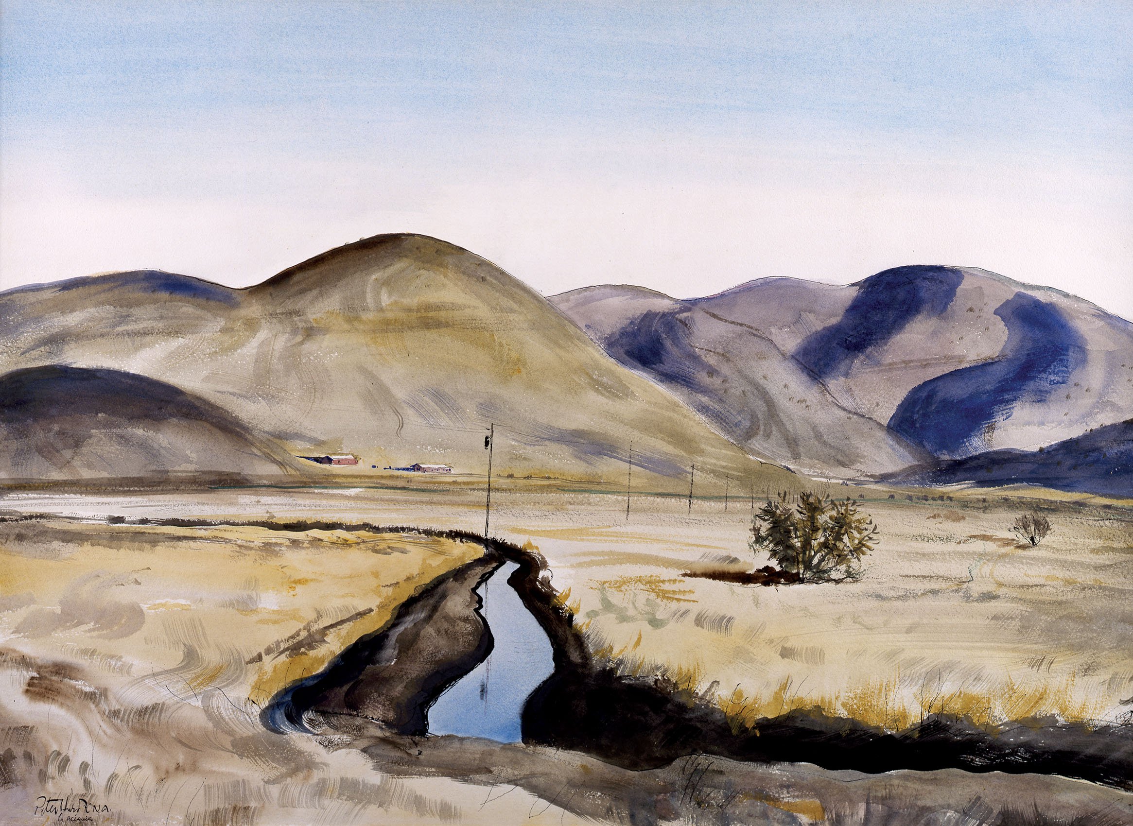
To translate what he saw in New Mexico, Hurd perfected the technique of painting in gesso with oil paints and egg tempera. Upon receiving his 1933 mural commission for the New Mexico Military Institute, Hurd traveled to Mexico City as well as Cuernavaca and Taxco to see the work of the Mexican muralists. There he got Diego Rivera's fresco formula, his type of brushes, paints, and advice from a Mexican fresco painter Ramon Montes. Hurd was attracted to dry fresco (the application of tempera onto dry plaster) as it combines all the brilliance of watercolor with the advantage of being readily wiped or dry sand papered out so passages could be redone. All sorts of efforts were possible using the dry fresco medium such as washes, stippled effects, smeared color, thin palette knife impasto, and glazes. From his understanding of mural painting, Hurd schooled himself to achieve a technique of an assured, restrained surface in his easel painting, using gesso as a ground on which to paint thin washes of oil and all the variety of applications he learned in tempera. The luminosity of the gesso ground creates the atmospheric brilliance essential to painting the light of New Mexico as seen in Rancho del Charco Largo. Hurd fashioned his own gesso panels with pots of hot sizing and marble dust applied to board paneling that he sandpapered many times. Hurd ground his own mineral colors. Hurd was so excited about this medium that he taught his brother-in-law Andrew Wyeth the technique as well.

While innovative in his painting techniques, Hurd aimed to subordinate material to subject, achieving this by the handling of space and objects in a spare way. To find subjects that moved him to paint them, Hurd drove a wide windowed camper truck over roadless plains and up flood carved arroyos in search of subjects. He made rapid field notes in watercolor on small blocks of paper rarely larger than 6 x 9 inches while driving and even smaller when riding a horse over his land. Hurd's farmscapes such as Rancho del Charco Largo were painted as symbols of human wishes, effort, and accomplishment. These abstract values are conveyed in his paintings and there is an undercurrent of acceptance of the fugitive in life. Hurd studied his designs for a painting in his mind's eye and rehearses his color in thought ó sometimes steadily looking at an unfinished work for hours considering changes to make, effects to be carried further, inner harmonies of detail to establish that would bring the picture alive as a whole.

Hurd grew up riding horses, took equitation at West Point and at Haverford College. When at Chadds Ford he rode with style and daring in horse shows and fox hunts with local clubs. Hurd's game was polo. He created his own playing field at San Patricio by clearing the cactus and rocks then bounding the area with goal posts. Hurd taught neighbors to play, enlisted guest players from the cavalry stationed at the New Mexico Military Institute in Roswell, recruited Mexican American cowboys and ranch hands from the valley, and made them into a polo team called the Beggars of San Patricio. They played against competition teams, both military and civilian teams from Roswell, El Paso, Fort Bliss, and Juarez. Peter captured one of those matches in a watercolor that is part of our exhibition titled Polo Tournament at Fort Bliss: San Patricio vs Juarez.

Success as an artist grew for Peter Hurd during the 1930s and 1940s. Hurd's first museum invitational was at the Corcoran Gallery in 1932. He had his first solo exhibition at Macbeth Gallery in 1934. In 1937 the Art Institute of Chicago purchased Hurd's El Mucho. Life magazine sent a photographer to photograph Peter Hurd at his San Patricio ranch in 1939. Hurd felt that it was not until he attracted the interest of the editors of Life magazine that he became known to the American public. In 1939, The Metropolitan Museum purchased Rancheria. From 1938 to 1942, Hurd spent time on mural commissions for post offices: Big Spring Texas; Alamo Gordo, New Mexico; and Dallas, Texas. In 1940 Steuben Glass commissioned Hurd to design a piece of glass. Hurd chose a windmill scene produced on a limited number of vases. 1941 saw a solo exhibition in New York at the Macbeth Gallery and the Tate Gallery purchase of Anselomo's House. Further cause for celebration were the two landscapes and a lithograph commissioned for Abbott Chemical Company's collection, a Life magazine commission, two commissions for Lucky Strike tobacco, and the cover of Collier's magazine. In 1942 Peter Hurd was made a member of the National Academy.

With America entering World War II, Peter Hurd became an accredited War Correspondent for Life magazine as a captain in the Army Air Corp. For one assignment, Hurd spent three months on an operational air station in England and executed nine portraits of combat crew members. When the portraits were published in Life in the July 26, 1943 issue, Hurd received one hundred letters from the airmen's families and friends. For a second assignment for Life, Hurd spent six months traveling with the Air Transport Command in 1943-1944, leaving him away from his ranch for eight months. Hurd recorded the creation of bases in remote places to provide a steady stream of men, aircraft, supplies, and hospitals for the war. Peter Hurd was awarded a European Theater Medal for Service in 1947. He spent 1952-1954 on a mural series at Texas Technological College in Lubbock. President Eisenhower appointed Hurd to the Commission on Fine Arts in 1959 and he painted a portrait for Lyndon B. Johnson for the White House Historical Association in 1966. Through all these adventures, Hurd was most happy painting in San Patricio.

[ TOP ]

Modernism 1913-1950 | Realism of the 1930s and 1940s | Abstraction of the 1930s and 1940s | Post-War | Selected Biographies

DEVELOPING ABSTRACTION THROUGH COLLAGE

May 20 - August 23, 2019

Essay | Some works may still be available, please contact the gallery at 212-581-1657
Essay by Deedee Wigmore

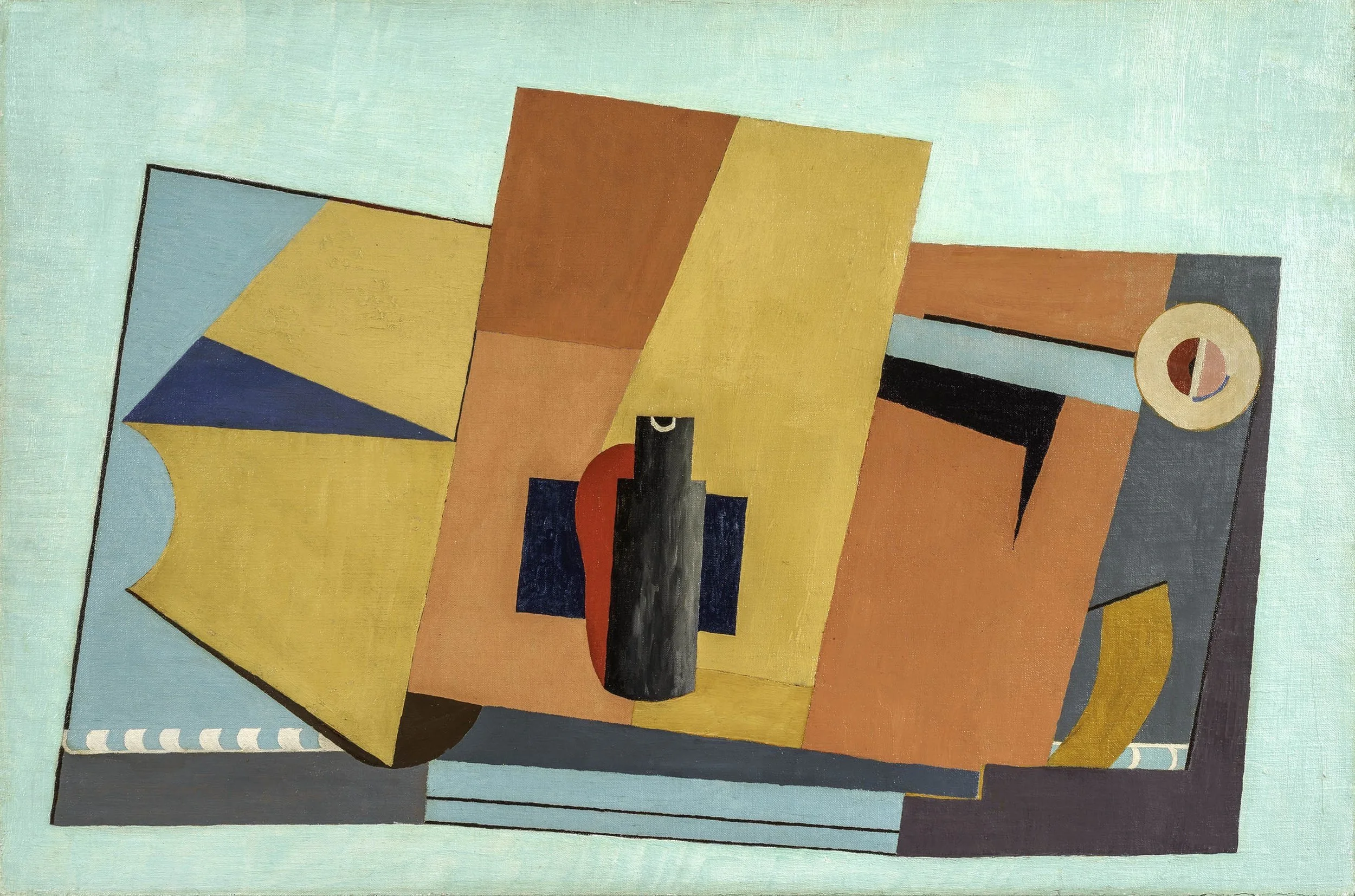
Our exhibition hopes to tell how America went abstract with a particular focus on the use of collage by artists to develop purely geometric compositions. The history of the American experience with abstraction begins with the 1913 Armory Show, which created the first public awareness of European Modernism and its abstract artists. The next major event was the founding of the American Abstract Artists group in 1936, when artists practicing in New York banded together to push for broader acceptance of their style.

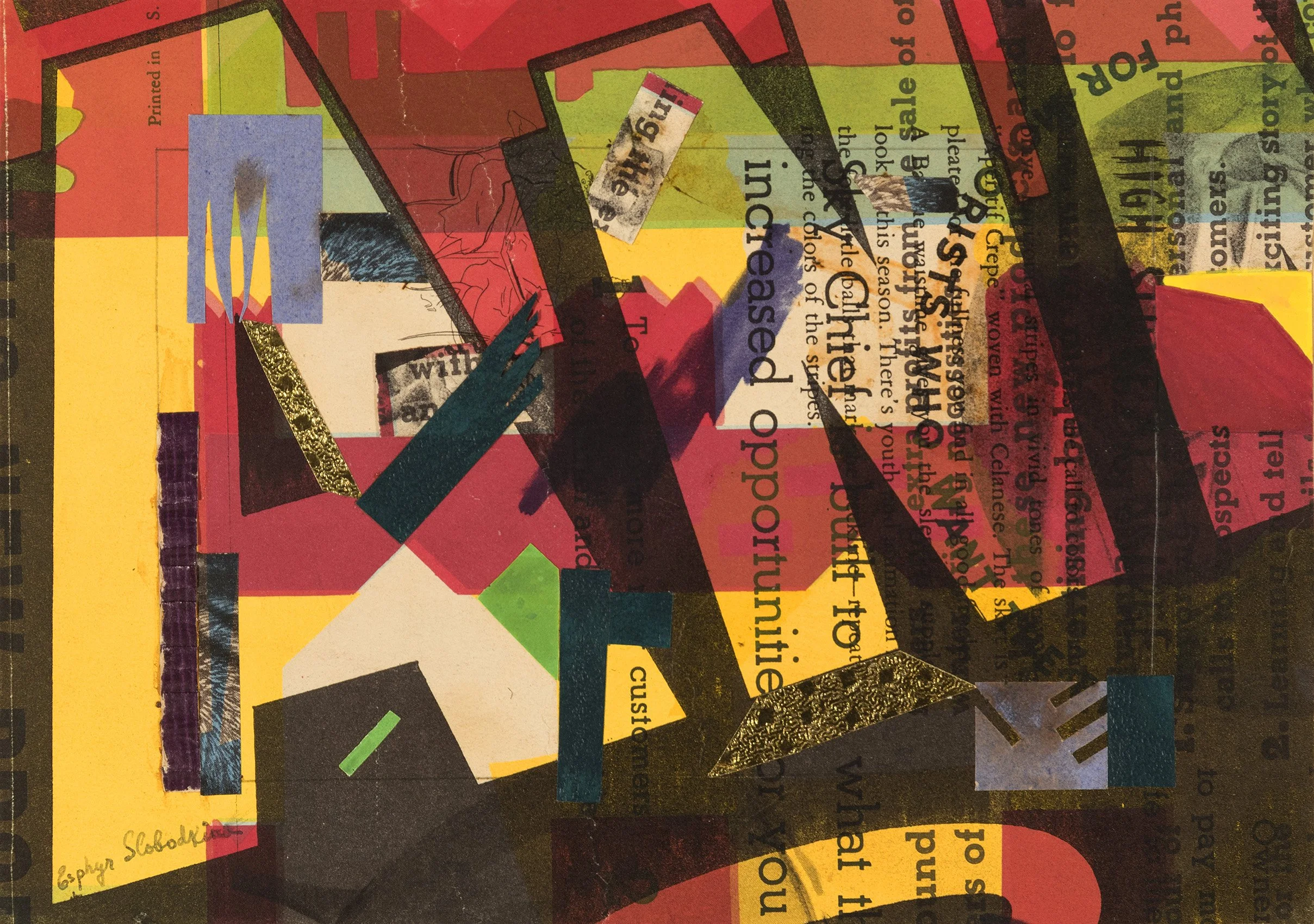
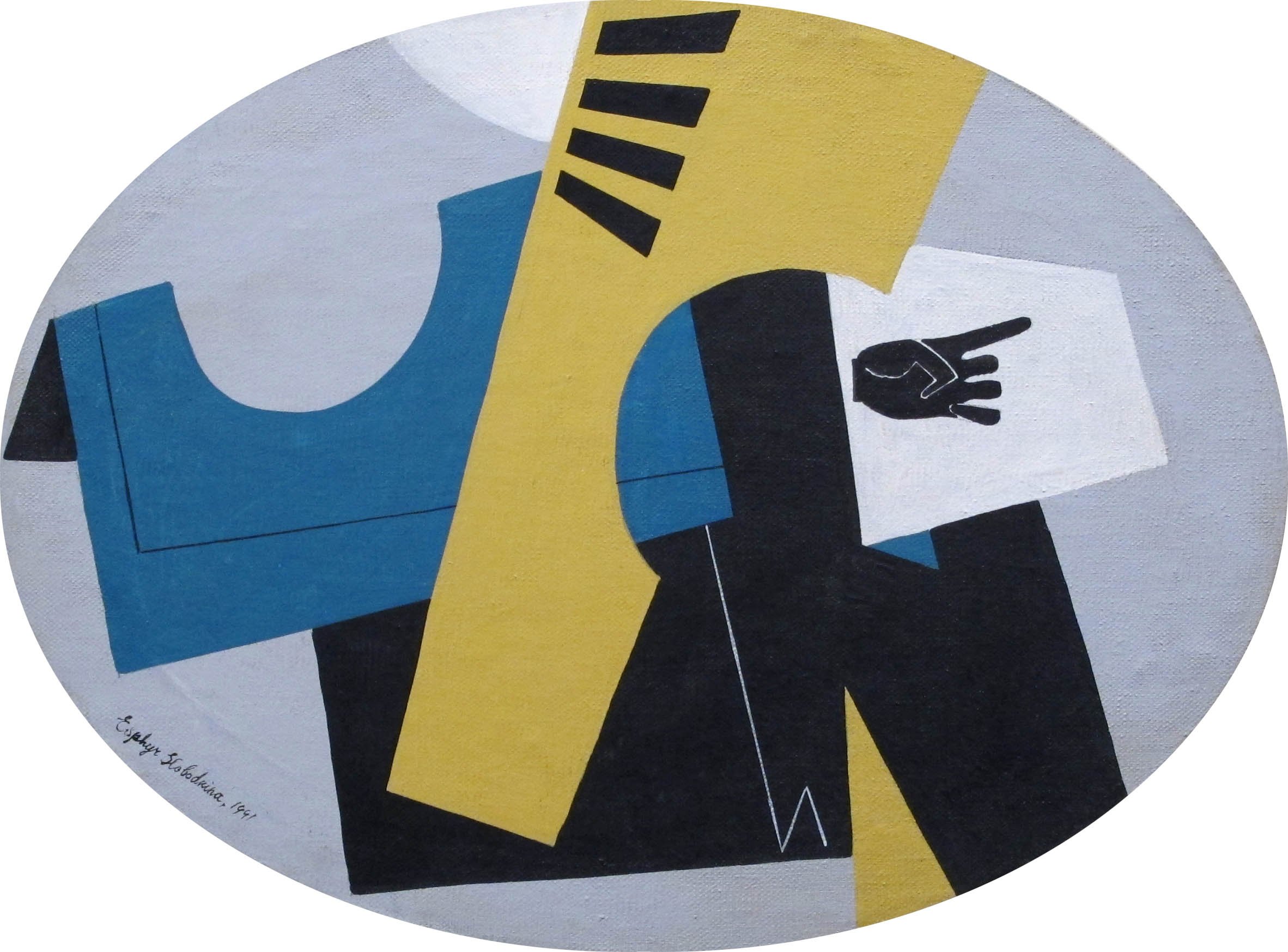
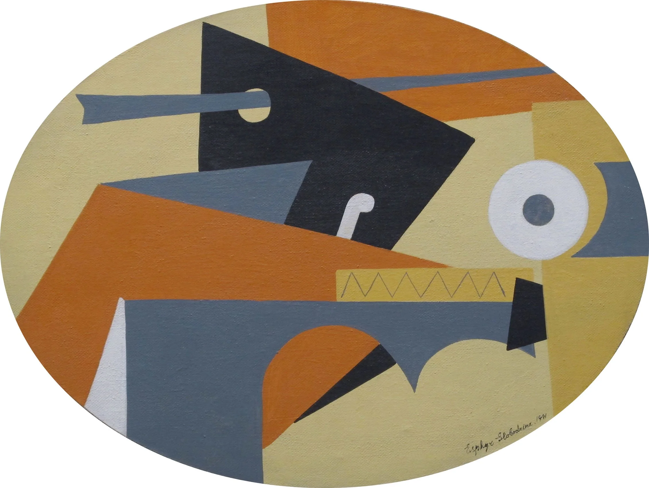
Between 1913 and 1936, a significant number of American artists traveled to Europe. Some lived there for extended periods, including John Ferren, Balcomb and Gertrude Greene, A. E. Gallatin, Carl Holty, George L. K. Morris, Charles Green Shaw, and Jean Xceron. Josef Albers, Werner Drewes, Ilya Bolotowsky, and Esphyr Slobodkina were recent immigrants from Germany and Russia. Periodicals like Cahiers d’Art and exhibitions of European modernists by Alfred Stieglitz’s 291 Gallery, Katherine Dreier and Marcel Duchamp’s Société Anonyme, and A.E. Gallatin’s Gallery of Living Art were available to artists who did not leave America. The American Abstract Artists group formed at a time of heightened social consciousness when art was expected to deliver answers to social concerns and deliver it in an accessible realist language.

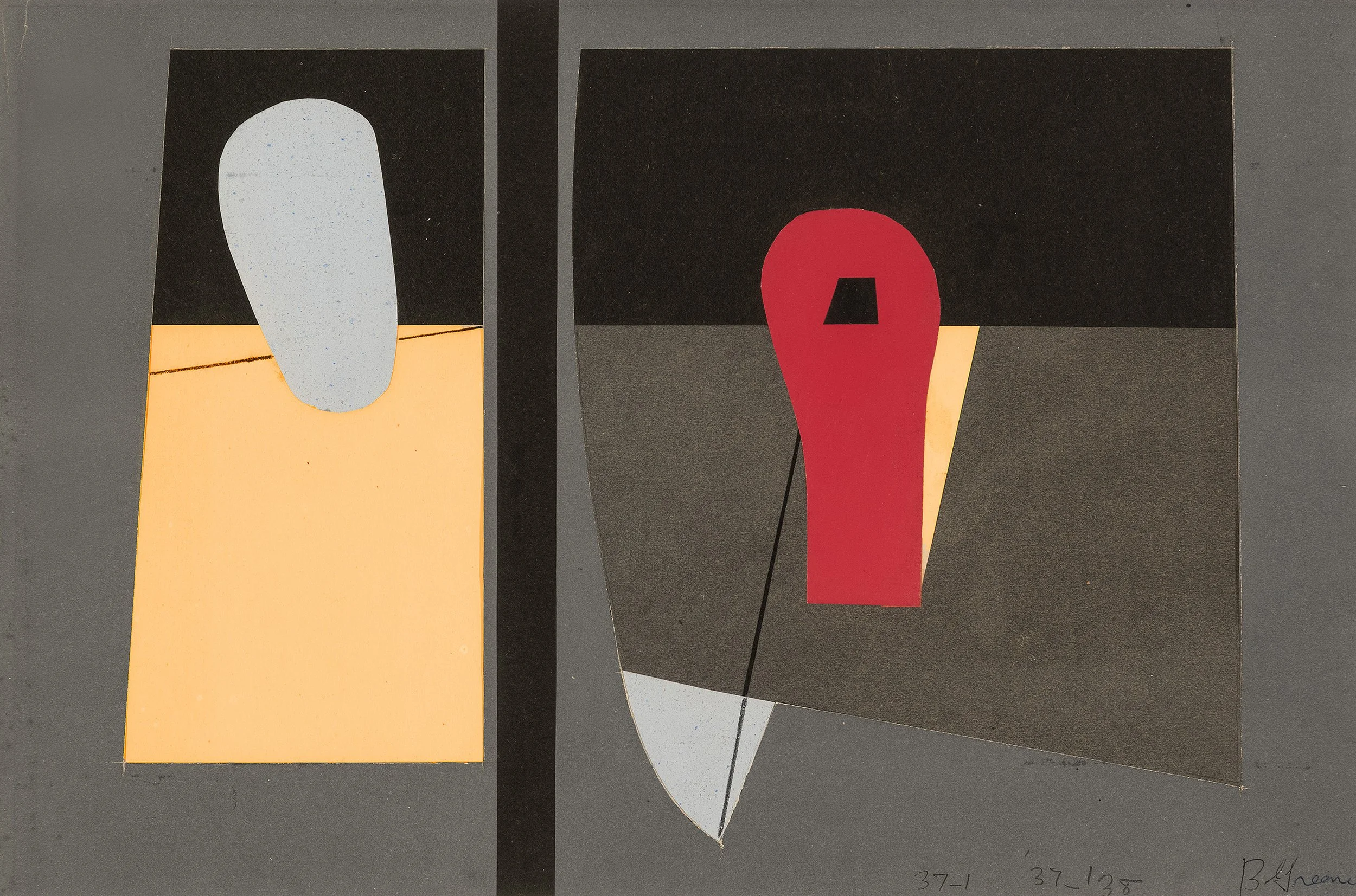
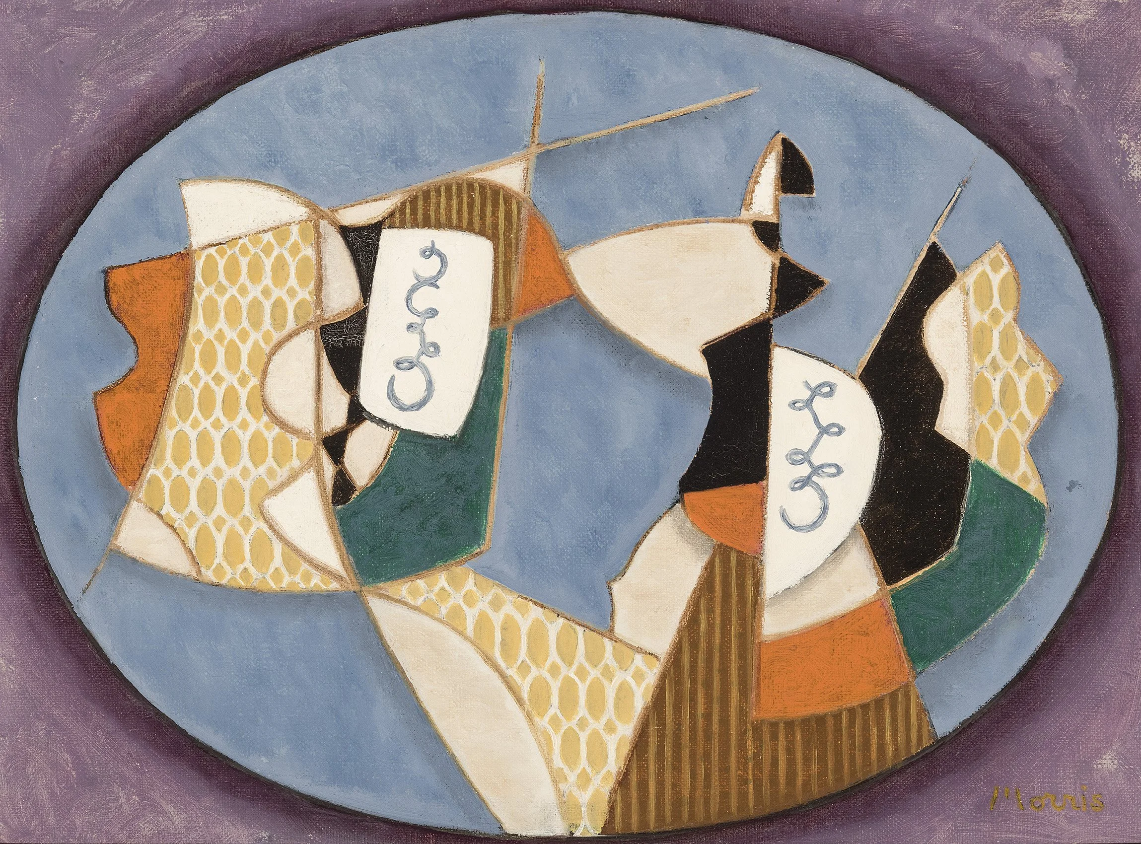
How to build an audience was a problem the diverse group of artists who founded American Abstract Artists faced. They began to meet informally in 1936 in various studios in New York as a way to become familiar with each other’s work. The group decided the only way to create an audience for abstract art was to rent a space where it could be shown. The group’s first annual was held in April of 1937 with 100 paintings executed by 39 artists. The exhibition ran for two weeks at the Squibb Building on Fifth Avenue and attracted 1,500 curious visitors, but had little critical success. Their next exhibition, held in 1938, drew 7,000 visitors and gained some reviews. Portions of the exhibition traveled to cities throughout the country, including Seattle, San Francisco, Kansas City, and Milwaukee. Our exhibition offers paintings by early members of the American Abstract Artists: Bolotowsky, Drewes, Gallatin, Balcomb Greene, Holty, Morris, Shaw, and Xceron, along with collages by Bolotowsky, the Greenes, and Slobodkina.

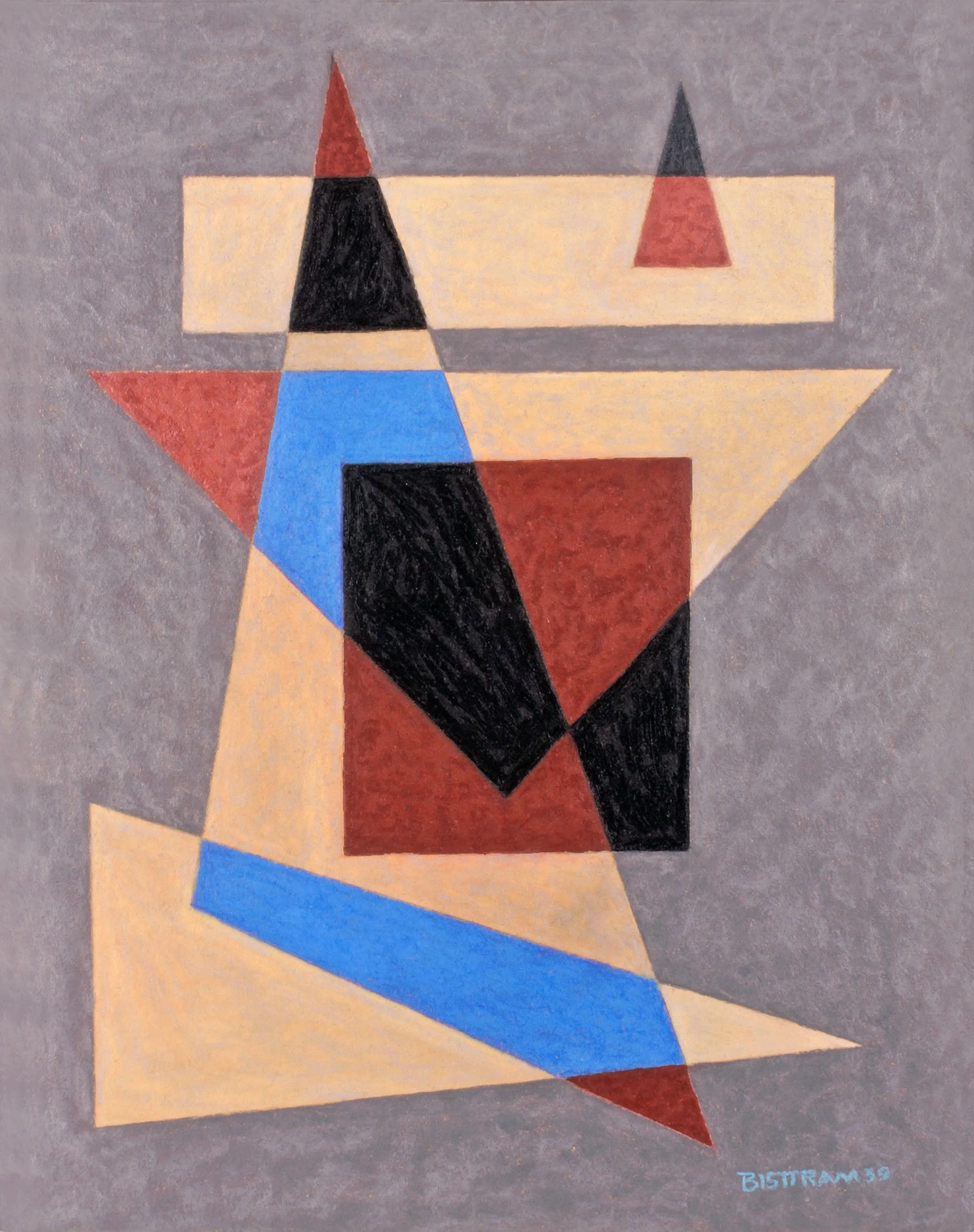
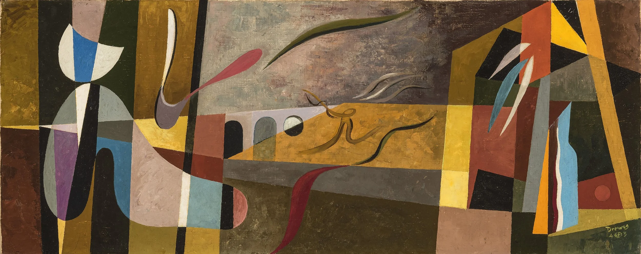
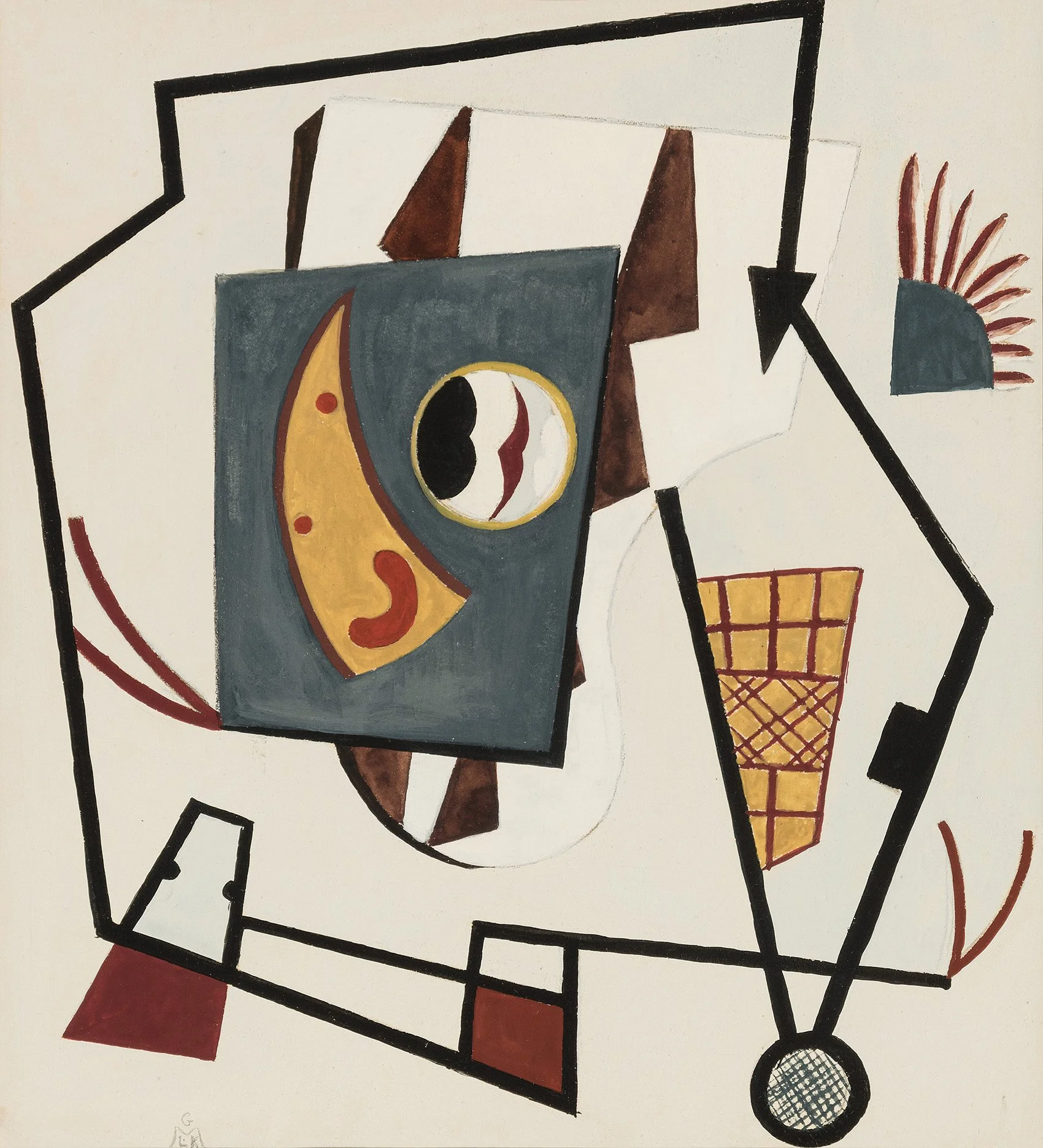
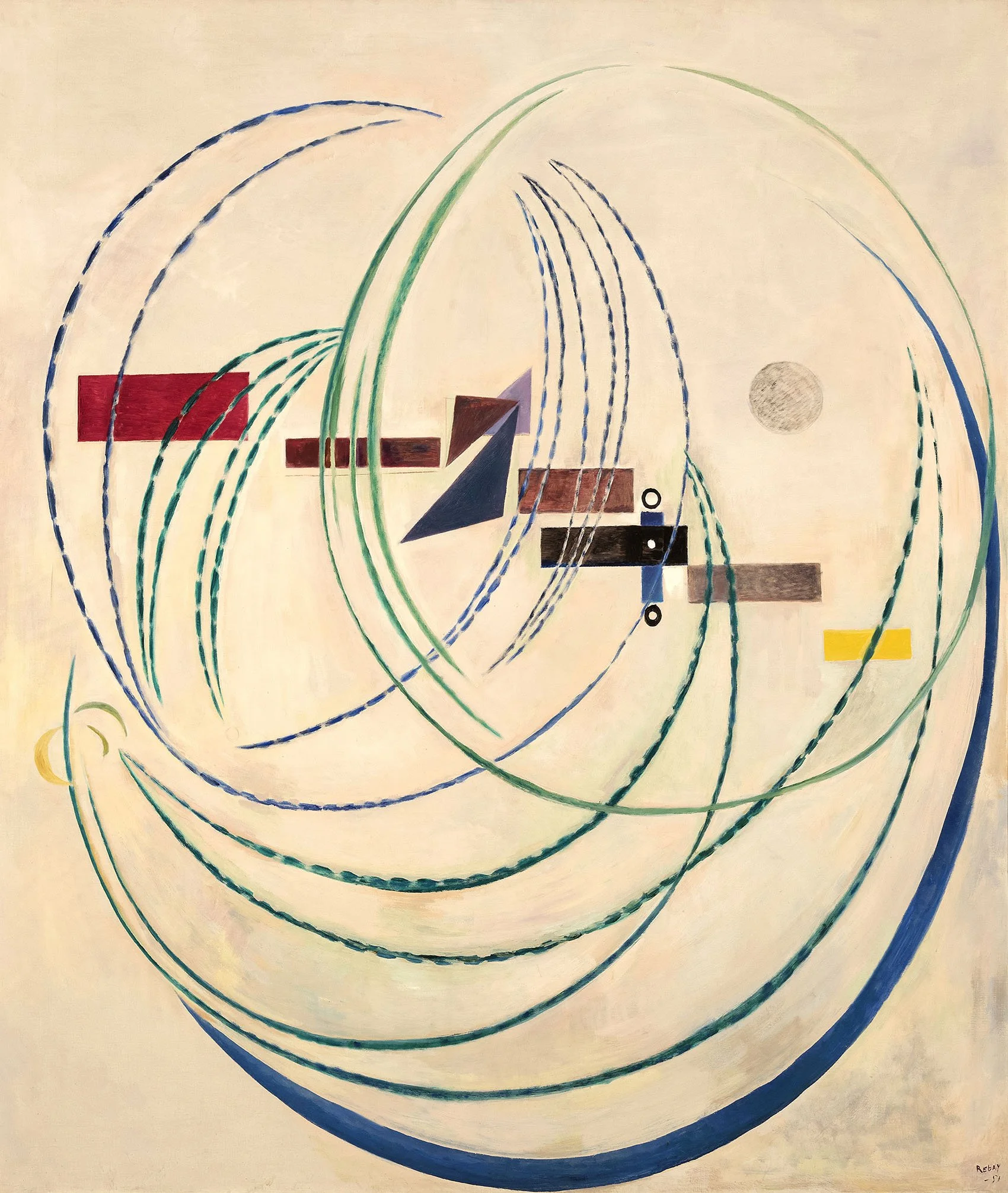
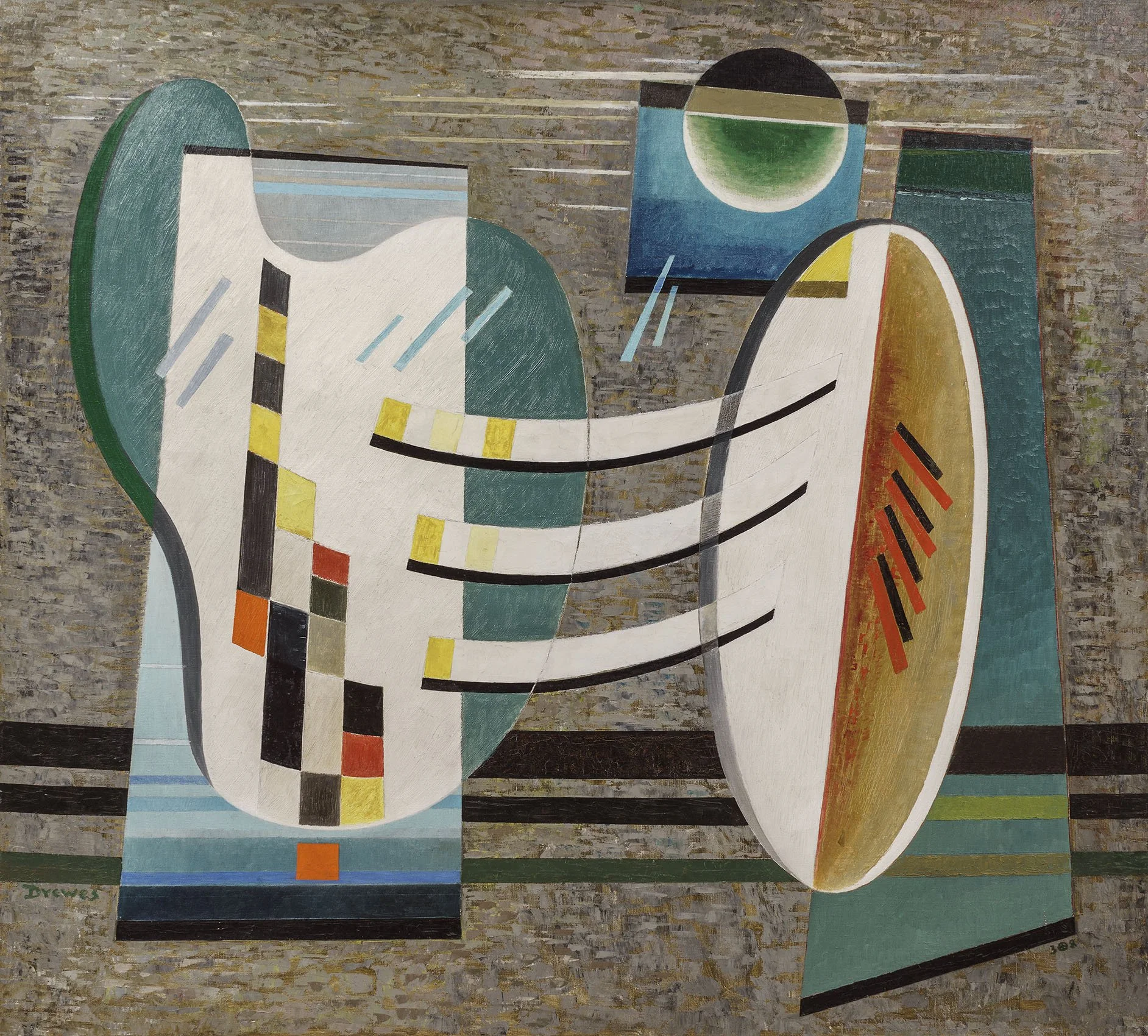
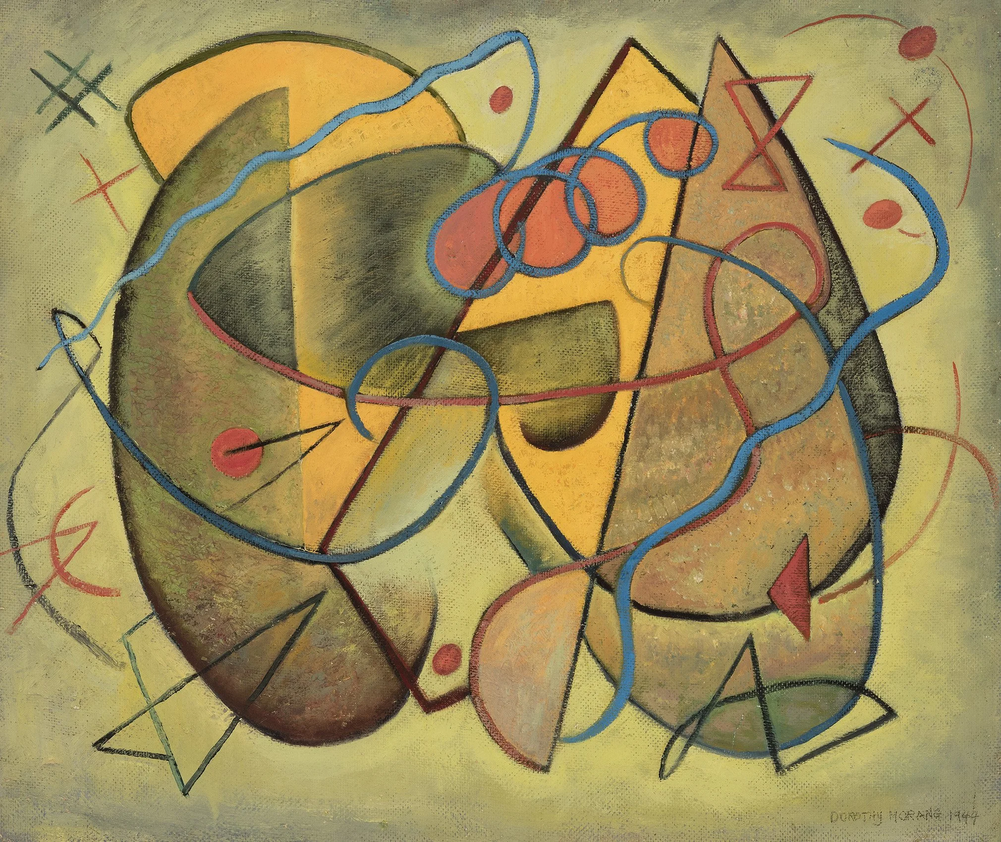
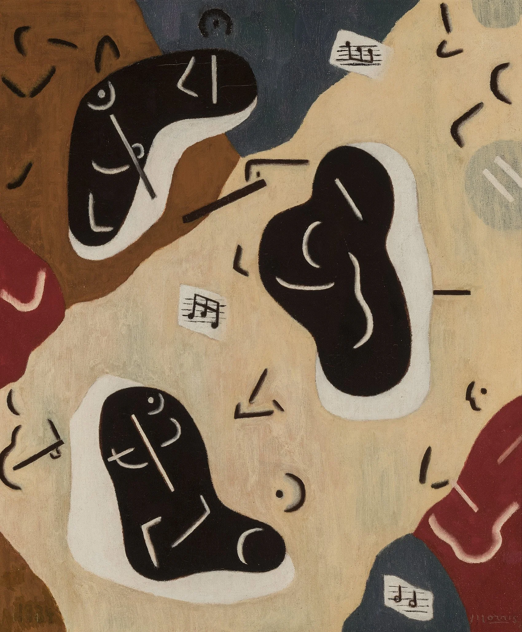
Many of the American Abstract Artists members had additional opportunities for exhibition with the founding of Hilla Rebay’s Museum of Non-Objective Painting. Rebay was Solomon R. Guggenheim’s art advisor and persuaded him to acquire non-objective art and make it available to the public. In 1939 The Museum of Non-Objective Painting opened in a showroom at 24 East 54th Street, exhibiting both European and American artists working in an abstract style. AAA members Irene Rice Pereira and Balcomb and Gertrude Greene were the subject of the museum’s first loan exhibition in 1940 (January 3 – February 14). Jean Xceron was in the second loan exhibition and Charles Green Shaw had solo exhibitions in 1940 and 1941. The Museum of Non-Objective Painting sought out artists inspired by Kandinsky’s writings on the spiritual in art, which led the New Mexico Transcendental Painting Group to exhibit there in 1940. Our exhibition includes Circles in Motion (1943) by Transcendental painter Emil Bisttram, three examples by Raymond Jonson, and Composition #112 (1938) by Stuart Walker. Werner Drewes was included in an exhibition of artists inspired by Kandinsky in 1941 and is represented in our exhibition with Loose Contact (1938) and Yonder the Tracks (1943). Hilla Rebay, while serving as the director from 1939-1952, exhibited her own work regularly at the museum, as well as supporting other women from across the country. Chicago Bauhaus artist Marguerite Hohenberg and New Mexico painter Dorothy Morang both exhibited at the Museum in 1944 and are represented in our exhibition. For Rebay, our exhibition includes four untitled collages and an oil titled Rondo #1, Charm of Existence. Rebay was instrumental in selecting Frank Lloyd Wright as the architect for the museum’s final home, which would become the Solomon R. Guggenheim Museum after its patron’s death. Rebay had significant dealers in New York (Wildenstein) and Paris (Bernheim-Jeune) while she was director and after leaving her position in 1952, Rebay exhibited with French and Company in New York.

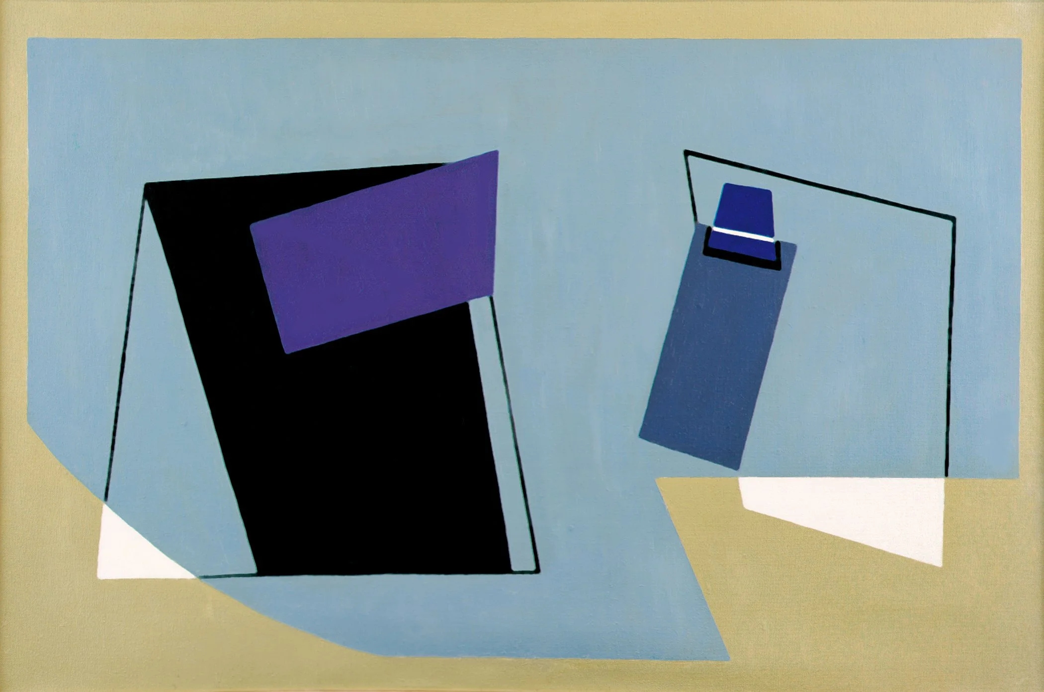
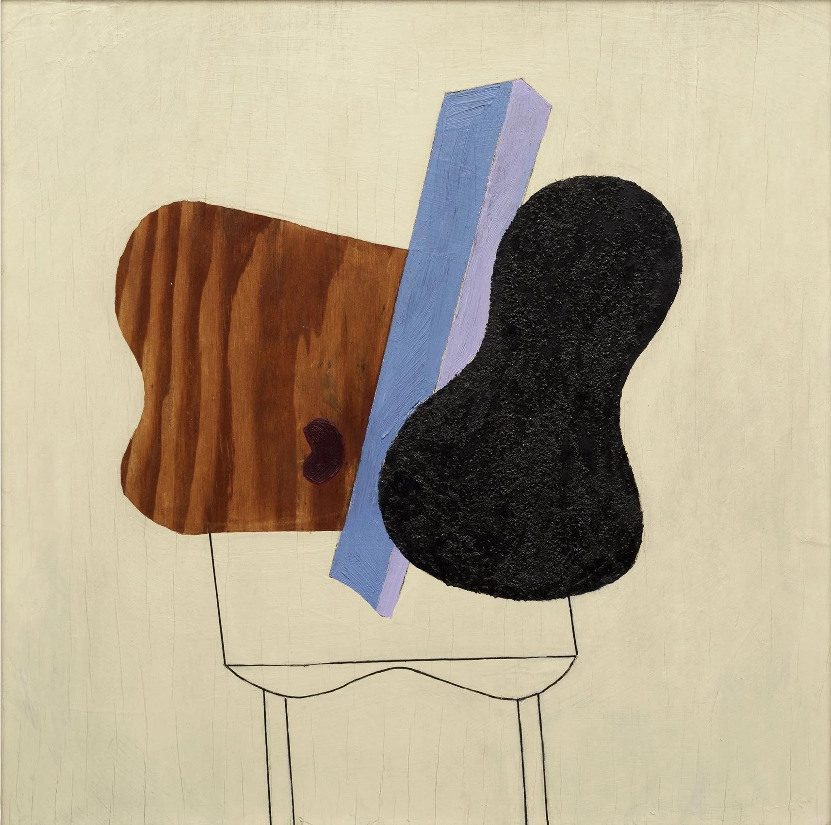
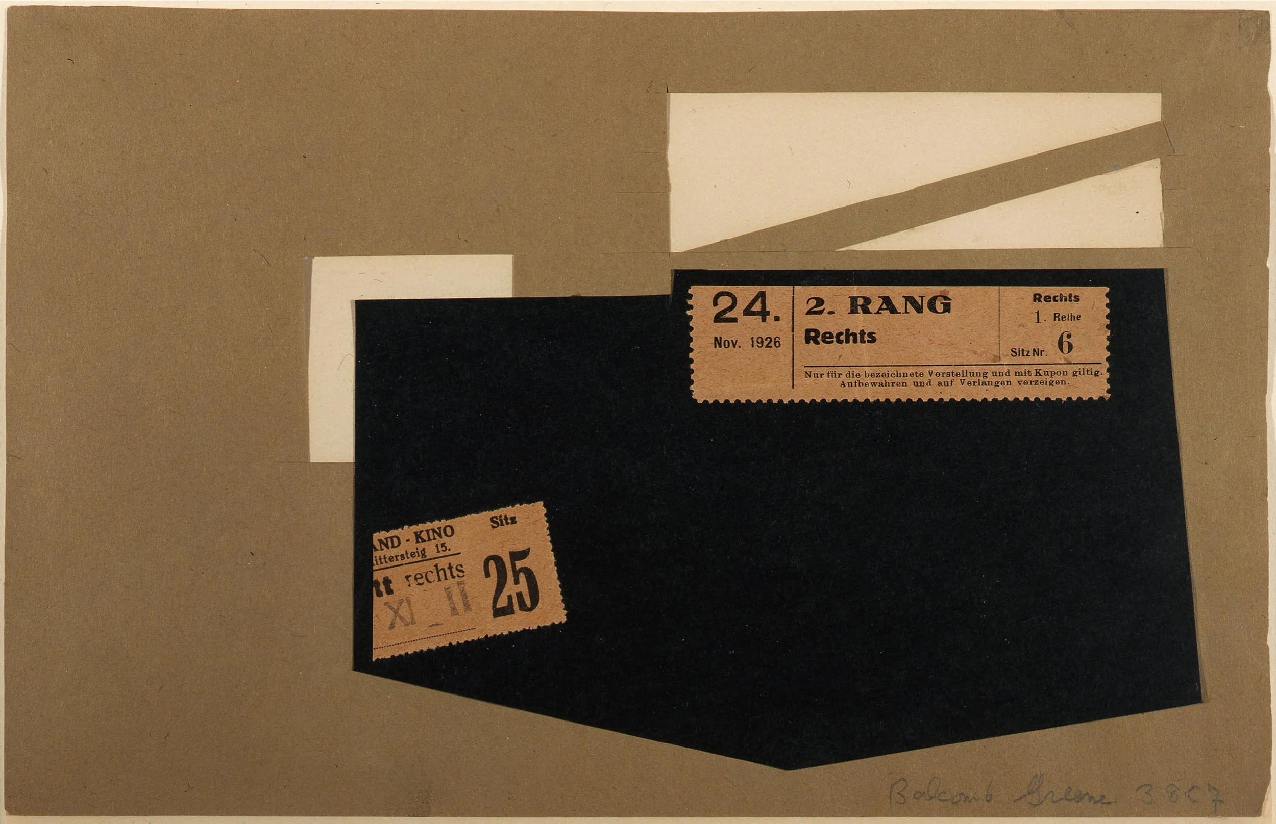
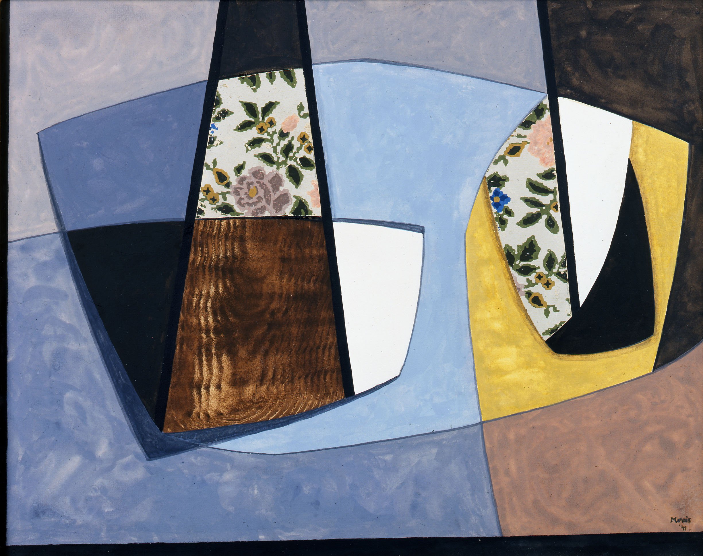
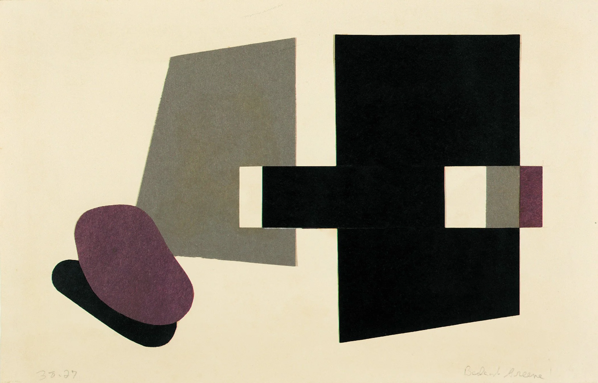
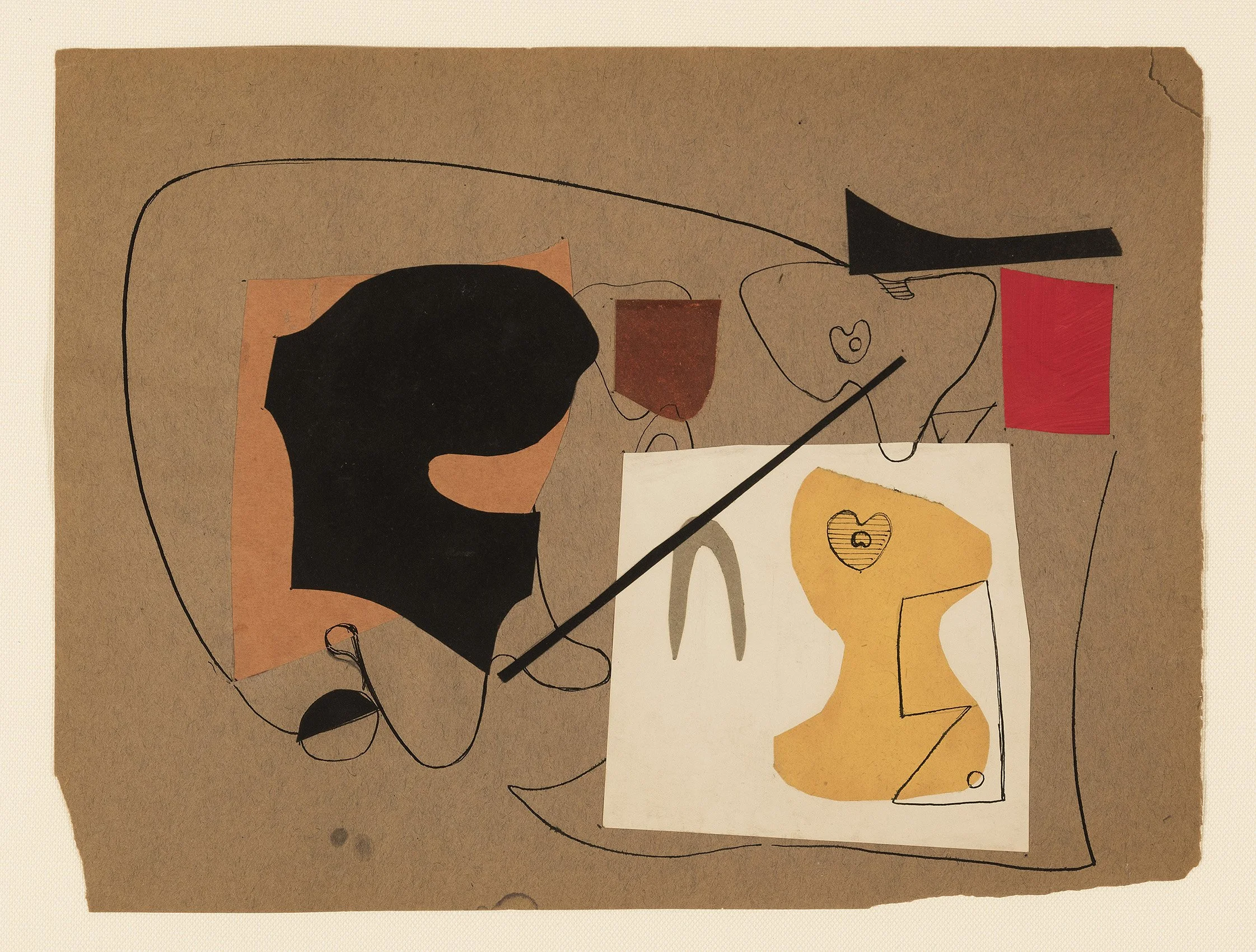
Perhaps the largest task for the pioneers of American abstraction was to figure out how to make a successful abstract painting. Looking at paintings in our exhibition, one is struck by evidence of collage use by Ilya Bolotowsky in Geometry on Green (1937) supported by Collages #2 and #5. In Balcomb Greene’s Black Rectangle (1937) and Memory Forms (1939), one suspects the artist designed paintings with collage, which is supported by collages 38C7 and 37-1 found in our exhibition. Artists thought of collage as designing with scissors, allowing the artist to build a composition in a quick and inexpensive way based on look and feel before thoughts censored out creativity. If a shape looked wrong the artist could peel it off to make a revision or paste another shape on top of it. Cut-outs in a variety of shapes could be moved around to try different placements of line and form. Carl Holty’s Geometric Abstraction (1940) has the feel of cut-outs being used with the layering of shapes on top of each other. The collage process allowed an artist to welcome interesting textures that might develop through the accidental use of a handy piece of cloth, paper, label, or foil. Movement and rhythm could be created by variations of light and dark shapes and also by alternation of flatness and depth. A collage by Esphyr Slobodkina titled Annual (1939) fits this description. Collage shapes, unlike the drawn line, include form and volume in their very nature. The background paper acts as the picture plane, forcing the pasted collage elements to thrust into space. The starts and stops of line and color using collage resulted in a new approach to spatial interplay. The importance of collage can be seen in Piet Mondrian’s last painting, Victory Boogie Woogie (1944), left unfinished in his New York studio. In the painting Mondrian used collage to develop his severe, rectilinear abstractions by placing colored tapes on plain canvases to study the space relations, rhythms, and precise equilibrium of the tapes. Mondrian constantly shifted and rearranged the tapes, only once satisfied did he paint actual lines in place of each tape. This was documented by AAA members who covered the rent of Mondrian’s studio for some months after his death so other abstract artists could study Mondrian’s use of collage. This adaptability explains the strong feeling of collage use in the paintings in our exhibition by diverse groups of abstract artists.

[ TOP ]

Modernism 1913-1950 | Realism of the 1930s and 1940s | Abstraction of the 1930s and 1940s | Post-War | Selected Biographies

THE SHAPED CANVAS MOVEMENT

Feb 27 - May 3, 2019

Essay | Some works may still be available, please contact the gallery at 212-581-1657

Essay by Emily Lenz

The shaped canvas was explored by artists of the 1960s in diverse styles including Hard-Edge, Color Field, Op, Pop, and Minimalism. The architectural structure of shaped canvases moved painting beyond the traditional rectangle that replicates the viewer’s field of vision. Lawrence Alloway brought attention to this movement in his Guggenheim Museum exhibition The Shaped Canvas (December 1964 - January 1965), which included Paul Feeley, Sven Lukin, Richard Smith, Frank Stella, and Neil Williams. In January of 1965, Frank Stella, Henry Geldzahler, and Barbara Rose organized the exhibition Shape and Structure at Tibor de Nagy Gallery, which included shaped canvases by Stella and Williams, as well as Charles Hinman, Will Insley, and Larry Bell, alongside three-dimensional works by Donald Judd, Robert Morris, Carl Andre, and Robert Murray. The Tibor de Nagy exhibition presented a group of artists investigating the relationship of a work’s internal structure and its bounding shape. It also showed the division between the Minimalists whose interest was the materials and the shaped canvas makers whose interest was color and accepted some level of pictorialism as a result. Our exhibition focuses on the Hard-Edge artists and their creativity in finding unified and balanced compositions within new forms.

In the early 1960s, Clement Greenberg’s call for painting to be flat still dominated. In Frank Stella’s early shaped canvases, the paint was stained into the canvas, staying within Greenberg’s doctrine. The physical depth in the shaped paintings of Sven Lukin and Charles Hinman broke with “the rules.” Lukin and Hinman set the stage for younger artists like Elizabeth Murray to redefine painting with her 1970s shaped canvases that mixed abstraction and representation, geometry and biomorphism. The shaped canvas movement paved the way for artists of the 1970s to re-evaluate what painting could be and in due course opened the door to the diverse art produced today.

1930s PRECEDENTS
In the 20th century, abstraction freed painting to be about the arrangement of shapes and colors. Without a natural order to follow, artists inevitably asked why must the canvas be a rectangle? At the same time, the challenge of developing an abstract language led many artists to use collage in their preparatory work. Paper cut-outs allowed for quick adjustments to compositions and led several American pioneers of abstraction to consider how this additive process could apply to their painting, resulting in the development of constructions and reliefs. Charles Biederman, Gertrude Greene, Charles Green Shaw, and Irene Rice Pereira were the primary American artists to work in painted constructions or reliefs in the 1930s, setting the precedent for the shaped canvas of the 1960s.

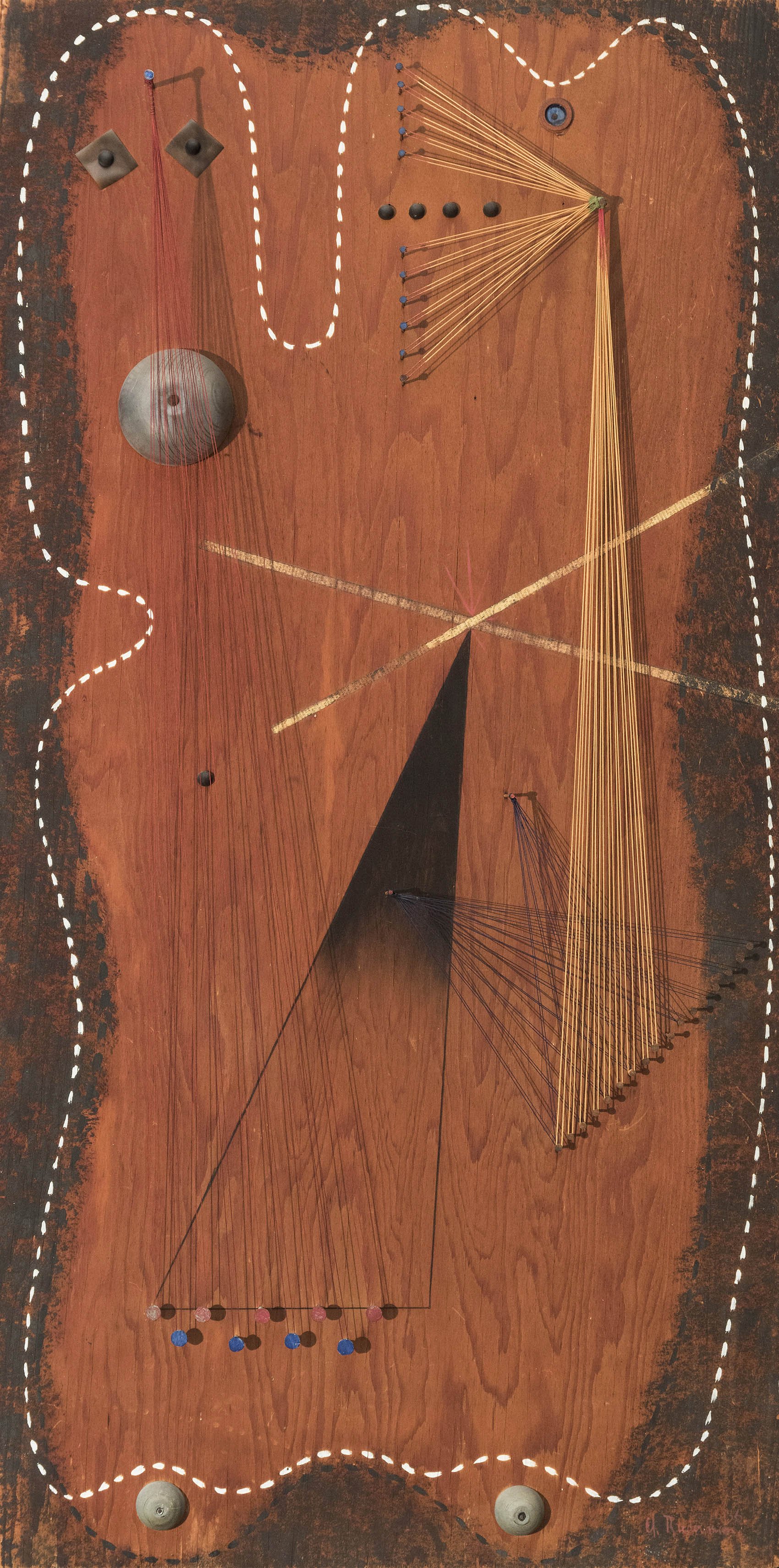
Charles Biederman (1906-2004) created his first reliefs and collages in 1935. Biederman wrote in his influential 1948 book, Art as the Evolution of Visual Knowledge, that 20th century artists were challenged to keep painting relevant once photography freed art from its pictorial task. This placed importance on the structure of a composition leading many painters to be more sculptural in their thinking. Biederman encouraged artists to seek out manufactured materials to create new art that would not mimic nature. In his earliest constructions, Biederman made sculptural wall reliefs, using wood, metal, nails, and string as seen in R-2, New York, 1936. While in Paris from October 1936 to June 1937, Biederman was struck by the technology displayed at the 1937 Paris World’s Fair. This moved Biederman towards a stricter use of pure geometry and new materials, including Plexiglass.

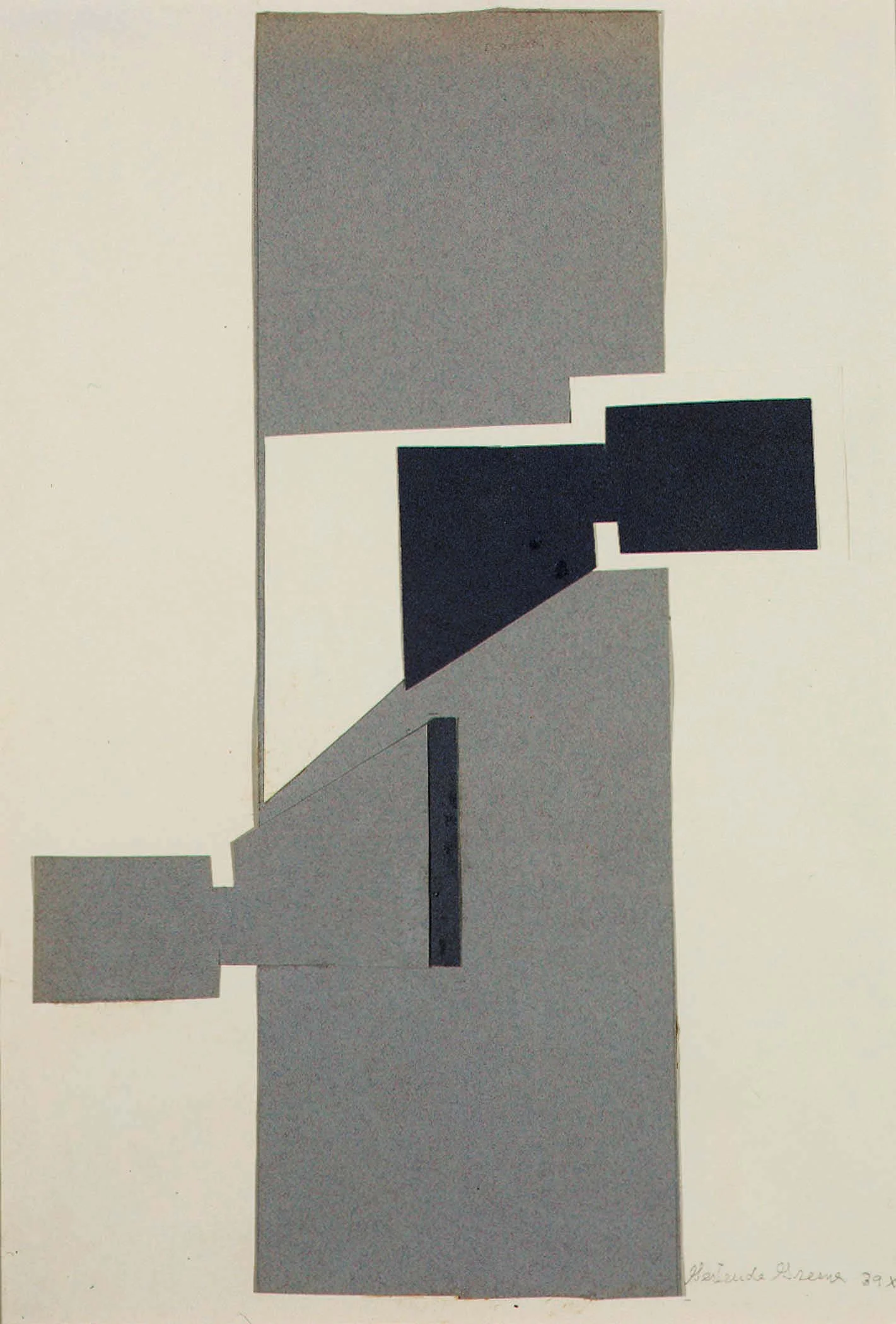
Gertrude Greene (1904-1956) made her first wood constructions in 1935 based on collage studies. Her early constructions reflected a dual interest in biomorphic and geometric abstraction. By 1940, Greene’s work aligned with Constructivism, with cleaner forms and simpler geometry as seen in the collage 39x1, 1939. While working in three-dimensions, Greene still used pictorial depth techniques in her constructions. For example, in 39x1 Greene placed a black piece of paper slightly over a similarly shaped larger white piece, an overlapping tool used to imply projection.

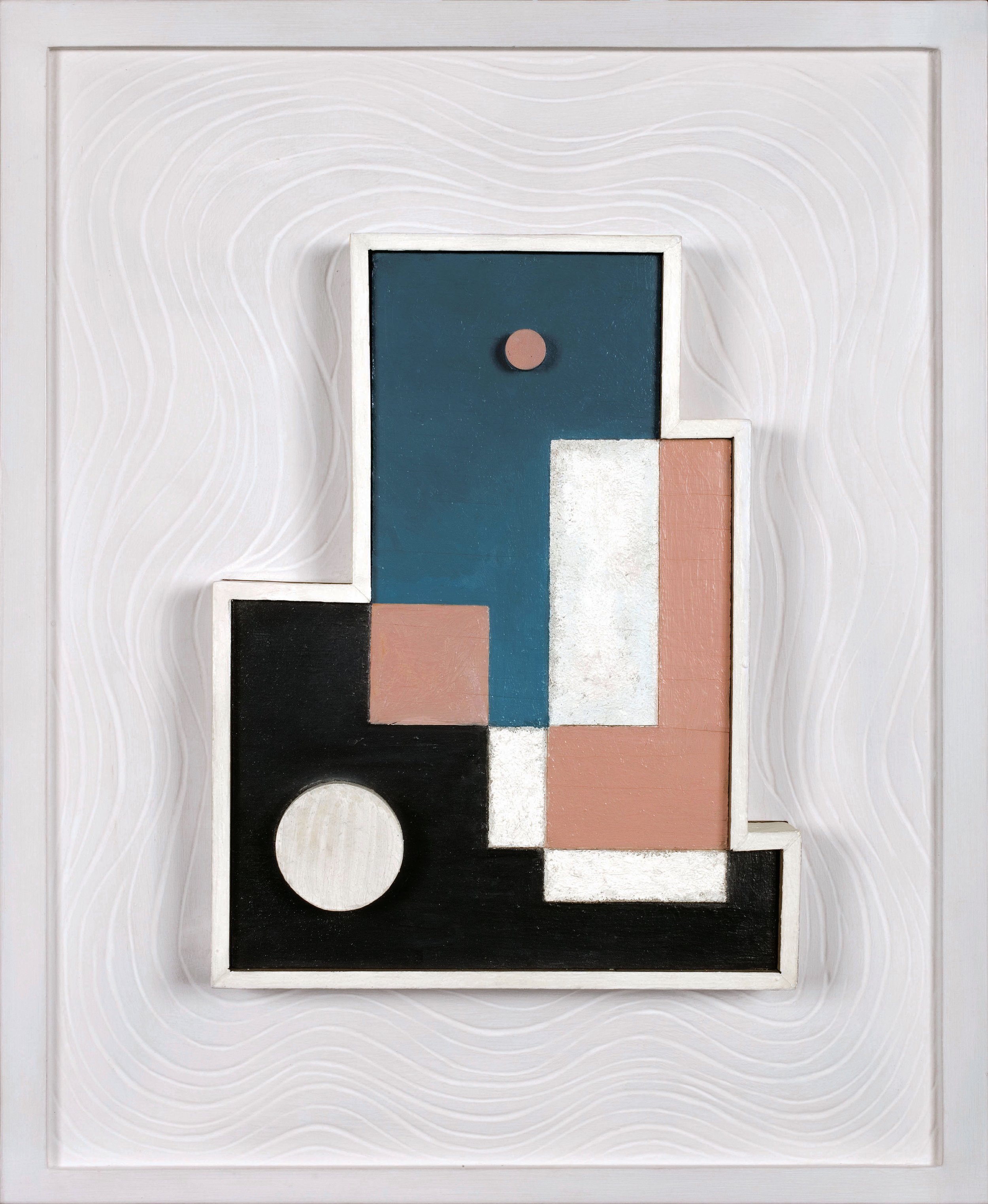
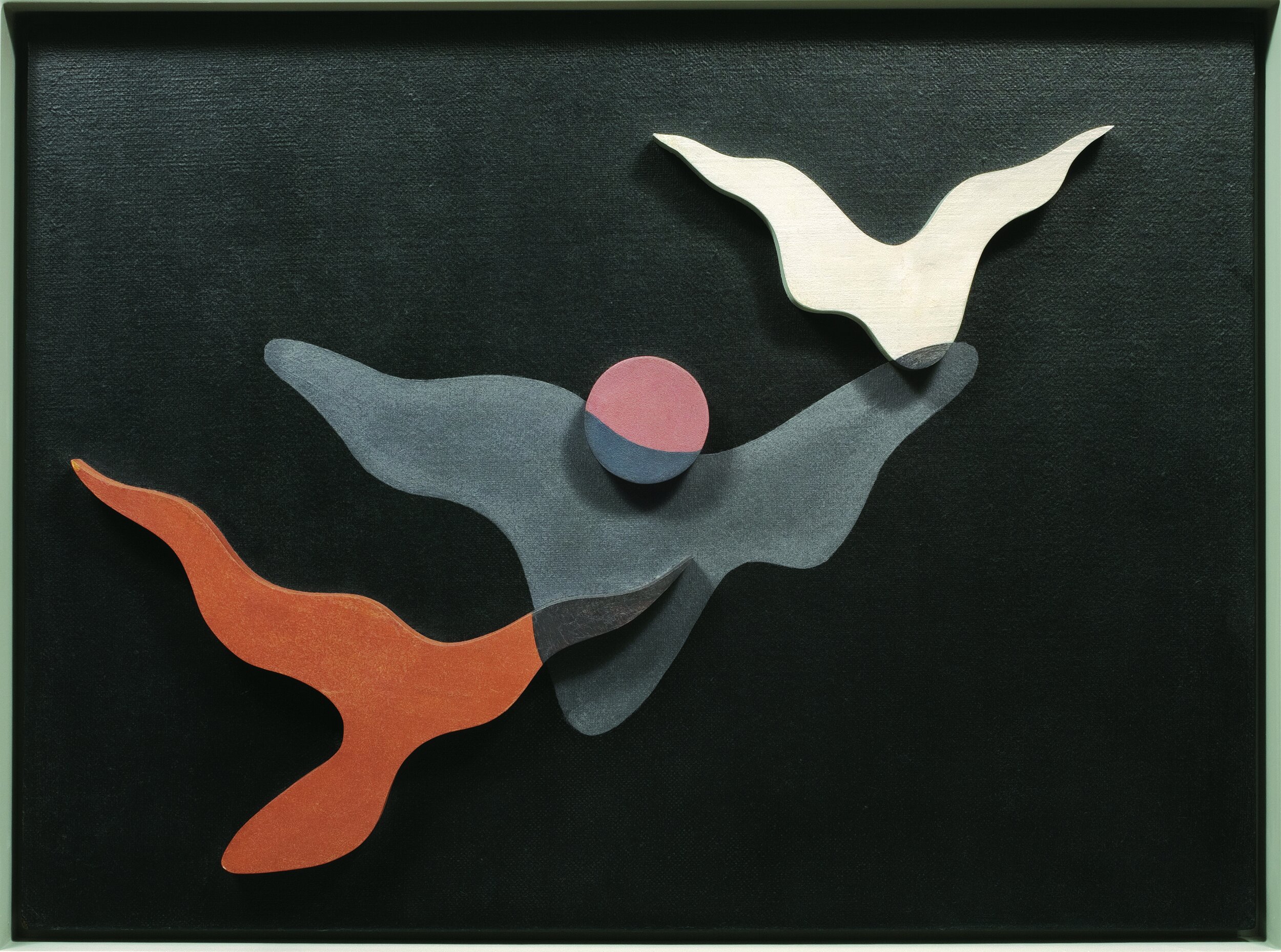
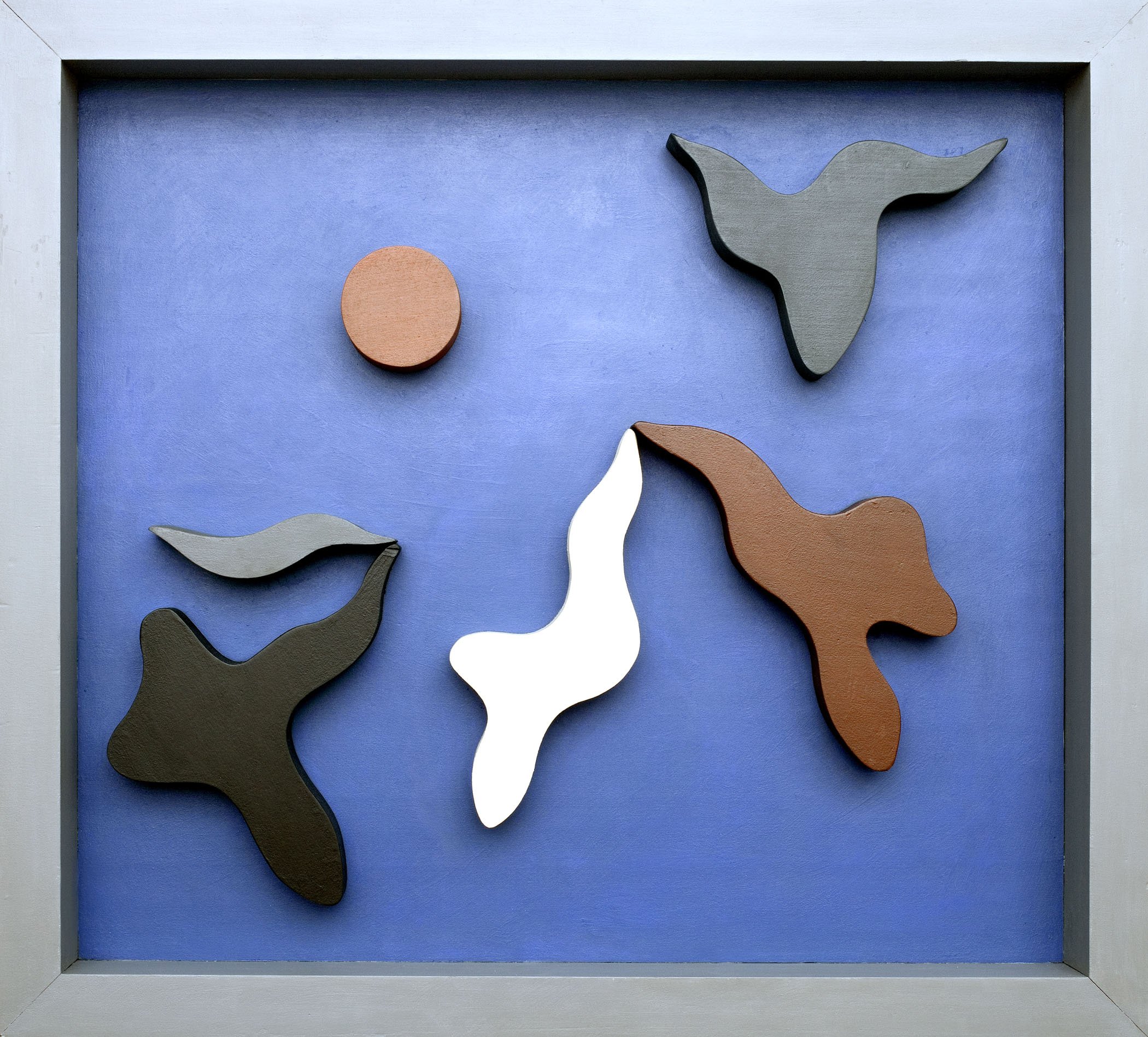
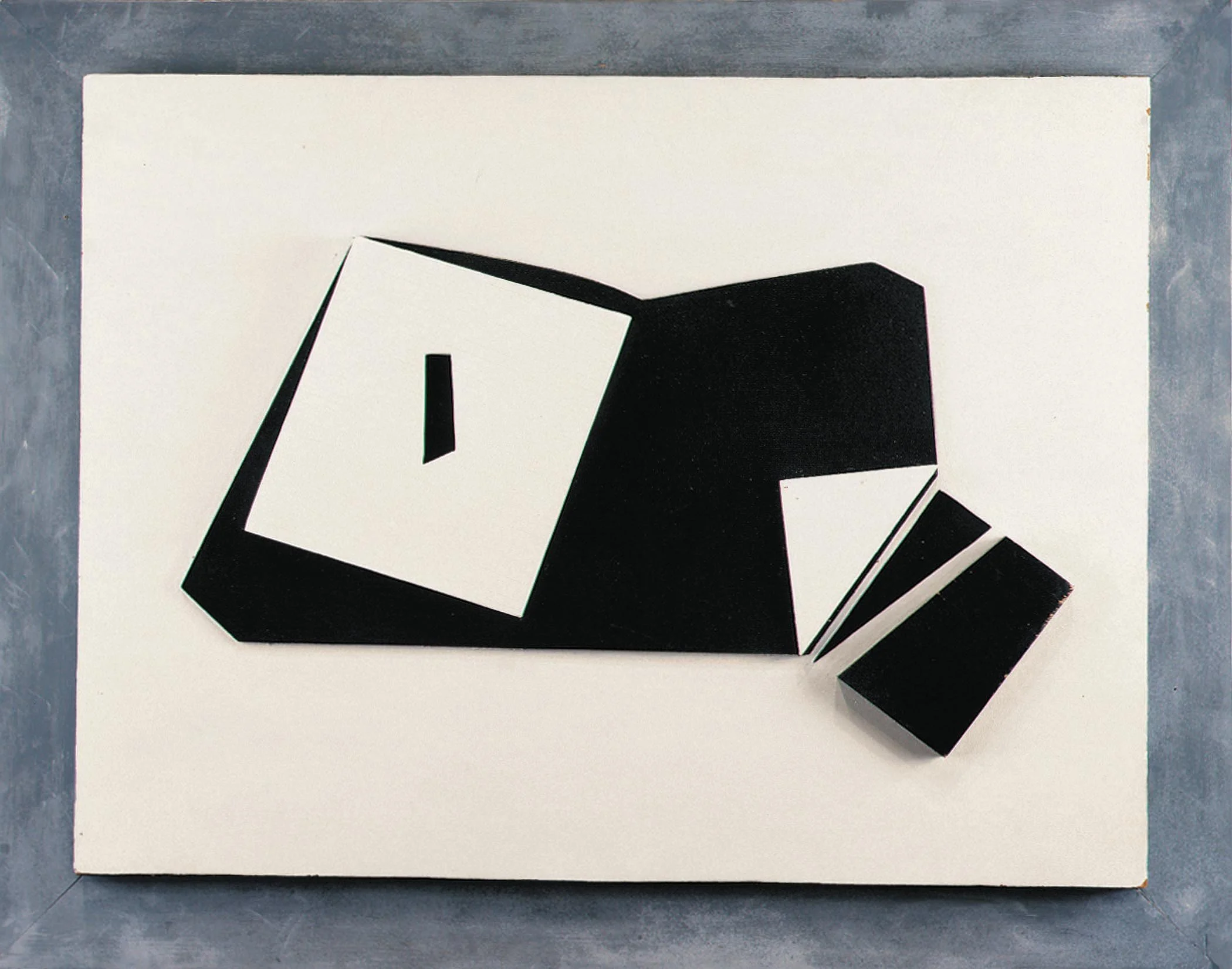
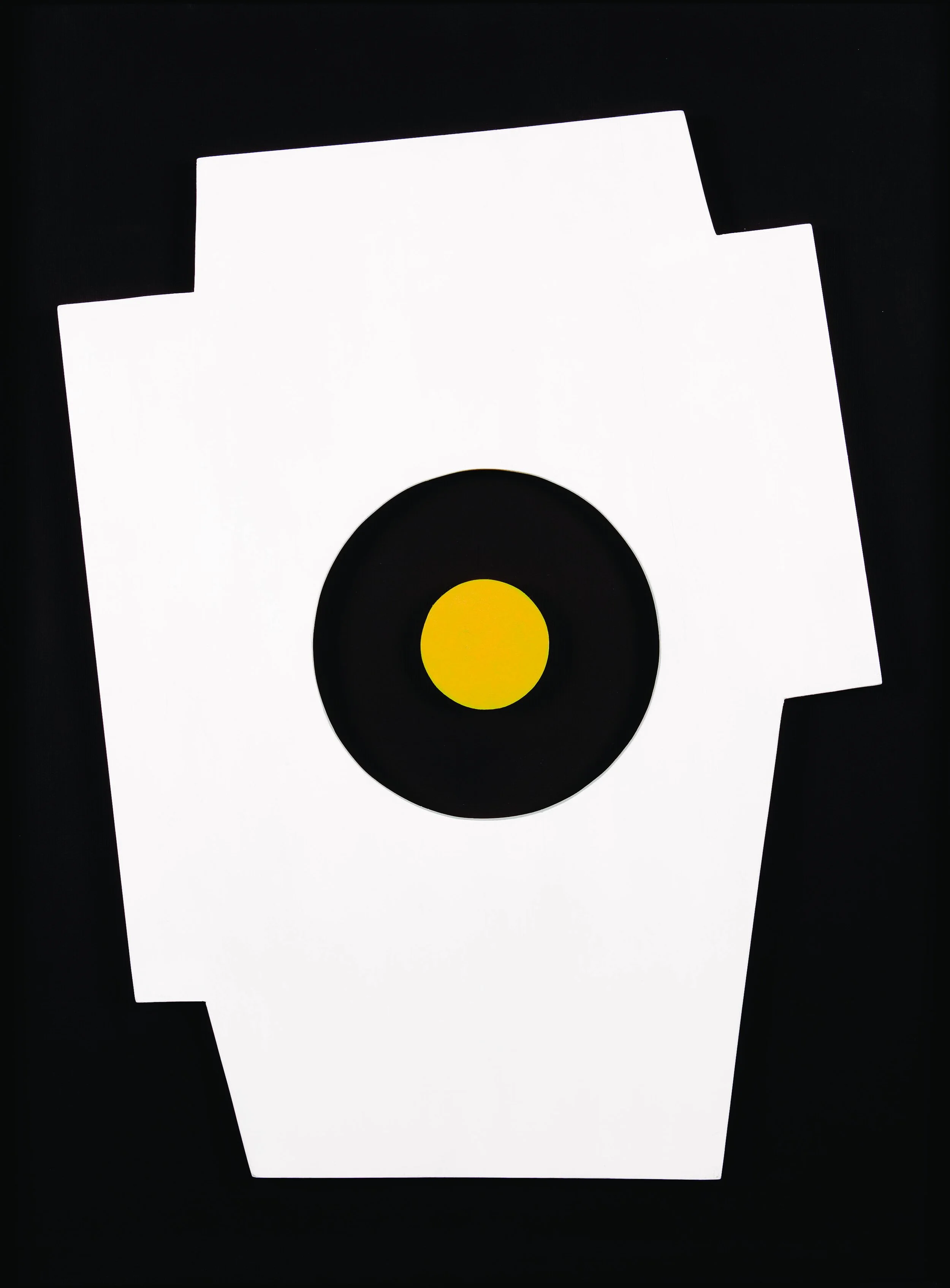
Charles Green Shaw (1892-1974) created one of his first constructions Day and Night Polygon in 1936 by cutting a wood panel into a multi-sided shape and adding wood elements to give it physical dimension. In a 1938 article for the magazine Plastique (edited by Jean Arp, Shaw, and others), Shaw defined his Plastic Polygon as “a several-sided figure divided into a broken pattern of rectangles.” Shaw also worked with biomorphic forms screwed onto a square or rectangle backboard, which he called Reliefs. The process of composing a relief mirrored collage as Shaw prepared his wooden forms first then arranged them on a board, as in Sky Float, 1938 in our exhibition. Shaw exhibited 26 constructions (Polygons, Reliefs, and Cut-Outs) at his New York dealer Valentine Dudensing in the spring of 1938. The exhibition included one of Shaw’s most irregular shapes, Day Break, 1938, in which a white polygon is activated by a small yellow circle within it.

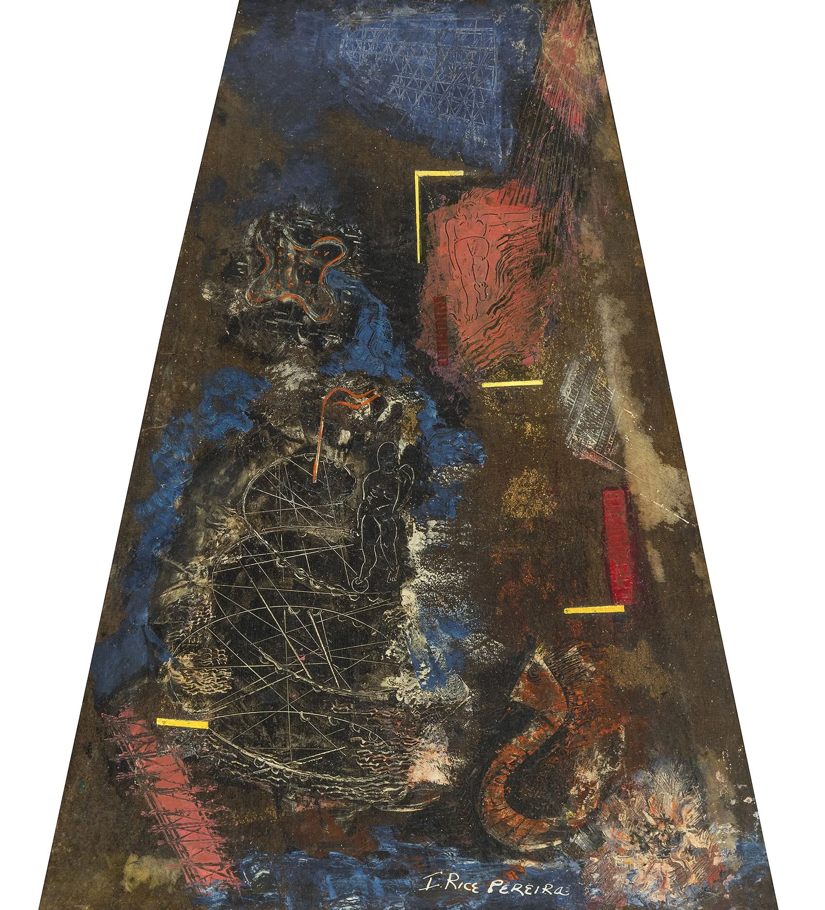
Irene Rice Pereira (1902-1971), known for her layered glass constructions, used a trapezoid shape for the 1943 symbolic Self-Portrait she exhibited at Peggy Guggenheim’s Art of This Century. The shape conveys a deep space receding into the distance. Pereira added to this spatial effect by foreshortening the two figures in the work to imply they soar above the viewer. In Self-Portrait, Pereira broke with the traditional canvas shape to heighten the impact of her narrative statement.

In the 1960s paintings and constructions combine for a new form- the shaped canvas

While enrolled at the University of Pennsylvania’s School of Architecture from 1953 to 1956, Sven Lukin (b.1934) attended lectures by the influential architect and urban designer Louis I. Kahn. Kahn’s celebration of monumental scale, unadorned surfaces, and volumetric forms inspired Lukin’s artmaking, leading him to be one of the first Americans to explore the shaped canvas. His earliest shaped paintings from 1961-62 were built up from three to five connected canvases. Next he worked with a single canvas with raised edges or center to create a concave or convex shape. Examples of Lukin’s single canvas shapes include Untitled, 1963 in our exhibition and Dwan Song exhibited at the Dwan Gallery in Los Angeles in 1963. In both, a symmetrical arrangement of one repeated shape is centered on an elevated structural support. These paintings are the most classical and restrained Lukin would create. Lukin broke with symmetry and moved into organic forms, creating eccentric shaped canvases from 1964 on. Flaunting his ability to both think and build three-dimensionally, Lukin pushed the shaped canvas into a nearly 120 foot long installation made for the Nelson A. Rockefeller Empire State Plaza Art Collection in Albany in 1969.

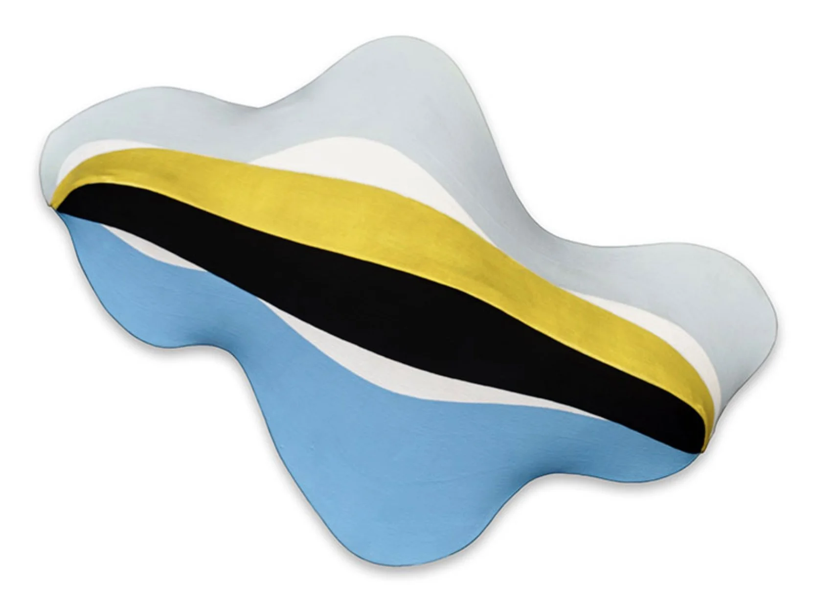
In the group show Seven New Artists at the Sidney Janis Gallery in 1964, Charles Hinman (b.1932) exhibited flat canvases balanced in suspension by cords and a few shaped canvases with physical depth, like Poltergeist, 1964, purchased by the Museum of Modern Art (MoMA). In Hinman’s volumetric shaped canvases, he explores the fusion of sculpture’s real space and painting’s illusionary space. Hinman’s bright colors and automobile-like curves give a Pop aesthetic to his 1960s paintings, perhaps an influence of his first studio mate James Rosenquist. The biomorphic shape of Untitled, 1965 suggests a landmass and the stripes of color act like topographical markings with a central ridge of vibrant yellow accentuating the physical depth of the piece. Untitled, 1965 was purchased out of Hinman’s 1965 exhibition at Feigen Gallery by Alfred Barr of MoMA. While artist-in-residence at the Aspen Institute the summer of 1965, Hinman produced about a dozen small paintings, including our Orange Sunspot, 1965. Hinman explored the inflection of a curve in the Sunspot series and exhibited them at Richard Feigen Gallery in January of 1966.

Neil Williams (1934-1988) is the only artist in our exhibition included in the two shaped canvas exhibitions of 1964-1965. Raised in Utah and Colorado, Williams credited exposure to the art of Navajo and Plains tribes for the order and balance in his work. Williams’s first solo exhibition at Green Gallery in May 1964 was followed by solo exhibitions at Dwan Gallery (1966) and Andre Emmerich Gallery (1968). In the early 1960s, Williams filled his canvases with parallelograms and in 1964 jutted out the canvas edge to recall the shapes within. Next in his 1964 Transparency series, the external shape was determined by the sliding and rotating of overlapping forms. Untitled, c. 1964 is a transitional work between the parallelograms and the Transparency series. Williams continued to work in shaped canvases until 1973, though they were no longer Hard-Edge after 1968. Williams shared a studio in the Hamptons with Frank Stella in the 1970s when both artists moved to collage-like painting.

Alexander Liberman (1912-1999) was raised in Paris by his Russian parents.  He designed stage sets in Paris in the 1930s and worked at Vu, the first magazine to illustrate the news with photographs. Liberman arrived in New York in 1941 where he found a job at Vogue. The circle was the subject of Liberman’s first solo exhibition held at Betty Parsons Gallery in 1960, which included one tondo and one collage. The tondo Omicron V, 1961 was one of three tondos in Liberman’s 1962 exhibition at Betty Parsons Gallery. It is a classic example of Liberman’s reductive approach of arranging a few elements in a flat, open field to produce an optical afterimage. This led to his inclusion in MoMA’s The Responsive Eye, an exhibition which presented the international Op Art movement in 1965.  

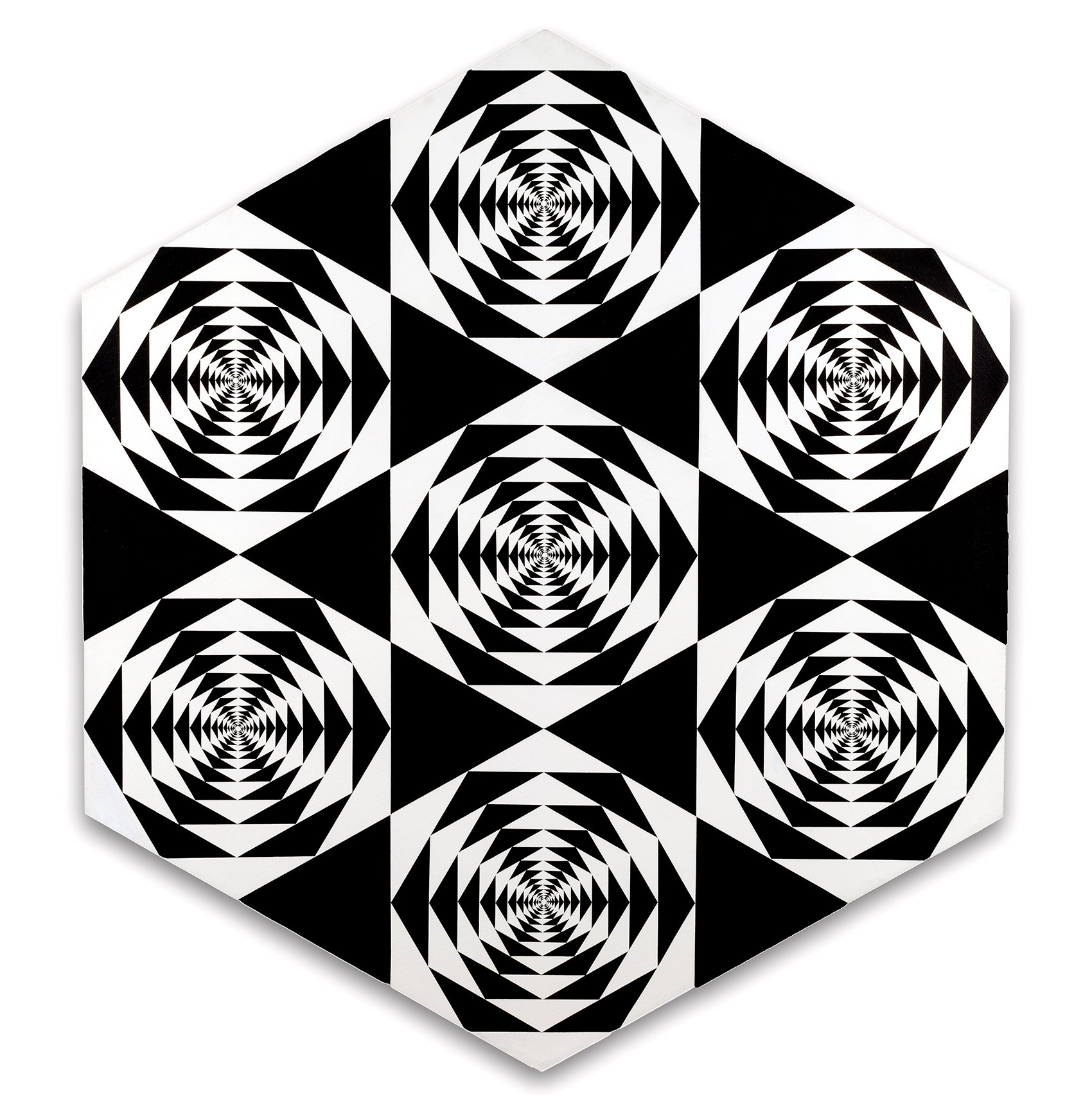
From 1965 to 1968, Francis Celentano (1928-2016) worked in shaped canvases and motor-rotated tondos. Celentano created studies for his complex arrangements by screenprinting triangles into patterns he collaged into larger arrangements to test the optical effect. Celentano achieved national recognition with his inclusion in MoMA’s The Responsive Eye. In Seven Hexagons, 1965, Celentano chose a form for his shaped canvas that is repeated multiple times within it. The high contrast of black and white in each hexagon creates an afterimage of a yellow hexagon pulsing along the outer ring of hexagons. The afterimage reflects the canvas shape and contents, taking to new heights Frank Stella’s concept of the outer bounds of a painting being defined by its internal composition.

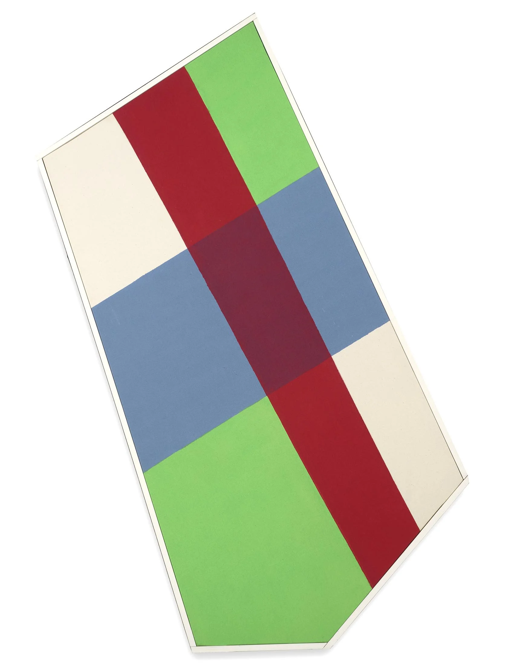
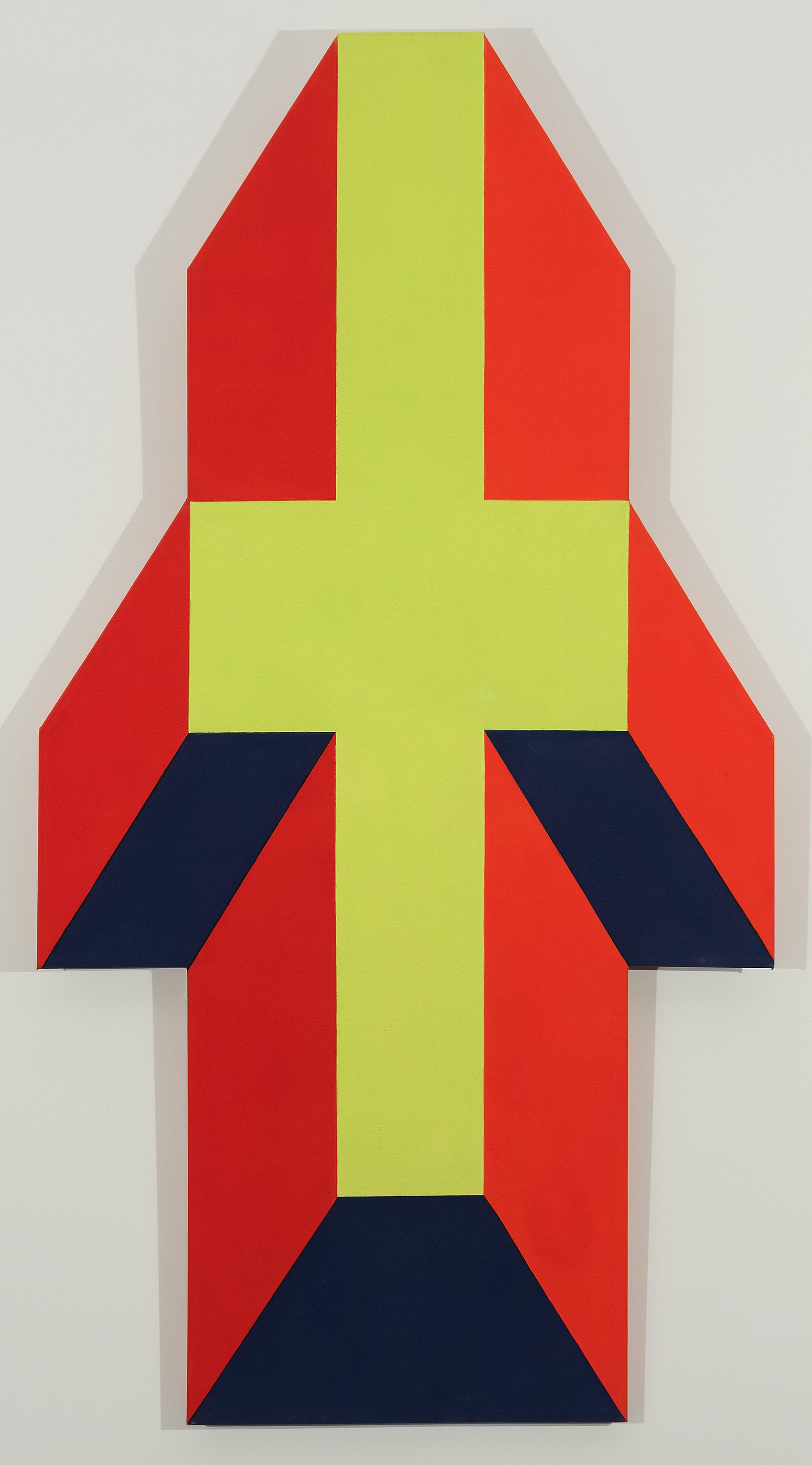
In 1965 Thomas Downing (1928-1985) first applied his grids of colorful dots to parallelogram canva--ses. Like other members of the Washington Color School, Downing’s work engaged the raw canvas as an active component of a painting, so it was not a stretch for Downing to consider the canvas shape as another choice in his creative process. Downing’s first shape was the parallelogram which pushed his dot motif into a thrusting forward movement. One of Downing’s parallelograms was included in Lawrence Alloway’s Systemic Painting at the Guggenheim in 1966. The parallelogram in our exhibition Untitled (Variations of Red), 1966, has subtle color variations in the dots, activating the whole. Downing next did shaped canvases of parallel stripes with one or two bends, which were exhibited at the Corcoran Gallery of Art (December 1966 - January 1967). The catalogue for the exhibition illustrates that these stripe paintings could be hung in multiple orientations on the wall. In 1967, Downing used isometric perspective in the Plank series to give the appearance of separate canvases projecting from the wall in three, five, or seven units. In the Fold series of 1968, Downing chose a form that implies a folding canvas in multiple colors. In the Plank and the Fold paintings, Downing stretched one canvas over a single board of shaped plywood to achieve his effect. In Fold One, 1968, the colors - two shades of green, pink, and blue- do not adhere to color theory concepts of projecting and receding color. Instead while the Fold shape strongly suggests a three-dimensional form, the colors counter the structure, giving the work the impression of a gravity-defying form folding in space.

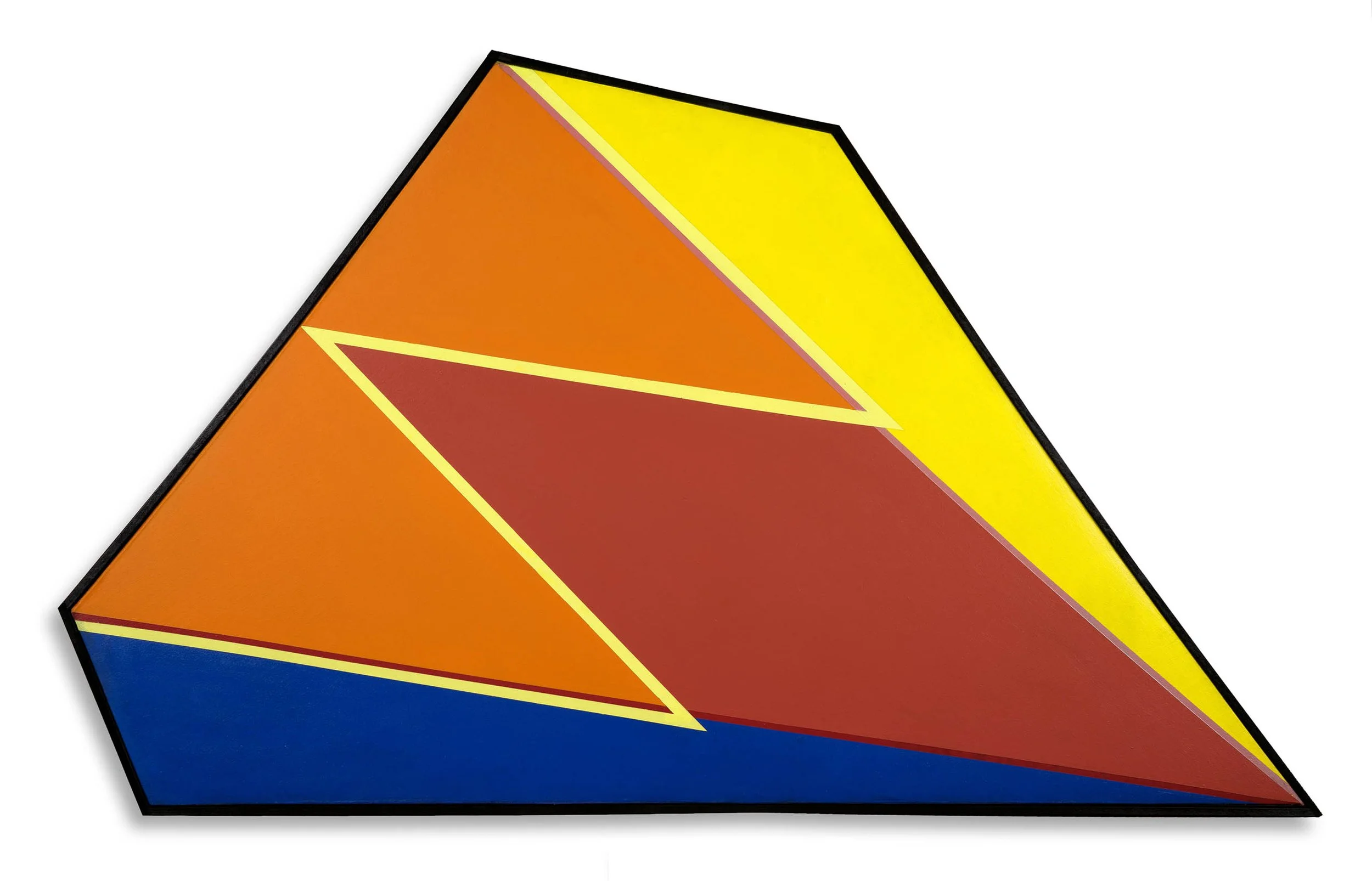
Paul Reed (1919-2015) considered the overall form of a painting in 1966 by drawing out shapes to see how color could work without a clear central axis. By twisting and pulling his grid to a peak, Reed created a five-sided shaped canvas he called Topeka. Intrigued by the effect of color pushing beyond the constraints of the canvas, Reed worked in increasingly complex shaped canvases from 1967 to 1970, in which he pushed the dynamic relationship between inner structure and outer shape. To begin a series, Reed first mapped out the shape on grid paper to determine the volume and estimate the interpretation of depth. He then worked in collage to determine what colors would reinforce that reading. Settled on a shape, he made a series of canvases with different color arrangements to push the complexity of the color interaction. The series Marmara (a sea in Turkey) and Safid (a river in Afghanistan) have a centered depth that referenced looking through Islamic architecture to sources of water. Reed used color to indicate planes and create depth with matte and fluorescent paints. Marmara, 1968 has an open blue center with each edge sculpted in a vibrant color. In Safid, 1968, the choice of bright green for the center aided by planes of deep blue increases the isometric projection.

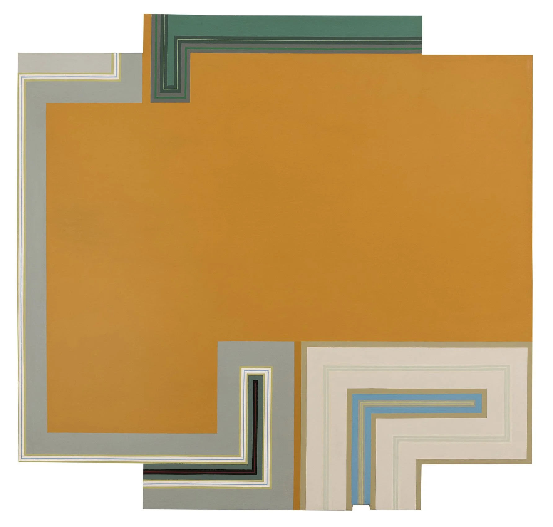
Ralph Iwamoto (1927-2013) came to New York in 1948 on the GI Bill to spend two years studying at the Art Students League. Raised in Hawaii by a family of Japanese heritage, Iwamoto served in the US Army from 1946 to 1948 as a translator in Japan. Iwamoto first worked in organic forms, muted colors, and elements from traditional Japanese art, which led to his inclusion in two Whitney annuals (1958 and 1959). Iwamoto worked as a guard at MoMA from 1957 into the early 1960s, where he befriended fellow guards Dan Flavin, Robert Ryman, and Sol LeWitt. He worked on some of Sol LeWitt’s early wall drawings and remained close friends with the group. Iwamoto’s work became more geometric in the 1960s. He did a series of shaped canvases from 1966 to 1968, in which the canvas edge is activated by arrangements of right-angled lines that move the viewer’s eye around the boundaries of the shaped canvas. He continued the lines around the canvas edge, adding to the sense that his work was both painting and object. In Melpomene, 1967, an ochre center holds the painting as the three sections of pale lines seem captured in a moment, about to unfurl and re-arrange their positions. Iwamoto had two exhibitions of these paintings, first at Watson Art Gallery at Elmira College in 1968 and then at Westbeth Gallery in 1973.  

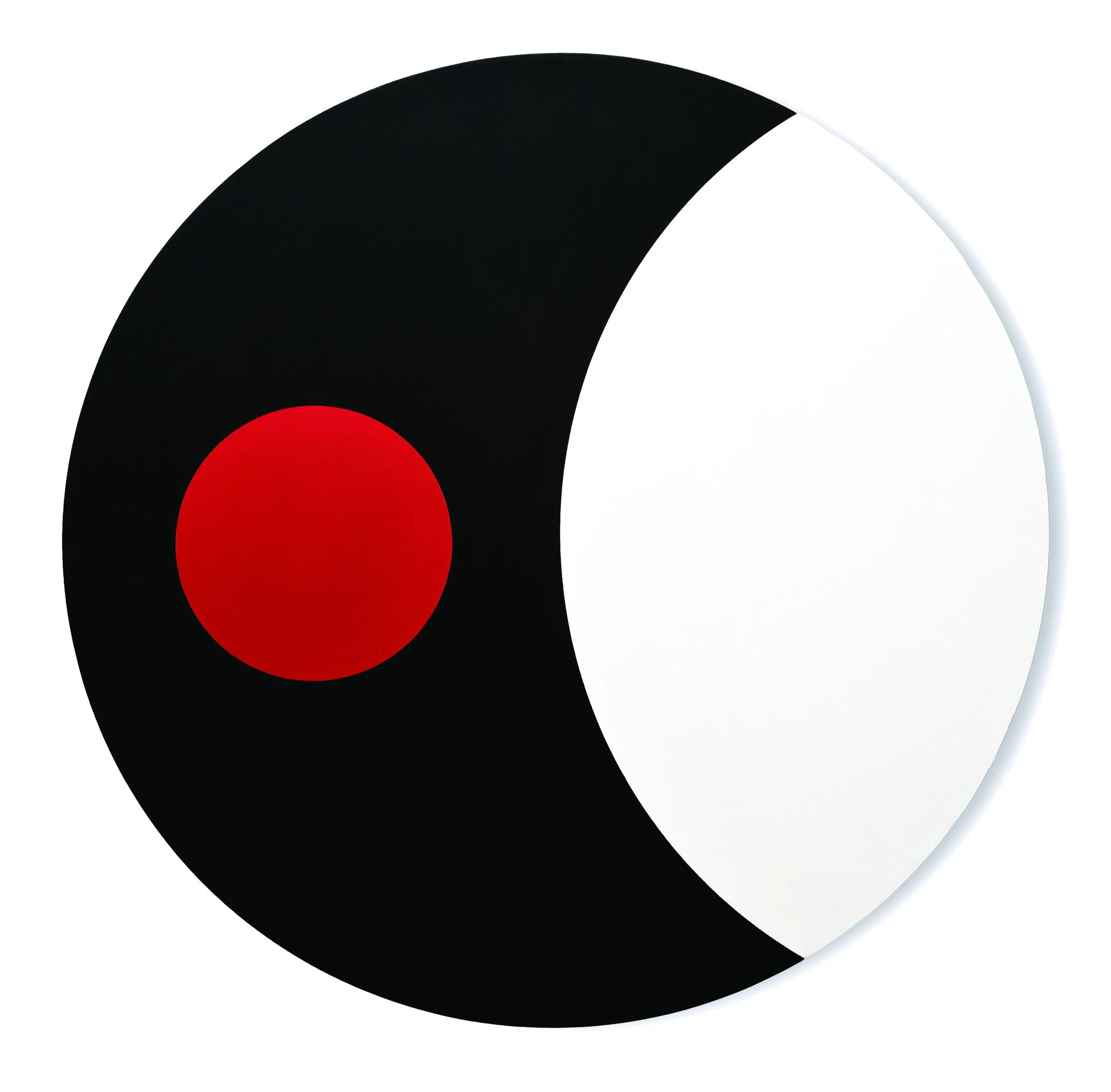
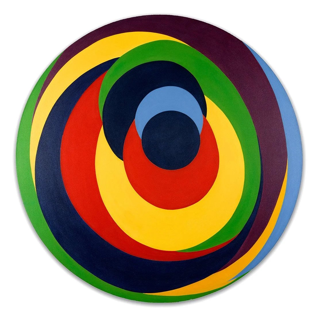
Theo Hios (1908-1998) came to New York in 1934 from Greece. He enrolled in WPA art classes and began exhibiting with the Artists’ Union in 1936. He served as a combat photographer with the Marines in the Pacific during World War II and used the GI Bill to study at the Art Students League. In New York, he was part of an expat group of Greek artists, including Nassos Daphnis and Michael Lekakis. In the 1960s, he found his own style with bold ellipses of overlapping color, suggestive of collage with their flat color and defined edges. The circular shape of his compositions left him wondering how to treat the corners of his painting. By 1967 Hios eliminated the corners, increasing the impact of his ellipses, which bulge and move in Tondo, 1968. He playfully titled his ellipses paintings The Apollo Series, referencing both Greek myths and the excitement of American space travel. Hios had a home and studio in Hampton Bays and had two solo exhibitions at the Parrish Art Museum in 1964 and 1972.

Al Loving (1935-2005) studied painting at the University of Michigan, Ann Arbor. In 1968, he relocated to New York and the following year became the first African-American to have a solo exhibition at the Whitney Museum of American Art. Loving used a hexagonal canvas to create three-dimensional renderings of geometric shapes. He took Josef Albers’ nested squares and turned them into crystalline cubes, playing with the tension between flatness and spatial illusionism. Loving added complexity in his Septehedron paintings by opening one side of his cube into an arrangement of four triangles. In Septehedron L-B-4, 1970, three-dimensions are conveyed through crisp outlining of each triangle in pink, blue, and green. In the Cubes and Septehedrons, Loving used traditional perspective devices as a way to juxtapose and play with color. In the 1970s, Loving shifted to torn canvas and collaged paper works, combining pieces of cut and torn canvas or paper into overlapping colorful patterns and shapes. Loving’s 1960s work and 1970s work look strikingly different, yet in both the shaped work is oriented on the wall, embracing the tradition of painting while challenging its definition.

[ TOP ]

Modernism 1913-1950 | Realism of the 1930s and 1940s | Abstraction of the 1930s and 1940s | Post-War | Selected Biographies

TERRA FLORIDA

Nov 26, 2018 - Feb 22, 2019

Essay | Some works may still be available, please contact the gallery at 212-581-1657

Essay by Deedee Wigmore

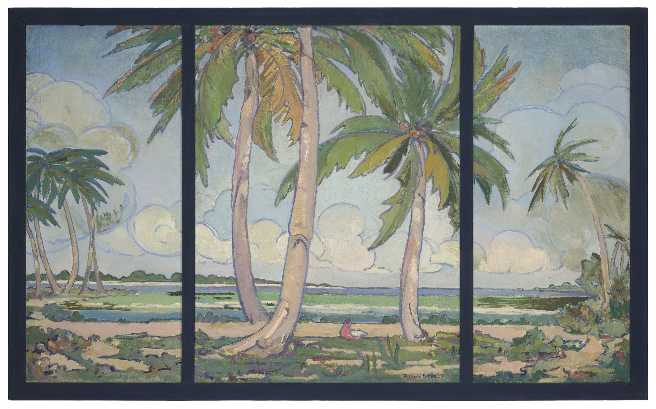
D. Wigmore Fine Art presents images of Florida by seventeen artists who visited the state between 1920 and 1970. The exhibition grew out of the gallery’s effort to assist Jennifer Hardin in her exhibition Imagining Florida: History and Myth in the Sunshine State (Nov. 13, 2018 through Mar. 24, 2019, Boca Raton Museum of Art). In searching for art created by established artists who visited the state, I was fascinated by the history of the places the artists painted. St. Augustine, Ormond Beach, Palm Beach, Miami, Key West, Naples, Sarasota, Bradenton, Clearwater, and Orlando all are represented in paintings in D. Wigmore Fine Art’s Terra Florida exhibition.

After the acquisition of Florida from Spain in 1821, the state’s cultural progress was held in check by Seminole Indian Wars ending in 1858 and the Civil War. After the Civil War, agricultural cultivation of cotton, citrus, celery, and even mulberry trees for the silk industry, as well as some real estate development and tourism, all opened the way for artists to find Florida a place of interest. However, real advancement of Florida’s culture and artistic growth can be credited to the businessmen who developed railroads, steamship service, and hotels. These builders of Florida were Henry Morrison Flagler, George Merrick, Addison Mizner, and John Ringling. The infrastructure they built established essential services and later with the technological developments made during World War II, tropical living became comfortable.

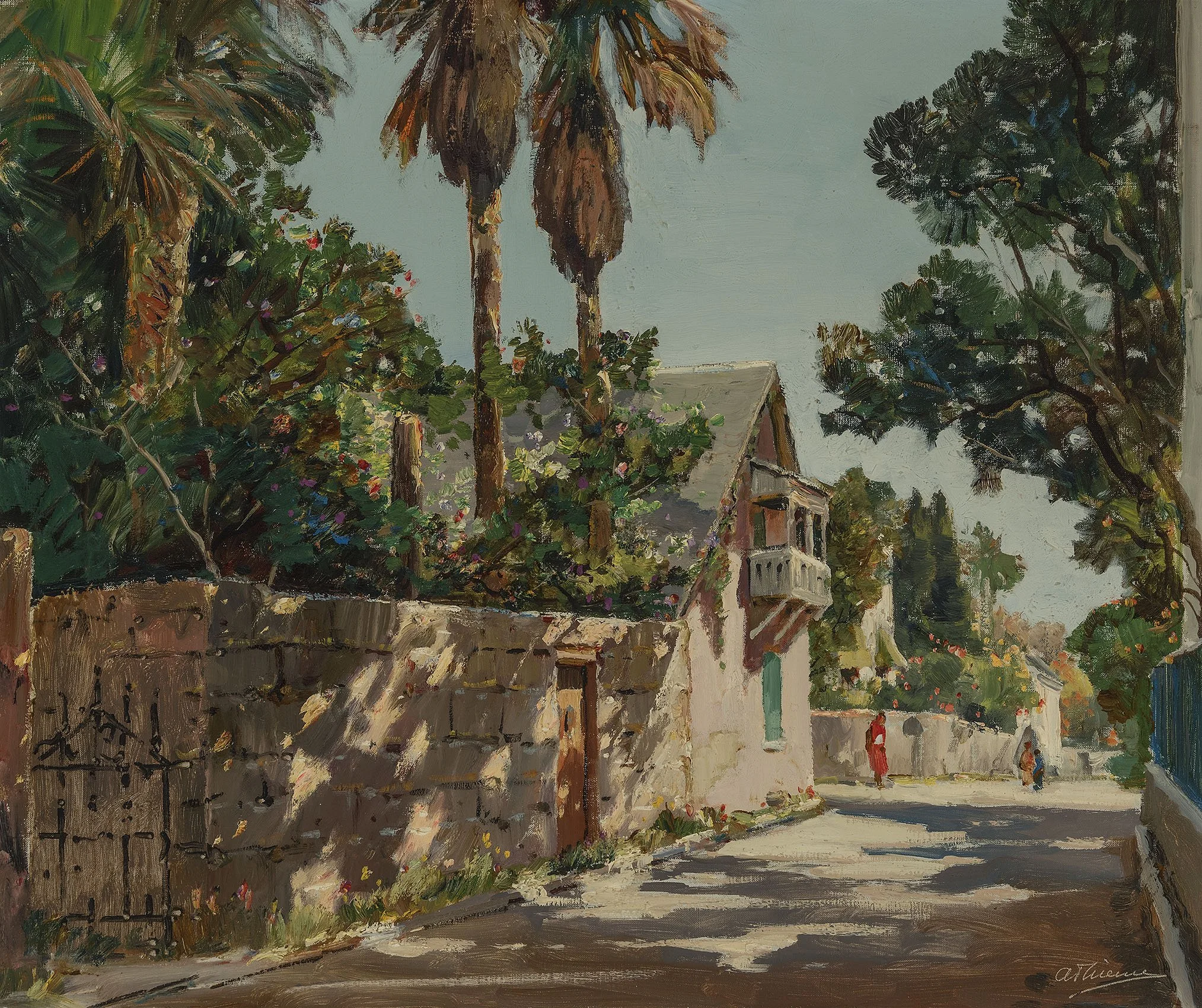
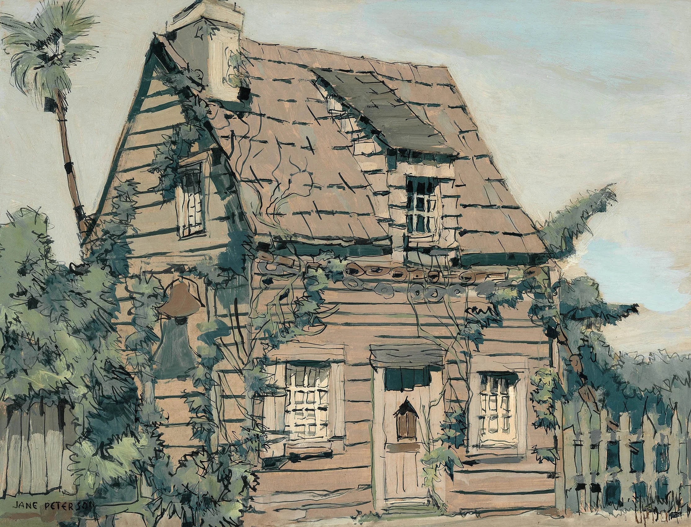
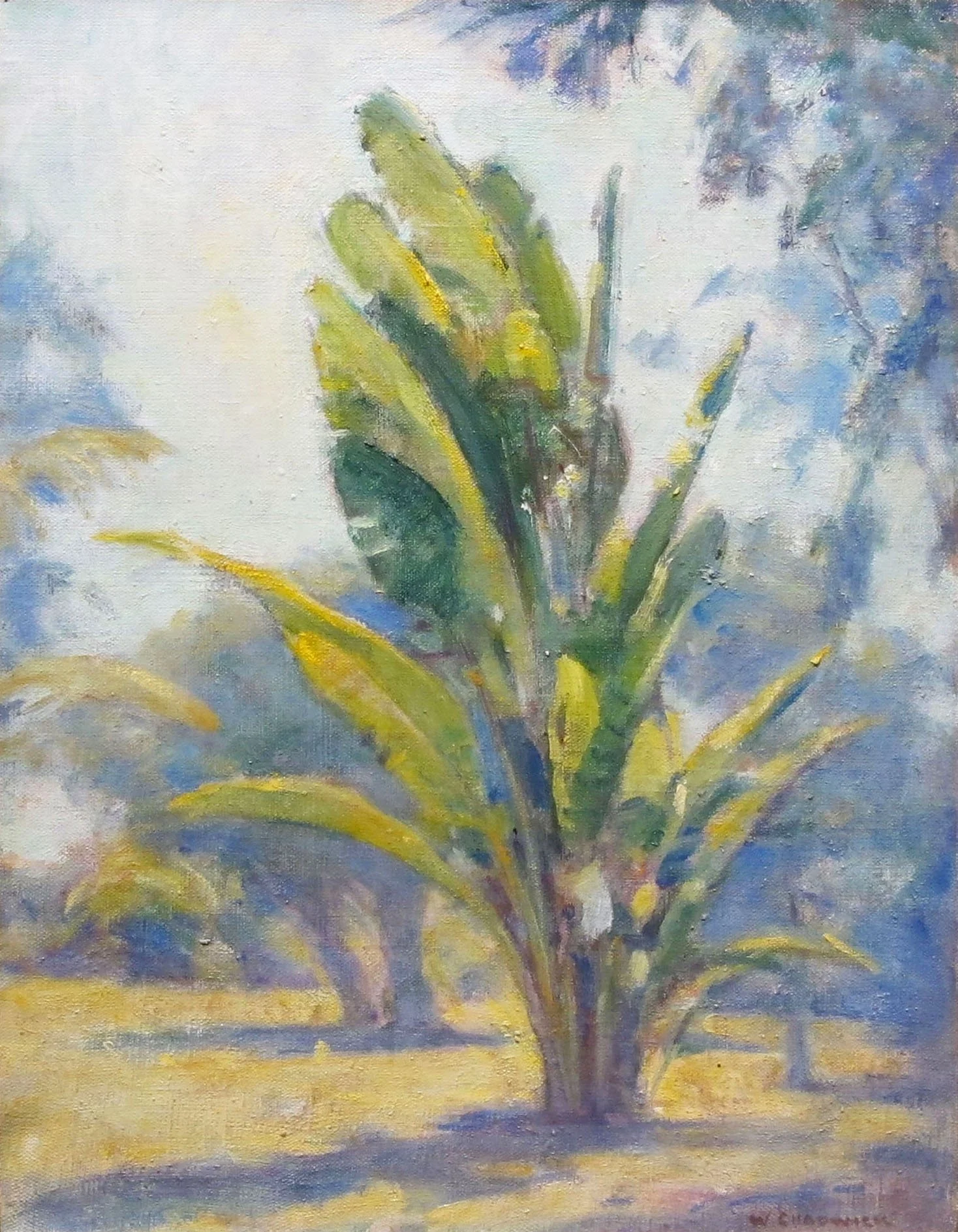
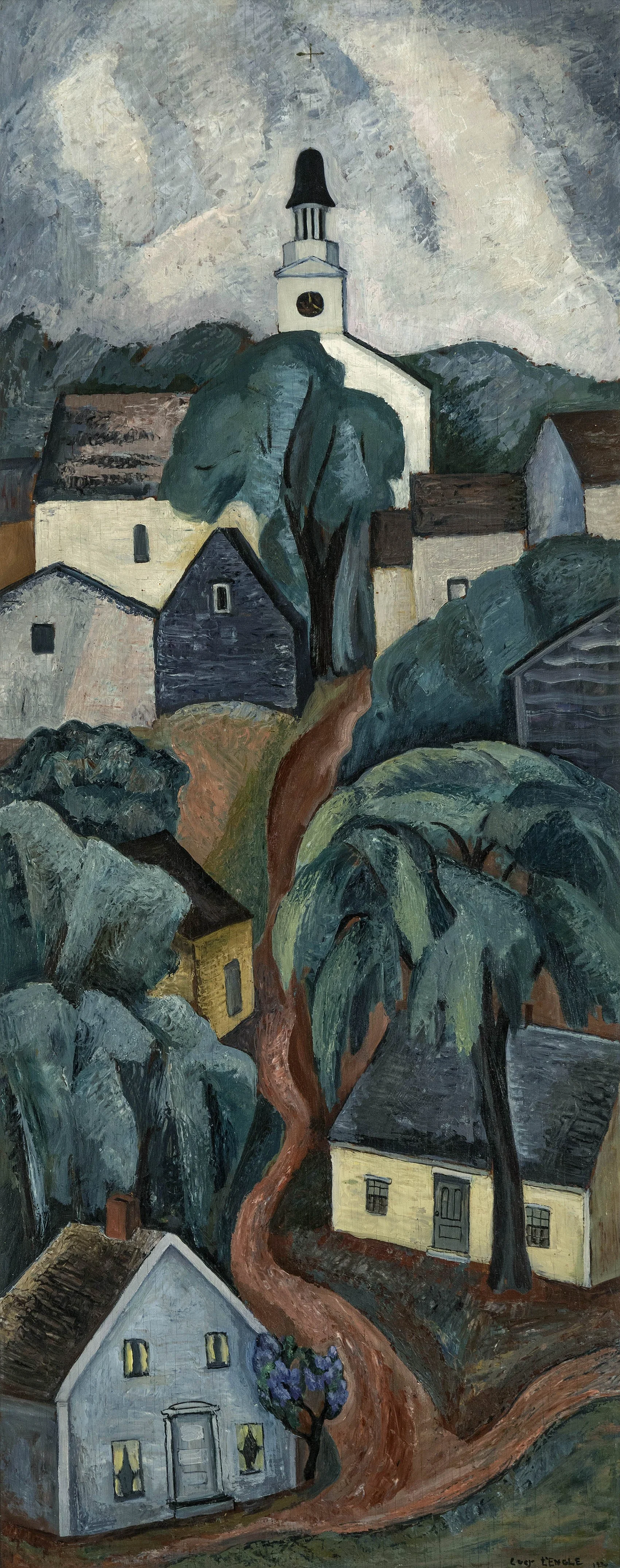
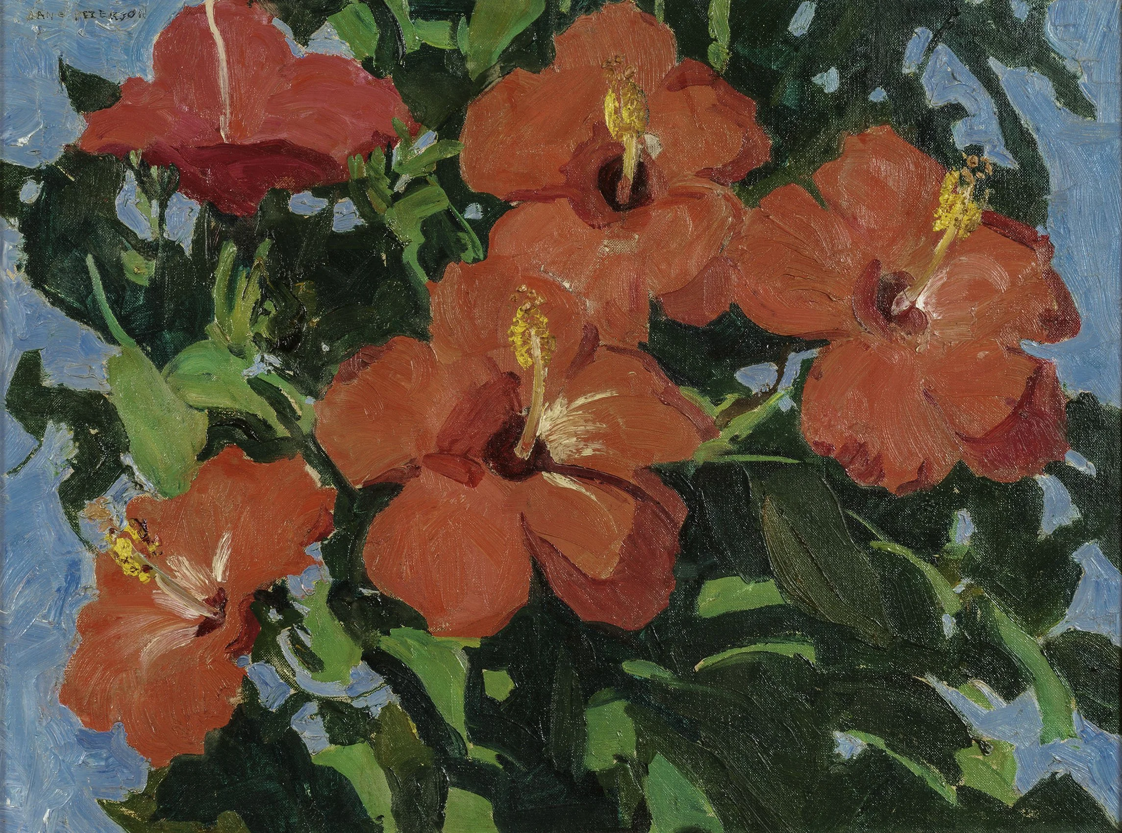
One of the first areas of Florida where artists worked was on the Northeast coast between the Matanzas and San Sebastian Rivers and along the shore in St. Augustine. There Henry Flagler built the luxurious Hotel Ponce de Leon in 1887 and the smaller Hotel Alcazar in 1888. As a diversion for hotel guests seven art studios were built on the grounds of the Hotel Ponce de Leon and artists invited to be in them. In the 1920s Florida had a real estate boom with significant population growth. In St. Augustine it led to the development of art organizations, which proved to be such an attraction the chamber of commerce started a campaign in 1934 to attract artists from famous northern art colonies. The campaign attracted two hundred artists to St. Augustine by 1939. Some of those artists are represented in our exhibition, including: Jane Peterson (1876-1965), Anthony Thieme (1888-1954), William Chadwick (1879-1965), and Lucy L’Engle (1889-1954). Both Jane Peterson and Anthony Thieme were attracted by St. Augustine’s colonial architecture. In America’s Oldest Wooden Schoolhouse, Jane Peterson painted the wood building at 14th and George Street that first appeared on the tax rolls in 1716. It was made of bald cypress and red cedar held together by wooden pins and iron spikes. Peterson lightened her palette to suit the sun-bleached old structure. Anthony Thieme’s painting Sunny Day shows the Canova-Prince Murat House, located at 250 St. George Street, built around 1815. Thieme’s painting gives the viewer an image of a sleepy town with dappled shadows and subtle gradations of light that filter through the tree-lined streets. William Chadwick painted the blazing light shining on Florida’s unique vegetation in Traveler’s Palm during a visit to the St. Augustine area in 1924-26. Lucy L'Engle was interested in St. Augustine’s Spanish history as a Catholic fort town, as seen in Two Nuns, 1944 and Castillo de San Marco, 1940. L'Engle brought a new style of representational art to St. Augustine as one of the modernist members of the Provincetown art colony.

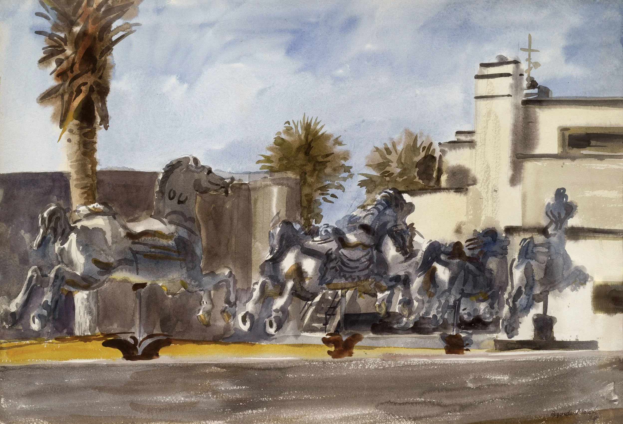
Ormond Beach was another tourist destination established by Henry Flagler when he purchased The Ormond Hotel in 1890, expanding it to 600 rooms as part of his East Coast Railway. Nearby Daytona Beach was another attraction with auto races held on the beach as early as 1902. Reginald Marsh (1898-1954) made regular trips to Ormond Beach, after his father, artist Dana Marsh, retired there in 1928. The younger Marsh wintered in Ormond Beach in 1930 and 1931, returning to the area for his honeymoon in 1934 and again in 1939. Because of its modern architecture, Dana Marsh called his house The Battleship. In the painting Carousel Horses, 1939, Marsh achieved a Surreal effect as white carousel horses gallop towards the streamlined house under Florida’s bright sun. Yet the scene is in fact the view of The Battleship from the beach. Dana and Reginald Marsh found carousel horses at a local dump and rescued them. Painted white, the carousel horses were placed on The Battleship’s lawn.

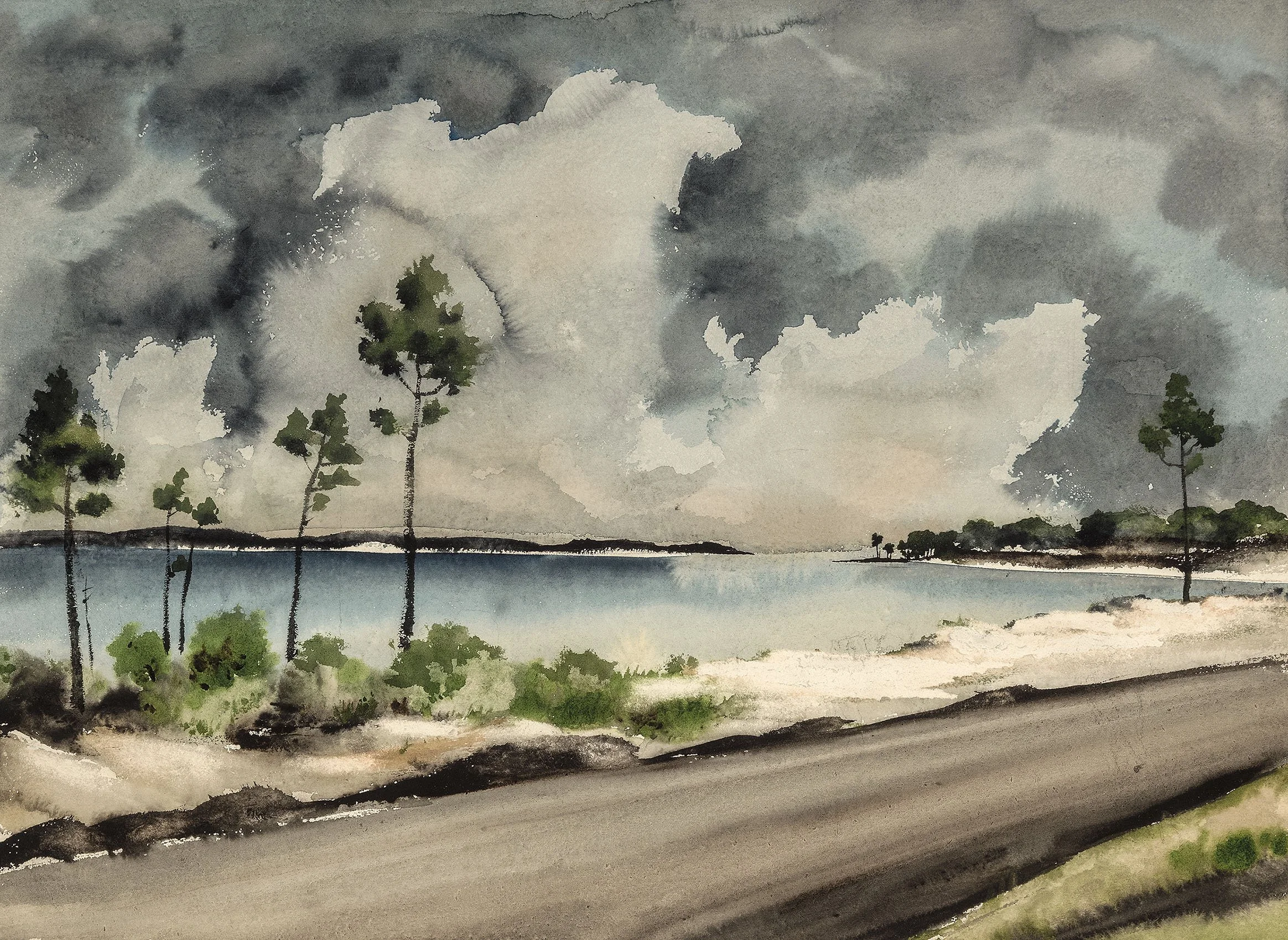
Palm Beach developed in the mid-1890s when Henry Flagler extended his railroad to link coastal cities from St. Augustine to Key West with luxurious hotels along the line, some using Addison Mizner’s exotic Mediterranean architecture. Flager built his own palatial home, Whitehall, which he moved into in 1902. Adolf Dehn (1895-1968) was in Palm Beach from 1949-1951 teaching at the Norton Gallery and School of Art. This allowed him the time to create a substantial body of work in Florida. Our Terra Florida exhibition includes a rare large ink and wash painting executed in 1949 by Adolf Dehn to capture one of Florida’s stormy moments when a hurricane hit West Palm Beach.

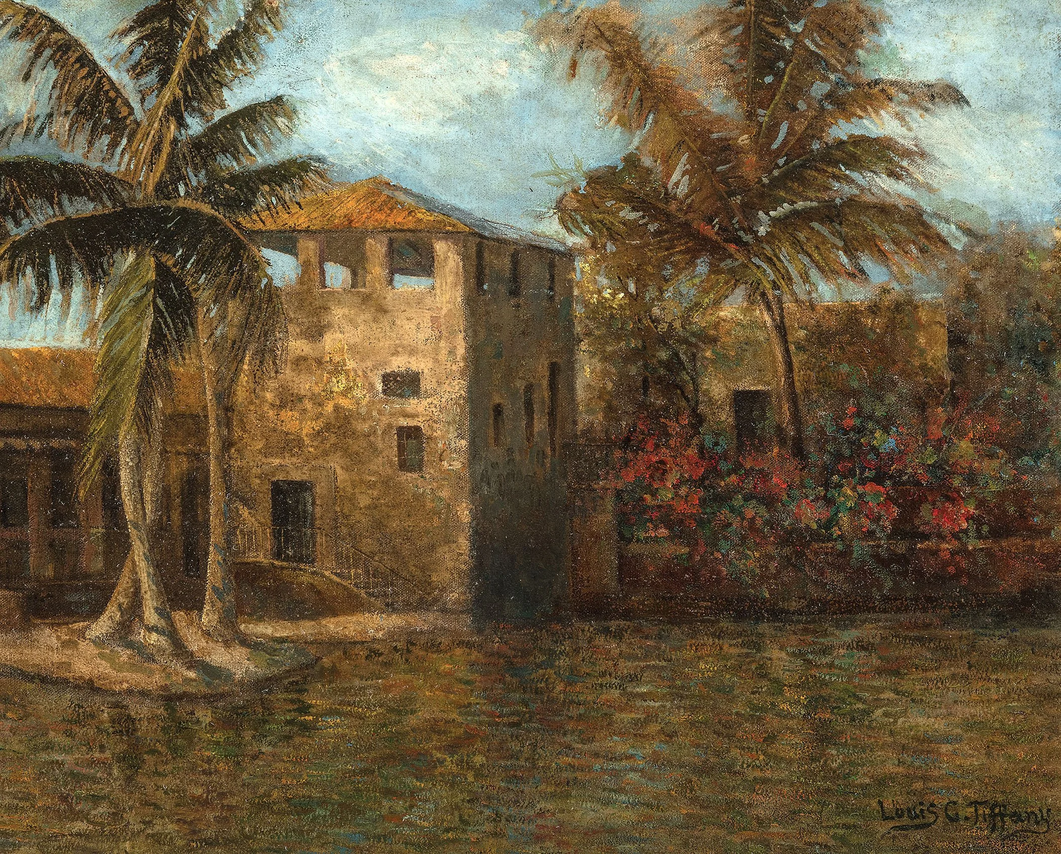
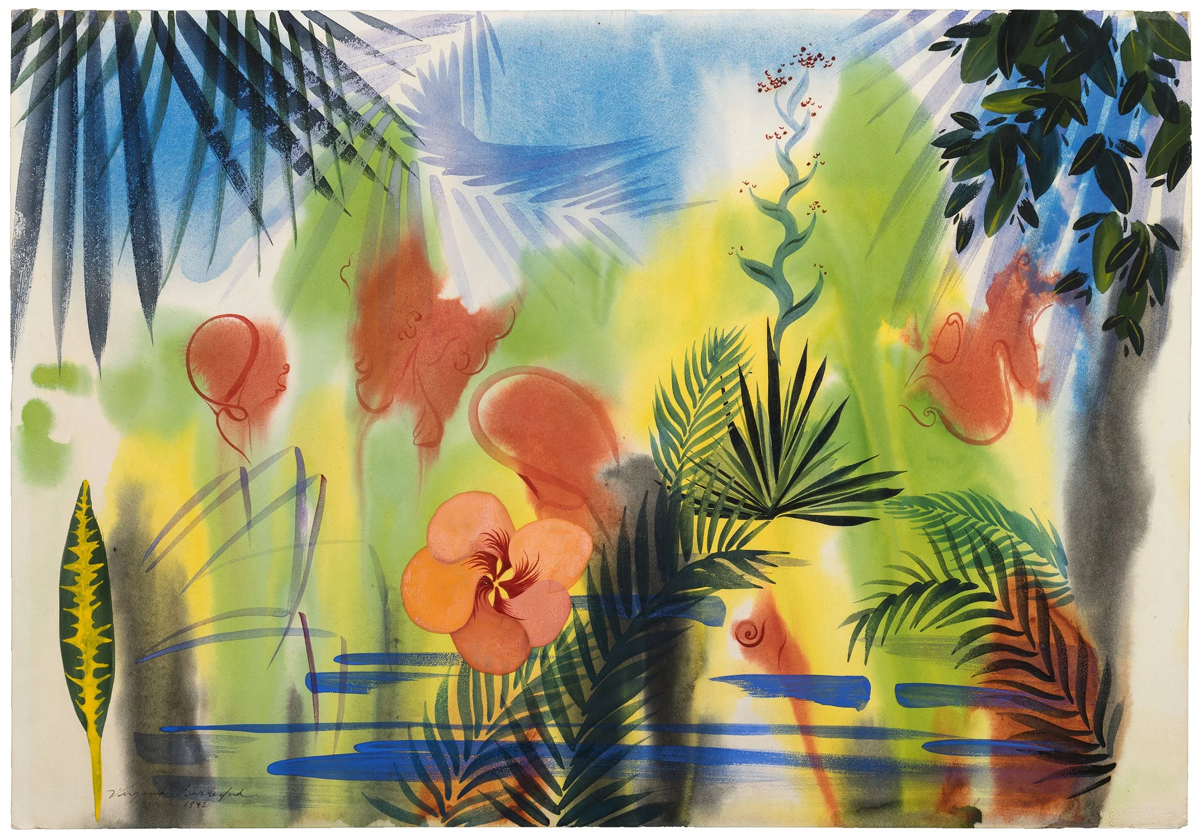
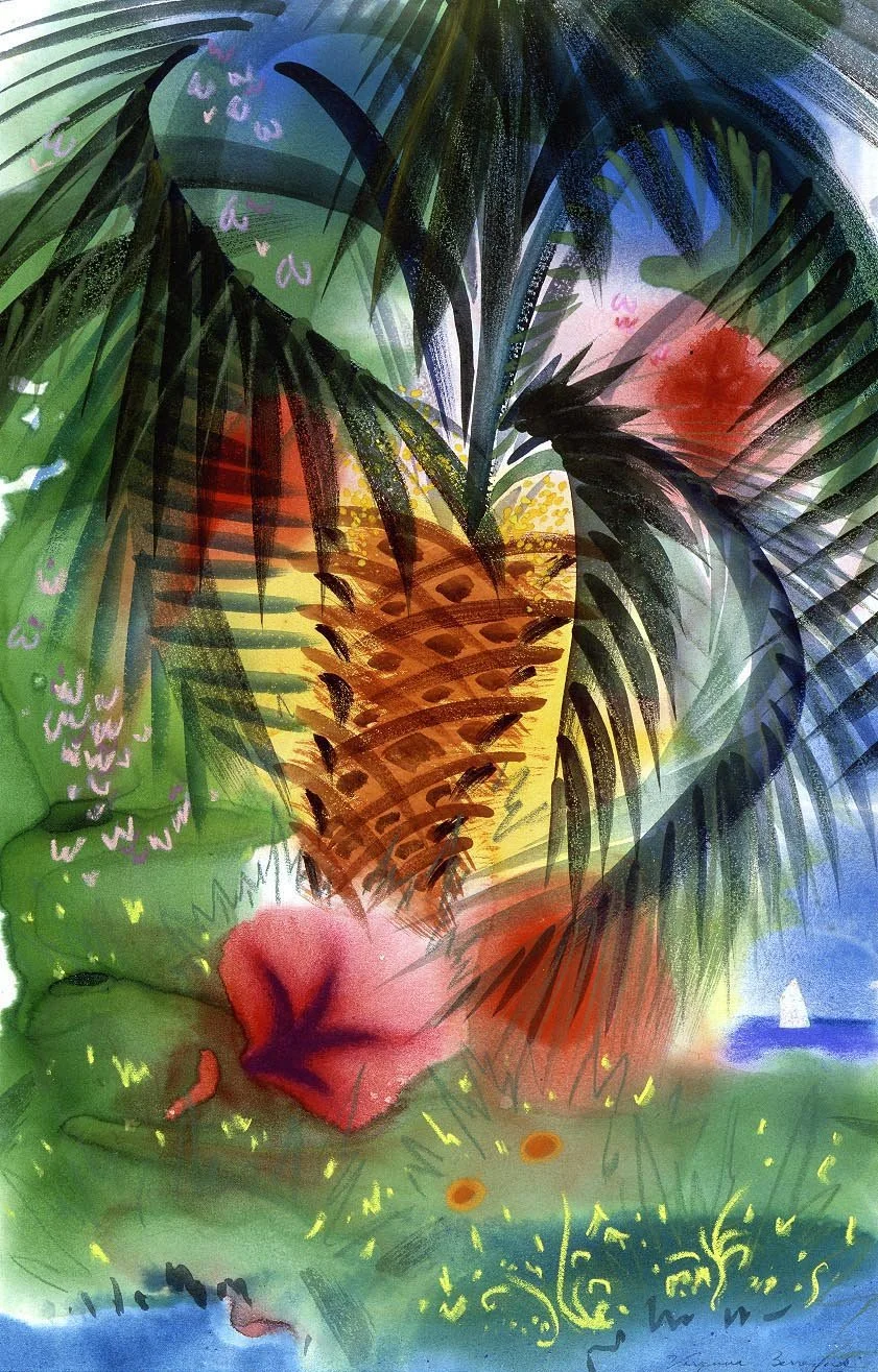
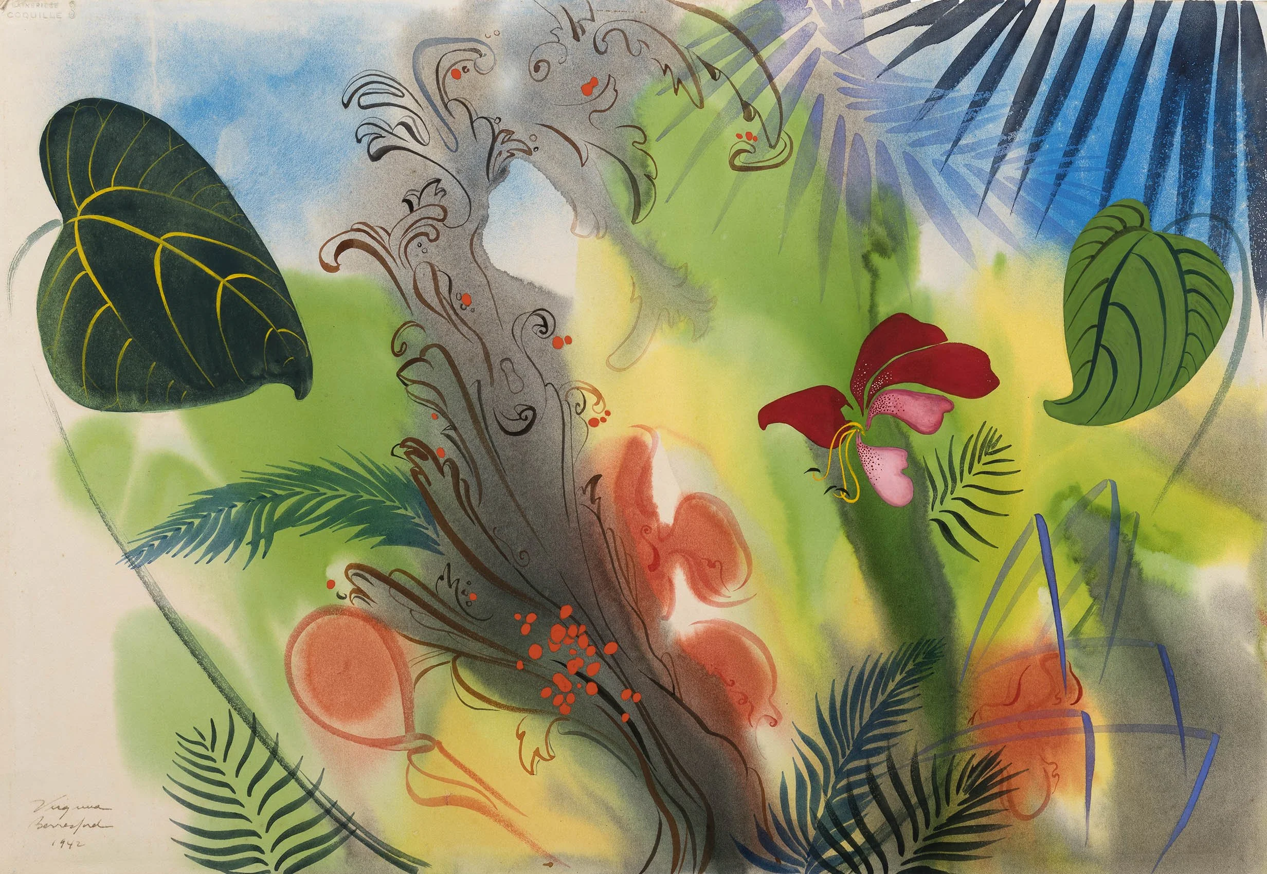
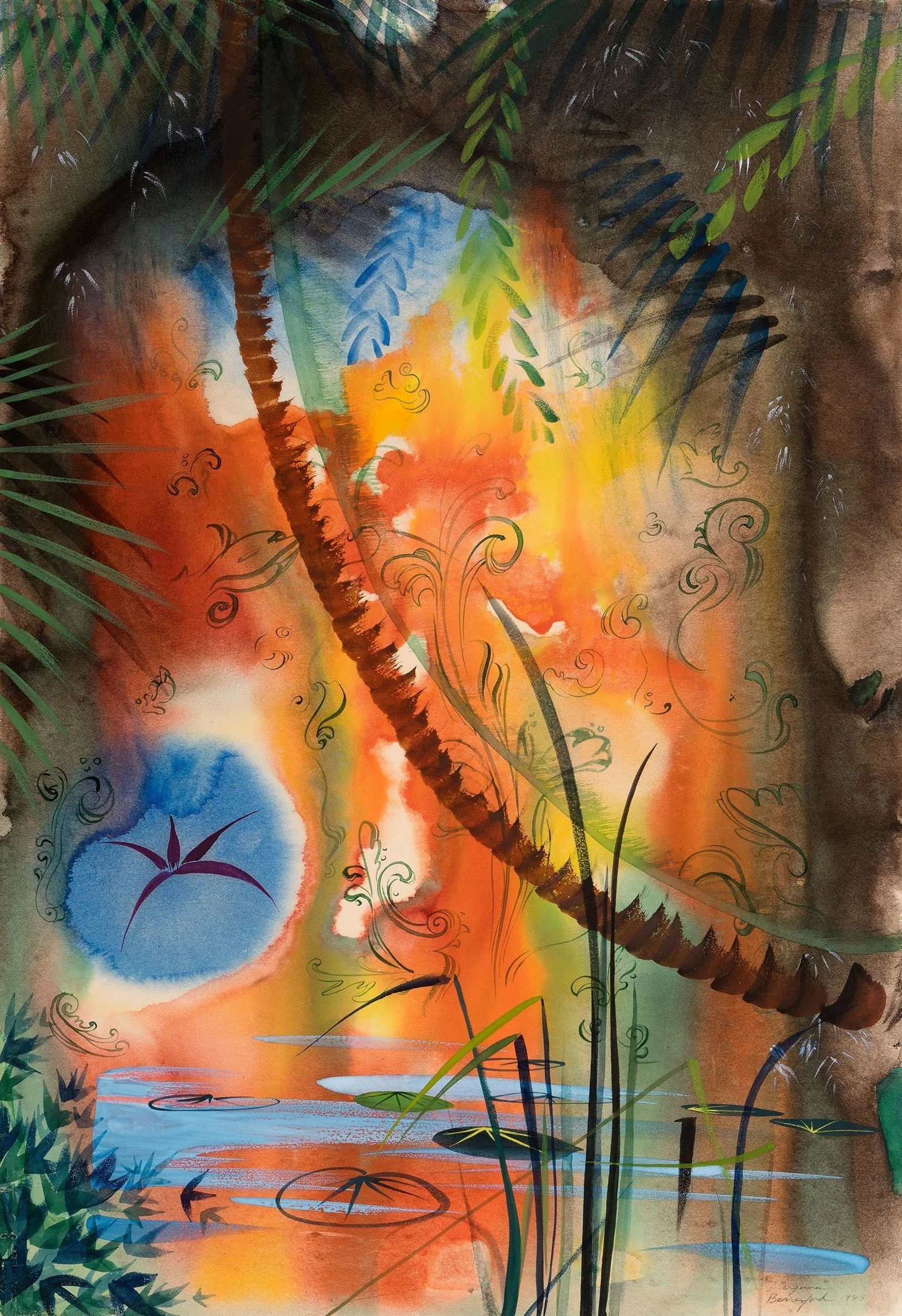
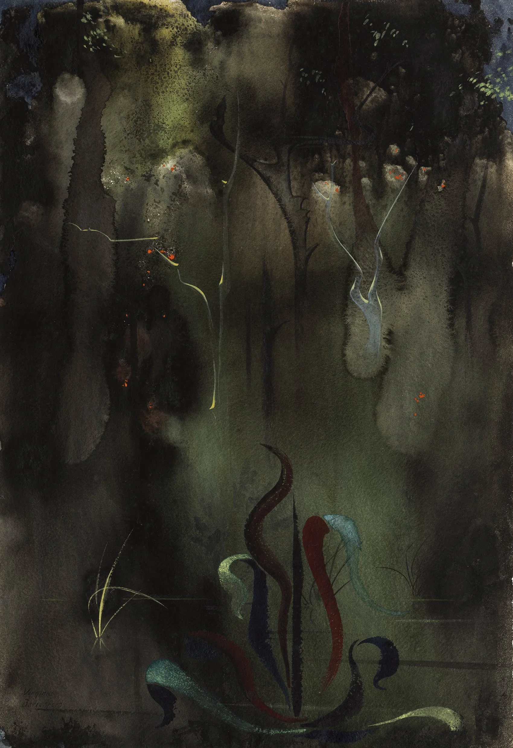
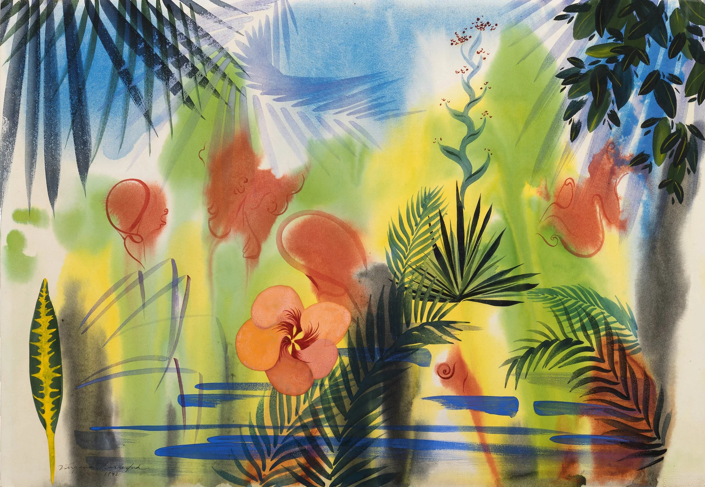
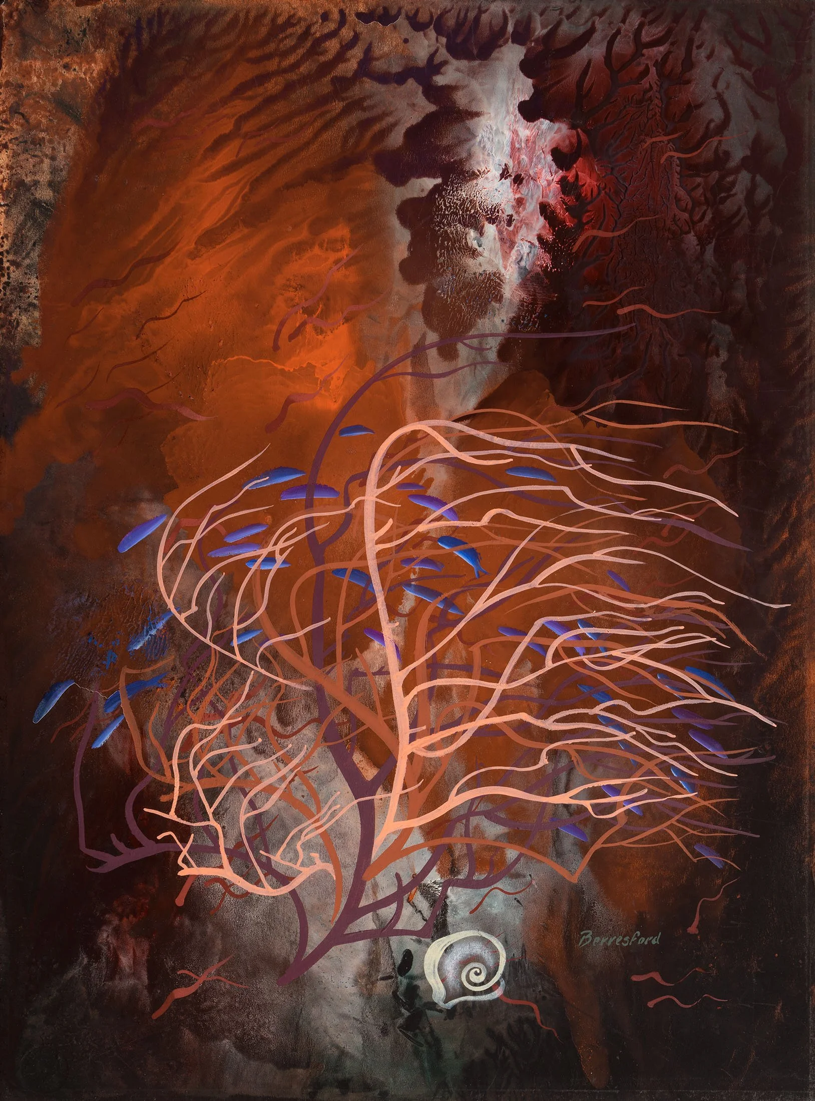
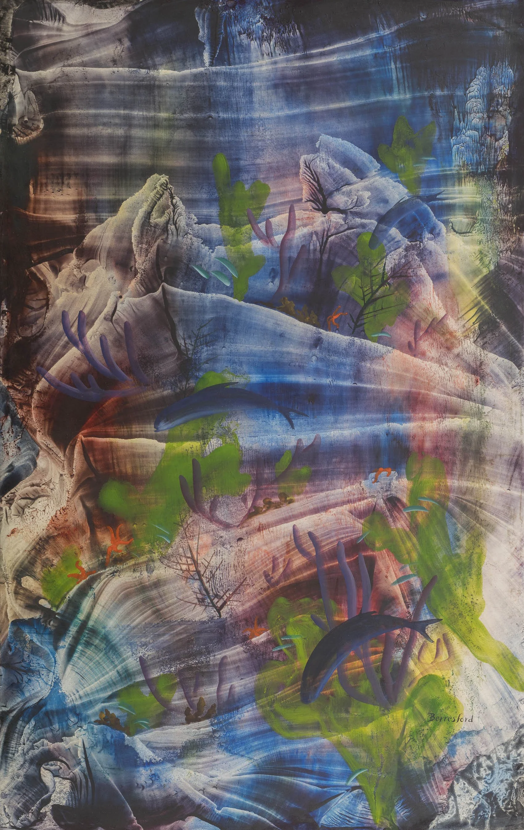
Another important Florida city is Miami, reached by Flagler’s East Coast Railway in 1896. The great designer and artist Louis Comfort Tiffany (1848-1933) first visited Miami in 1917, building his house Comfort Home there from 1921 to 1923. Tiffany was in Miami to experience the 1924 opening of George Merrick’s Venetian Pool, a rock quarry transformed into a Mediterranean style public swimming pool, in Coral Gables. Tiffany painted the Venetian Pool in a subdued palette and softened light emphasizing the architecture of the pool buildings. The Mediterranean architecture of Venetian Pool was soon replaced by Miami Art Deco. In the 1930s streamlined housing came to Miami aided by the Miami architect Robert Law Weed who created the Florida Tropical Home for the 1933 Century of Progress International Exposition in Chicago. The modernist New York artist Virginia Berresford (1904-1995) began to winter in Miami in 1943 when her Navy husband Lieutenant Commander Benedict Thieland was stationed there. Berresford remained in Miami until 1950. Prior to that, Berresford wintered in Key West from 1934 until her move to Miami. Florida’s intense light and shadow and new flora and fauna inspired Berresford to work in watercolor using daring free strokes and bright colors, loosening the flat hard planes of her earlier geometric style. These works were a success, resulting in solo exhibitions in New York at Montross Gallery in 1934, the Walker Gallery in 1936, and Marie Sterner Gallery in 1938. Berresford joined the war effort by volunteering for the Miami Red Cross to teach watercolor technique to hospitalized soldiers.

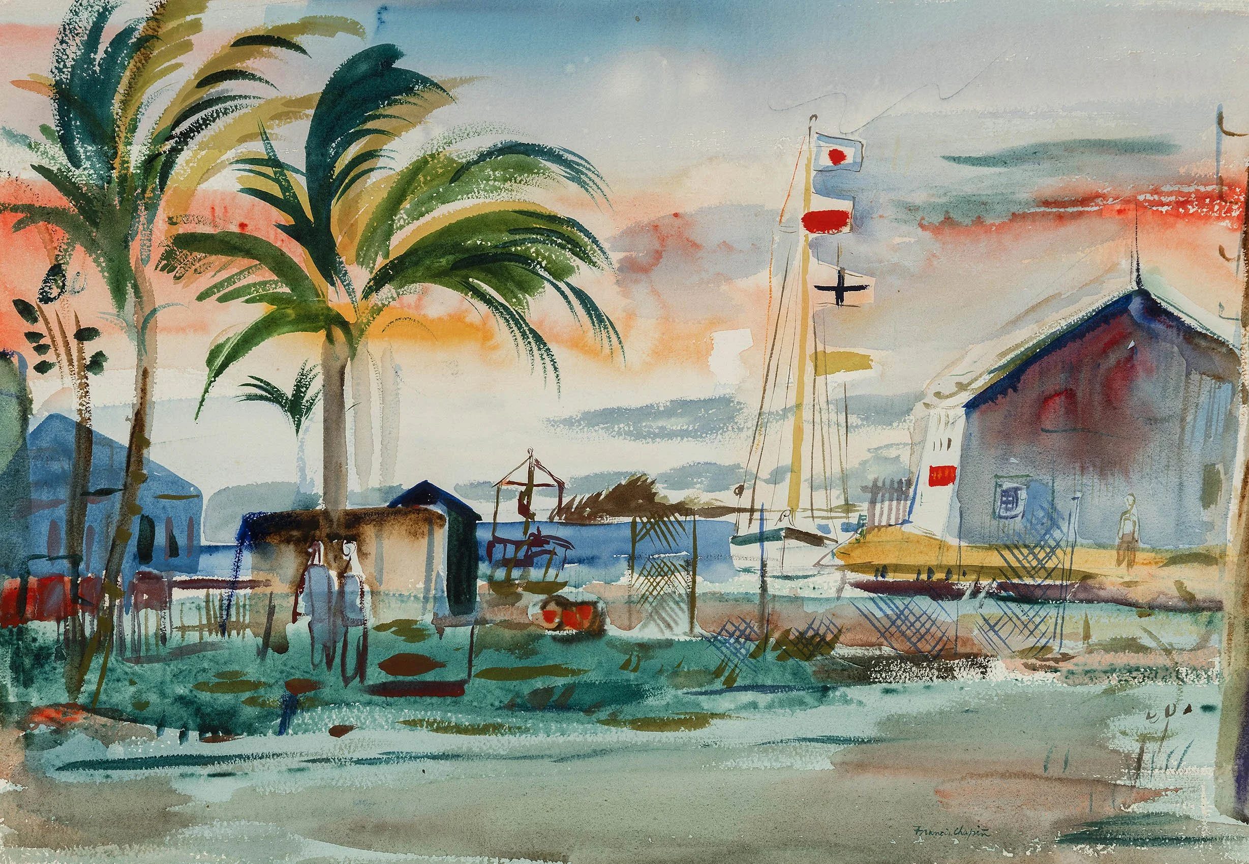
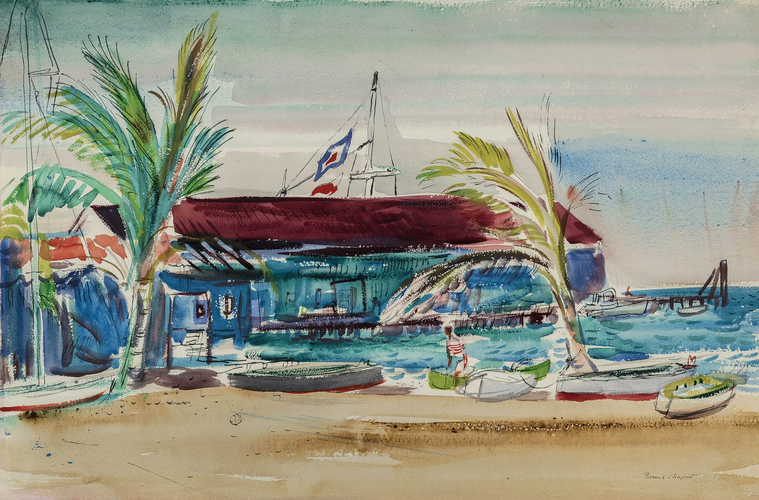
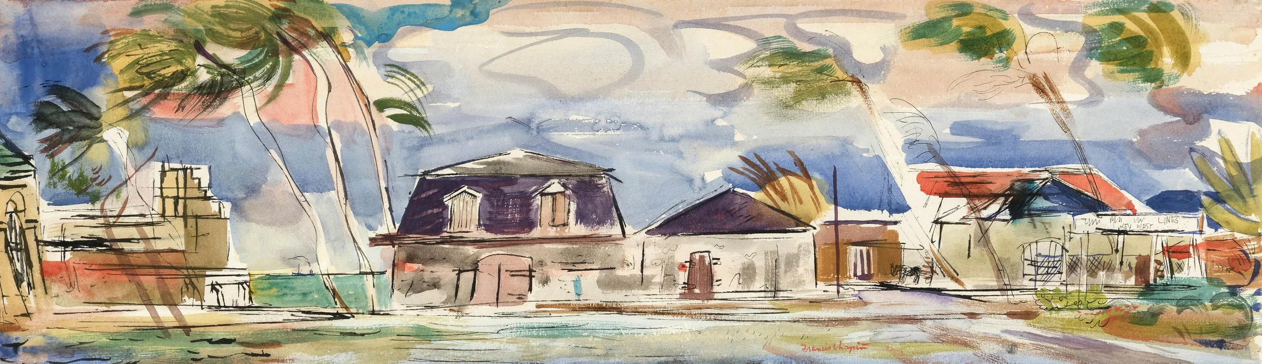
Key West, the southernmost city of the continental U.S., was famous for salvage from local ship wrecks, fishing, salt production, and cigar making. The Overseas Railway was constructed to connect the island with the mainland in 1912. However, a hurricane demolished the railroad in 1935 and it was replaced by the Overseas Highway which put Key West in touch with Miami. Adolf Dehn (1895-1968) was often in Key West from 1945-1948. Our exhibition offers Key West Beach Scene, 1948 in which the artist captures some of the eccentric characters seen on the beach. Dehn also visited the Florida Panhandle, spending time in Pensacola in 1938 and 1942 where he did the watercolors we are showing: Beach Near Pensacola and Sand Dunes, Pensacola. Francis Chapin (1899-1965), a Chicago Modernist, first visited Orlando in 1929 when his father retired there. A popular instructor at the Art Institute of Chicago’s School of Art from 1929-1947 and at the Institute’s summer art school in Saugatuck, Michigan from 1934-1938, Chapin was invited twice to be the visiting artist at Stetson University in Deland, Florida near Orlando. He taught there in 1947 and 1964. Chapin found the experience so wonderful he continued to winter in Orlando and Key West. Our exhibition offers five watercolors of Key West subjects, including the marina and the bustle of the town with its shops and traffic.

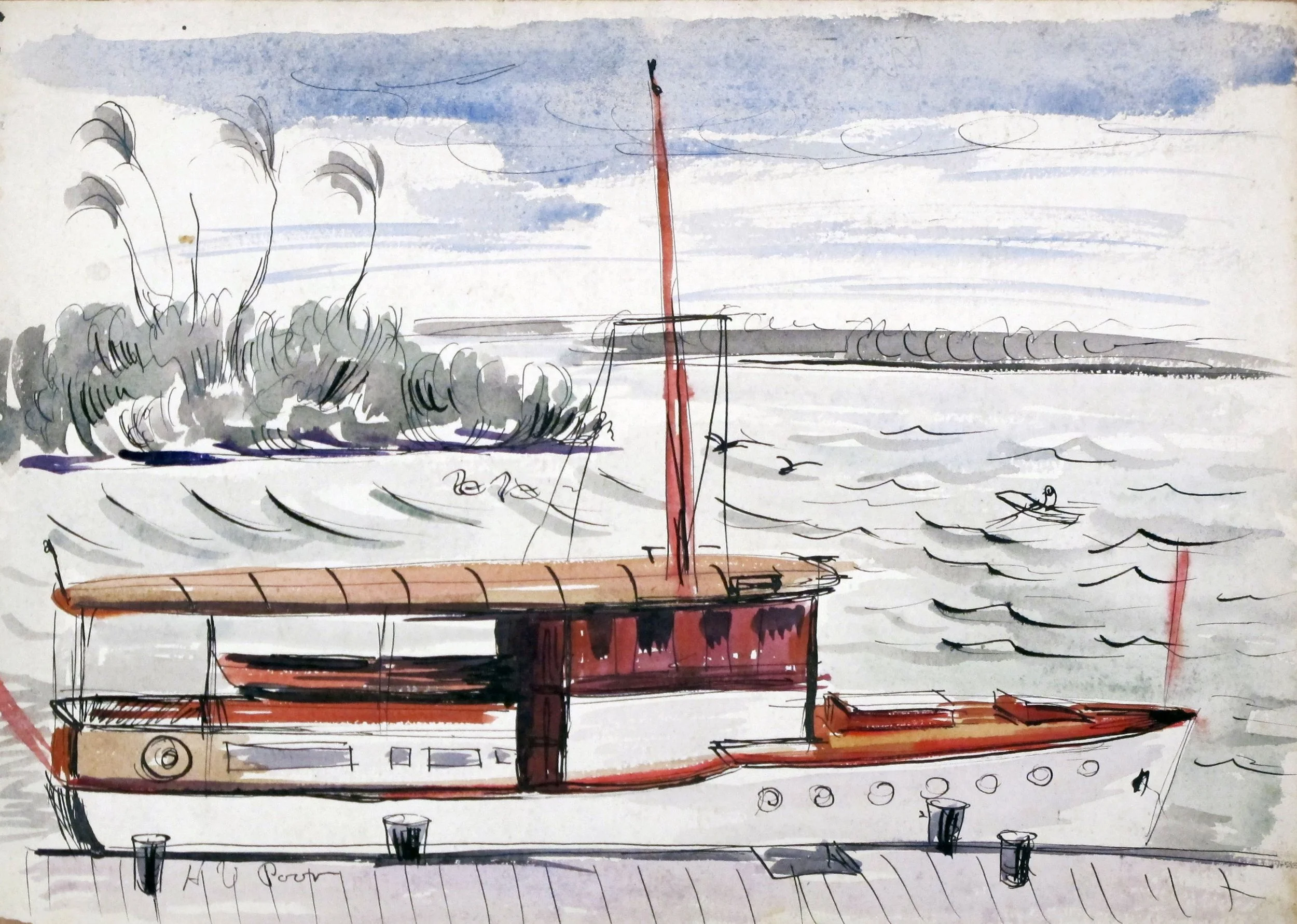
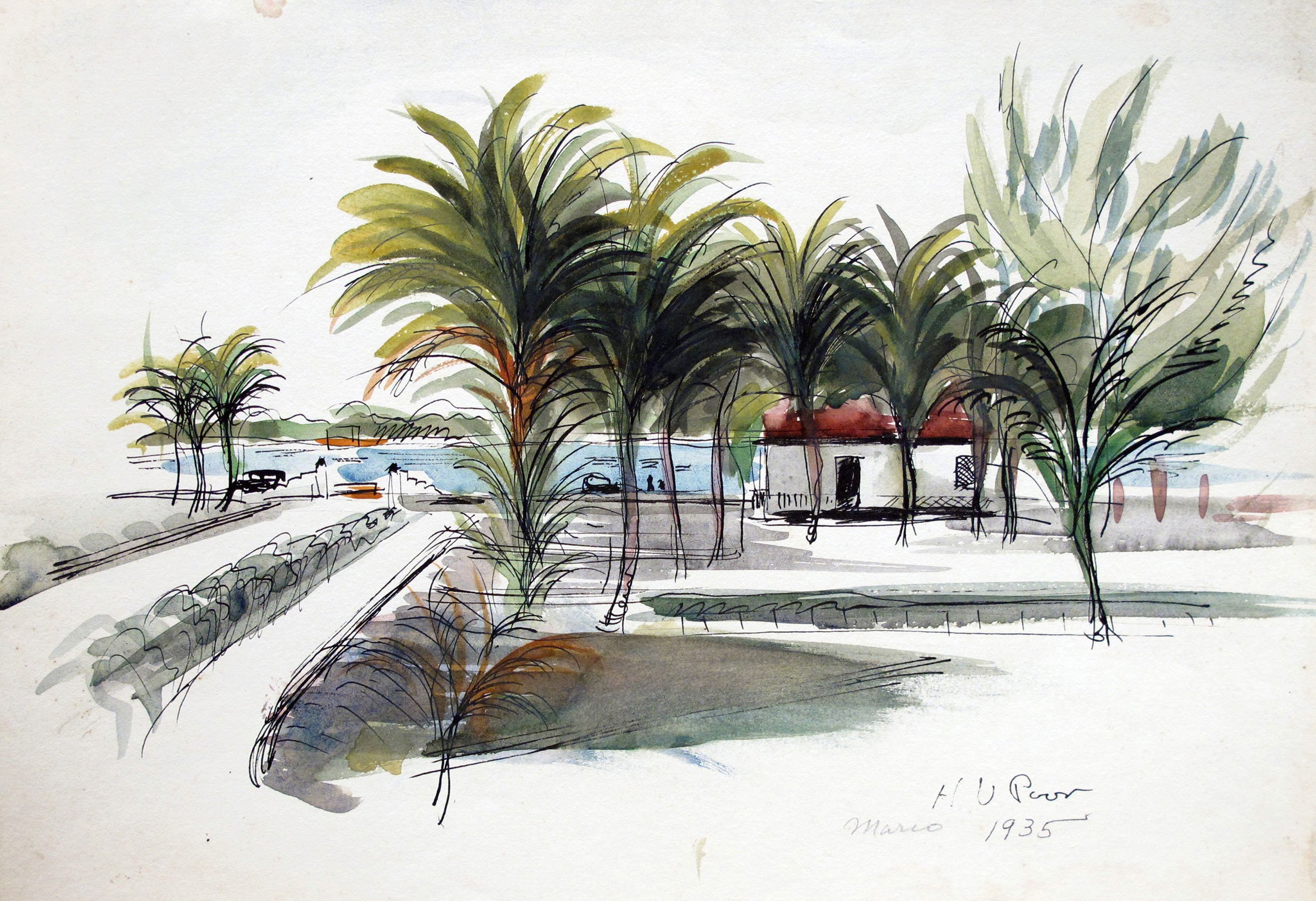
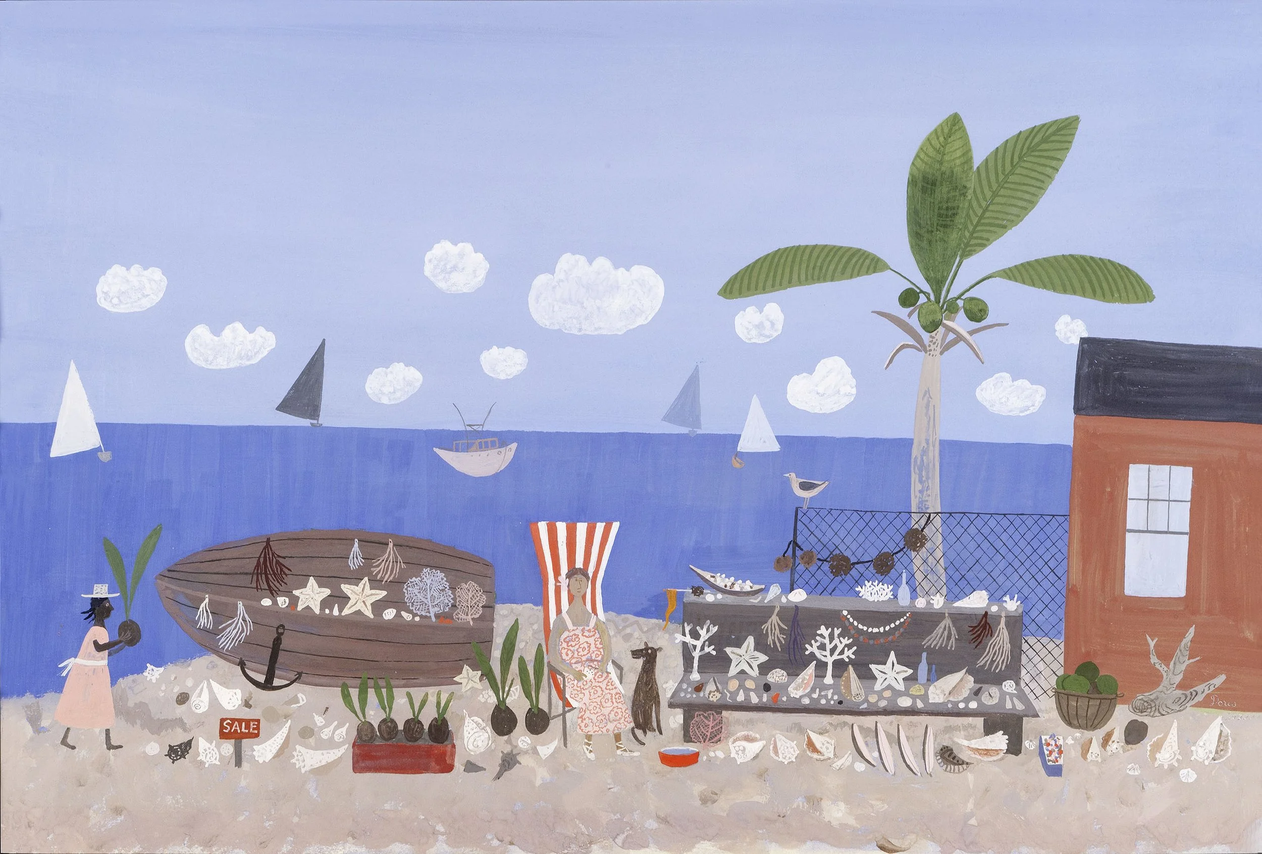
Kansas-born artist, Henry Varnum Poor (1888-1970) came to Florida the winter of 1929-1930 when he took a break from producing his successful ceramics to shift his focus back to painting. Poor first went to Naples, Florida in the winter of 1929-1930, but finding the town too populated for his taste, Poor choose nearby Marco Island for his winter retreat. At Marco Island, Poor felt in tune with nature and painted the three watercolors offered in our exhibition: Marco Island Fish House, 1930; Docked Yacht, 1935; and House, 1935.

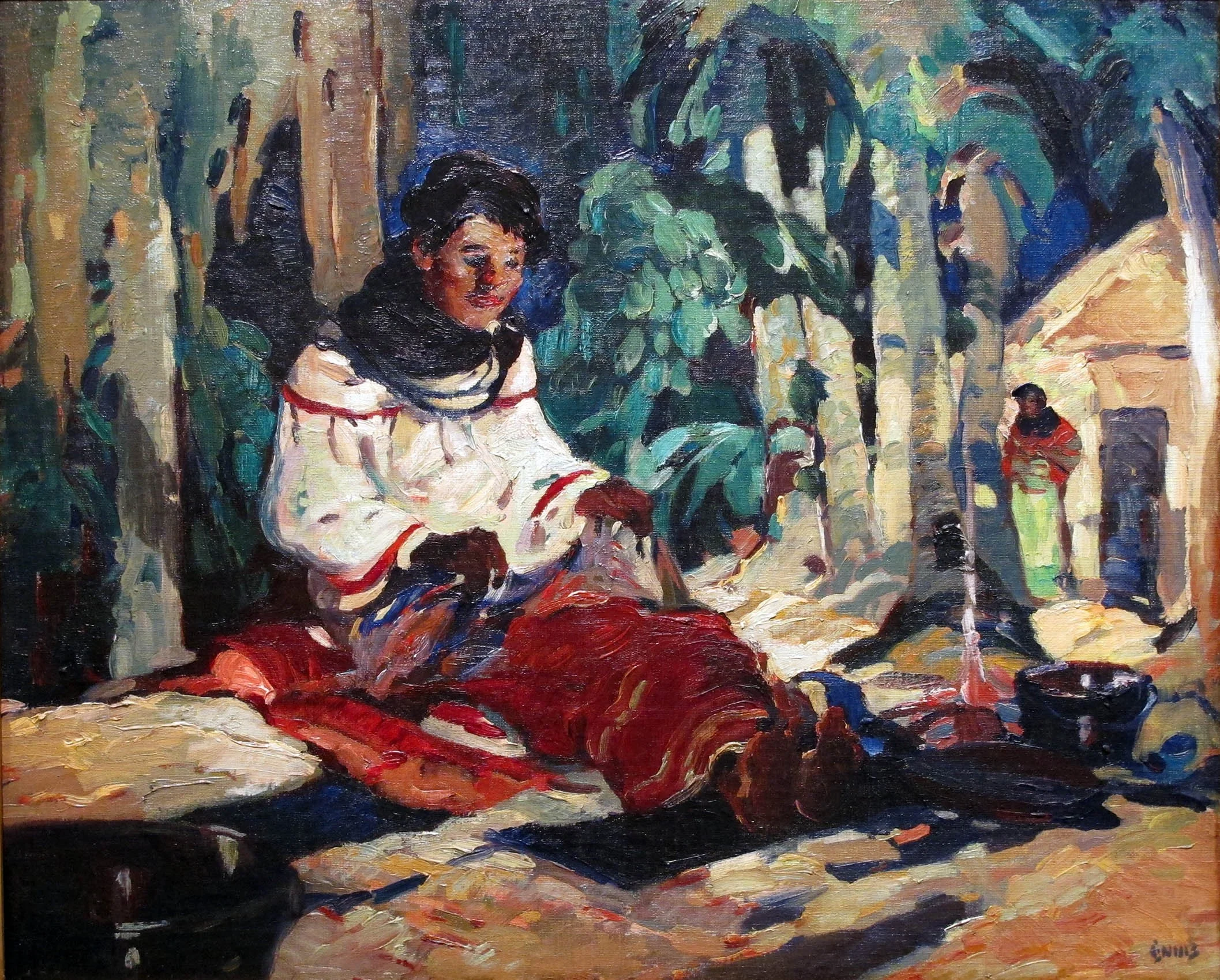
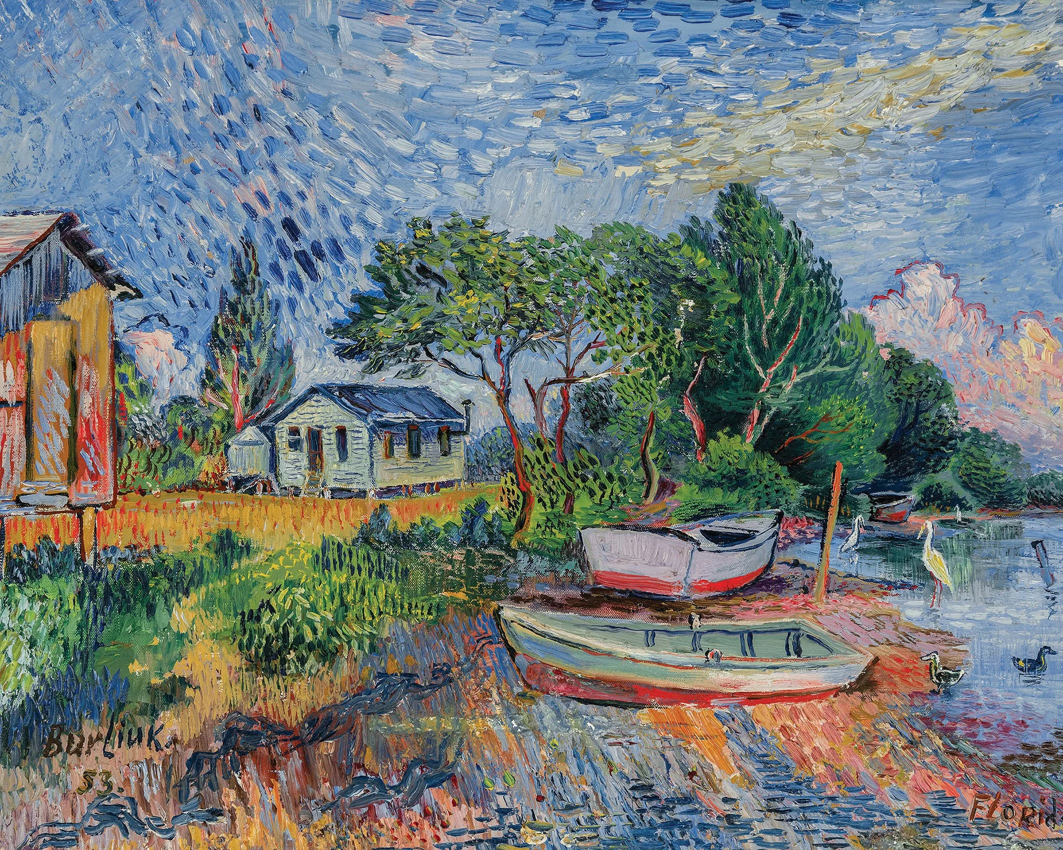
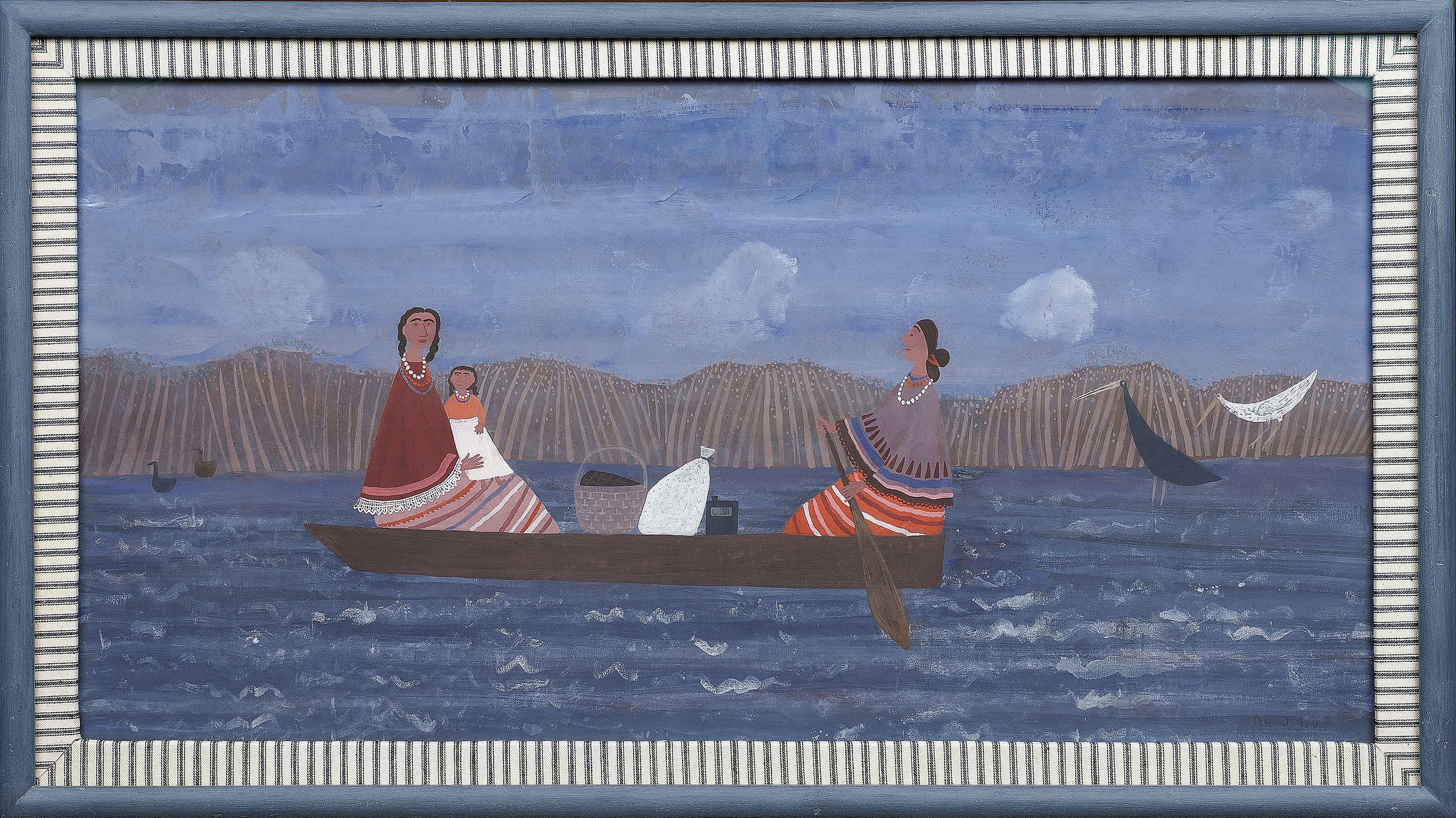
Sarasota is another city that attracted artists. It began as a military fort in 1842, incorporating as a town in 1903 when it was reached by rail service. John Ringling’s arrival in 1912 shifted the town from agriculture (it was known for its celery crop) to a tourist center. By the early 1930s, Sarasota had an air strip, baseball diamonds for the New York Giants and the Boston Red Sox, and a municipal golf course built and dedicated by Bobby Jones. Ringling developed homes, hotels, an art museum, and brought Ringling Brothers and Barnum and Bailey Circus to Sarasota for winter quarters. In 1931 he built a Junior College and School of Art. The artist who oversaw the development of the teaching program at the Ringling School of Art was George Pearse Ennis (1884-1936). In Sarasota, Ennis was interested in the remaining Seminole tribes that lived along the edge of the Everglades. As an artist and designer of art glass, Ennis was taken with Seminole craft traditions, which led him to get to know and paint Seminole people. Our exhibition includes Ennis’s painting A Seminole Maiden in the Everglades, 1932. Another artist in our exhibition, Lucile Blanch (1895-1989) taught at the Ringling School of Art in 1936-1937 where she created the watercolor Ringling Work Horses. Blanch also visited one of the oldest towns along the east coast of Florida to research its history for a mural commission for the Fort Pierce post office. David Burliuk (1852-1967), a central figure in the Russian avant-garde who exhibited with the Blue Rider Group in Munich, came to America in 1922 and started wintering in the Sarasota area in the 1940s. He visited the barrier islands of the North Port-Sarasota area at Anna Maria Island and Longboat Key. He set up his studio each winter in Bradenton, which could be reached from U.S. 41 between Tampa and Sarasota. Burliuk’s painting Beached Boats, 1953 captures the beach, birds, boats, and blue sky that charmed Burliuk.

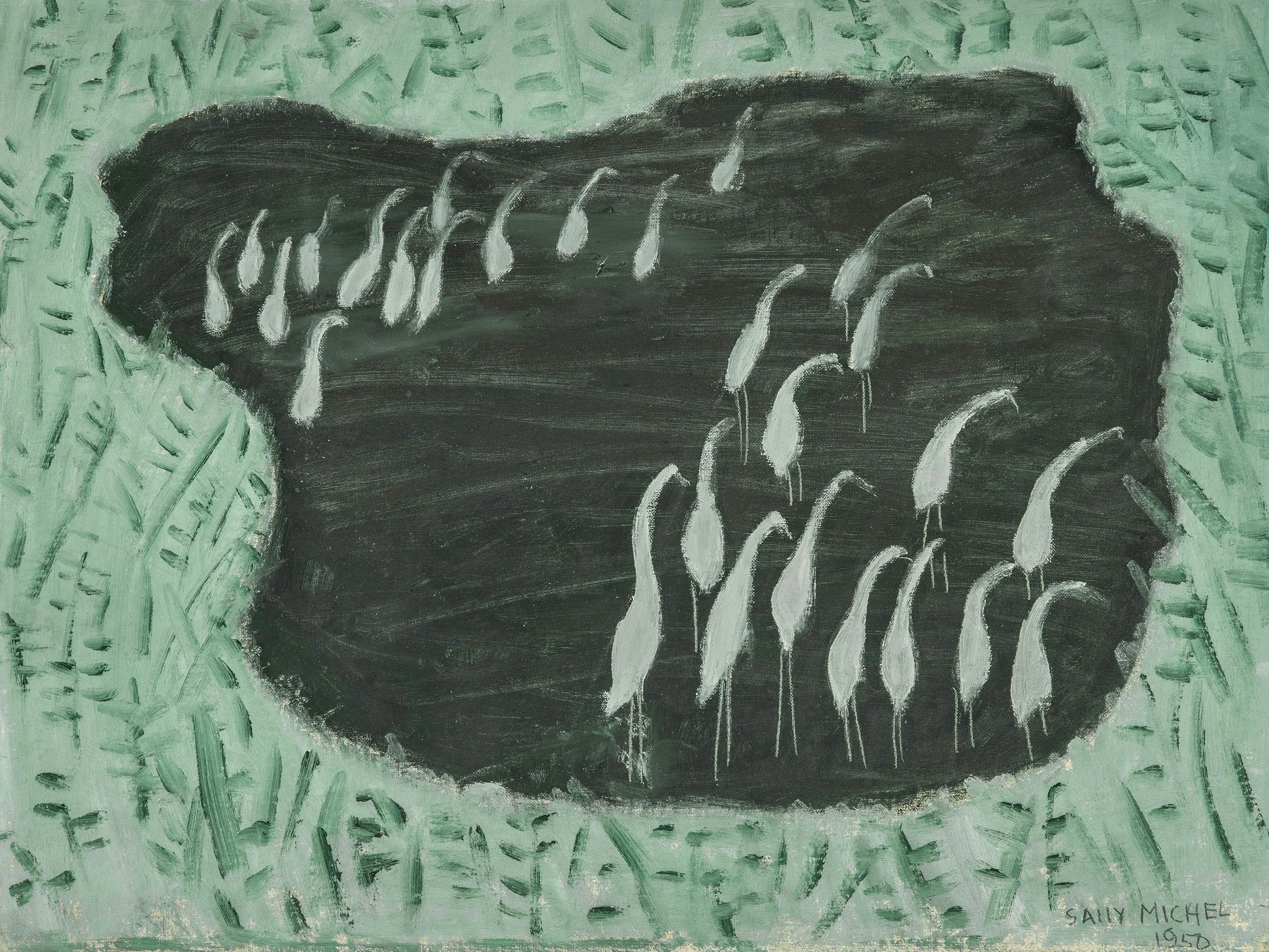
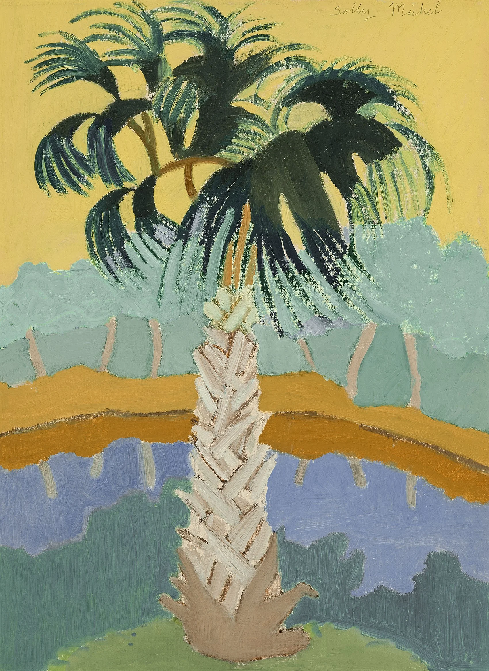
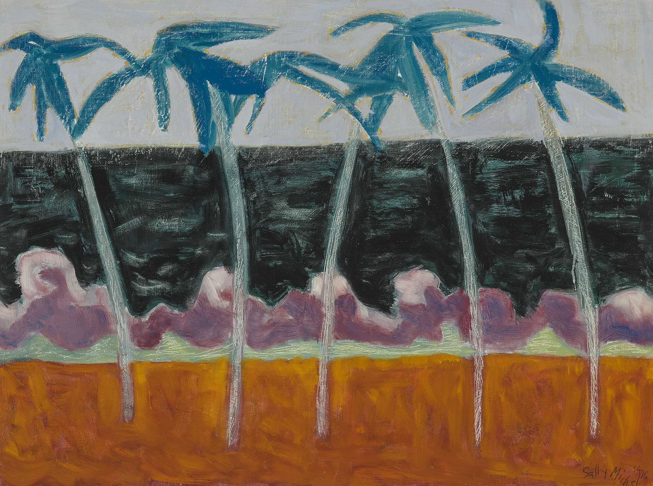
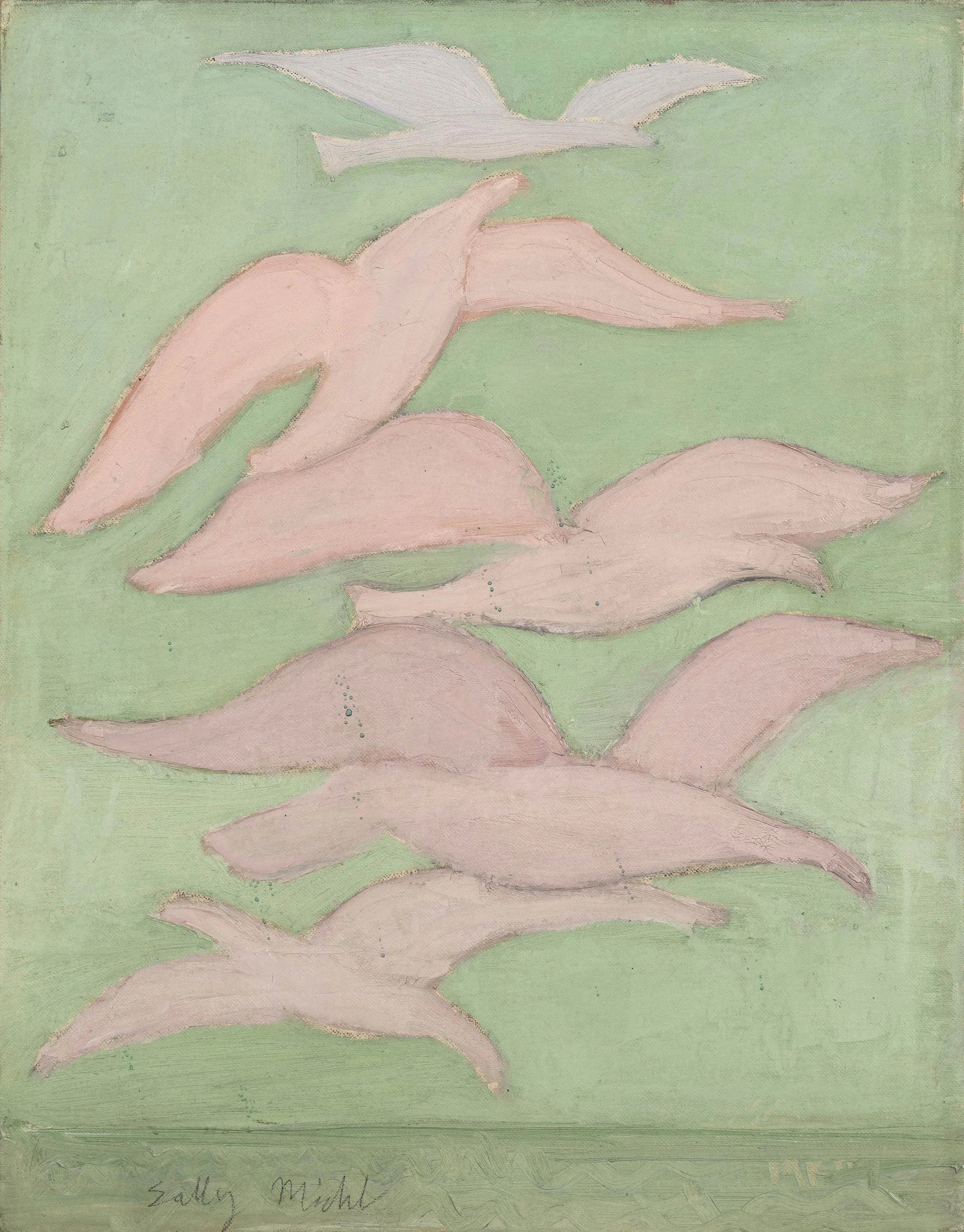
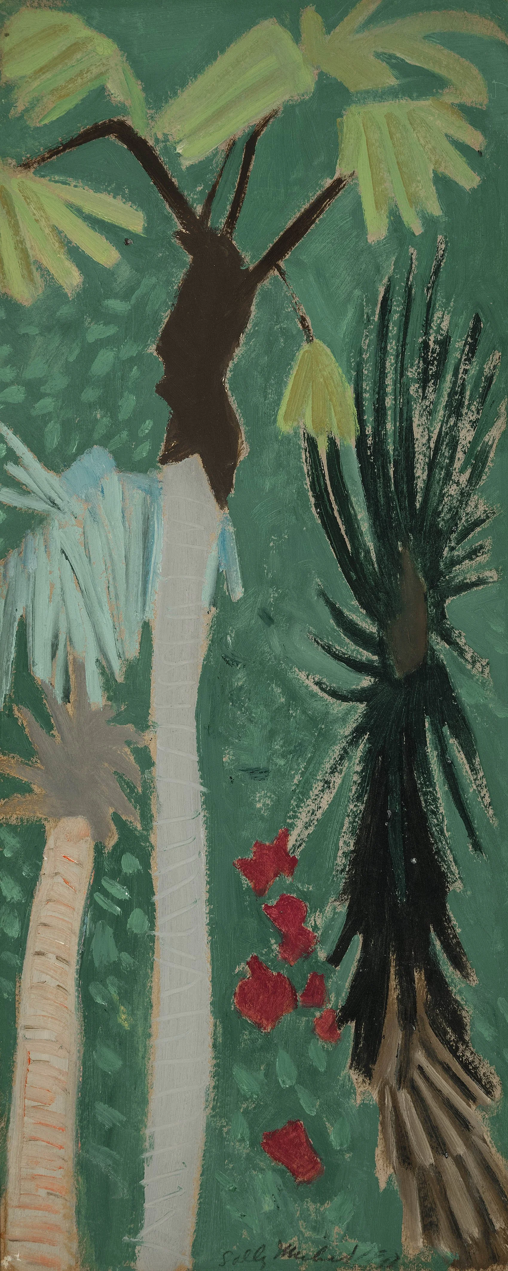
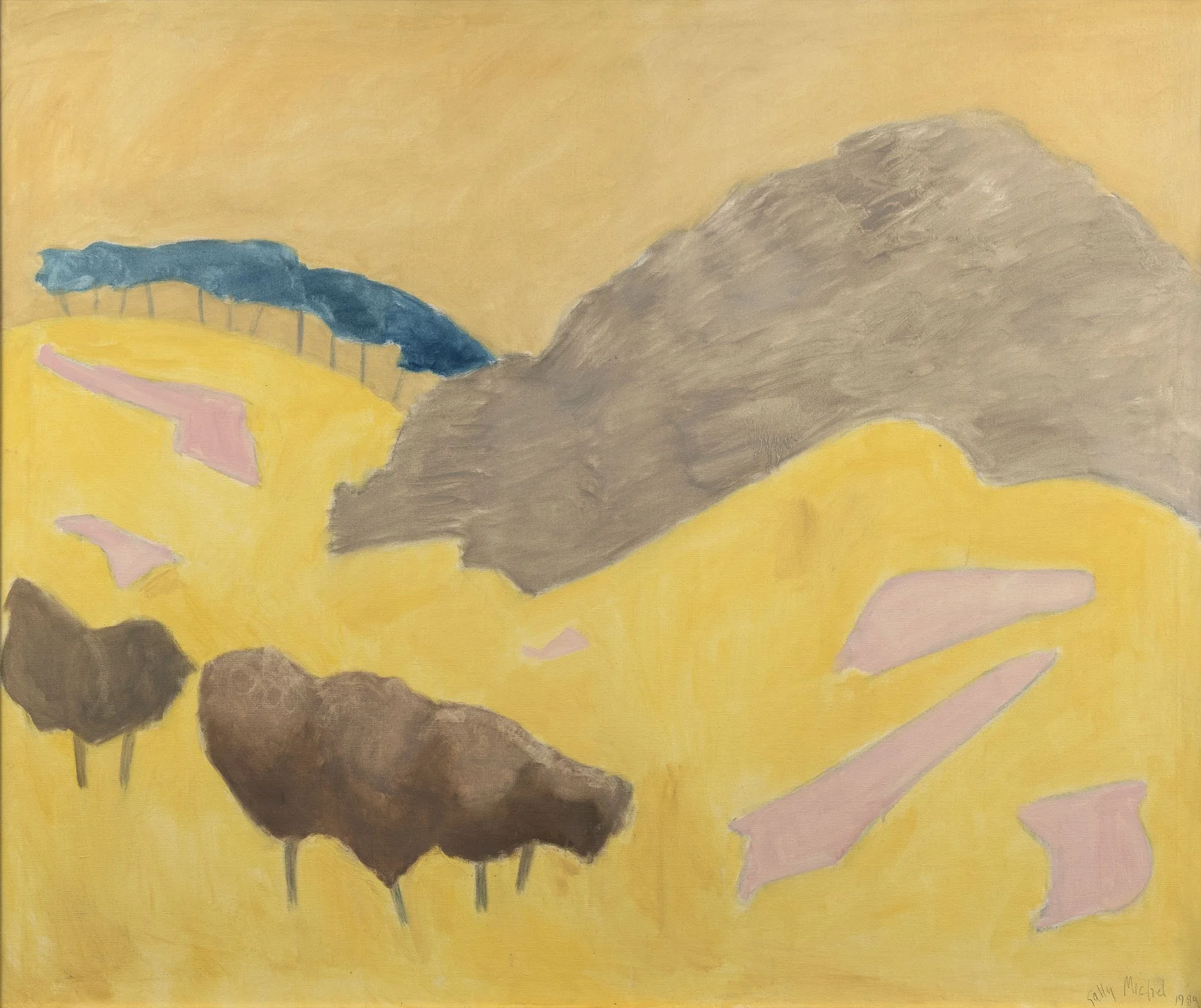
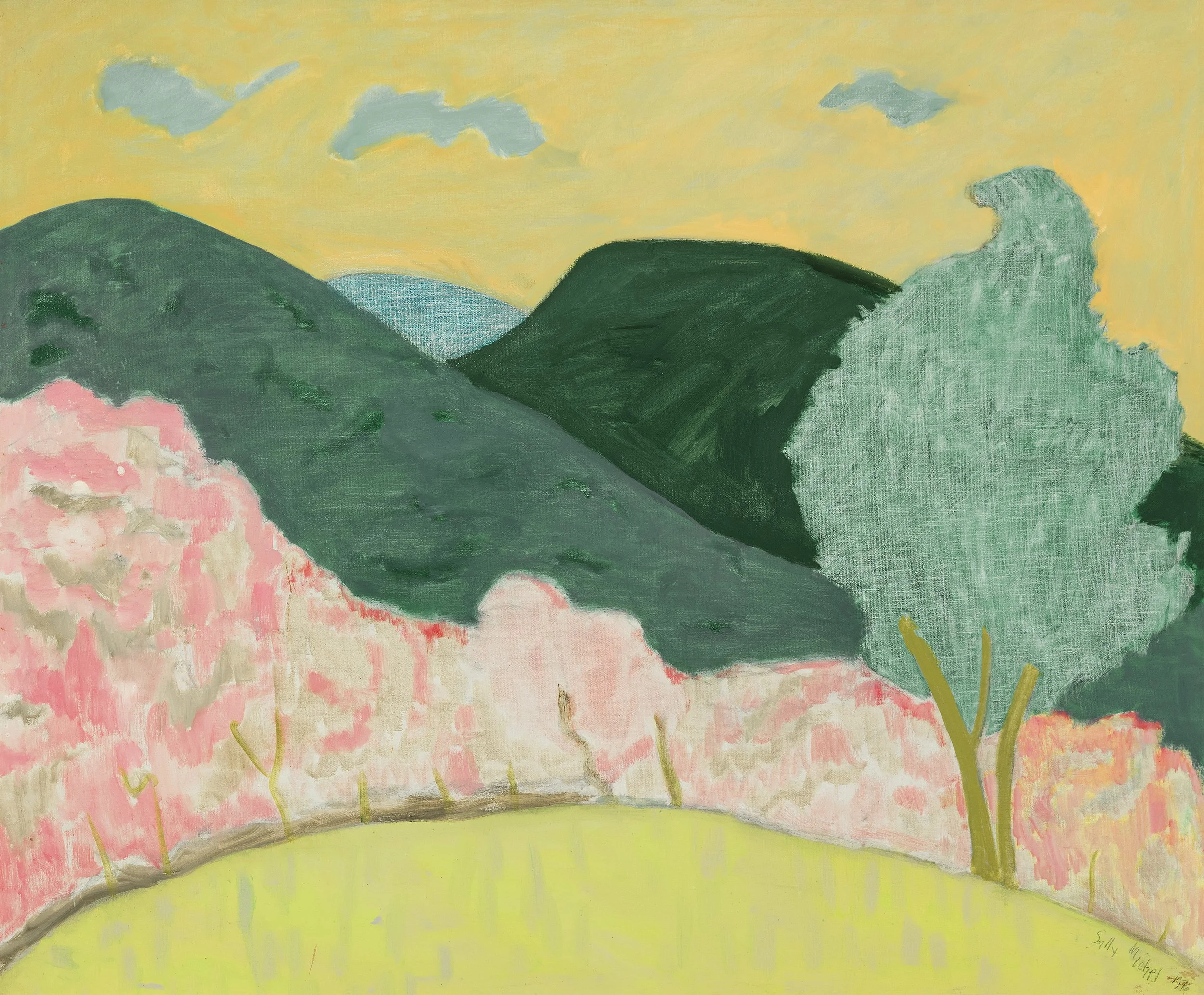
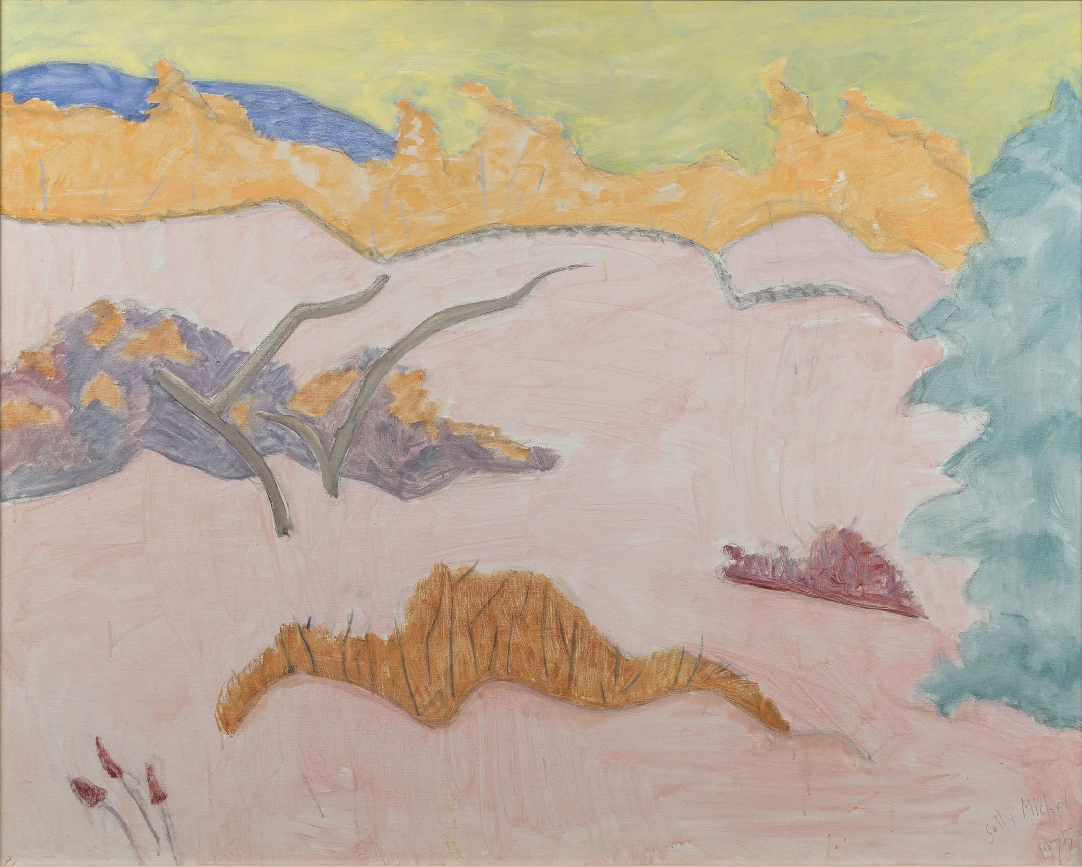
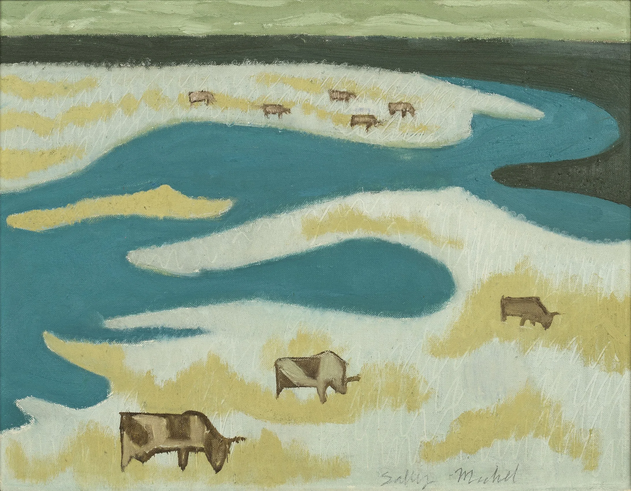
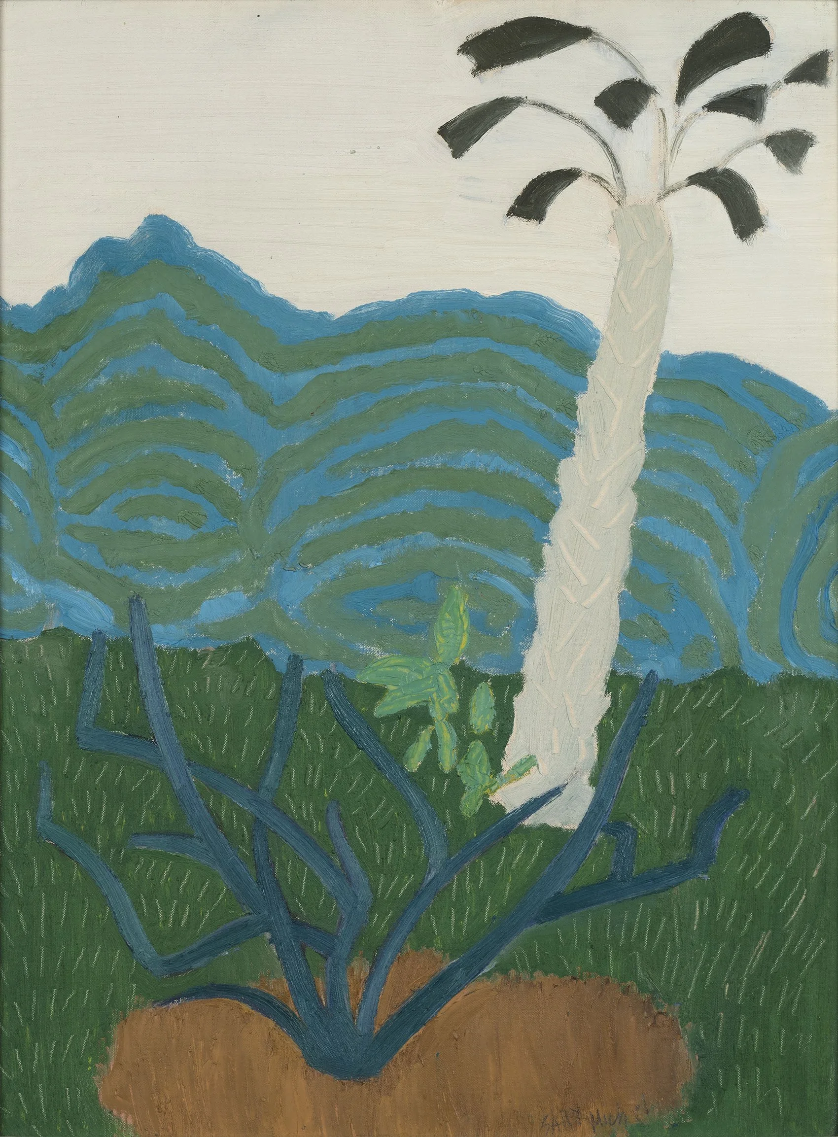
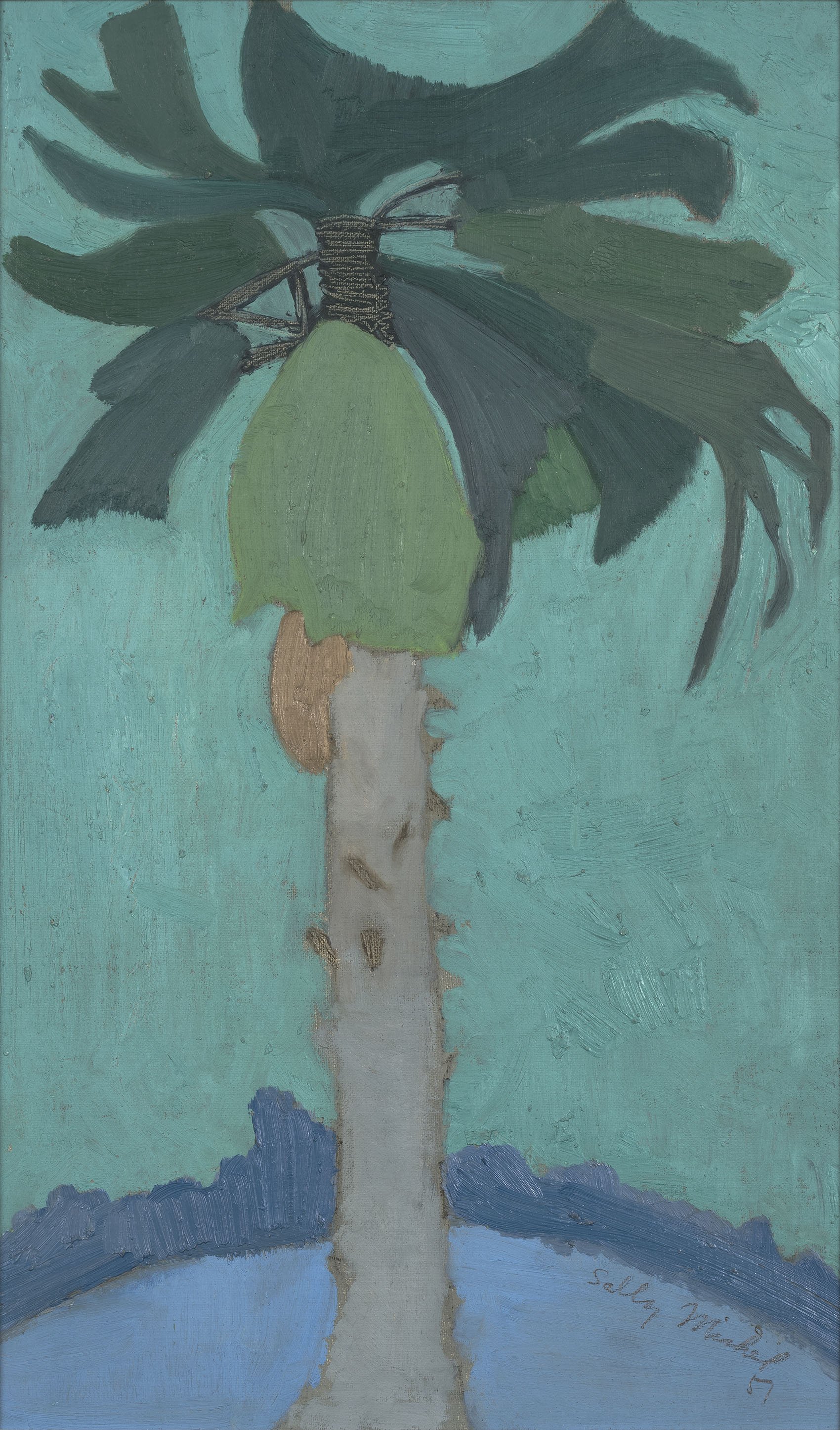
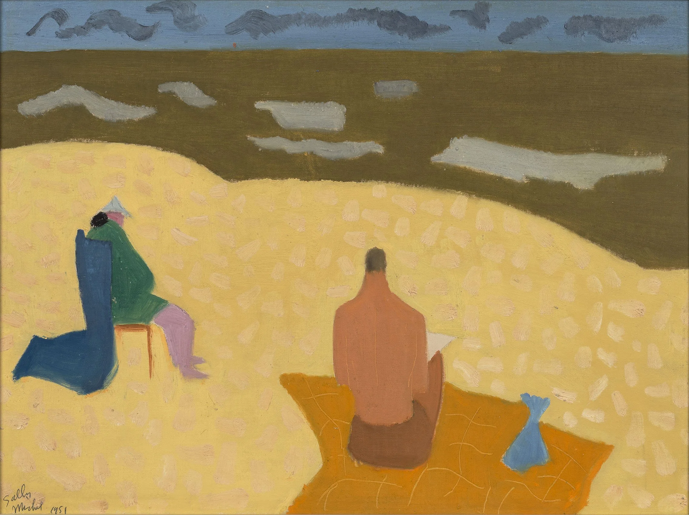
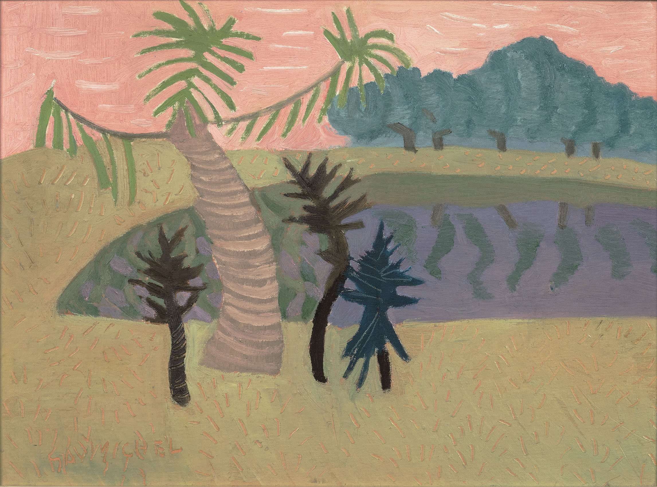
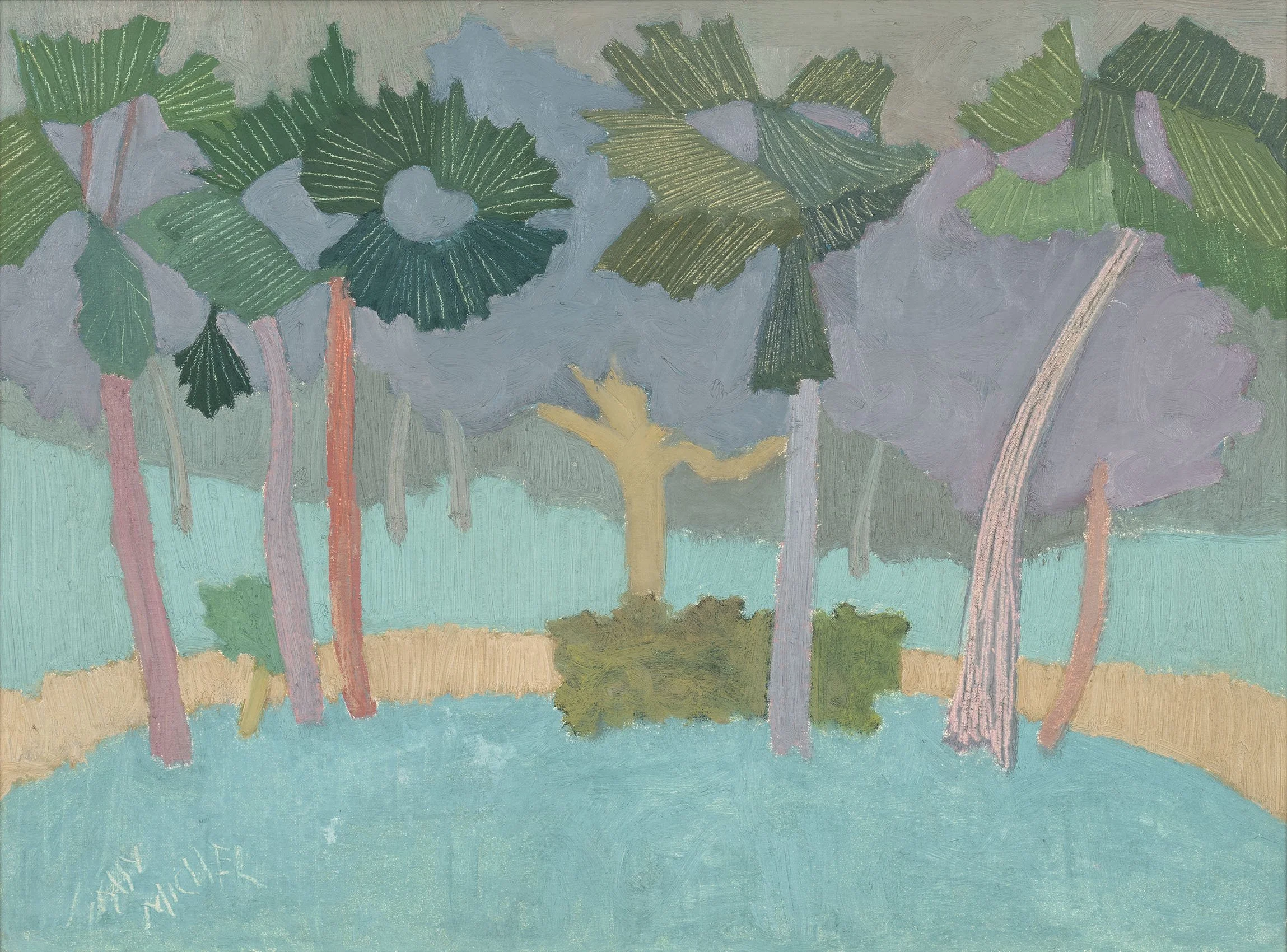
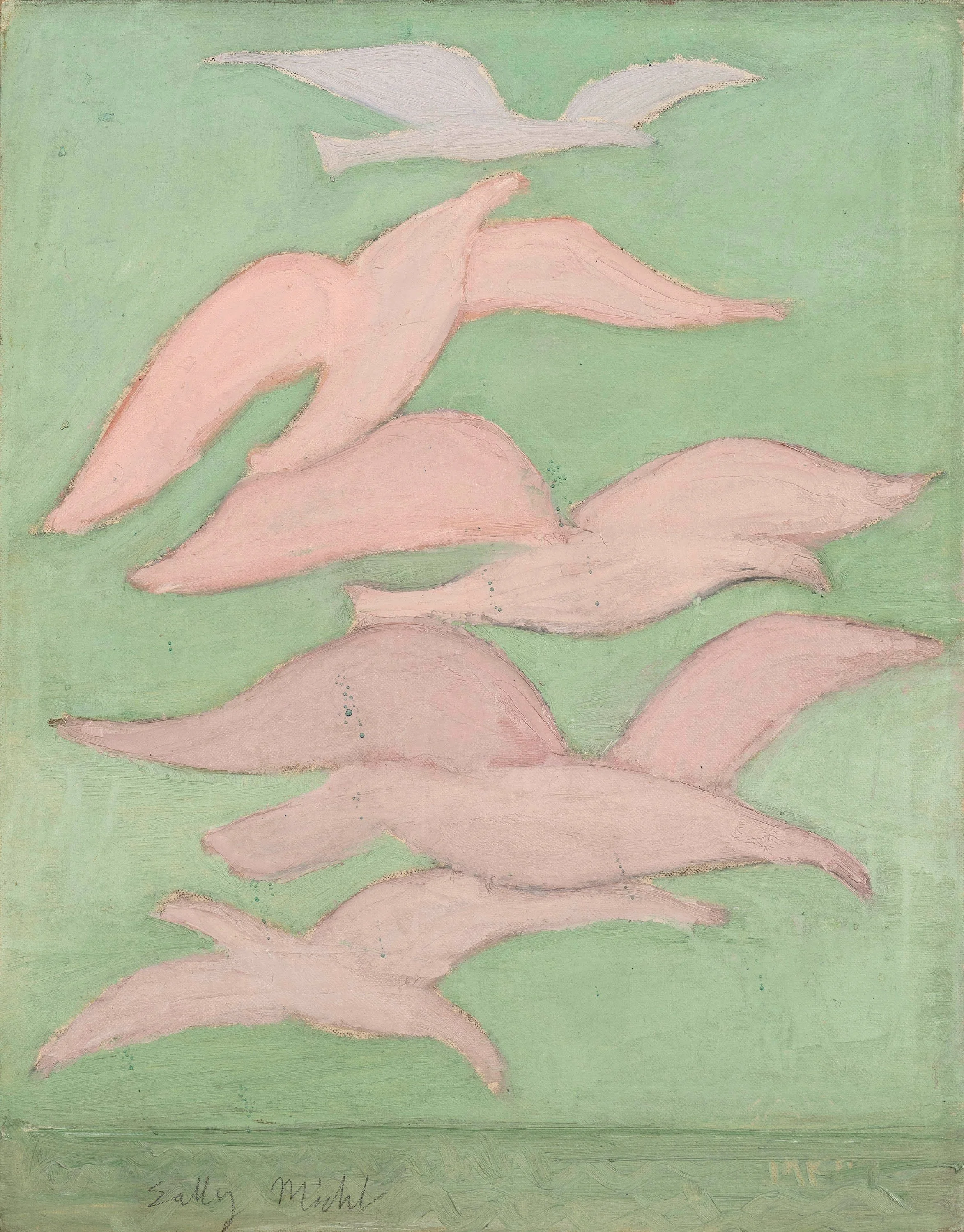
The Maitland Research Studio was an art colony outside Orlando, formed in 1937 by artist J. André Smith. The center offered unique architecture in its Mayan Revival style. Sally Michel Avery (1902-2003) and her husband, Milton Avery (1885-1965), spent the winters of 1949-1950 and 1950-1951 at the Research Studio where Milton received a Bok Fellowship. They came to Florida because Milton was recovering from a heart attack and his physician recommended Milton spend the winter in a warmer climate. While at the Research Studio, Milton focused on sketching subjects for watercolors and monoprints, which he could later develop into paintings in his studio. One painting by Milton Avery titled Florida Lake is offered in our exhibition. With freedom to paint in Maitland, Sally was charmed by Florida’s palm trees, birds, and bathers. We can see this in the six Florida paintings by Sally Michel in our exhibition.

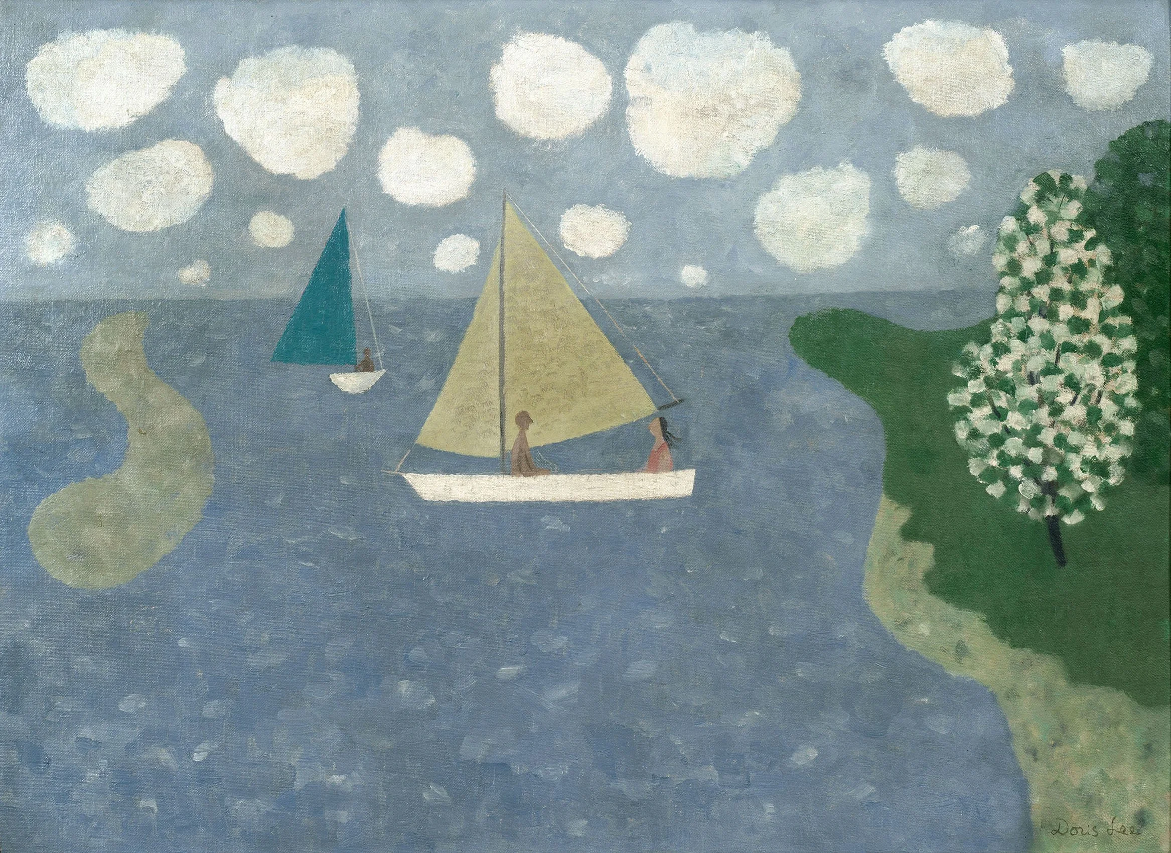
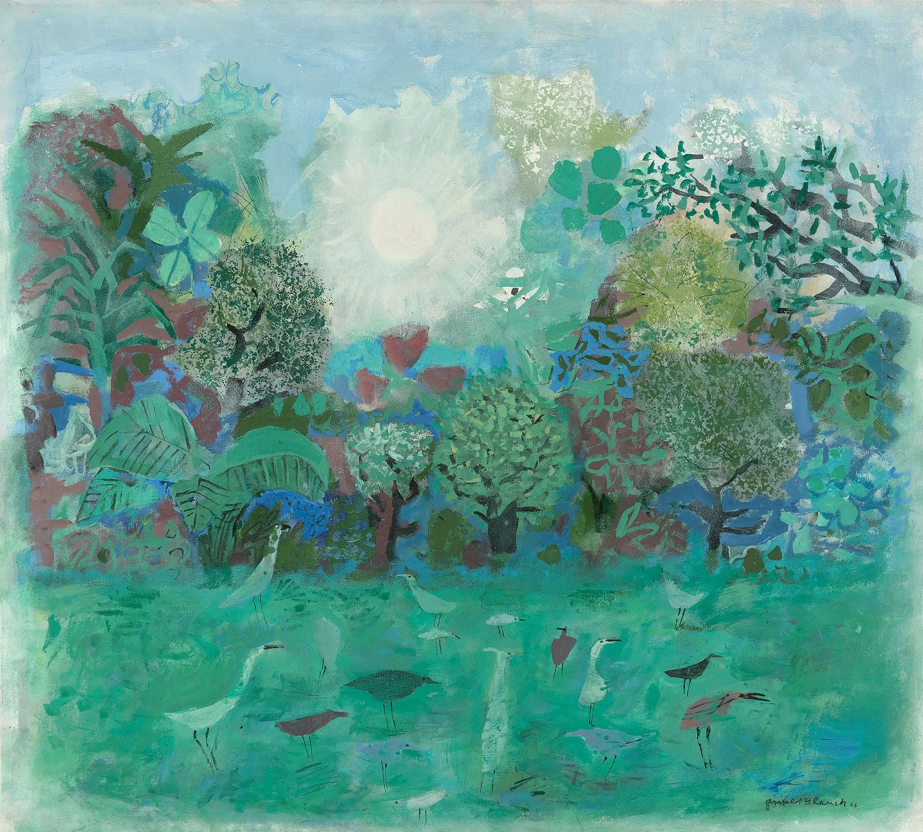
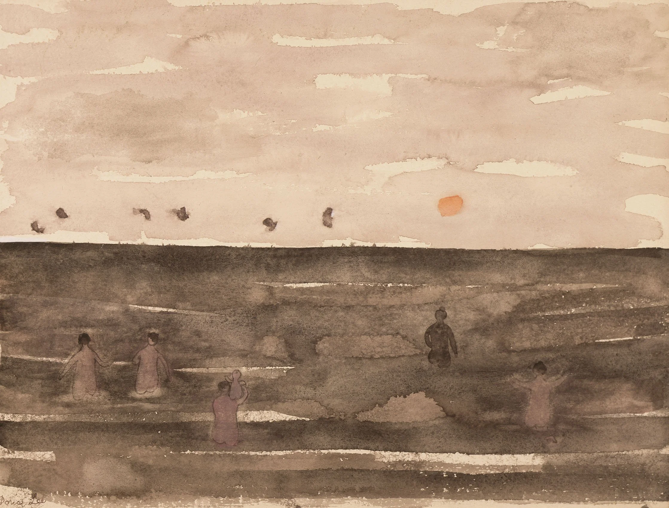
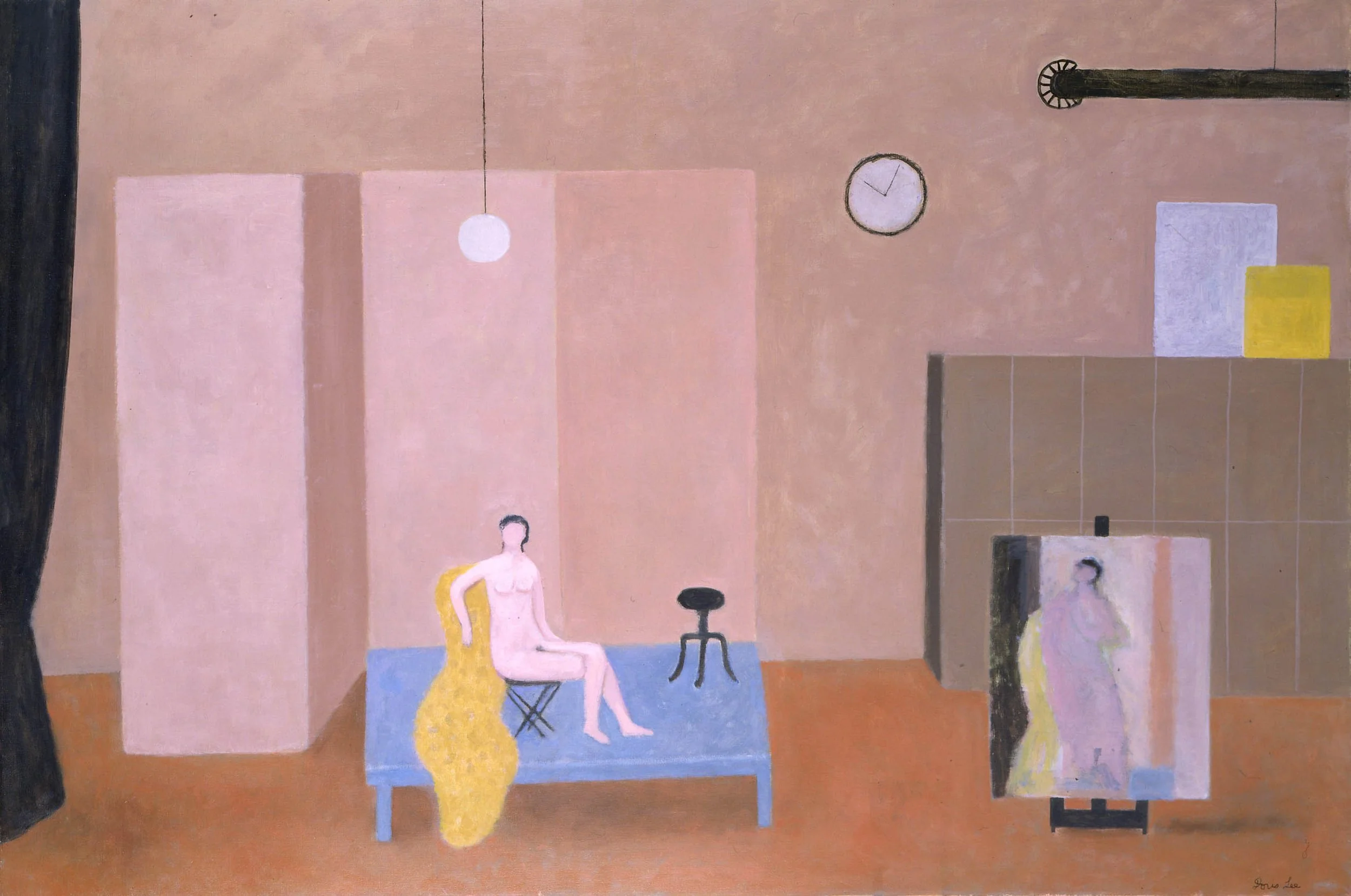
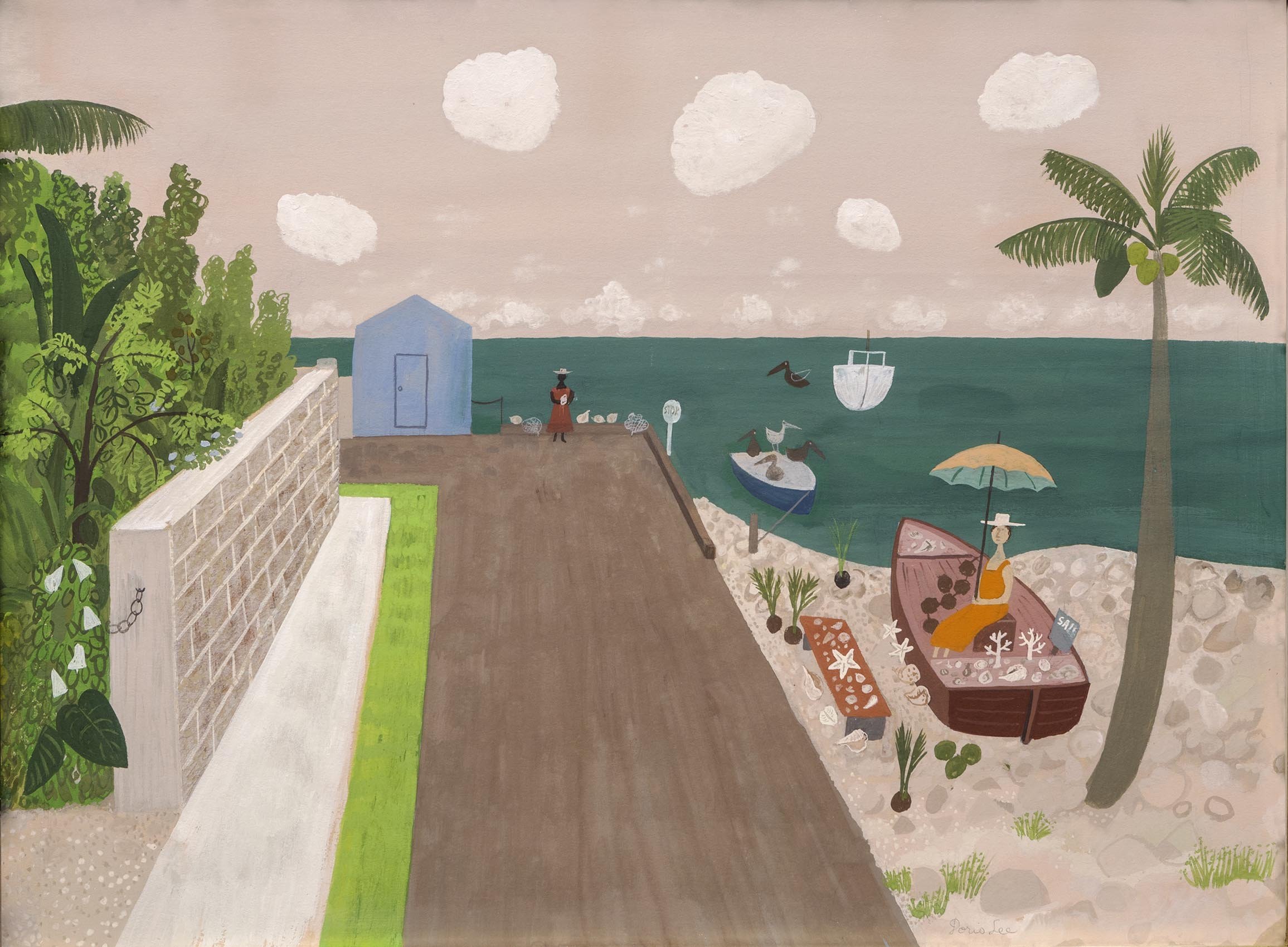
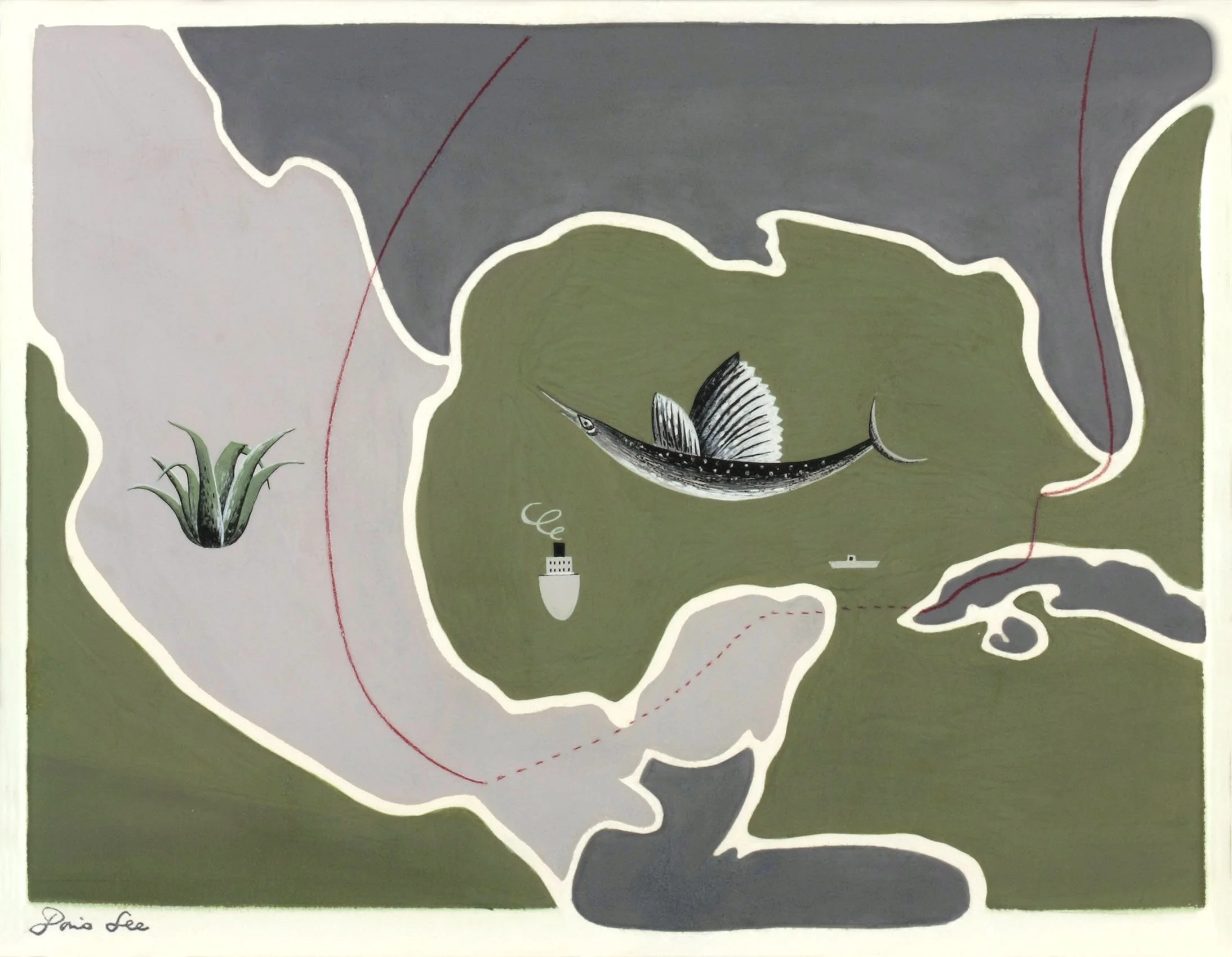
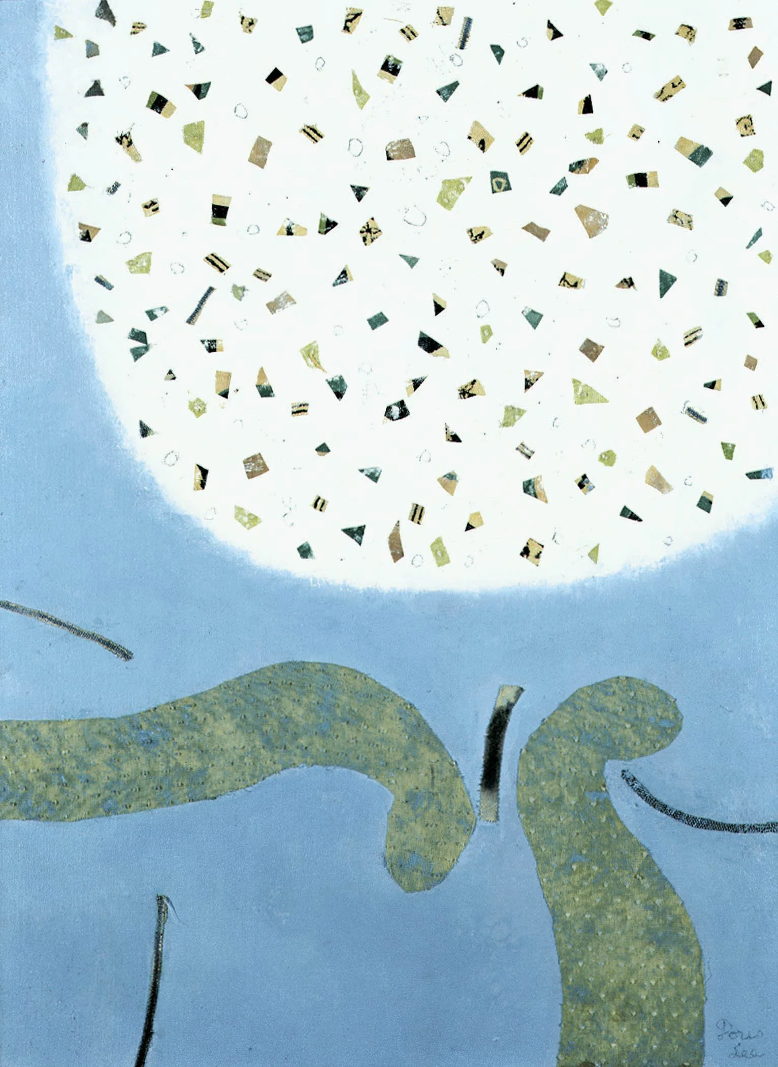
The artist couple Arnold Blanch (1896-1968) and Doris Lee (1905-1983) traveled extensively throughout Florida. Blanch, a highly respected artist, teacher, lecturer, and visiting art critic was a winter resident of Key West in 1916. He was one of the first artists to visit the area before it became a favorite tourist spot. Blanch shared his love of Florida in 1934 with Doris Lee. Blanch taught at New York’s Art Students League and also the League’s summer program in Woodstock, New York. Each year, after Thanksgiving, the couple would leave Woodstock and drive to Florida. Arnold would teach art across Florida while Doris painted. During the 1930s they traveled to Key West to exhibit in the WPA sponsored art exhibitions, which were a draw for many artists. According to Tennessee Williams’ memoir, Lee and Blanch joined him along with Grant Wood and Yasuo Kuniyoshi in Key West the winter of 1941-1942. Life Magazine commissioned Lee to travel around the Gulf of Mexico by car to create images of the area for an article on the Pan-American Highway in 1946. In addition to Key West, the couple particularly liked the Clearwater area. Lee was a charter member of the Clearwater Art Club formed in 1935. In 1951 both Lee and Blanch received solo exhibitions at the Florida Gulf Coast Art Center. Both artists were Bok Fellows at the Maitland Research Studio in 1949-1950 when Milton and Sally Michel Avery made their first Florida visit. By 1954, Lee and Blanch had purchased winter homes in both Key West and Clearwater. In the mid-1960s, Lee retired to the Clearwater area and Blanch continued to paint there each winter. Our exhibition includes an oil by Arnold Blanch titled Birds and Trees, 1966 as well as a gouache titled Figures by the Sea executed during winters in Florida. We have matched this by offering an oil by Lee titled Sailboats on a blue ocean just off a curvy sandbar shore. An oil by Lee titled Approaching The Beach suggests the viewer is flying over the ocean looking down onto a sand bar patterned by collaged-on beach towels.

I feel I have just scratched the surface of Florida’s rich history in presenting some of the notable artists who visited the Sunshine State between 1920 and 1970. In researching the artists and the areas of Florida that attracted them, I discovered the pioneering spirit that is so American in the development of Florida’s cities.

[ TOP ]

Modernism 1913-1950 | Realism of the 1930s and 1940s | Abstraction of the 1930s and 1940s | Post-War | Selected Biographies

AMERICAN WOMEN PAINTERS

Bohemian National Hall | 321 East 73rd Street

November 10-13, 2018

The American Art Fair | For availability and pricing, contact the gallery at 212-581-1657.

Installation Views

Essay by Deedee Wigmore

Artists of different traditions and backgrounds reflect and shape our view of the American West, land of the rancher and the cowboy. So, when I was given the opportunity to offer collectors the western paintings of two successful American artists working during the Great Depression and World War II, I could not resist. The resulting exhibition is an exploration of the paintings of Adolf Dehn (1895-1968) in Colorado from 1938 into the 1960s and Peter Hurd (1904-1984) in New Mexico from 1928 forward. The 25 paintings hung in our gallery create a kind of a conversation between two artists who both captured the authentic West. These paintings provide more than a comparison and contrast of two very different western landscapes, they are a narrative of an artist's journey. Looking outward to select what the artist wants you to see, the artist also takes a journey inward. That journey reveals each artist's personality expressed through his selection of subject, painting style, artist tools, and choice of medium. The journey sculpts and shapes the art. These two artists stretch our thinking about western landscapes. In December, the Colorado Springs Fine Arts Center held a symposium on "The Landscape Tradition Continued in the Western States" so we feel our exhibition of Adolf Dehn and Peter Hurd is timely.

As a youth in Waterville, Minnesota, Adolf Dehn knew he wanted to be an artist. He attended the Minneapolis School of Art from 1914-1917 and then accepted a scholarship to the Art Students League in New York, which he attended from 1917-1919. In 1939 Dehn was awarded a Guggenheim Fellowship for travel in the Far West and Mexico. One of Dehn's stops was a visit to Boardman Robinson who was teaching art at the Fountain Valley School and heading the art program at the Broadmoor Art Academy (now the Colorado Springs Fine Arts Center), which combined an art school, museum, and theater. This ambitious program was successful because Colorado Springs was a major cure center for tuberculosis filled with wealthy patrons. Dehn had been a summer art instructor at Stephens College in Columbia, Missouri in 1938 and 1939 so Boardman Robinson invited Dehn to teach at Colorado Springs Fine Arts Center the summers of 1940-1942.

At the Colorado Springs Fine Arts Center, Boardman Robinson created an art print shop run by Lawrence Barrett, a master printer, who had come to Colorado Springs to recover from tuberculosis and stayed. Adolf Dehn had come to Colorado already a printmaker as well as a painter. At the Fine Arts Center, Dehn and Barrett connected and experimented with varied textures in Dehn's lithographs to enhance their realism. The work forged a partnership between Dehn and Barrett that lasted a lifetime. Dehn returned to Colorado regularly through the 1960s to pull prints with Barrett, leading to a body of Colorado subjects in watercolor and casein as well.

In Colorado Springs, Adolf Dehn reshaped his art from European-inspired figural social satire into landscape art of the new American Scene style as seen in Cows Grazing in Gunnison Valley, 1941. With Pikes Peak, the Garden of the Gods, and the Rocky Mountains at its door, Dehn could paint an America that exists outside of time, class, or political affiliation. Dehn's style transformation was aided by the Colorado Springs Fine Arts Center's Artist-in-Residence Program which attracted artists who were instrumental in developing the American Scene style. At the Fine Arts Center, Dehn knew several of the visiting artists: Arnold Blanch (1896-1968) taught 1939-1942; David Fredenthal (1914-1958) assisted Boardman Robinson on a mural in the summer of 1936 and then taught the summers of 1940-1941; Yasuo Kuniyoshi (1893-1953) was a visiting artist the summer of 1941; and Doris Lee (1904-1983) was a guest artist from 1939 to 1941.

Painting the mountains and lakes required Dehn to go beyond the subject. He needed to think of big masses of color, light and dark, eliminating some detail for the sake of the composition, and even ignore the color before him at times to create a more exciting arrangement of color to evoke a certain mood or reaction to a scene. Dehn worked from an outdoor sketch, taking from ten minutes to two hours, depending on the complexities of the subject. He used either a soft pencil or lithographic crayon and a sketch book of smooth paper. Generally he did not make a finished drawing as his main interest was recording data for the painting he would later execute in the studio. Any part of the scene that was complex or difficult in its construction, he developed more completely. Color notes were written on the drawing. Sketching, rather than painting on the spot, allowed Dehn to develop a feeling about his subject and focus on the big picture without worry of changing light or weather. In the studio, Dehn considered the result of his color choices in different kinds of lighting, judging how a color and its different shades looked in the subdued light of a room, harsh light of overhead lighting, and in daylight. For the Colorado paintings, Dehn developed skill in the mediums of casein such as Mountain Landscape and watercolor such as Remote Ranch. Dehn found casein, a form of watercolor thickened with sour milk, gave paintings more body, a perfect medium for painting the crusty rock surfaces around Colorado Springs. As a printmaker he was already a master of ink wash, charcoal, and pencil drawing. Printmaking had taught Dehn to achieve a rich spectrum of tonalities and textures that blossomed in his Colorado paintings as seen in Gunnison Valley. By 1941 Dehn had such a sure hand as a painter that Life magazine made his art a feature in its August issue.

Peter Hurd (1904-1984) grew up in Roswell, New Mexico. His father Harold Hurd, a Boston lawyer, came to Roswell as he was threatened with developing tuberculosis. Peter Hurd focused on painting and drawing from youth. His education at the New Mexico Military Institute led him to spend two years at West Point as a cadet in 1921-1922. In 1923 Hurd transferred to Haverford College realizing he did not want a military career. While there, Hurd met N.C. Wyeth and with persistence became his apprentice. To improve his drawing, Hurd enrolled at the Pennsylvania Academy of the Fine Arts along with N.C. Wyeth's daughter, Henriette. In 1927 Hurd became engaged to Henriette and began to exhibit his paintings at the New Mexico Military Institute and the Wilmington Society of the Fine Arts.

Peter Hurd brought his new bride, Henriette Wyeth, to New Mexico in 1929. He had achieved some success as an artist and was able to come up with $2,600 to purchase in May of 1934 a ranch of forty acres on the Rio Ruidoso with two adobe houses and an adobe barn. The ranch had water rights from the river to eight acres of orchards with apples and pears stored in one of the four adobe rooms. San Patricio was a village of a few families fifty miles west of Roswell. San Patricio's ranch country and people became Hurd's subject. All through the 1930s the Hurds traveled east to Chadds Ford for Wyeth family visits or to fulfill commissions for portraits, advertising, and book illustration. In the 1930s Hurd could not afford to do full time what he most wanted to do - paint the New Mexico landscape. He had to paint New Mexico when he could.

Like Adolf Dehn, Pete Hurd was a painter of the American Scene. To paint New Mexico Hurd had to develop practices and materials that gave him what he wanted. In New Mexico the earth forms assume a sharper contour, shadows are denser. Sunward surfaces are fixed in a dazzle of light. Heat waves in the summer make roads shimmer. The light makes color remain clear even at a distance. The sky is vast and may show several weathers at the same time. In the spring, winds bring weeks of heavy blowing dust. Our exhibition includes several paintings that speak of these moments of change so common in New Mexico. They include The Mirage and Finishing Chores Before the Rain. Peter Hurd described himself as "a painter of what occurs around me." The spirit of his landscapes is one of lyrical delight in the un-posed form, movements, and designs found in real life. From N.C. Wyeth, Peter Hurd learned to focus and become for a time whatever he was painting.

To translate what he saw in New Mexico, Hurd perfected the technique of painting in gesso with oil paints and egg tempera. Upon receiving his 1933 mural commission for the New Mexico Military Institute, Hurd traveled to Mexico City as well as Cuernavaca and Taxco to see the work of the Mexican muralists. There he got Diego Rivera's fresco formula, his type of brushes, paints, and advice from a Mexican fresco painter Ramon Montes. Hurd was attracted to dry fresco (the application of tempera onto dry plaster) as it combines all the brilliance of watercolor with the advantage of being readily wiped or dry sand papered out so passages could be redone. All sorts of efforts were possible using the dry fresco medium such as washes, stippled effects, smeared color, thin palette knife impasto, and glazes. From his understanding of mural painting, Hurd schooled himself to achieve a technique of an assured, restrained surface in his easel painting, using gesso as a ground on which to paint thin washes of oil and all the variety of applications he learned in tempera. The luminosity of the gesso ground creates the atmospheric brilliance essential to painting the light of New Mexico as seen in Rancho del Charco Largo. Hurd fashioned his own gesso panels with pots of hot sizing and marble dust applied to board paneling that he sandpapered many times. Hurd ground his own mineral colors. Hurd was so excited about this medium that he taught his brother-in-law Andrew Wyeth the technique as well.

While innovative in his painting techniques, Hurd aimed to subordinate material to subject, achieving this by the handling of space and objects in a spare way. To find subjects that moved him to paint them, Hurd drove a wide windowed camper truck over roadless plains and up flood carved arroyos in search of subjects. He made rapid field notes in watercolor on small blocks of paper rarely larger than 6 x 9 inches while driving and even smaller when riding a horse over his land. Hurd's farmscapes such as Rancho del Charco Largo were painted as symbols of human wishes, effort, and accomplishment. These abstract values are conveyed in his paintings and there is an undercurrent of acceptance of the fugitive in life. Hurd studied his designs for a painting in his mind's eye and rehearses his color in thought ó sometimes steadily looking at an unfinished work for hours considering changes to make, effects to be carried further, inner harmonies of detail to establish that would bring the picture alive as a whole.

Hurd grew up riding horses, took equitation at West Point and at Haverford College. When at Chadds Ford he rode with style and daring in horse shows and fox hunts with local clubs. Hurd's game was polo. He created his own playing field at San Patricio by clearing the cactus and rocks then bounding the area with goal posts. Hurd taught neighbors to play, enlisted guest players from the cavalry stationed at the New Mexico Military Institute in Roswell, recruited Mexican American cowboys and ranch hands from the valley, and made them into a polo team called the Beggars of San Patricio. They played against competition teams, both military and civilian teams from Roswell, El Paso, Fort Bliss, and Juarez. Peter captured one of those matches in a watercolor that is part of our exhibition titled Polo Tournament at Fort Bliss: San Patricio vs Juarez.

Success as an artist grew for Peter Hurd during the 1930s and 1940s. Hurd's first museum invitational was at the Corcoran Gallery in 1932. He had his first solo exhibition at Macbeth Gallery in 1934. In 1937 the Art Institute of Chicago purchased Hurd's El Mucho. Life magazine sent a photographer to photograph Peter Hurd at his San Patricio ranch in 1939. Hurd felt that it was not until he attracted the interest of the editors of Life magazine that he became known to the American public. In 1939, The Metropolitan Museum purchased Rancheria. From 1938 to 1942, Hurd spent time on mural commissions for post offices: Big Spring Texas; Alamo Gordo, New Mexico; and Dallas, Texas. In 1940 Steuben Glass commissioned Hurd to design a piece of glass. Hurd chose a windmill scene produced on a limited number of vases. 1941 saw a solo exhibition in New York at the Macbeth Gallery and the Tate Gallery purchase of Anselomo's House. Further cause for celebration were the two landscapes and a lithograph commissioned for Abbott Chemical Company's collection, a Life magazine commission, two commissions for Lucky Strike tobacco, and the cover of Collier's magazine. In 1942 Peter Hurd was made a member of the National Academy.

With America entering World War II, Peter Hurd became an accredited War Correspondent for Life magazine as a captain in the Army Air Corp. For one assignment, Hurd spent three months on an operational air station in England and executed nine portraits of combat crew members. When the portraits were published in Life in the July 26, 1943 issue, Hurd received one hundred letters from the airmen's families and friends. For a second assignment for Life, Hurd spent six months traveling with the Air Transport Command in 1943-1944, leaving him away from his ranch for eight months. Hurd recorded the creation of bases in remote places to provide a steady stream of men, aircraft, supplies, and hospitals for the war. Peter Hurd was awarded a European Theater Medal for Service in 1947. He spent 1952-1954 on a mural series at Texas Technological College in Lubbock. President Eisenhower appointed Hurd to the Commission on Fine Arts in 1959 and he painted a portrait for Lyndon B. Johnson for the White House Historical Association in 1966. Through all these adventures, Hurd was most happy painting in San Patricio.

[ TOP ]

Modernism 1913-1950 | Realism of the 1930s and 1940s | Abstraction of the 1930s and 1940s | Post-War | Selected Biographies

FRANCIS CELENTANO: COLOR IN MOTION

Sept 14 - Nov 16, 2018

Essay | Artist’s Series | For availability, contact gallery at 212-581-1657.

Essay by Emily Lenz

For our first solo exhibition for Francis Celentano, we have selected two bodies of work, the Alpha series (1968-1971) and the Electra series (1990-1992) to demonstrate the artist's use of color and structure, often through patterning, to create a unique viewing experience. In the two series, we see Celentano's methodical development for each series, his embrace of technology available at the time, and his ceaseless exploring of the endless possibilities of color.

Francis Celentano came to national attention with his painting Lavender Creed (1964) in MoMA's 1965 exhibition The Responsive Eye, which announced the new international style Op Art. His style at the time, like Screen (1965), was more Hard Edge than Op with repeating bold forms in subdued colors of navy blue, purple, and black. Celentano wrote that in these works, he desired to evoke a mood using "carefully calculated, premeditated, and visually measured (intuitively)" forms. He found each compositions through small progressive changes in sketches, something he considered a complete rejection of the spontaneous Abstract Expressionist style. Celentano and other Op Art painters' focus on the audience rather than self was considered another rejection of Abstract Expressionism.

Celentano also used studies to establish a technical approach for every series he did. Screen printing, stencils, and an airbrush were key to his 1960s compositions as computer programs would later be. Celentano embraced available technology to assist him in executing his vision. This was noticed and his New York dealer in the 1960s was the Howard Wise Gallery, known for its focus on art and technology. His paintings were, in fact, support for the first computer-generated art exhibition, organized by the Howard Wise Gallery in 1965. The importance of screen printing in the Op works can be seen in a collage study for Zilos (1966). Celentano first created a screen print of a row of increasingly larger black triangles which he then collaged in mirrored, rotated, and repeated strips to find his composition. He scaled up his study for the painting using stencils to maintain the crisp edges of the intricate arrangement.

An important step in Celentano's development was his participation in the International Artists' Seminar in 1965, where he got to know Polish artist Wojciech Fangor (1922-2015). The program, held at Fairleigh-Dickinson University in New Jersey, brought international and American artists together in a residential program for the exchange of ideas about new artistic practices. The focus of the 1965 seminar was Op art and ten artists were selected, including Celentano, Fangor, and the Paris-based Groupe de Recherche d'Art Visuel (GRAV) artists Yvaral (1934-2002) and Horacio Garcia Rossi (1929-2012). Half of the artists had been in MoMA's The Responsive Eye exhibition earlier that year. Vasarely wrote the opening text for the traveling exhibition of works made at the Seminar. He called for Op art to be the art of the time, to reflect the new knowledge that emotions were the result of biochemistry and the experience of art was no longer felt in the heart but through the retina. Most impactful for Celentano was seeing how Fangor's gradient transitions of sprayed color and the resulting color pulses provided an alternative to the severity of Op's black and white contrasts. The work Celentano created during his residence at Fairleigh Dickinson and his subsequent work for the next two years remained classically Op, like Zilos (1966), but the idea of painting sensuous color was percolating.

In his kinetic paintings from 1967-1968, Celentano used drawings and collage to determine the progression of black ellipses on a white circular canvas that would have the desired effect of warping and undulating when rotated by motor. In the kinetic paintings, Celetano felt he had created "a viable, physical presence in which the spectator responds more to the whole and less to elemental parts." The viewer seeing a work as the whole was one influence that encouraged Celentano to investigate pure color as a controlled experience.

Celentano found his third influence for color upon moving to Seattle, where he accepted a position at the School of Art at University of Washington in 1966. Celentano was hired by Spencer Moseley, director of the School, who was interested in M. E. Chevreul, the 19th century theorist who held that the juxtaposition of two complementary tones heightened both their intensities. Chevreul's writings, Fangor's soft approach to Op, and his own desire for his paintings to be experiences led Celentano in 1968 to formulate his own strategy for color.

The Alpha Series, 1968-1972

For the Alpha series, Celentano used vertical sequences of color bands in a horizontal format with alternating stripes of gradient and uniform color. He used an airbrush, a popular tool for artists at the time, to soften the many color transitions within a single stripe. The striped structure holds the color while the interaction of sprayed saturated colors creates dramatic tension. With continued looking, the stripes disappear and waves of color ebb and flow in the viewer’s space. With close looking, the viewer's eye cannot pin the color down. Instead the color shimmies across the canvas as even the crisp edges of stripes blur. The lively color zips back and forth across the highlighted horizon evident in each work, like the streak of vibrant red in Alpha Blue (1969).

All of this is achieved through Celentano's meticulous technique. In the Alpha paintings, Celentano first sets down vertical stripes of a single color or white. Next Celentano used an airbrush to spray gradations of high-keyed color in an even and consistent surface on every other stripe. He used a watered down paint to allow the white gesso underneath provide additional luminosity. So seamless are Celentano's transitions from green to purple to red then yellow and back again in Alpha Prime (1968), it is difficult to sense which colors were laid down first. The result is shimmering color that expands beyond its structure. In Alpha Prime, particles of green paint at top and bottom melt into the purple next to it, as if the viewer is falling down the stripe into a hot yellow center. Celentano's choice of airbrush to apply the paint in very fine particles of pure color adds to the sense of the painting as an atmosphere rather than an object. Unlike most Op artists, Celentano frequently worked with the rectangular canvas rather than the square. This heightens the experience for the viewer as the shape mimics the field of vision, resulting in color extending beyond viewer's peripheral vision.

The Electra Series, 1990-1992

The 1990s brought the age of the pixel with the expansion of personal computers. Imaging programs improved immensely, like Targa, an early version of Photoshop. In the late 1980s, computer monitors went from displaying about 30,000 colors to nearly 17 million. Celentano, not shy about using technology, set out to see how the computer could help him. For Celentano the particles of color in his Alpha paintings became pixels in his Electra series. He used the computer program to generate colors within an array of squares on a continuous ground. He selected four colors for the pattern and one as background. Two colors were in the same tone as the background and two in sharp contrast. He arranged the colors into units of four squares, which he flipped and mirrored to create a larger unit of 16 squares which he repeated throughout the composition. The act of mirroring, flipping and repeating recalls Celentano's Op paintings. He also used the program to determine the scale of the squares to the background color, as he was interested in how a viewer's distance effects the reading of a painting.

Once Celentano had settled on a color arrangement and scale, he applied the colors selected on the computer monitor to paint on canvas. He created the grids by taping out 1/4 squares in the case of Electra #10 (1991) or 3/16 squares in the other Electras. Only after removing the tape from the canvas could Celentano see if his computer studies translated to traditional materials. The effect is dazzling. The viewer perceives a pattern but the colors trick the eye, resulting in random light pulses and seemingly endless paths through the painting. From across a room, the Electra painting look like a single field of color, difficult to hold down but overall the background color dominates. Moving closer, the viewer sees varying lines such as diagonals, zigzags, and more complicated paths moving through the image, the result of the mirroring and reversing patterns. Up close, the viewer discovers the lines and dots are in fact pixel-like patterns of squares in four colors. Here Celentano allows the viewer to understand the mystery of the color interactions that creates the sense of an electric field with infinite movement.

Celentano's work across six decades considered in an intellectual, structured approach the emotional effects of color, its sensuous qualities. By identifying patterns and economic ways to execute intricate paintings, Celentano continued to find new series to expand his understanding of color and its effect on all of us. Critic Suzi Gablik said of his paintings, "Color is an event, not a fact." In both the Alpha and Electra series, Celentano makes this clear.  


FRANCIS CELENTANO EXPLAINS HIS SERIES, 1963-2015

1. Hard Edge Painting 1963-1965
The images are a priori, symmetrically ordered and refined. They evoke an implacable, timeless presence and a ponderous, aggressive sense of weight conveyed by large areas of black and dark gray and smaller contrasting white shapes that suggest compressed light.

2. Optical Painting 1965-1968
By designing units or elements relative to others in a particular way, an optically expressive result is shorn of all references. The paintings generate an aggressive immediacy in which the units almost dissolve in perception as they fuse together on a super-visual level distorting the observer's normal perception. For example, Reversible Units consists of an array of alternating black and white asymmetrical units that are repeated, rotated, mirrored, and locked together in a unified field of absolute opposition, totalized and immediate.

3. Kinetic Paintings 1967-1968
These were in part inspired by my take on surrealist concepts that inform aspects of my position in art up to the present. I designed, constructed, and timed each of their motors so that undulating movements would radiate from each surface creating a pulsing rhythm. The repetitive rotations seem almost organic and alive, generating a hallucinatory and destabilizing experience.

4. Alpha, Delta, Kappa Paintings 1968-1972
In l968 as a reaction to black and white, I got involved with systems of color, subtractive (pigment mixtures), additive color (mixtures of light), and human visual responses. I began painting with color on canvas and called the first series Alpha. In this series I used vertical sequences of color bands in a horizontal format. Bands of gradient colors alternated with bands of uniform color ranging from opposition to harmony varying the
perception of the uniform color bands. Kappa is a more complex variation of Alpha. In the Delta series the bands are the same, alternating inversely so the visual effect, fixed to the center, is more intense.

5. Iota, Epsilon, Theta Paintings 1973-1975
From l973 to l974, I executed vertical paintings consisting of strips of plastic cut at first from two and later one pre-painted surface with gradient color. The cut strips were then rotated and/or displaced in relation to each other. I called this first series using precut bands of color Iota. I used the same method for the Epsilon series. In the Theta series that followed, I generated two paintings with two sets of the same color bands each sequenced differently. Additional Iota paintings were made in 1994.

6. Diamorphus Paintings 1977
This series represents another variation of sequencing a pattern of painted bands of color. In this series the painting is cut in pairs of the same color gradients and then rotated in alternating pairs, each pair selected from the opposite inverted sequence of the same painting.

7. Pendenza Paintings 1978-1980
I used the same method of sequencing as in Diamorphus but reduced the color bands to eight strips and for the first time tapered them. The top and bottom edges of the strips were cut at an angle so all together they formed a long tall parallelogram, eight to ten feet high slightly tipped and leaning from the floor against the wall. Backs of the Pendenzas were painted a color that reflected back from the surface of the wall behind and around the painting creating a subtle halo effect. This series was a precursor to the columns that would follow the Isis series right after Pendenza.

8. Isis Paintings 1982-1987
This series as the Theta series earlier dealt with recombinations of bands of the same color ordered differently to generate different paintings. These improvisations or sets of paintings were named Curve, Alternate, Wing and Step and in l987 I added Syncopated. The shape of these paintings and their serrated edges are determined by the order of the displaced and tapered strips that carry the bands of interactive color.

9. Spira Paintings 1988
I generated three sets of paintings much as I did with the Isis series and named them Harmonic, Alternate and Syncopated. But the tapered strips that carry the graded color are shorter, the formats in all the sets are narrow verticals and their serrated edges describing the displaced strips are characterized by a subtle, undulating rhythm.

10. Trizazz Paintings 1989
With this series, I divided each painting into three parts and in each I explored the contrast of graded color in tapered strips with two outer tapered strips of solid color, one different from the other. There are no sets in this series.

11. Electra Paintings 1990-92
I produced this series, working with Targa, a computer program. It permitted me to generate color within an array of squares on a continuous ground. In this way I arranged 4 colors in patterns of squares and combined them to play against each other as well that of the background. The observer's shifting eye movements and focus results in a continually changing illusion of random light pulses along the plane of the picture. In this structure I also explored the perception of color and shape variations as a function of distance from the work.

12. Exana Paintings 1993
Using a vertical format, I produced three gradient color planes. After deploying the initial gradient on the entire surface, I masked out alternately and deployed another color gradient. Without removing the first masking I did the same thing the second time after masking out with diagonals in the opposite direction and painted the third gradient. Depending on the interaction of color, I was able to generate a variety of shapes: diamonds, stripes and gradual transitions between them.

13. Serpa Paintings 2002
I did a series in a narrow format with undulating strips. I used a CAD program (computer assisted design) to cut strips of plastic into wave-like rhythms that meshed neatly one into the other. The method of deploying color and painting the strips was similar to that of several of the earlier series described above. The wave-like shapes add another dimension of visual experience, enhancing the rhythm of color and form.

14. Le Cirque Paintings 2003-2004 and Cirque Variations 2005-2007
In this series I returned to spraying paint on canvas using a horizontal format. These paintings continue my interest in wave-like shapes as in my sculpture series but in a more traditional manner on a flat continuous plane. Each consists of a number of repeated vertical modules organized in shape and color to evoke a dramatic visual sense of totality.

15. Radial Paintings 2008-2010
These were brush painted either on canvas or plastic surfaces in a variety of shapes: diamonds, circles, scallops, and an ellipse and all have a radiating center. Shapes that make up the image move about the center in a variety of ways, displacing, rotating, radiating, and so on. Initially they began in 2008 as black, white, and gray, or just black and white. In 2009, I included color as an additional element to contrast and balance with the black, white, and gray components. These geometric images emerged from my mind automatically. I enhanced them by exploiting their character in the media of painting to convey a clear, precise, and dramatic impression.

16. Gemini Paintings 2010-2012
This series continues an interest that first began in 1990 in composing paintings with the assistance of a computer program. In this case it involved the overlapping of two identical patterns. Each pattern is first painted in black and white on canvas or plastic and then fed into a computer program, converted into a transparent white and gray image and then duplicated and overlapped in a number of ways, displaced, rotated or flipped. Transparent gray and white checkerboard patterns that overlap produce additional black shapes. These shapes are then converted to color. The image is printed out and an acrylic painting on canvas or plastic is generated from them. In a sense the painting is an altered portrait of the computer image. The last paintings in the series are based on undulating patterns and the omission of black shapes that occur when grays overlap. These former black shapes become white shapes and join the white of the ground simplifying the pattern dramatically and producing a strong rhythm throughout the painting. These fused patterns produce a variety of visually intriguing images as a result of combining painting techniques with opportunities afforded by a sophisticated computer program.

17. Triangle Overlays 2013-2015
I used the same methods as the Gemini series now applied to a triangle shape instead of a square. As in theGemini series I overlapped duplicate images by rotating mostly and in some cases displacing one in relation to the other. The resulting extended array of triangle shape fragments was selectively reframed to arbitrarily emphasize what I considered to be the salient features of the automated pattern.

[ TOP ]

Modernism 1913-1950 | Realism of the 1930s and 1940s | Abstraction of the 1930s and 1940s | Post-War | Selected Biographies

TADASKY: SERIES D

May 8 - Aug 31, 2018
at 499 Park Avenue

Jan 27 - Aug 31, 2018

Essay | Geoform Interview | Selected Work | For availability, contact gallery at 212-581-1657.

Essay by Thomas Micchelli

Tadasky (Tadasuke Kuwayama, b. 1935, Nagoya, Japan) came to the United States in 1961, intoxicated with the possibilities of abstraction — especially the geometric rigor of Homage to the Square, the series of paintings by Josef Albers that formed the foundation of postwar color theory.

Over a career spanning nearly six decades, Tadasky has devoted his practice to the geometric motif of the circle, through which he has pursued his two preoccupations: the interaction of color and an incomparable control of the brush.

There is no trial-and-error in Tadasky’s approach. Each new painting springs fully formed from his imagination while he is at work on the previous one — a meditative process that is both deeply felt and serenely impersonal. This is why Tadasky titles his paintings with letters and numbers — a letter denoting the series, and a number identifying the location of the work within the sequence — there are no references to the world outside the frame.

The superhuman perfection of Tadasky’s concentric circles is founded on the specialized human qualities of discipline and skill. They are made on a large turntable of his own devising, which is overlaid by a wide plank (an expert woodworker, his family’s business had been the manufacture of impeccably crafted Shinto shrines).

Sitting cross-legged on the plank, he rotates the turntable with one hand while lowering the tip of a paint-soaked brush to the canvas with the other, gripping it with a firmness that must be at once rock-solid and highly attuned to the minute variations of the fabric’s warp and woof.

Look carefully at the lines constructing the concentric circles, and it soon becomes evident that what greets the eye with the exactitude of an inkjet is in fact a brushstroke animated by infinitesimal degrees of expansion and contraction, like the breathing of a snake.

The variations on the circle that Tadasky has explored over the course of his career range from vaporized spatters to compacted matter to rings of fire. Each series encompasses a coherent visual statement, such as the solid ball floating like a cold sun in the E series, or the expressionistic brushwork that forms the ragged circumferences of the G series.

The works in this exhibition have been selected from series D, completed more than fifty years ago, between 1966 and 1967. Coming only a few years after Tadasky committed himself to circles, the D series includes striking departures from the artist’s customary format of a circle enclosed within a square canvas. In D-155 (1966-67) and D-156A (1966), severely cropped circular bands interlock and overlap, disrupting the calm embodied by their neighboring concentric compositions. Further, Tadasky extracts the bands of color into narrow, vertical single-stripe paintings, which are created through an equally meditative process involving a large, rotating drum.

At the time Tadasky was making these paintings, critical attention was split between an austere Minimalist/Conceptualist aesthetic and its antithesis, Pop. In brief, Minimalism focused on the artwork’s material composition and its status as an independent, non-referential object, while Conceptualism contended that the object was subordinate to the idea behind it. Pop Art, in contrast, drew its influences from mass media and popular entertainment, including advertising, graphic design, and comic books.

Other approaches, however, arose in tandem with the mainstream. One was Perceptual Painting, dubbed Op Art in the popular press, in which pure abstraction is channeled into high-key, optically vibrating surfaces. (This movement was codified in The Responsive Eye, an exhibition organized in 1965 by the Museum of Modern Art, New York, which prominently featured Tadasky’s work).

Tadasky’s D series incorporates aspects of each style without allowing a single current to dominate. The elemental motifs of circles and stripes reflect the Minimalists’ formal rigor, while the artist’s insistence that his paintings reference nothing beyond themselves aligns with their advocacy of art’s self-possession. The exacting internal consistency of Tadasky’s various series and the preconceived mental image that governs his painting process imply a Conceptual context for each work.

Perceptual Painting is manifest in the alternating patterns of thick-to-thin black lines, which set off an optical surface buzz while demarcating tightly packed, convincingly rendered cylindrical volumes. And the solid bands of blue, red, yellow, orange, and violet recall the luminous tones of printer’s ink in both comic books and Ukiyo-e prints, the popular Japanese graphic art form practiced from the 17th to the 19th century. It can be argued that, with Tadasky’s D series, the look and feel of Ukiyo-e, which influenced American comics and, in turn, Pop Art, have come full circle in the abstractions of a Japanese-American painter.

Reading into the possible influences on Tadasky’s paintings can be a reward in itself, but background knowledge is not necessary to understand his work as he intends it — a visual portal into a perfect realm of abstract color, shape, and line.

[ TOP ]

Modernism 1913-1950 | Realism of the 1930s and 1940s | Abstraction of the 1930s and 1940s | Post-War | Selected Biographies

THE AMERICAN FARM

May 8 – Aug 31, 2018

Essay | Some works may still be available, please contact the gallery at 212-581-1657
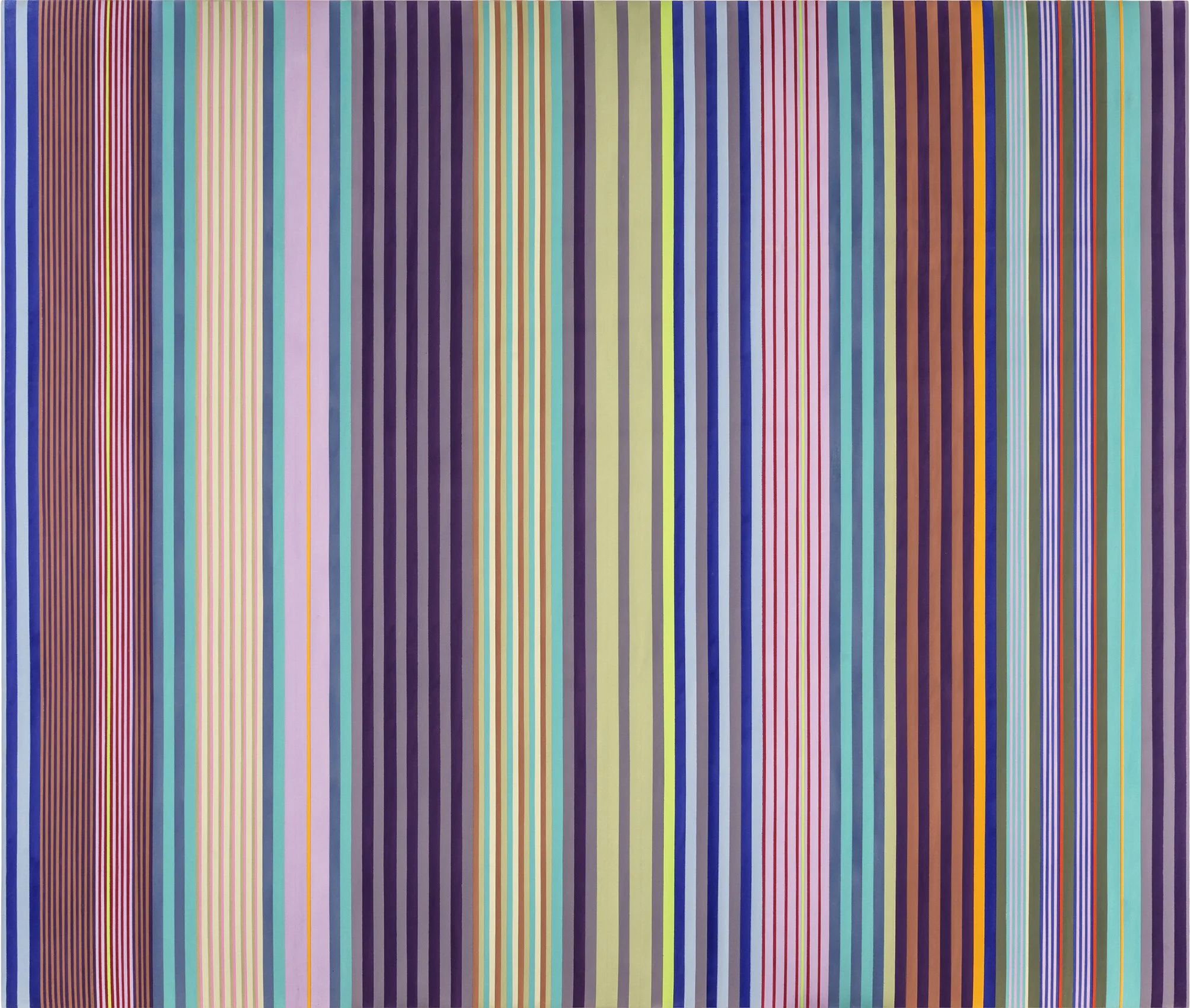
Essay by Deedee Wigmore

The agricultural landscape and the people whose labor made it productive are central to this exhibition. The farm had an historic place in the American imagination. It stood for the values of self-reliance, industriousness, and public spirit. It was a world of plenty resulting from laborious repetitive work. When Europe was at war from 1914-1918 the USA became the breadbasket of the world, but as Europe recovered from World War I commodity prices fell, and farmers who had borrowed for new machinery or to buy land struggled. Between 1920 and 1929 nearly 6 million people left farms and rural bank failures reached record levels. The Depression for farmers occurred between 1919 and 1932 when their net income fell 70% and the Plains States were afflicted with the Dust Bowl caused by poor land use practices coupled with wind and drought. Relief for the Plains States and the Midwest farmers came with New Deal policies starting in 1933 and as Europe moved toward World War II late in the decade.

Farm recovery came with President Roosevelt’s New Deal. He devalued the dollar 65%, raising commodities prices, and instituted numerous farm programs such as the Agricultural Adjustment Administration and rural electrification. Four government projects were dedicated to supporting the arts: the Public Works of Art Project (1933-34), the Federal Art Project of the Works Progress Administration (need-based support of a variety of artists, 1935-1943), the Section of Fine Arts in the Treasury Department (commissioned murals won by competition, 1934-1943), and the Treasury Relief Art Project (need-based hiring for decoration of Federal buildings, 1935-38). The American Scene dominated in these projects because it spoke to a wide audience with its representational style and commonplace subjects connected to regional history, geography, and culture. The American Scene artists aimed to record rural America and preserve its integrity as a vital part of society. To preserve knowledge of American farm life, artists documented the farmer’s landscape, work, stock, and specific crops harvested. The Midwest was a natural cradle for this kind of American Scene art as many of its artists came from farms and farming communities then went to art schools in Cleveland, Kansas City, Chicago, Minneapolis, and St. Paul.

American Scene artists gathered from many art styles to create a new American realism that dominated the 1930s and 1940s. Some ingredients in the American Scene style can be traced back to The Armory Show of 1913, which created a state of uninhibited art exploration offered by European innovation. These international styles, of which Cubism and Expressionism are most represented, along with the Hudson River School, folk art, and Precisionism were assimilated to create a new American narrative. This can be seen in the farm subjects selected for our exhibition that demonstrate the mixing of European and American styles for a modern effect.

Beginning at the turn of the century, European modern artists considered various kinds of folk art to break from the formality of classical painting. By the early 1930s interest in folk and vernacular art began to develop in America and the art establishment came to accept it as art. This was reflected in folk art exhibitions at The Newark Museum in 1932 and New York’s Museum of Modern Art in 1933. In our exhibition, the American farm as depicted by Ben Shahn’s (1898-1969) Harvesting Wheat (1940) has a shallow perspective that is sophisticated and derived from Cubism, while the figure of the farmer and the harvest elements have the simplicity of folk art. They convey the narrative of muscle and heavy work done by a simple, honest man. In Corn, Hay, and Rye (1946), Georgina Klitgaard saw the harvest landscape as a flat all-over pattern which she composed like a stage set with vines framing the top and bottom. Petra Cabot’s (1907-2006) The Hog Pen, (c.1940) contrasts a close up view of a rustic hog pen against a highly edited background of a pink barn. The unexpected combination gives the painting the charm and whimsy of folk art.

Cubism, like folk art, was also used by American Scene artists in traditional subjects. The original Cubists were looking for the geometric forms underlying nature and abandoned deep space perspective to achieve a more compact composition in which foreground and background are fused. Field Workers (1930) by Peppino Mangravite (1896-1978) and The Farm at Evening (c. 1930) by Jan Matulka (1890-1972) each use a Cubist perspective and its neutral dark palette.

The fundamentally geometric shapes of farm buildings lent themselves to the American Precisionist style developed in the 1920s. Precisionism, like early Cubism, simplified forms and suppressed details. Both styles were a compromise between abstraction and realism. In Precisionist paintings the abstract quality was never lost due to the style’s severe simplification of planes and volumes to emphasize architectural and industrial forms. Impact was achieved through editing details of a scene, leaving only those which created a feeling of strong rhythm and pace. Use of photography by Precisionist artists led to new treatment of light that could either be clarifying or mysterious. With the development of the inexpensive handheld camera in 1930, American Scene artists began to use photography to create paintings with unusual angles, perspectives, and lighting. Precisionist compositions of flattened forms and silhouetted structures with sharp edges are easily recognized. Using photography and the Precisionist interest in architectural forms, this allowed artists to both romanticize the pioneer days and create a more modern effect in their farm subjects.

We see the architectural focus coupled with different photo-like perspectives in three paintings—close up in Ernest Fiene’s (1894-1965) Lasher Farm in Winter (1926), the middle view in Paul Sample’s (1896-1974) Vermont Farm (1937) and a distant view in Peter Hurd’s (1904-1984) Rancho del Charco Largo (1939). The lighting in Ernest Fiene’s Lasher Farm is winter’s flat gray. Farm buildings keep the focus in the foreground where there is rhythmic retention of detail in the fields. Paul Sample’s Vermont Farm has the light of midday. Two elements in the painting keep the viewer’s eye in the midground- the white barn and the shadows under the cows. Peter Hurd’s distant silhouettes of Rancho del Charco Largo against an evening sky strengthens the viewer’s feeling of an open, endless, dry farmscape. The role of photography is more obvious in the work of Luigi Lucioni (1900-1988) in such paintings as Barns on the Road (1948) and Nestled Barns (1948). Because Lucioni saw the great barns as monuments to labor threatened by economic conditions, he painted them close up with precise detail in different lights.

Some American Scene artists found the Expressionist style offered a means to render visible their complex feelings towards a place. They felt photography lacked emotion and edited out geographic specificity. In a realist style, character and feelings could be expressed through gesture and attitude. However, by adding elements adapted from Expressionism, greater impact could be achieved in portraying both economic and social problems. While pure abstraction did not allow easy discussion of problems, the use of Expressionist intense arbitrary color, textural surfaces, and startling distortions of form add punch to social comment. A painting by Abram Tromka (1896-1954) titled Old Kentucky (1938) uses this kind of acidic color and texture to speak of the hardship of farm life. The Expressionist tendency to exaggerate types of humanity allowed for satirical use as well. A painting open to interpretation is Clarence Carter’s (1904-2000) Jane Reed and Dora Hunt (1943). Carter uses aspects of Expressionism to emphasize the pluck of two very thin farm women picking up coal chunks on the railroad tracks for fuel. Their bonnets either suggest the women have been marooned in time or comment on their isolation and poverty.

Critics describing the American Scene style as too direct or simple do not consider the feat American artists achieved in developing a recognizable style out of an amalgam of ideas derived from the Cubists and Expressionists, which offered modern stylistic elements such as distortion, irregular perspective, exaggerated or reduced spatial depth, and elongated figures. American Scene artists added from their own history Precisionist compositional ideas that discarded excess detail, generalized characters, and used photography to modernize compositions and tell the story of America facing the changes brought by industrialization, immigration, depression, and world war. The Depression of the 1930s and W.P.A. programs created new social relationships, basic changes in the social function of art, and new aesthetic concepts. Responsibility of the individual and freedom were not abstract ideas in the 1930s-1940s. American Scene art was a new national style, the product of America dreaming of a democratic art.

[ TOP ]

Modernism 1913-1950 | Realism of the 1930s and 1940s | Abstraction of the 1930s and 1940s | Post-War | Selected Biographies

PAUL REED: WASHINGTON COLOR PAINTER

Feb 27 – May 16, 2018

Essay | Some works may still be available, please contact the gallery at 212-581-1657
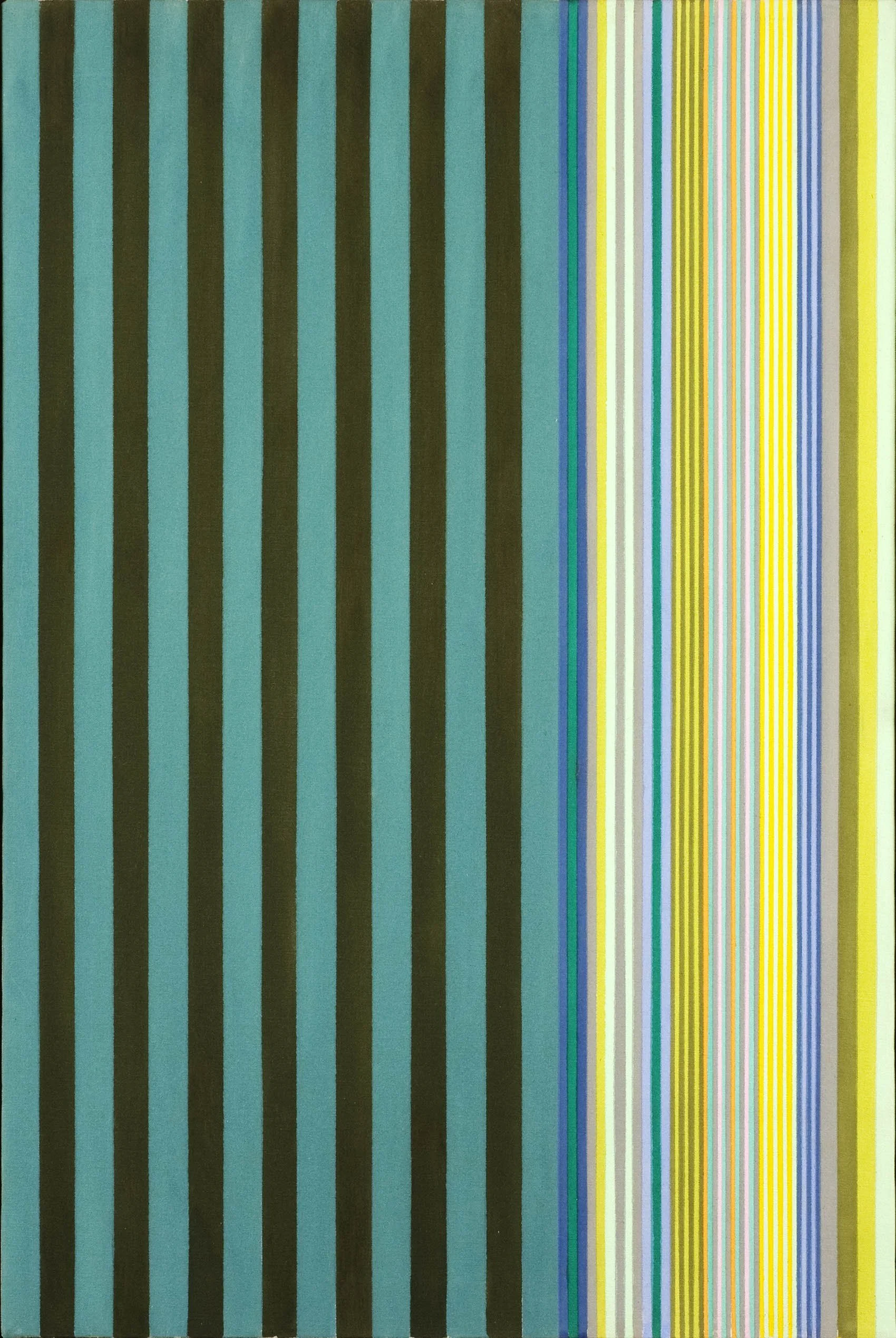
Essay by Emily Lenz

Paul Reed is one of the six original members of the Washington Color School, which began with Morris Louis (1912-1962) and Kenneth Noland (1924-2010) and grew to include Paul Reed (1919-2015), Gene Davis (1920-1985), Thomas Downing (1928-1985), and Howard Mehring (1931-1978). The artists were defined as a school by the 1965 landmark exhibition Washington Color Painters, curated by Gerald Nordland at the Washington Gallery of Modern Art. These DC-based artists used recently developed acrylic paints directly on unprimed canvas, embedding or staining the color into the painting surface, to create a new sense of color. Juxtaposed against the raw canvas, the glowing matte color appears to float off the painting. The artists experimented with pouring, sponging, rolling, and blotting to see how color creates movement and depth. While some worked intuitively and others mapped out their compositions, Gerald Norland in his exhibition text noted there were no accidents with the Washington Color painters- even in Louis’s flowing Veils there was order and gravity. Our exhibition of Paul Reed’s work from 1962 to 1967 shows his exploration of color and transparency to achieve movement in evolving series: first with biomorphic shapes in circular motion (1962 to 1964), then in geometric structures (1964 to 1965) that crystallize into grids (1966), which then twist and stretch into shaped canvases (1966-1967).

At the time of the 1965 Washington Color Painters exhibition, Morris Louis had passed away and Gerald Nordland said Reed was “the only painter who continues to explore the possibilities of transparency which were set out originally by Morris Louis.” Like Louis, Reed worked in an experimental approach through series to investigate the properties of color through layering of paint, which required great skill in handling. The progression in Reed’s compositions is evident in a diagram of thumbnail sketches showing his series from 1962 to 1971. The earliest works rely on biomorphic shapes to provide movement (such as #12, 1962). The forms are then simplified to large geometric shapes to explore transparency and color (such as Disk Painting #29 , 1965). In 1966 Reed moves to grids and bands as a neutral form to hold color (such as Intersection XII, 1966) and emphasize the interaction of overlapped colors.

The variety within Reed’s series is unique among the Washington Color School. Thomas Downing was the next most varied. In Reed’s 1994 oral history for the Archives of American Art, he describes his process with each series in three steps. First, he draws shapes until he settles on a form that will hold his envisioned color exercise. Second, he works in collage and colored tissue paper to see how the color and transparency might work. Third, he applies the form to canvas, now intuitively seeing where he can take the color. Once he has achieved the most complex and sophisticated colors for that form, the series is over. Reed said all his ideas were built on lessons learned from previous forms. With color interaction performing differently with scale, Reed felt it was important to limit “the number of straitjackets you put on.” (Interview with artist, 2013) Reed and childhood friend Gene Davis agreed that repeating a composition allowed for deeper exploration of color, but Reed felt there were finite possibilities. When Reed ended a series he did so to increase the complexity of the next composition, as color always provides new challenges.

Discussion of Art Works

Paul Reed came into his own style in 1962 using interlocking forms based loosely on a grid, first in all-over compositions and then centered on a field of raw canvas. Circular movement was a key element in Reed’s work from 1962 to 1965. In #12, 1962, the earliest work in the exhibition, raw canvas forms float on a yellow field with a mass of colorful forms to one side. The open organic forms of the raw canvas provide light while the multi-colored forms contribute energy to an overall composition that is ordered and balanced. In Barbara Rose’s 1964 article “Primacy of Color,” she states one of the four influences on the Washington Color Painters was an exhibition of Matisse’s late cut-out works at MoMA in 1960. One can see why comparisons to Henri Matisse were made with Reed’s early paintings.  

Reed, however, credits another important artist for inspiration. In a 2005 interview, Reed said he was interested in applying Josef Albers’ theory of simultaneous contrast to curved forms to bring together the energy both create. This is evident in #20C, 1963 where the alternating red and orange forms revolve around a raw canvas center. The curved yet crisp edges of the forms draw attention to the circularity and three small offshoots emphasize the active movement. In the introductory text for Reed’s first solo exhibition in DC at the Adams-Morgan Gallery in January of 1963, fellow artist Howard Mehring wrote, “He has chosen a curved energized shape as a vehicle for color, a shape which itself seems to express the properties of color vibration and pulsation….They move and play freely or converge on a center gently touching and overlapping.  We catch their joy and their sense of play, their friendliness.” 

The centrifugal force seen in #20C, 1963 led to the next series, the “Satellite Paintings,” where a single form breaks out of the central painting, whirling away to become a smaller canvas nearby. Seven of the Satellite Paintings, including Satellite Painting #12, 1963 in our exhibition, were featured in Reed’s first New York exhibition, held at the East Hampton Gallery in November of 1963. In 1964 the focus on circular movement shifts to more geometric compositions such as #9 where a flower-like form of eight blue petals floats on an orange field and a triangle of deep eggplant on the lower left provides a foreground to anchor the painting. In Kumquad, a unique composition by Reed, rings of color radiate out from a central green circle. Kumquad provided the idea of a central disk in the artist’s next series, the 1965 “Disk Paintings.” The Disk Paintings mark a change in Reed’s work from the biomorphic to the geometric as Reed became more interested in the transparency water-based acrylic paints allowed.

In 1966 Reed thought about how Jackson Pollock’s use of strong vertical blue lines in Blue Poles, 1952 (National Gallery of Australia) moved his eye across the canvas at a tempo determined by Pollock. This caused Reed to consider how cadences of color guide the viewer, first exploring zigzagging bands of color (Upstart and Interchange) and then grids (Inside-Outside, Intersection, and Coherence). The structure of these compositions provides a simple, direct way for the eye to relate bands of color to the canvas support. This realization led Reed to consider the overall form of the painting and to use shaped canvases to emphasize the power of color.

In the Interchange series, bands of color appear to bend as they zigzag down the vertical canvas. In Interchange P, 1966, each band is made up of three colors which shift from deep purples and blues at the top to lighter blue and teal at the center to shades of yellow-green at the bottom. The small overlap of each band at the canvas edge creates the sensation of a bending run of continuous color shifting from dark to light. Reed applies the lessons of bending color to the parallelogram-shaped canvas In-and-Out C, 1966 where the slight overlap of the central yellow bands and the green edges give the painting a sense of ribbons unfurling in a rotating movement.

Inside-Outside VII, 1966 represents Reed’s first grid series where he uses a lattice of four bands of colors to produce a grid of 16 colors. The layering results in a variety of earth tones. In the next series, represented in our exhibition by Intersection XII, 1966, Reed opens the lattice to include more raw canvas, giving each color in a grid of blue, orange, and green more space. Reed makes small shifts in the density of the paint to provide one lighter and one darker shade of each color so that the meeting of the two produces a richer toned square. In the Coherence series, which came next, Reed stretched out the grid to focus on one band of intersections. The lessons of Intersection and Coherence led Reed to the lozenge-shaped Emerging series. In Emerging XVII, 1967, a bright orange band bisects three bars in a slightly more muted gradient of red, orange, and yellow. The shift in color value of the vertical bands causes the eye to pulse back and forth along the diagonal.

In 1967 Reed experimented with the overall form of a painting. He drew out shapes to see how color would work when there was no longer a clear central axis. By twisting and pulling his grid to a peak, Reed found his next series, Topeka, a five-sided shaped canvas. Topeka XVIII, 1967 is the final work in our exhibition. In the painting a diagonal band of magenta bisects a stretched grid of green, blue, and raw canvas. The overall effect is color pushing out beyond the constraints of the canvas. Reed was so pleased with the Topeka series, he went on to do increasingly complex shaped canvases from 1967 to 1970. These works were shown in our 2013 exhibition Paul Reed and the Shaped Canvas in the context of shaped canvases created by other Washington Color Painters.

[ TOP ]

Modernism 1913-1950 | Realism of the 1930s and 1940s | Abstraction of the 1930s and 1940s | Post-War | Selected Biographies

HAROLD WESTON

Nov 30, 2017- Feb 22, 2018

Essay | Some works may still be available, please contact the gallery at 212-581-1657
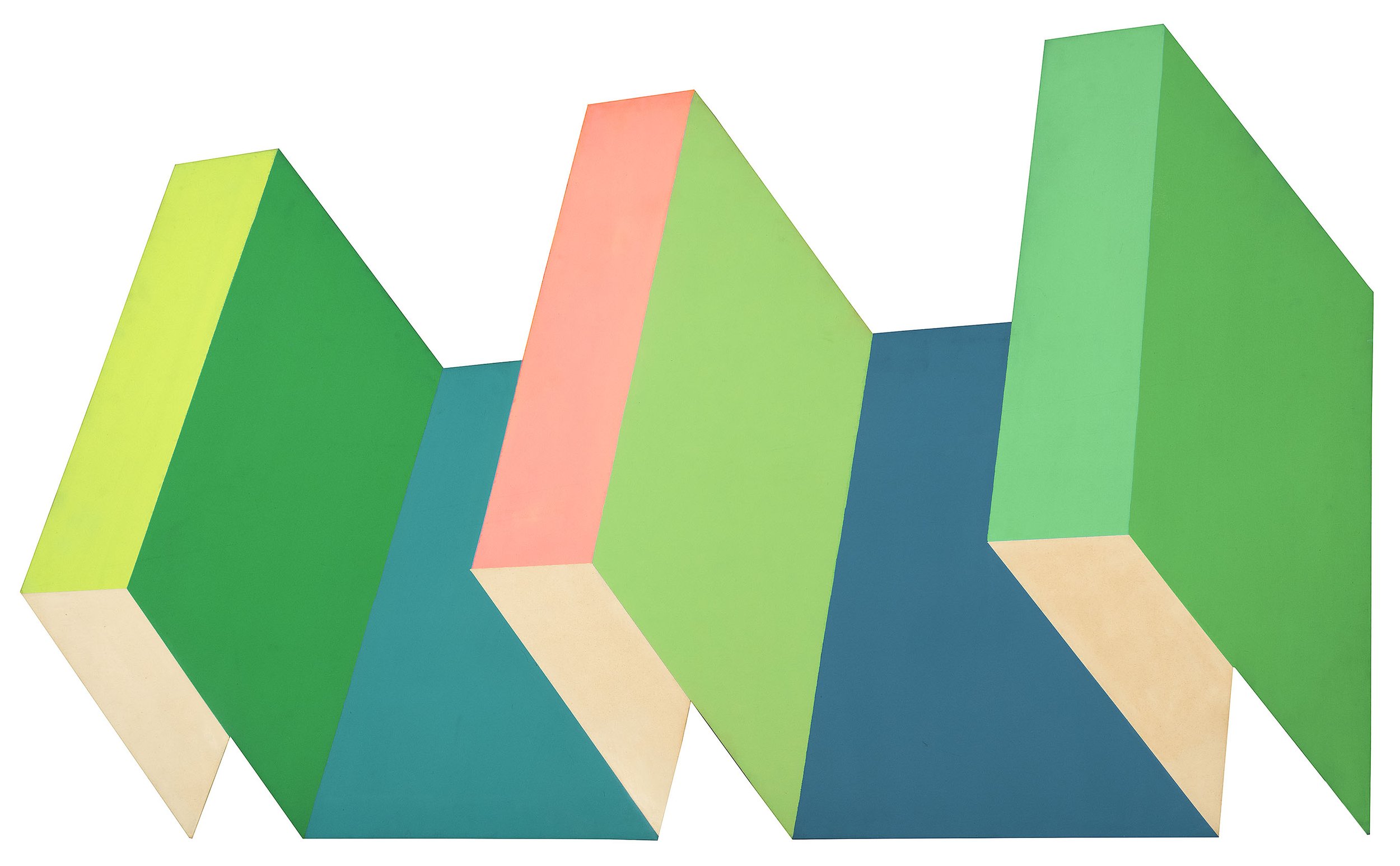
Essay by Deedee Wigmore

Harold Weston: Modernist of the Adirondacks is the second exhibition of Weston’s Adirondack landscapes I have done working with the artist’s daughter Nina Foster and granddaughter Rebecca Foster. My husband and I met Harold Weston’s wife Faith around 1975 at an exhibition of the artist’s paintings held at The Adirondack Store and Gallery in Raybrook, New York. We felt an immediate connection to the abstracted beauty of Weston’s spiritual Adirondack landscapes and made some purchases. I have been a member of Harold Weston’s fan club ever since.

Harold Weston (1894-1972), born in Merion, Pennsylvania, graduated from Harvard in 1916 magna cum laude, Phi Beta Kappa, and editor of The Lampoon. During the summers, while at Harvard, Weston took art classes with Hamilton Easter Field (1873-1922) in Ogunquit, Maine. Field provided him with a foundation of design principles and an introduction to Modernism and subjective interpretation. After graduation, Weston spent three and a half years helping with war relief in Persia during World War I then traveled extensively through the Far East.

Back in the United States by 1920, Weston furthered his art studies with William Schumacher (1870-1931), an American Symbolist inspired by the modernism he witnessed in the 1913 Armory Show. While attending art school in New York, Weston realized his calling was to paint directly from nature. He built a studio in St. Huberts, three miles south of Keene Valley in the Adirondacks, where his family had vacationed for two generations. There Weston developed his own style of distinctive patterning, outlined areas of color, and fragmented forms.

Success came quickly to Harold Weston. His first major exhibition opened November 8th, 1922 at The Montross Gallery, a leading New York gallery associated with The New York Ten and their early Modernism. Montross remained Weston’s dealer until 1932 when the owner Newman Montross died. That first exhibition had 62 paintings and 100 sketches, primarily of Adirondack subjects. All the oil paintings had pine frames carved by Weston and the best sketches sold for $200. The exhibition was a huge success. Weston was compared favorably with Marsden Hartley as a modernist who used color as an instrument of emotional expression and of plastic design in his response to a rugged place. His nature forms were described as modernist but not unrecognizable, challenging but not alienating. Weston had six solo exhibition at Montross Gallery between 1922 and 1932. With established success, Weston married Faith Borton of Moorestown, New Jersey in 1923 and the two spent much of their time in the Adirondacks.

Weston began to work in watercolor early in 1923 after the Brooklyn Museum offered to feature his work in their annual exhibition in April if he could produce a group of watercolors as good as his oils. With only a few months until they were due, Weston took on this difficult medium with impressive technique and strong colors. While traveling in Europe in the late 1920s, Weston worked in watercolor on colored paper for added vibrancy and color. Our exhibition includes 6 examples of Weston’s works on paper in watercolor and gouache.

Suffering from poor health, Weston and his wife moved to France from 1926 to 1930. There they traveled between the Pyrenees and Paris, alternating between remote mountains and the influential expatriate society of Gertrude Stein and the Modernist movement. Weston continued to send work to his dealer, Montross Gallery.

Weston returned to America in 1930, beginning a decade in which his career and reputation grew steadily. He received valuable exposure through his friendship with Duncan Phillips, the influential art collector and critic. In 1928 Phillips purchased the first in what would eventually become a collection of 34 works by Weston. During the 1930s alone, the Phillips’ Memorial Gallery in Washington DC (now the Phillips Collection) mounted four solo exhibitions. Another achievement of that decade was the series of murals across 22 panels (840 square feet) Weston painted for the General Services Administration Building in Washington between 1936 and 1938; the mural was a commission awarded by the Treasury Relief Art Project. In 1939 Weston’s vibrant Girl with Green Hat won a prize at the Golden Gate International Exhibition in San Francisco. From 1949 to 1952 Weston created a series of six oils showing the successive stages of the United Nations buildings during its construction, which was purchased by the Smithsonian Institution.

Our exhibition contains 14 paintings executed between 1921-1940 in oil, gouache, and watercolor as Weston was proficient in all of these mediums. Weston packed a knapsack with a tin sketchbox that had paints, pencils, and small pieces of card board, usually nine by six inches. While climbing or canoeing, Weston worked in small sketches when he was struck by a composition to capture the fast moving atmosphere and light found in the Adirondacks. In his first fall sketching in the Adirondacks in 1920, Weston wrote in his diary, "I feel I ought to make studies of two definite sorts, close to nature and freely interpretive." These sketches gave Weston a visual and emotional clue of what he was after when he returned to his studio. Weston also took photographs of subjects that inspired him. In the 1930s traveling by car, Weston recorded in watercolor or gouache sketches the farms, mines, and small towns that interested him. Some of those sketches are a part of our exhibition.

[ TOP ]

Modernism 1913-1950 | Realism of the 1930s and 1940s | Abstraction of the 1930s and 1940s | Post-War | Selected Biographies

WOMEN ARTISTS IN FLORIDA, 1920-1951

Nov 30, 2017- Feb 22, 2018

Essay | Some works may still be available, please contact the gallery at 212-581-1657
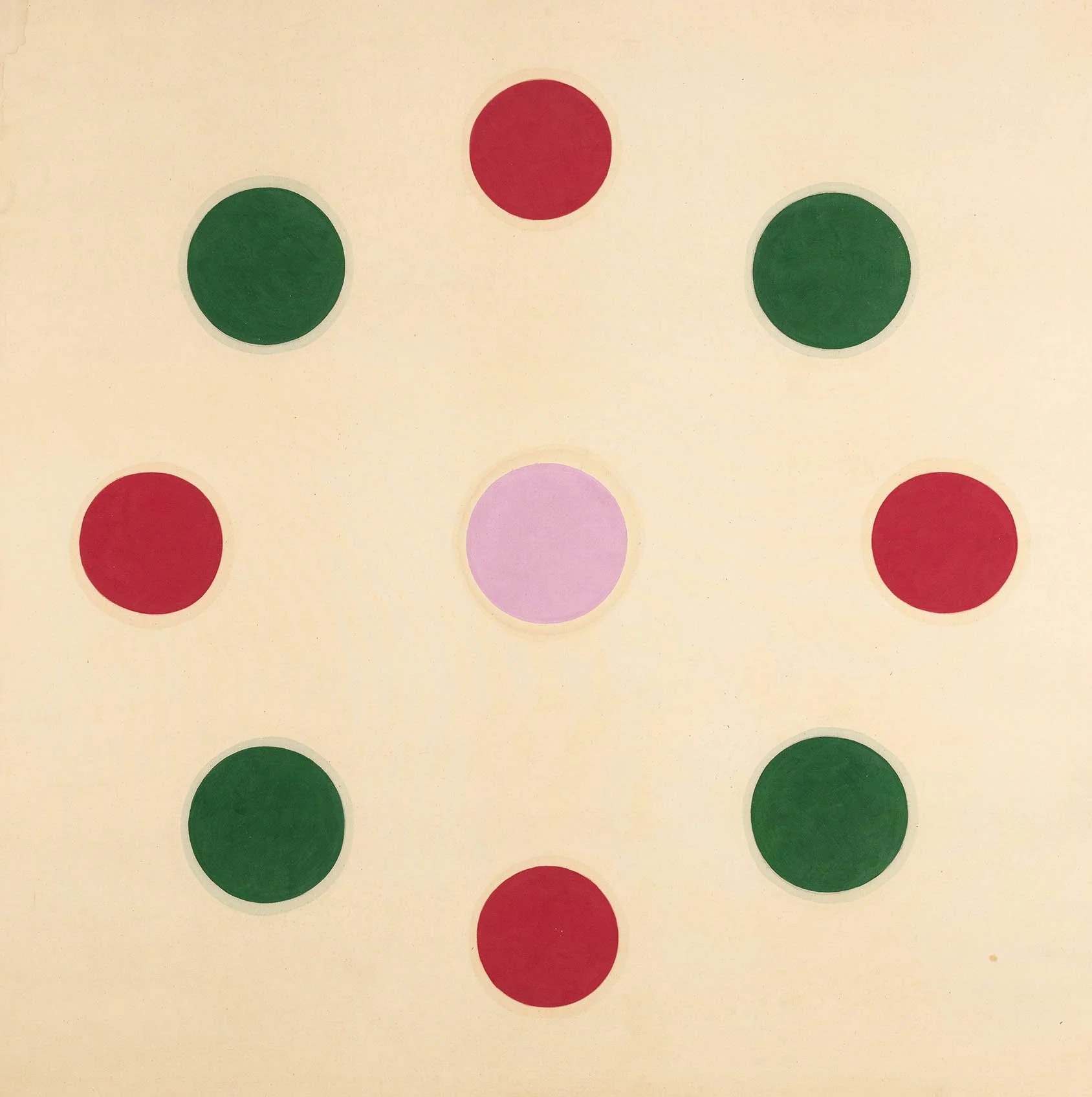
Essay by Deedee Wigmore

This exhibition presents images of Florida by some of the women artists who visited Florida and recorded their impressions in the 20th century. The artists were attracted to Florida’s profound beauty and idyllic weather. The gallery’s focused exhibition on women artists’ contributions is just a taste of the larger efforts of curator Jennifer Hardin who is revisiting and reviving 20th century Florida art in the upcoming exhibition Imagining Florida: History and Myth in the Sunshine State to be held at the Boca Raton Museum of Art, November 13, 2018- March 24, 2019.

One of the artists in our exhibition, Sally Michel (1902-2003), spent the winters of 1949-50 and 1950-51 in Florida at the Research Studio in Maitland. Her husband Milton Avery was recovering from a major heart attack and his physician suggested that Milton spend the winter in a warmer climate. Michel arranged for Avery to receive a Bok Fellowship at the Research Studio, where he joined fellow artists-in-residence Minna Citron (1896-1991), Doris Lee (1904-1983) and her husband Arnold Blanch (1896-1968). While Avery focused on monoprints, Michel painted scenes of the exotic flora and fauna she encountered in the Maitland area. A charming example is Cows in Marsh, c.1951 where Michel has dotted the waterways of the area’s lakes with familiar Holsteins.

Many artists from the Woodstock, New York art colony were influenced by the glowing descriptions of fellow artists to visit Florida. Zulma Steele (1881-1983) was the first woman artist to live at Byrdcliffe, the Arts and Crafts colony located in Woodstock. There she designed oak furniture and painted landscapes from 1903 to 1909 when the colony was most active, then continued to teach art classes on the Byrdcliffe campus each summer through the early Twenties. The three panel Florida Landscape with original artist-made frame was executed in the 1920s and hung in Steele’s Woodstock home.

Doris Lee first went to Florida in 1934 and returned every winter. Each year after Thanksgiving, Lee would leave Woodstock and drive to Florida with her husband Arnold Blanch, who taught art across Florida while Lee painted. Lee was a charter member of the Clearwater Art Club, formed in February of 1935. Committed to the area, Lee received a solo exhibition in 1951 at the Florida Gulf Coast Art Center, formed in 1948 when the Clearwater Art Museum, the Museum Art School and other nearby art organizations joined together. While Lee remained connected to Clearwater, eventually retiring there in the 1960s, she and Blanch traveled throughout Florida. The two exhibited in WPA-sponsored art exhibitions in Key West in the 1930s. The programs was a success and Key West became a draw for many artists by the 1940s. According to Tennessee Williams’ memoir, Lee and Blanch were joined by Williams, Grant Wood, and Yasuo Kuniyoshi in the winter of 1941-1942. Our exhibition offers several Key West scenes by Lee executed in gouache. Helicopter over Key West, Seashell Vendors, and Souvenirs, Key West were all exhibited in Lee’s exhibitions at Associated American Artists in New York through the 1940s and 1950s. While in South Florida, Lee often visited the Everglades and was interested in the remaining Seminole tribes that lived along its edge. Seminole artistic traditions of embroidering beadwork and hand woven patchwork on clothing are noted by Lee in her Seminole Indians in the Everglades, a painting of two Seminole women in traditional dress returning from market in their canoe. A 1946 Life Magazine commission led Lee to travel around the Gulf of Mexico by car to create images of the area for an article on the Pan-American Highway, published in May of 1947. One of the paintings for that commission titled Sailing off the Gulf of Mexico is in our exhibition. In the painting Lee conveys Florida’s unique land shape as the only peninsula and subtropical area in the continental United States.

Jane Peterson (1876-1965) first visited Florida in 1918 when she organized the Palm Beach Country Art Club, which later became the Palm Beach Art League. In 1925 then nearing her fiftieth birthday, Peterson married a successful corporate lawyer, Bernard Philipp. During this marriage Peterson began to paint flowers both as portraits and still life compositions. Bernard Philipp died in 1929 leaving Peterson a rich woman. This allowed her to travel; spending summers in Europe or Ipswich, Massachusetts, spring in New York and winters on the Riviera or in Palm Beach. The painting in our exhibition Hibiscus depicts a flower commonly seen in Florida landscapes.

Virginia Berresford (1904-1995) first visited Florida in 1932 with her husband Ben Thielen. Her first winter in Florida resulted in an oil painting Tropic Island, 1934 which was included in Berresford’s 1936 solo exhibition at New York’s Walker Art Gallery, as well as in our exhibition. Berresford wrote in her journal, “In Key West I got the idea of breaking loose from my usual severe painting style, partly Ozenfant inspired; I loosened up, went into watercolor, used daring free strokes and bright colors.” [Virginia’s Journal, an Autobiography of an Artist, p. 41]. Berresford’s first solo exhibition of watercolors was held in New York at the Marie Sterner Gallery in 1938. Some of the other notable New York galleries that exhibited Berresford’s art were Mortimer Levitt, Bonstell Gallery, Bodley Gallery and Jacques Seligmann Gallery. Our exhibition includes nine of these Florida watercolors. Winters in Key West became a regular thing. Berresford’s journal records her bone fishing and sailing to Sand Key and driving to Palm Beach for lunch at the Everglades Club. In 1943 Berresford’s husband Bernard Thielen was commissioned a Lieutenant Commander in the navy and stationed in Miami. The couple rented a house in Coconut Grove, a roomy Spanish-style house in tropical garden scenery. There Berresford used her bedroom as a studio and taught watercolor techniques to soldiers at Miami Hospital for the Red Cross. When the war ended in 1945, Ben Thielen was dismissed from the Navy and the couple returned to Key West for the winter of 1946. In 1948 Berresford ended her marriage to Ben Thielen and her time in Florida.
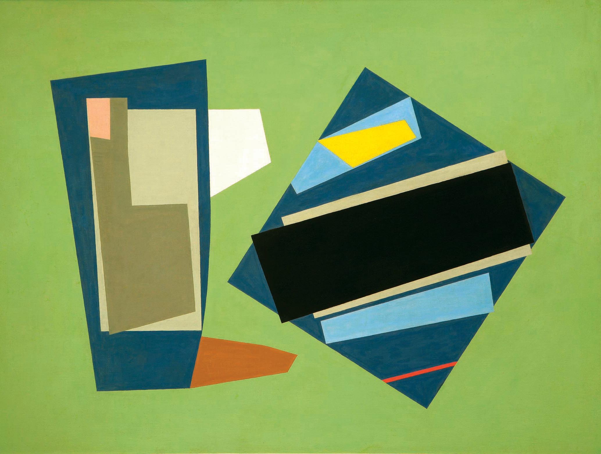
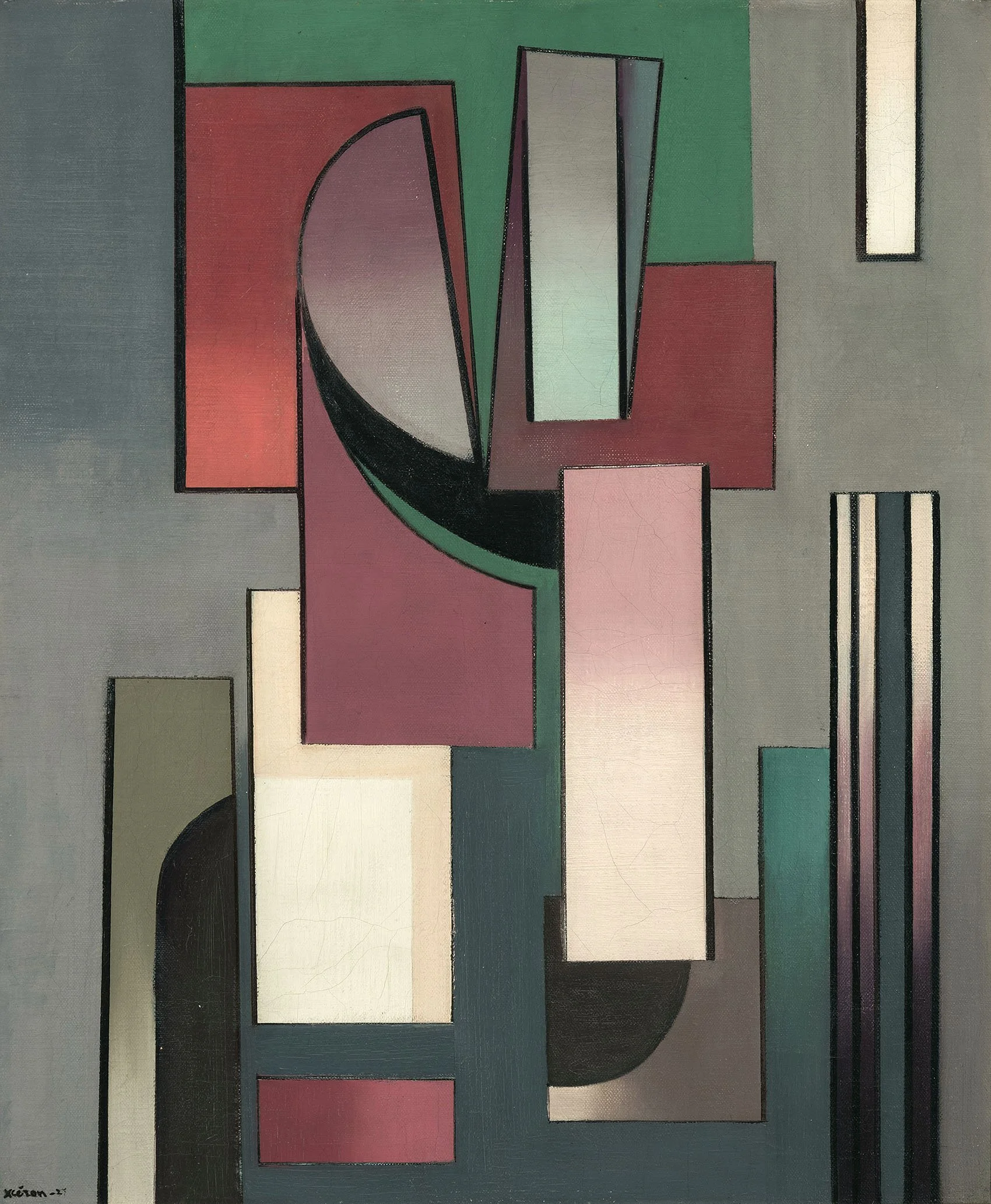
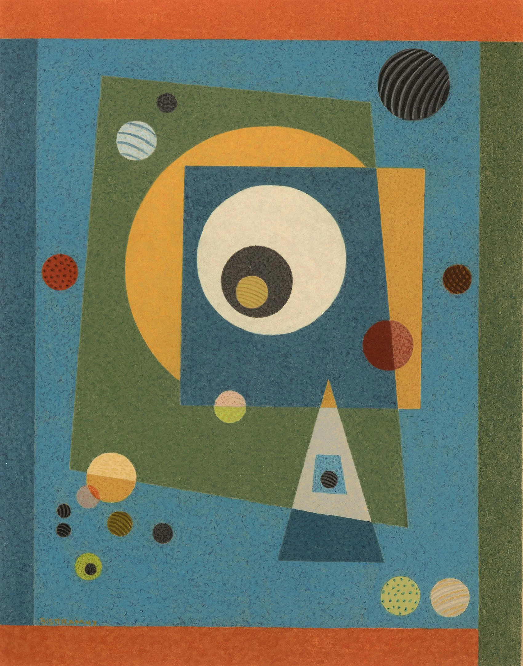
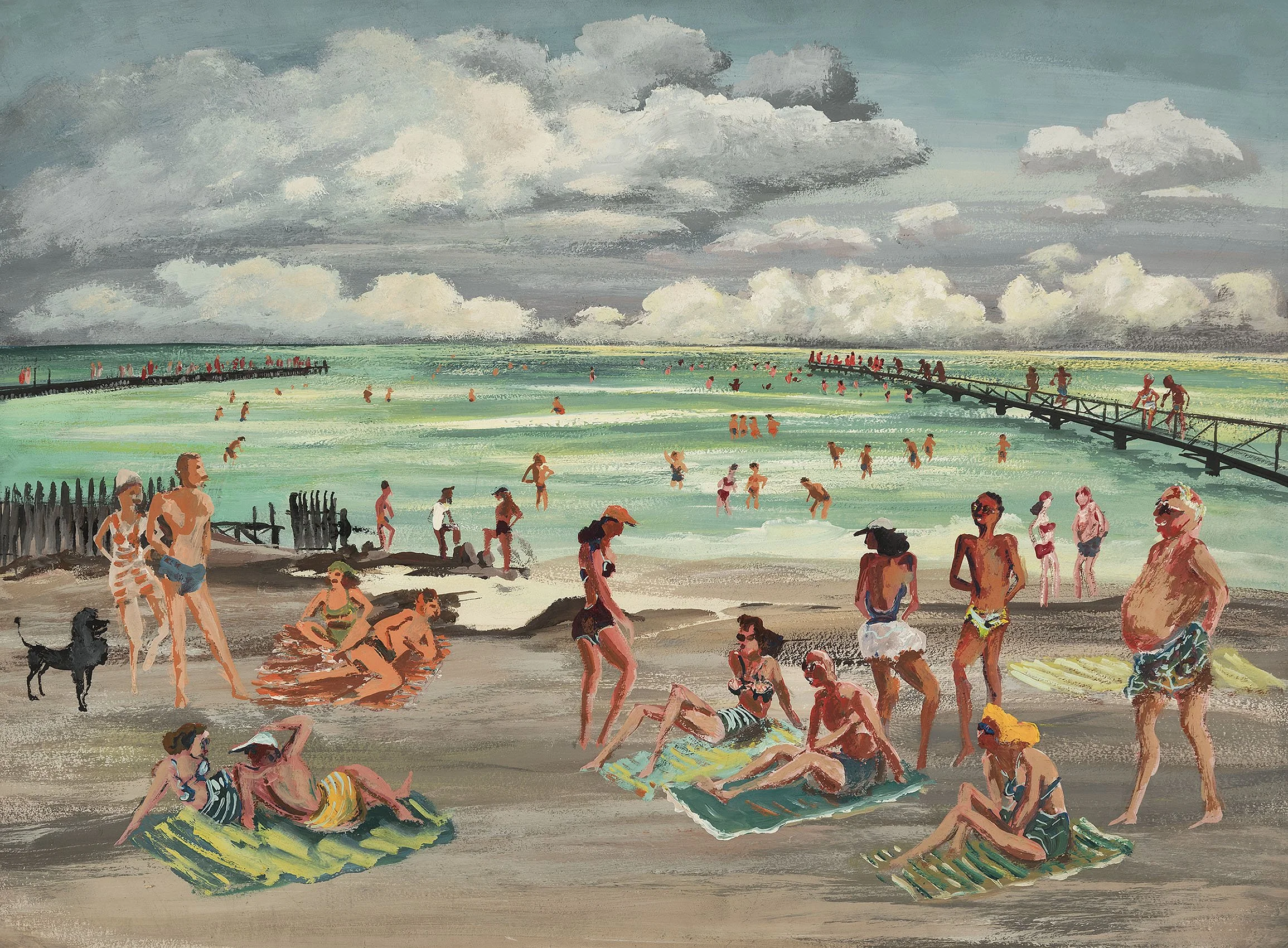
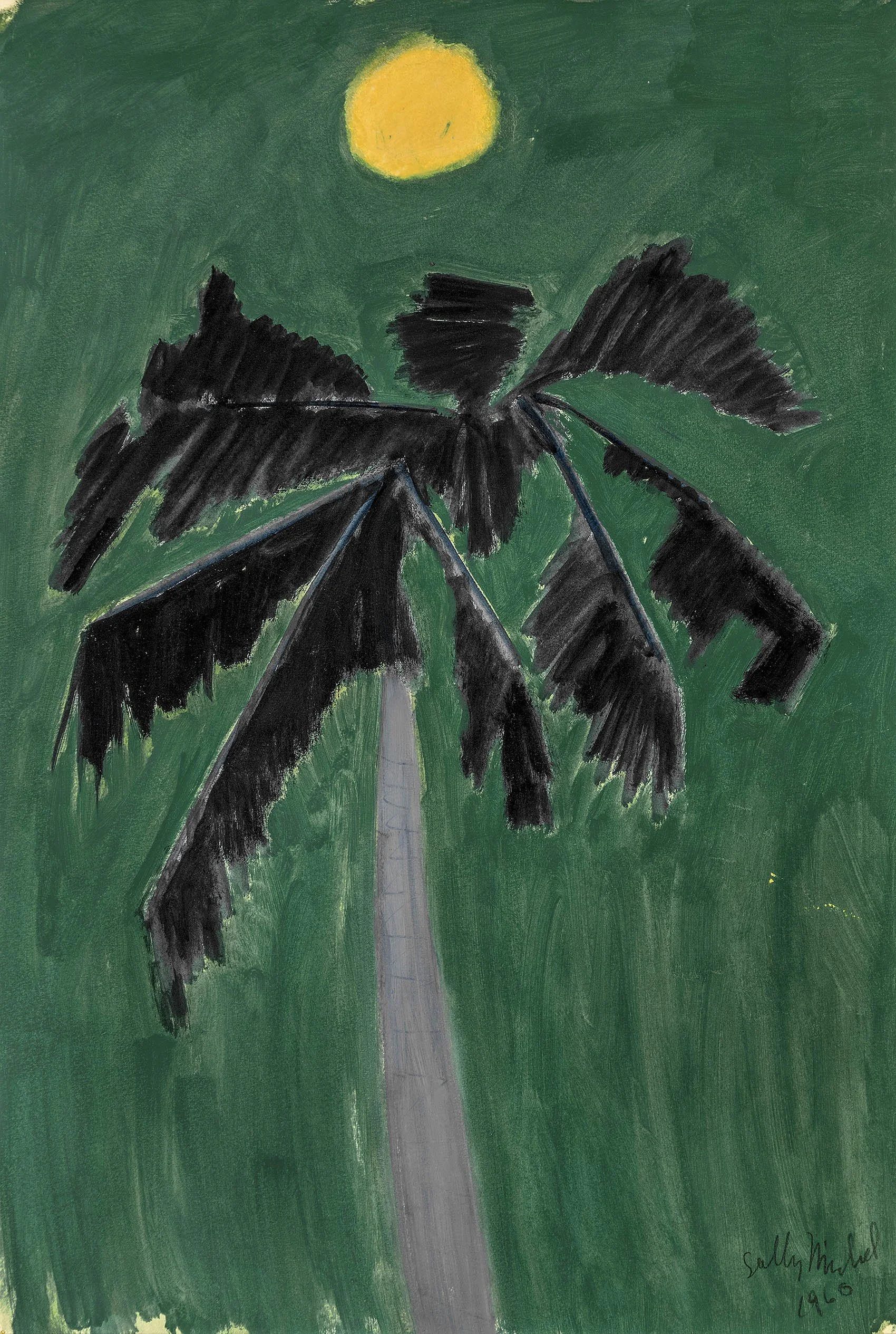
[ TOP ]

Modernism 1913-1950 | Realism of the 1930s and 1940s | Abstraction of the 1930s and 1940s | Post-War | Selected Biographies