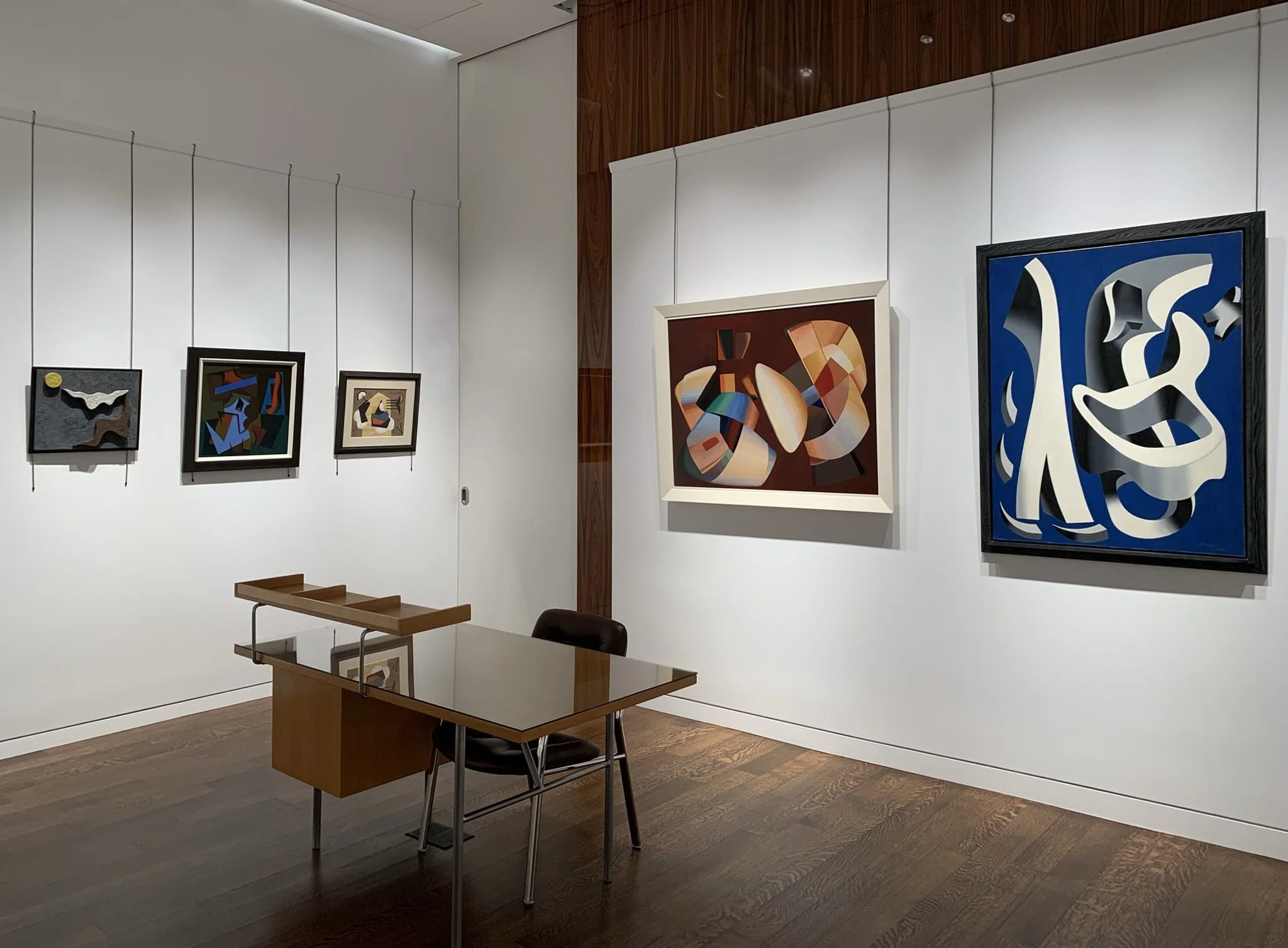
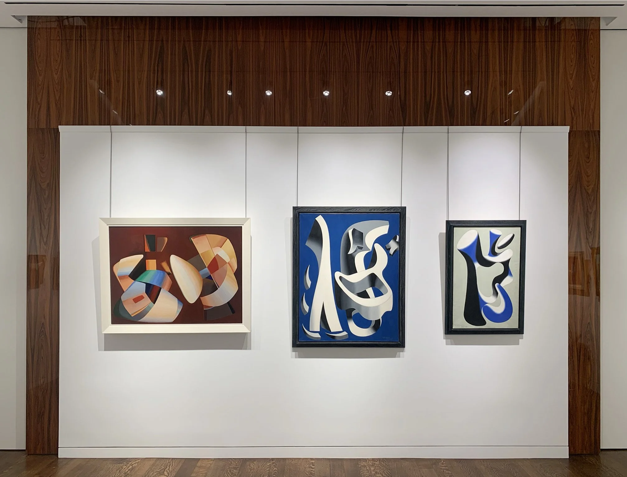
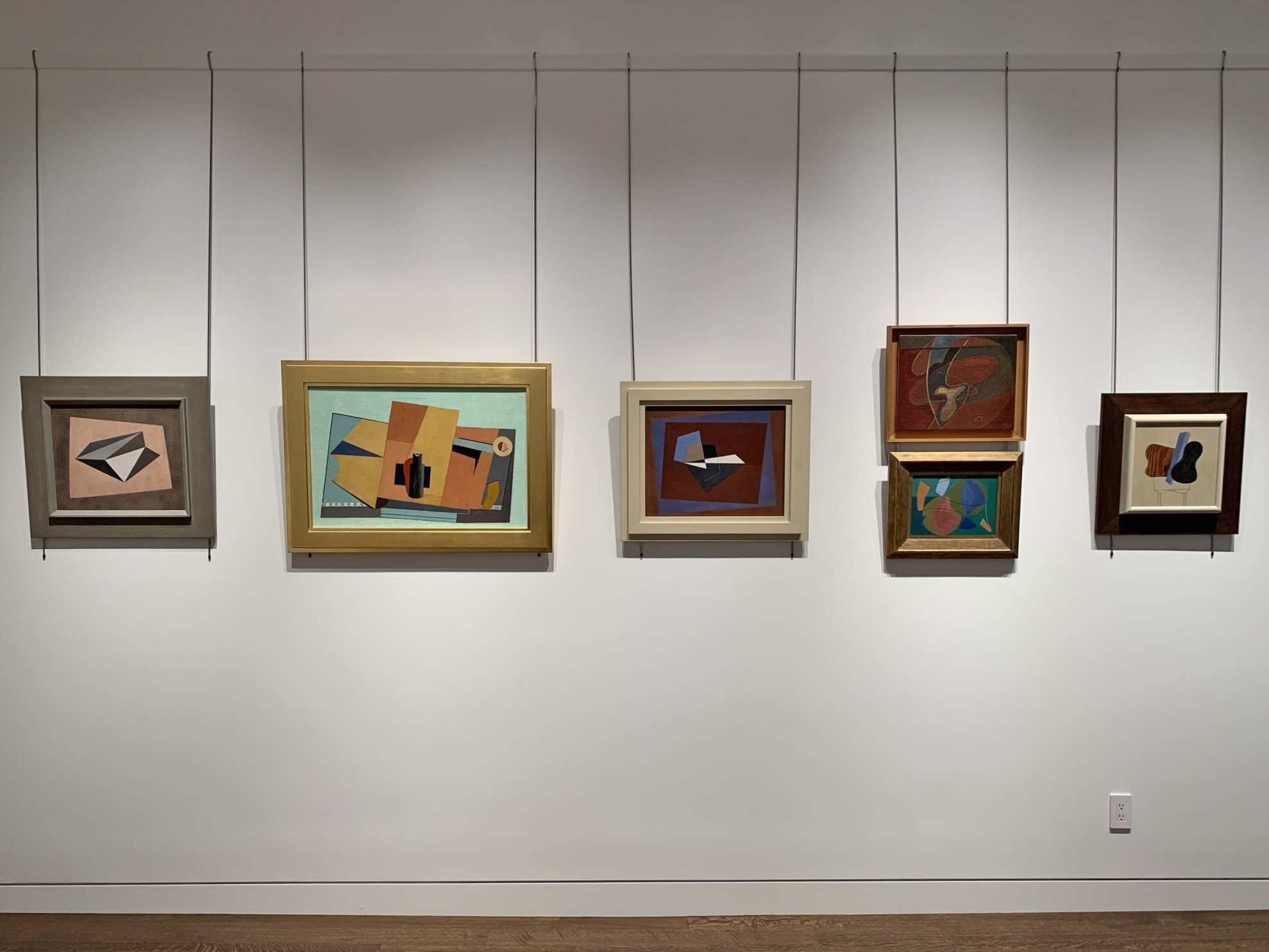
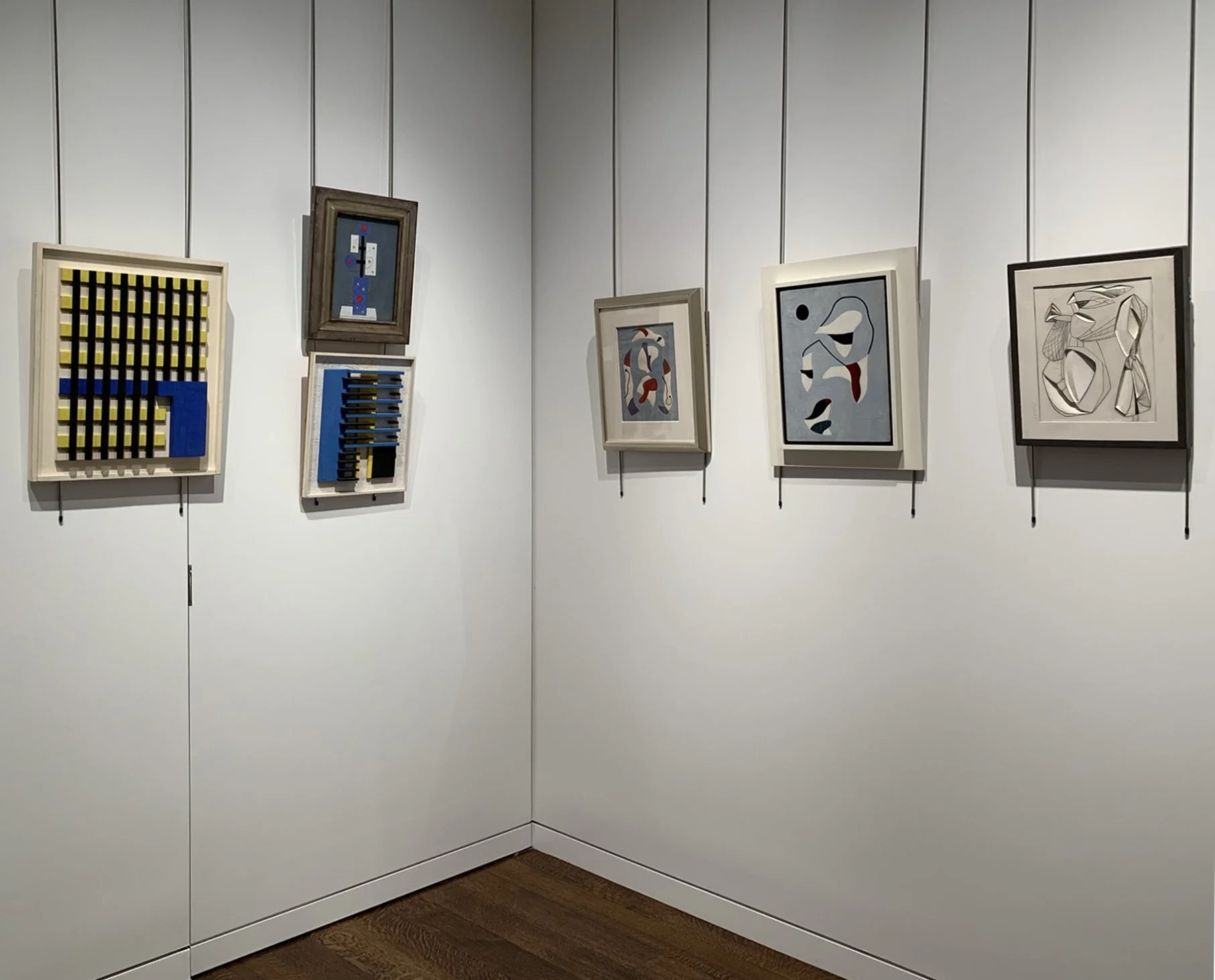
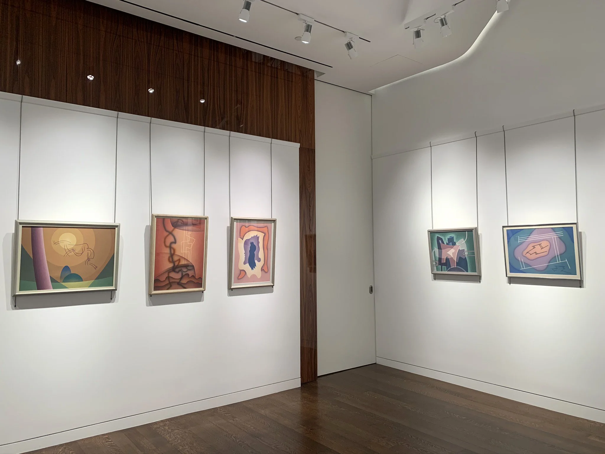
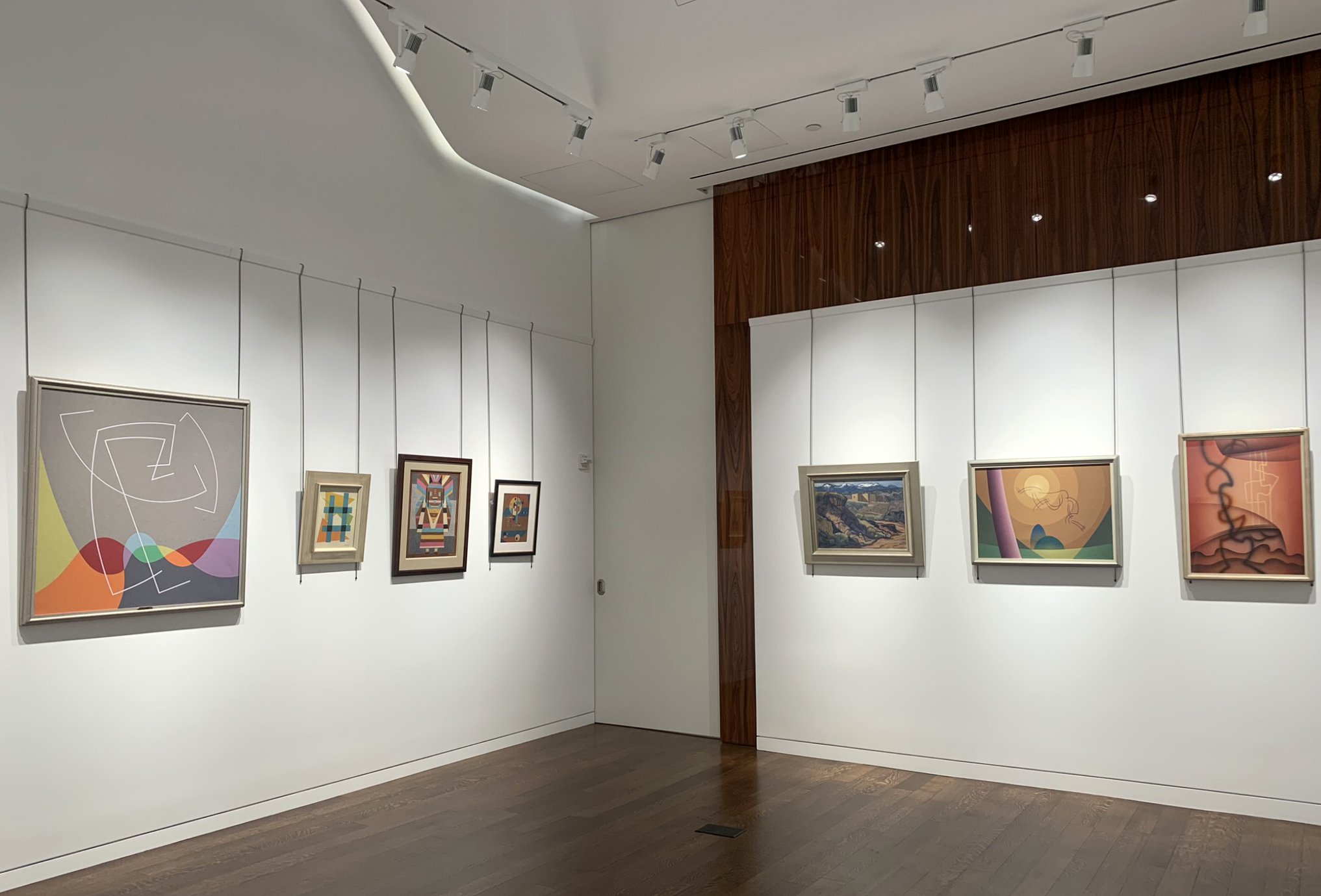
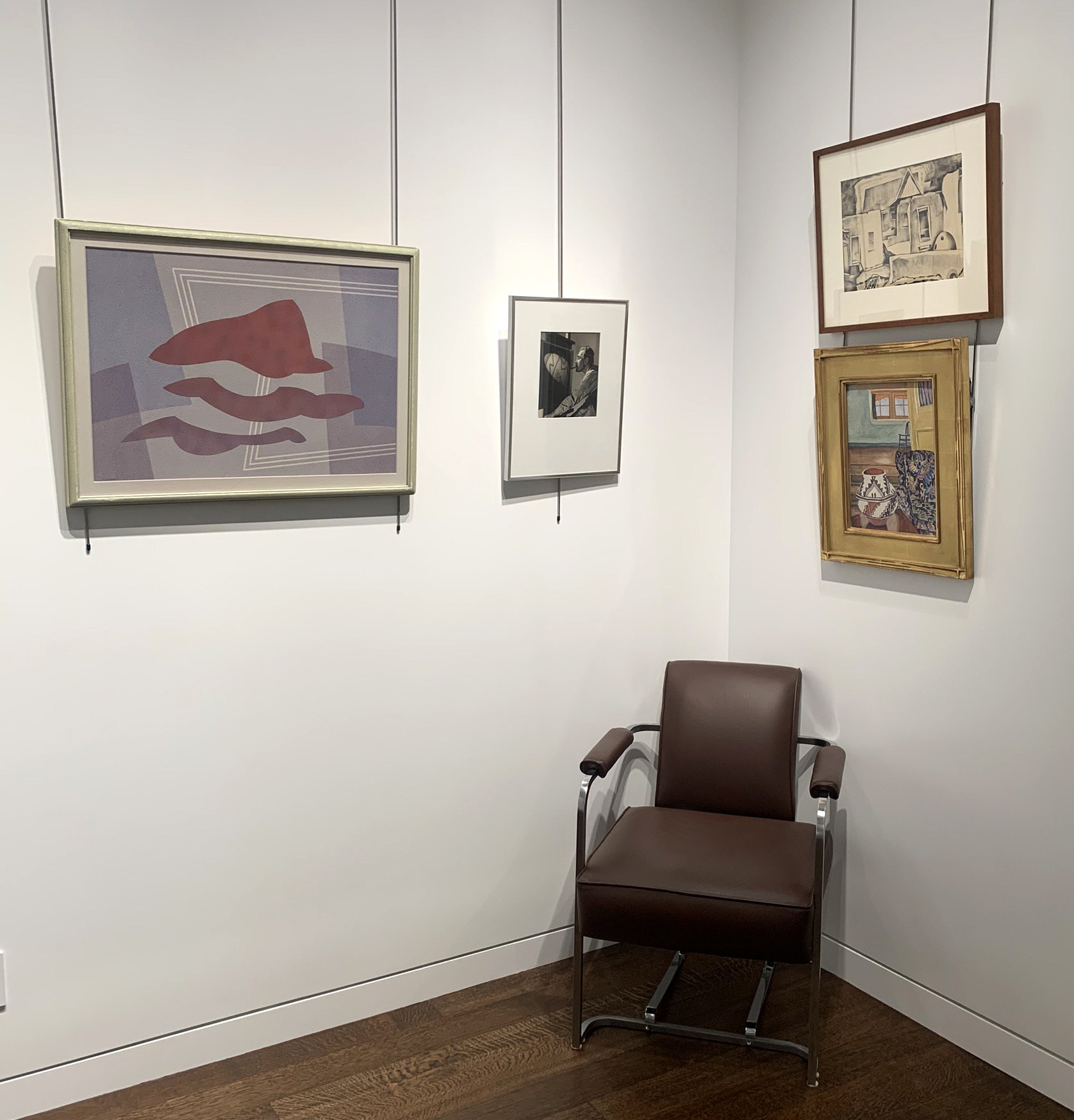
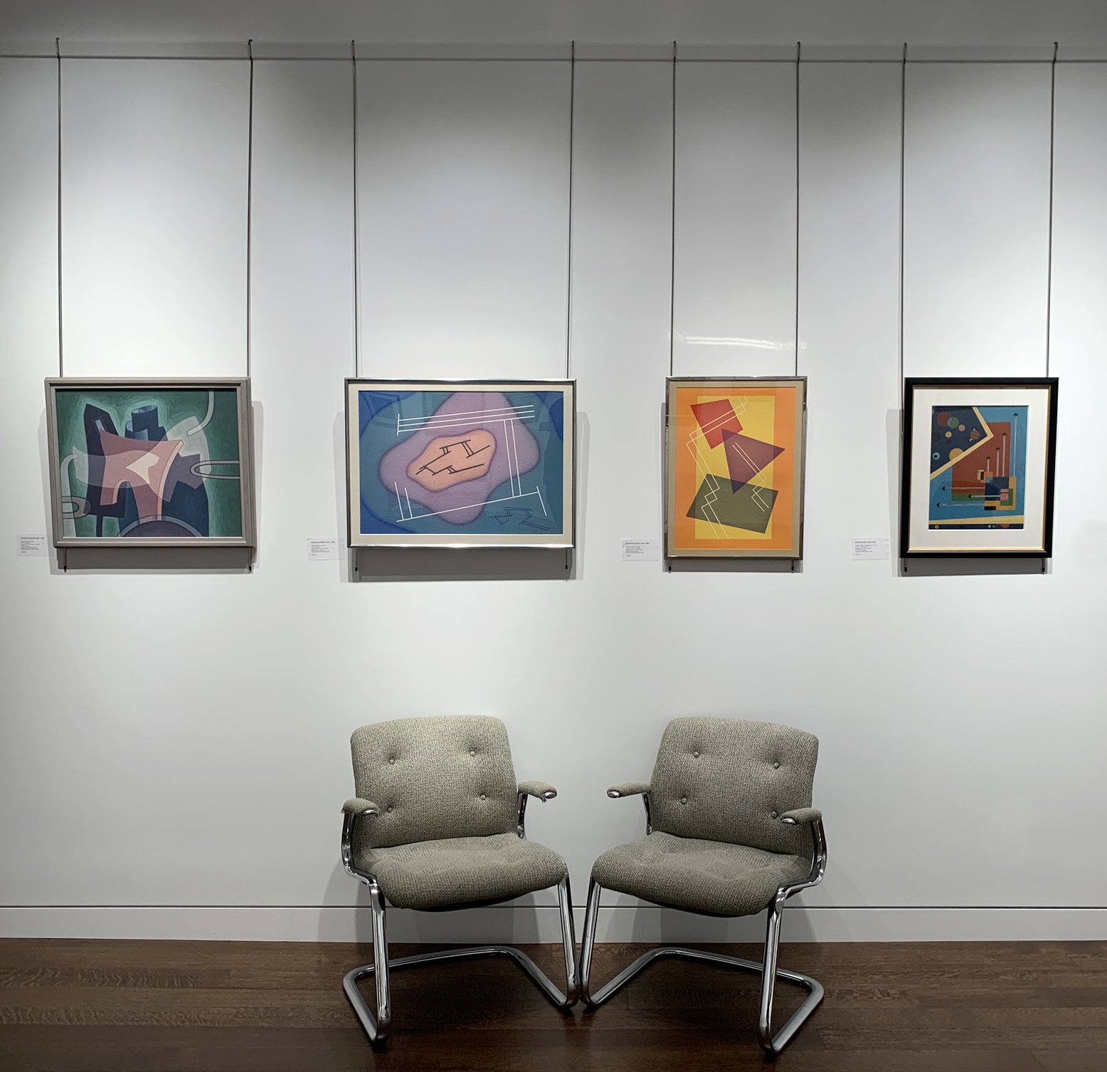
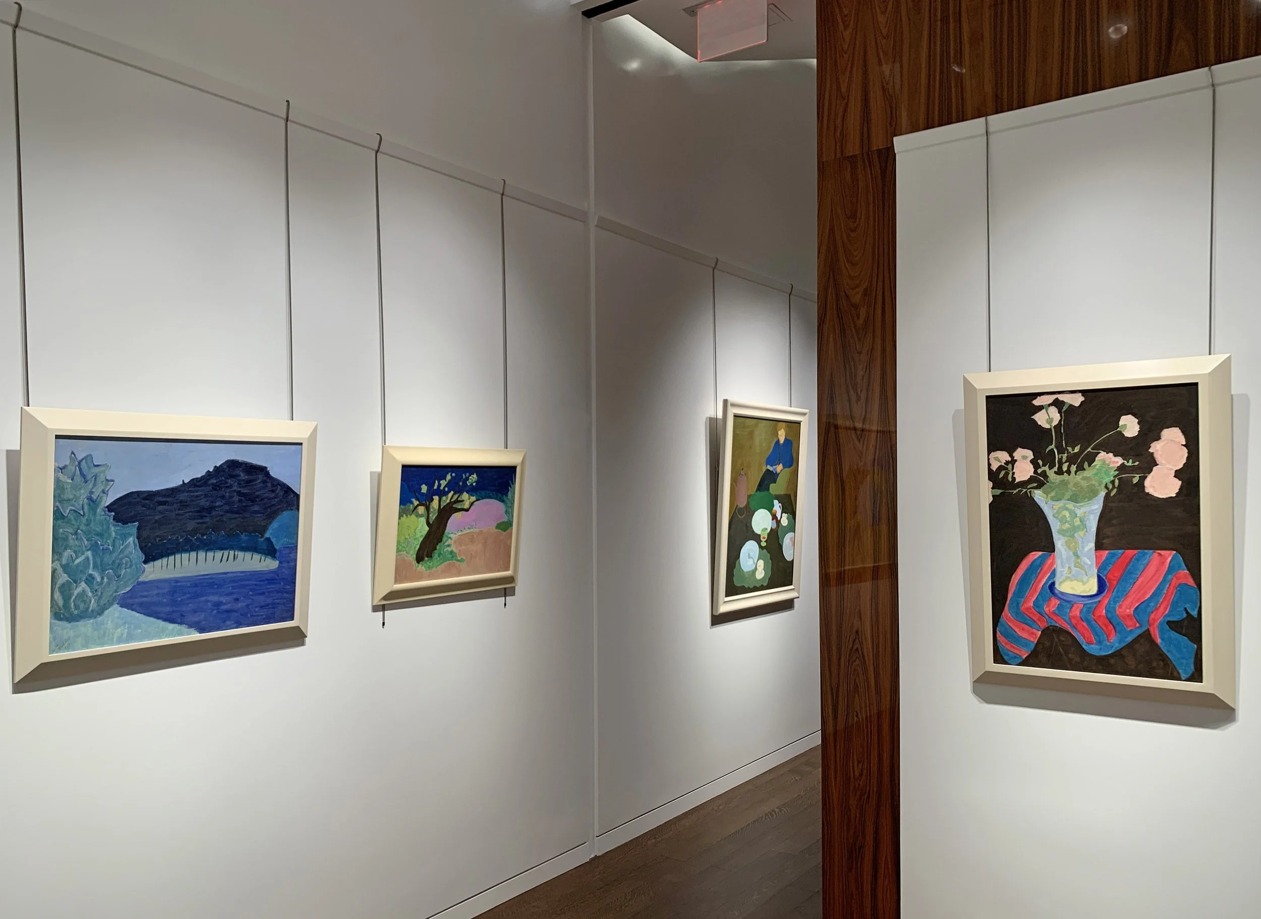
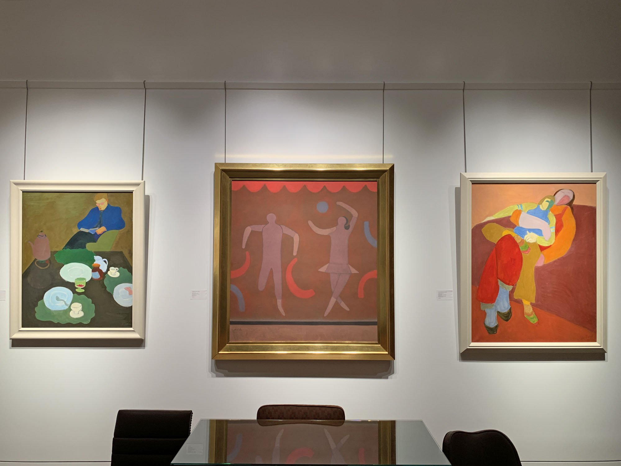
SALLY MICHEL: RESHAPING REALISM, 1950-1985

March 2 - May 18, 2022, extended through June 10
Essay | Installation Views | Exhibitions and Museum Collections
2016 New York Times Review | For further inquiries, call 212-581-1657.


Installation Views

Essay by Deedee Wigmore

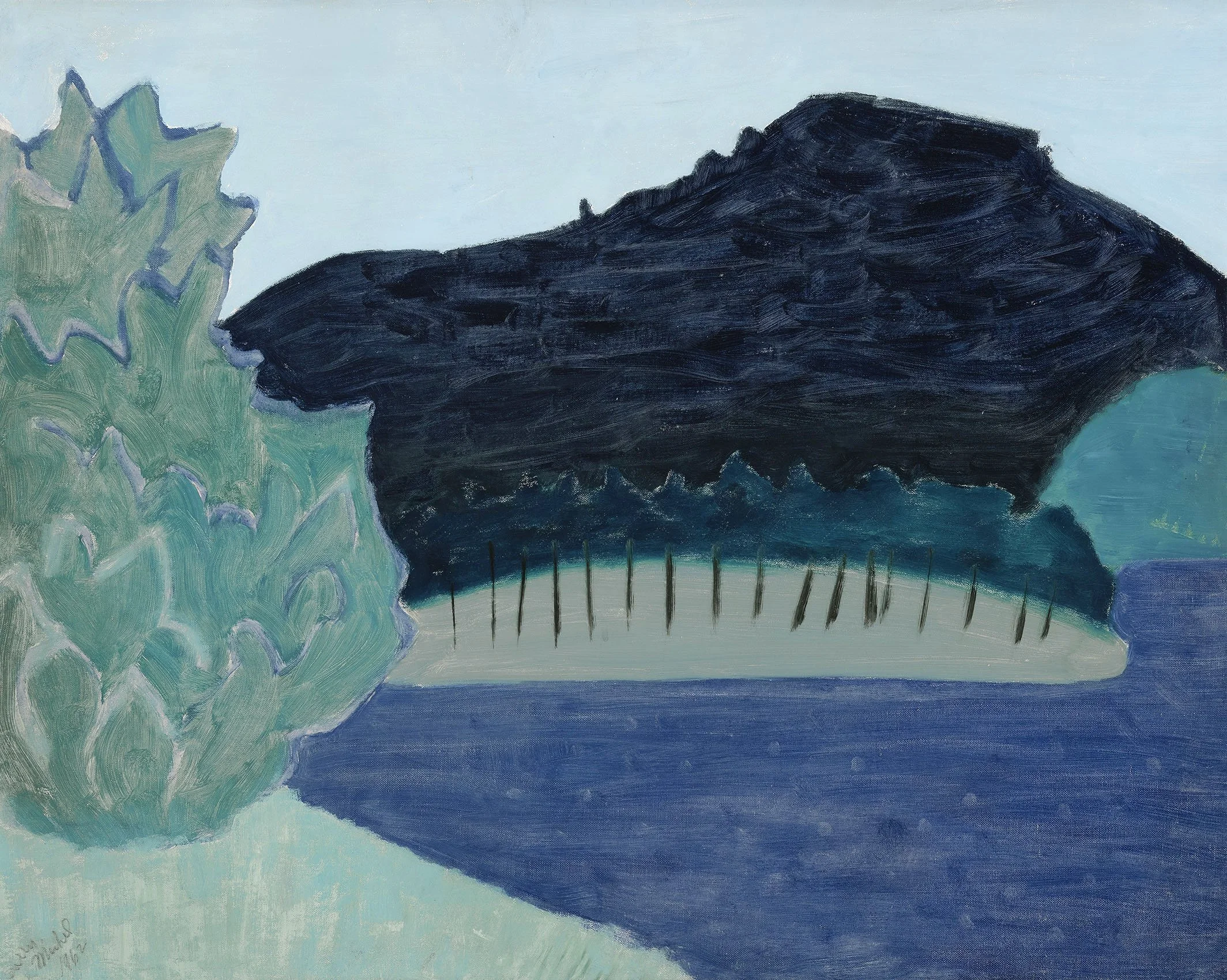
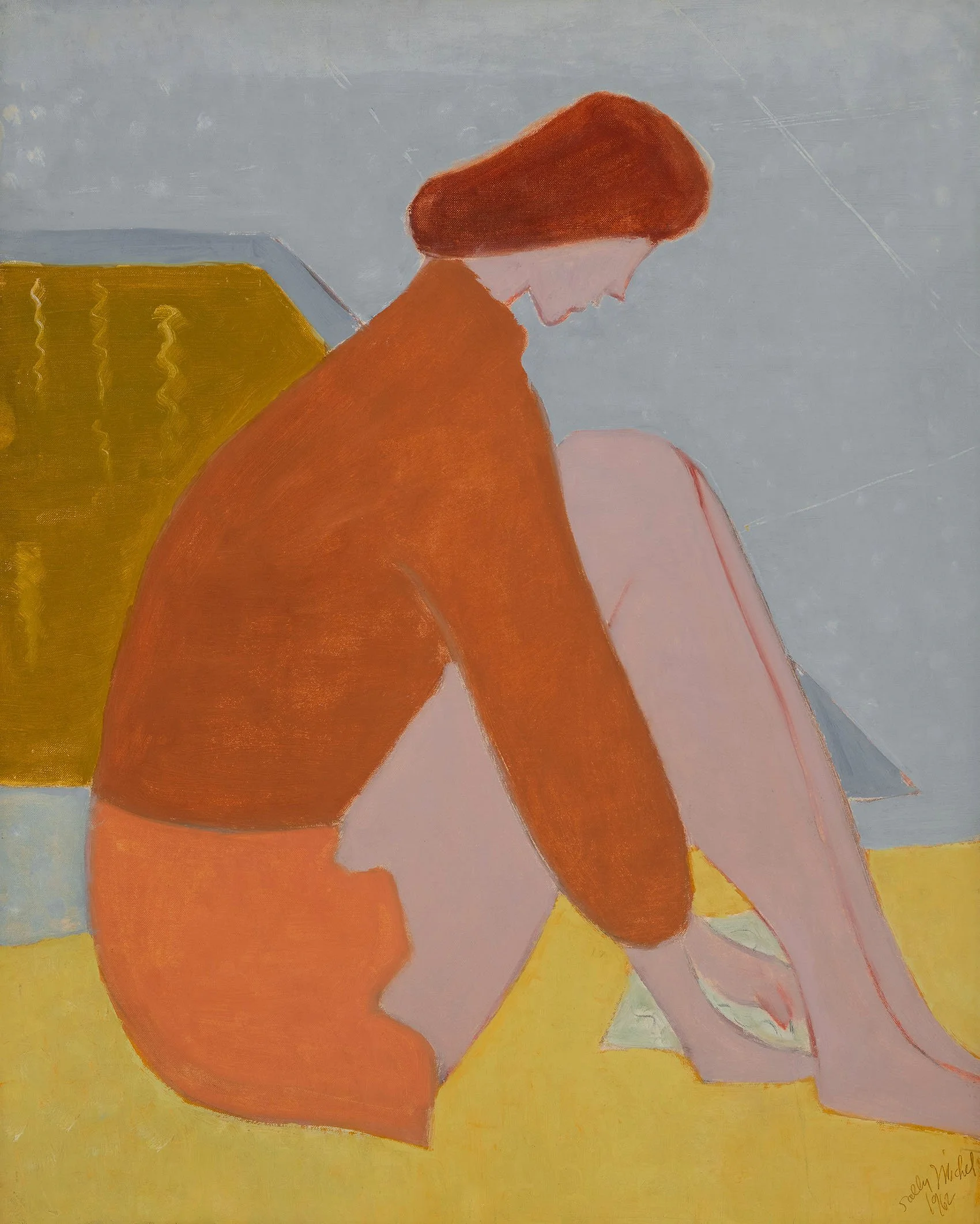
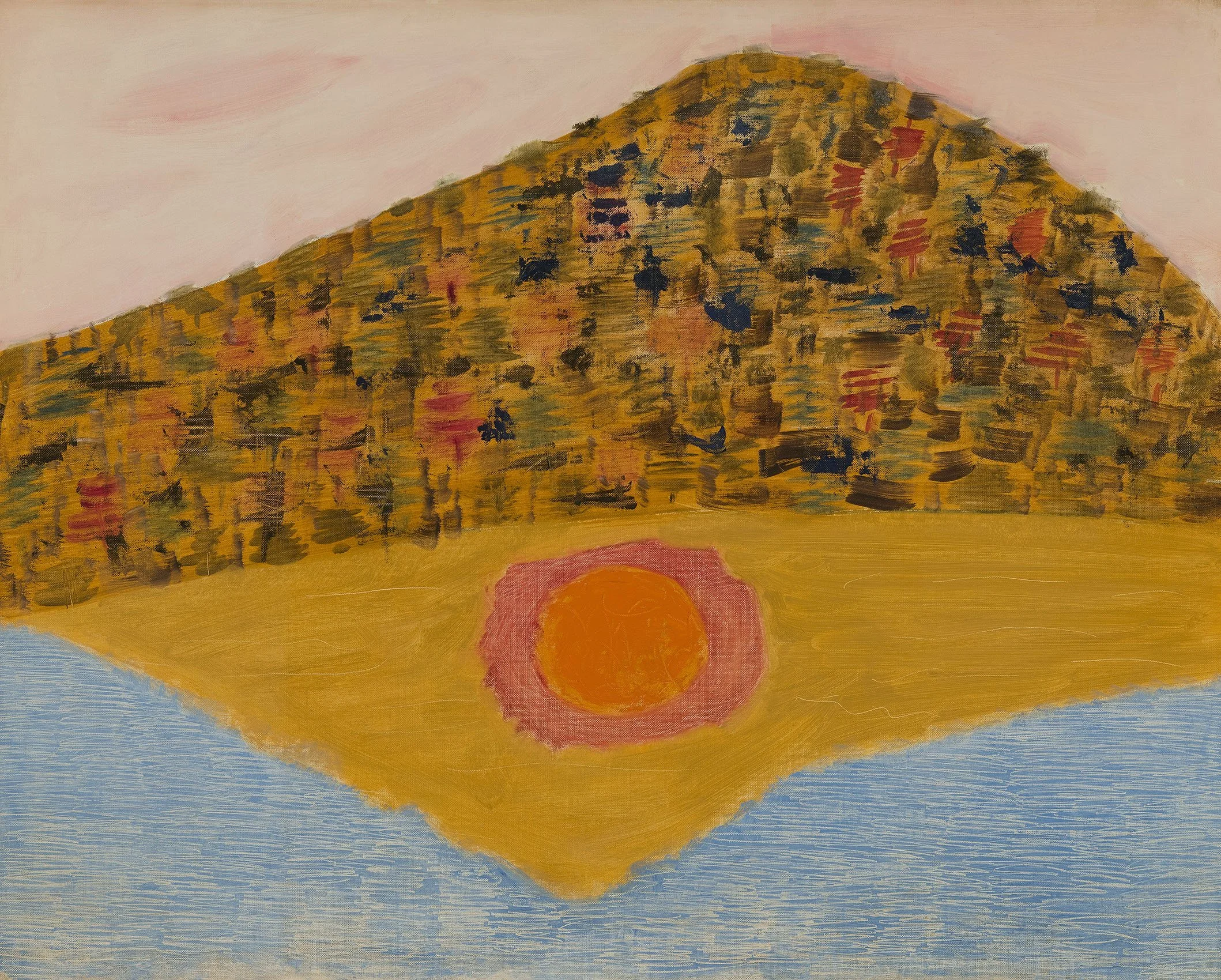
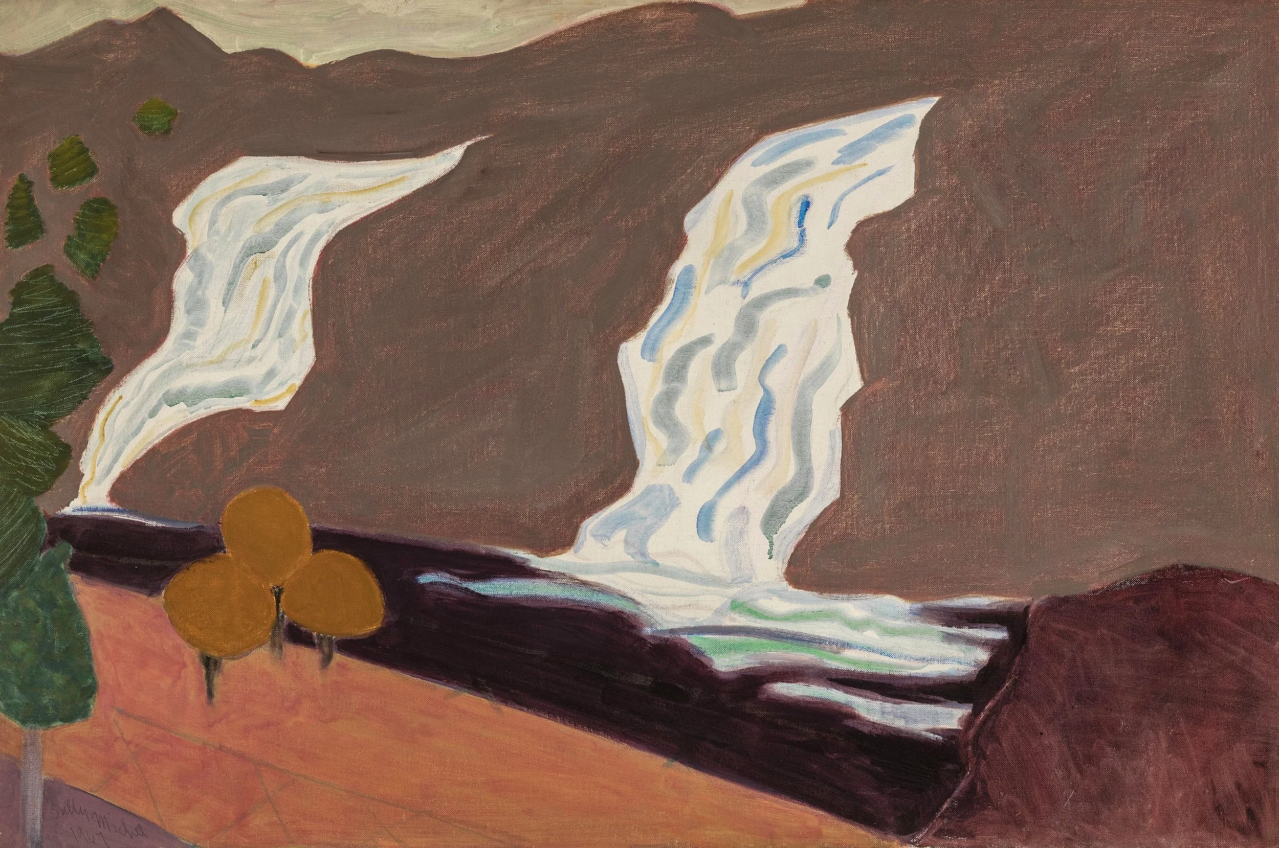
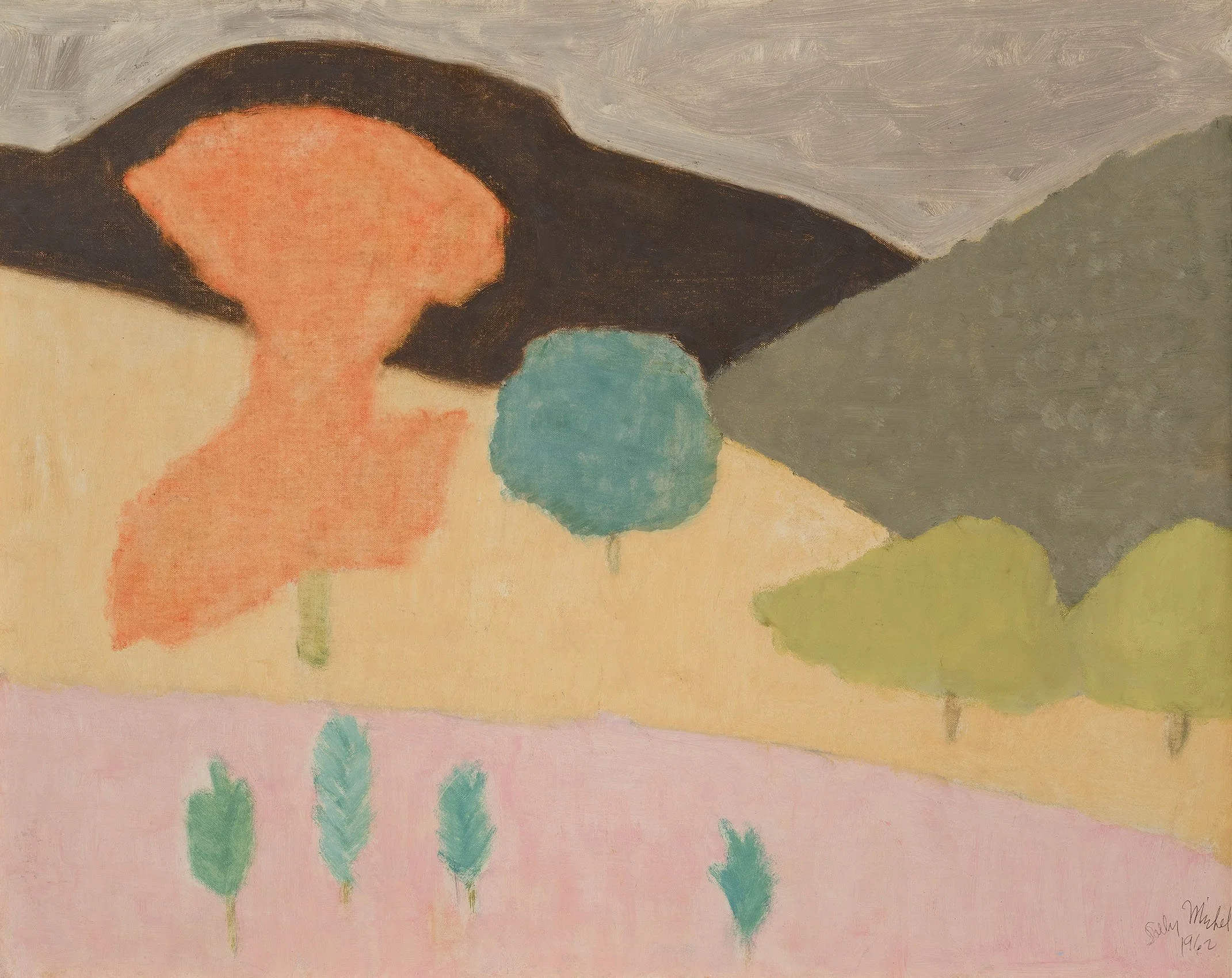
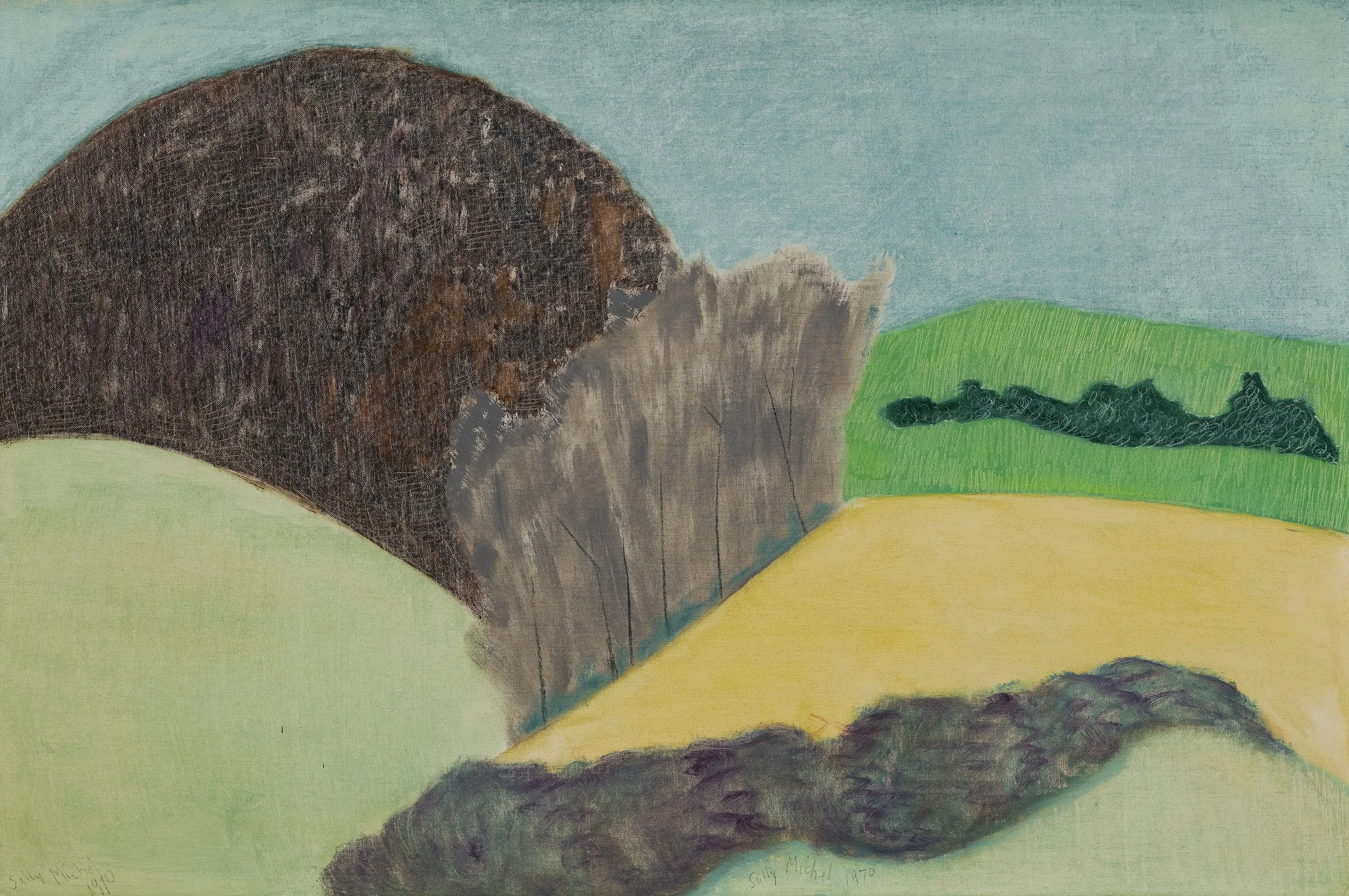
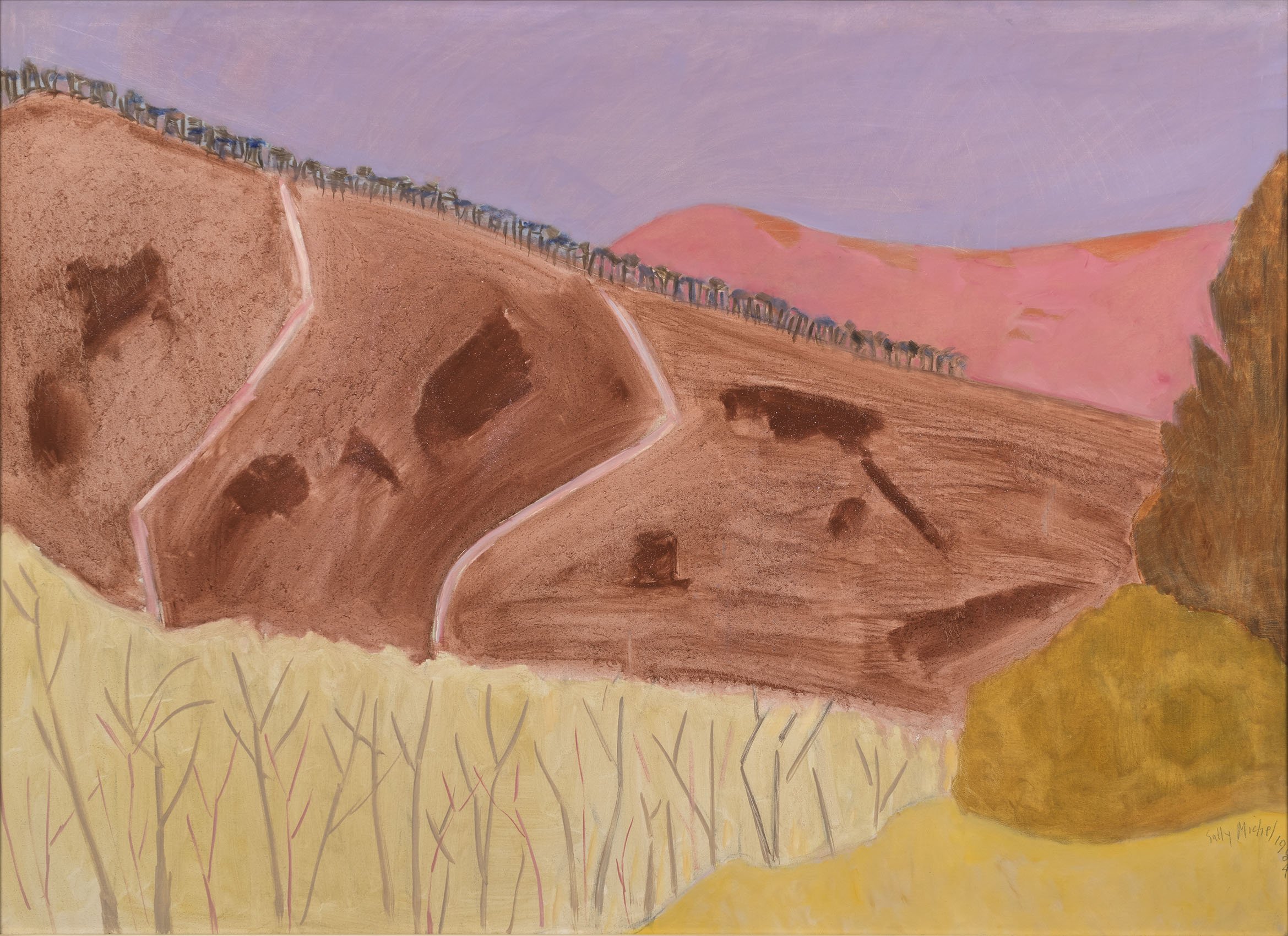
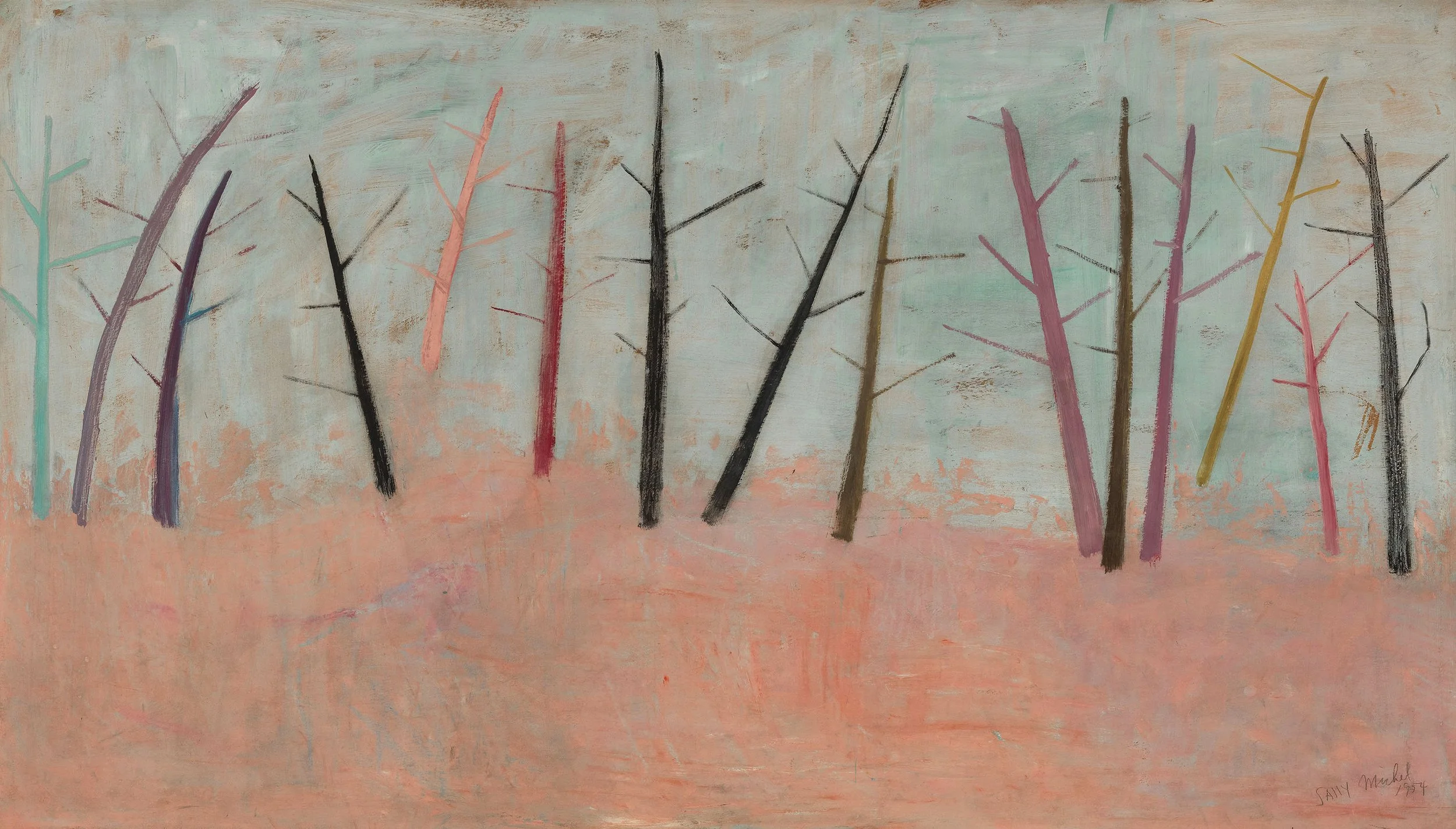
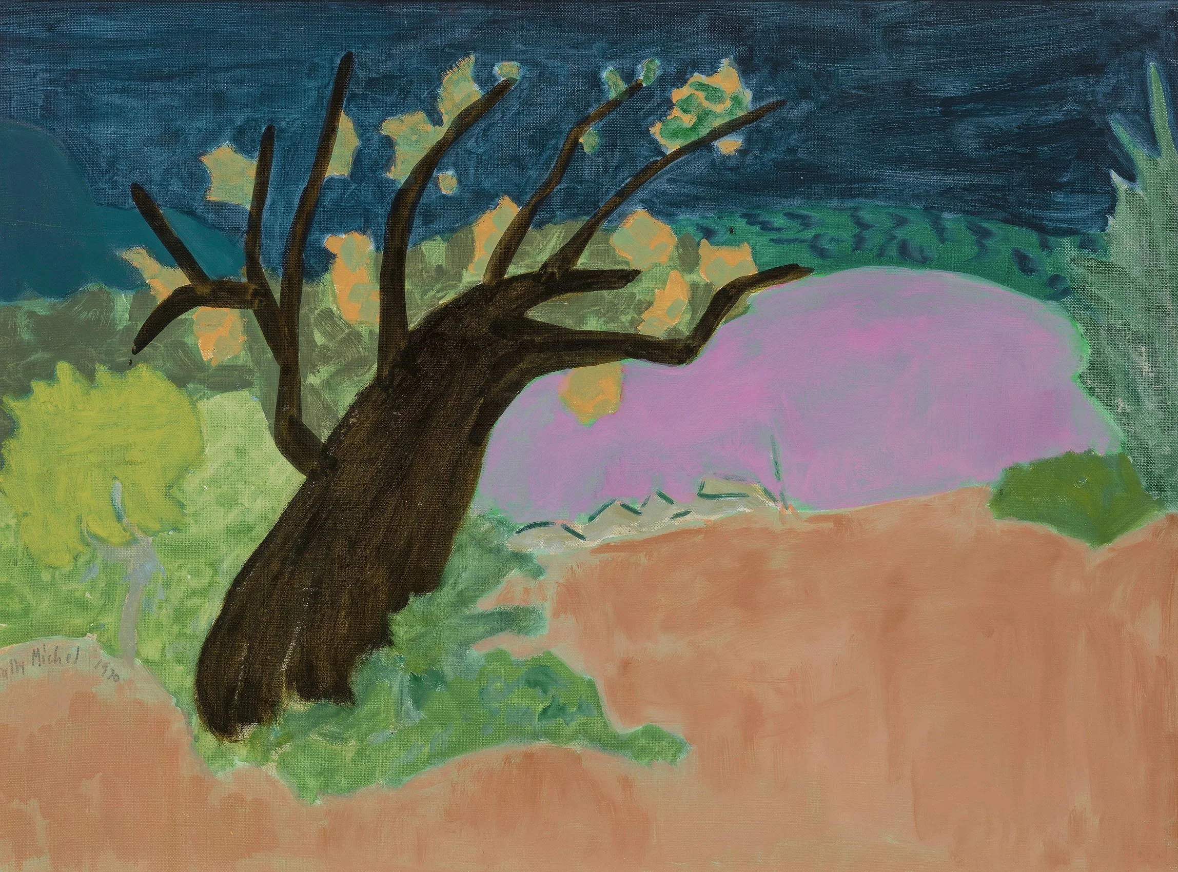
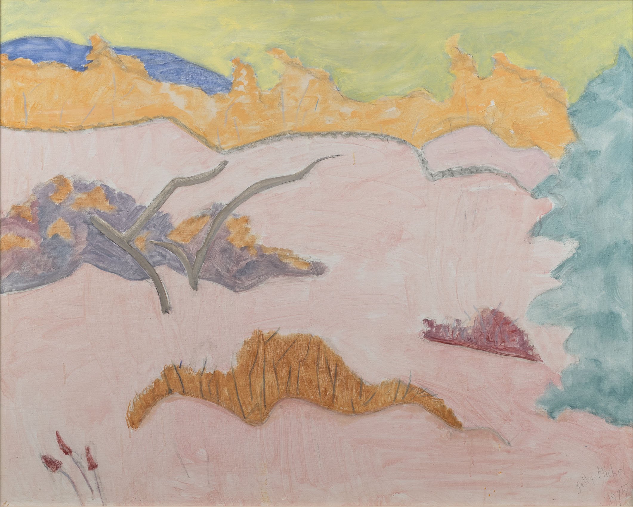
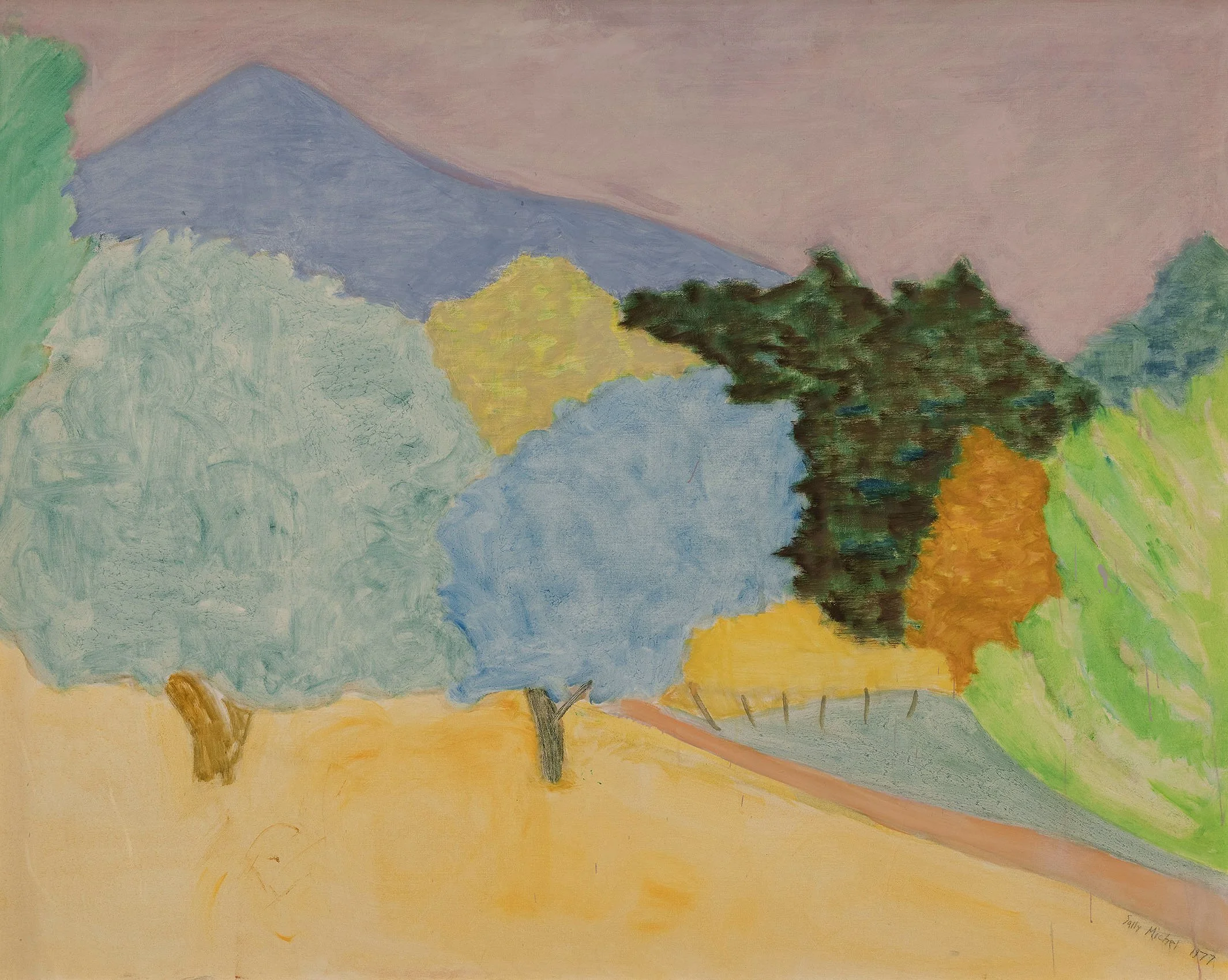
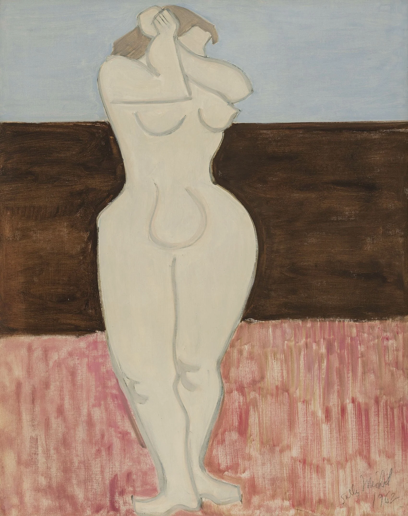
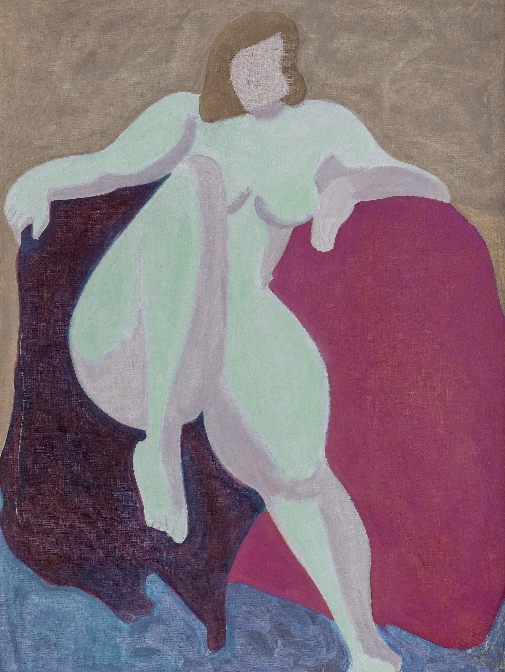
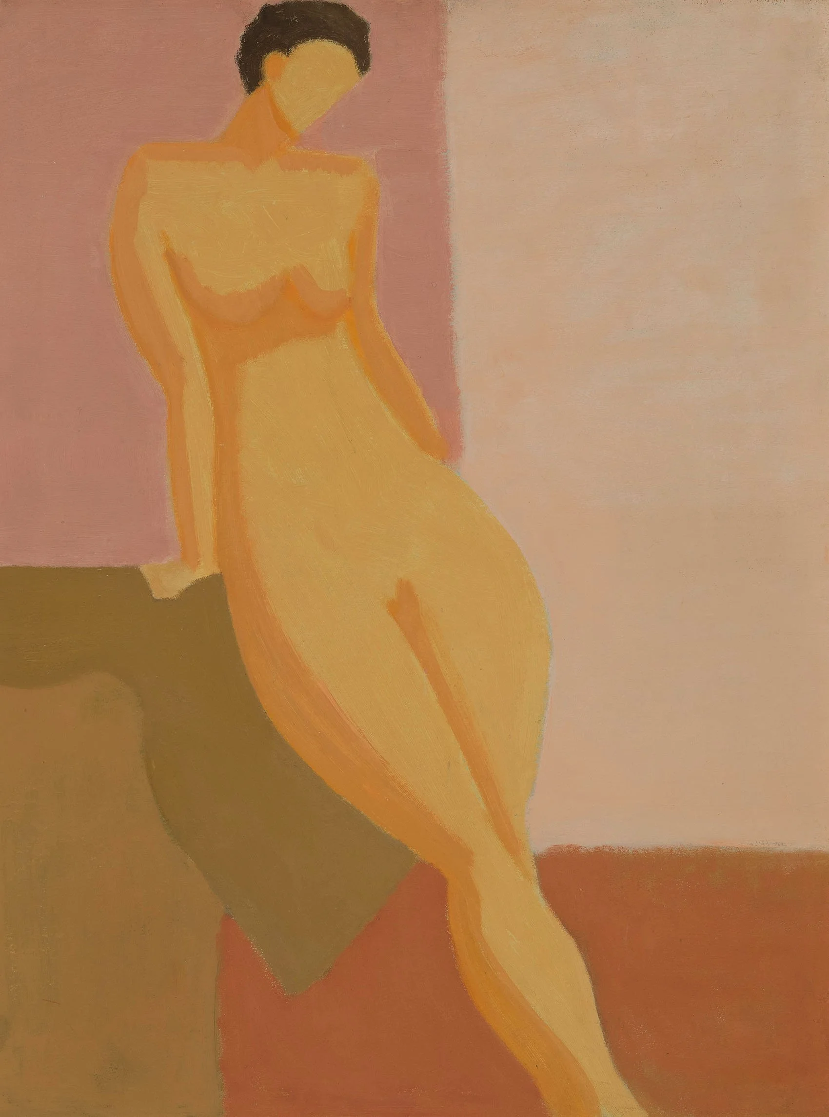
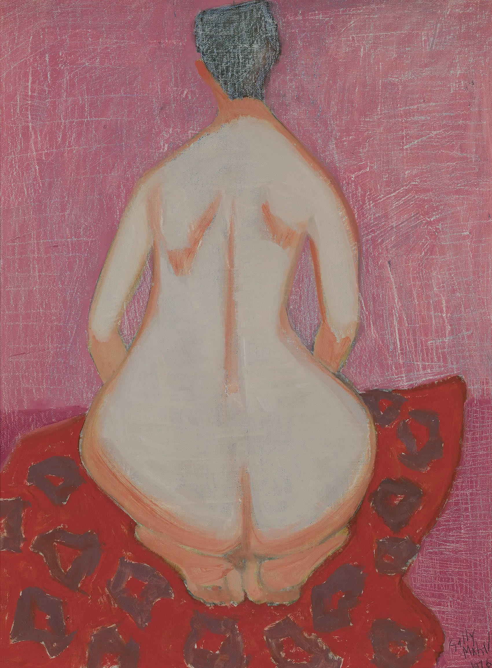
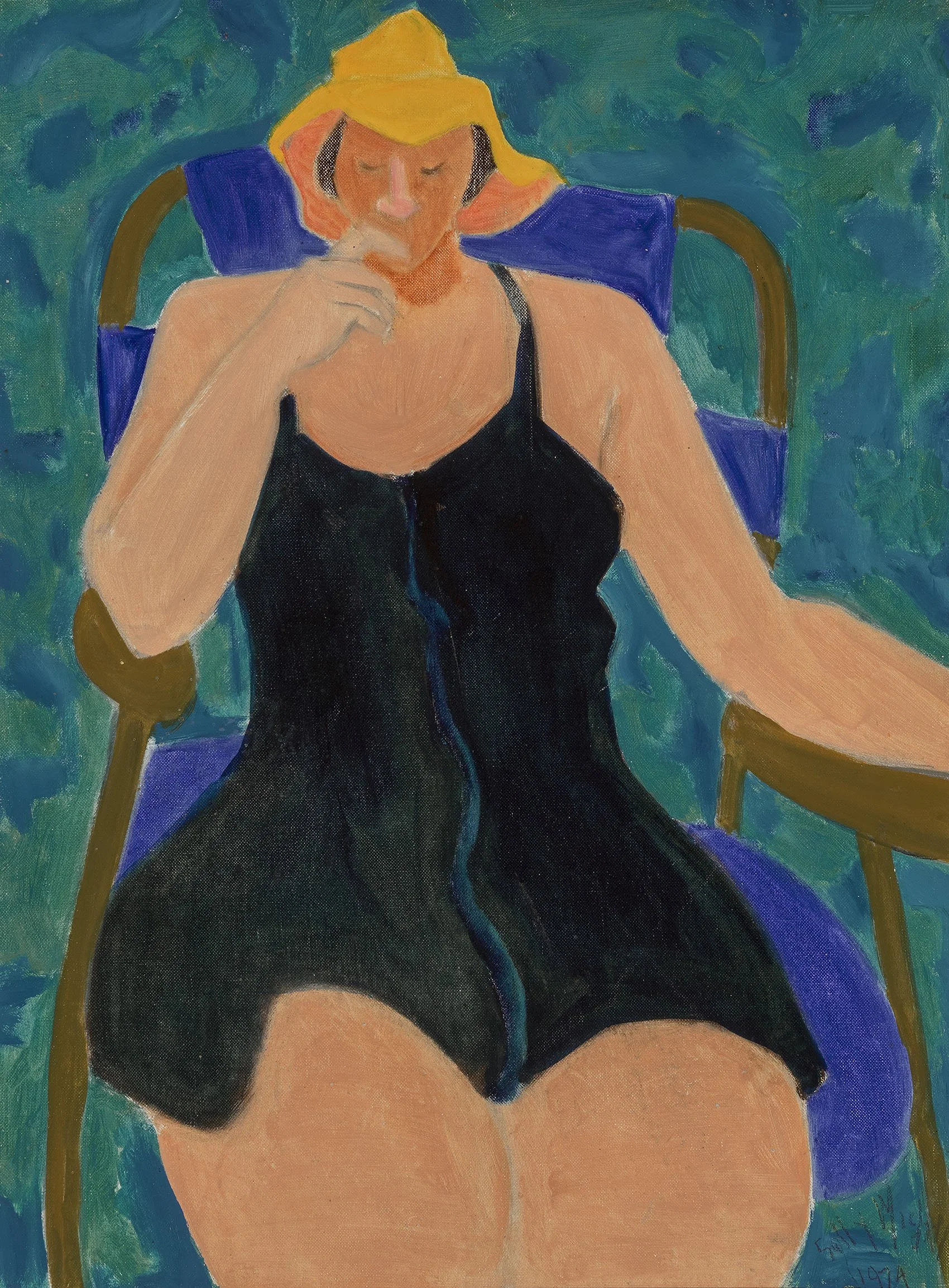
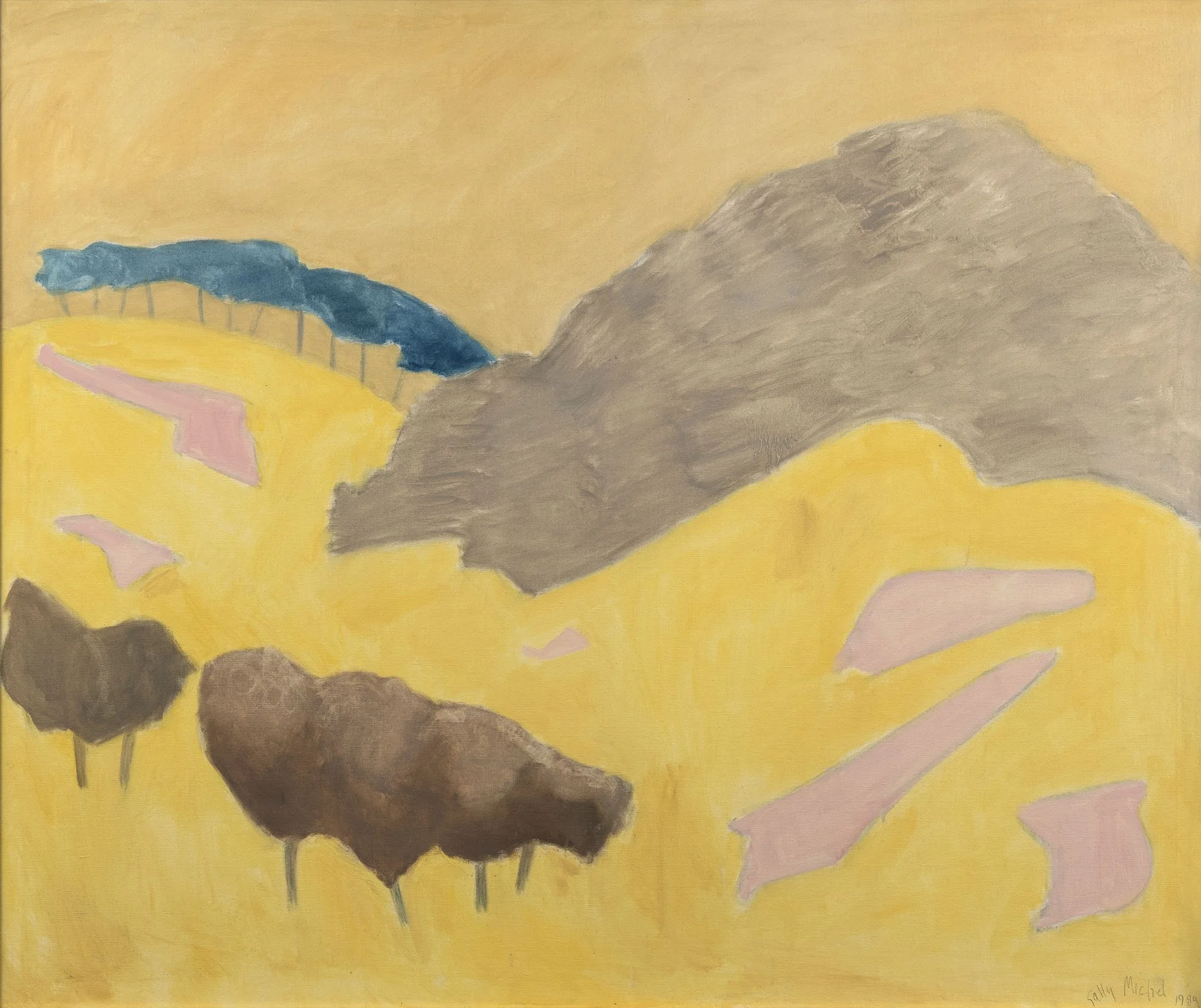
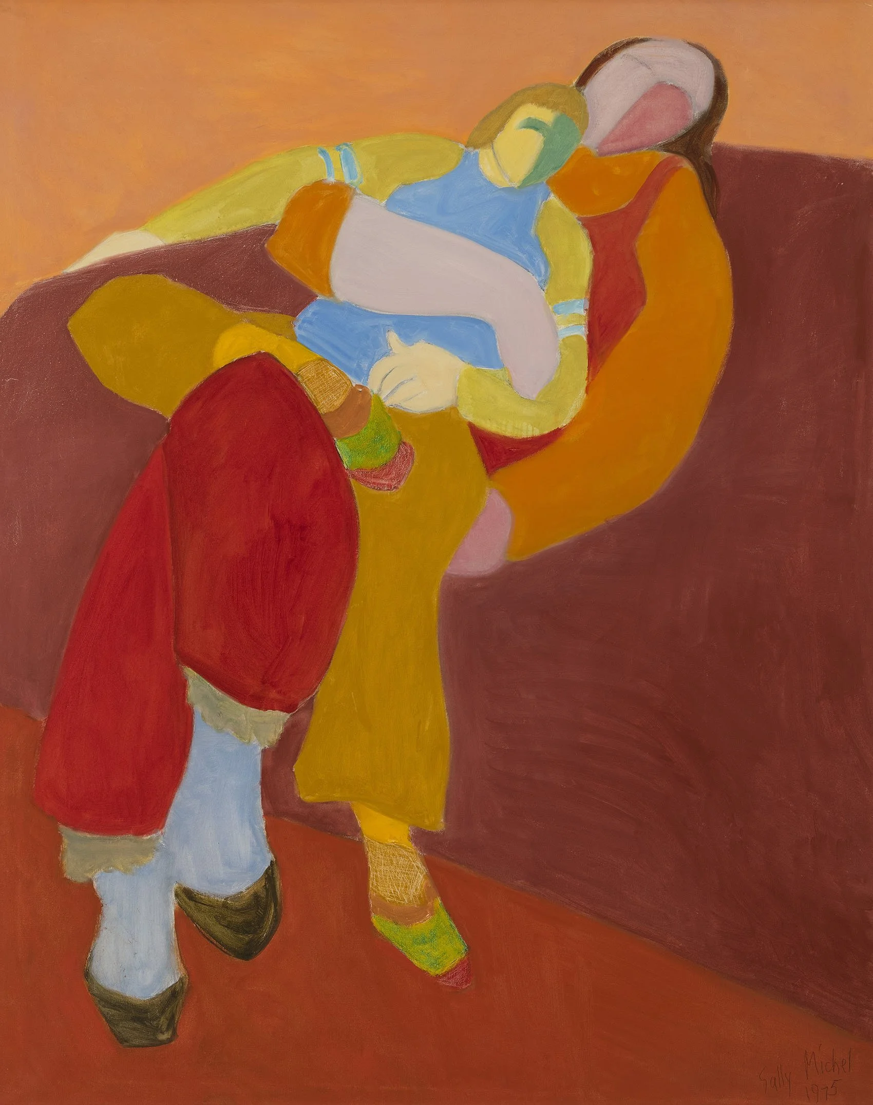
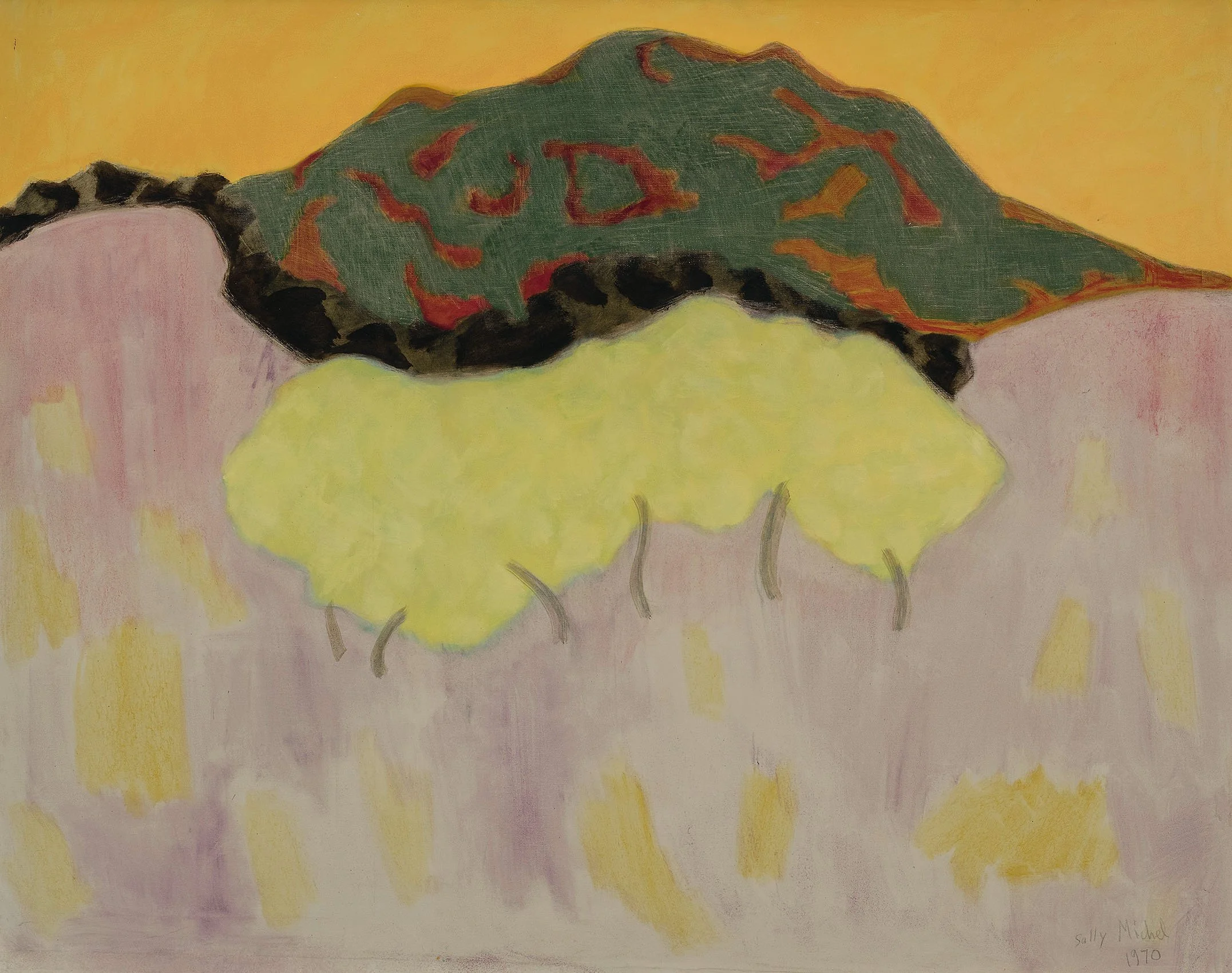
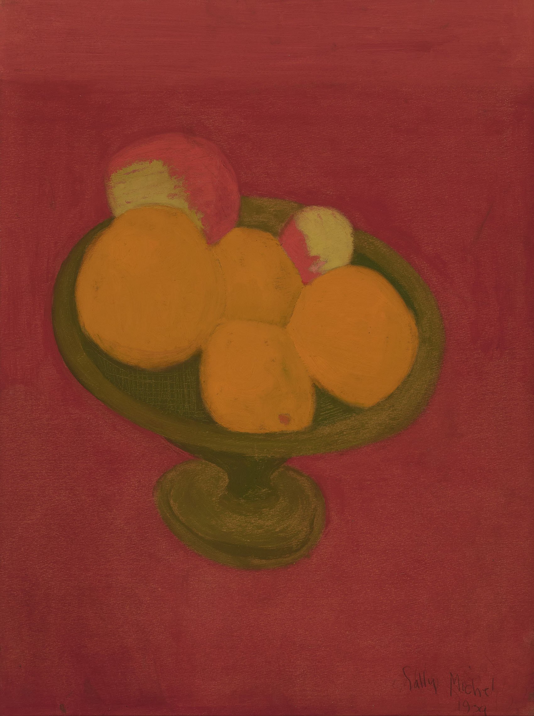
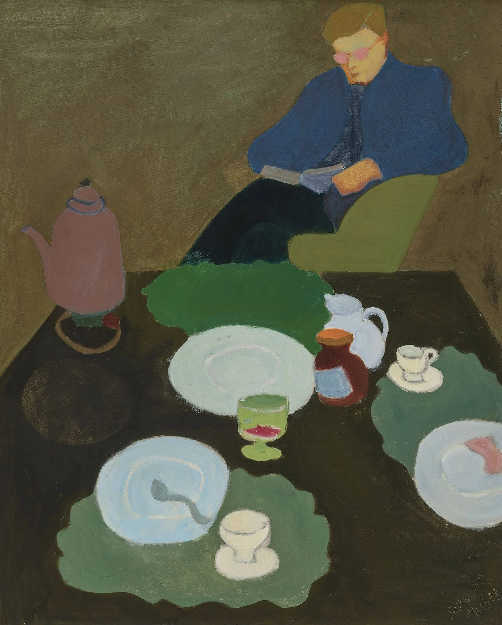
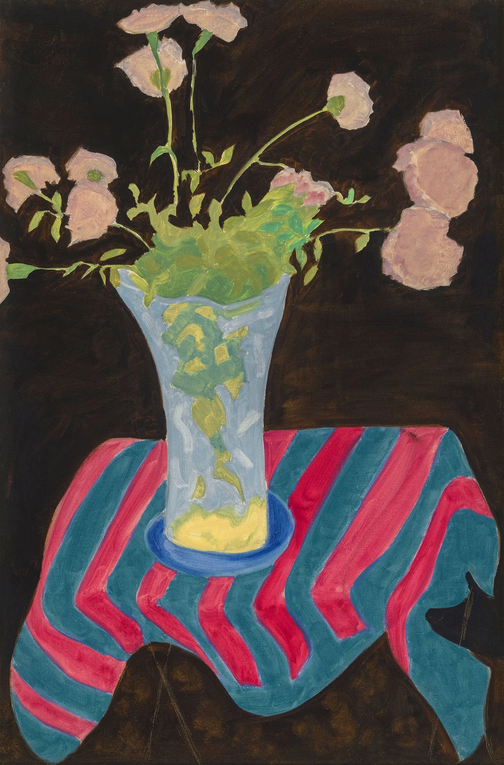
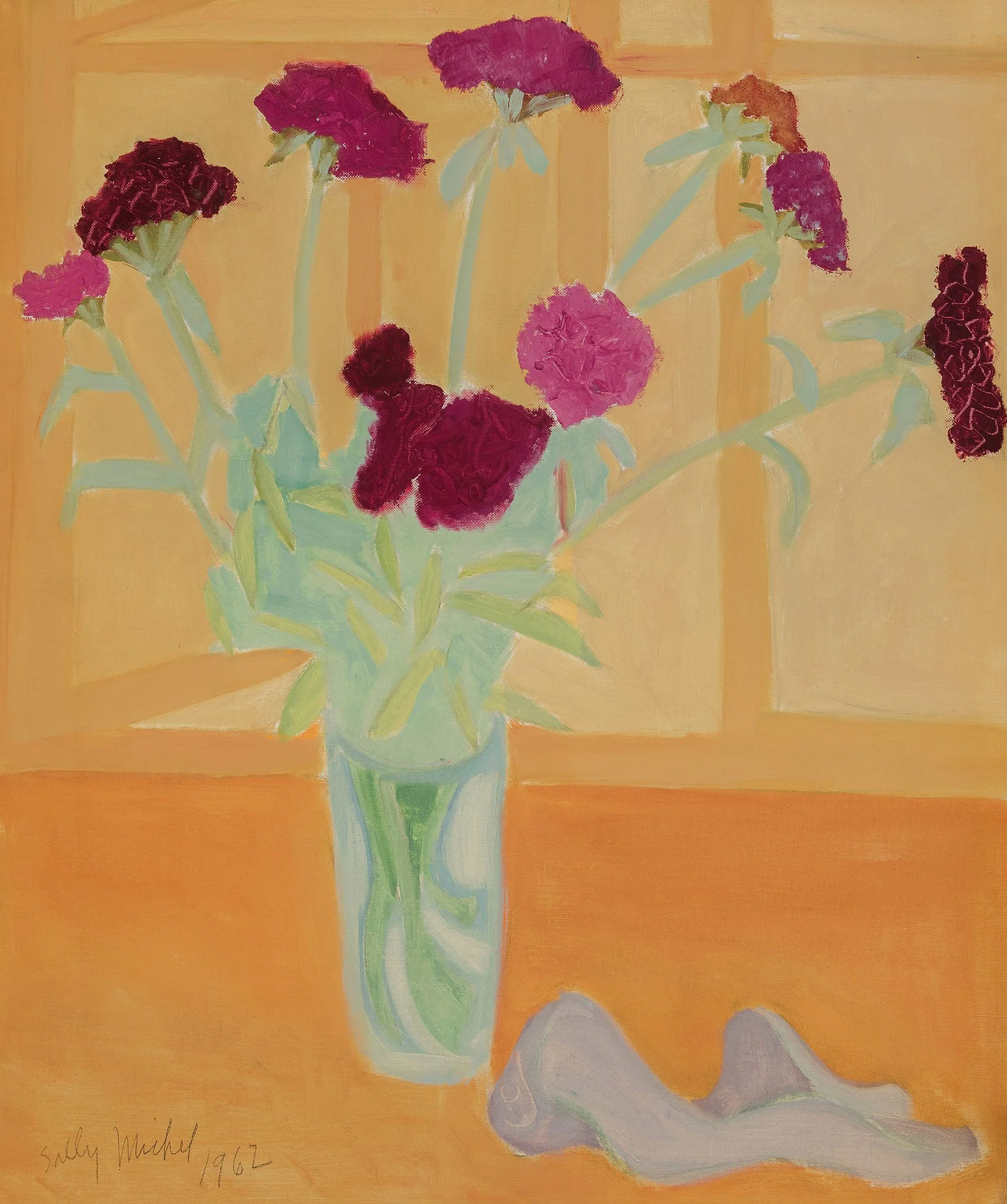
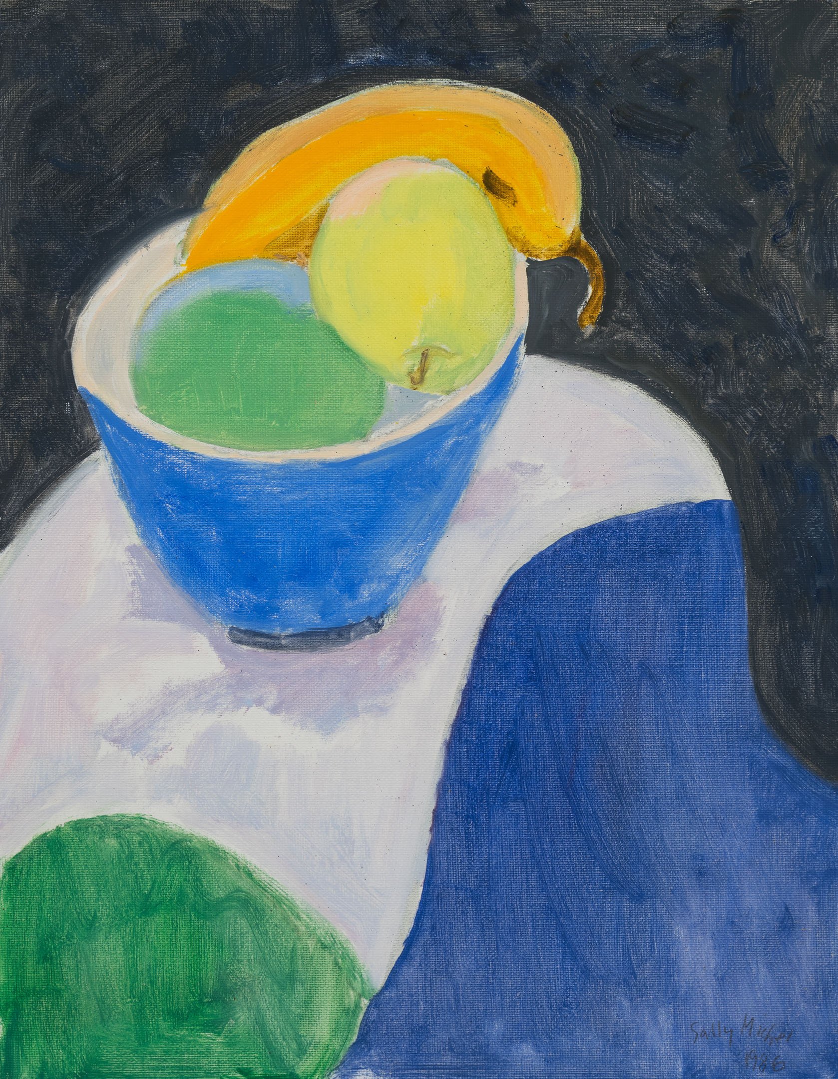
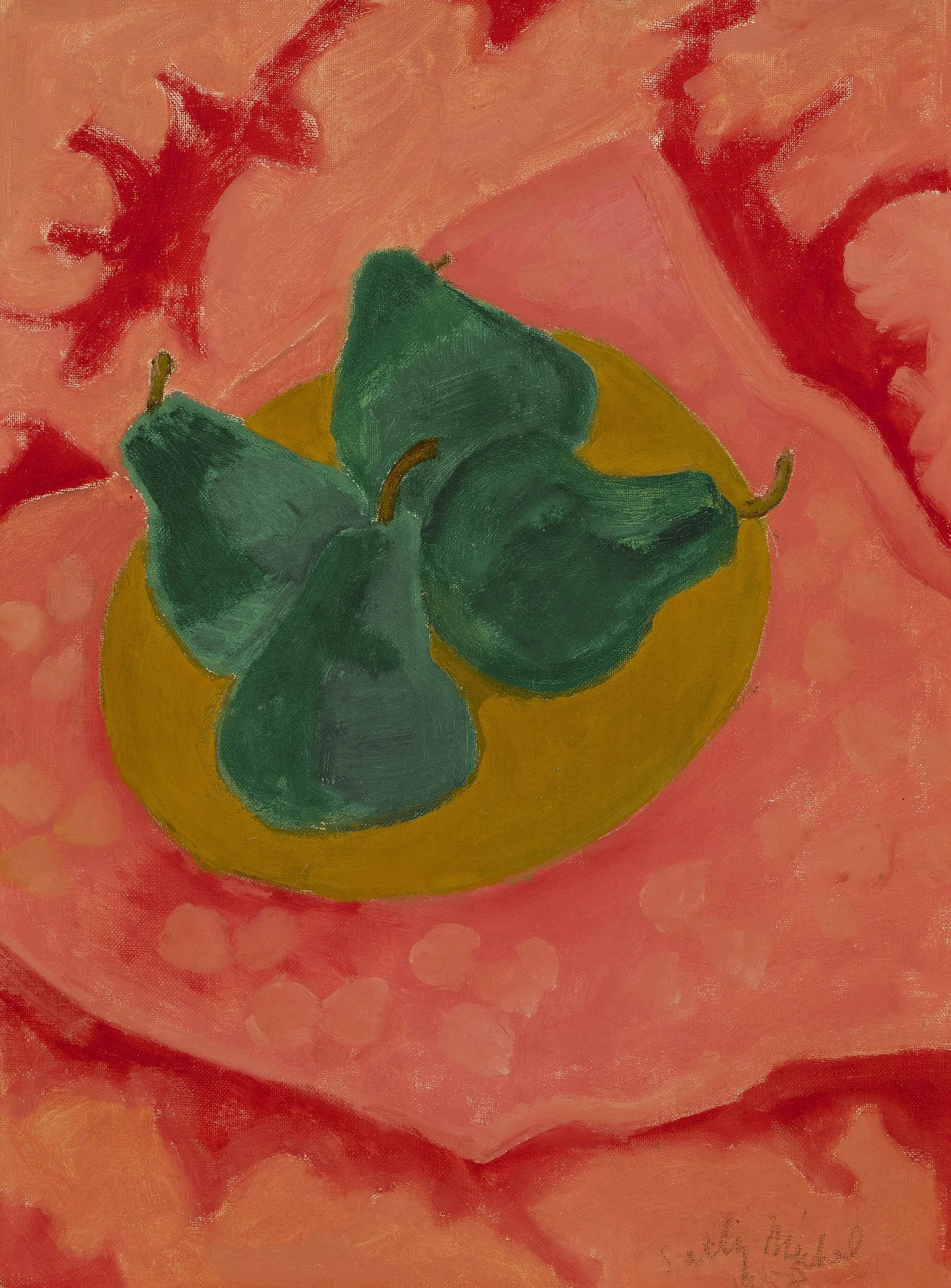
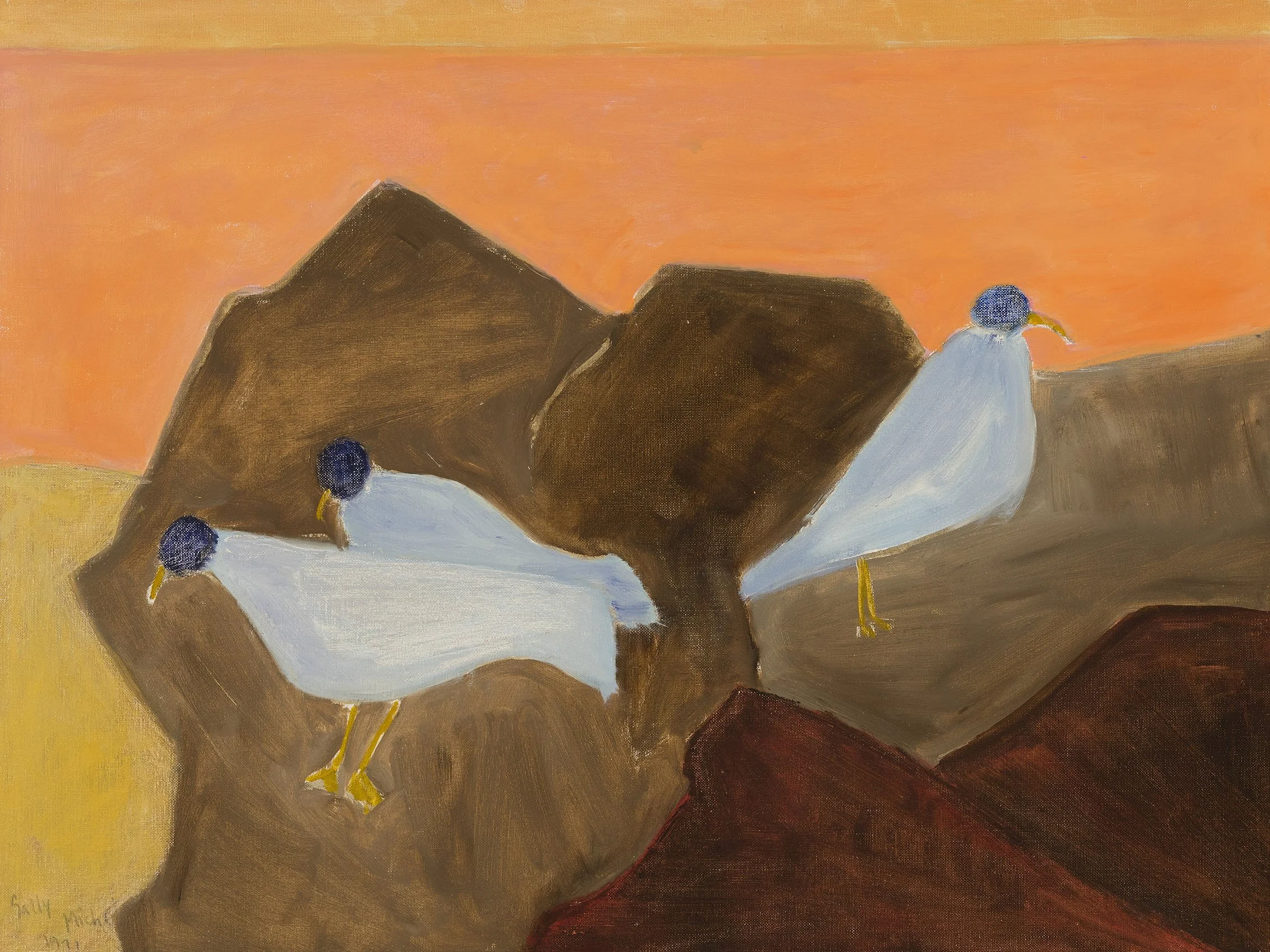
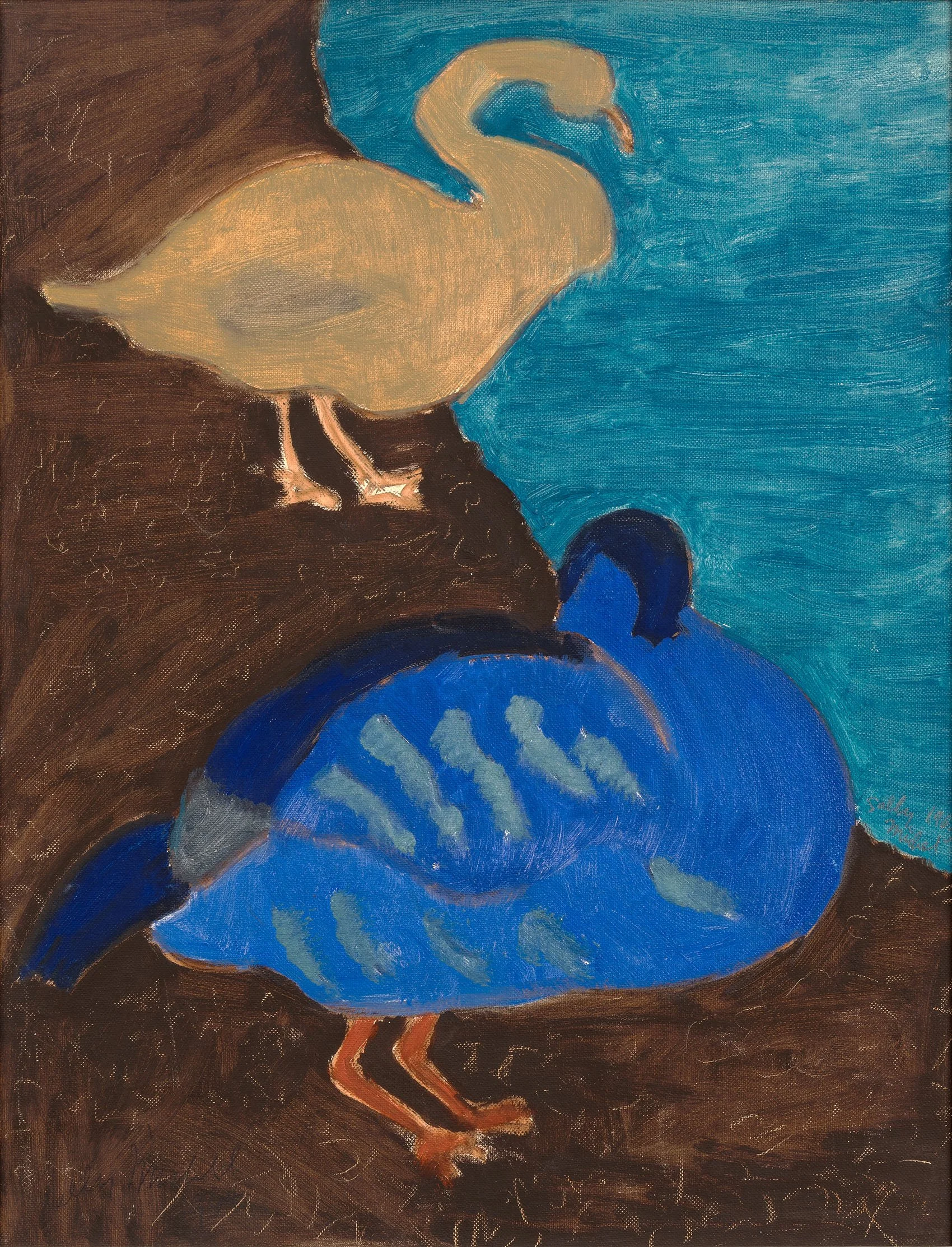
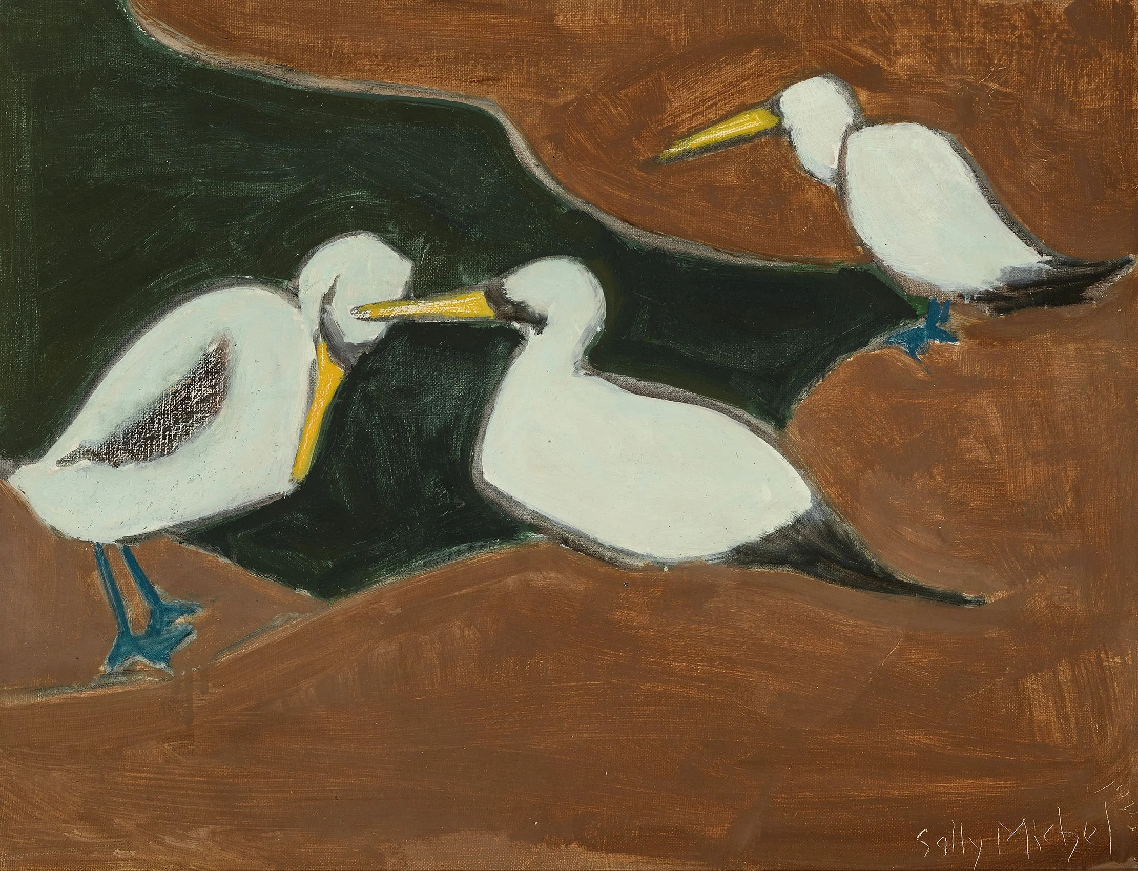
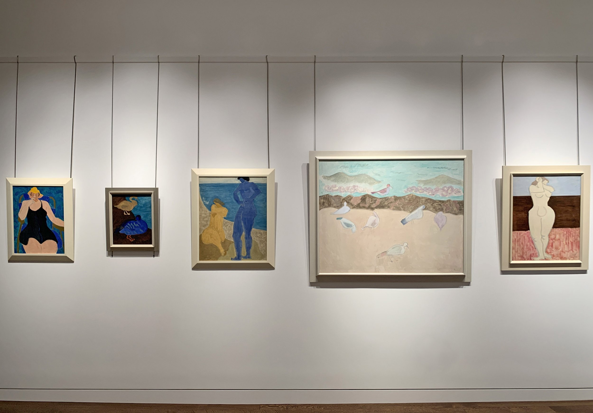
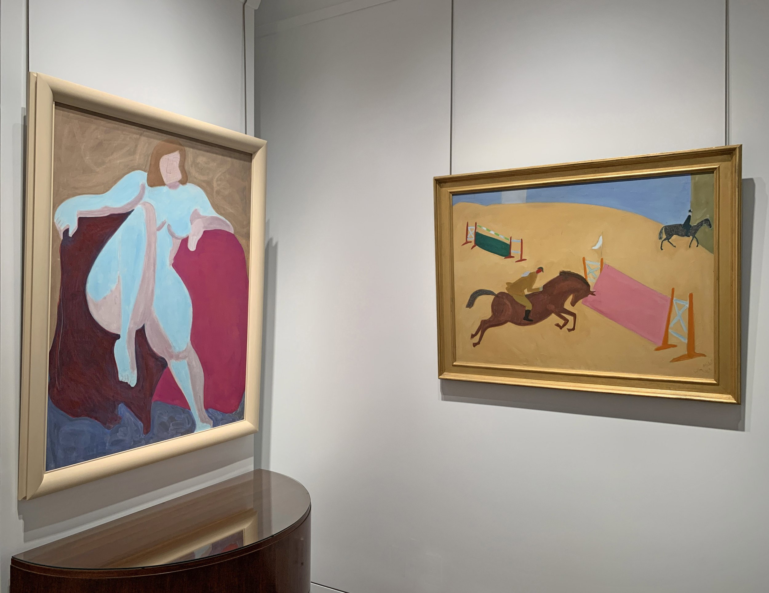
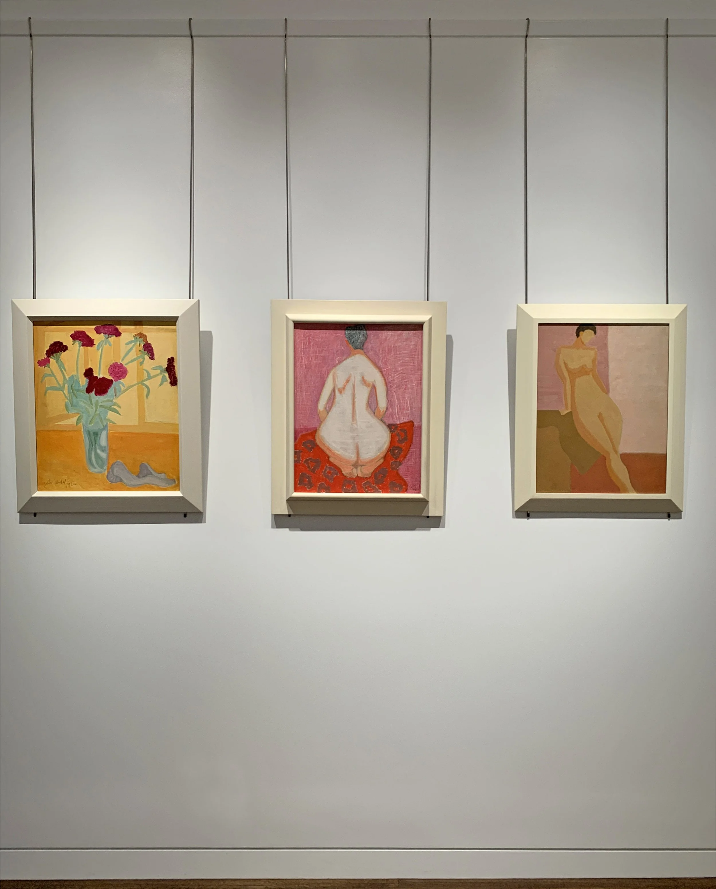
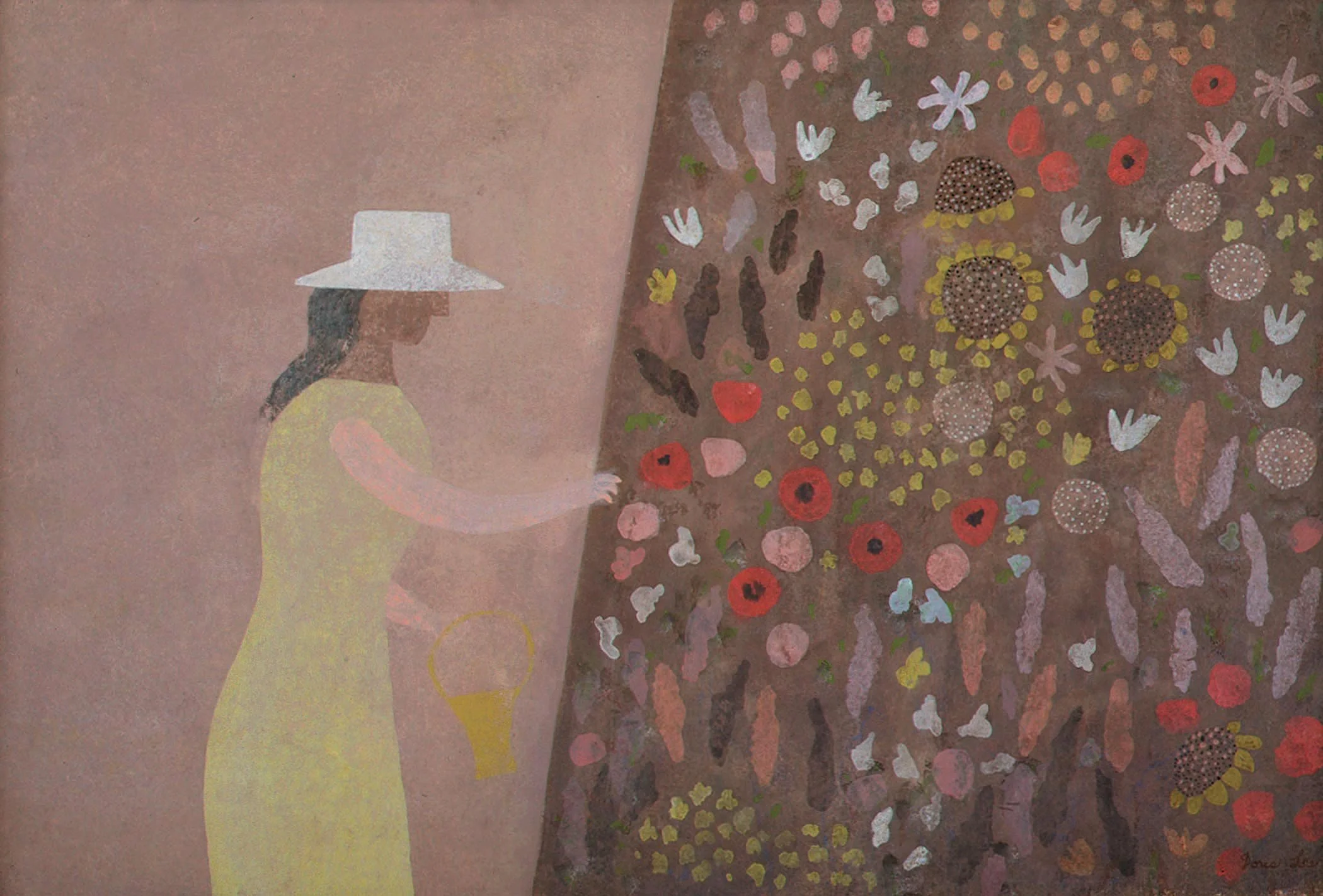
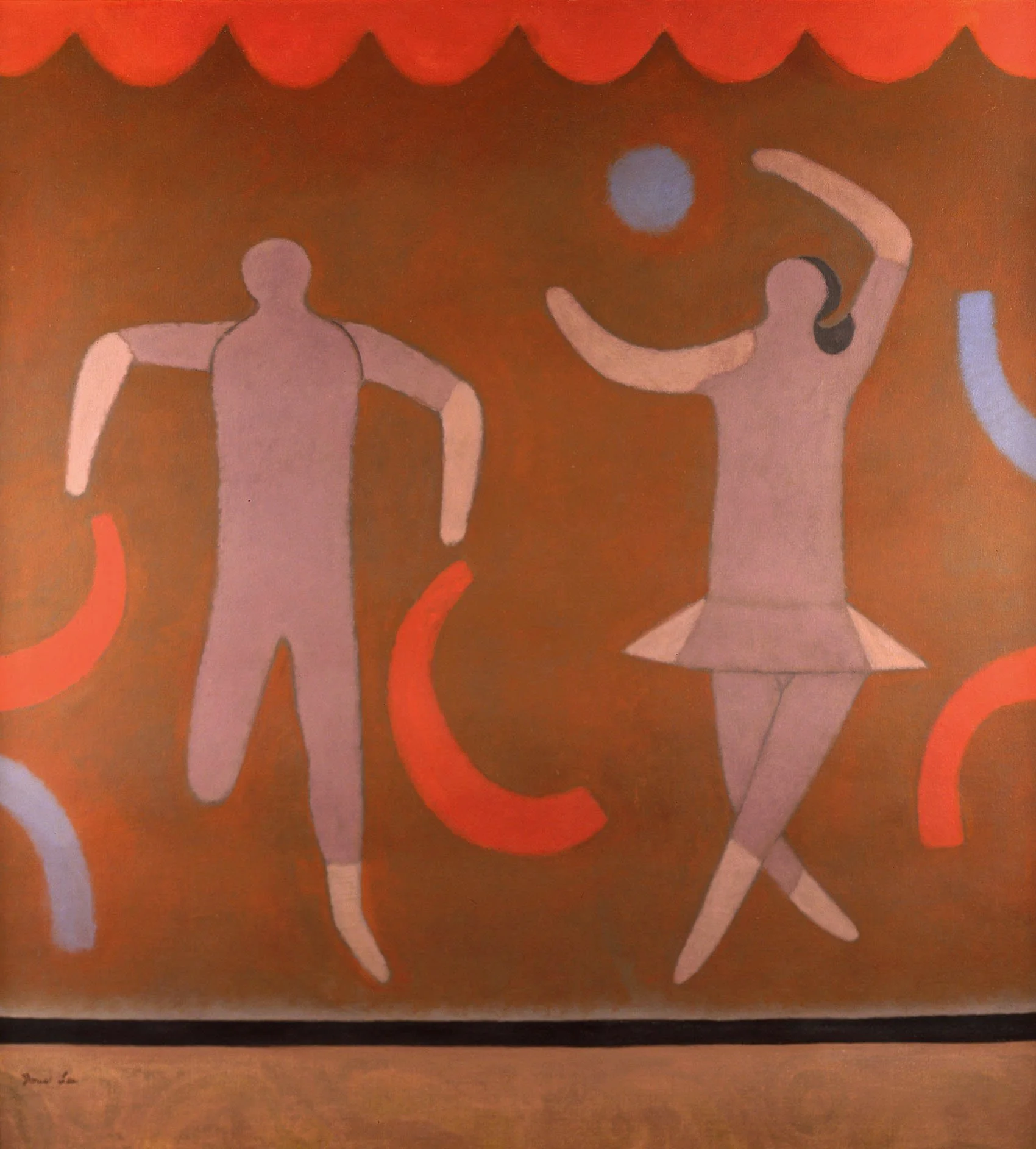
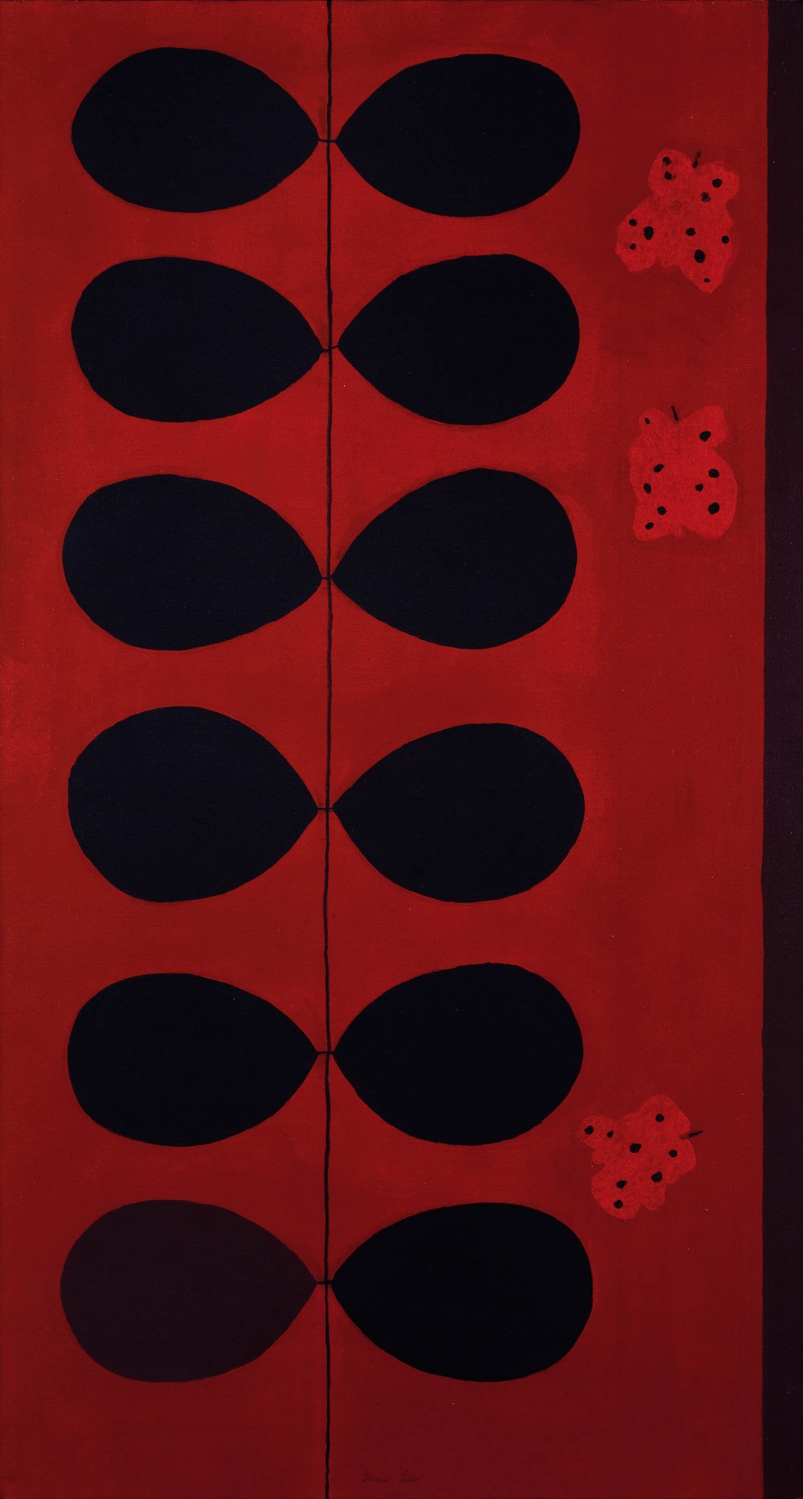
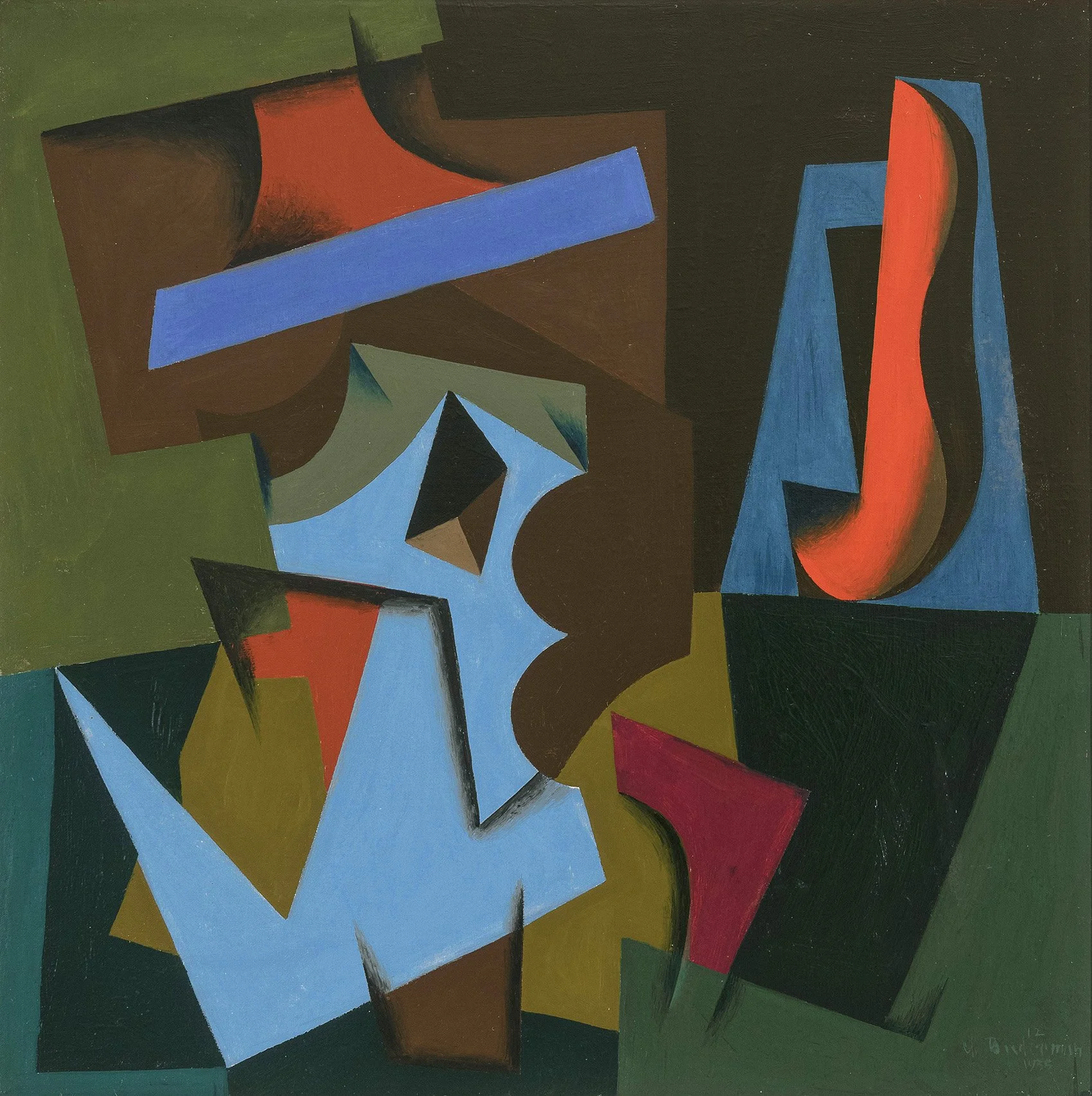
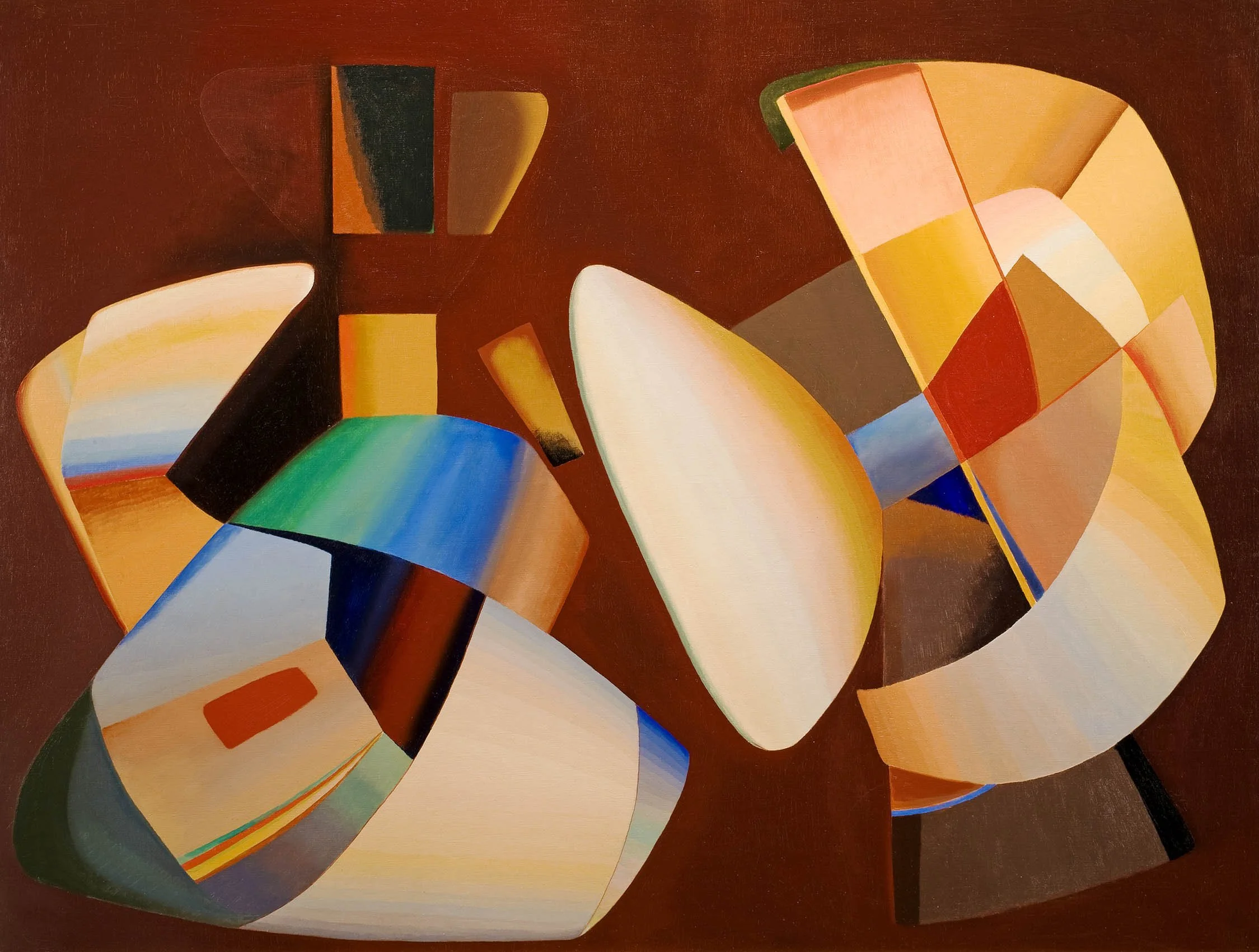
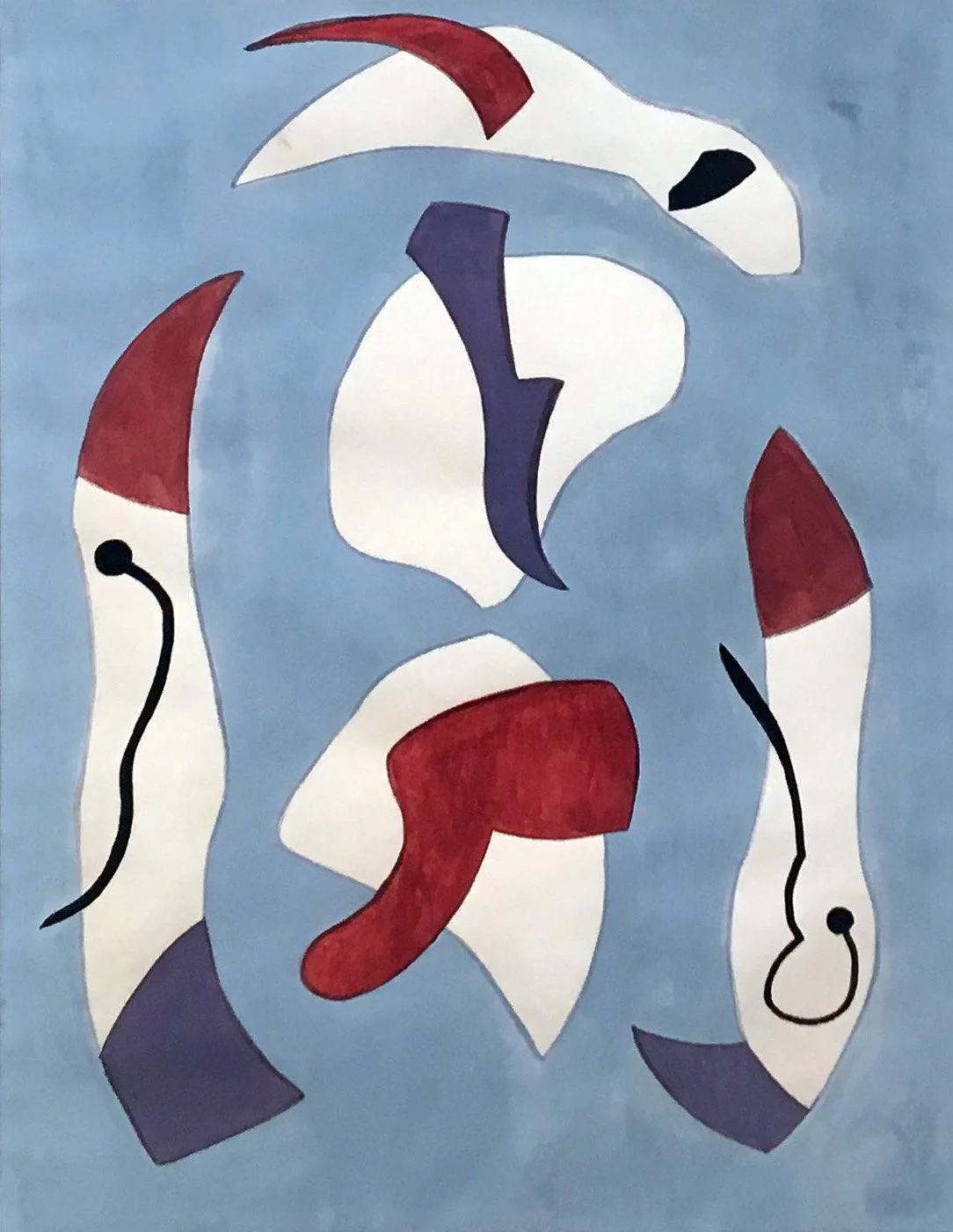
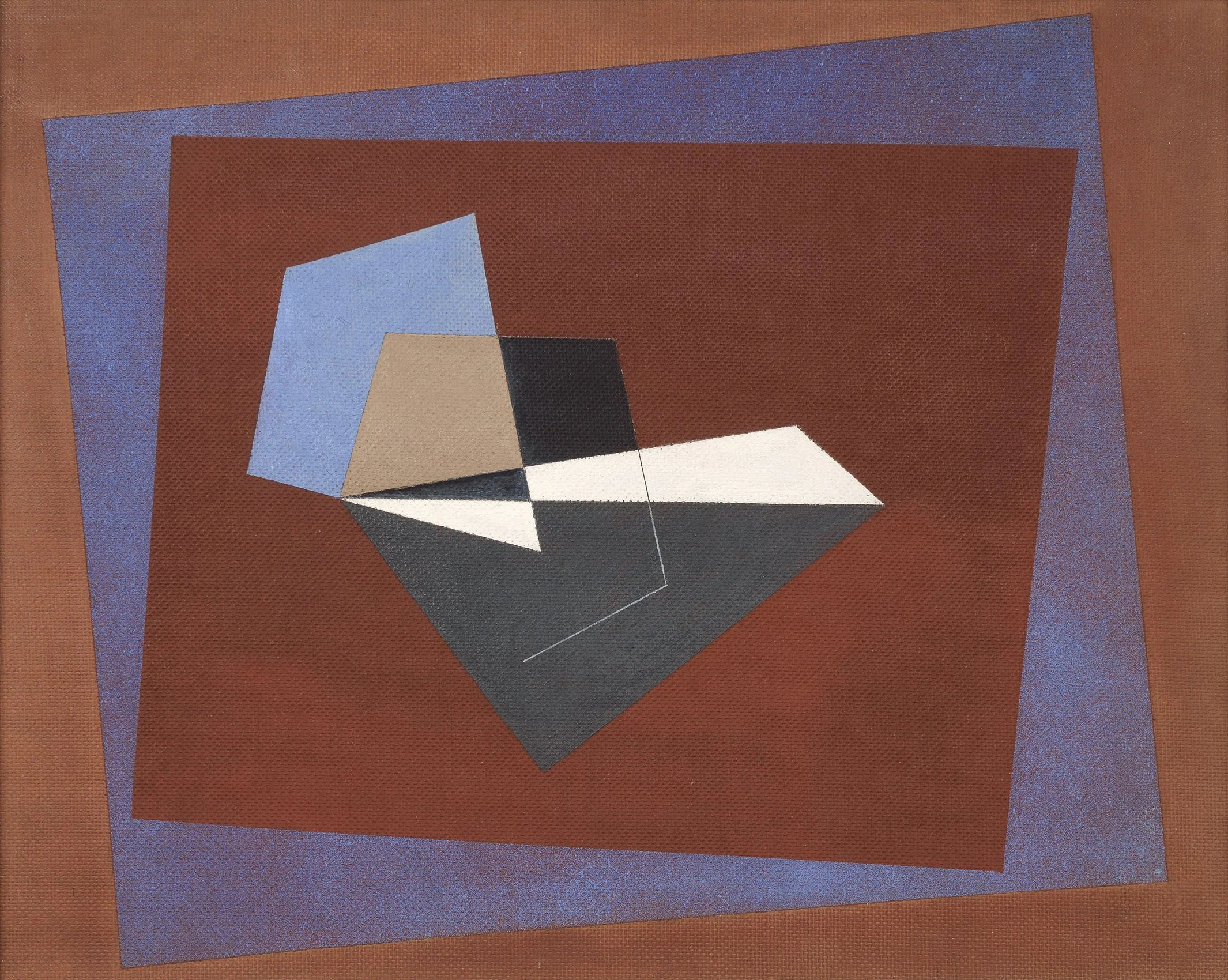
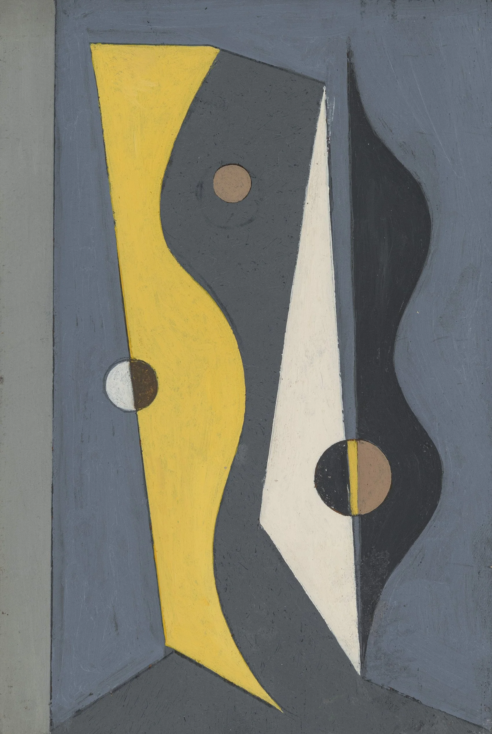
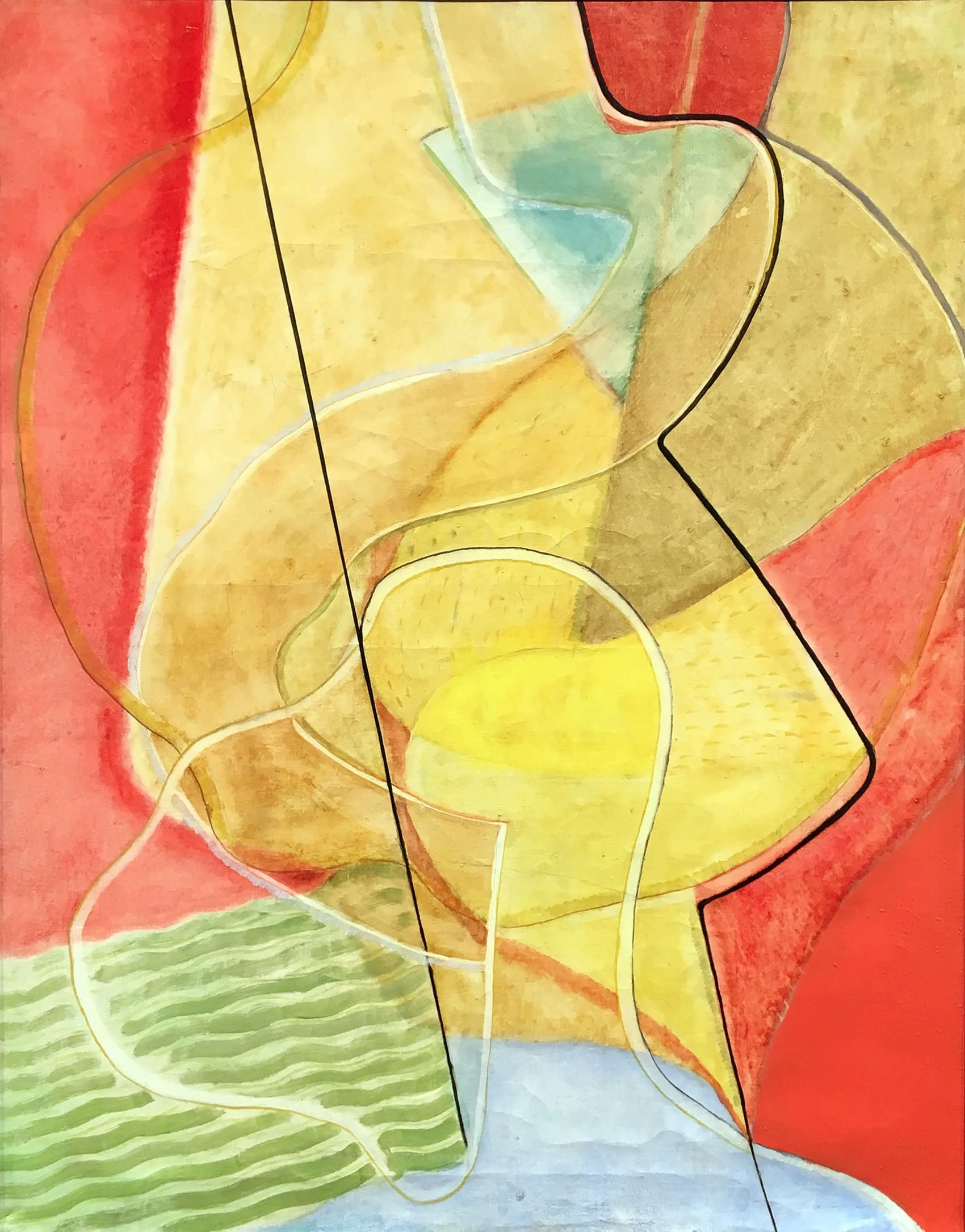
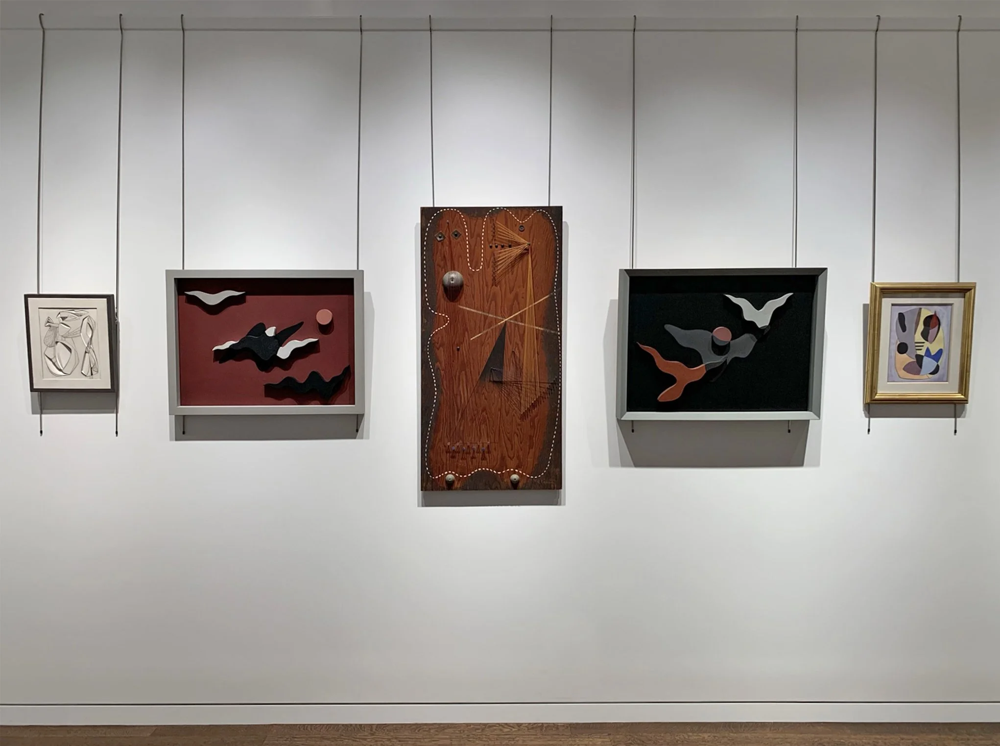
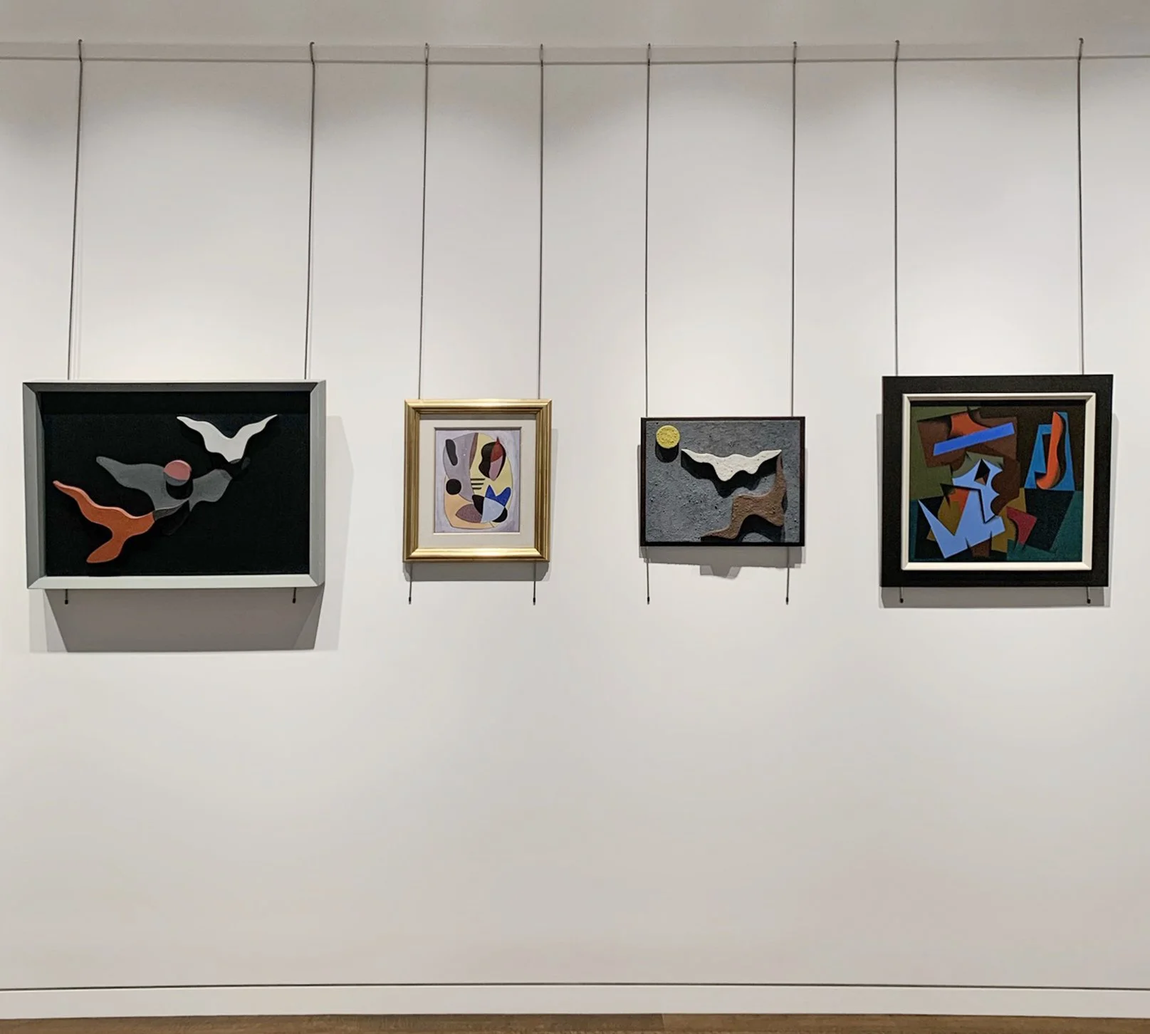
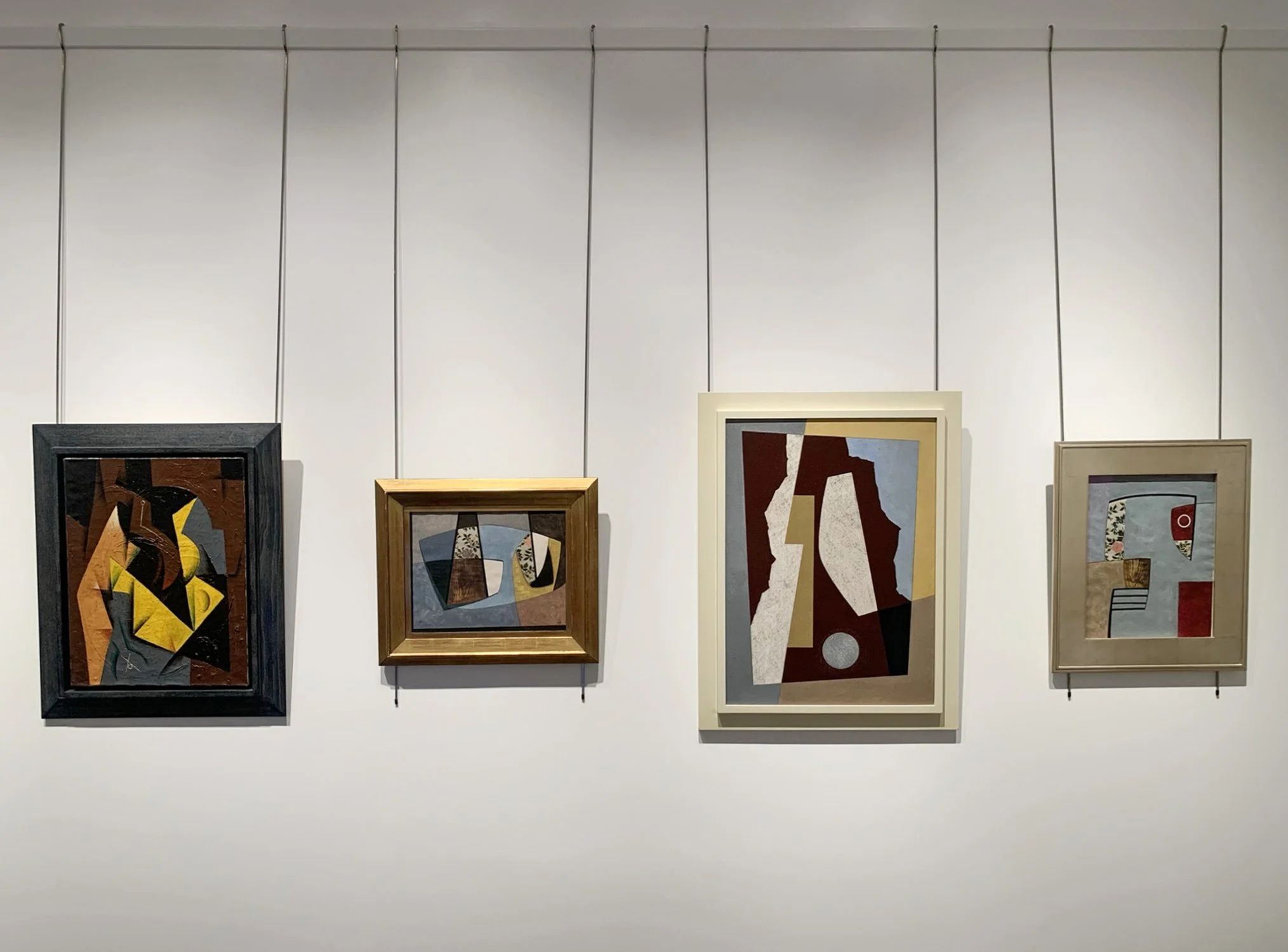
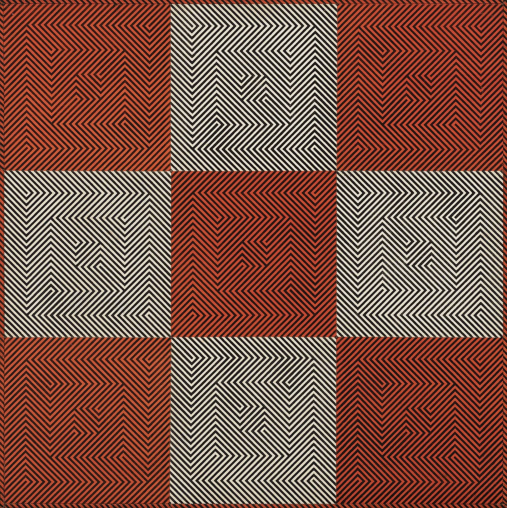
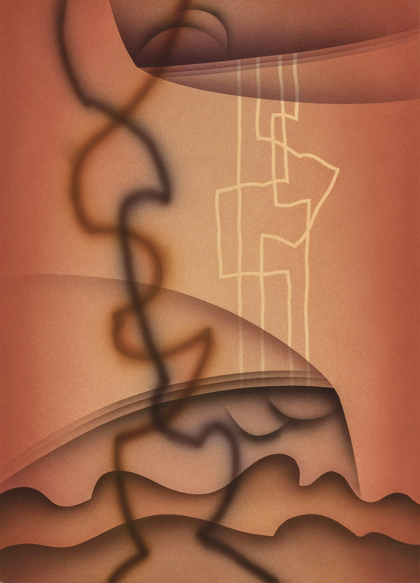
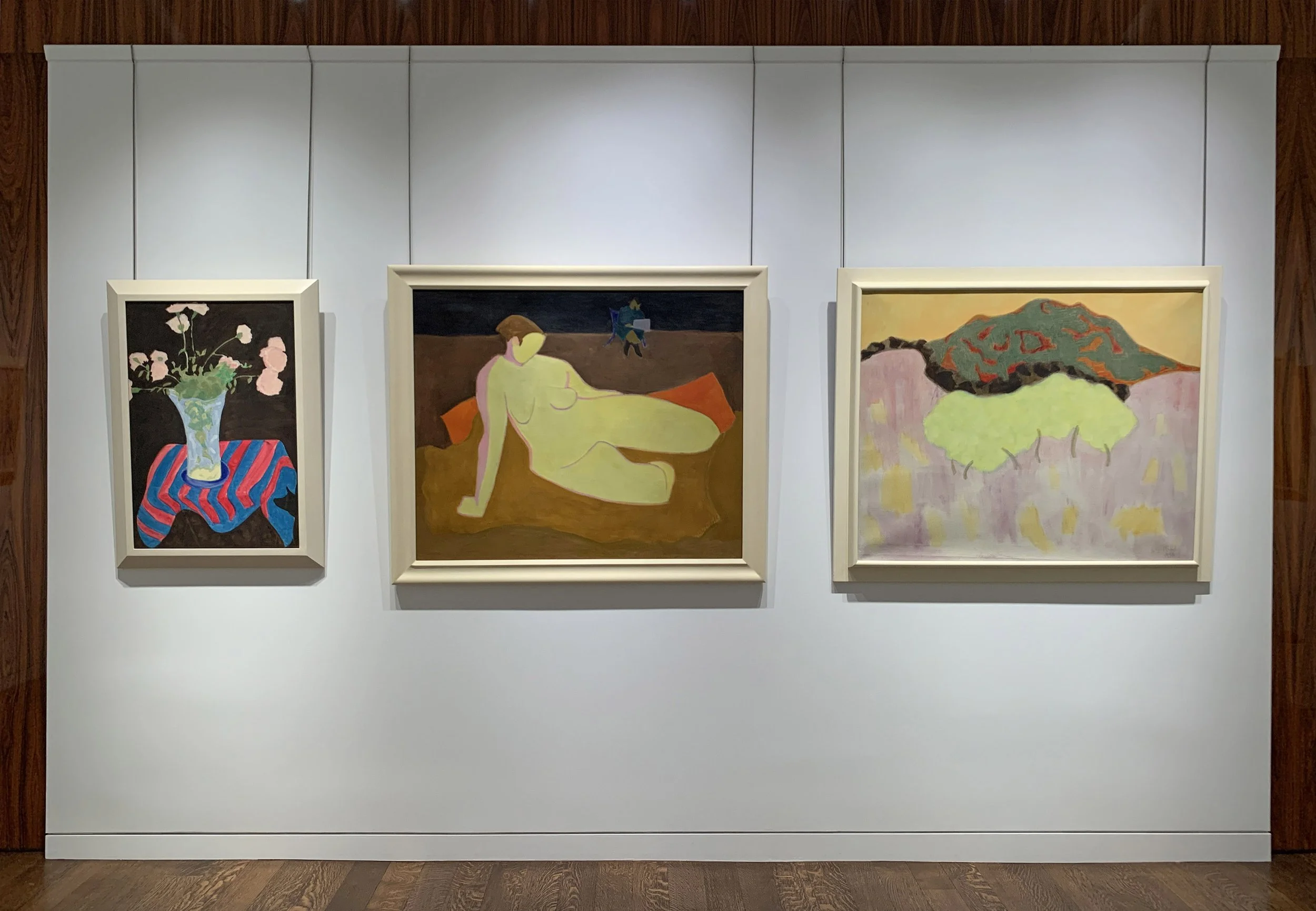
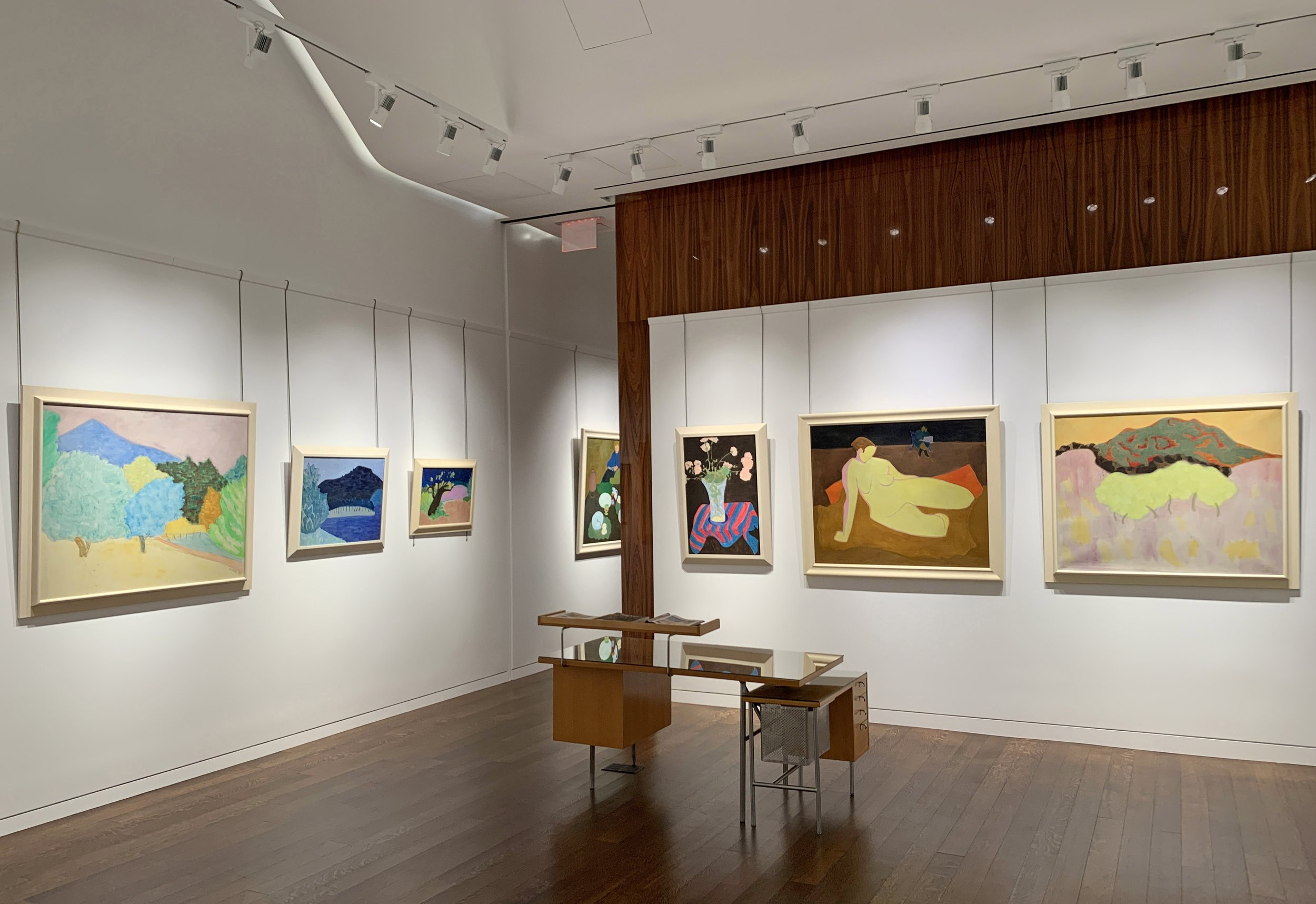
This exhibition of thirty paintings by Sally Michel, created between 1950 and 1985, aims to show how her art bridged the gap between representational and abstract painting, in a style that successfully refreshed and moved realism forward. Sally Michel’s story cannot be told without bringing in her life partner, Milton Avery.

Milton Avery (1885-1965) and Sally Michel (1902-2003) met painting in Gloucester, Massachusetts in 1924. They admired each other’s dedication to sketching all day. Married in 1926, Sally and Milton worked in New York as a unit until Milton’s death in 1965. To provide support, Sally worked as a freelance illustrator, an occupation she could pursue at home. This allowed her to remain by the side of Milton and their young daughter, while continuing to develop her own painting. The couple would rise at six in the morning and draw or paint straight through to dinner. Sally was gregarious and Milton was taciturn, so she became his spokesman. Every Saturday they went to New York’s galleries and museums. They continued to sketch from a model at the Art Students League and later with a group of their artist-friends, at each other’s studios. Through the 1930s, fellow artists of Sally’s generation, including Mark Rothko, Adolph Gottlieb, and Barnett Newman frequently came to the Avery home to discuss art. By the mid-1940s Milton and Sally had each developed their own parallel but unique approaches to painting.

The refinement of their artistic visions evolved over many years of sketching, painting, looking, and sharing ideas on art. The Averys structured their year so that summers could be shared creating together and later with their artist-daughter March (b. 1932). Because rental apartments in New York were plentiful, Milton and Sally were able to leave the City each summer and return in the fall. They sketched non-stop on their trips, gathering source material for future paintings to be executed in the studio. A list of the summer trips gives some indication of which location inspired a painting’s subject. With limited funds in the 1930s, the Averys drove to summer locations in Connecticut (1930), Gloucester, Massachusetts (1926-1933), Vermont (1937, 1939, 1940), and the Gaspé Peninsula, Québec (1938). In the 1940s they traveled further: to California with stops in Yellowstone and Glacier National Parks (1941); Mexico (1946); and the Canadian Northwest and Oregon (1947). After their 1952 trip to Europe, the Averys’ later years saw summers spent closer to home: Woodstock, New York; the art colonies Yaddo (1955) and MacDowell (1953, 1954, 1956); and Provincetown, Massachusetts (1957-1961). Under doctor’s orders, Milton spent the winters of 1949-1950 and 1950-1951 recuperating in Maitland, Florida where he and Sally were Bok Fellows at The Research Studio. Later they wintered again in Florida (Key West) in 1959.

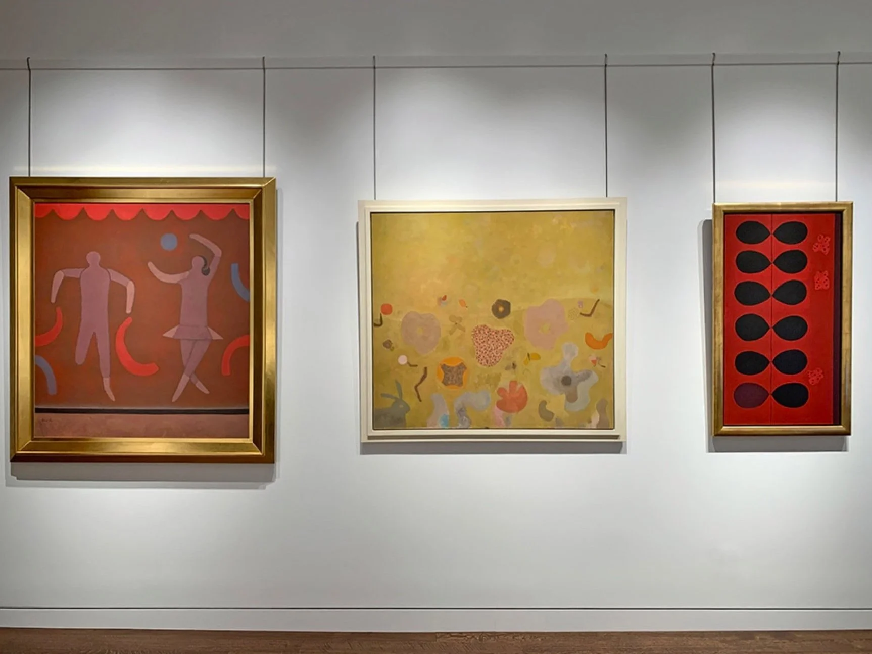
Sally Michel did paint directly from nature throughout her career, but developed most of her artwork from sketches. She often created an intermediary watercolor or gouache that then informed the finished oil, transmitting a mood, time of day, weather, or season. The fluidity and luminosity of gouache and watercolor provided freedom to experiment with color and tone, which could be duplicated on canvas by painting with thinned pigments. To create an overall textural softness, Sally used a stiff brush to apply matte pigments in thin layers. If a pigment became too thick it could be scraped from the canvas to reveal lower coats of pigment and achieve the desired tone. In looking over a group of sketches to select one to paint, Sally considered contrasts between straight and curving lines, discrepancies in scale, and different views of a single scene. Sally’s portraits of individuals were often close-ups isolated against flat backgrounds. Scale distortion, exaggerated color, or caricature could provide social commentary when she desired it. This sketch-to-painting approach allowed Sally to achieve simplified and abstracted shapes locked together into finely balanced compositions.

Milton and Sally Michel Avery were artists dedicated to painting what they saw at a time of uncertainty for realism in American art. From 1946 to 1958 Abstract Expressionism, a gestural or action painting style with roots in European Surrealism, was at its height of popularity. Abstract Expressionists considered any reference to recognizable imagery to be parochial, out of date, and taboo. The Averys saw that bridges between realism and abstraction can go both ways and color, structure, and light are the common denominators. This realization led to recognizing that shapes, spaces, and color form a set of unique relationships independent of any subject matter. The Averys modernized realism by using the shapes of things, the spaces around them, and color in new ways. They treated color less naturalistically to reflect mood and transcend the factual aspects of realistic subjects. Realism traditionally relies on light and dark contrasts to create depth. They found the use of non-naturalistic color suppressed that contrast and led to a new challenge of how else to produce depth. The solution they found was that a highly structured composition would still be read as a landscape, still life, or figure. To capture further universality and interconnections in their paintings, the Averys worked with shapes and their edges. They used thinly applied paint so the canvas ground was revealed around the edges of shapes, making the bare canvas function as color. The boundaries of soft shapes could be achieved through intricate color transitions, creating contiguous forms that blend into one another. This approach led to a new and important discovery that the distinctions between objects in a painting are fundamentally illusions and that the borders between shapes are what create representational art. The Averys also found that reducing the number of shapes and colors in a painting and eliminating illusionistic rounded volumes and modeled forms added modernity to a scene. Shape and color could become equal when shapes were used as containers of color and that areas of color could be stacked as abstract signs of foreground, middle ground, distance, and sky. The Averys used patterns, organic or geometric, to express the forces as well as the forms of nature. Liquid or transparent areas of paint could embody the forces of wind and water. This demonstrated that painterly surfaces associated with the Abstract Expressionists could be used in realism to express more than angst.

In March of 1964 Milton’s health put him in a New York hospital where he died in January of 1965. Sally worked tirelessly to ensure Milton’s legacy while also continuing to paint and evolve the way she used materials for another twenty-five years. To achieve a dry paint surface with a soft matte feel, she mixed large amounts of turpentine with her paint rather than linseed oil. Always frugal with pigment, Sally used rags to moderate layers of color in a shape, and added luminosity by tinting colors with white pigment. Her experimentation with color harmonies was often daring. When she wanted textural interest or to bring attention to the two-dimensional surface of a canvas, she scratched into the paint. In the figures, animals, still lifes, and landscapes she painted, Sally worked to achieve mood and movement rather than detailed representation. She continued to find her imagery in the visible world, often inspired by her own travels abroad. To present it in a modern way took careful consideration and skill in her non-associative color choices for mood, selection and placement of realistic shapes, and attention to the edges of her reductive forms to achieve flattened compositions. In her art, Sally Michel understood and adapted elements from the two streams of representation and abstraction to refresh realism, keeping it relevant after Abstract Expressionism.

[ TOP ]
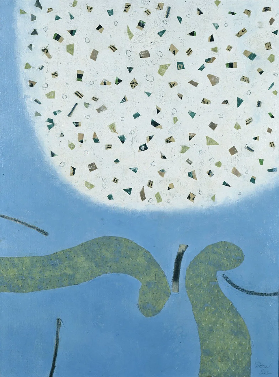
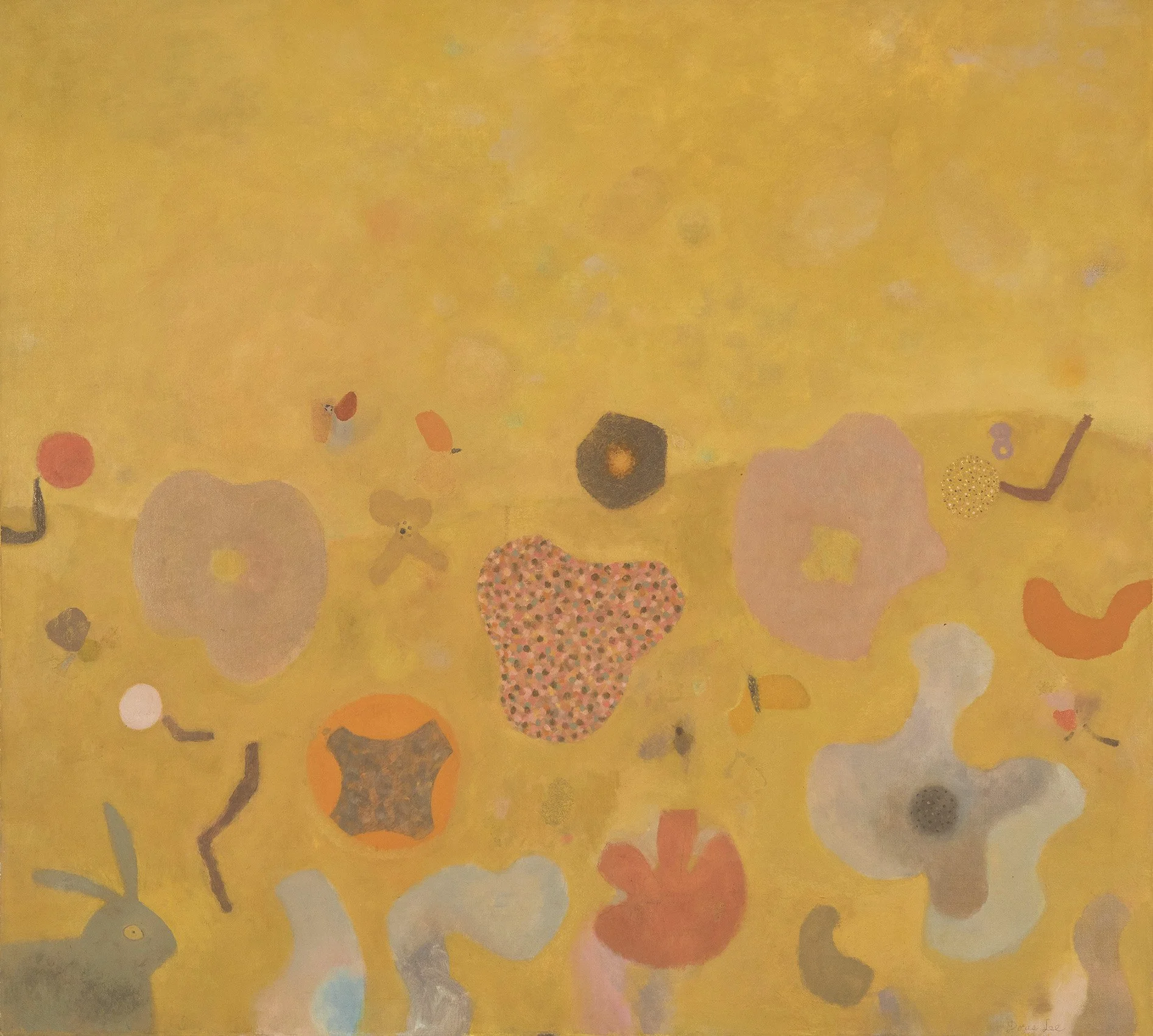
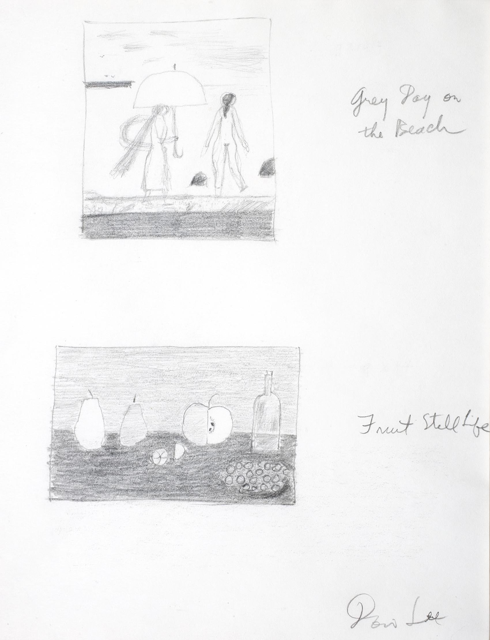
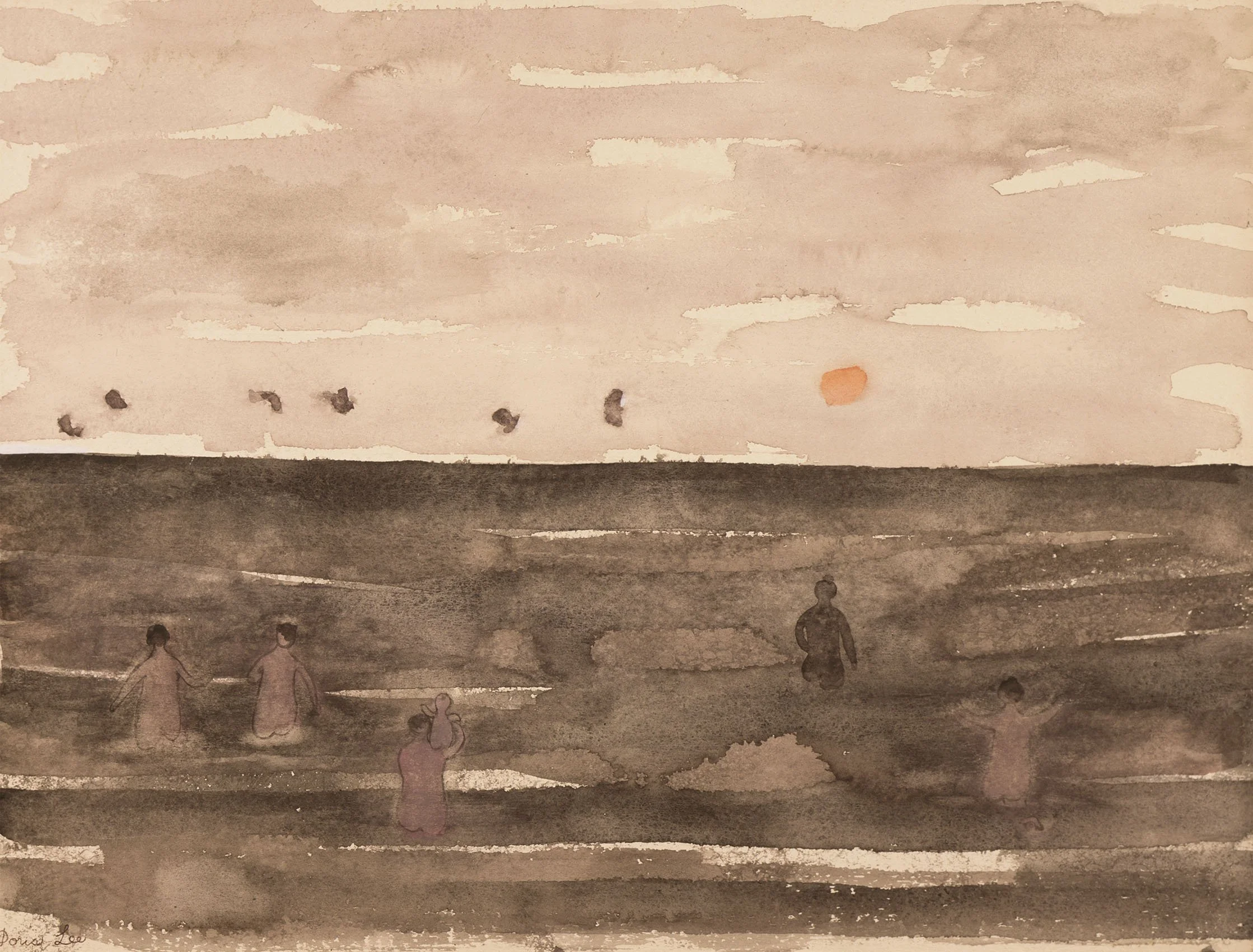
DORIS LEE: AMERICAN STORYTELLER

November 11, 2021 - January 28, 2022
Read essay here. | Installation Views | For pricing and availability please call the gallery at 212-581-1657


Installation Views

Essay

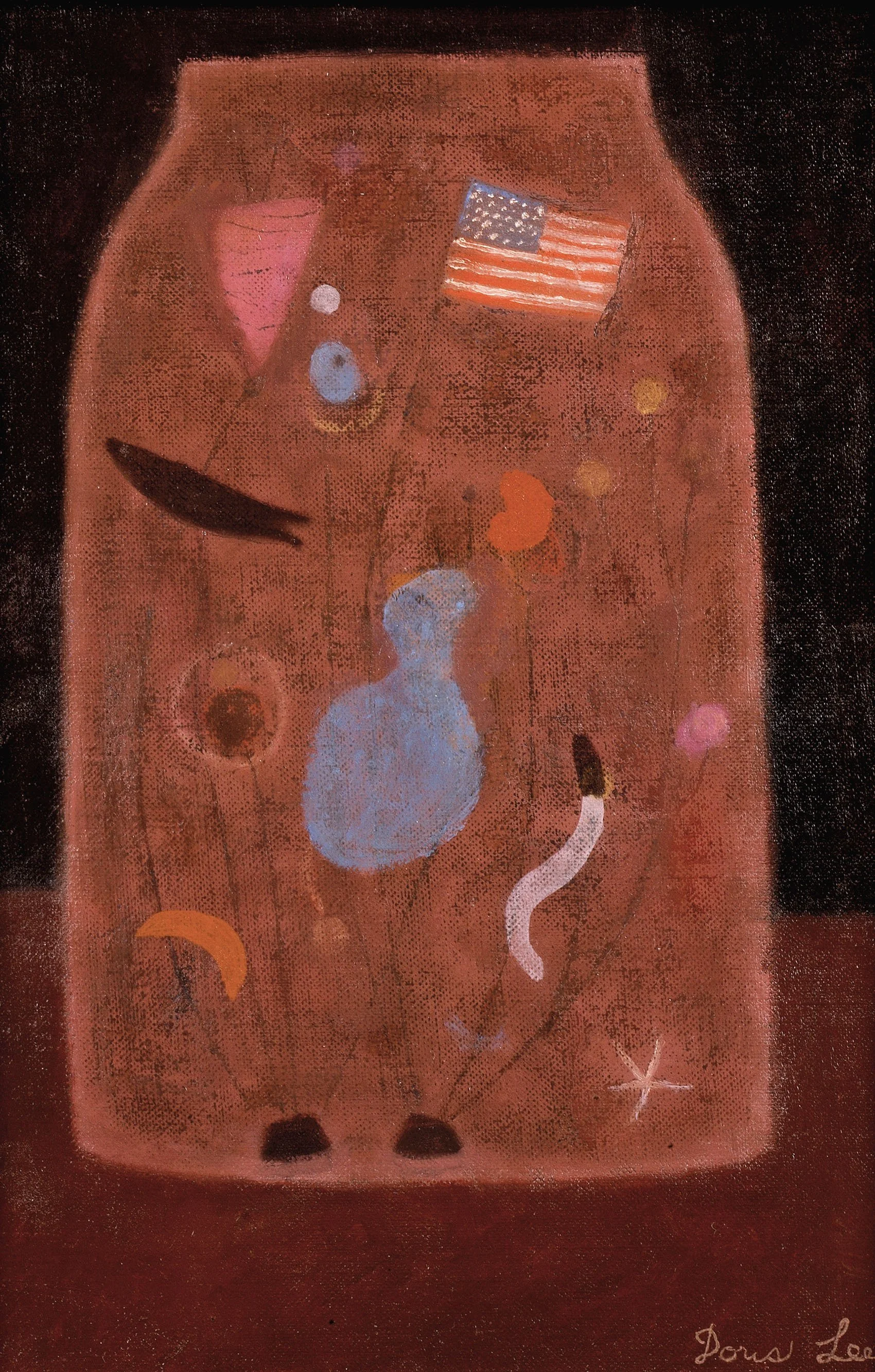
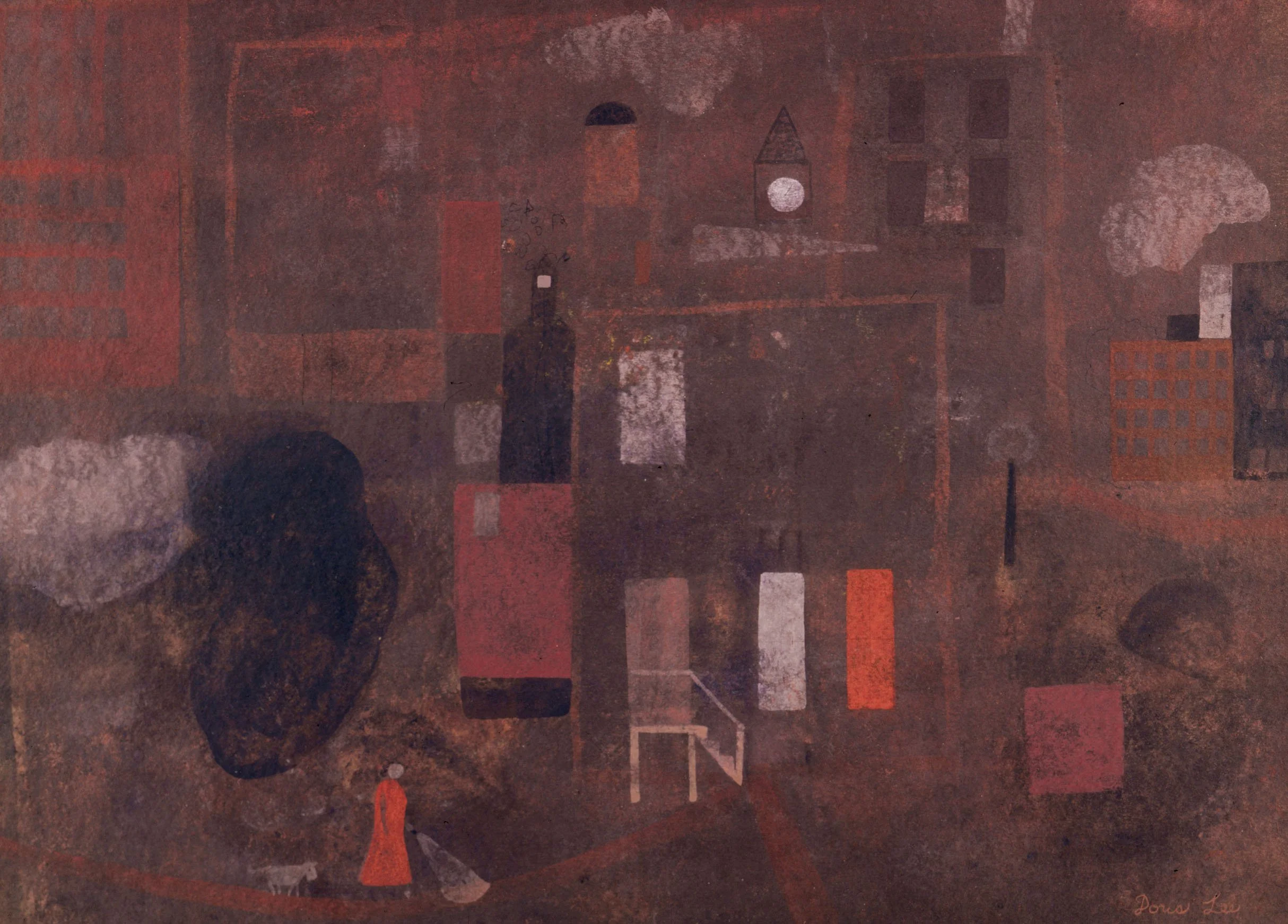
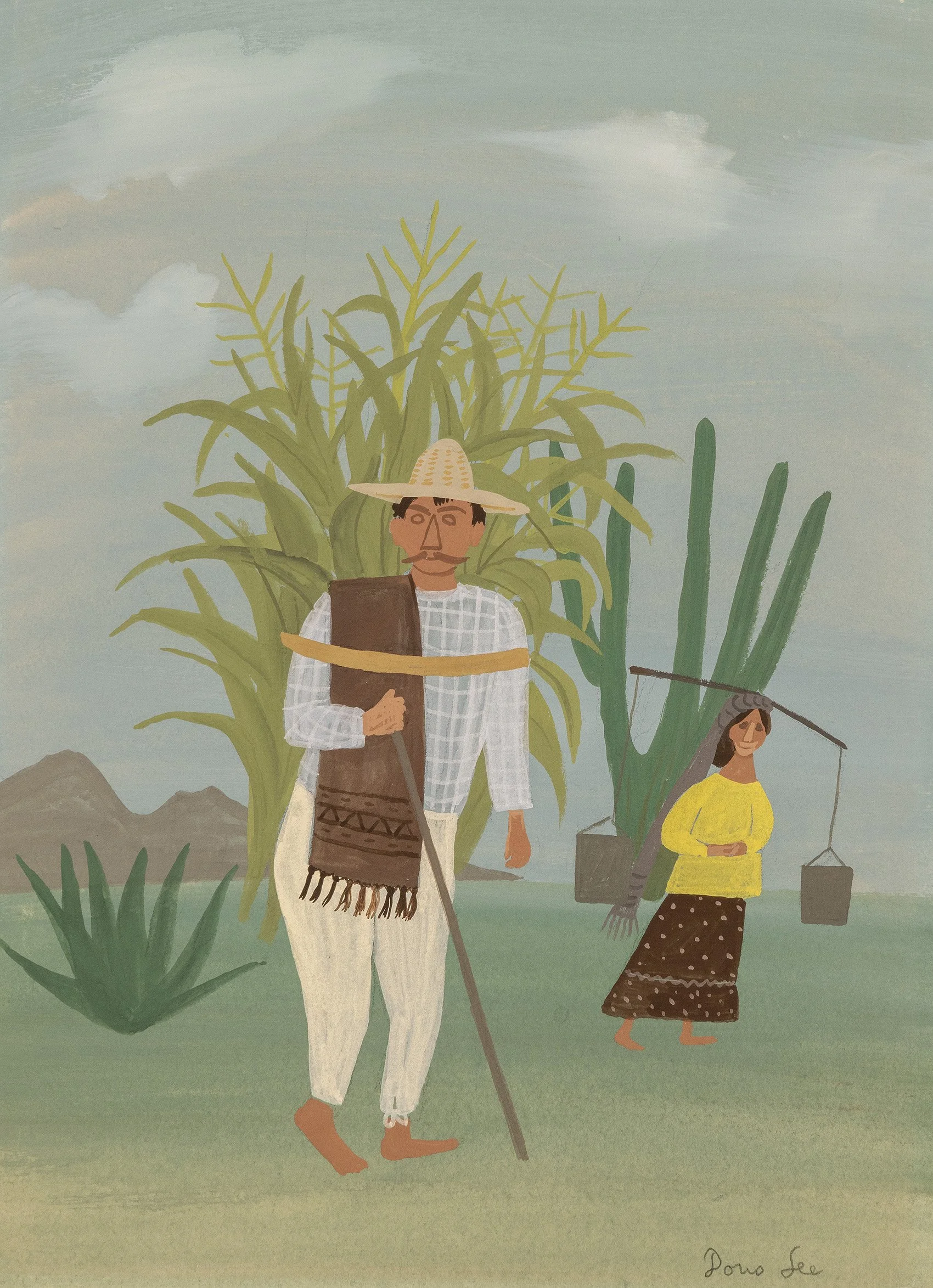
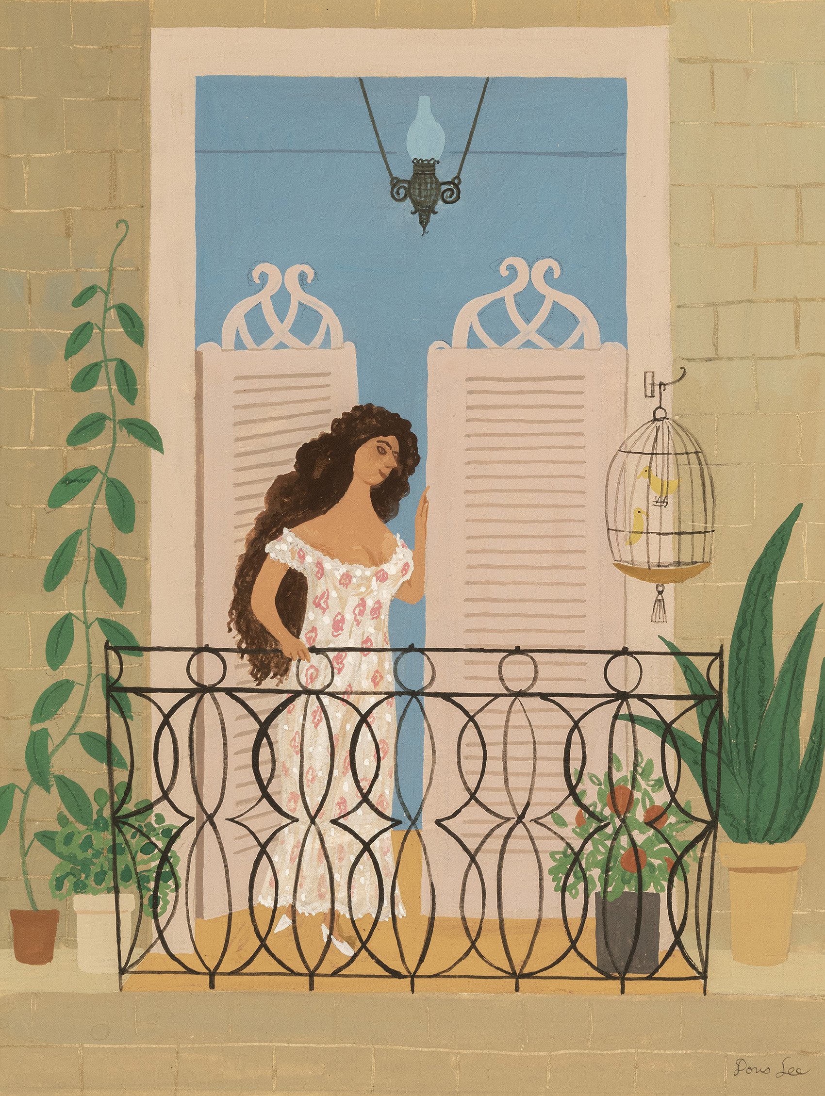
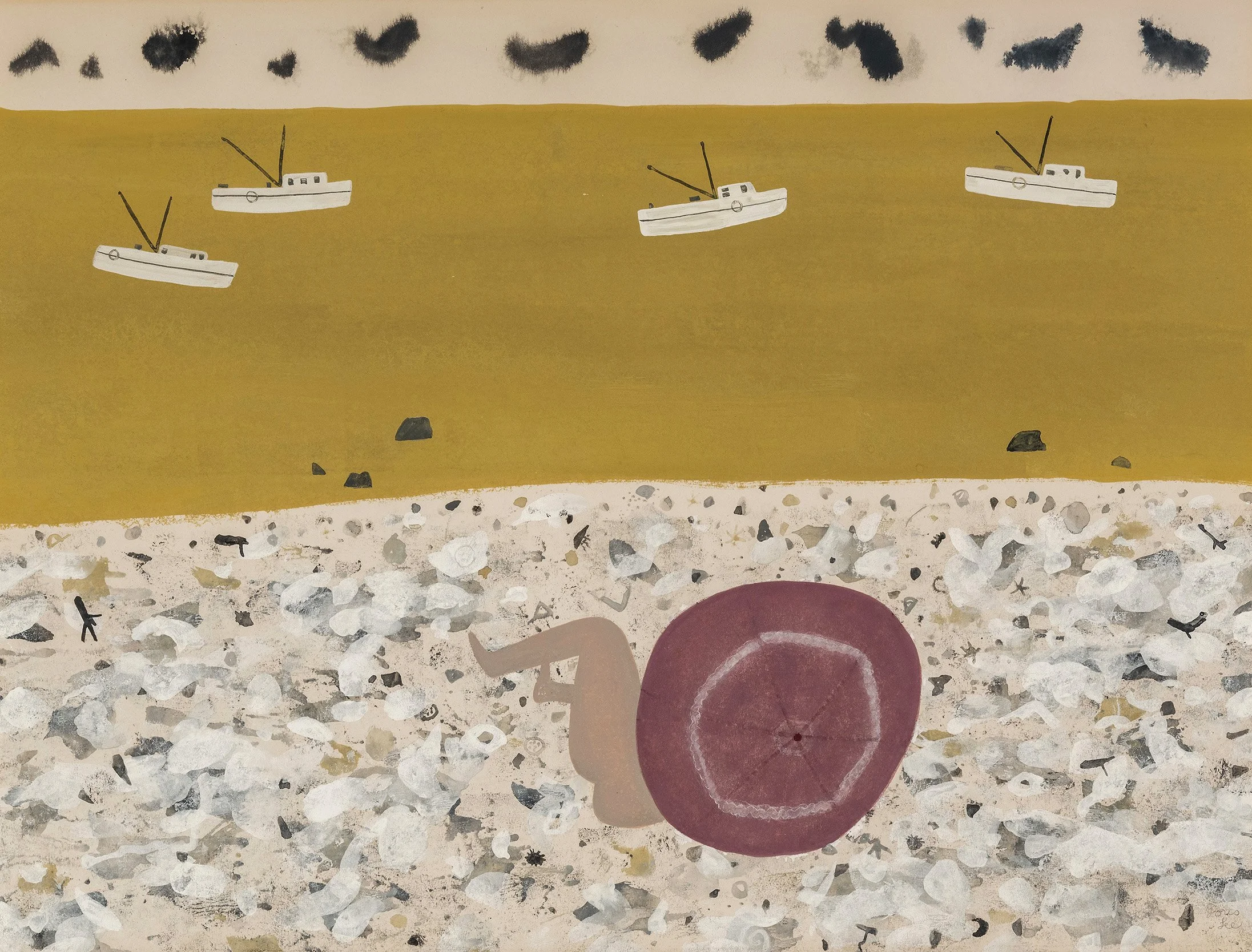
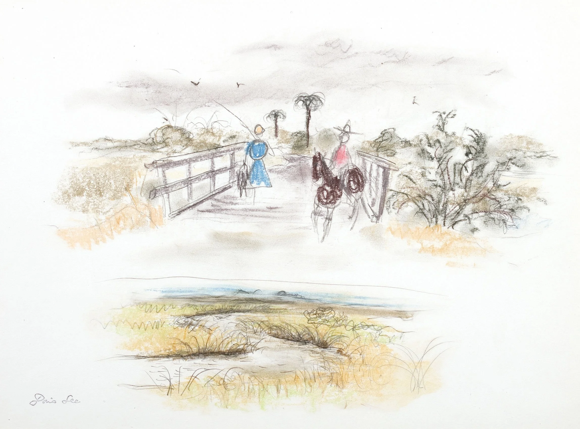
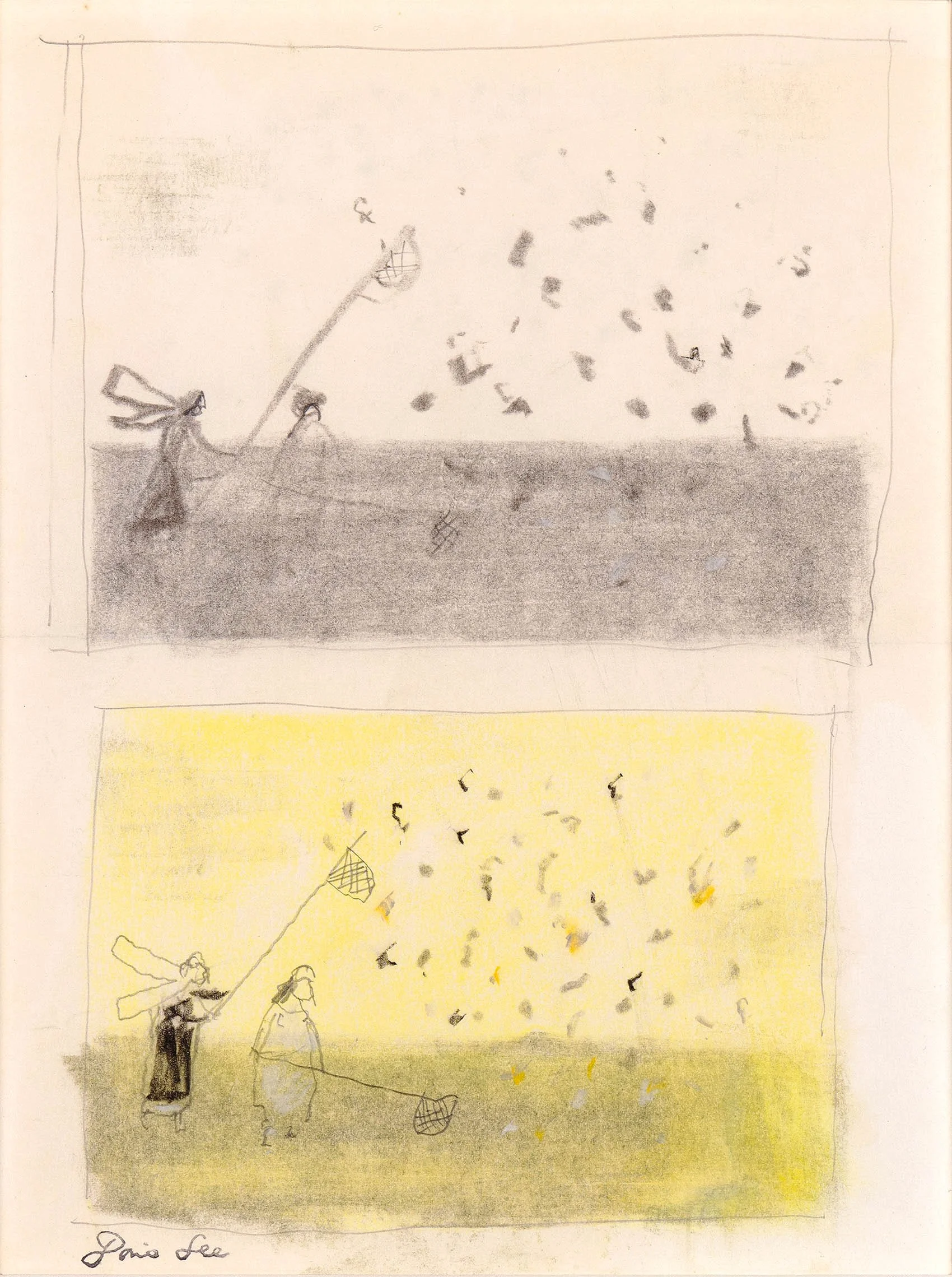
As the exhibition Simple Pleasures: The Art of Doris Lee begins its four museum tour, D. Wigmore Fine Art offers an exhibition of artworks in oil, watercolor, gouache, pencil, and pastel executed between 1932-1967 to complement the museum exhibition.

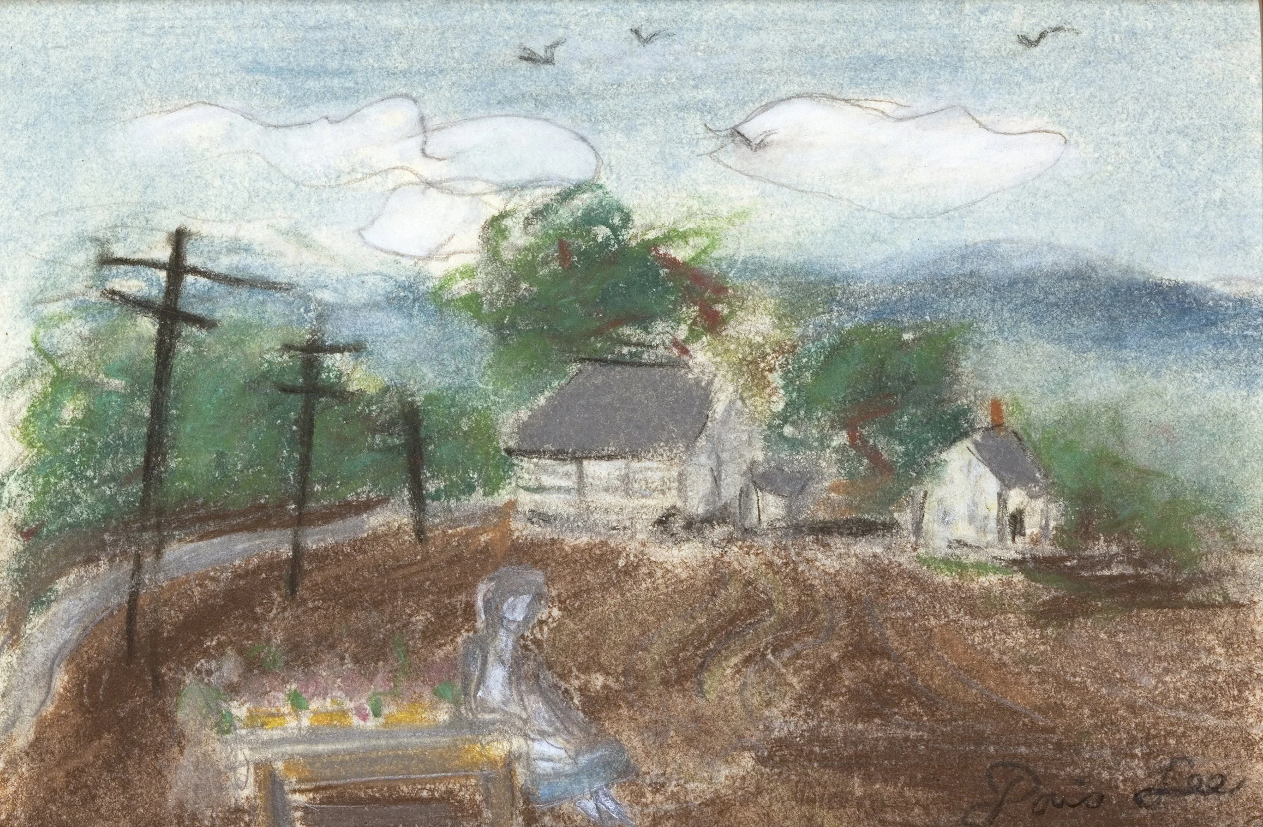
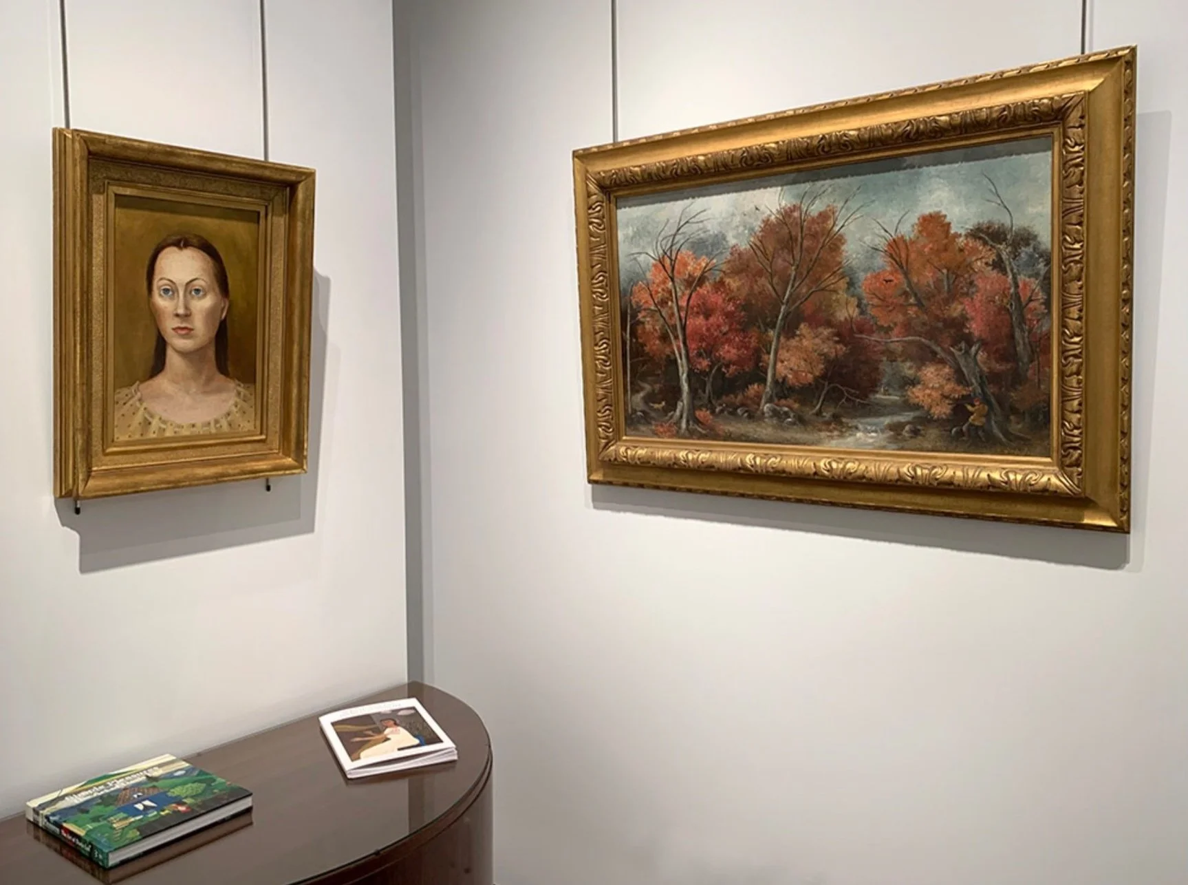
Doris Lee joined one of America’s leading art colonies located in Woodstock, New York in 1931. Artists were newly focusing on social scenes of everyday life, both on the farm and in the city, as expressions of the shared history and support for Americans at a time of national instability. A rural landscape of this type by Lee titled Early Spring Landscape is in our exhibition. It was accepted for the Whitney Museum of American Art’s First Biennial Exhibition in 1932 and requested for the 1933 Annual Exhibition at the Pennsylvania Academy of the Fine Arts. We are also showing Landscape with Hunter, which was exhibited in the 1937 Corcoran Biennial Exhibition and reproduced in the 1945 American Artists Group monograph on Lee. Landscape with Hunter is rich in both autumn color and game as the hunter is provided with a choice of a fox or a stag. In 1936 Lee had a solo exhibition at the Phillips Memorial Art Gallery, Washington, DC and Maynard Walker Galleries became her dealer. With a museum exhibition and a leading New York dealer, Doris Lee at the age of 32 was now a prominent American artist.

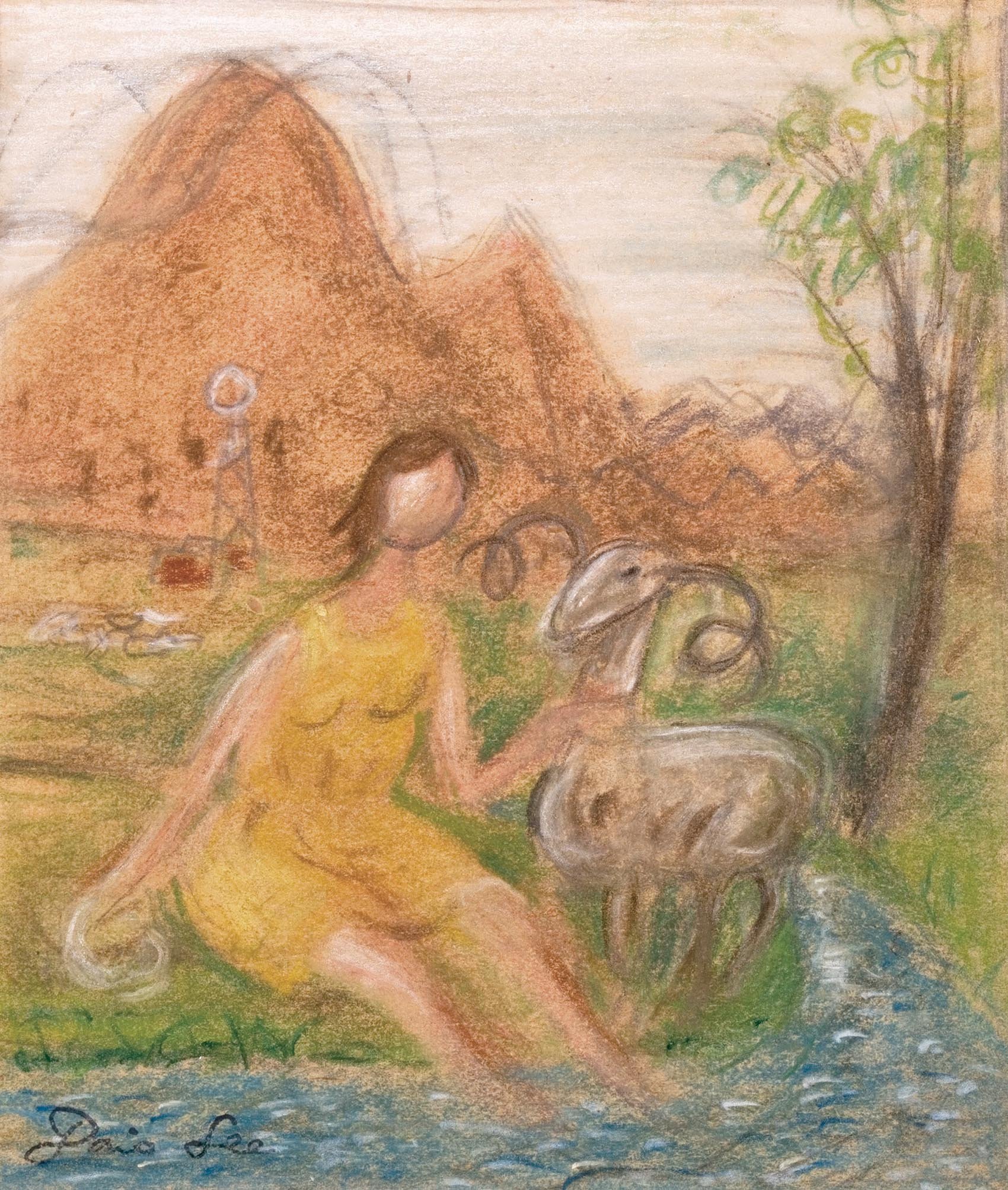
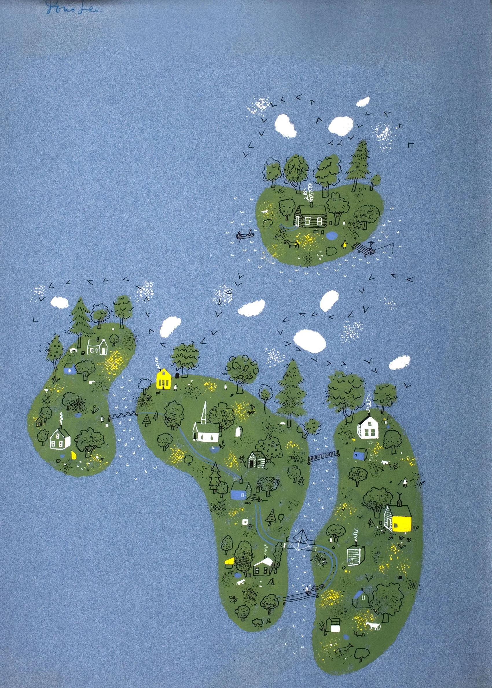
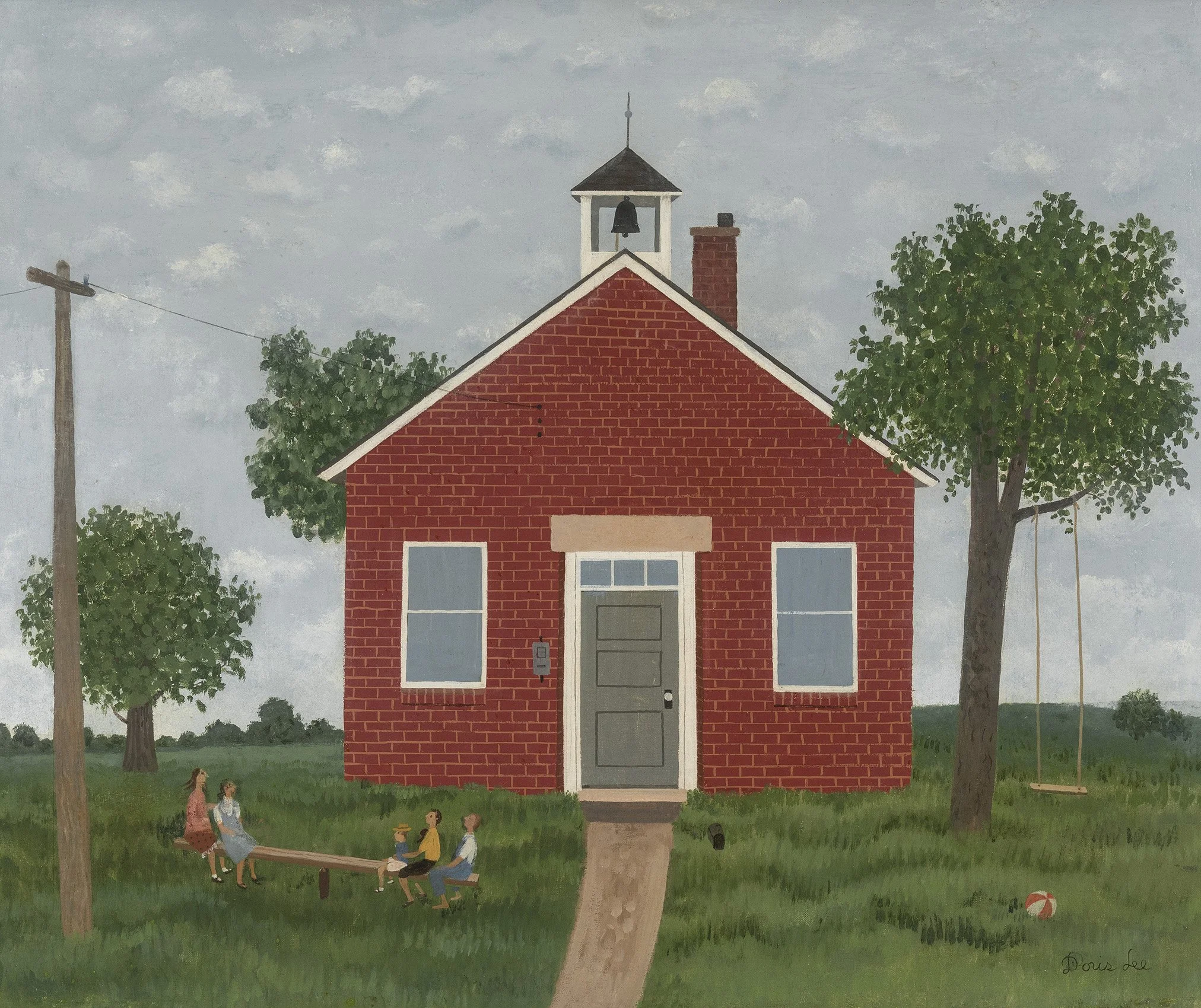
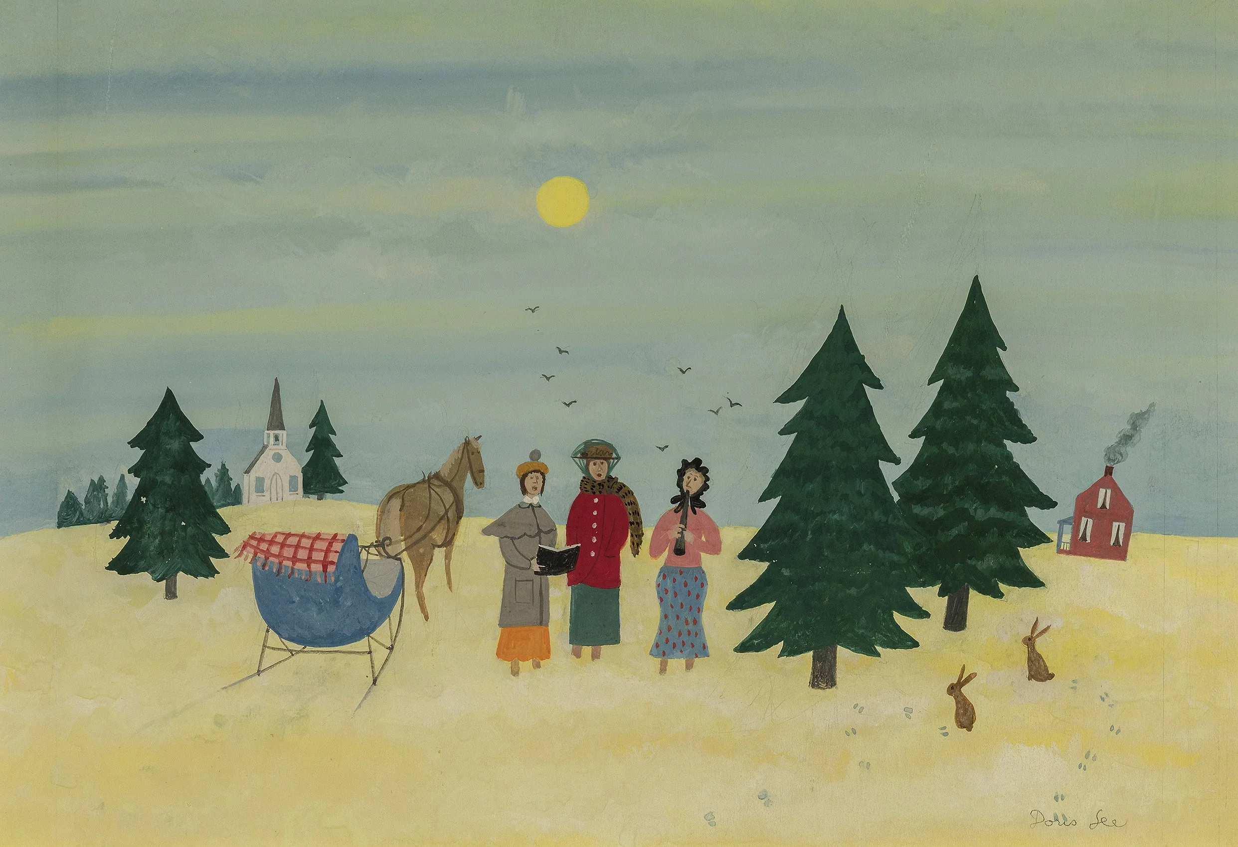
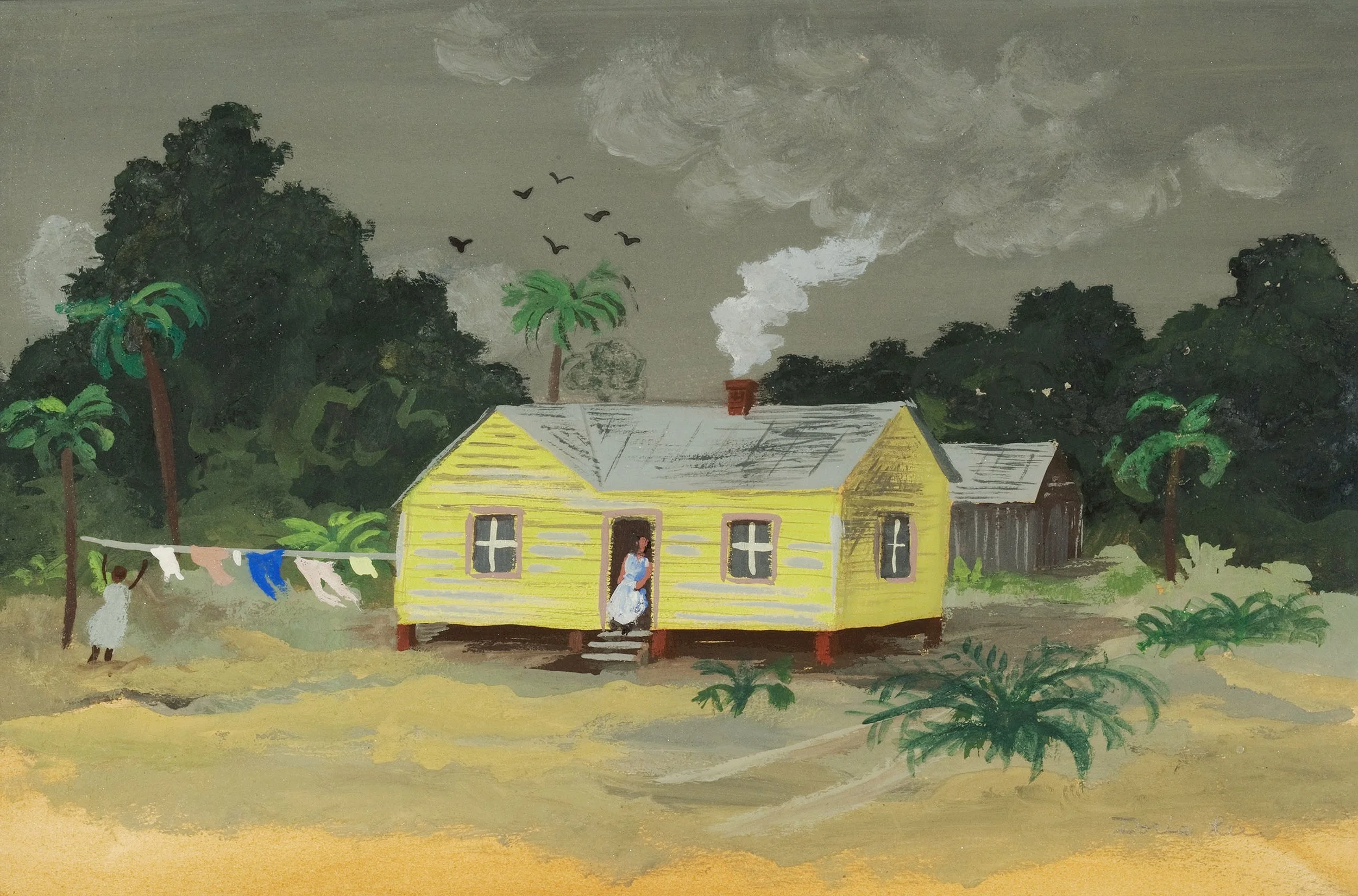
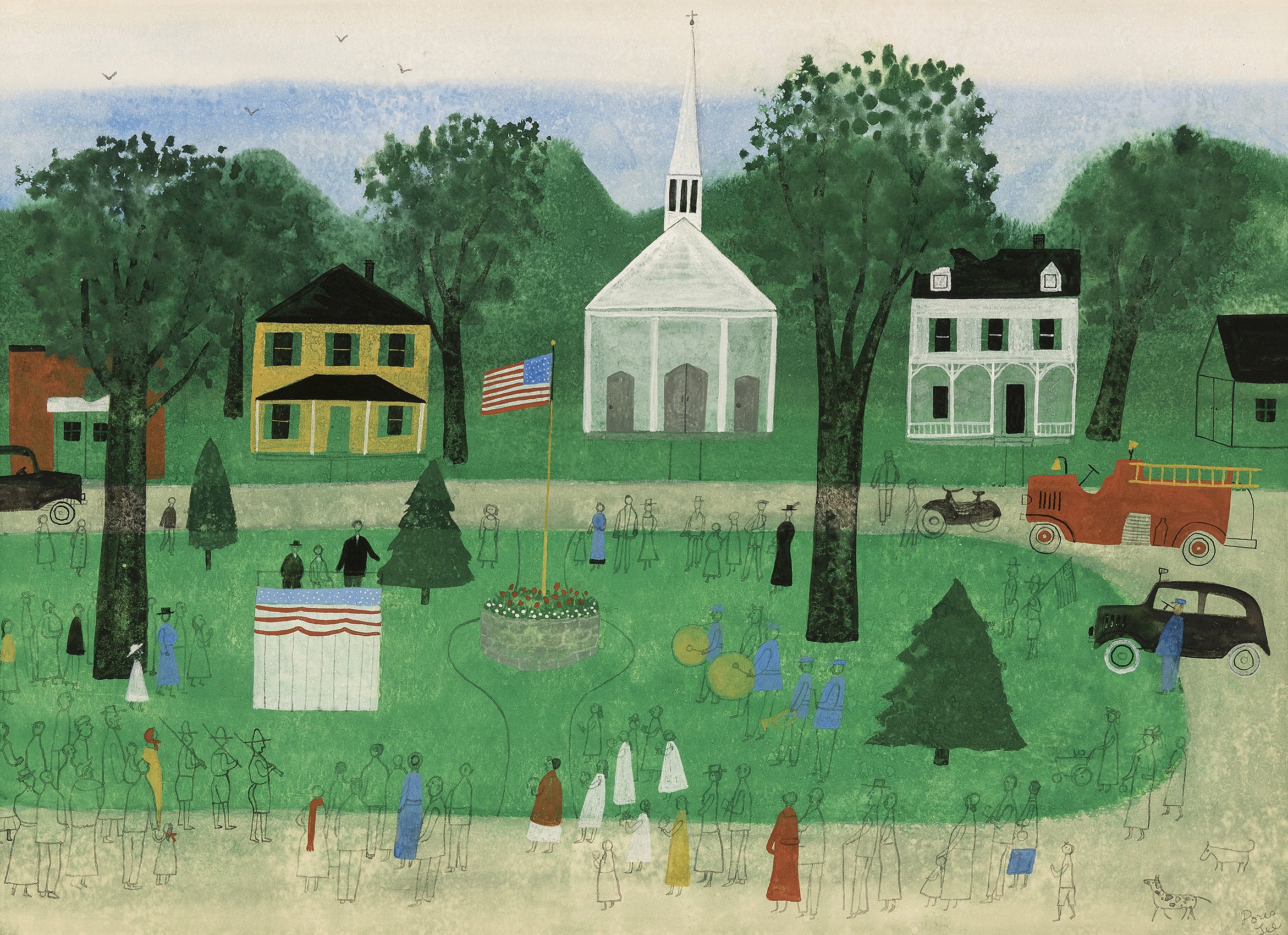
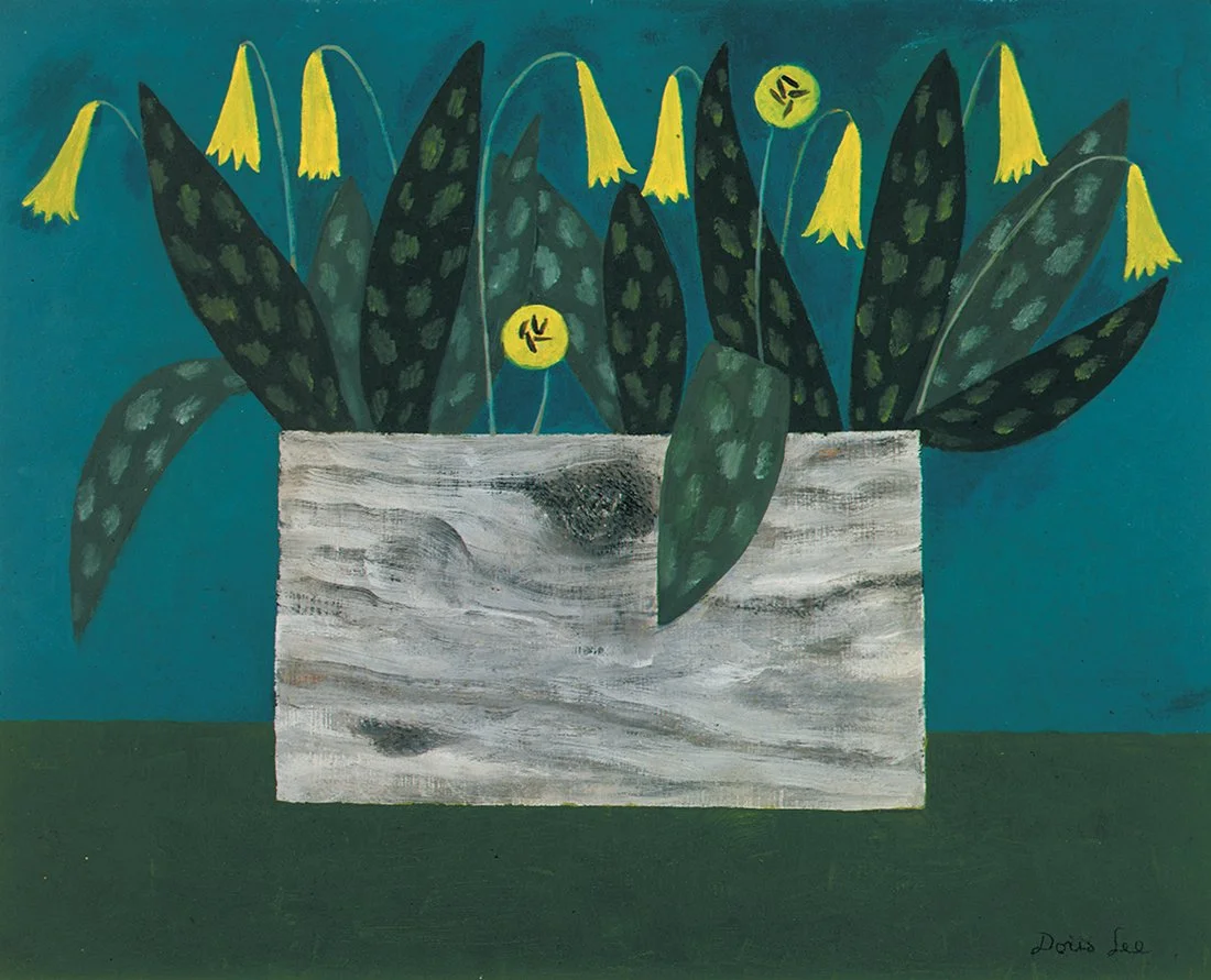
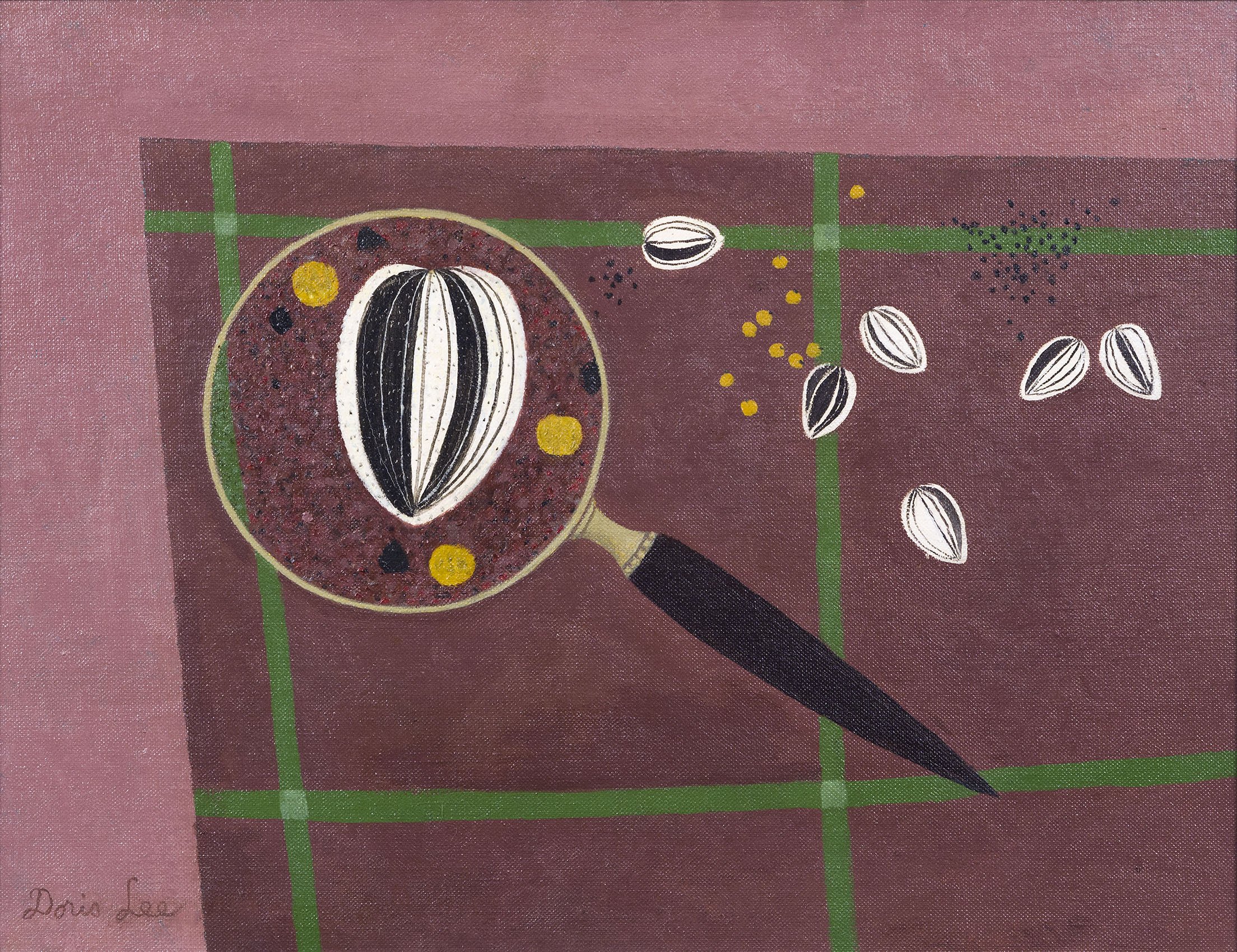
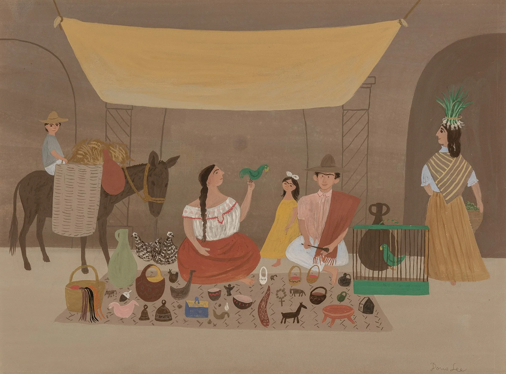
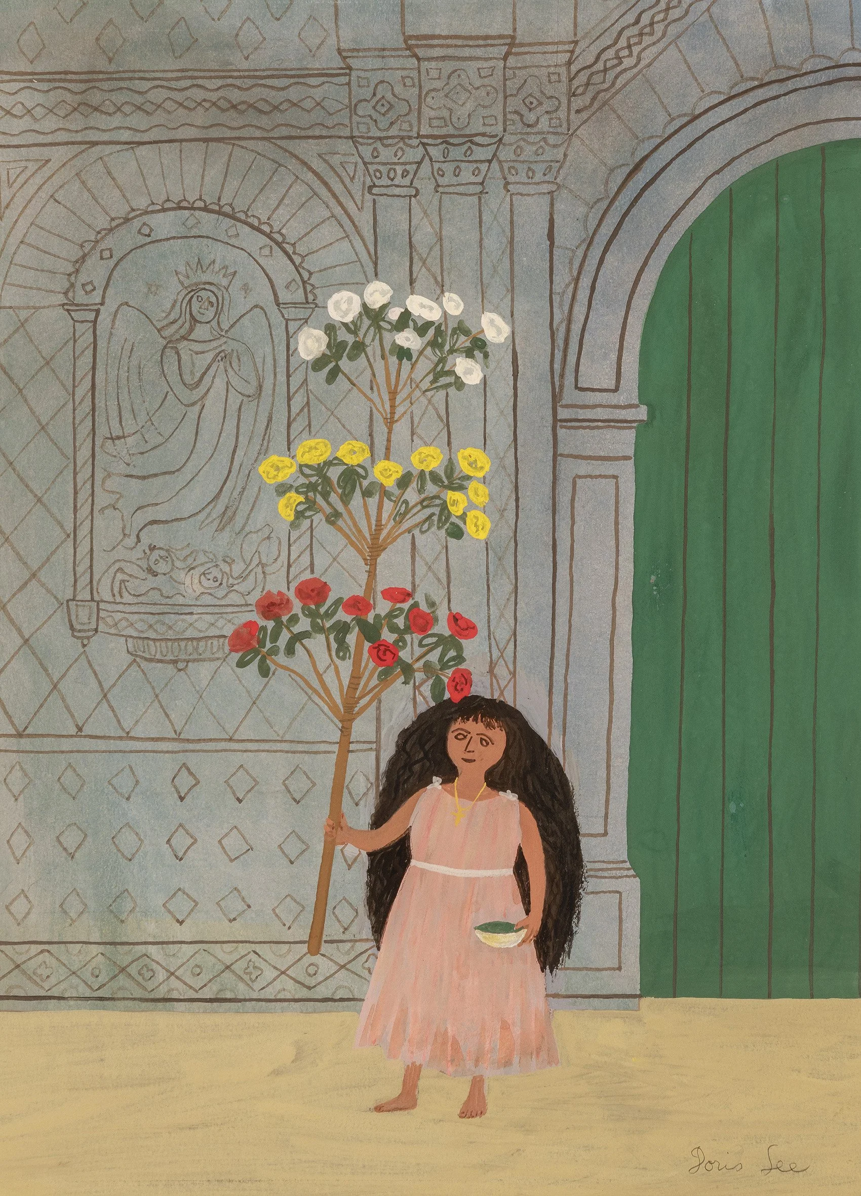
In the Woodstock art colony, stylistic and ideological differences were accepted as vital to moving art forward. While surrounded by farms, mountains, and lakes, Woodstock was close enough to New York City that artists could keep a studio in the city and be in Woodstock during the summer. This proximity allowed Doris Lee to visit art galleries and museums and be known to dealers and curators. Each summer in Woodstock, Lee connected with other artists and they shared what they saw as important. In New York three major exhibitions at the Museum of Modern Art during the 1930s had an impact on Lee and other artists. The exhibitions were: The Art of the Common Man in America: 1750-1900 in 1932; Cubism and Abstract Art in 1936; and Masters of Popular Painting: Modern Primitives of Europe and America in 1938. One result of these exhibitions was artists began to consider folk art as a way into modernism. Lee and her husband Arnold Blanch became collectors of early Americana, as did their Woodstock artists friends Konrad Cramer and Yasuo Kuniyoshi. These exhibitions also helped Lee shift her focus in the 1940s to subjects that were part of her everyday life of friends, community, gardening, sewing, games, and travel. A painting in our exhibition that shows the transition Lee made from American Scene painting’s tighter realism to Americana appears in Vase of Flowers, a portrait of a country vase filled with colorful simple flowers placed on a floral patterned cloth executed around 1940. As Lee continued to paint still life, she focused on the abstract structure of a subject to flatten space and play with perspective. Our gallery exhibition includes several still lifes, such as Flower Box Still Life, Magnifying Glass with Sunflower Seeds, Summer Souvenirs, and Lilacs. They are offered to show Doris Lee’s continued stylistic evolution. In subjects such as Carolers, Memorial Day, and Cottage Country, Lee uses memory as a tool to clarify some elements and eliminate others. These paintings are each simplified stories told from a woman’s point of view with decoration and figuration that embrace pattern.

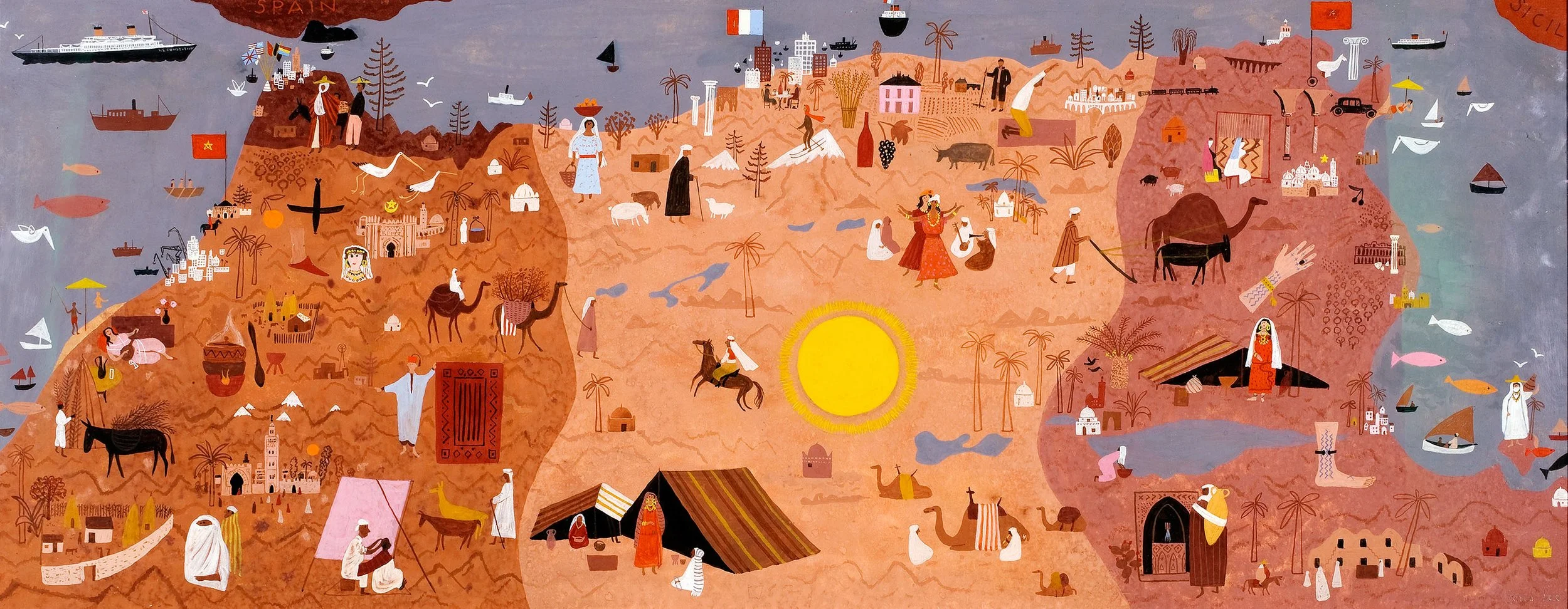
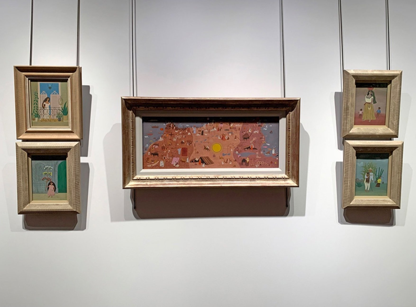
From 1941 on, Doris Lee was represented by Associated American Artists, led by Reeves Lewenthal, a dealer who negotiated commissions between his artists and corporations. This arrangement created more opportunities for Lee to travel nationally and internationally. Lee remained busy through the 1950s with exhibitions and commissions. For instance in the period 1950-1951, Lee’s schedule included: a solo exhibition at Associated American Artists Galleries, New York; an artist-in-residence at the Maitland Research Studio, Florida over the winter; a panel at the Third Woodstock Art Conference; inclusion in the major exhibition American Painting Today at the Metropolitan Museum of Art; and an application for a Guggenheim Fellowship. Also in 1950-1951, Lee received prizes for both her Abbott Laboratories advertisement and Seventeen magazine illustrations and received commissions to illustrate The Rogers and Hart Song Book, design ceramics for Stonelain, and travel for two months through North Africa for Life magazine.

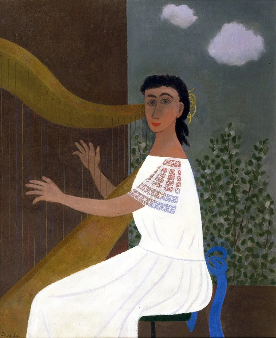
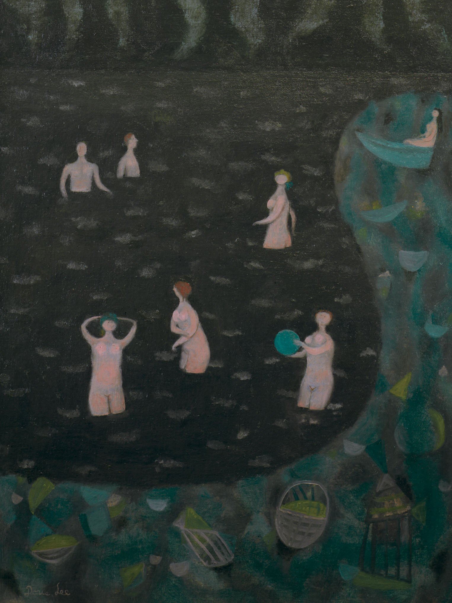
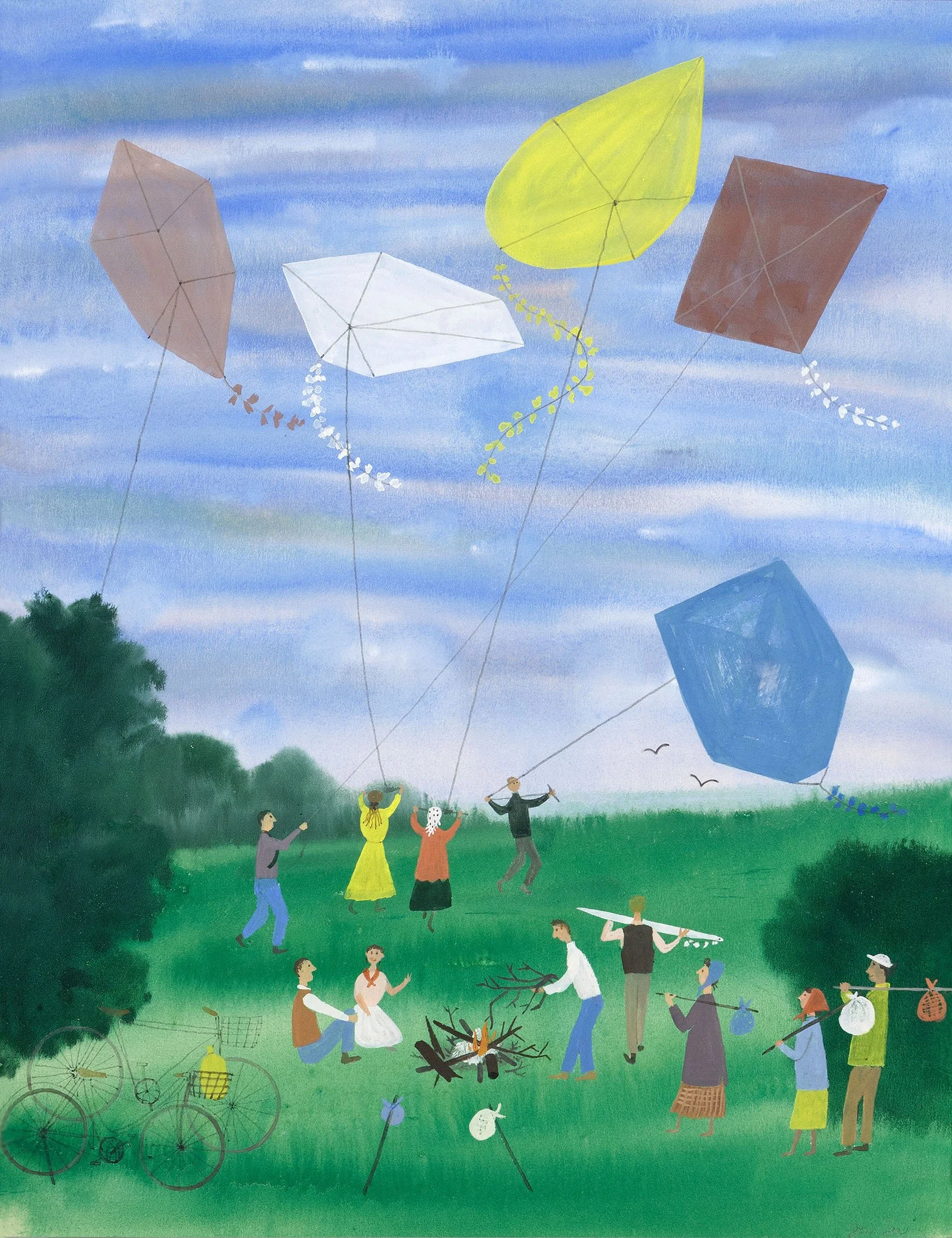
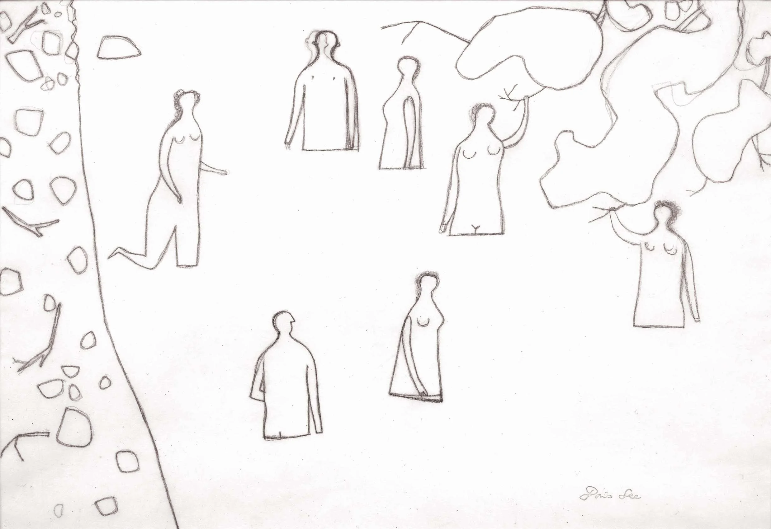
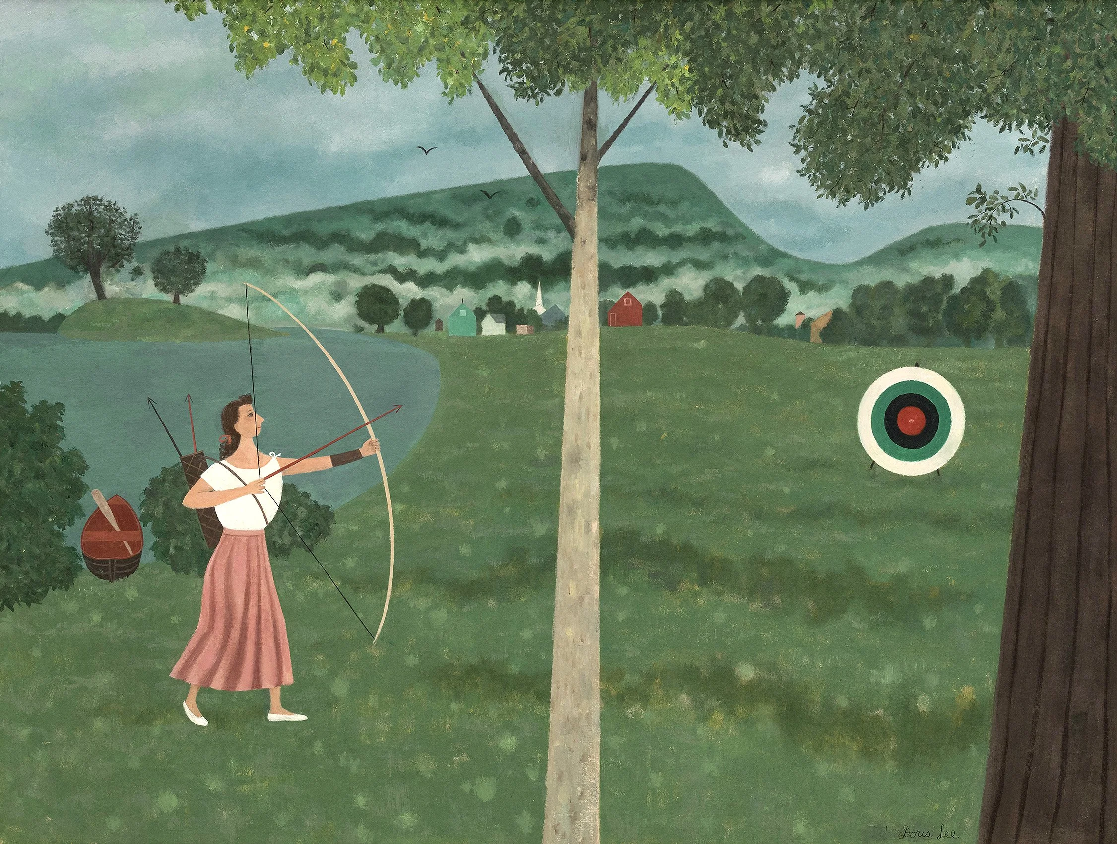
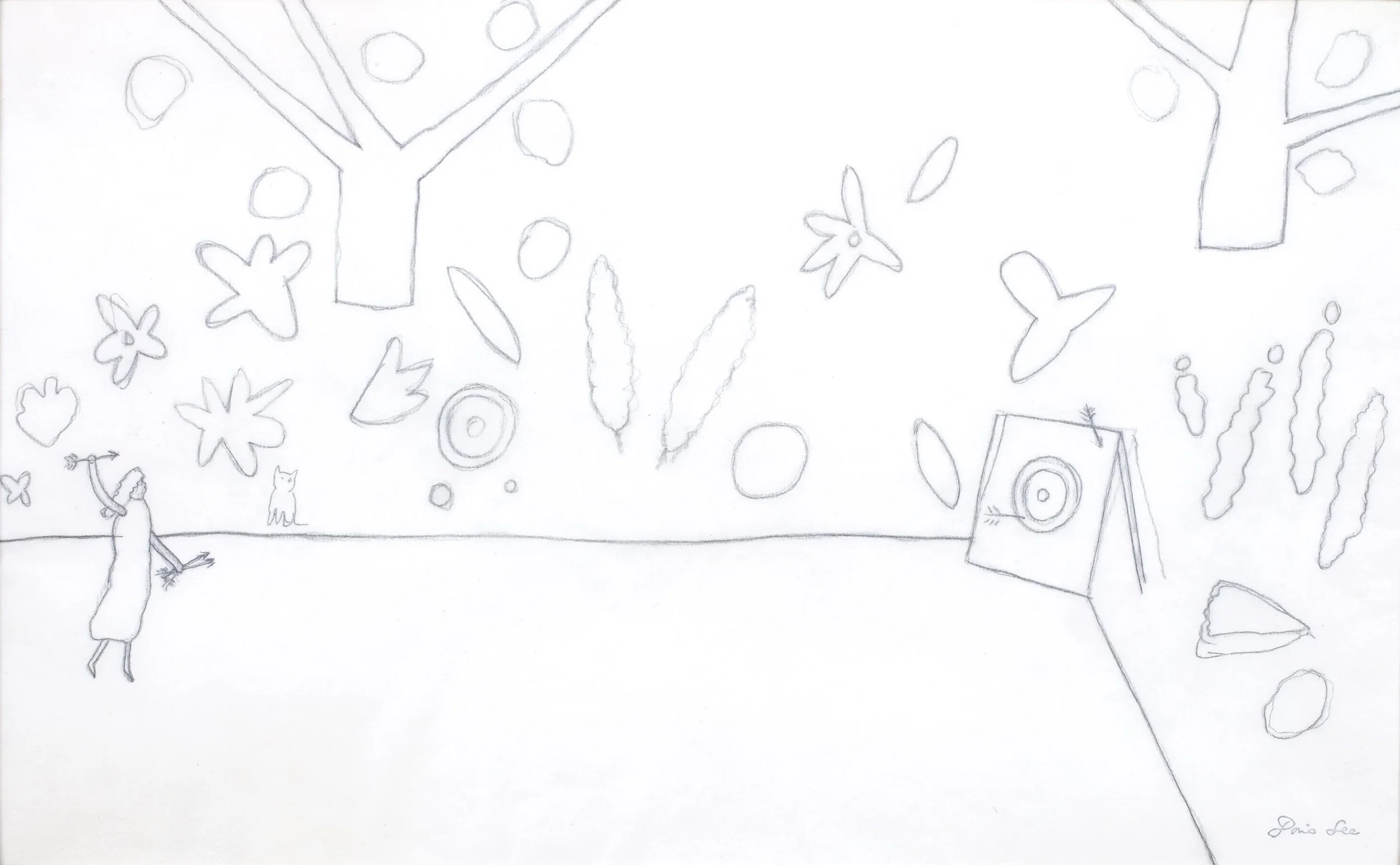
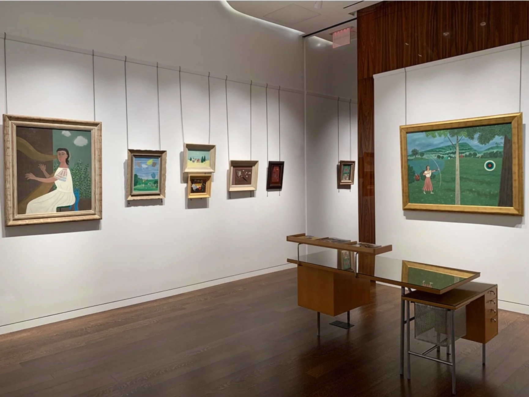
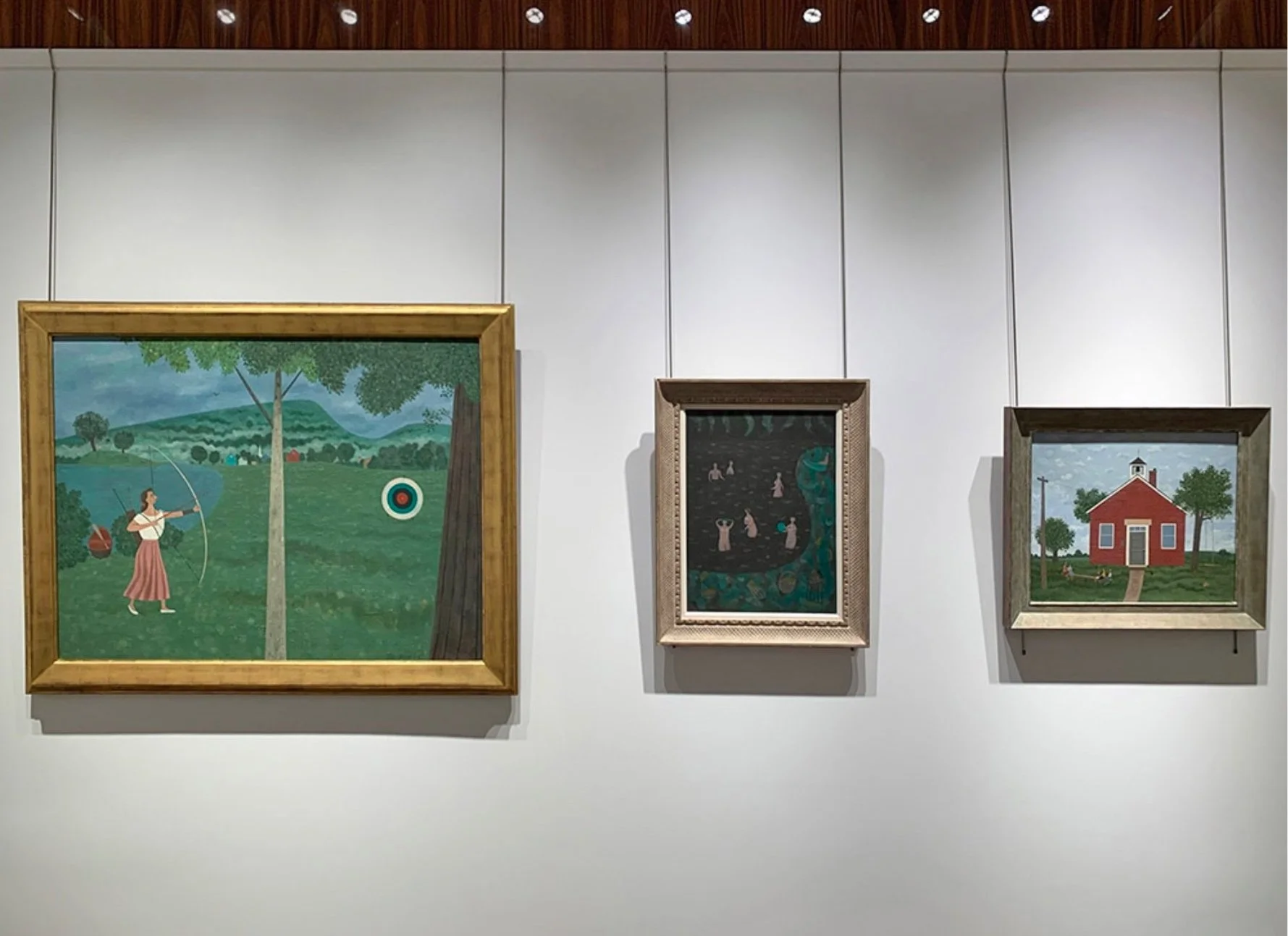
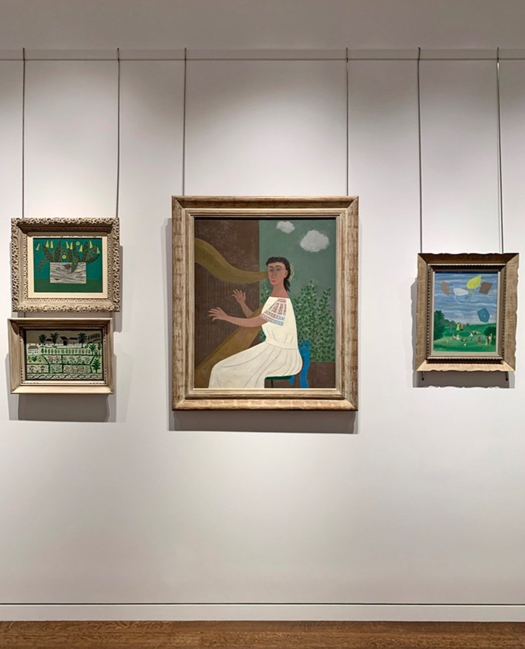
We have selected Young Harpist as the cover of our gallery exhibition catalogue as it was shown in Lee’s 1950 solo exhibition of 22 oil paintings and 5 gouaches at Associated American Artists Galleries. In Young Harpist, a Doris Lee-like figure plays a musical composition for the viewer. A window with a country view behind the harpist suggests a fuller story is being told. Further works in our exhibition that deserve mention are Country Schoolhouse which was part of an 8 painting commission Lee received from J. L. Hudson Co. on contemporary life in Michigan and High Flying Picnic which received the award of merit at the Art Directors Club in 1950, submitted for consideration by art director of Seventeen magazine Cipe Pineles. Two further examples of Lee’s storytelling feature fun happenings in Woodstock are Dark Pool with an evening picnic and skinny dip and The Archer representing the women’s archery club to speak of the skills and strengths of women.

There are many fine paintings and drawings in our exhibition. We hope you will enjoy them. Like Doris Lee, our aim is to give you moments of joy.

[ TOP ]
Modernism 1913-1950 | Realism of the 1930s and 1940s | Abstraction of the 1930s and 1940s | Post-War | Selected Biographies

TADASKY: EXPANDING VISION, 1964-1970

Sept 8 - Nov 5, 2021

Essay | Installation Views | Artist Statement
For pricing and availabilty, please contact the gallery at 212-581-1657


Installation Views


Essay by Emily Lenz

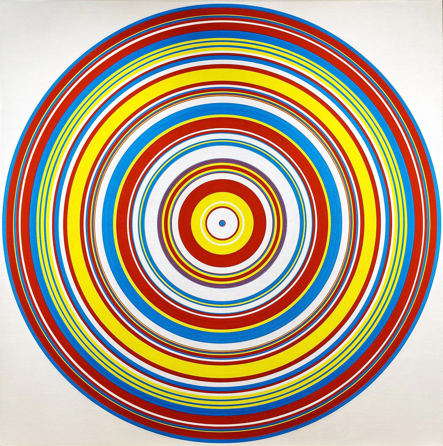
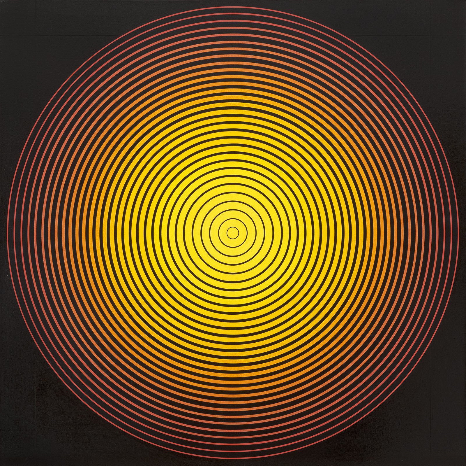
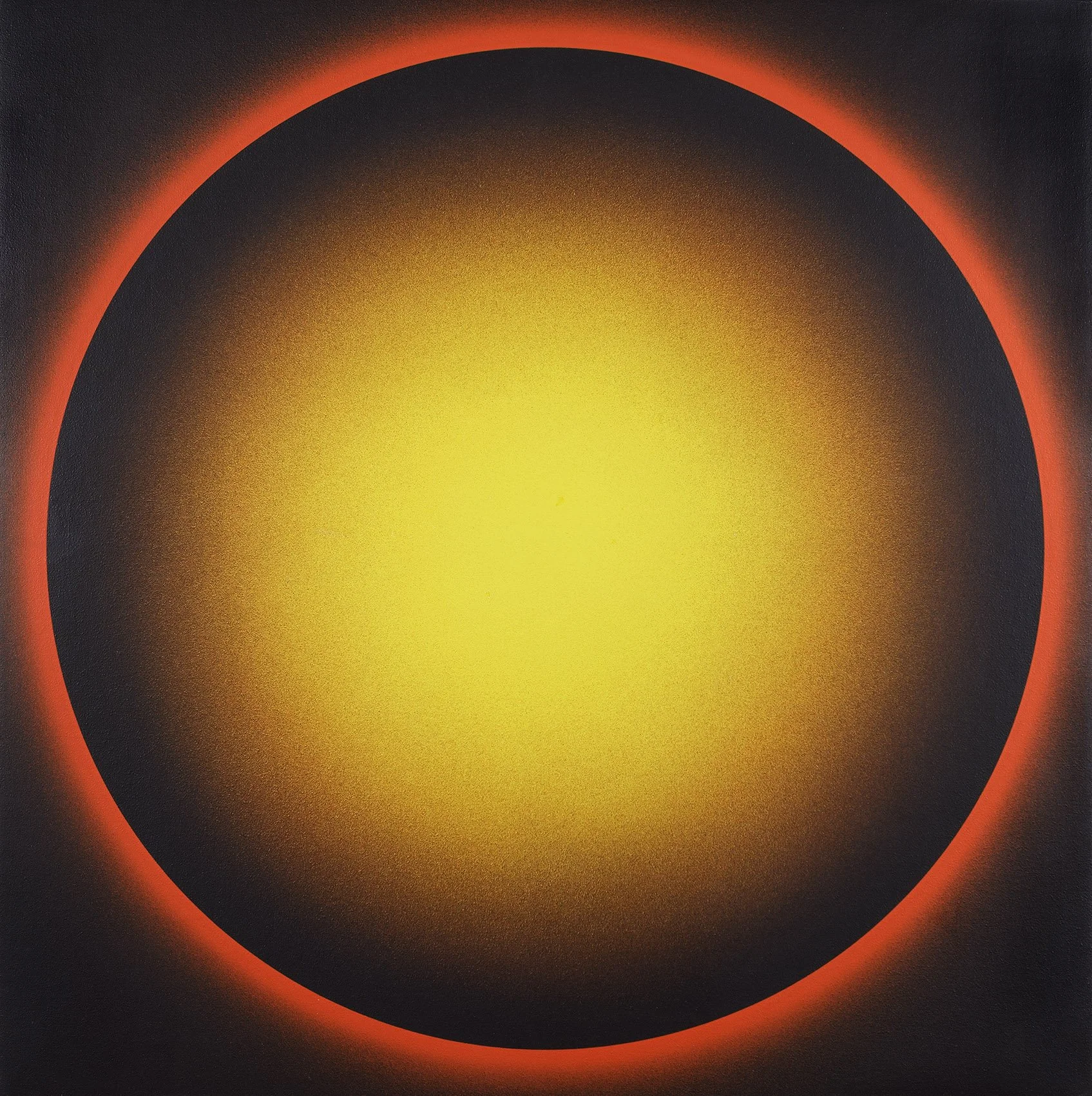
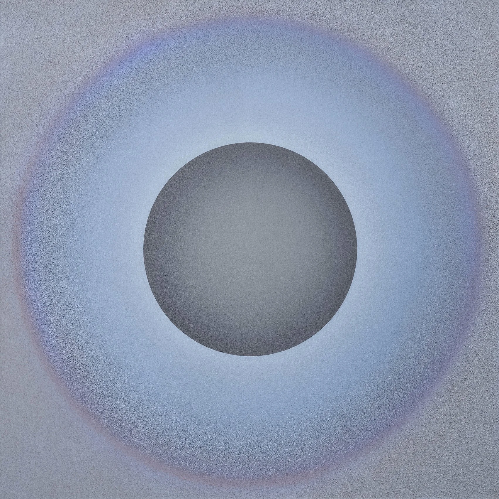
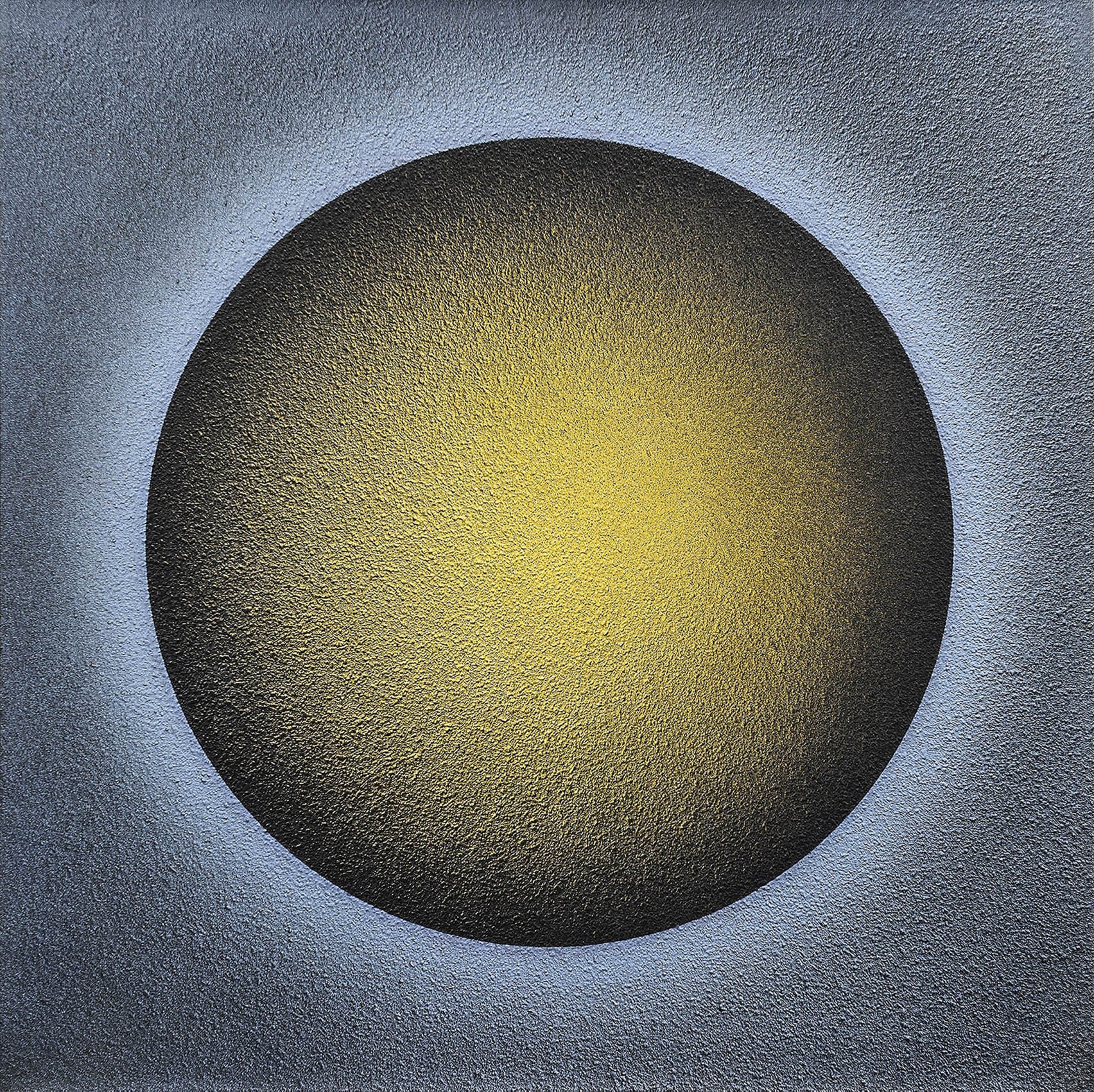
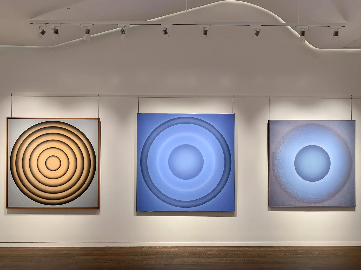
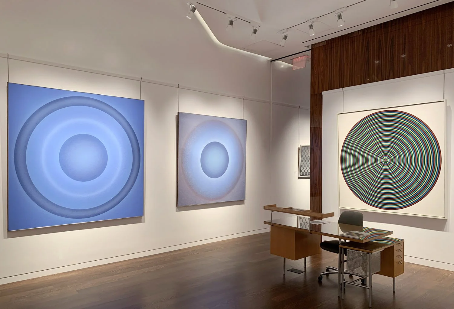
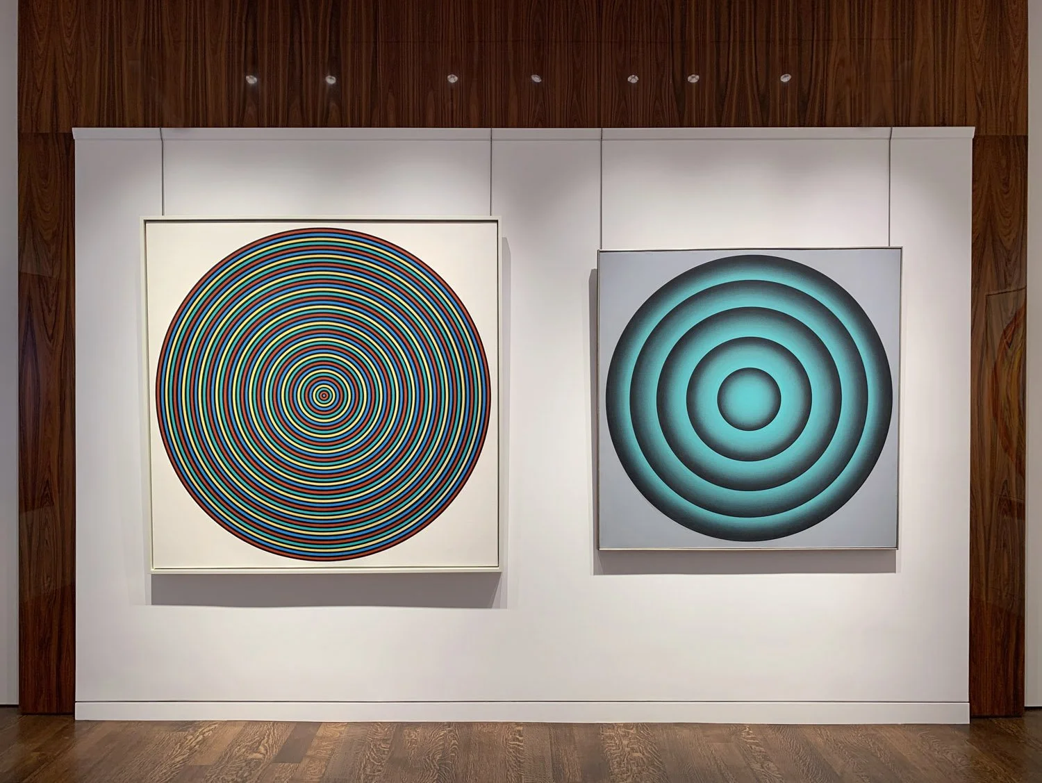
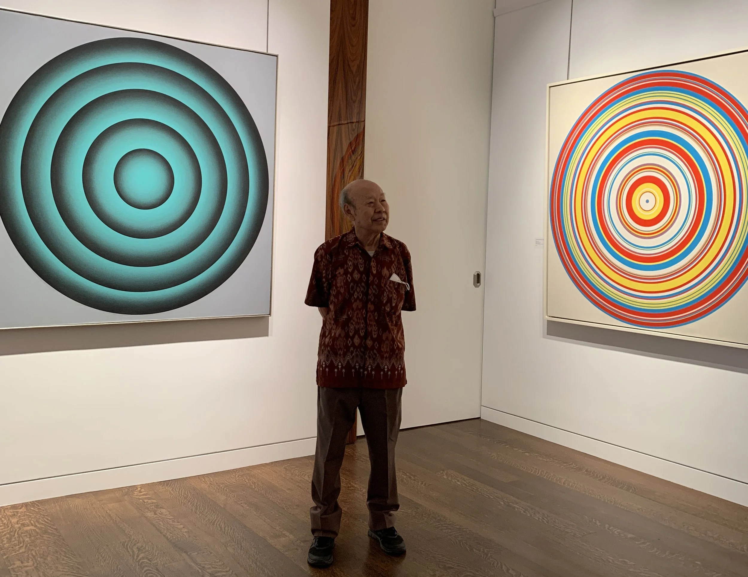
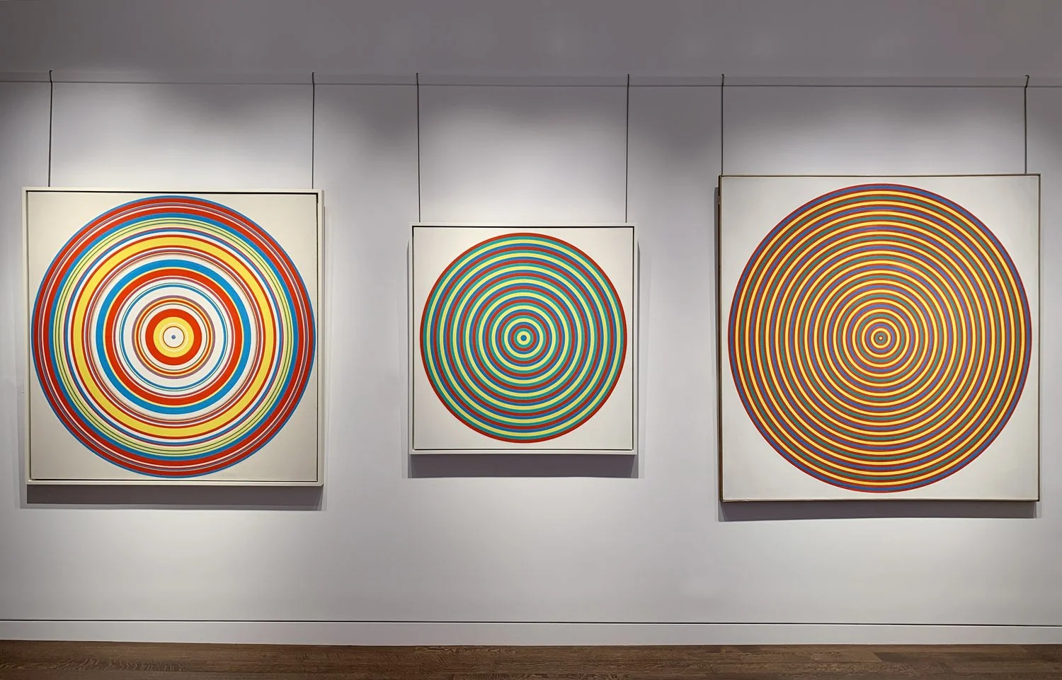
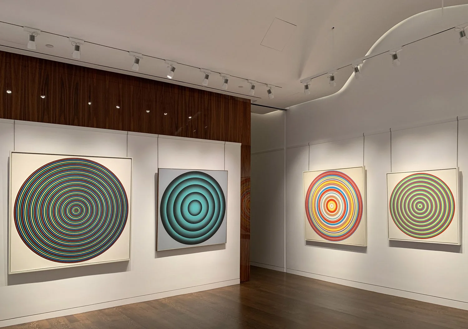
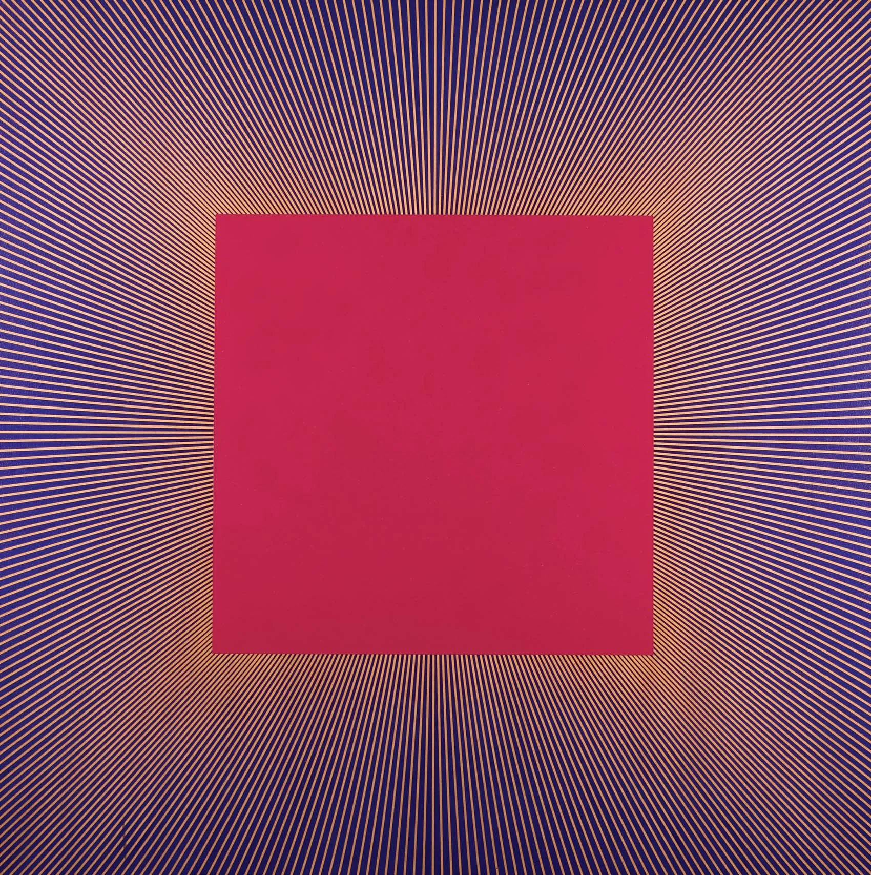
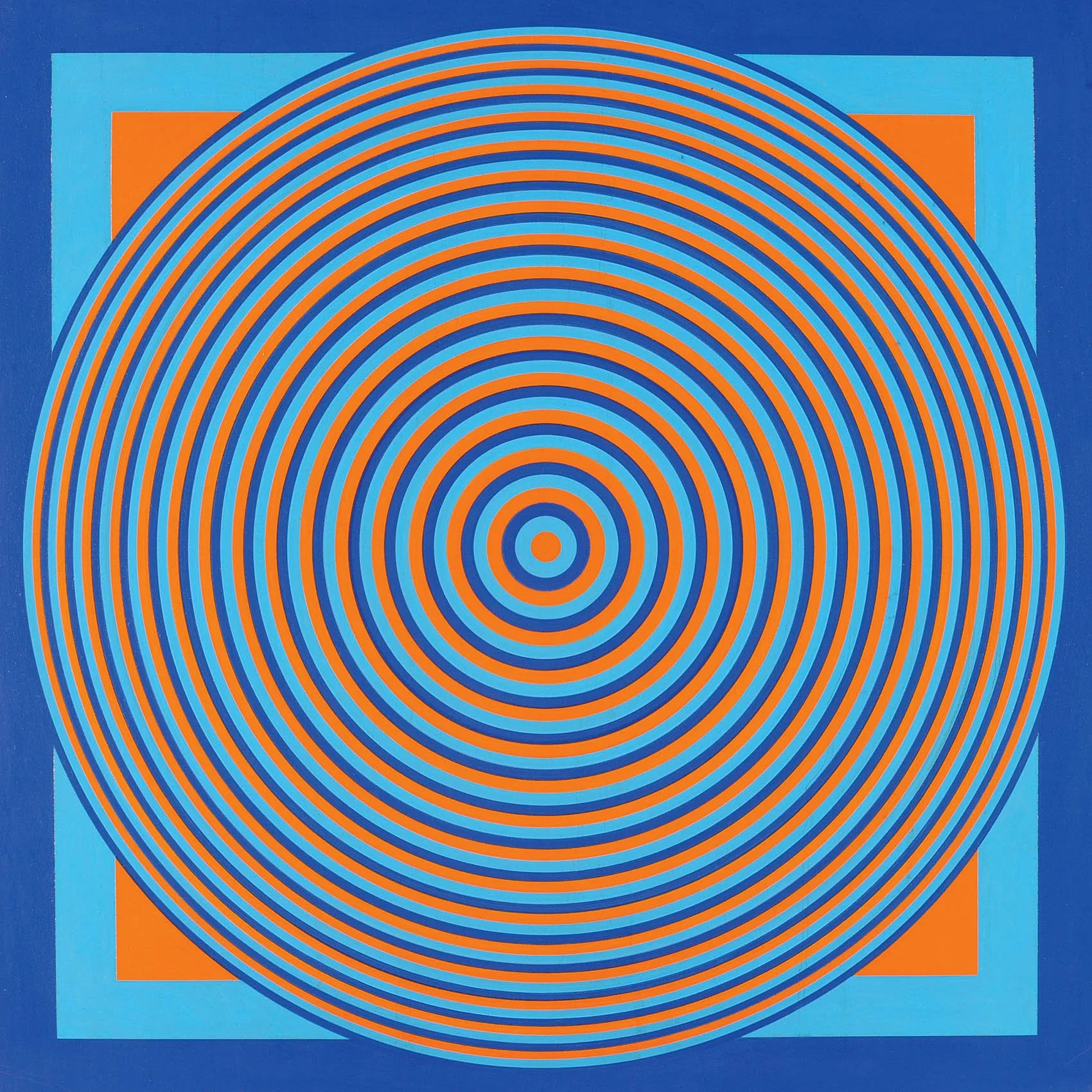
Our exhibition focuses on the years 1964 to 1970 when Tadasky (Tadasuke Kuwayama, b.1935) developed his distinct style and was exhibited widely in New York with Sam Kootz and Fischbach galleries and in Japan with the Tokyo Gallery and the Gutai. In the 1960s Tadasky’s paintings went from bright targets and flat spinning discs in the A, B, and C series to pulsating rings in the D series to glowing orbs in the E and F series. Tadasky numbers rather than titles his works as he wants them to be universal and timeless.

Tadasky painted about 100 paintings before showing his work to anybody. In 1964 Ivan Karp was one of the first to view Tadasky’s work and he spread the word to Leo Castelli and the Museum of Modern Art. The more aggressive dealer Sam Kootz visited the studio, purchased paintings, and offered Tadasky a solo exhibition. Tadasky accepted, pleased to have the same New York dealer as Picasso. Over the next two years until Kootz’s retirement in 1966, he sold over 80 of Tadasky’s paintings to many important collectors, including Larry Aldrich, David Rockefeller, Frederic Weisman, and James Michener.

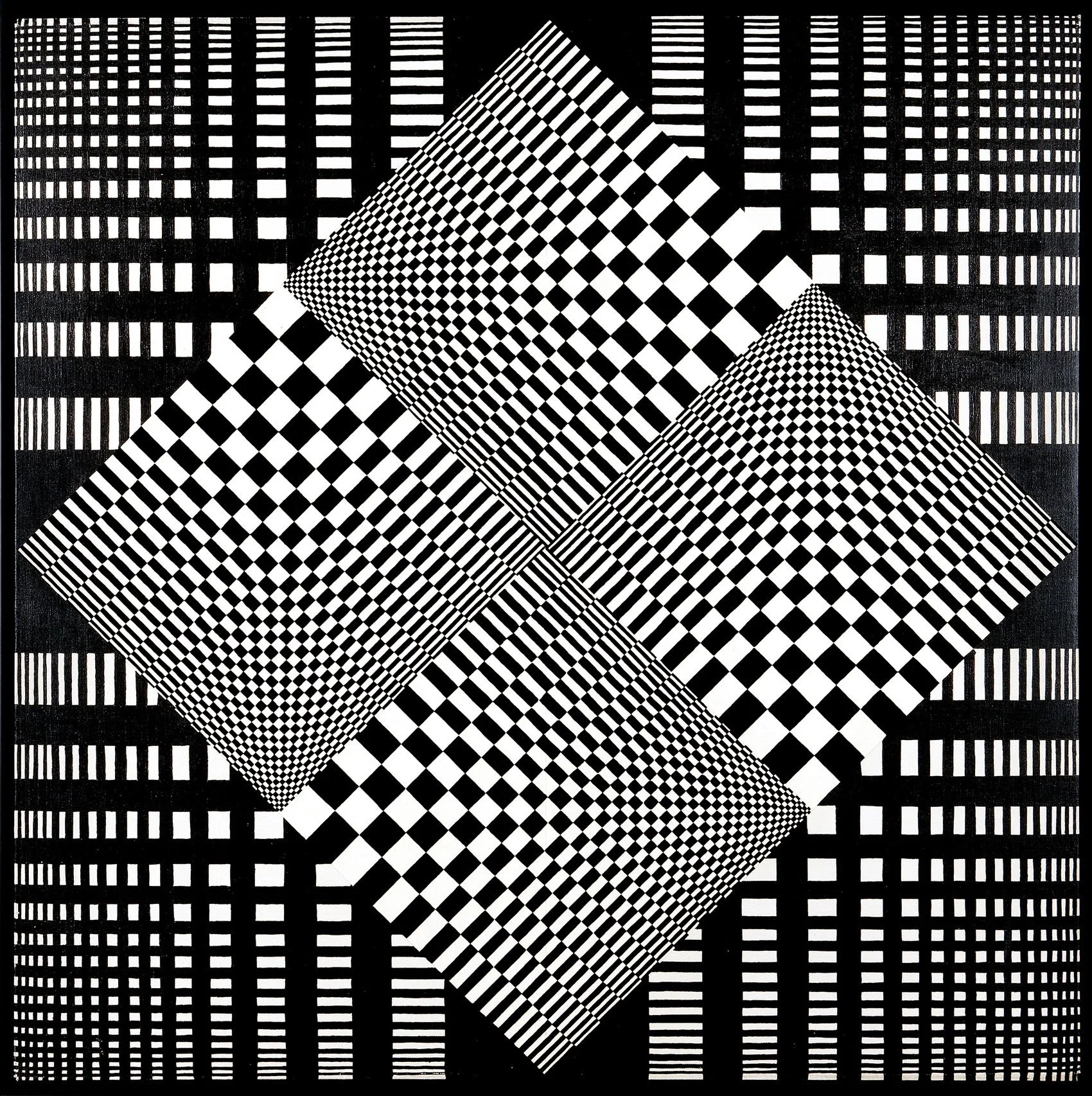
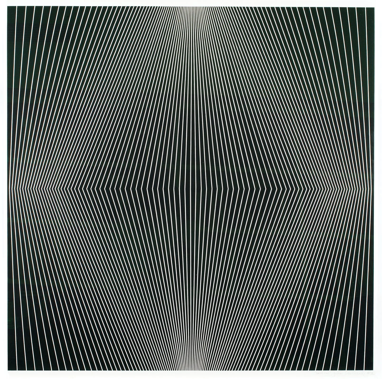
Tadasky’s work was identified as Op art when curator William Seitz included him in the Museum of Modern Art’s 1965 exhibition The Responsive Eye of international Op art. Tadasky’s work demonstrates Op’s characteristic openness to viewer interaction. With an investigative approach in their studios, Tadasky and his peers including Richard Anuszkiewicz (1930-2020) and Julian Stanczak (1928-2017) applied new understandings of perception to create a new model of depicting space. These artists explored the relationship of color and line to achieve movement that projects and recedes. The viewer’s participation in an active visual dialogue was fundamental to the work; the ultimate goal was to create a heightened awareness of what it means to see and a new way to evoke nature’s energy.

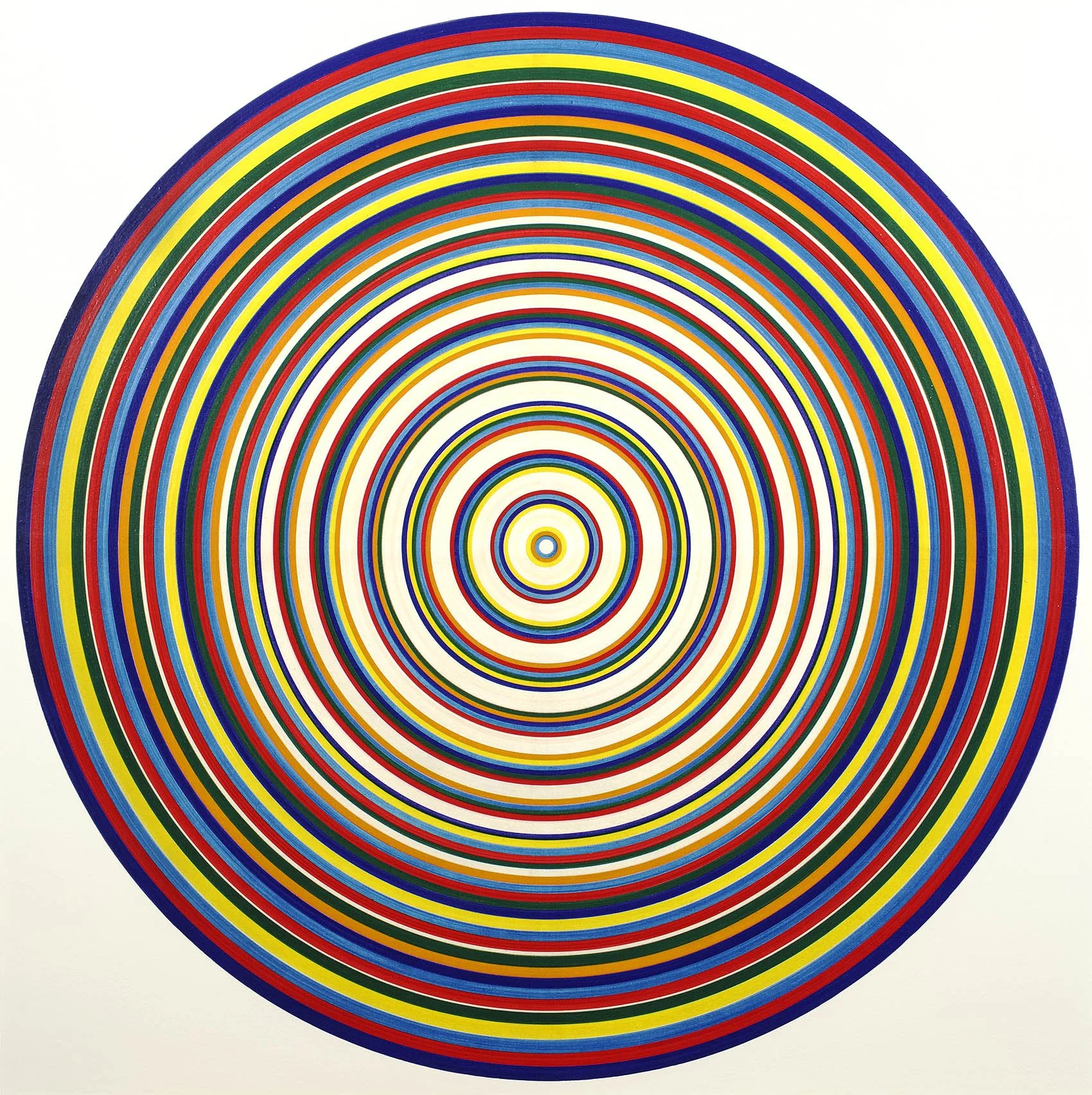
Arriving in New York from Japan in 1961, Tadasky developed his distinctive technique to create precise concentric rings of vibrant color. Inspired by the potter’s wheel, he built a turntable easel that rotated the canvas beneath him. Using traditional Japanese calligraphy brushes, Tadasky painted thin lines that build up to the broader rings we see in the paintings. This requires deep focus as he carefully calibrated the paint flow onto the undulating surface of the rotating canvas. In the 1960s Tadasky used 10 colors – first making his own paint by mixing pigments into newly available acrylic emulsions then moving to commercially made tubes when success permitted the expense.

In the A series, Tadasky applies rings of raw color using their proximity to create optical blending. In both B-181, 1964 and C-162, 1965, Tadasky repeats a four-color pattern. The equal width and vibrancy of the colors intensify the color interaction, causing a spinning and flickering effect. While the works are very active, they are also flat. A new element of dimension occurs in our exhibition with C-200, 1965 marking a pivot point. Red, blue, and yellow are arranged without pattern in varying widths divided by spaces of white that allow the colors to breathe. The painting can read as either spinning flat or pulsing in and out, a new element of dimension.

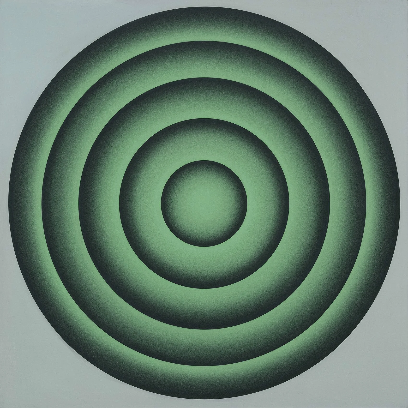
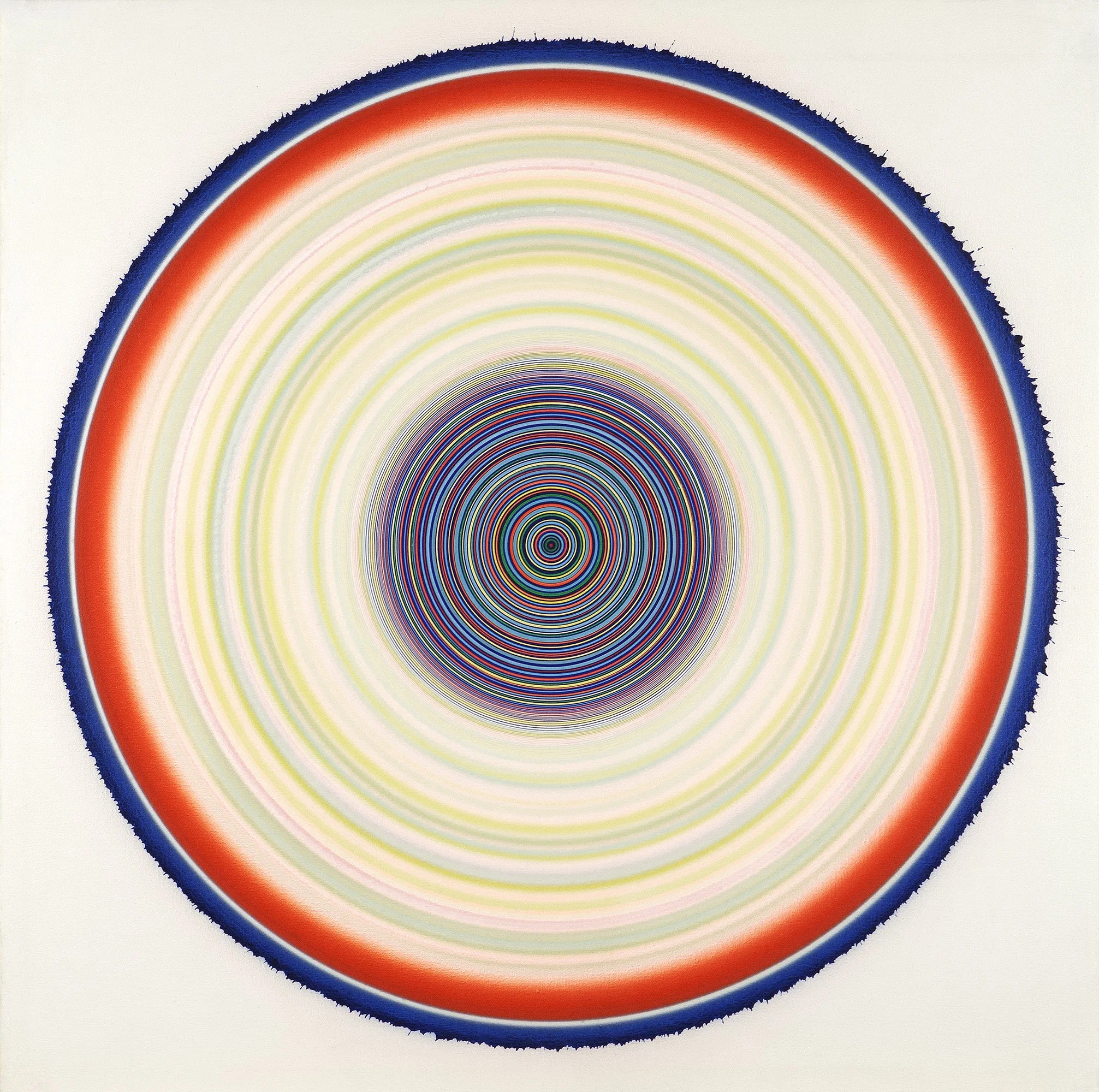
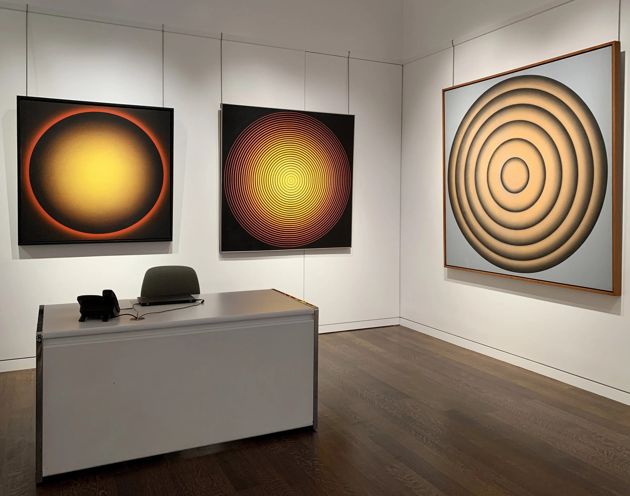
In the second half of the Sixties, Tadasky explored how his paintings could create expansive vision regardless of size. As Tadasky said, I work with a limited space – the surface of the canvas. Yet I can create depth, through which you can enter the painting. The works from this period are ethereal and bold. One can see this transformation comparing D-109, 1966 and D-212, 1970. In D-109 the gradation of color from yellow at its center to red at the edge produces a luminous heat. Drawn out of a black background, the color increases in vibrancy at the center when the black circles thin out producing a radiant effect. Tadasky uses black in a new way in D-212, applying it with an airbrush to the edge of each ring, achieving a new level of volume in the buoyant pile of inner-tubes.

While painting the late D series, Tadasky noticed the occasional blobs of paint on the canvas when his airbrush got backed up and realized he could slowly build up a textured surface by using his airbrush at low pressure. The result was the E series in which Tadasky develops great depth with floating spheres and atmospheric ground. While predominantly monochrome, the E series has shimmers of different colors achieved by spraying paint in a single direction, as seen in the umber halo in E-119, 1969 created by a light spray of red across the blue crags of the ground layer.

For Tadasky, the square format of his paintings allows each one to be a transformative space. The circle-in-the-square format parallels the clarity and symmetry Tadasky feels upon entering a Shinto shrine. Each painting is its own world and Tadasky strives to make it all-encompassing.

Artist Statement

I use the circle to create my own world, a world that no one has seen before, my own universe. The closest comparison for me is the experience of entering a traditional Shinto shrine: because they are both so simple and symmetrical, the impact is very powerful.

The circle is of course something from nature. But I have no desire to depict nature; rather, I want to reproduce that power, that “vibration” that we experience in viewing nature’s beauty.

If a painting is good, it explains itself, it lasts. My paintings are not meant to refer to anything, and there is no philosophy or theory involved. People are free to look at my work in many different ways.

Color helps to create depth. I work with a limited space—the surface of the canvas. Yet I can create depth, through which you can enter the painting.

I love trying new ideas and approaches. But at the same time, each work evolves from the one before. I have learned that when you polish something over and over, it shines in its own way.

I spend a lot of time thinking before I paint. I wait until an idea is very clear in my mind. When I begin to paint, I know precisely what colors I will use, what width of line, what shapes. I don’t change anything once I begin to paint. To change the idea along the way is “taboo” for me.

It is always wonderfully exciting to see the painting complete. Indeed the entire process is full of joy – if I didn’t enjoy painting, the result would never be good.

-Tadasky, 2015

[ TOP ]
Modernism 1913-1950 | Realism of the 1930s and 1940s | Abstraction of the 1930s and 1940s | Post-War | Selected Biographies

THE BIRTH OF AMERICAN ABSTRACTION: THE 1936 CONCRETIONISTS EXHIBITION

May 13- July 30, 2021. Extended to August 20, 2021.

Read essay here | Installation views | Biographies | For pricing, please contact the gallery at 212-581-1657


Installation Views

Essay by Emily Lenz

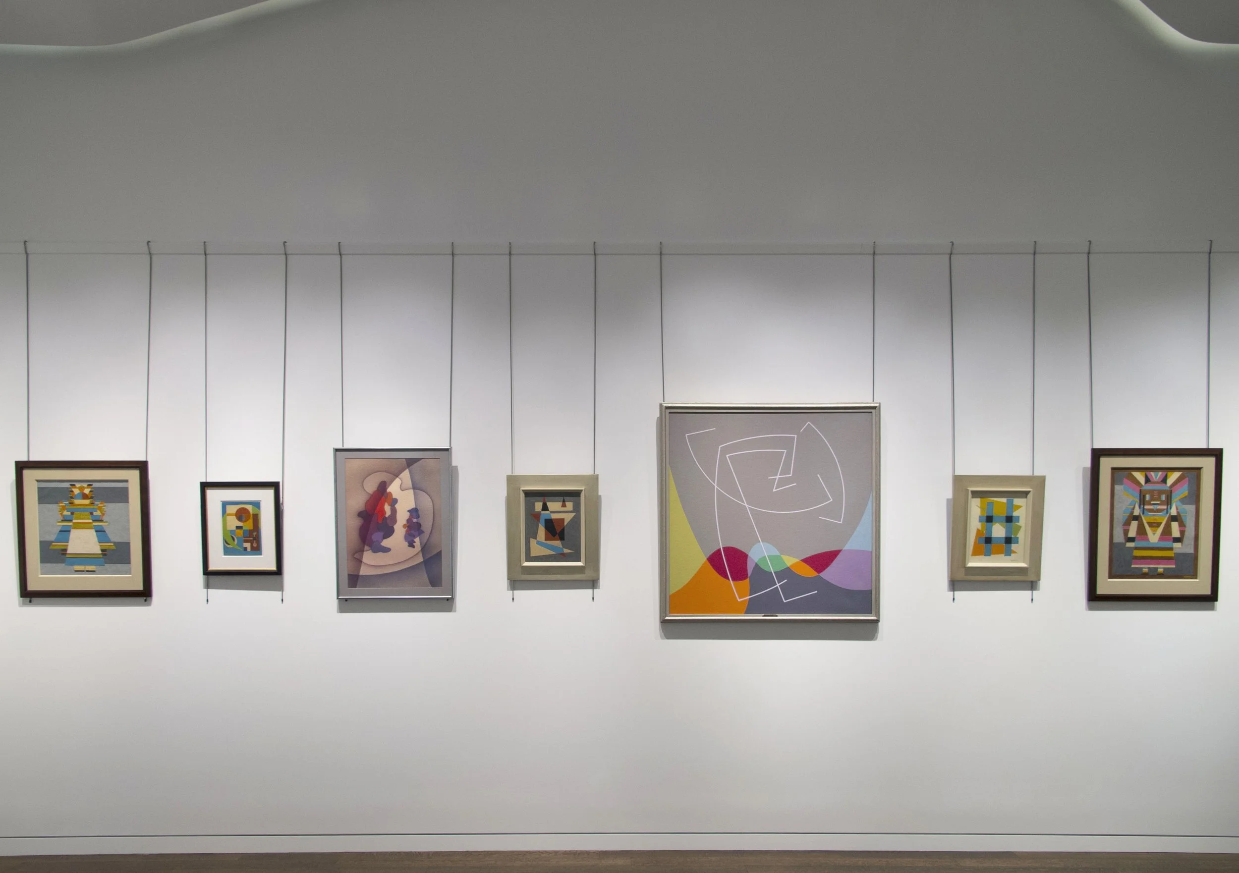
Our exhibition features the work of Charles Biederman (1906-2004), John Ferren (1905-1970), A. E. Gallatin (1881-1952), George L. K. Morris (1905-1975), and Charles Green Shaw (1892-1974). The pivotal exhibition Five Contemporary American Concretionists was held at the Paul Reinhardt Galleries in March of 1936. The term “Concretionists” emphasized the non-objective style of the artists’ compositions and aligned with current discourse on abstraction in Paris. The Concretionists exhibition marked a turning point for American abstraction. Within the year, a larger group of artists would form the American Abstract Artists, joining together to create more exhibition opportunities.

Organized under the auspices of A. E. Gallatin’s Gallery of Living Art, the Five Contemporary American Concretionists exhibition included Biederman, Alexander Calder, Ferren, Morris, and Shaw. The exhibition was a protest against the exclusion of American painters in Alfred Barr’s Cubism and Abstract Art at the Museum of Modern Art, which opened that spring. The exhibition set in motion the idea that American abstract artists should be recognized. Both Biederman and Ferren had their first New York solo exhibitions in 1936 at Pierre Matisse Gallery. The Concretionists exhibition also created a new reciprocity between abstract artists in New York and Paris. When the exhibition traveled to the Galerie Pierre (Loeb) in June, Jean Helion, Joan Miró, Fernand Léger, Piet Mondrian, César Domela, and Wolfgang Paalen attended the Paris opening, along with Alfred Barr. In July the exhibition was held at London’s prestigious Mayor Gallery. Gallatin replaced Calder in the Paris and London exhibitions as he had recently resumed painting after a ten year hiatus. Gallatin, Morris, and Shaw joined Jean Arp and Sophia Tauber-Arp in 1936 to create the art publication Plastique, which furthered reciprocity of art ideas between New York and Paris by producing five issues through 1939.

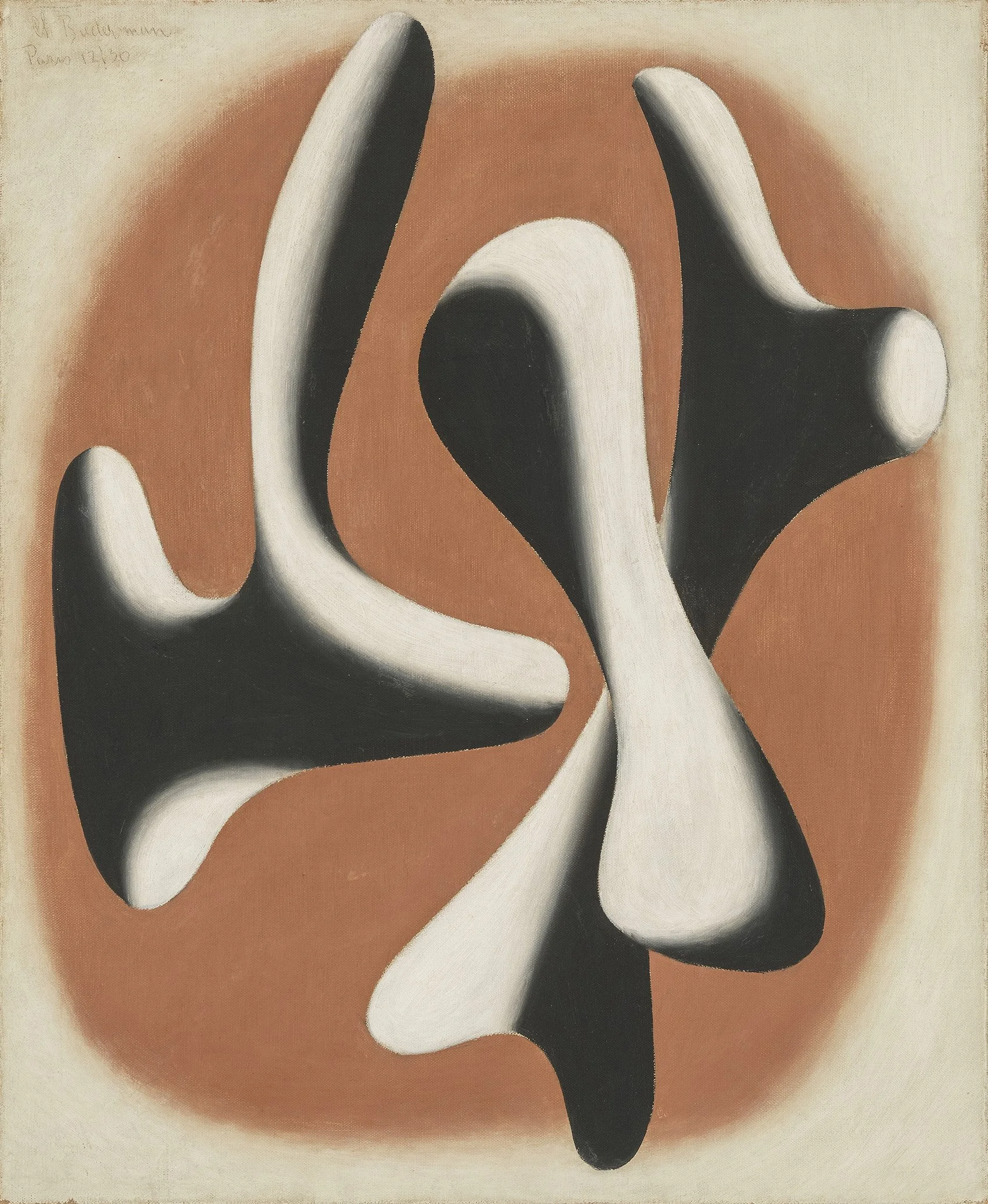
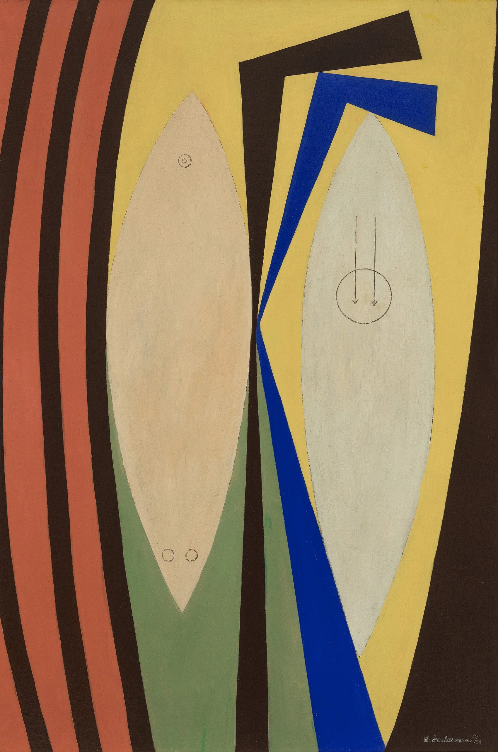
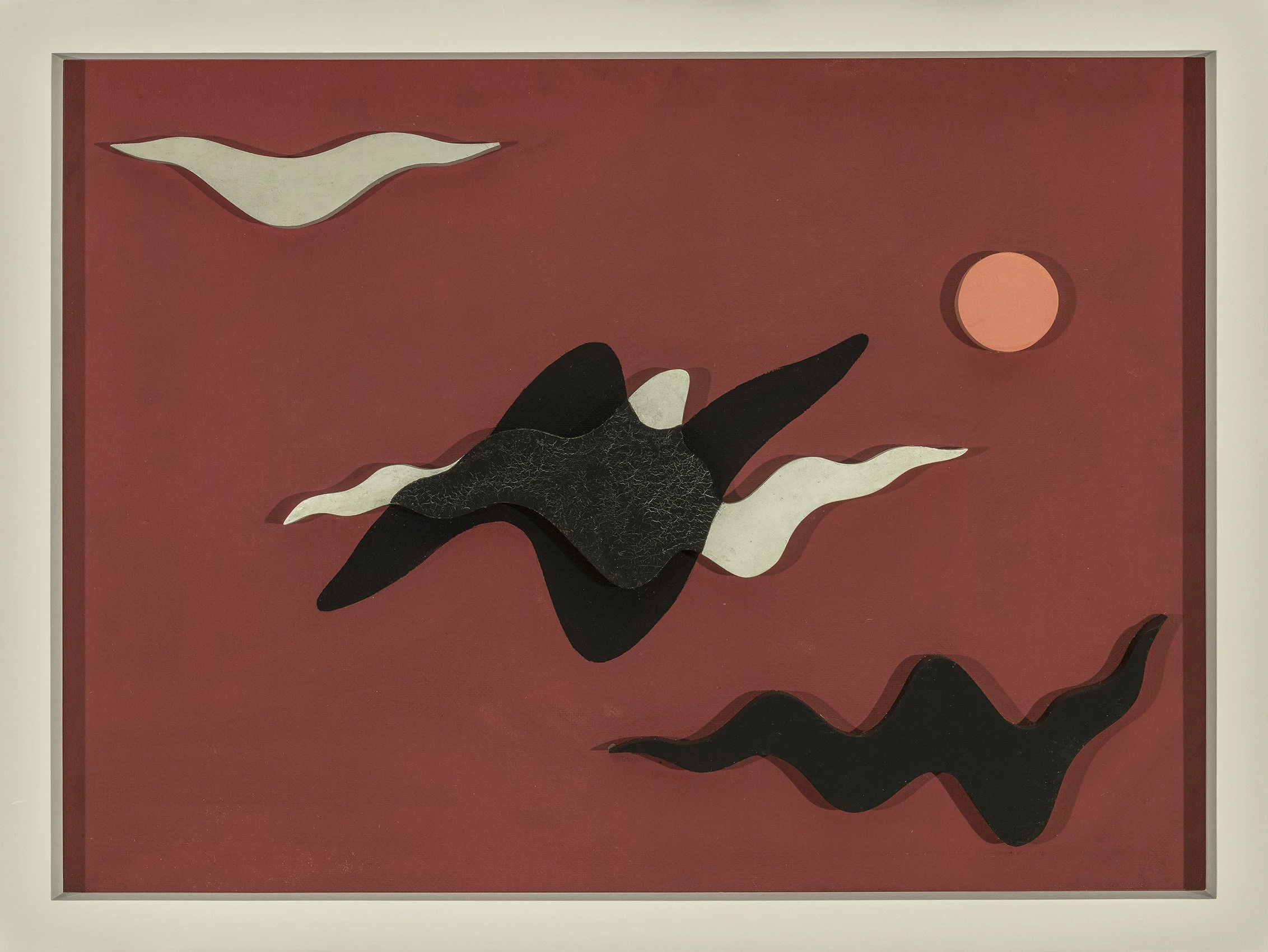
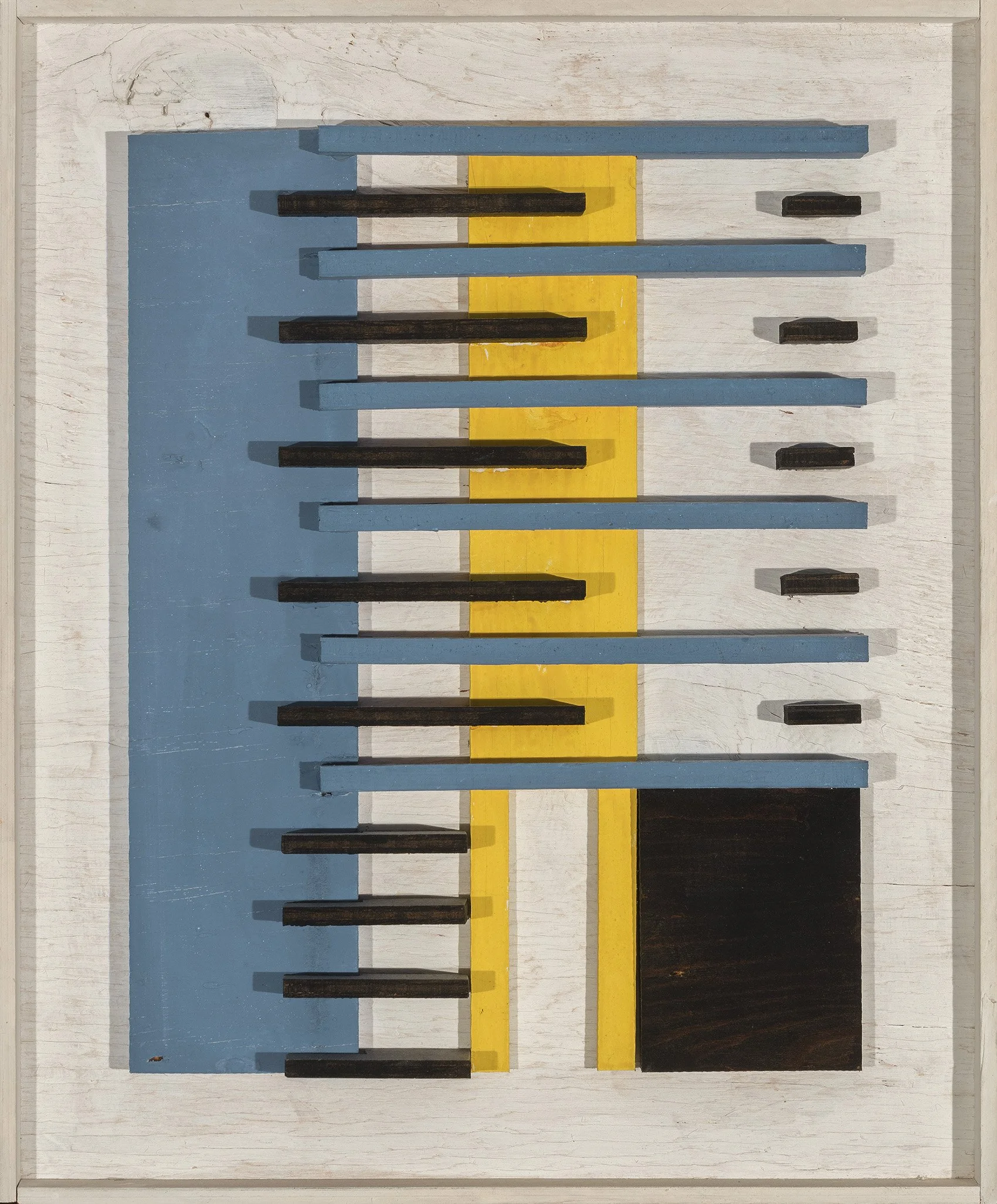
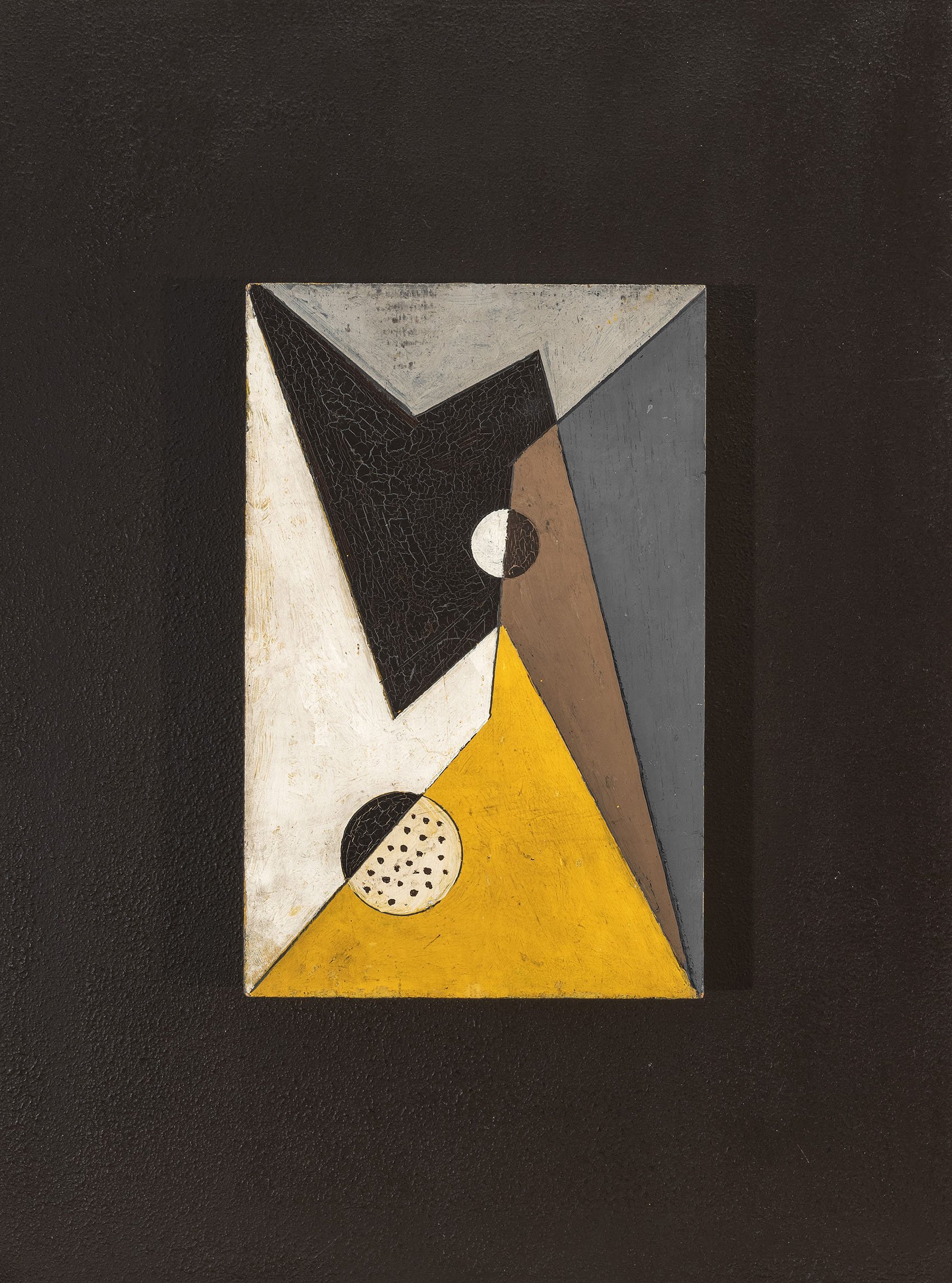
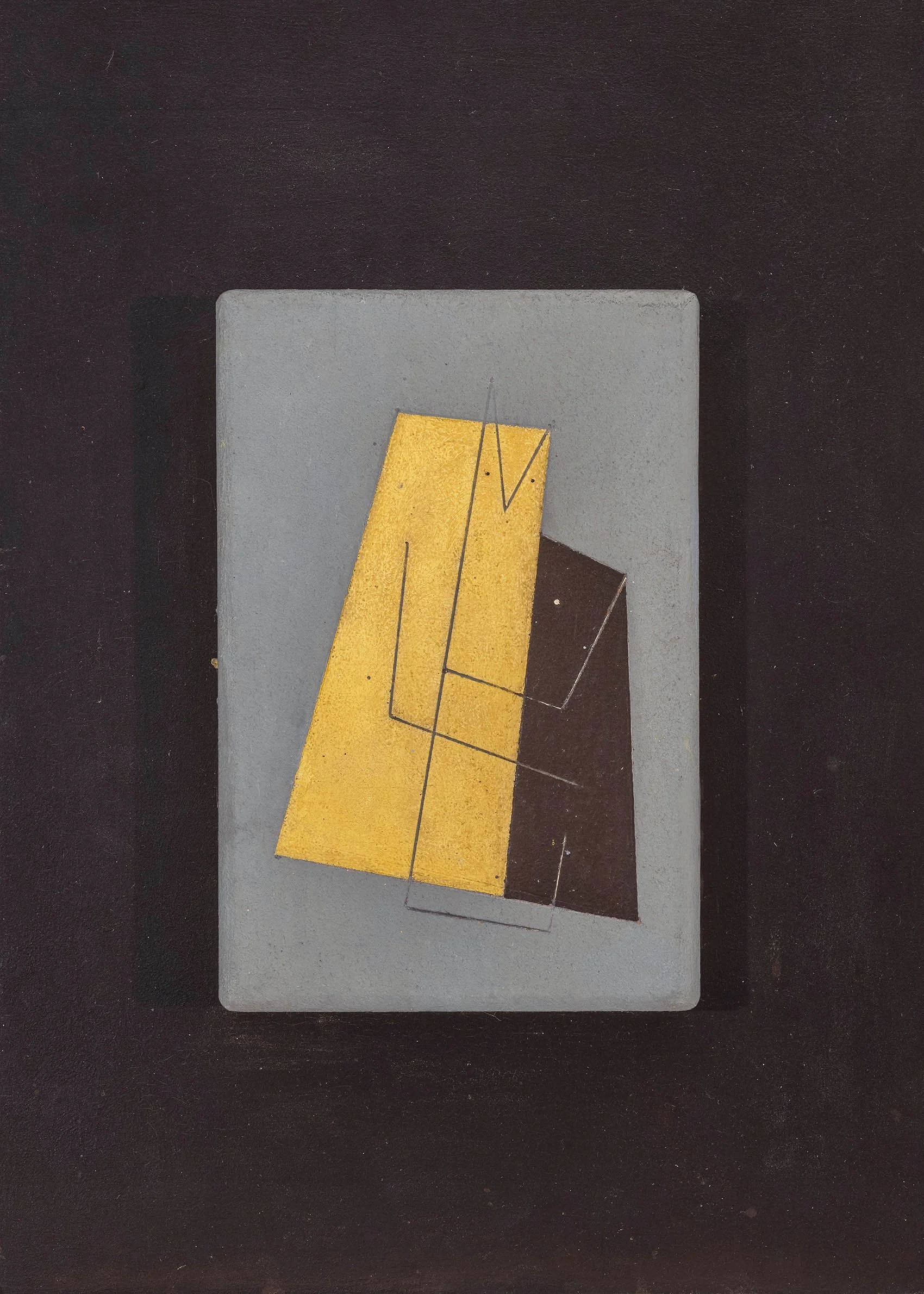
In the New York opening of Five Contemporary American Concretionists, paintings dominated the exhibition. By the Paris iteration three months later, Shaw contributed four constructions (his first Plastic Polygon shaped canvas works) and Morris and Biederman exhibited collages alongside their paintings. Each of the artists were now exploring unusual materials. Biederman began his string reliefs in 1935 and gave up painting entirely by 1938 for constructions. Shaw made both his multi-sided Plastic Polygons and his biomorphic Reliefs from 1936 to 1938. Ferren had such success with his carved plasters, Pierre Matisse Gallery had an exhibition of them in 1938. The late 1930s brought a diversity of materials and styles within abstraction. Following the example set by the Paris-based Abstraction-Creation group, the Americans also embraced a mixture of biomorphic, Surreal, and geometric abstraction. Our exhibition includes one piece from the Concretionists exhibition, Charles Biederman’s Untitled, New York, June 1935. This sizeable oil at 48 x 32 inches has a flattened picture plane of interconnected elements and the suggestion of positive and negative space with slight shifts of color between the warm oval to the left and the cooler one to the right. Untitled, New York, June, 1935 exemplified the debates in New York and Paris between strictly geometric arrangements and biomorphic shapes held in space.

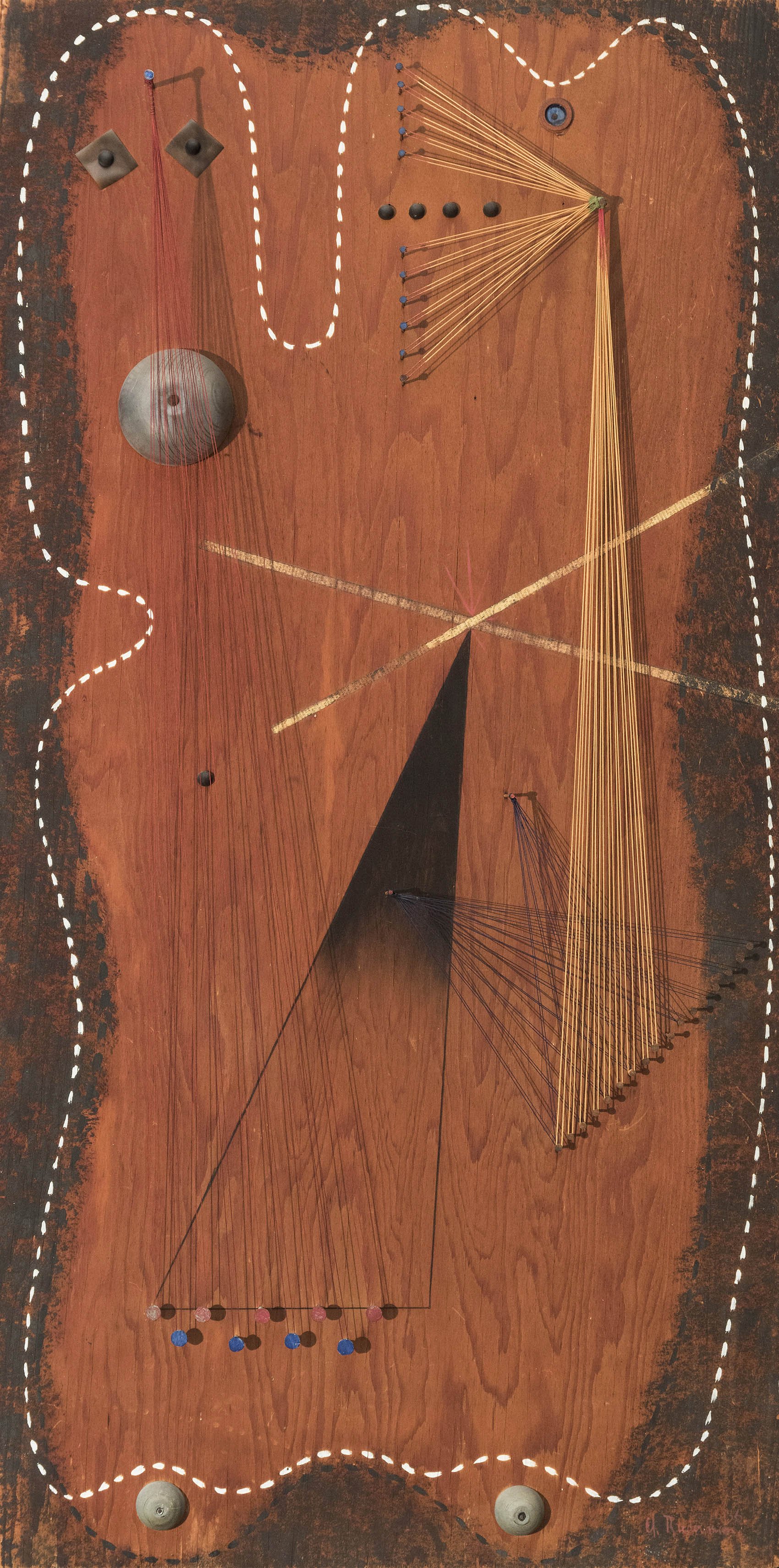
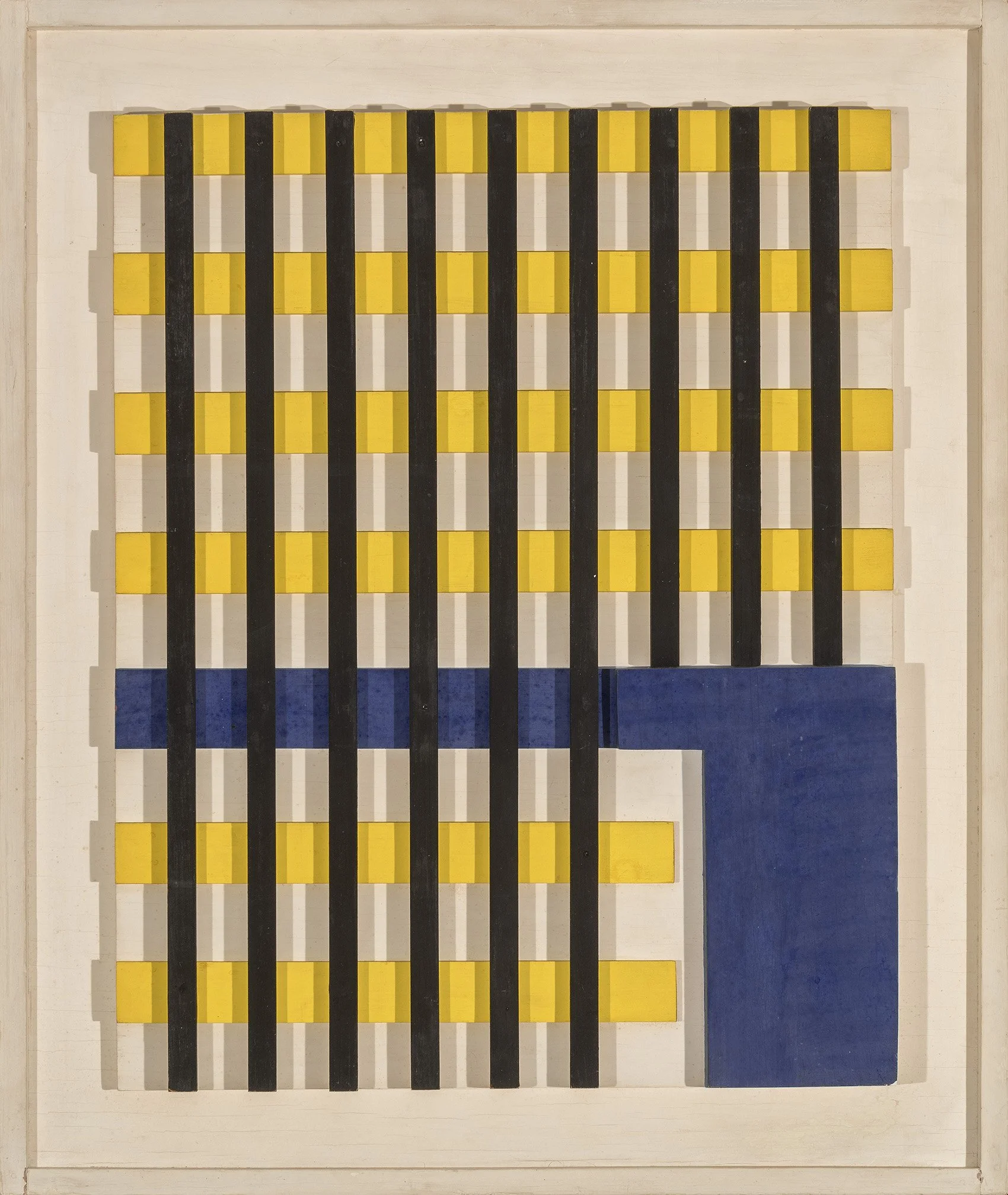
Our exhibition includes two significant string reliefs Biederman made in June of 1936. R-2, New York, June 1936 is mounted on unpainted wood with newspaper collage, metal shapes, and painted biomorphic outlines that suggest primitive figuration. In String Relief (White and Blue), New York, June 1936, an underlying abstract composition of gray, blue, and yellow is heightened by rubber and metal components and geometric arrangements of strings anchored by nail heads. Biederman likely sourced his materials at the hardware store. The work has elements of Dada with the materials, Constructivism with the radiating strings, Surrealism with the arrangement of coat hooks to resemble claws, and a palette identifiable with De Stijl. All these come together to create an artwork that is both mechanical and joyful.

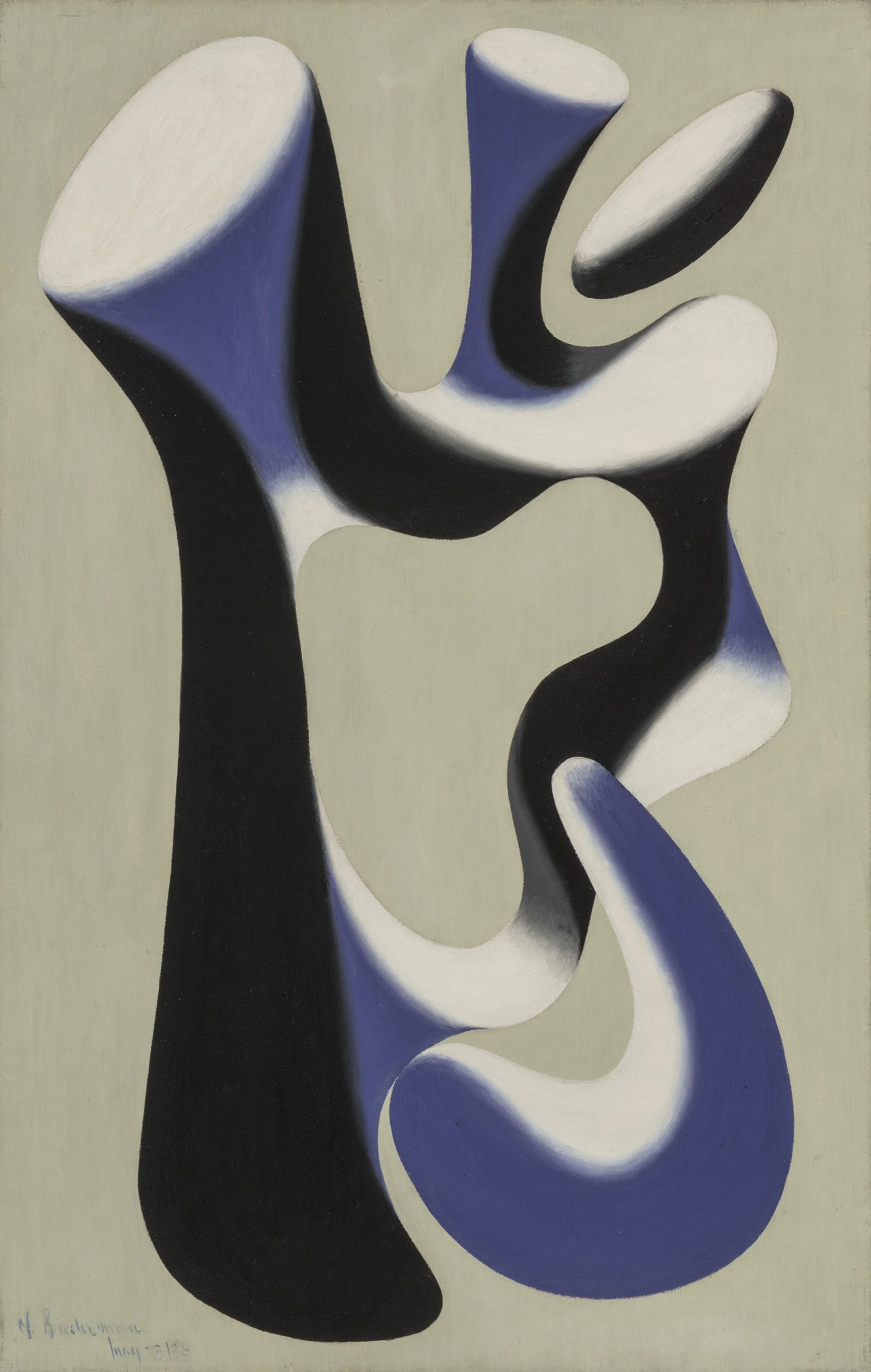
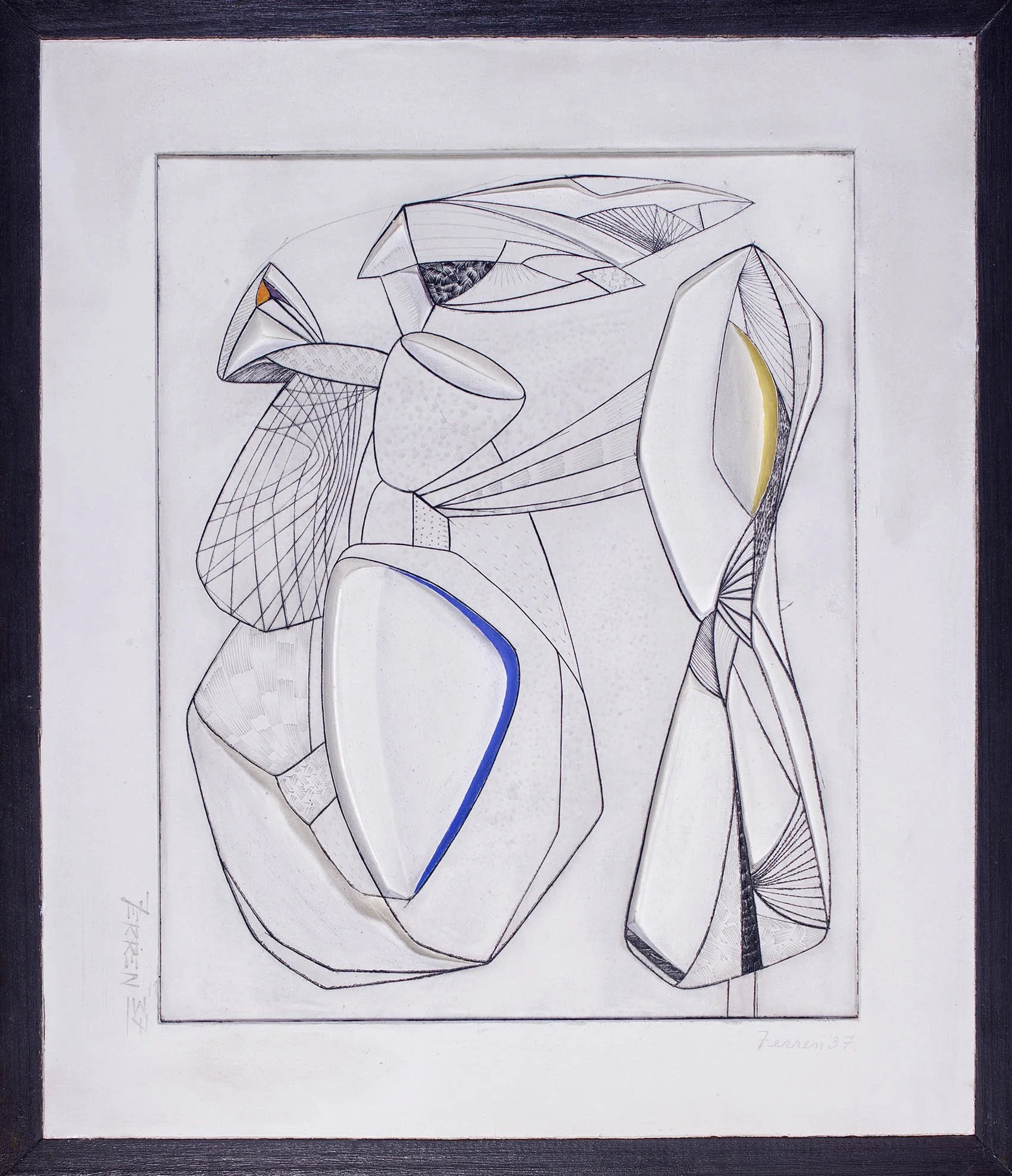
Ferren’s Untitled, 1936 is a masterpiece and given its large size likely shown in both Ferren’s New York and Paris solo exhibitions that year. Ferren grew up in California then spent the 1930s in Paris so his New York connections where all made abroad. In the mid-1930s Ferren explored color and volume through simple shapes against a solid background. The compositional structure of Untitled, 1936 came about as Ferren and Jean Helion, both members of the Paris Abstraction-Creation group, worked to combine Léger’s style with the austerity of Constructivism. While Helion’s work has a gentle curve along each form’s edge to suggest a shallow depth, Ferren’s shapes twist into a deep picture plane and their defined edges solidify the composition. The fusion of expansiveness and hard-edged shapes seen in Untitled, 1936 demonstrate Ferren’s distinctively American approach to abstraction. From 1935 to 1937, Ferren executed 36 carved plasters using an etching technique to set the lines of the composition, which he then slowly carved into and applied color highlights to capture the effect of light. Our exhibition has one of these plasters from 1937.

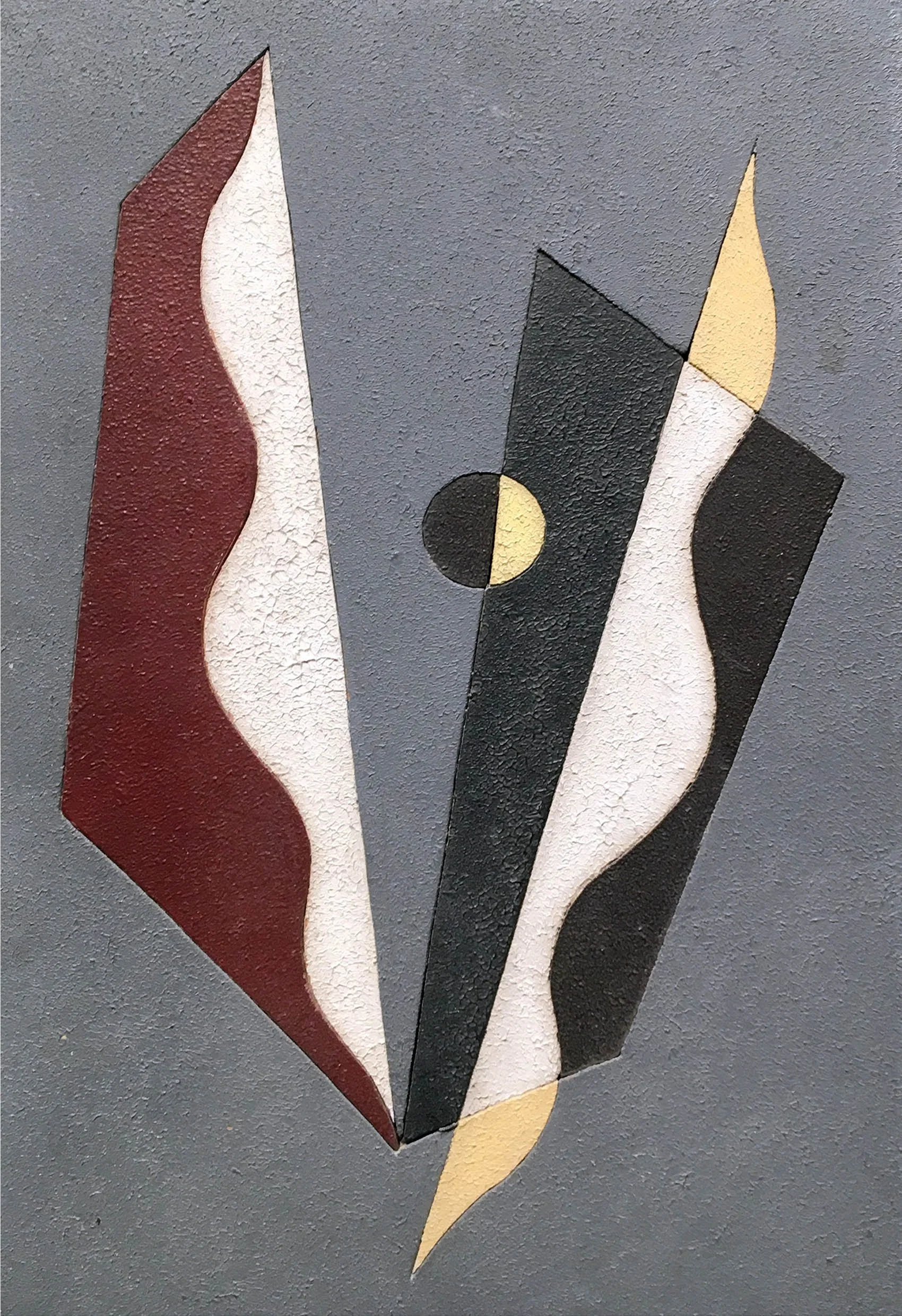
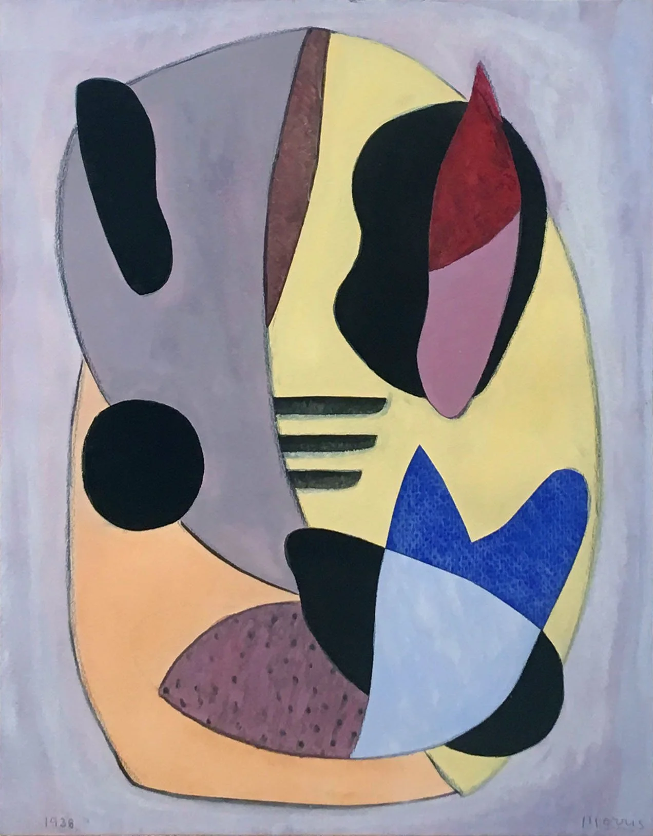
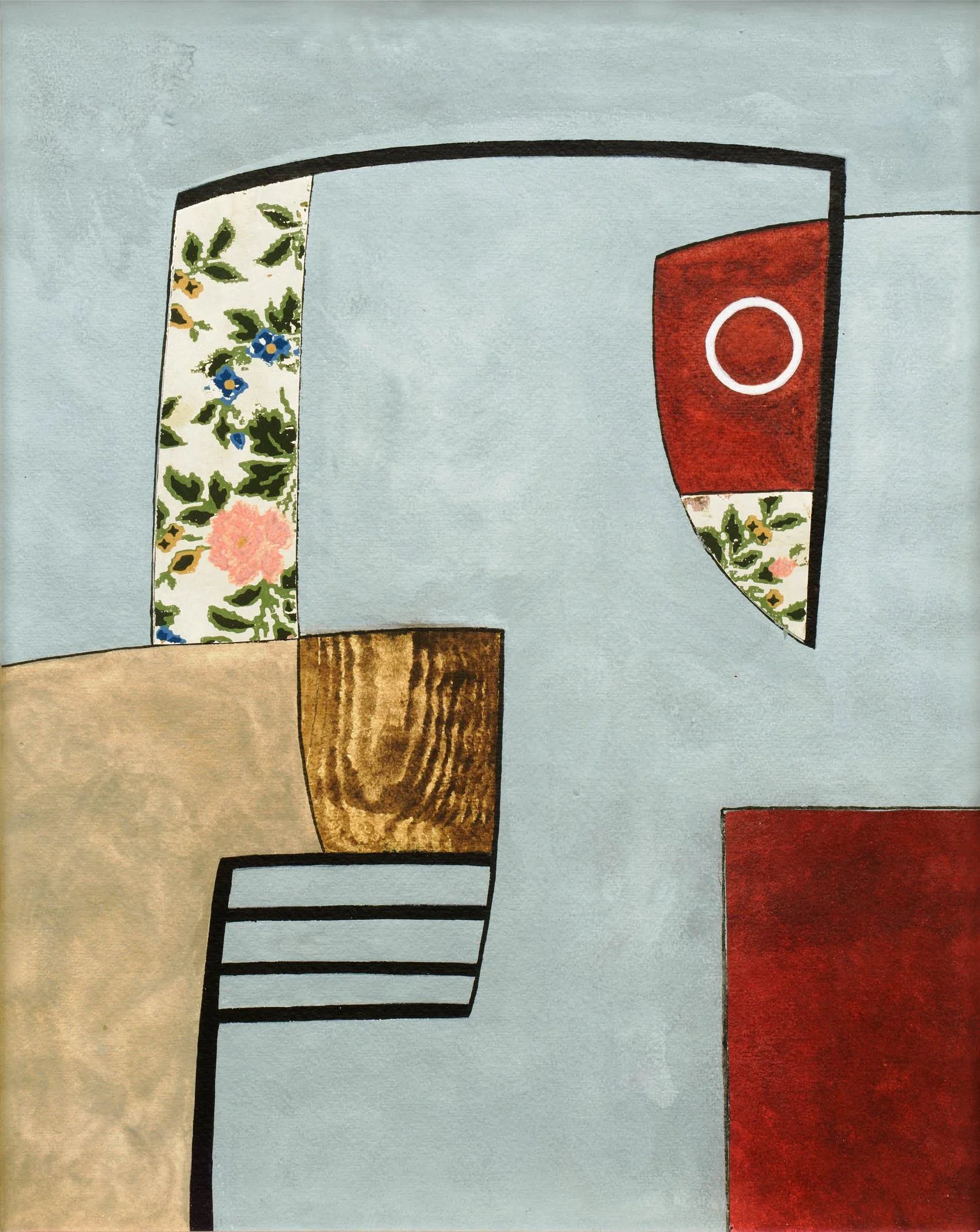
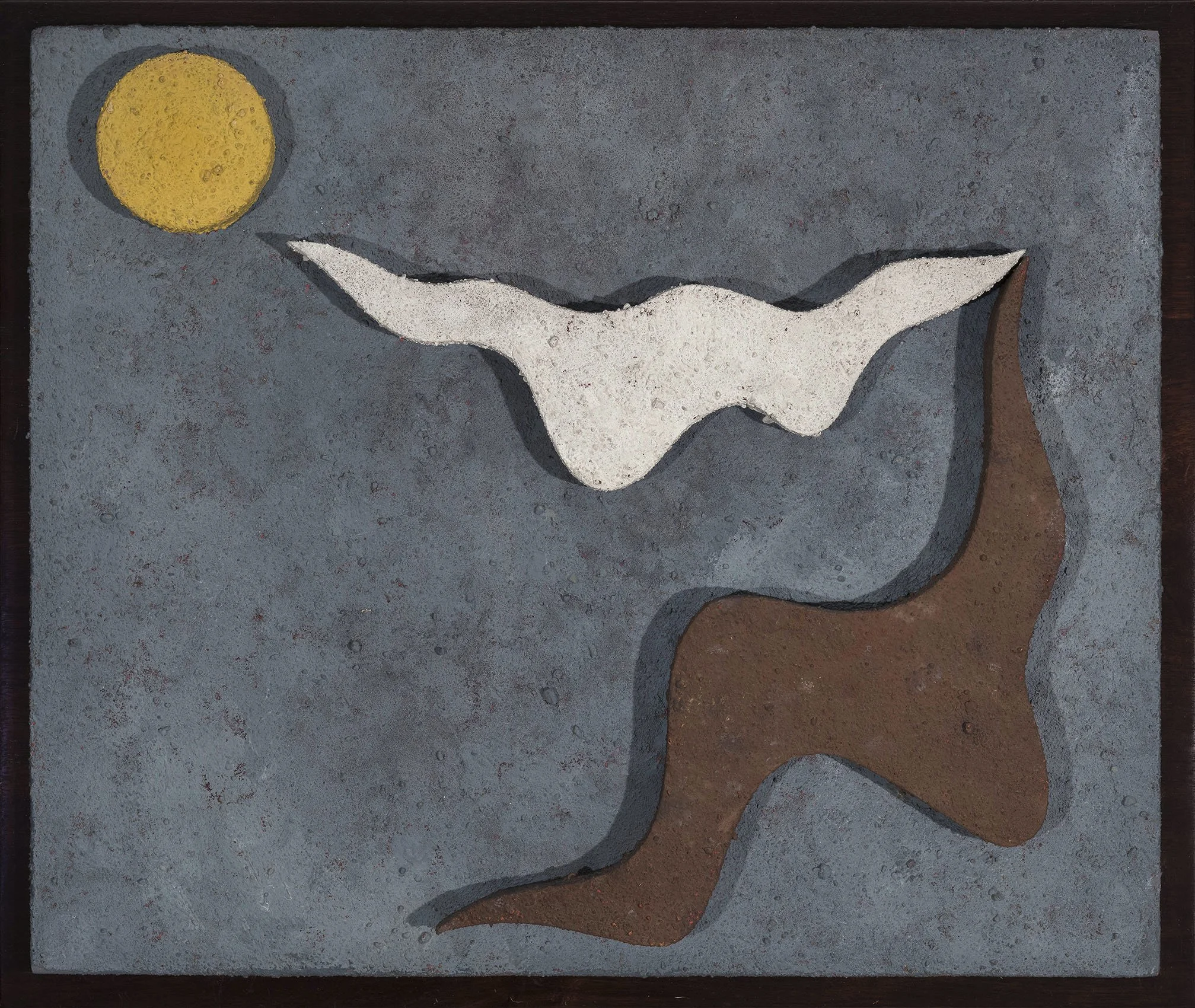
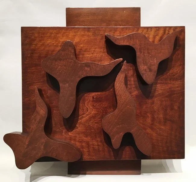
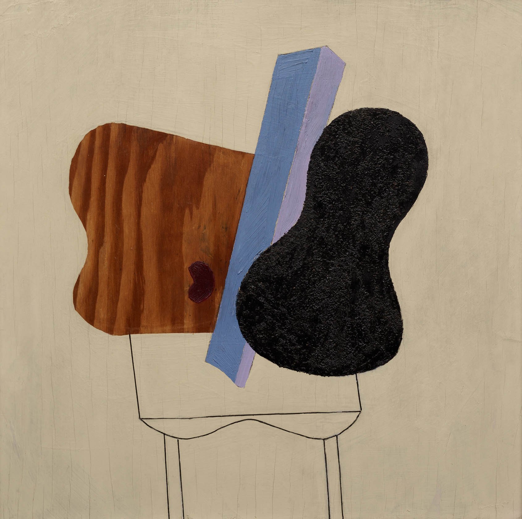
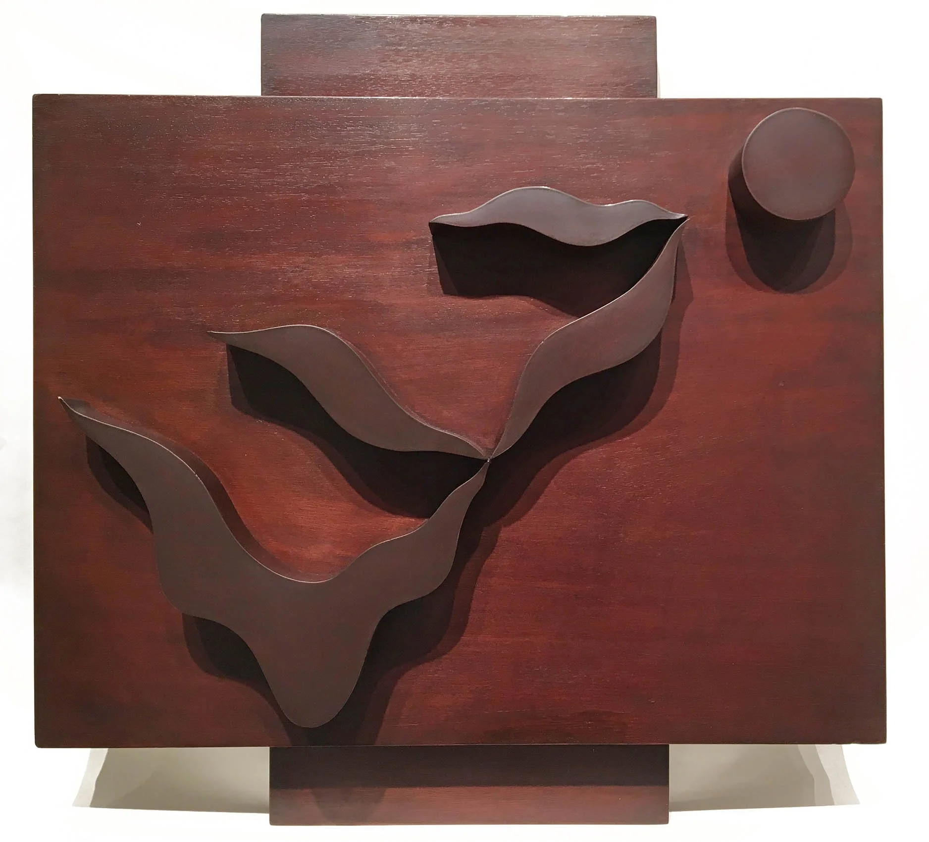
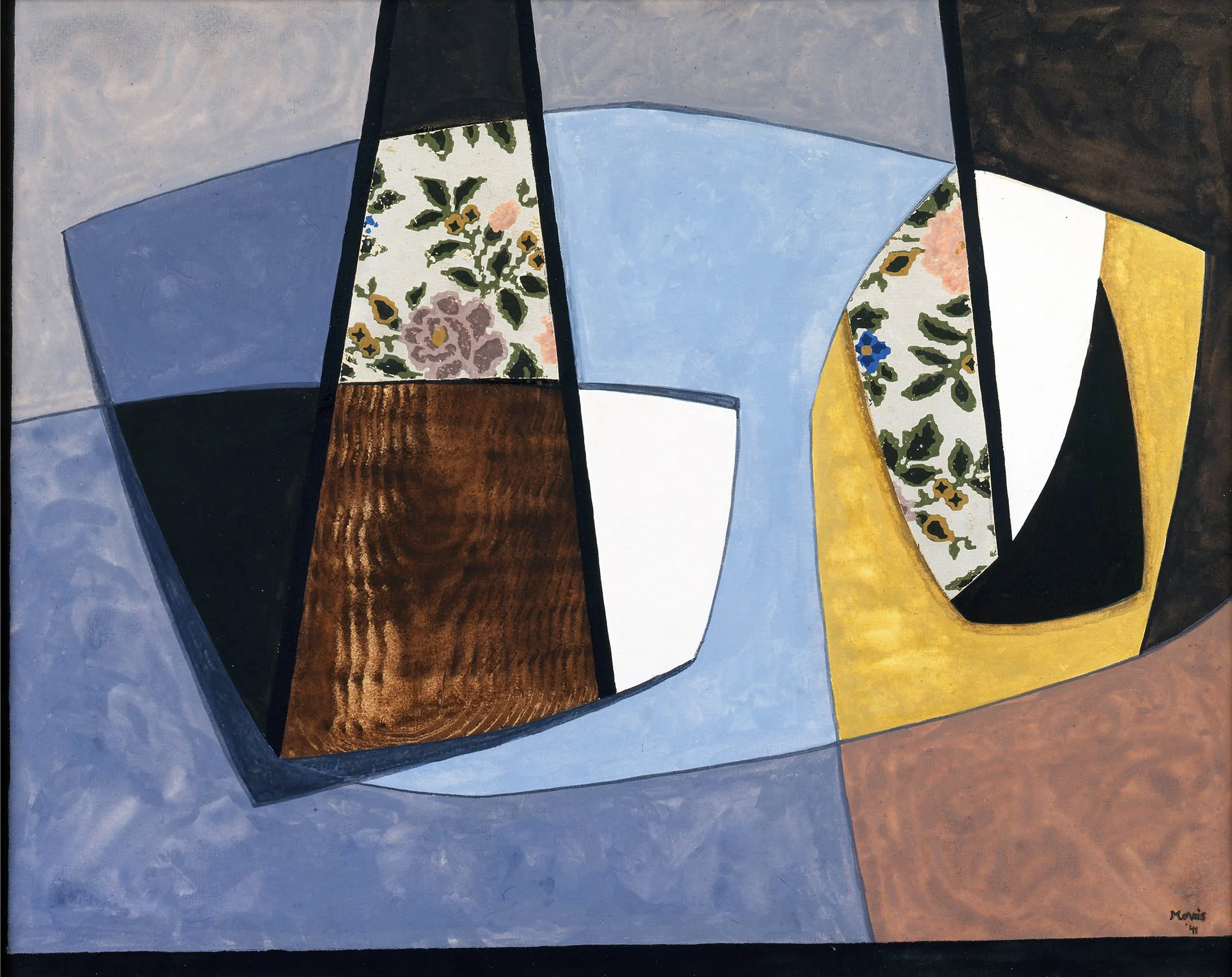
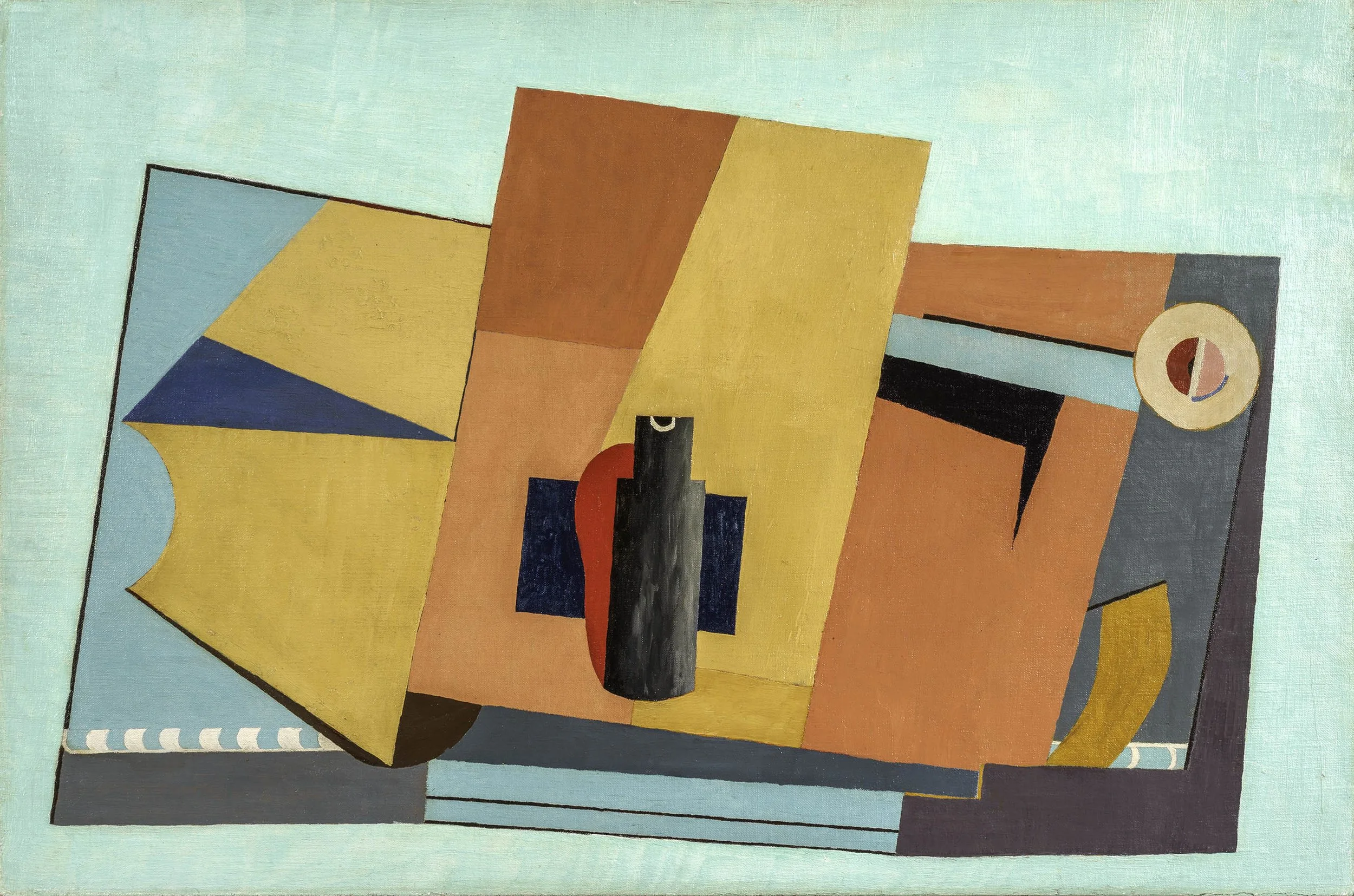
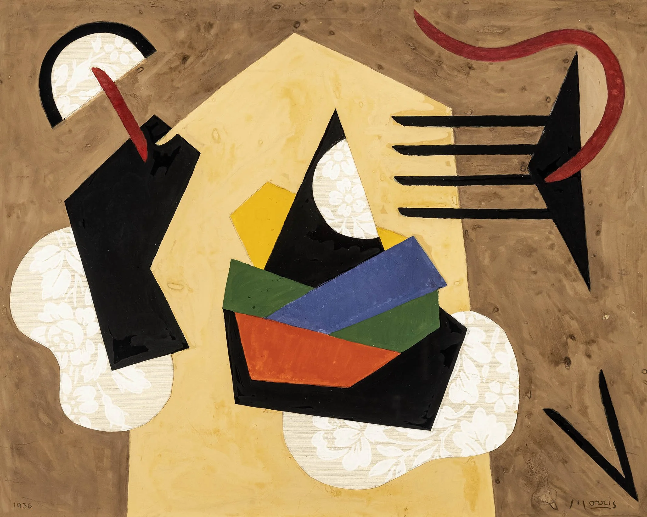
Like Biederman and Ferren, Charles Green Shaw worked in both paintings and constructions following the New York Concretionists exhibition. Four of Shaw’s biomorphic reliefs are in our exhibition- one painted, one textured, and two in stained mahogany. Textured Relief, 1938 demonstrates Shaw’s use of sand in his paint, a method he learned in Paris from Ferren in 1935. Shaw wrote in his journal about the distinct quality of the edges he wanted in his constructions’ applied wooden shapes – like a good bar of soap. While biomorphic, the reliefs have clean edges and simplified forms, providing a streamlined appeal. The defined edges and In George L. K. Morris’s Mural Composition, 1936, geometric shapes in primary colors are balanced by strong black forms and curved collage elements of floral wallpaper. The work has Morris’s characteristic playfulness, on the formal level with the balance of geometric and biomorphic forms and bold and sensitive colors, as well as theoretically as the abstract shapes resemble dancing figures. Our exhibition features Gallatin’s No. 125, 1938-49, a painting included in the 1939 traveling museum exhibition of works by Gallatin, Shaw, and Morris. Gallatin composed No.125 as a flat arrangement of geometric shapes that come together as a desk top still life. The volumetric cylinder at the center resembles a bottle, the work’s only nod to classic Cubism. When the painting was first exhibited, Gallatin painted small flowers in the yellow in the upper left, perhaps a nod to his friend Morris and his wall paper. When he exhibited the painting again in 1949, he simplified the geometry further and painted over the flower details, the pentimenti gives the impression of embossed leather adding to the composition as a desk top still life.

Our exhibition includes over 30 works from 1933 to 1942 by the five artists included in the Paris version of Five Contemporary American Concretionists. Our exhibition highlights the rich diversity in developing pure abstraction in both style and materials. The five Concretionists tested the limits of what easel painting could be and led the way for the complete explosion off the wall seen in the 1960s with the shaped canvas movement. They also set the groundwork for New York to become a respected art capital and it soon became the home for many artists escaping the war in Europe.

Biographies

HOMAGE TO THE SQUARE: ALBERS' INFLUENCE ON GEOMETRIC ABSTRACTION

Feb 18 - May 7, 2021

Essay | Installation views | For prices and availability, call the gallery at 212-581-1657


Installation Views

Essay by Emily Lenz

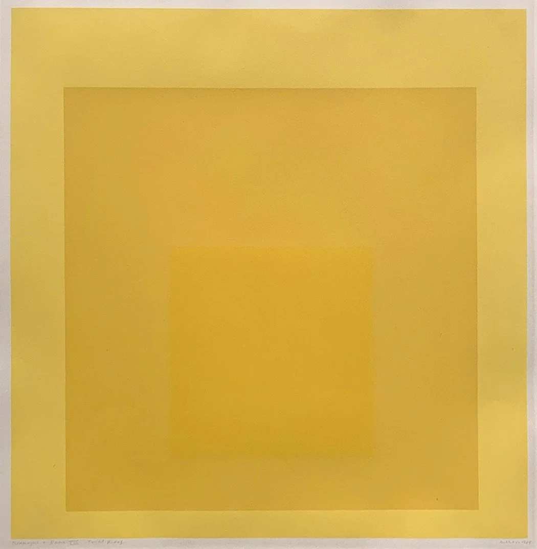
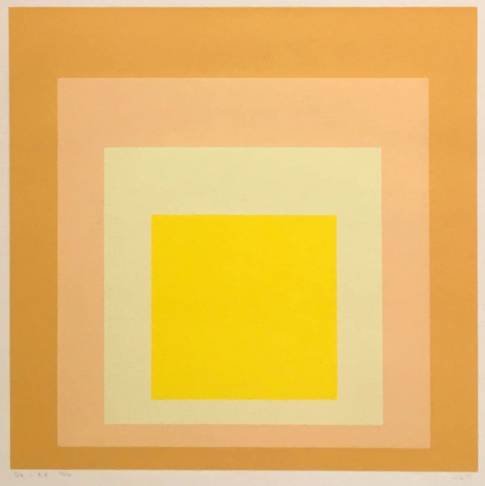
By 1950 Josef Albers (1888-1976) settled on an arrangement of concentric squares to investigate the interaction of colors in his series Homage to the Square. Albers saw the nested squares as pure containers of color that standardized the experiments he continued for 25 years. Albers defined his color theories in Interaction of Color in 1963. The book reproduced the courses he taught at the Yale School of Art. The book’s purpose was to establish an understanding of color’s relativity and instability in its interaction with other colors. Albers’ wrote in his introduction, "In order to use color effectively it is necessary to recognize that color deceives continually."

Albers’ teaching impacted his own students, particularly Richard Anuszkiewicz and Julian Stanczak, and his paintings and book reached many young artists, including Paul Reed in DC, Al Loving in Detroit, and Tadasky in Tokyo. Across the styles of Op, Hard Edge, Color Field, and Constructions in our exhibition, we demonstrate how geometric artists of the 1960s were impacted by Albers and Homage to a Square.

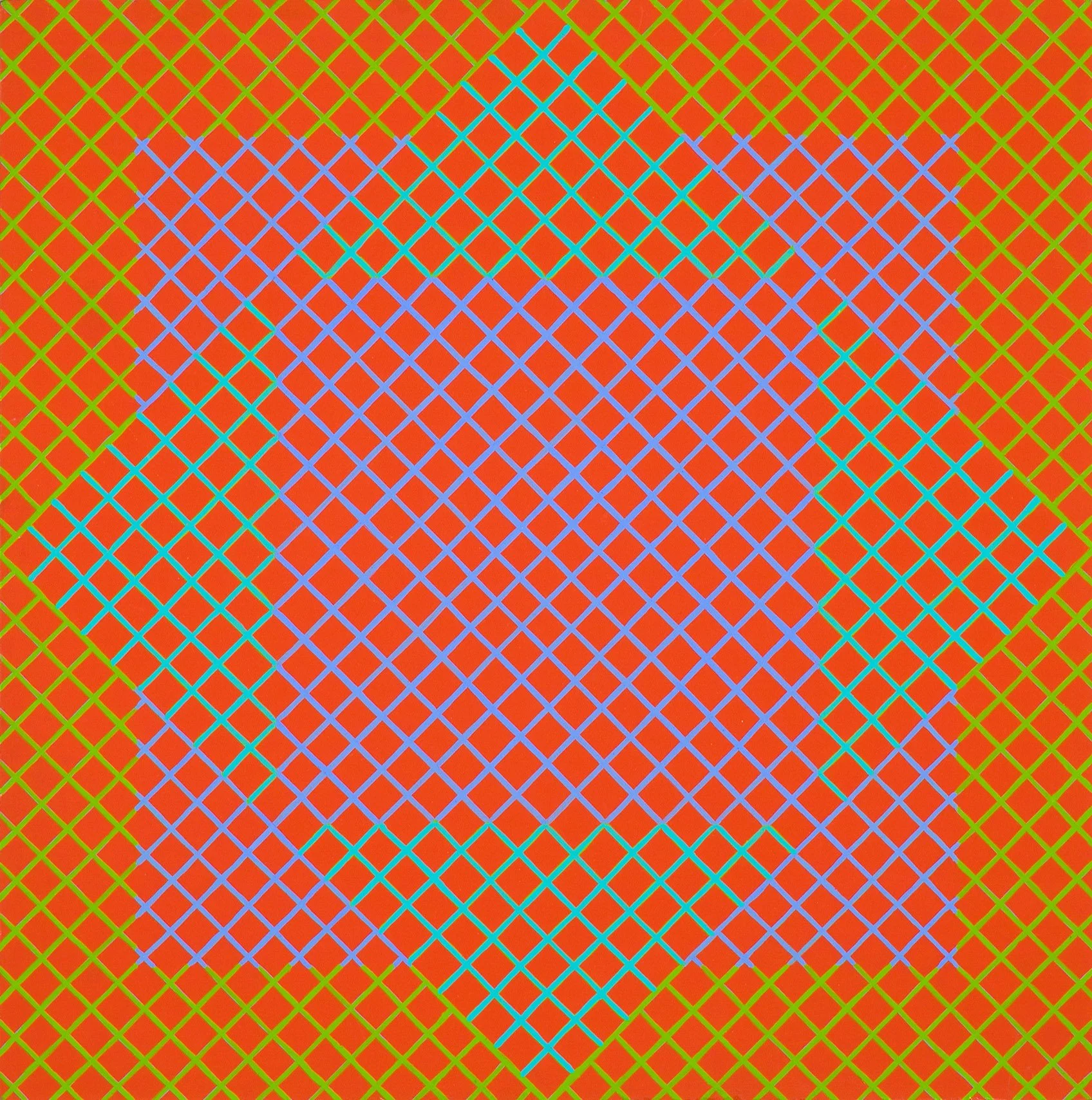
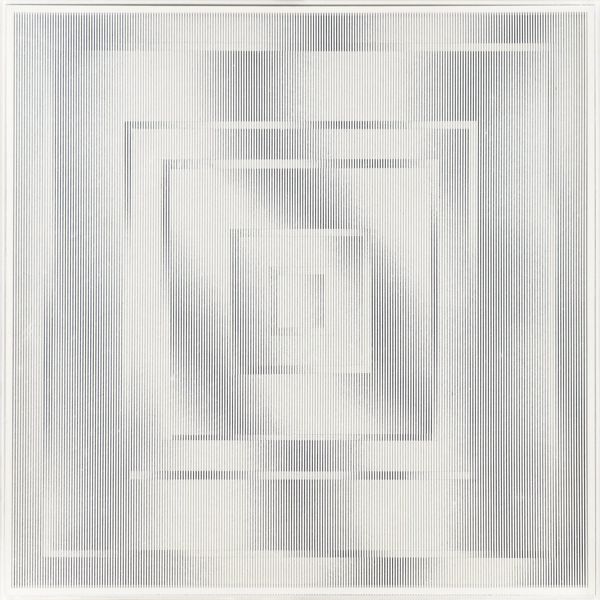
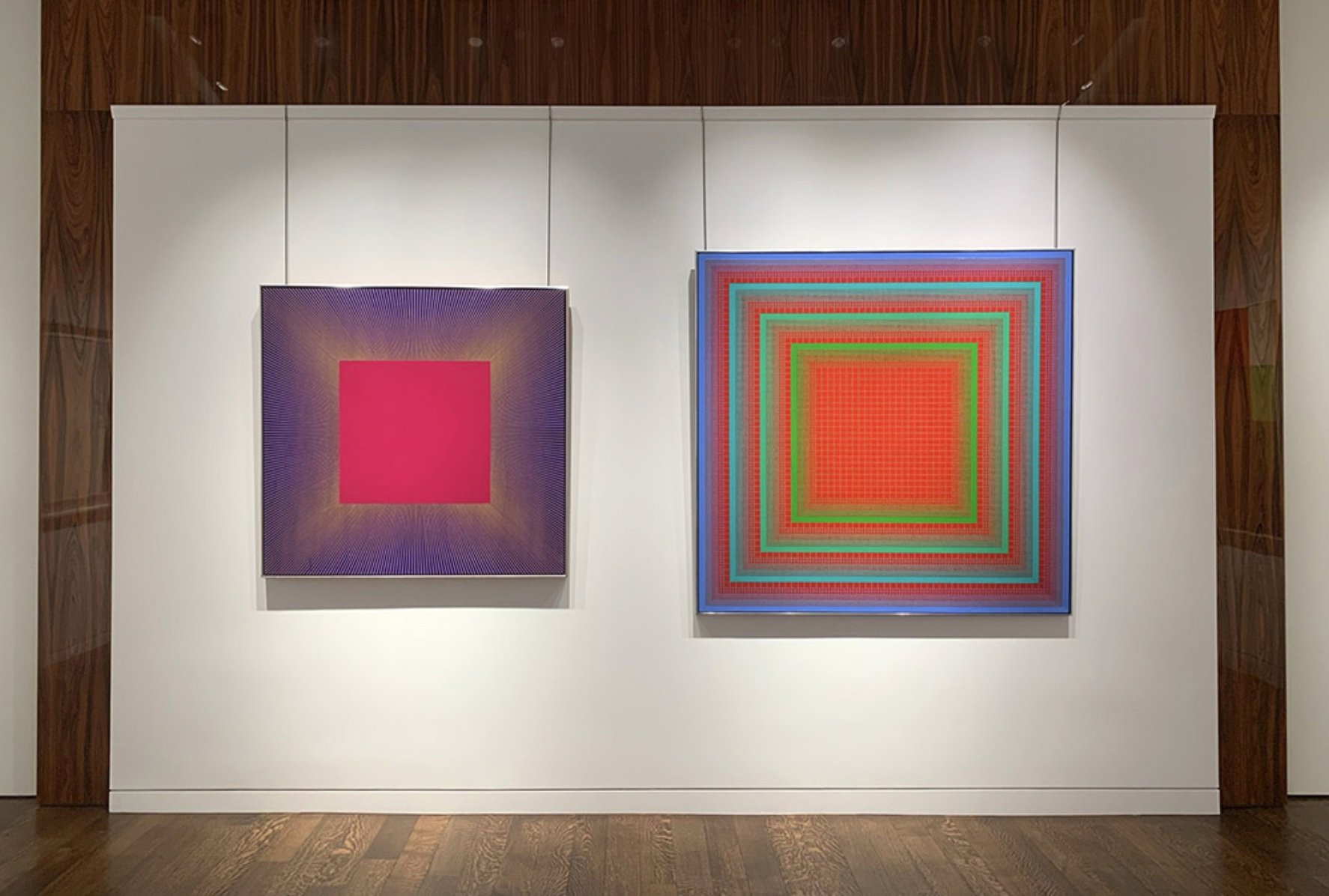
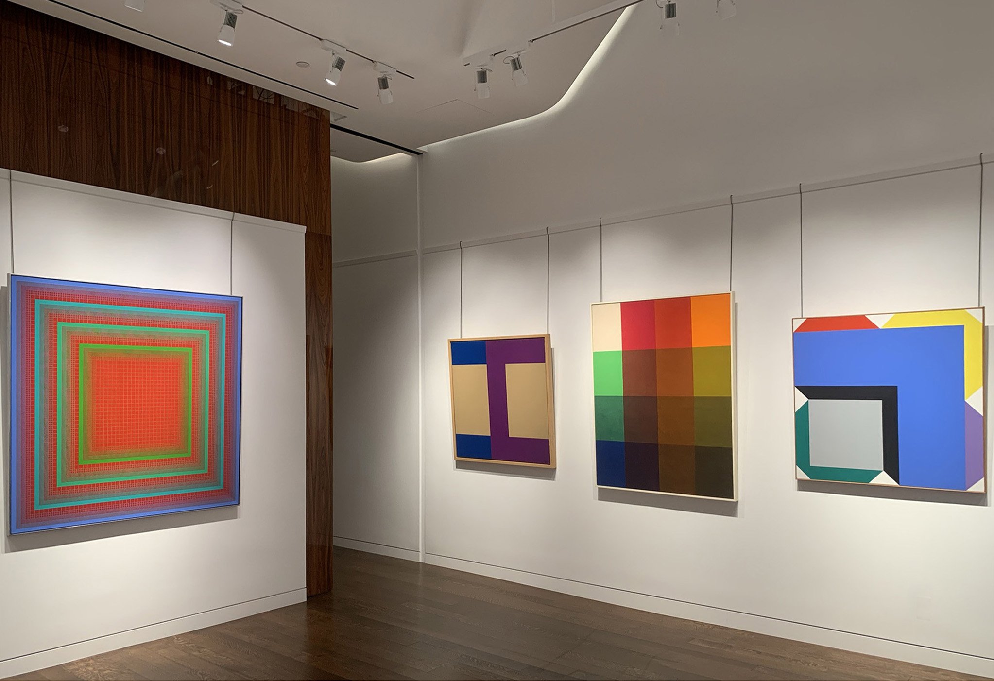
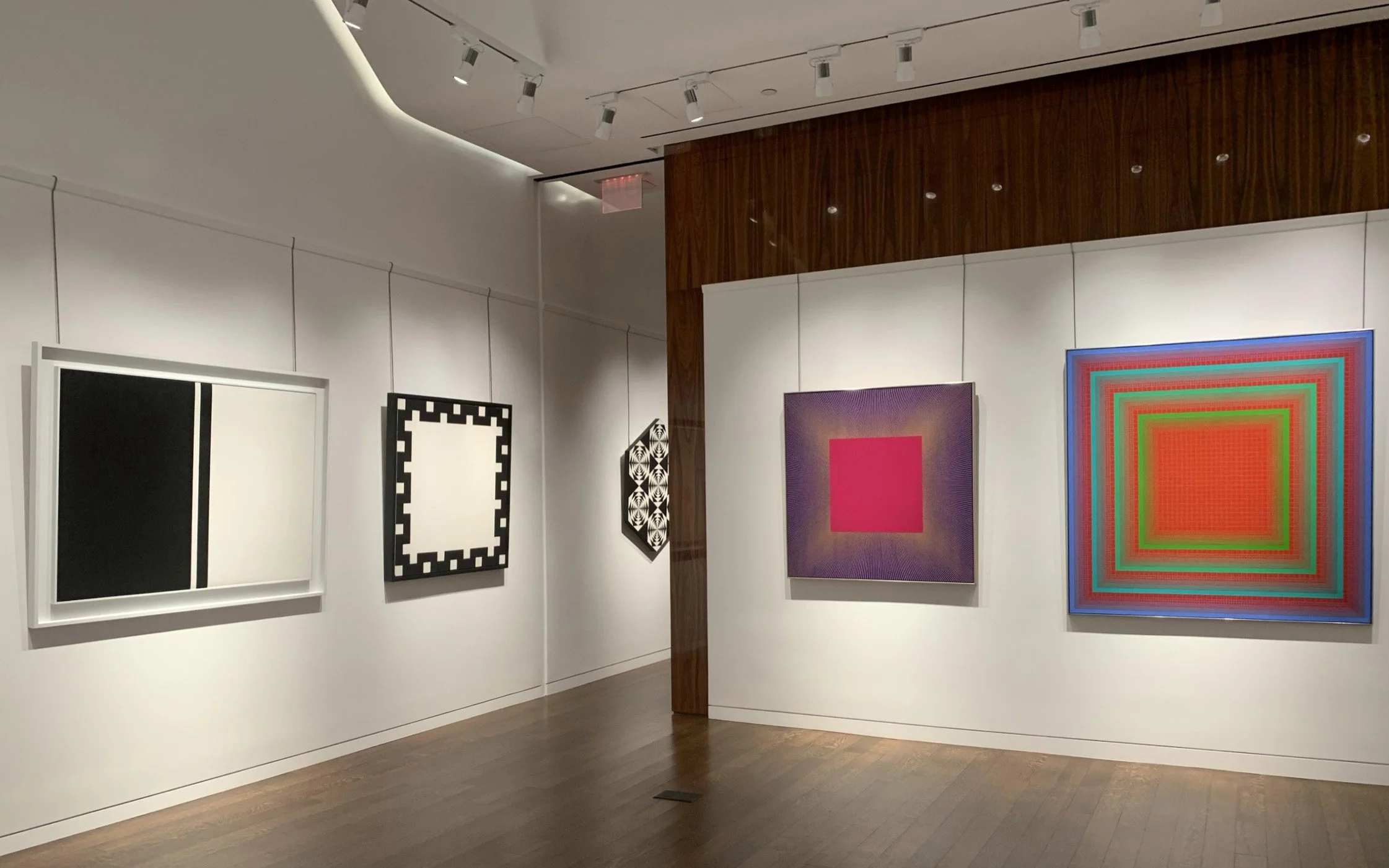
Until the 20th century, the square was an unusual canvas shape in painting. The horizontal rectangle depicted landscapes and the vertical rectangle was used for figuration. For Albers, squares were neutral shapes that offered simple borders between colors. Depending on Albers’ color selection, his squares project, recede, or blend together under certain lighting and distance. In Interaction of Color, Albers laid out how artists could intuitively understand why we see what we do. The square format also allowed artists to play with symmetry- either with complex arrangements that required an equally divided canvas (like Richard Anuszkiewicz’s Quiet Center) or a bold arrangement of color blocks that have movement (like Karl Benjamin’s #36 and Bill Komodore’s Meander). Our exhibition presents three ways artists used the square: to emphasize color interactions; to explore the tension of symmetry; and to put Albers’ exercises into three dimensions in plastic constructions and shaped canvases.

COLOR EFFECT

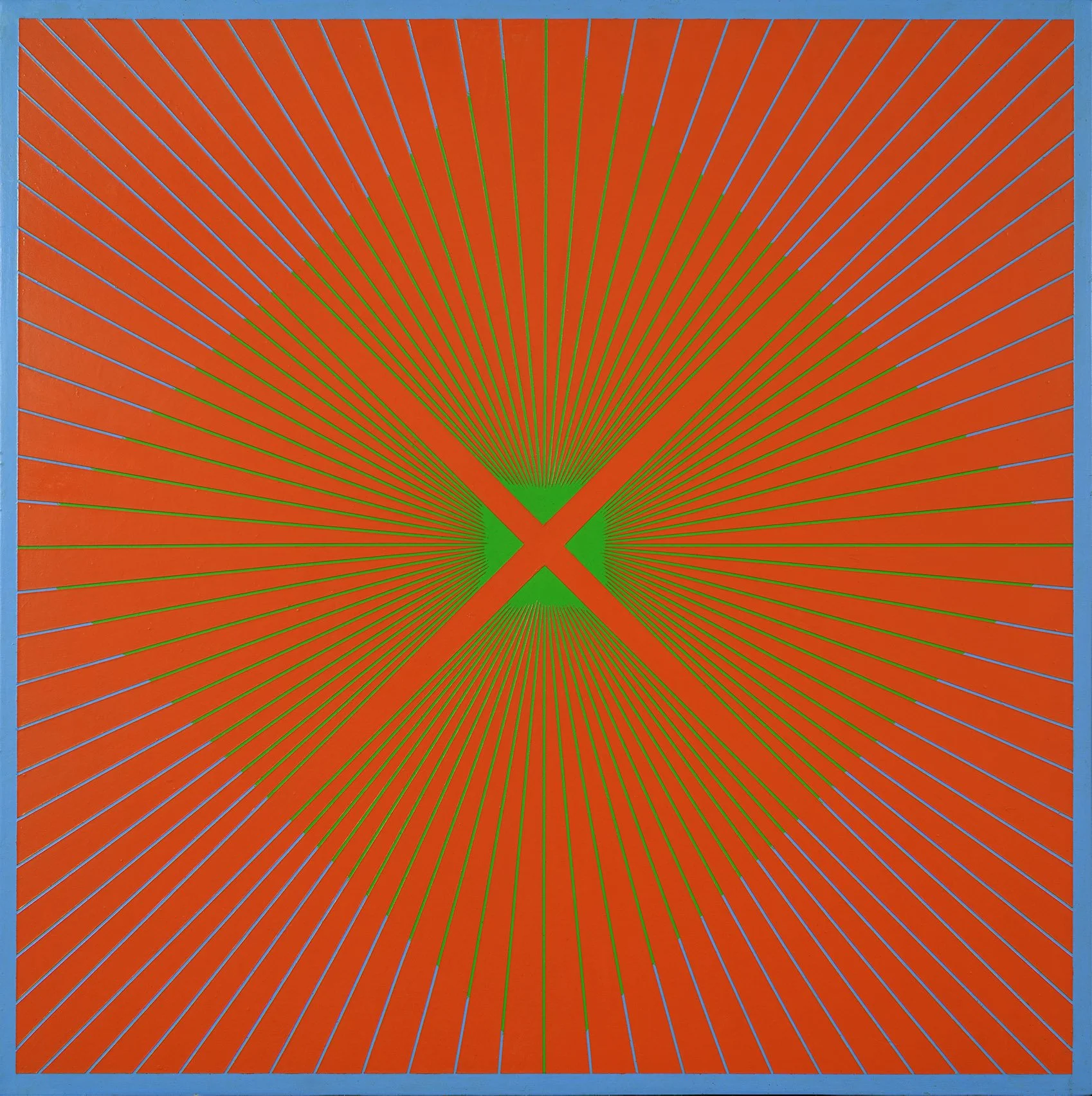
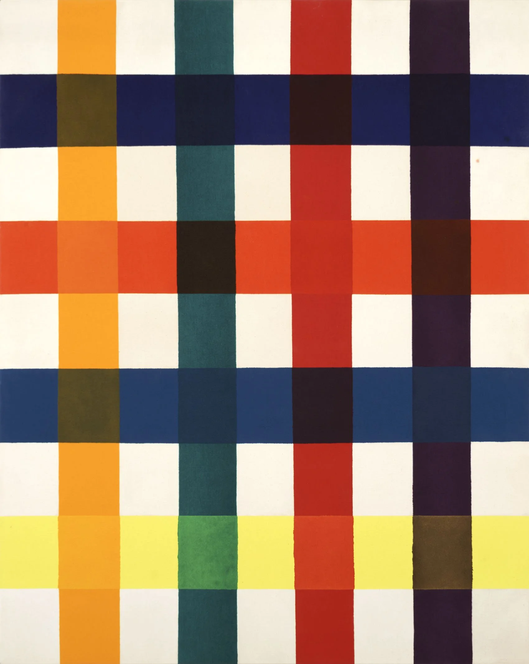
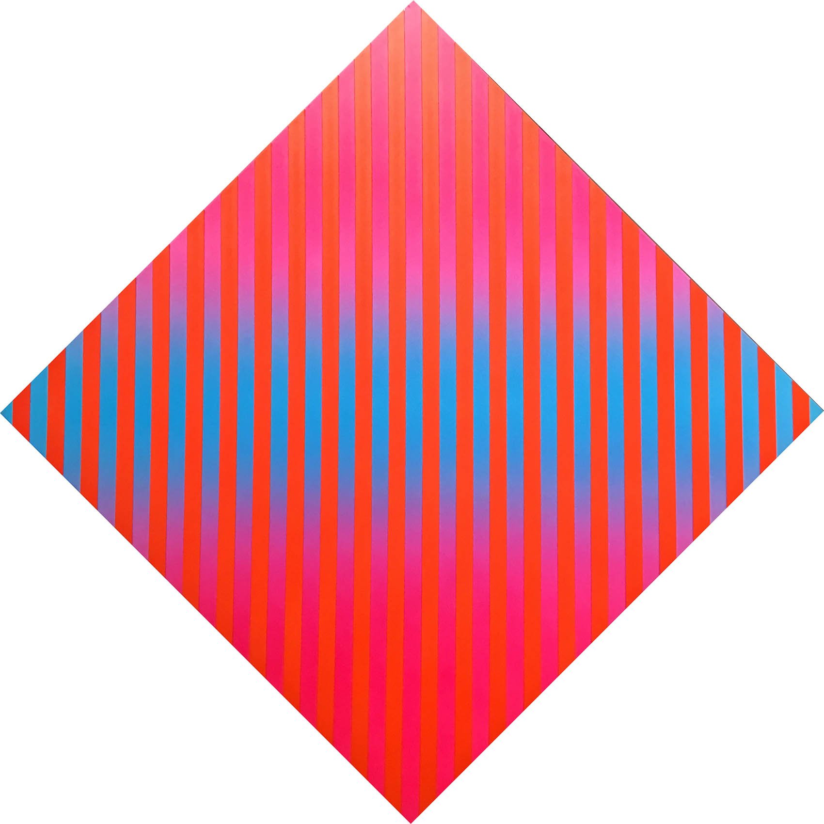
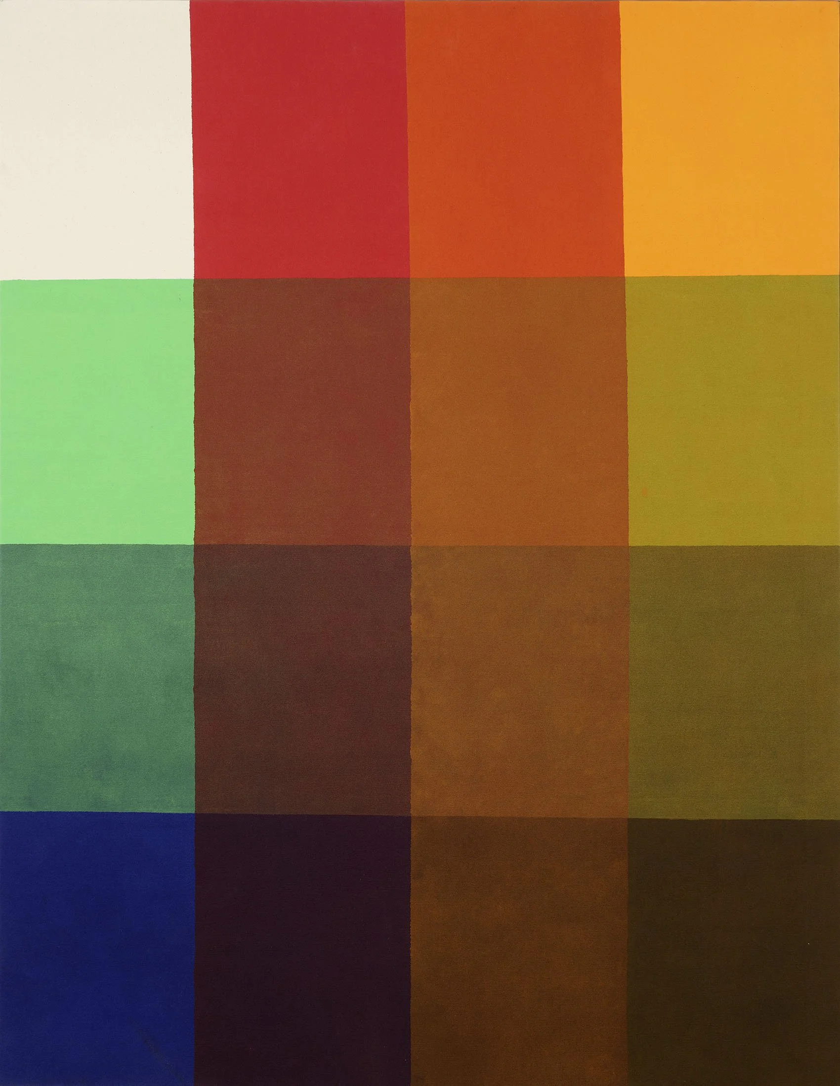
Artists Richard Anuszkiewicz (1930-2020), Julian Stanczak (1928-2017), Tadasky (b.1935), and Francis Celentano (1928-2016) were impacted by Josef Albers’ studies in color relativity and his use of a single form as his subject. In the 1960s Anuszkiewicz worked with a limited palette of red, green, and blue. These contrasting colors in matched intensity led his work to buzz, making him the leader of the American Op Art movement. In Anuszkiewicz’s Quiet Center (1962) a solid field of red appears as three different colors due to thin lines of olive green, kelly green, and periwinkle blue. The thin lines themselves form a diamond projecting out of a centered square. After seeing one of Albers’ paintings in reproduction, Tadasky (b.1935) came to America to paint geometric shapes, a style considered taboo in Japanese art schools. While Tadasky is known for his concentric circles, the square is always present in the canvas’s boundaries. Tadasky considered the circle in the square to be a universal composition. In D-101 (1966), concentric squares of orange and two shades of blue border concentric circles in the same colors. Francis Celentano (1928-2016) began a deliberate exploration of color using Albers’ methodical approach in 1965 after his inclusion in MoMA’s exhibition The Responsive Eye. He settled on stripes of floating color shifts that both project and move across the canvas, achieved by spraying two pigment in alternating density along one stripe. In Celentano’s Alpha Diamond Study (1969), the rotated square canvas appears solid in its shape while the blue color at the center bulges forward into the viewer’s space. Washington Color School artist Paul Reed (1919-2015) was influenced by the effect of implied transparency seen in Interaction of Color. Reed painted four series (Inside Out, Intersection, Coherence, and Interchange) in 1966 using the stripe as a neutral form to examine transparency through actual overlaid colors. Reed’s method was technically possible because of new water-based plastic paints, which dried quickly and could be stained into raw canvas. The lattice composition of Intersection VII (1966) provided an efficient framework to examine the many points of crossing between two sets of stripes, the vertical colors warmer than their horizontal companion.

TENSION IN SYMMETRY

The nested squares in the Homage to the Square paintings are slightly orientated to the bottom of the canvas. This small adjustment to the symmetry heightens the color effects of projection and recession and demonstrates how to use the viewer’s desire for symmetry to create dynamic movement in a painting.

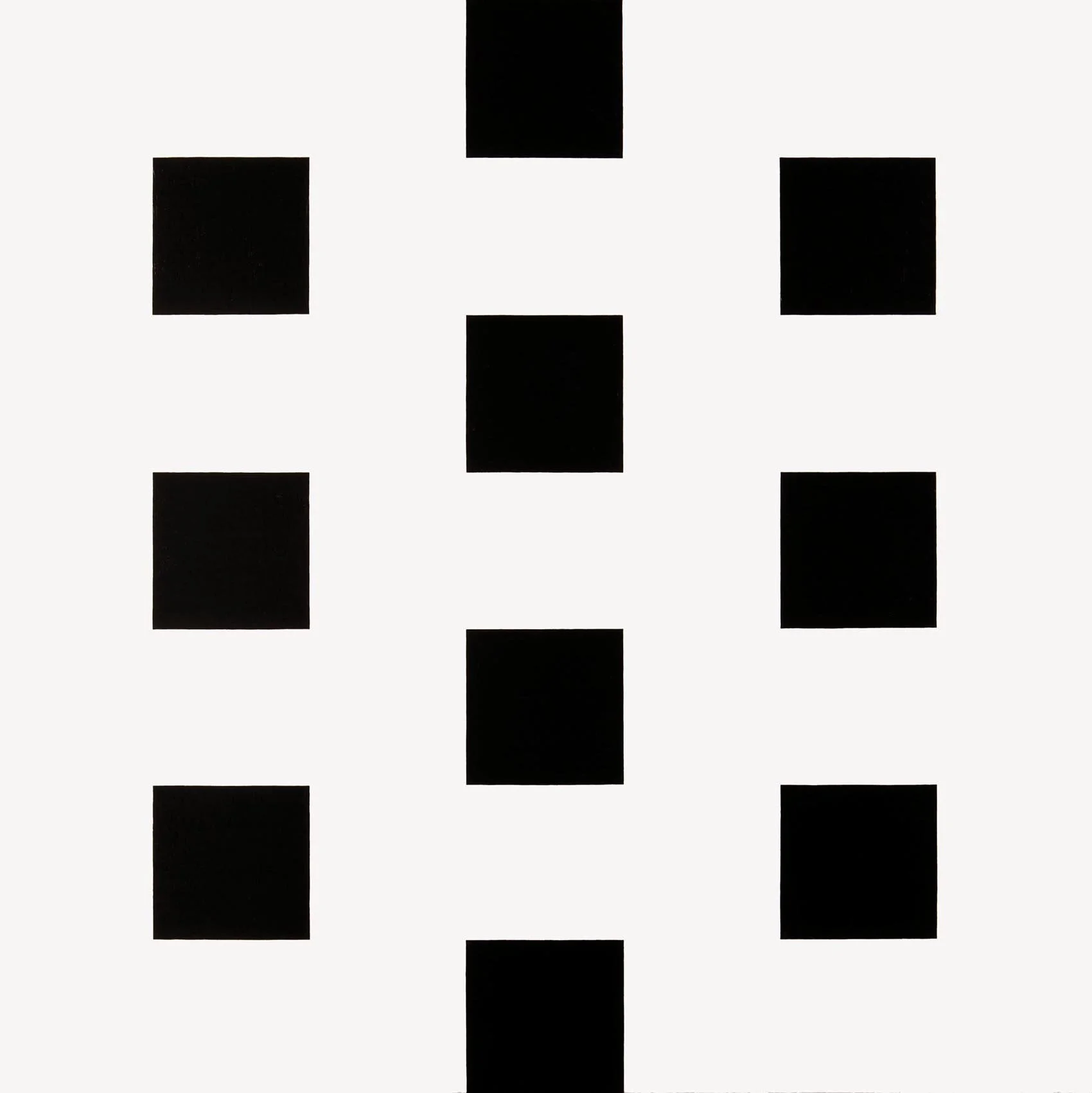
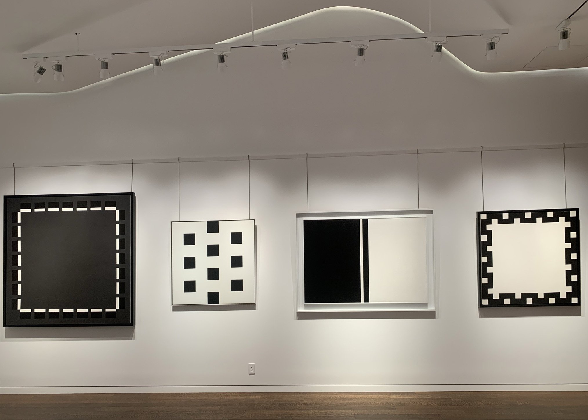
Karl Benjamin (1925-2012) and Frederick Hammersley (1919-2009) were California Abstract Classicists, a group that made hard edged paintings with geometric simplicity, linear precision, and purity of form and color. The Abstract Classicists aimed for tension between the shapes to create excitement rather than depth. Both Hammersley and Benjamin used square canvases to emphasize the balance of symmetry. In Benjamin’s #36 (1964), blocky lines of deep green and blue of equal intensity seem interwoven, making it difficult to determine which color projects or dominates – an experience that energizes the painting. In Hammersley’s Sanforized, #1 (1967), the artist divides the canvas into a 7 x 7 grid with ten black squares at its center. First the black squares hover above the white field then with further looking the white begins to project instead. The underlying grid gives a clear symmetry to Sanforized while the high contrast of black and white activates a dynamic response in the viewer.

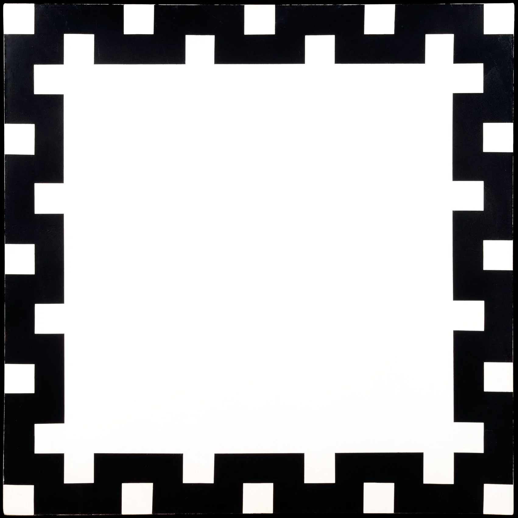
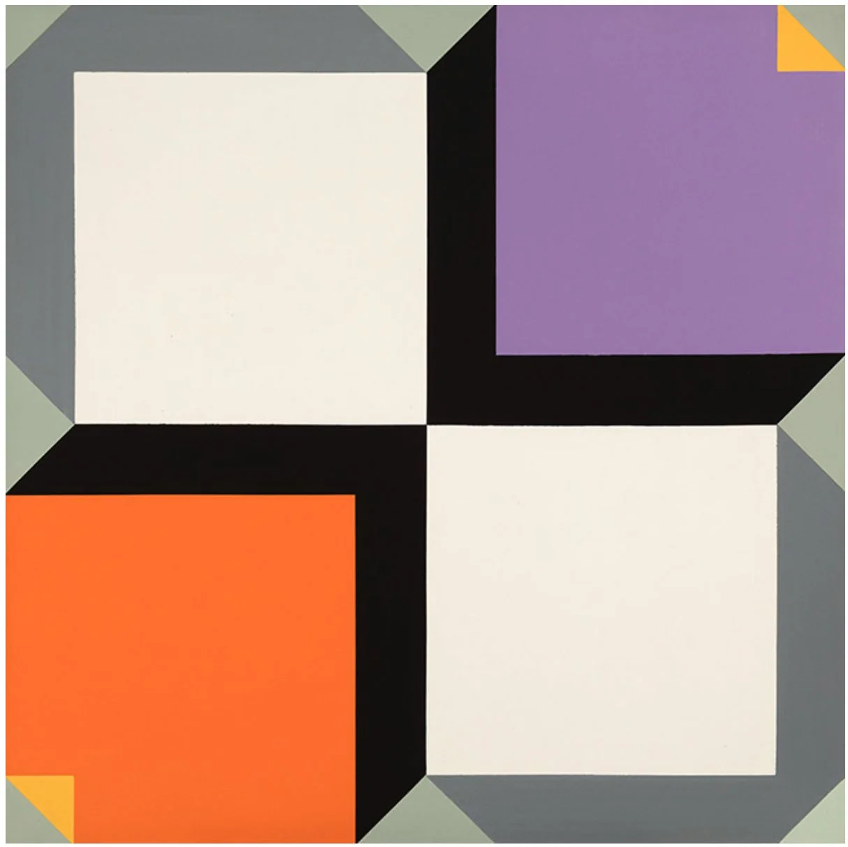
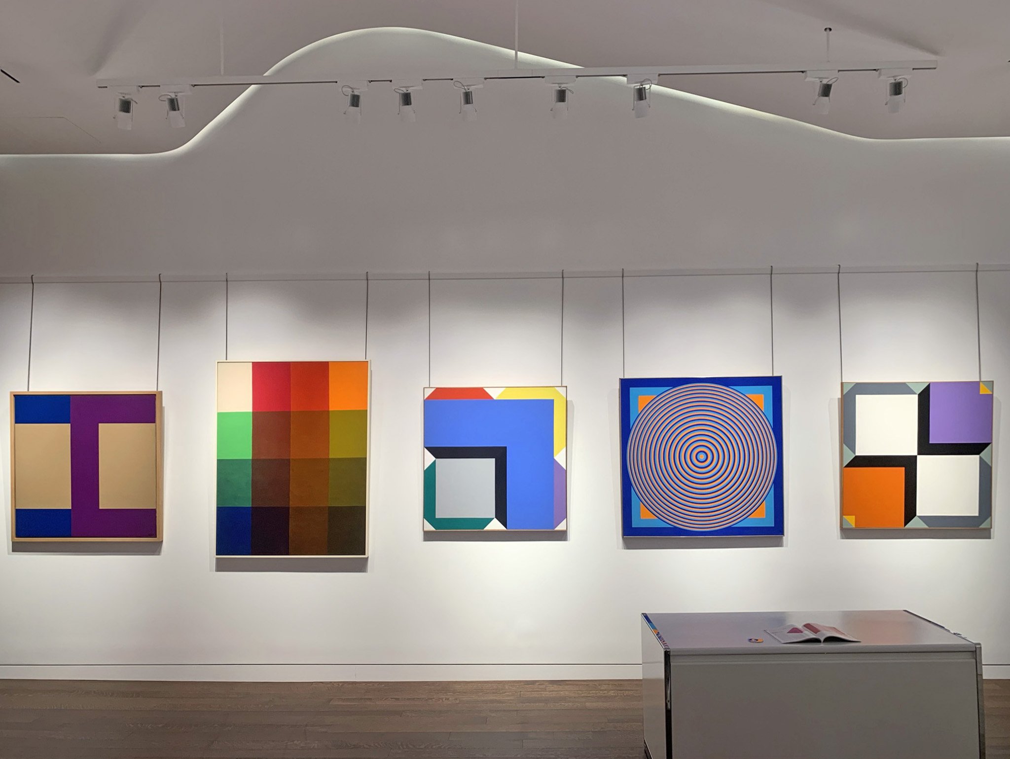
Bill Komodore (1932-2012) and Ralph Iwamoto (1927-2013) are New York artists whose styles align with the bold compositions of the California Abstract Classicists. In Meander (1967), Komodore borders a field of white with a thick black meander. The small white squares along the painting’s edge seem to jump to the center, filling the painting with action. Iwamoto made geometric shaped canvases in subdued colors accented by vibrant ones in the 1960s. In 1970 he started using square canvases divided into four quadrants, each with its own flat shapes of high–keyed color for a punchy effect. Iwamoto called these works QuarOctagons: four octagons set in a square. He used this format for three years in distinct series. In Structure #2 (1971), mirrored white squares compete diagonally with orange and purple quadrants for dominance, accentuated by borders of black and gray. Iwamoto continued to the octagon in all of his paintings through 1987.

ALBERS IN 3-D

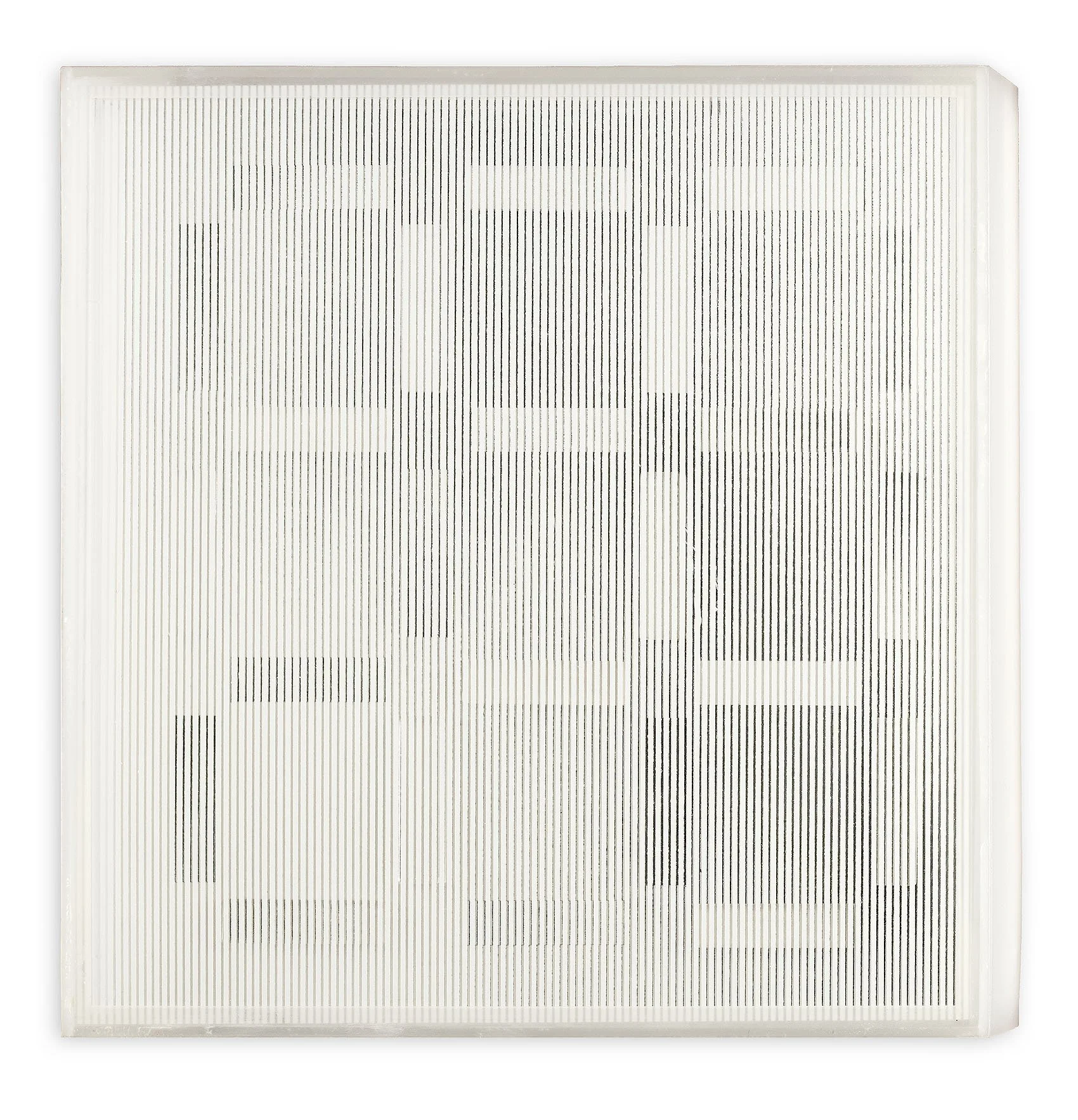
Josef Albers made beautiful stained glass works at the Bauhaus and was an excellent printmaker, but never applied his color theory to sculpture. Albers’ seriality and color relativity were expanded into plastic constructions and shaped canvases by Leroy Lamis (1925-2010), Mon Levinson (1926-2014), and Al Loving (1935-2005).

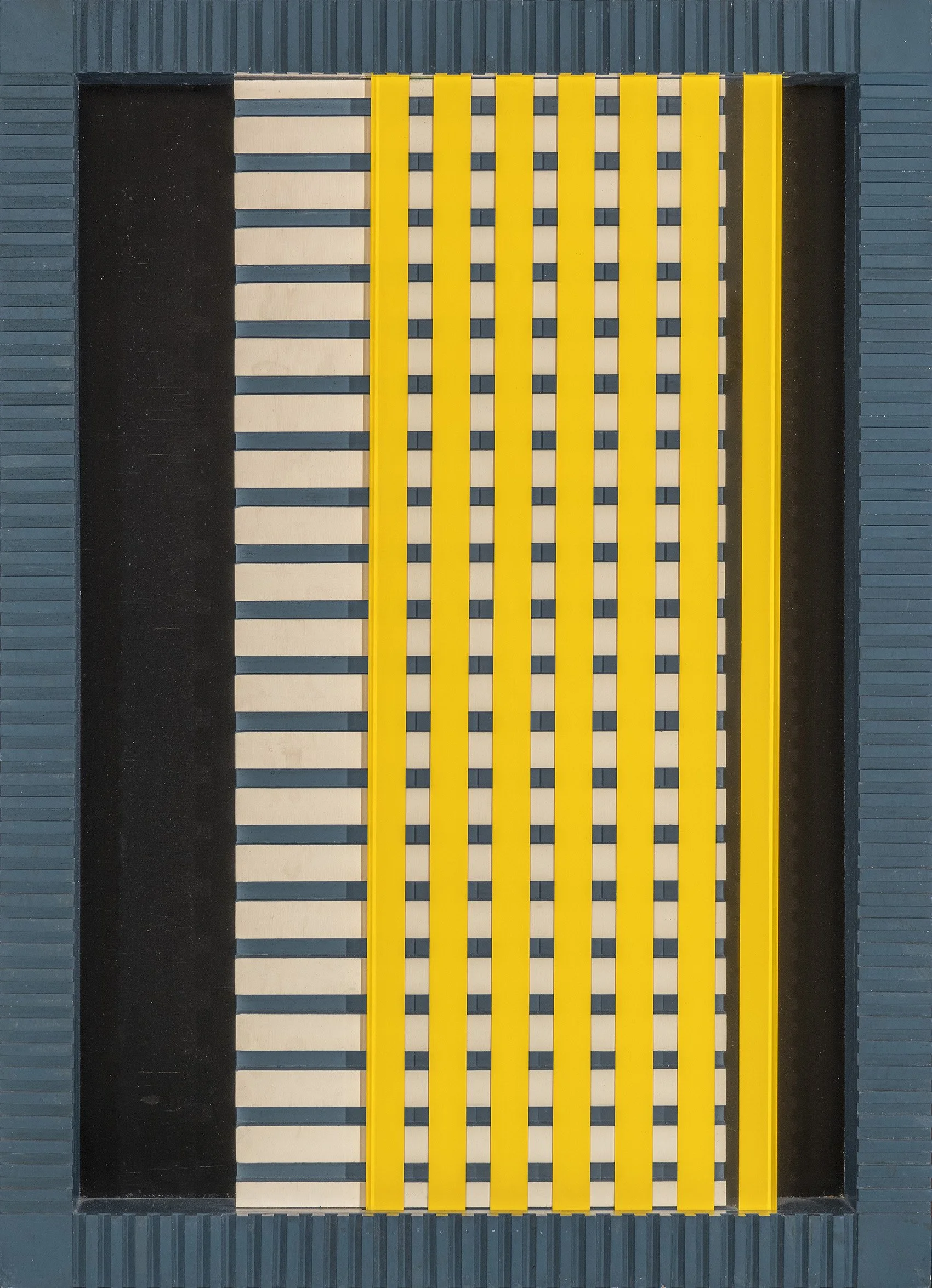
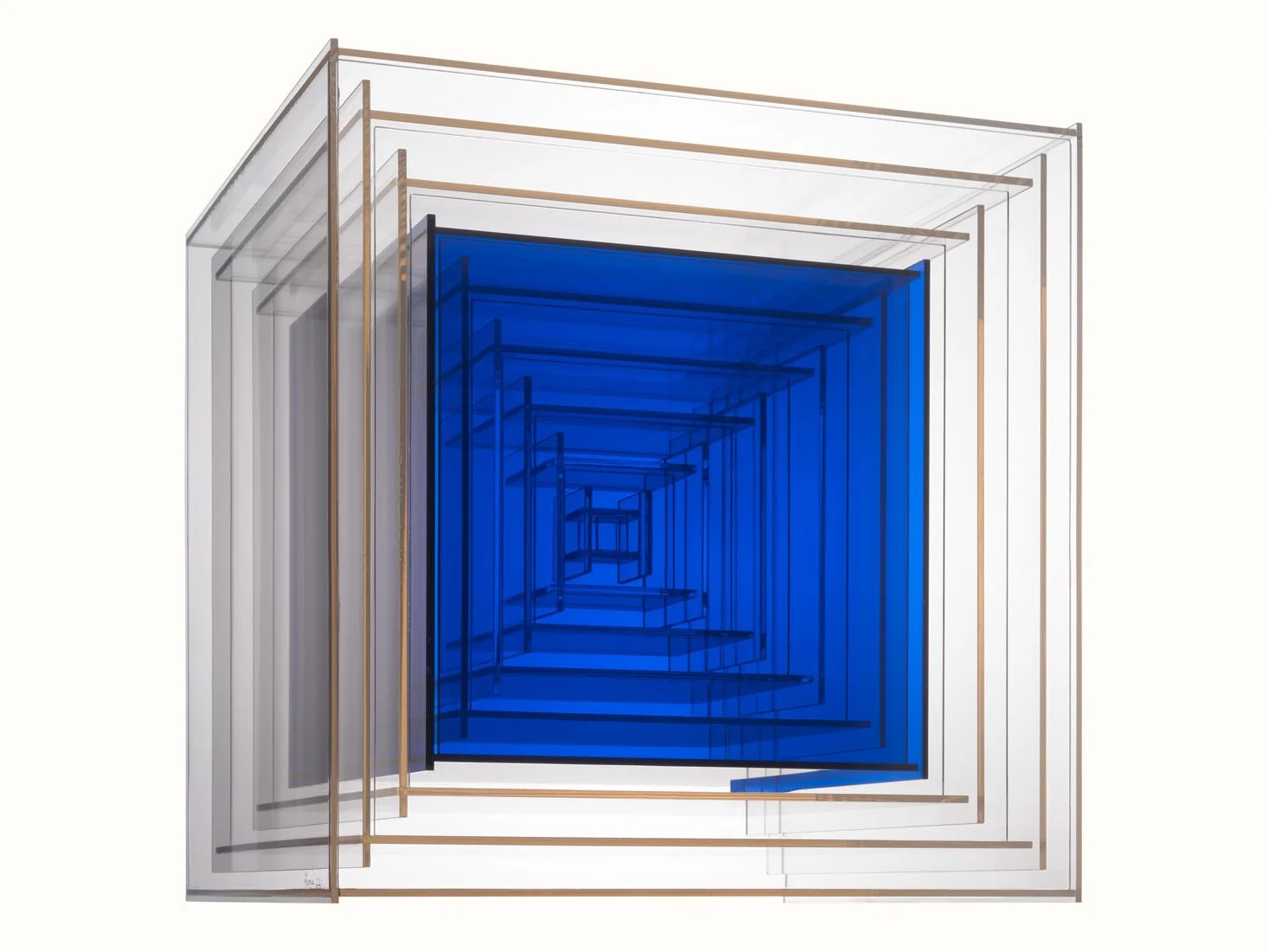
Leroy Lamis started his career working in metal and glass prisms in the Constructivist style. The Constructivists opposed color as an optical surface but Lamis found in Plexiglas a material that could be embedded in color and therefore in keeping with Constructivist theories. Lamis created a three dimensional approach to Albers’ color theory over the course of his 230 constructions made from 1962 to 1973. The variety he achieved using eight colors of Plexiglas, as well as clear and white, came from the layering and reflection of the plastic cubes. The brilliance of the blue in Construction No. 221 (1973) results from the artist placing the color in the middle of a clear construction. The blue cube’s location between 3 outer and 5 inner cubes of clear Plexi allows light to shine through the construction to highlight the color while the internal structure provides the lines of nested cubes without blocking the light further. Lamis brought a new dimension to optical color mixing with his use of plastic.

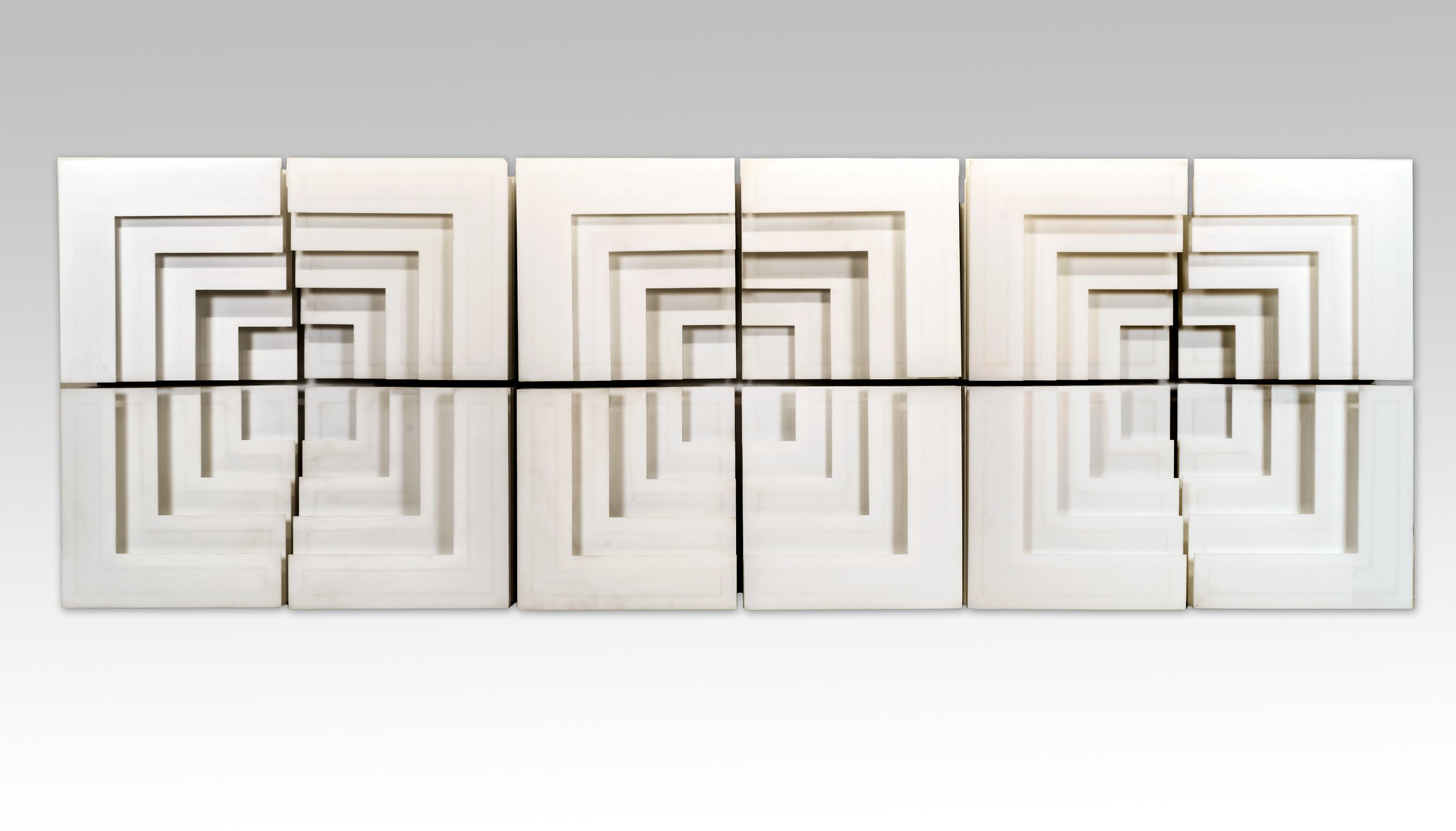
Mon Levinson began working in plastics in the early 1960s as a way to avoid the brushstroke and highlight the forms. In the late 1960s Levinson simplified his compositions and used formal geometry to emphasize light and shadow. Spacer Variations 3 (1968) is a Plexi wall relief of 12 interchangeable components. Each quadrant of nested white corners attaches to a back panel so the four pieces can be re-arranged as desired. In this work, Levinson used a fixed white shape that in its placement next to its neighbors could project or recede, replicating in a way Albers’ exercises in color relativity using light and shadow.

Al Loving settled on the cube motif as his subject by 1967, inspired by Homage to the Square. Loving turned Albers’ nested squares into a crystalline structure, playing with the tension between flatness and spatial illusionism in a shaped canvas. His cube soon became a more complex form as he opened one side into a triangle to hold more color as seen in Septehedron L-B-1 (1970). He called this shape a Septehedron as the form’s inner structure implied a seven sided volume. Loving exhibited these both singularly or grouped. In Loving’s 1969 Whitney Museum exhibition, one wall had 91 Septehedrons organized into 7 rows of colors. Within each row, each canvas adjusted slightly in color intensity from its neighbors adding a pulse to the complex arrangement. This repetition of a shape to such an extreme is another nod to Albers’ seriality.

Josef Albers modeled for future artists how to be both an artist and a teacher. Beyond his continued exploration of color in a methodical approach, he also showed a deliberate and clear way to share information with students and viewers. Many of the artists in our exhibition shared this commitment and had long careers as working artists and art professors: Karl Benjamin, Francis Celentano, Leroy Lamis, Paul Reed, and Julian Stanczak.

AMERICAN ART FOR THE PUBLIC: MURAL STUDIES AND PAINTINGS, 1930-1945

October 19, 2020 - February 15, 2021

Essay | Installation views | For availability and pricing, contact the gallery at 212-581-1657


Installation Views

Essay by Deedee Wigmore

The reopening of the Whitney Museum and its exhibition Vida Americana: Mexican Muralists Remake American Art, 1925-1945 provides a picture of the purpose art has served in troubled times and made me wonder how the Mexican muralists, who were all revolutionary, helped America reimagine itself during the Great Depression. To examine that question, one needs to know why Americans were receptive to the Mexican muralists.

After the stock market crash on October 29, 1929, economic problems worsened into a global depression. As Americans lost jobs, homes, and savings, tensions were accentuated between: immigrant ethnic groups; farm and town dwellers; physical and mental occupations; and progressive politics and conservative traditions. The Depression threatened American utopian notions of opportunity and progress. Racial violence flared in the 1930s because of economic competition. Violence caused protesters to raise questions about social justice and the American legal system. Bitter economic hardship led some to regard democracy as an ineffective form of government.

The Mexican mural program of the 1920s was part of rebuilding the country after ten years of brutal class warfare. The mural program depicted the life of everyday Mexicans as a means of connecting the people to their new government. The American artist George Biddle had traveled in Mexico in 1928 and been a house guest of Diego Rivera. He saw the impact of the Mexican government-supported public art program for both the artists and the people.

In 1933 George Biddle proposed a public works project for the arts to newly elected President Franklin D. Roosevelt in a personal letter. Roosevelt liked the idea that artists could rally a fractured society around social ideals. The first American public arts program began in 1933-1934. Roosevelt expanded the arts program to include archiving American design, historic preservation, and teaching community art classes as part of the Works Progress Administration. The WPA also built dams, roads, parks, electrification, and other infrastructure from 1935 to 1943, employing 8.5 million as part of the New Deal.

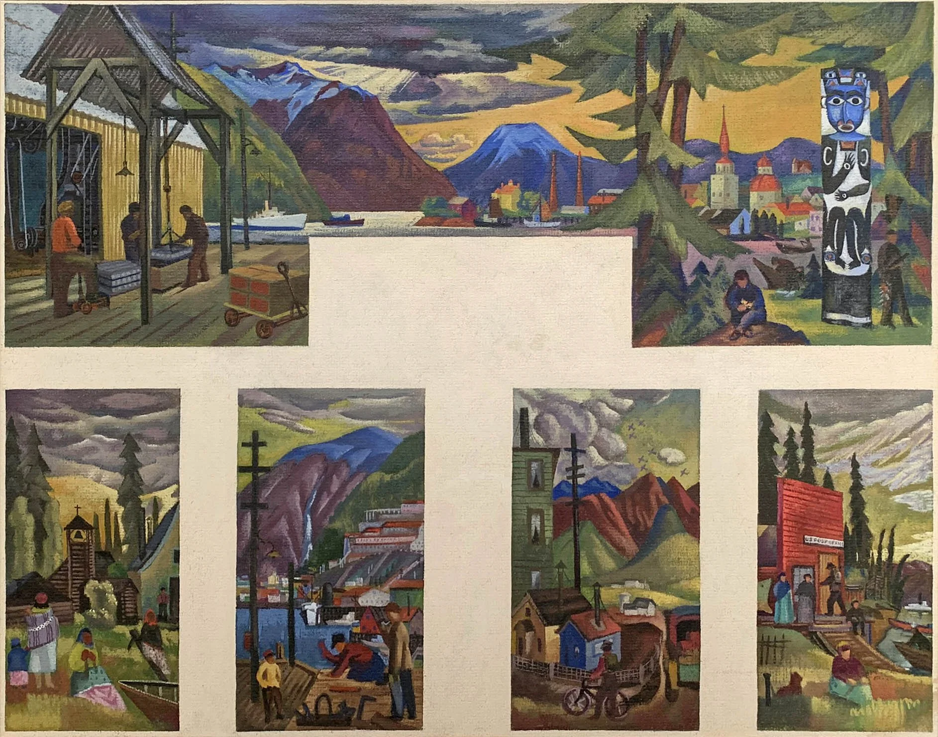
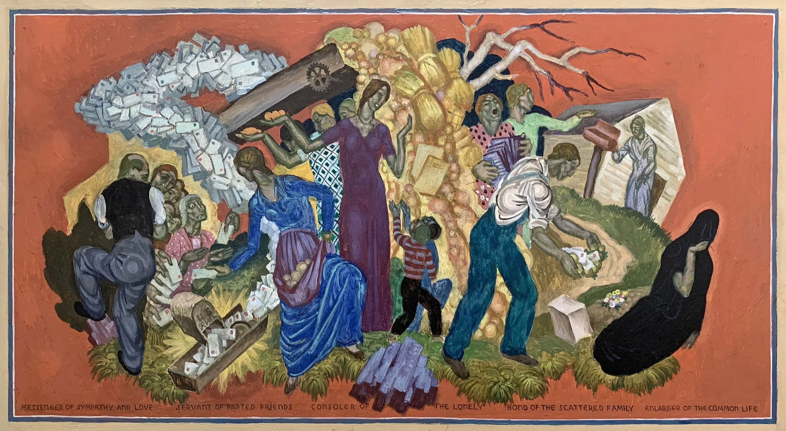
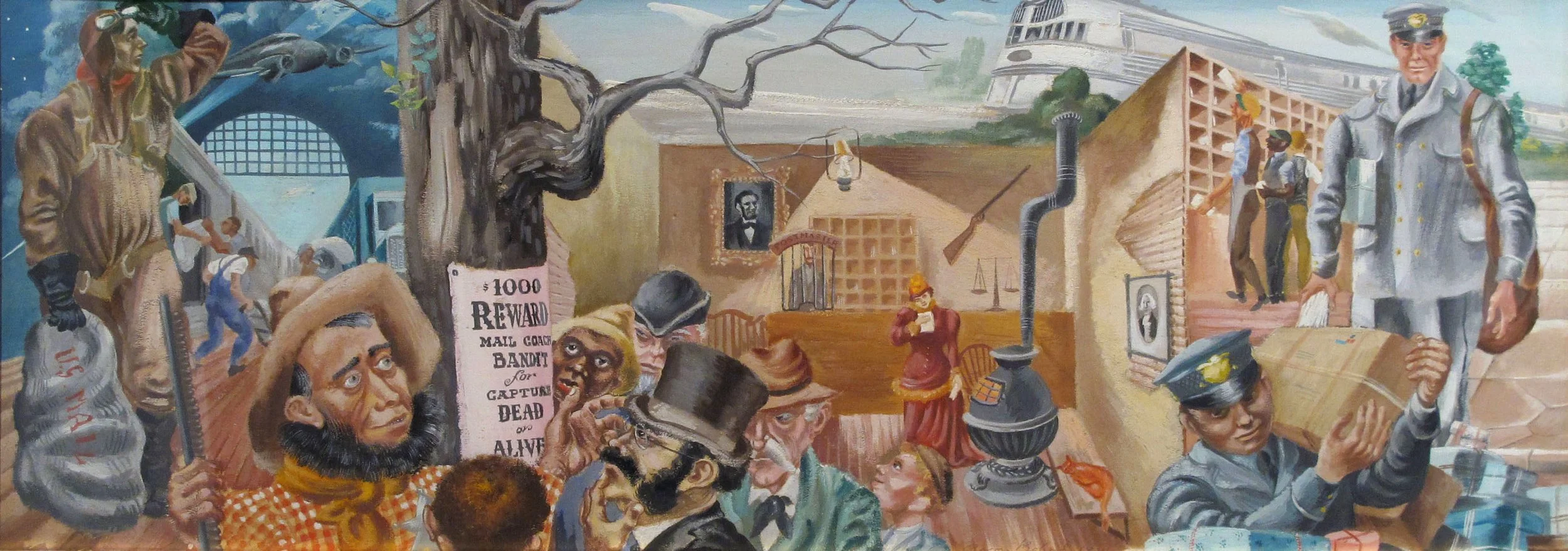
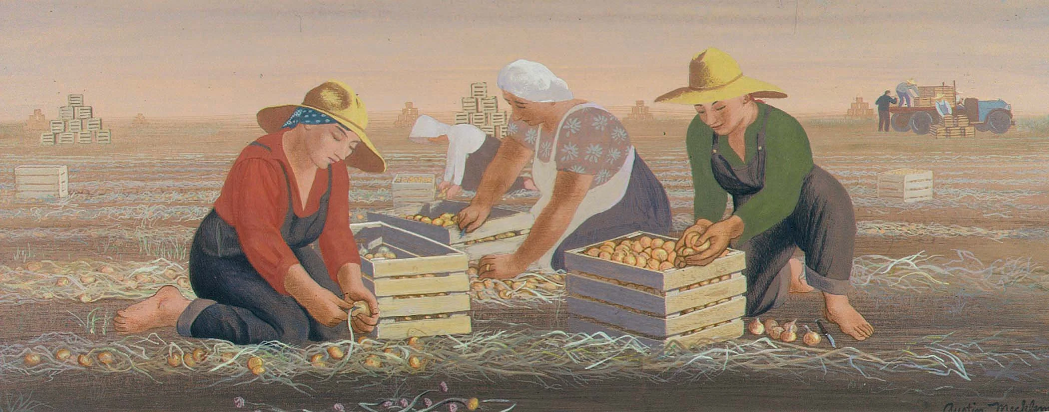
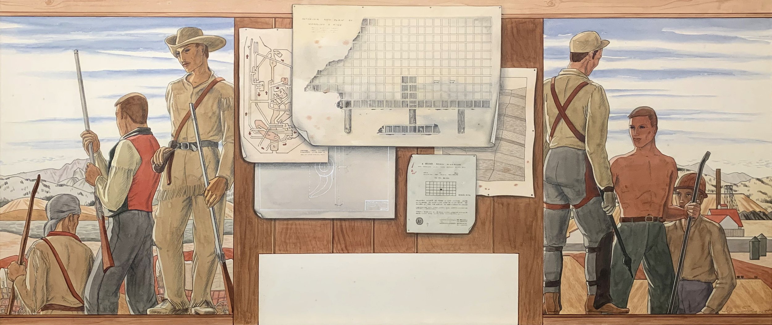
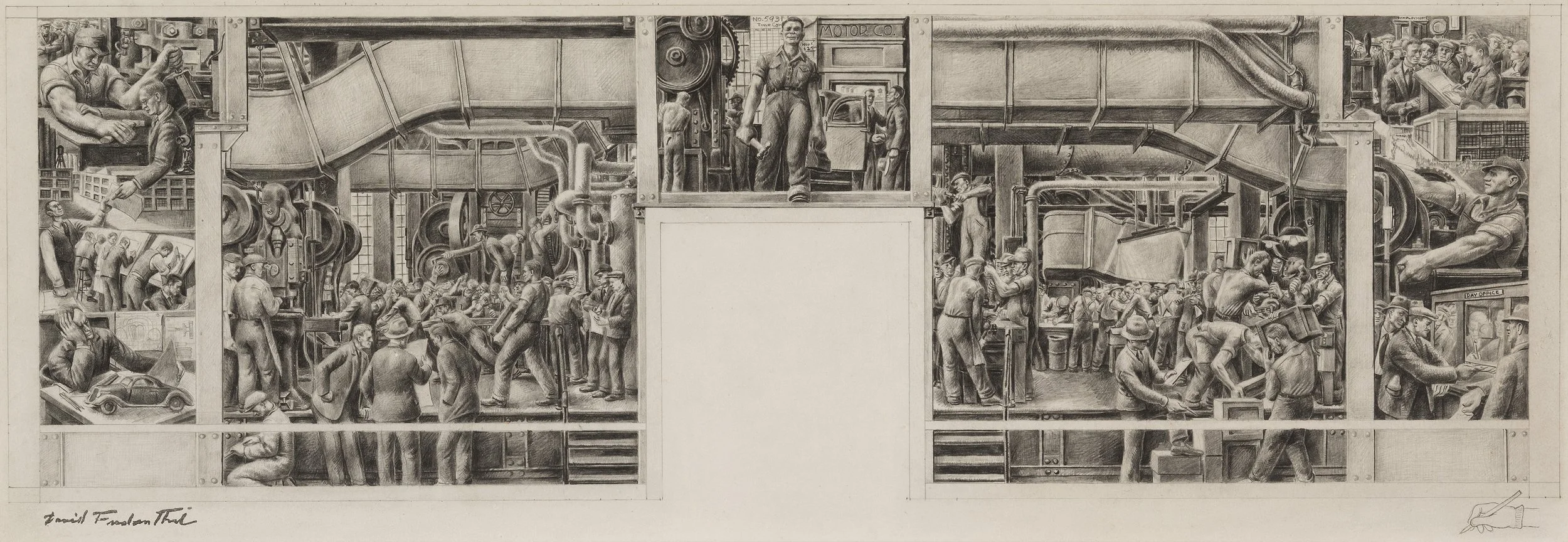
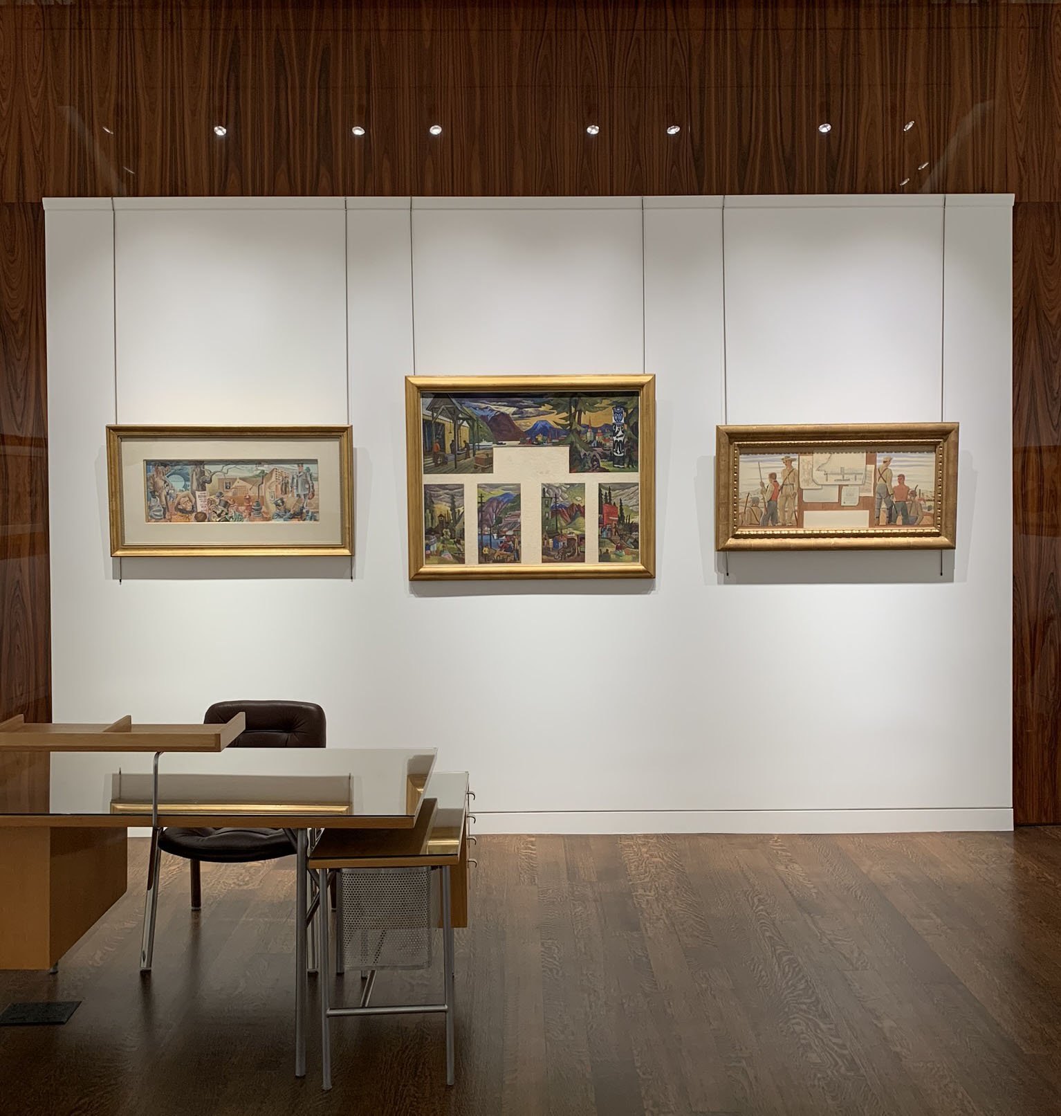
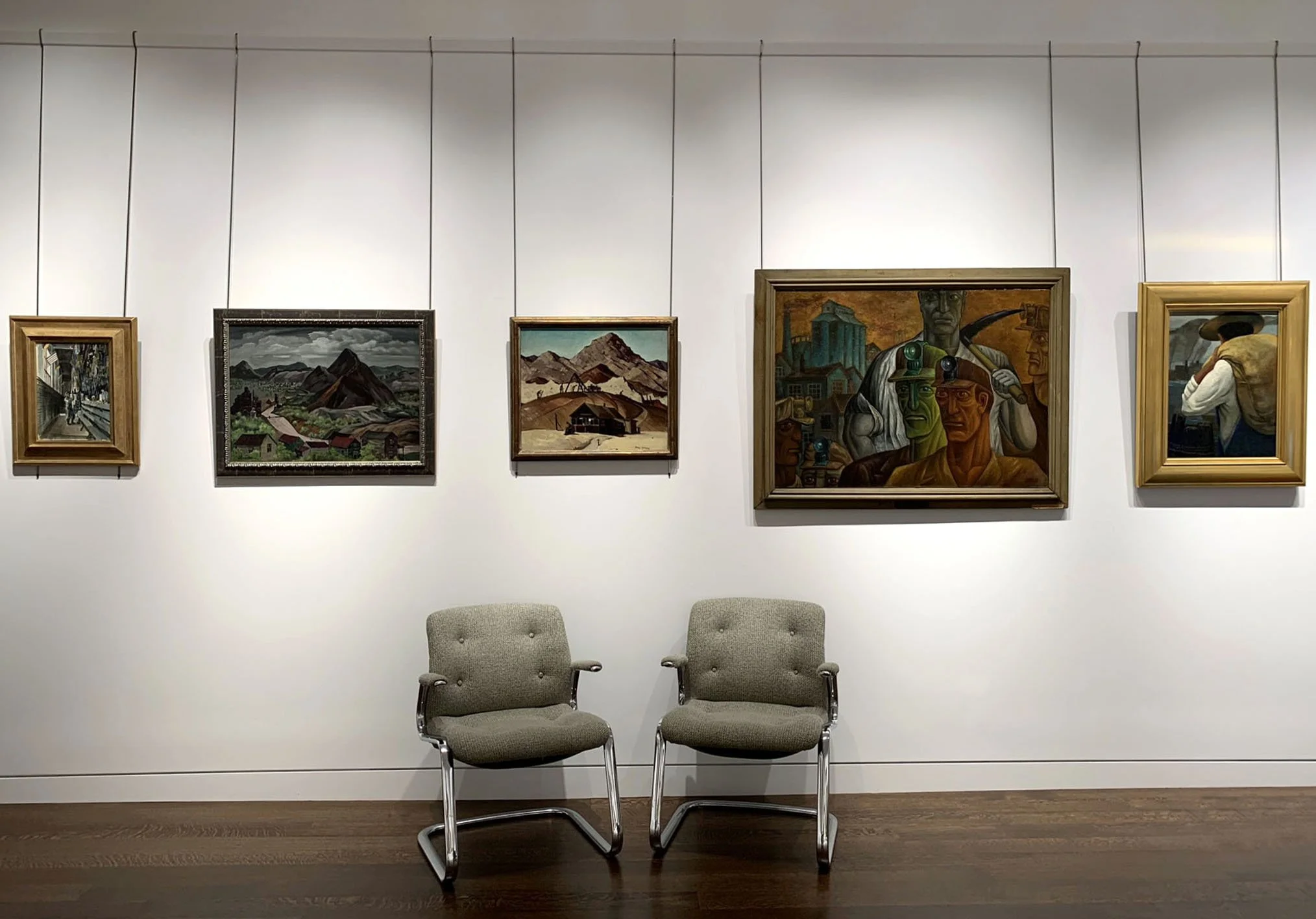
The American public art programs, like its Mexican counterpart, elevated to wage earners artists who created murals, easel paintings, prints, and sculptures. The Section of Fine Arts from 1934-1943 awarded commissions for art installed in public buildings, particularly post offices. The Treasury Relief Art Project awarded commissions from 1935-1939 for new and existing federal buildings. For every mural commission granted, a great many artists submitted an oil, watercolor, gouache, or drawing of their interpretation of a specific theme or location. Thus in organizing an exhibition at my gallery to consider the contribution of the Mexican mural program to America, I offer nine mural proposals to view.

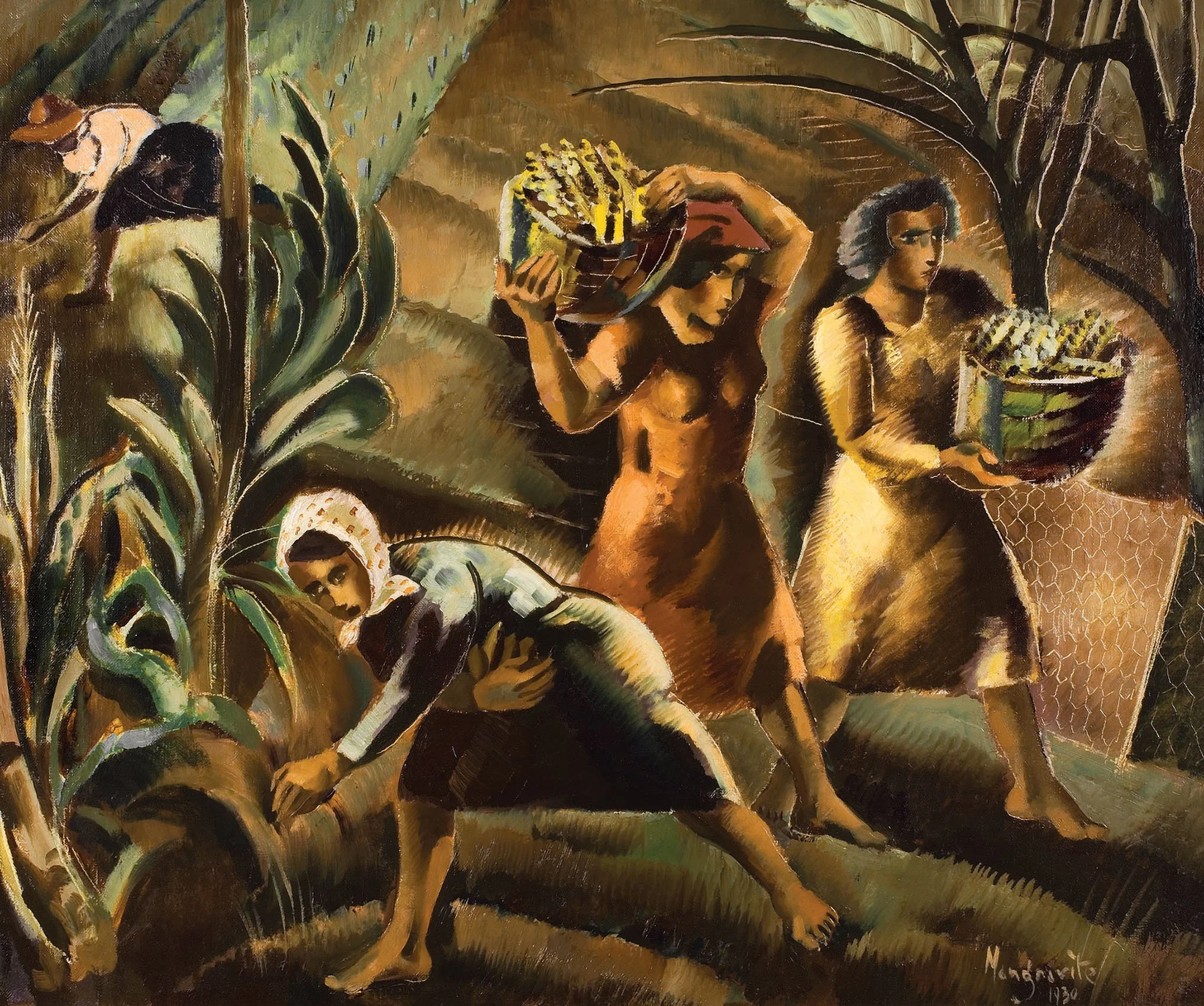
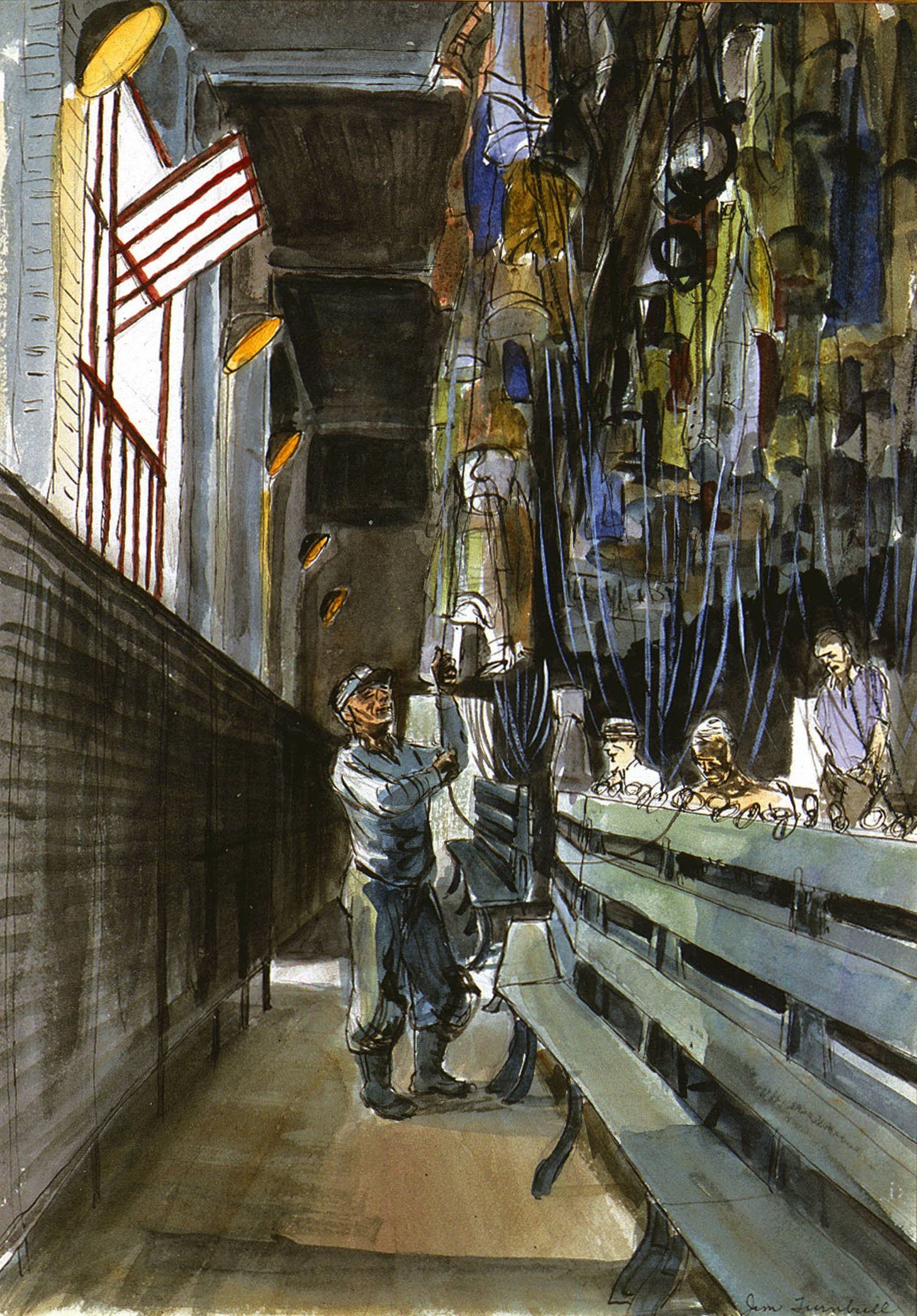
The Mexican artists focused on murals because they were monumental, public, and owned by the people. Easel painting was repudiated in Mexico as private intellectual art. The American mural program valued both mural and easel paintings, which allows me to provide a good comparison of the subject matter of easel paintings to go with the mural studies in my gallery exhibition.

The Mexican muralists became known to American artists through: travel to Mexico during the 1920s; their murals painted in America; museum exhibitions; and more broadly through the press and printed material from 1930-1940. The idea of unifying a country through art celebrating national traditions, history, and the everyday life of ordinary people was taken from the Mexican mural program. More importantly, the Mexican muralist style gave new vitality to representational art at a time when abstraction and non-objective art was heralded as progressive and synonymous with individual freedom. It settled the question of which style- realism or modernist abstraction- would best express the American story. Government programs in both Mexico and the United States chose realism over abstraction for most of its commissions as realism was considered more accessible to the public.

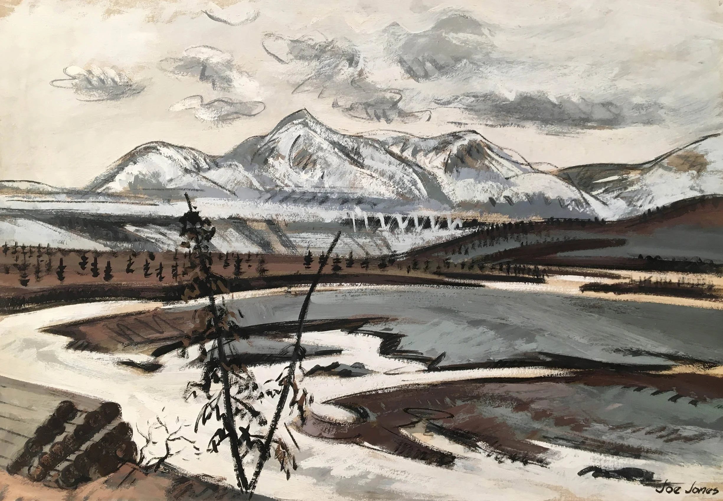
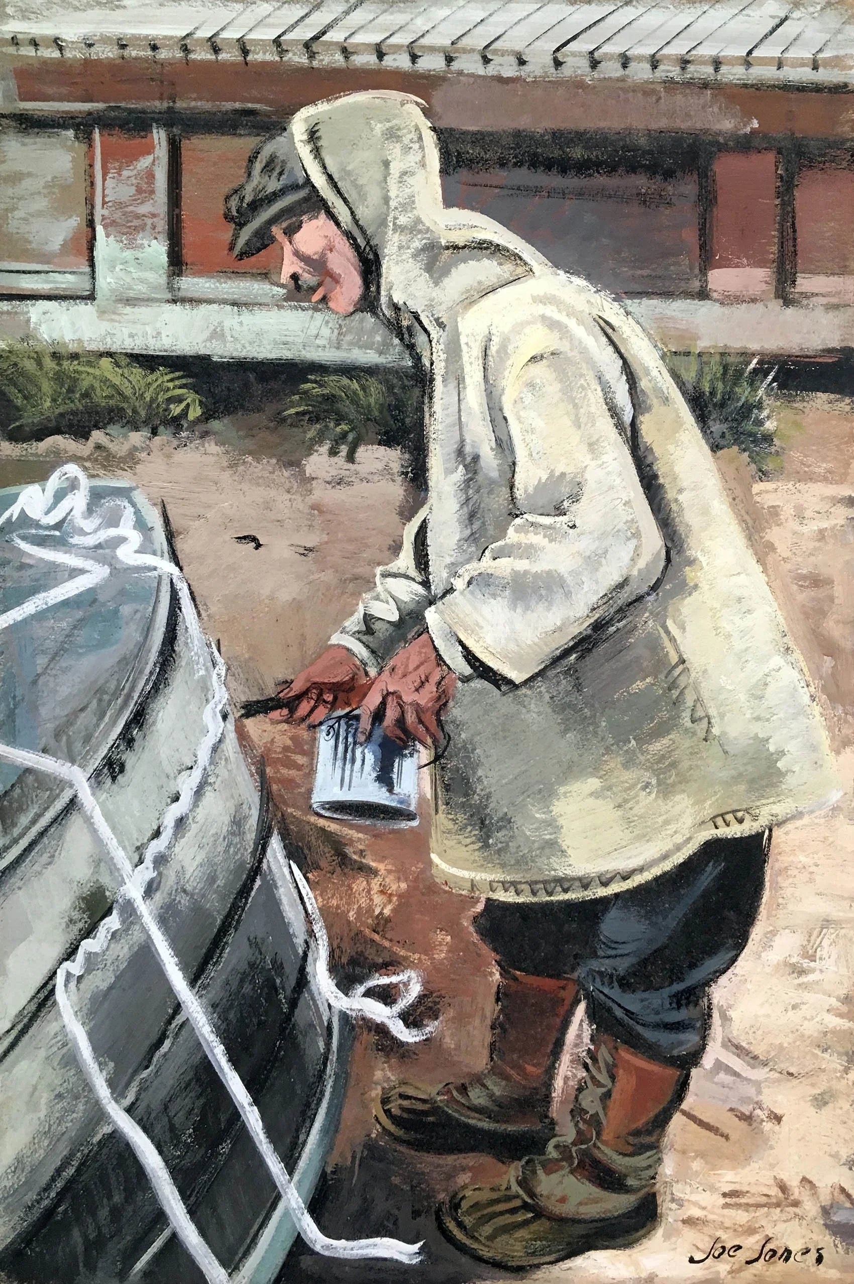
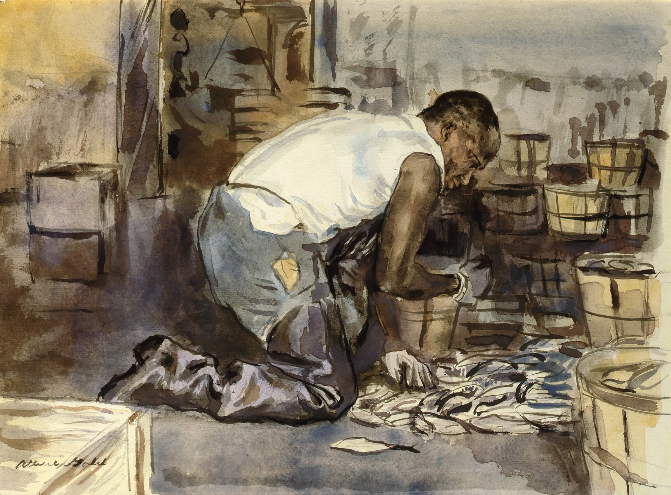
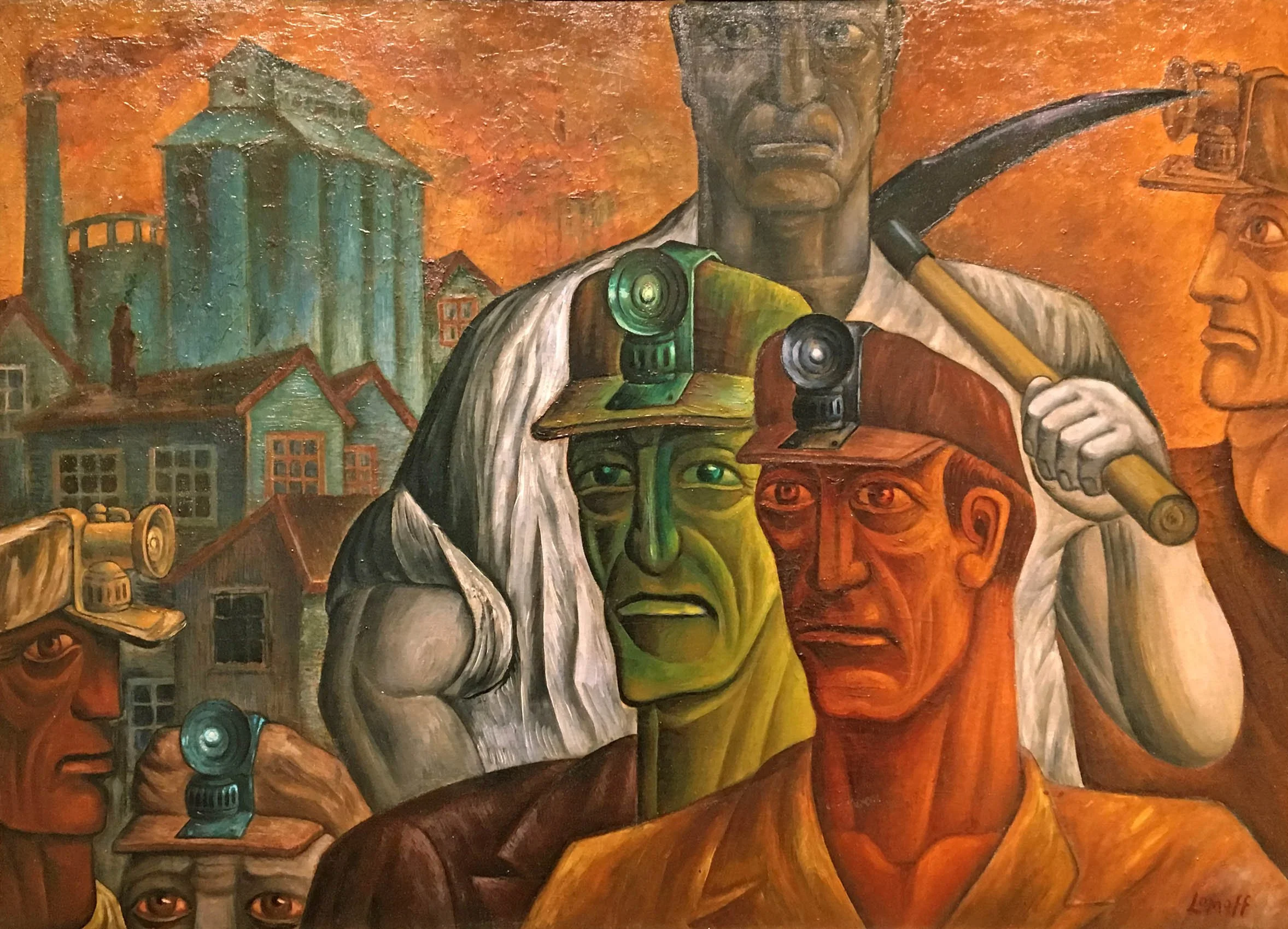
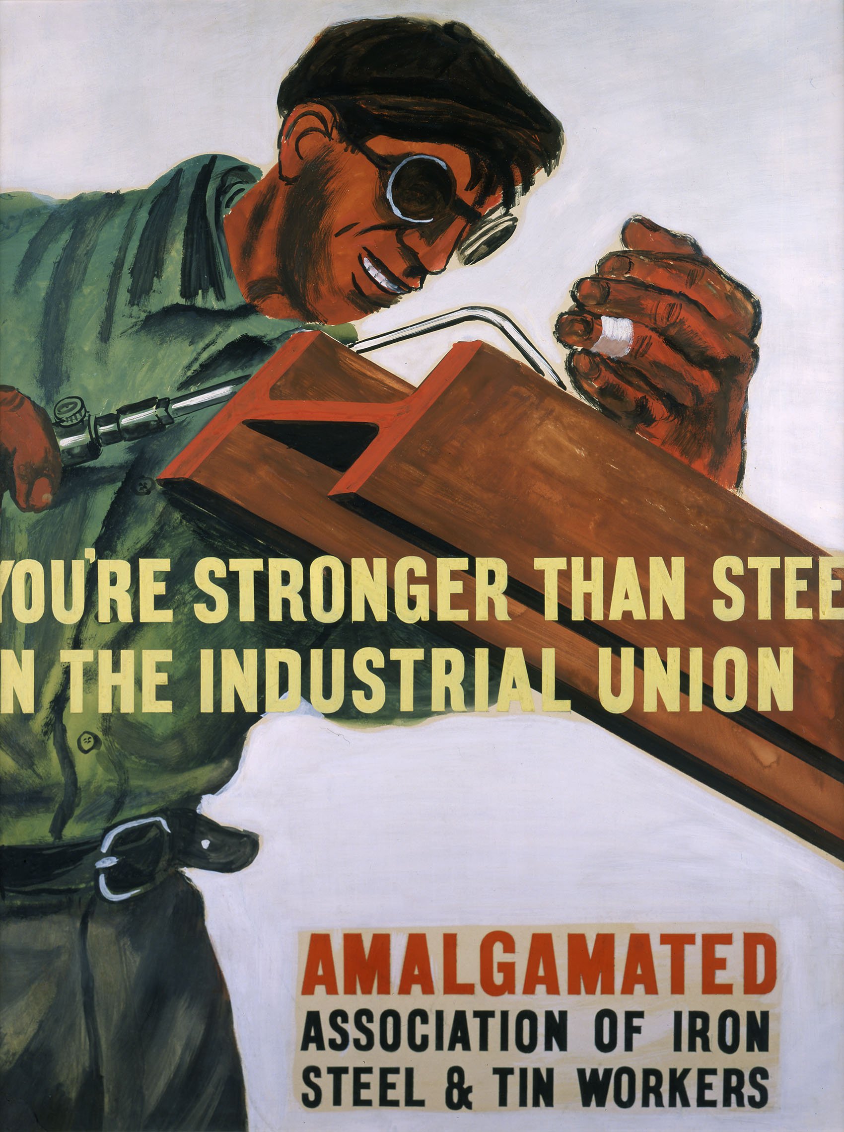
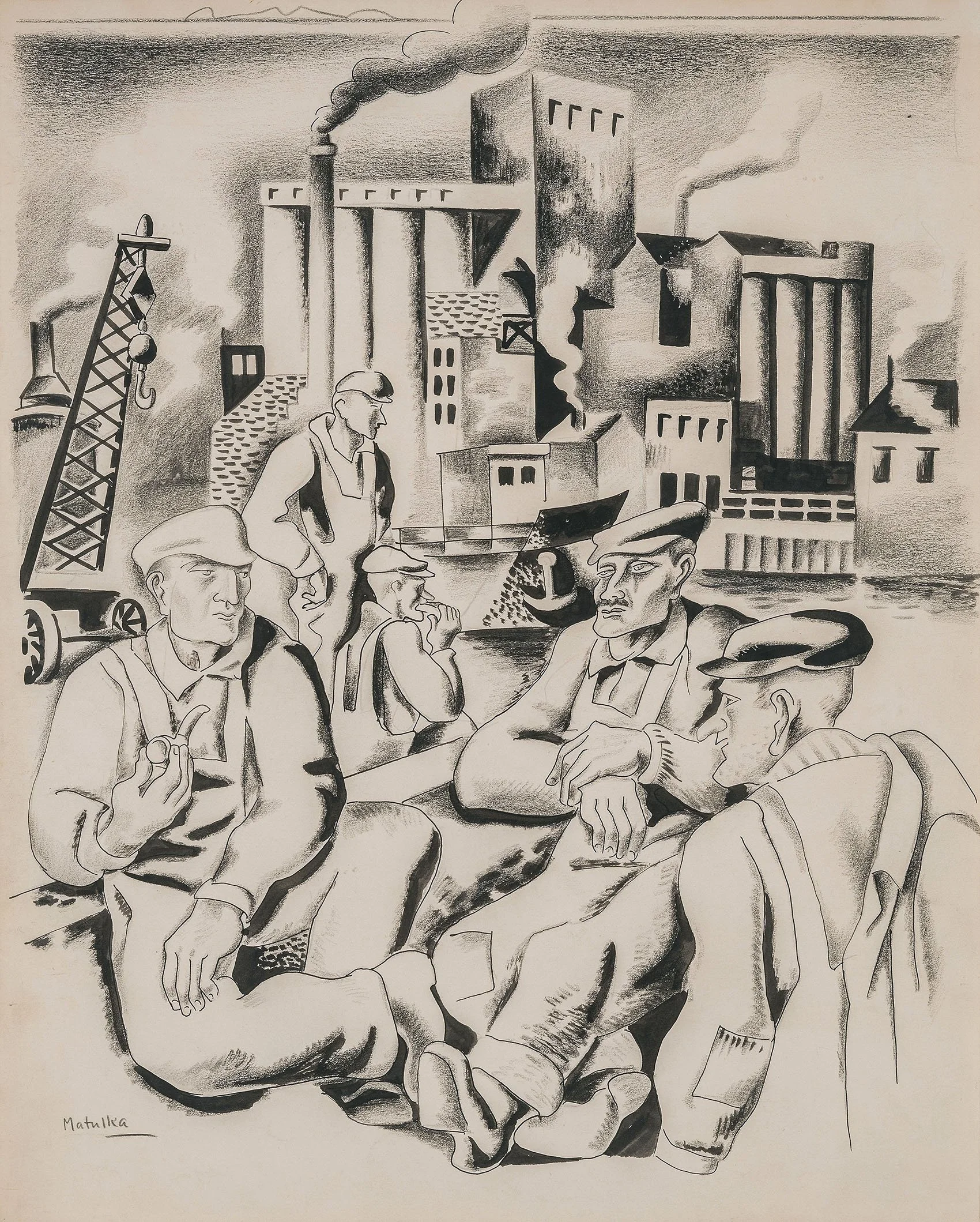
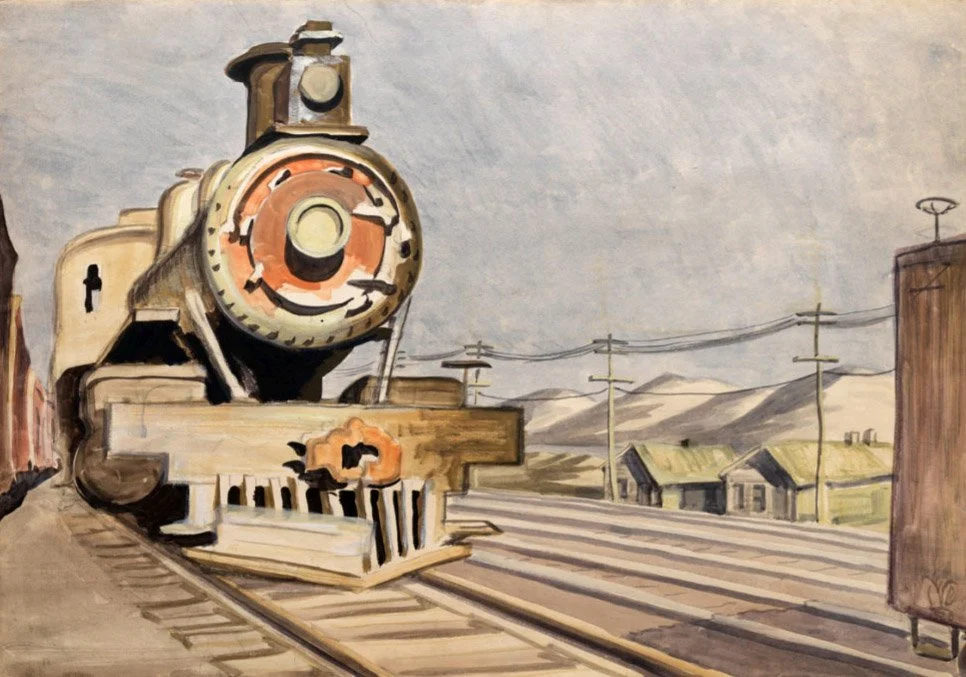
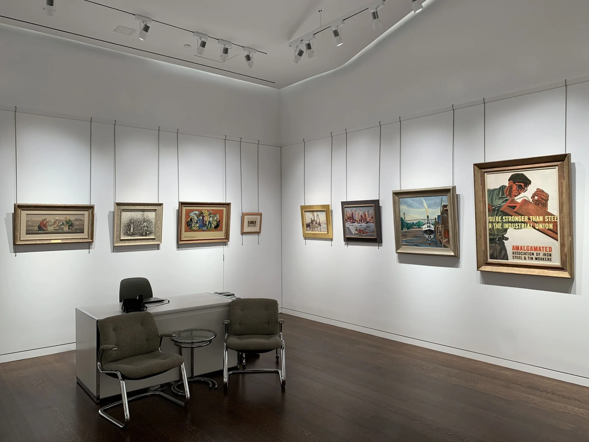
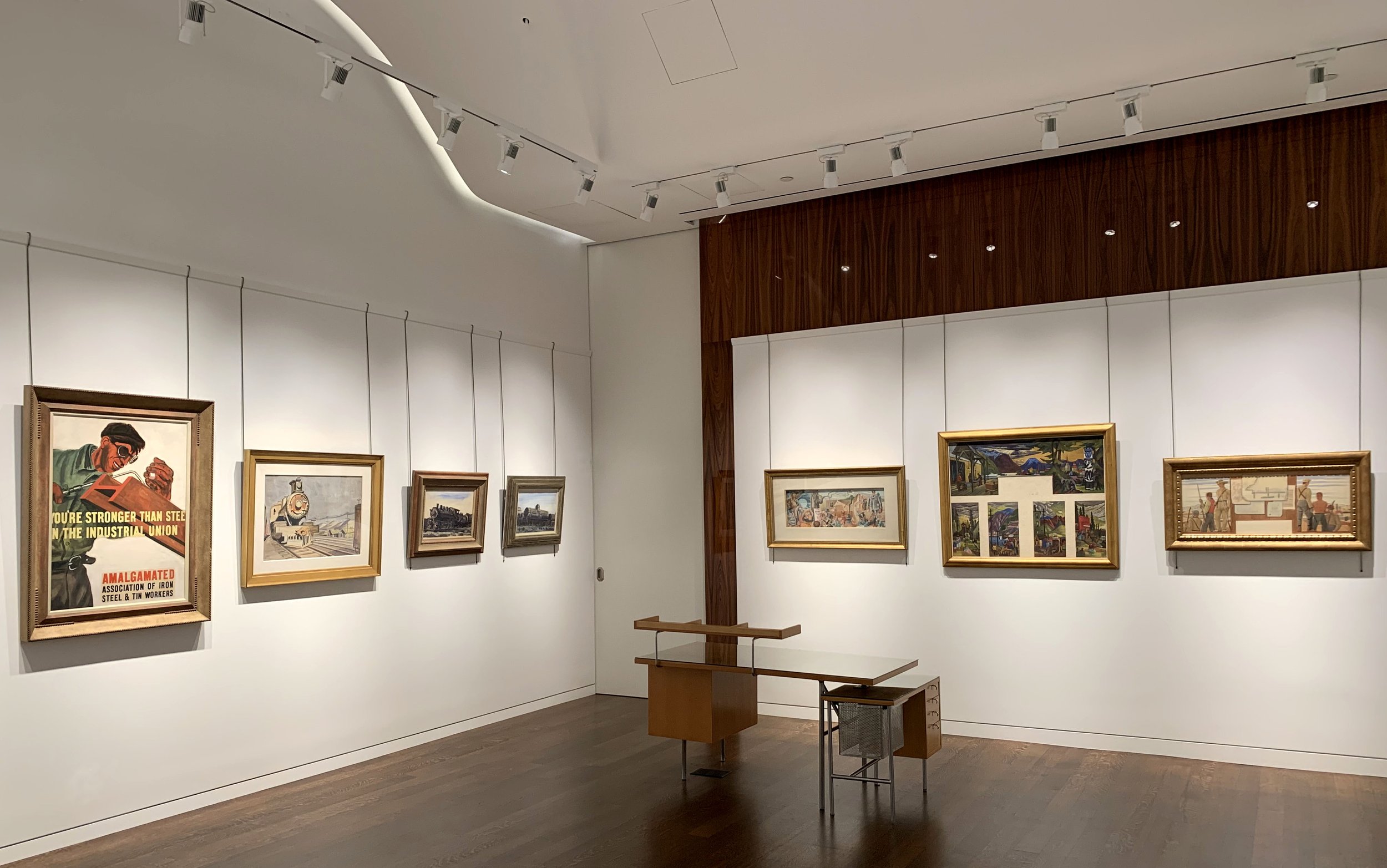
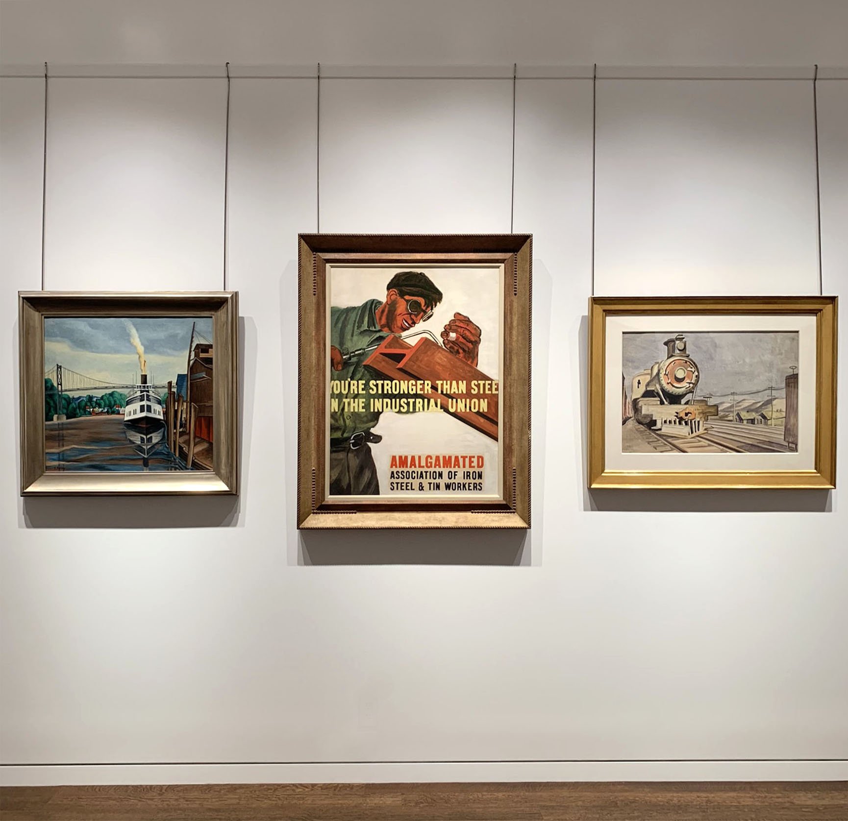
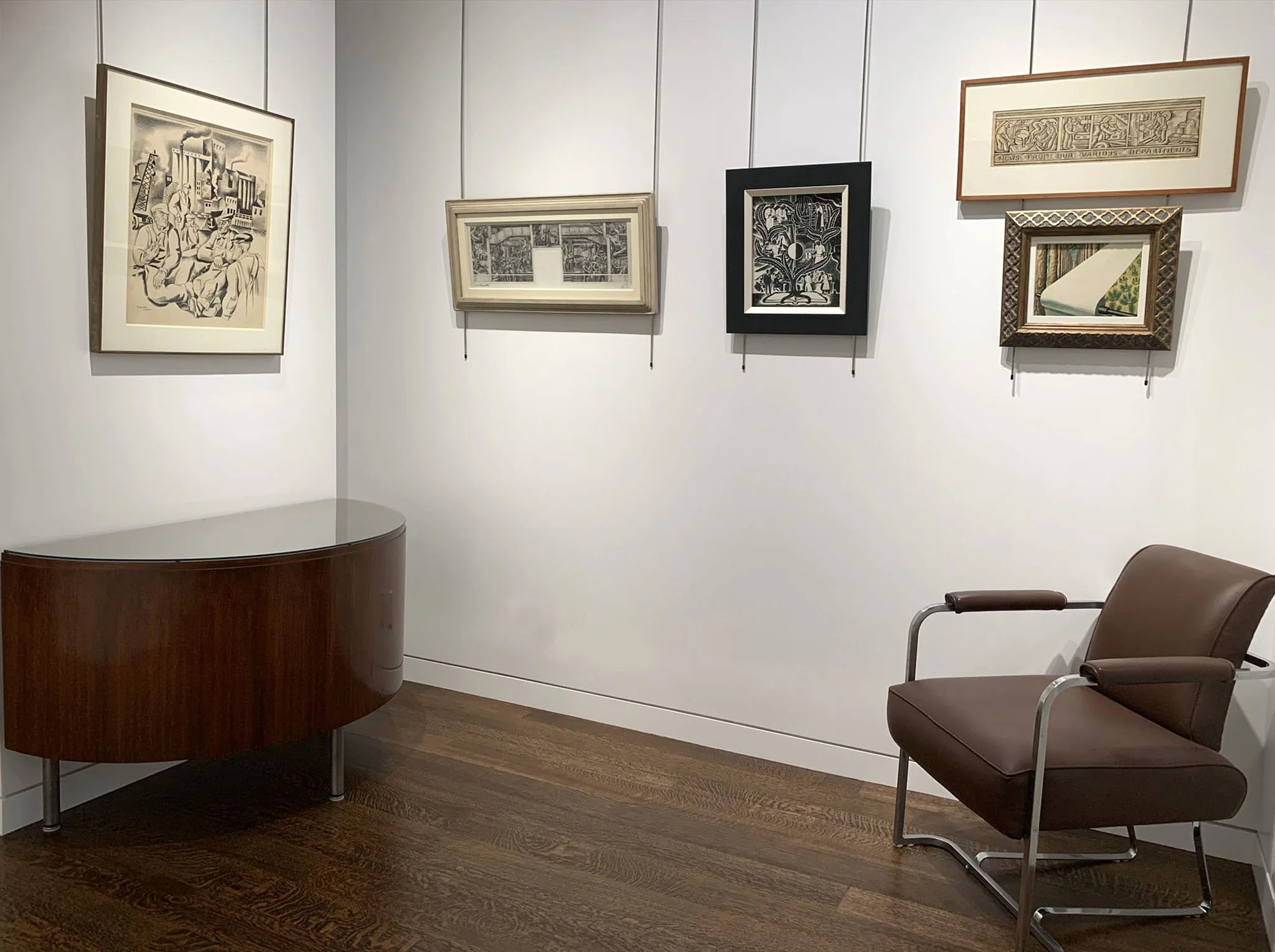
American realist artists were made up of Social Realists and Regionalists. The Social Realists presented an argument for organized workers erasing economic inequality. They are best represented in our exhibition by Ben Shahn’s welder in You’re Stronger than Steel and Joseph Lomoff’s miner in Toilers of the Underground. Paintings in our exhibition of train cars by Charles Burchfield and Reginald Marsh, on the other hand, celebrate industry by emphasizing streamlined machinery as an expression of American power. Jan Matulka in Up and Up uses structural design to depict industry as ordered and pristine. His streamlining of shapes suggests American efficiency. For their subjects, Regionalists focused on community in rural towns, farming, regional topography, and great moments in their state or local history. The Regionalists aimed to give people heart and pride by recalling their skill as farmers and ranchers. Like the Mexican muralists, the Regionalists tell the story of man’s heroic struggle with his environment and his will to live. Our exhibition has Regionalist works such as Joe Jones’s Farmer with a Load of Wheat and Adolf Dehn’s Colorado Mining Town. Whether Social Realists or Regionalists, American artists did not erase race or poverty from their narratives. We have on view Albert Gold’s painting of a black worker in Fish Packing and Joe Jones’s Eskimo Caulking Boat in our exhibition. Their murals and paintings tell an inclusive story.

American artists adapted style elements they liked from the Mexican muralists, especially high key color and stylized juxtapositions of montage storytelling. Regardless of their aesthetic interests, political affiliations, and choice of locations painted, artists in the United States all felt pressed to negotiate a way between the national identity claimed by the Realists and Modernism’s connection to European abstraction. Cubism and Surrealism were adapted to allow free association and juxtaposing of pictorial motifs for new ways of storytelling. Both Eugene Savage in his mural proposal for the Post Office Building in Washington, DC and Aaron Bohrod in his mural proposal for the Vandalia Post Office in Illinois are examples of montage storytelling taken from the Mexican muralists.

The Mexican government-supported public art program provided America with an idea for unifying its citizens using art to inspire change and connect people to a shared past, present, and future. In American murals and paintings, the heroes were the farmer, homesteader, and pioneer who endured struggle to gain land ownership and build communities and infrastructure for mutual benefit. Land ownership, religion, and the degree of government control were areas of difference between the Mexican and American art projects. Federally-funded competitions for American murals did not offer opportunities to engage with socialist subject matter given the government approval process. The public art program in the United States produced a picture of American values: family, community, various types of work, and an intimate knowledge of the diverse regions of the country. In American art of the 1930s-1940s, one feels the intense love of our country. It is a message sent through art from one tough time to another that might inspire us today.

[ TOP ]
EMIL BISTTRAM AND RAYMOND JONSON: FOUNDERS OF THE TRANSCENDENTAL PAINTING GROUP

May 20-October 16, 2020

Read essay here. | Installation | For availability and pricing, please contact the gallery at 212-581-1657


Installation Views

Essay by Deedee Wigmore

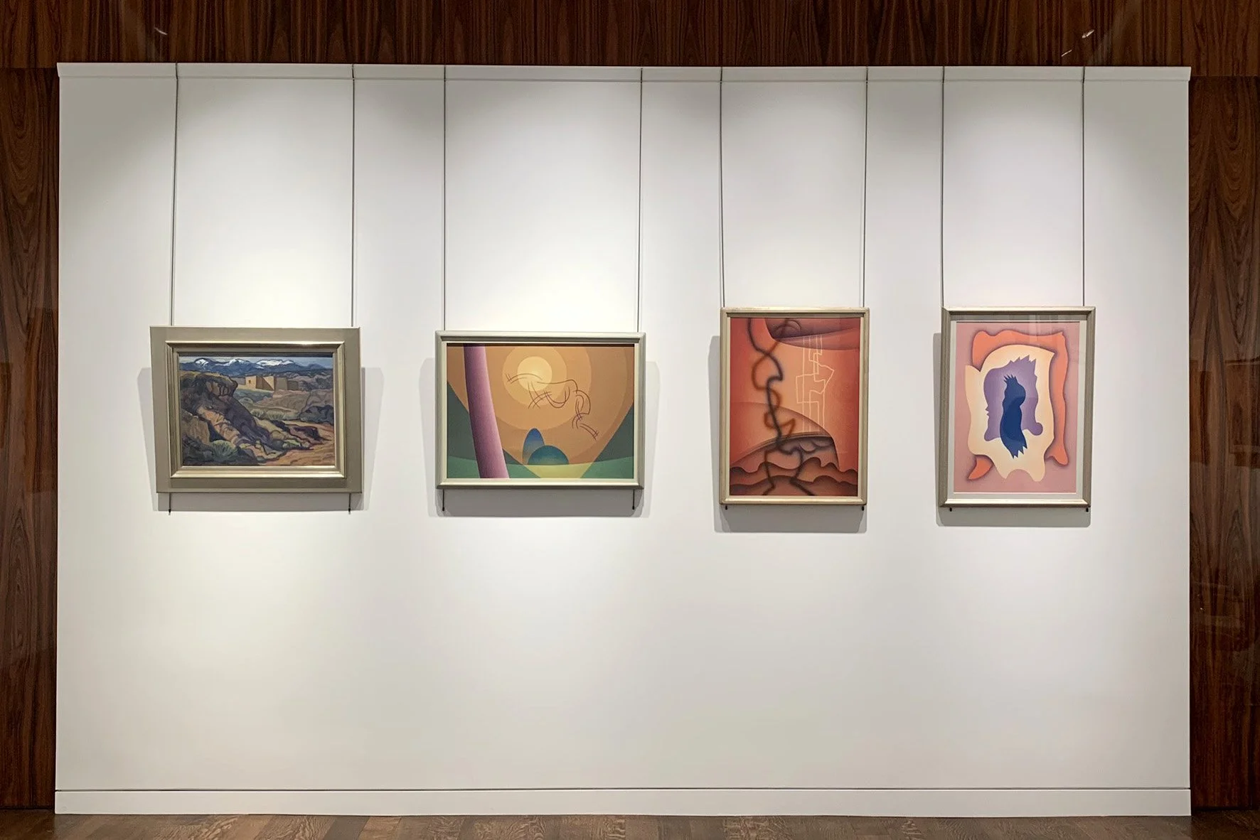
D. Wigmore Fine Art is pleased to present an exhibition of thirty paintings by two artists whose work was shaped by the landscape and Native people of the Southwest. Our exhibition presents the journey Raymond Jonson (1891-1982) and Emil Bisttram (1895-1976) took from realism to abstraction. The two joined together in 1938 to found the Transcendental Painting Group that raised them to national fame.

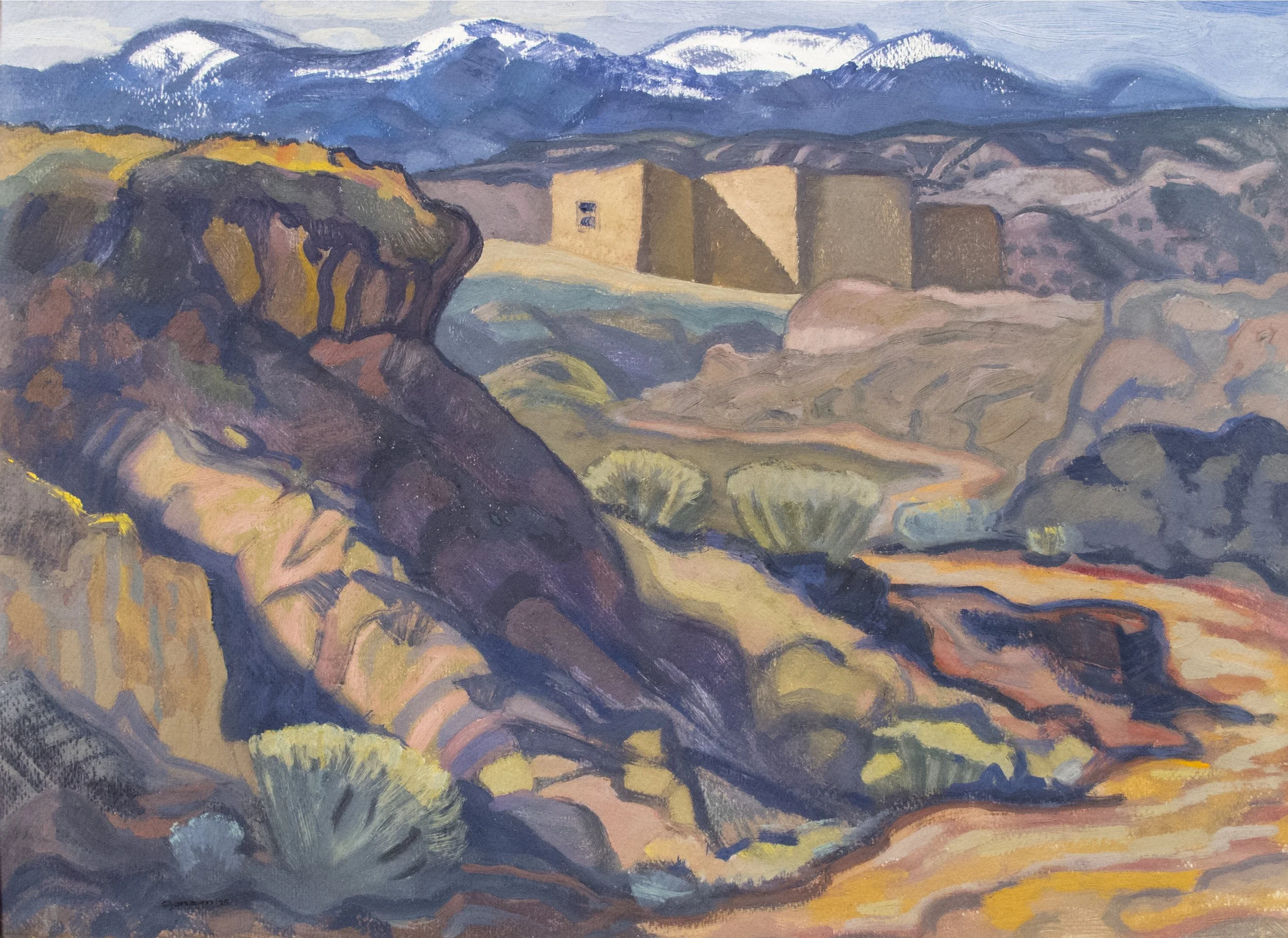
The Chicago artist Raymond Jonson spent four months in Santa Fe, New Mexico in 1922 and discovered there natural shapes and a rhythm in the landscape that he could use to develop his art. This visit resulted in Jonson and his wife Vera moving to Santa Fe in 1924 to build a home and studio on land they purchased. Exploring and sketching the landscape, Jonson was challenged by both his geological surroundings and the high contrast of light and shade. His solution was to approach his compositions using ratios indicated on the edge of his sketches. Jonson felt this mathematical approach led to divisions of the land and sky that held all the elements in balance. This practice gave a geometric framework to his paintings. Mountains with Snow, Santa Fe, 1925 in our exhibition is an oil painted in the first year of Jonson’s time in Santa Fe.

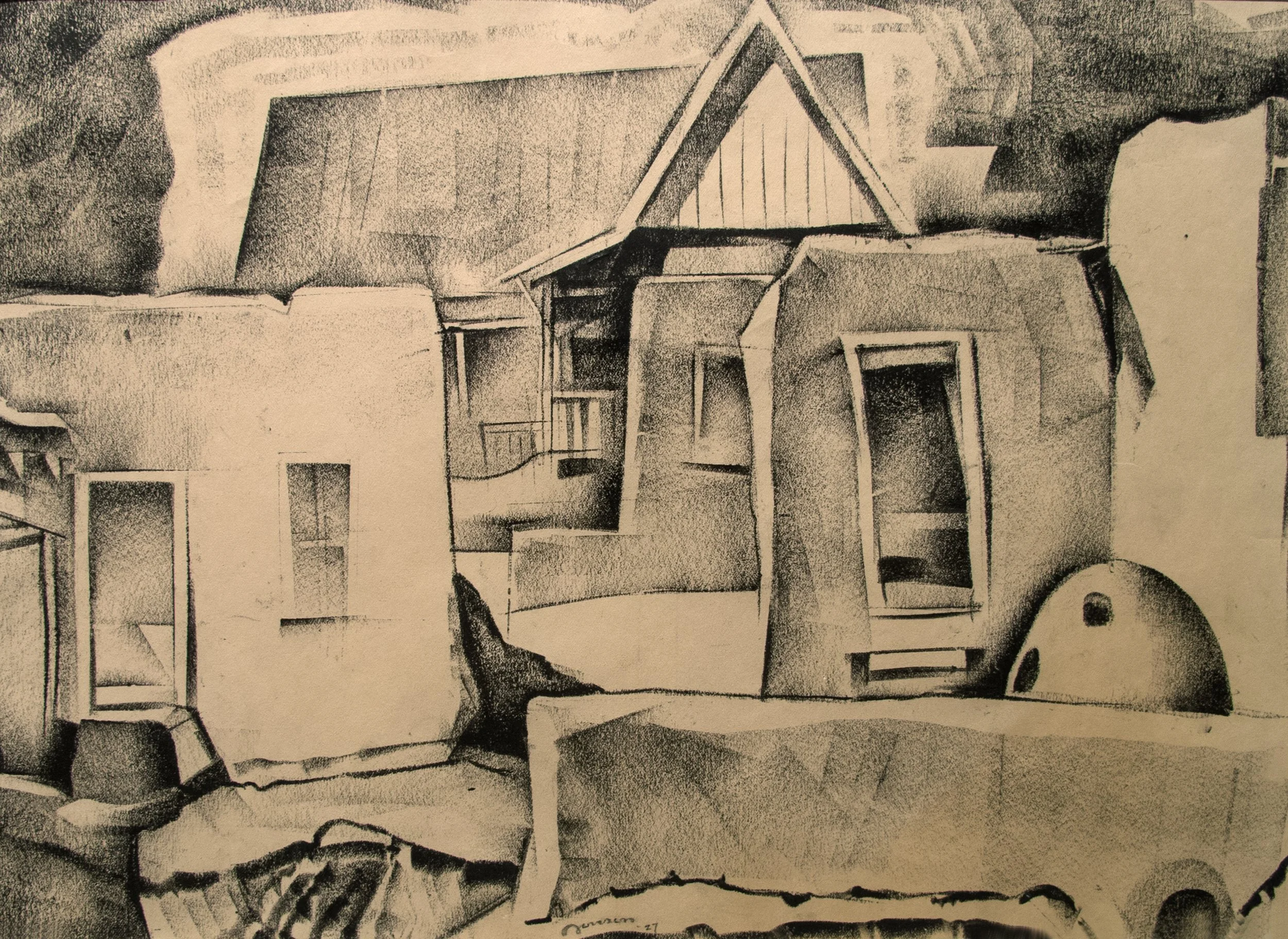
Earth Rhythms is the title of a series Jonson began in 1925 focused on unity in landscape formations. Jonson’s practice was to produce both oils and watercolors of closely related works in an open ended series. If inspiration suggested an addition in later years, Jonson added another painting to the series. Jonson also created trilogies and cycles of paintings so closely related they were conceived as a single work. From 1925 to 1929 Jonson attempted to liberate from the landscape what is significant from what is not and weave the spirit of the forms into a rhythmic whole. He employed color for establishing mood and to simulate natural light and shadow. New Mexico’s sharp contrasts of intense light and deep shade can provide a theatrical effect that is not always desirable. To record this light and avoid theatricality, Jonson focused on planes of color in gradation arranged to reflect the shapes, rhythms, and relationships of the landscape. Realistic pencil drawings were made in the field and stored as a source of forms and ideas for paintings. Our exhibition includes one of Jonson’s litho-crayon field drawings of Cordova Houses, 1927. Once in the studio, a field drawing would be adjusted through color selection to express the generalized emotion the location stimulated. The early landscapes of 1925-1928 incorporated local architecture in admiration of the Native Americans able to live harmoniously with nature. Jonson did not begin to incorporate ideas suggested by Native design and symbols into abstract compositions until the 1940s.

The 1920s was a period of development for Raymond Jonson. To provide income Jonson opened his Atalaya Art School in 1926 teaching a ten-week summer art course for three years. Times were lean but improved when Jonson joined an exhibition group of more established Santa Fe artists- Andrew Dasburg, B.J.O. Nordfeldt, Jozef Bakos, Willard Nash, and John E. Thompson in 1927. The group exhibited together in Seattle, Tucson, Los Angeles, and San Francisco. Along with Russell Cowles and Olive Rush, the group of six artists also showed in monthly exhibitions offered by the Museum of New Mexico’s space for contemporary art. In 1928 Jonson’s career took off with a solo exhibition of forty paintings at the Museum of Fine Arts, Houston, which traveled to the University of Oklahoma Museum of Art. The same year Jonson exhibited eleven works on paper at the California Palace of the Legion of Honor in San Francisco. Additional income was provided by Vera Jonson who began working at the Spanish and Indian Trading Company founded by B.J.O. Nordfeldt, Andrew Dasburg, Witter Bynner, and John Evans founded in 1926 to deal in authentic Native arts and crafts. Vera already was collecting Indian crafted objects for their home. Jonson’s painting titled Indian Pot, 1924 shows one of Vera’s early purchases. When Vera died in 1965, the Maxwell Museum of Anthropology at the University of New Mexico accepted 29 Indian objects to form the Vera Jonson Memorial Collection.

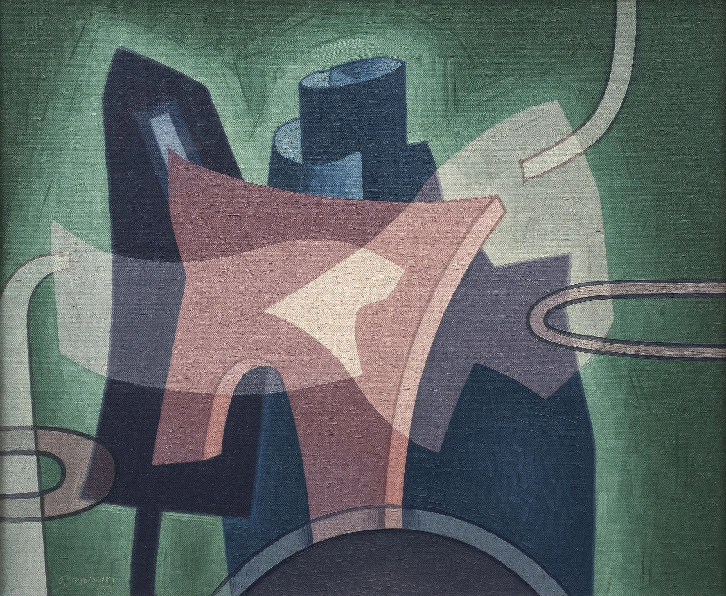
Jonson’s painting progressively became more abstract as he found compositional elements that connected the rhythmic structure of the work that had nothing to do with the landscape. This can be seen in a 1929 series called Growth Variants that explored plant forms and branched out into a group of paintings about growth patterns. This series helped liberate Jonson from the earth-sky format that dominated his landscape paintings. From 1929 to 1936, Jonson moved away from landscape-derived compositions and began working with shapes and abstract figuration in three further series: the Digit Series numbered one to ten, the Number Series, and the Letter Series of 26 works. The paintings in these four series were given a different color palette to add emotion to form and design. The paintings were exhibited in Jonson’s 1931 solo exhibitions in New York at Delphic Gallery and in Chicago in 1932 at Increase Robinson’s Studio Gallery.

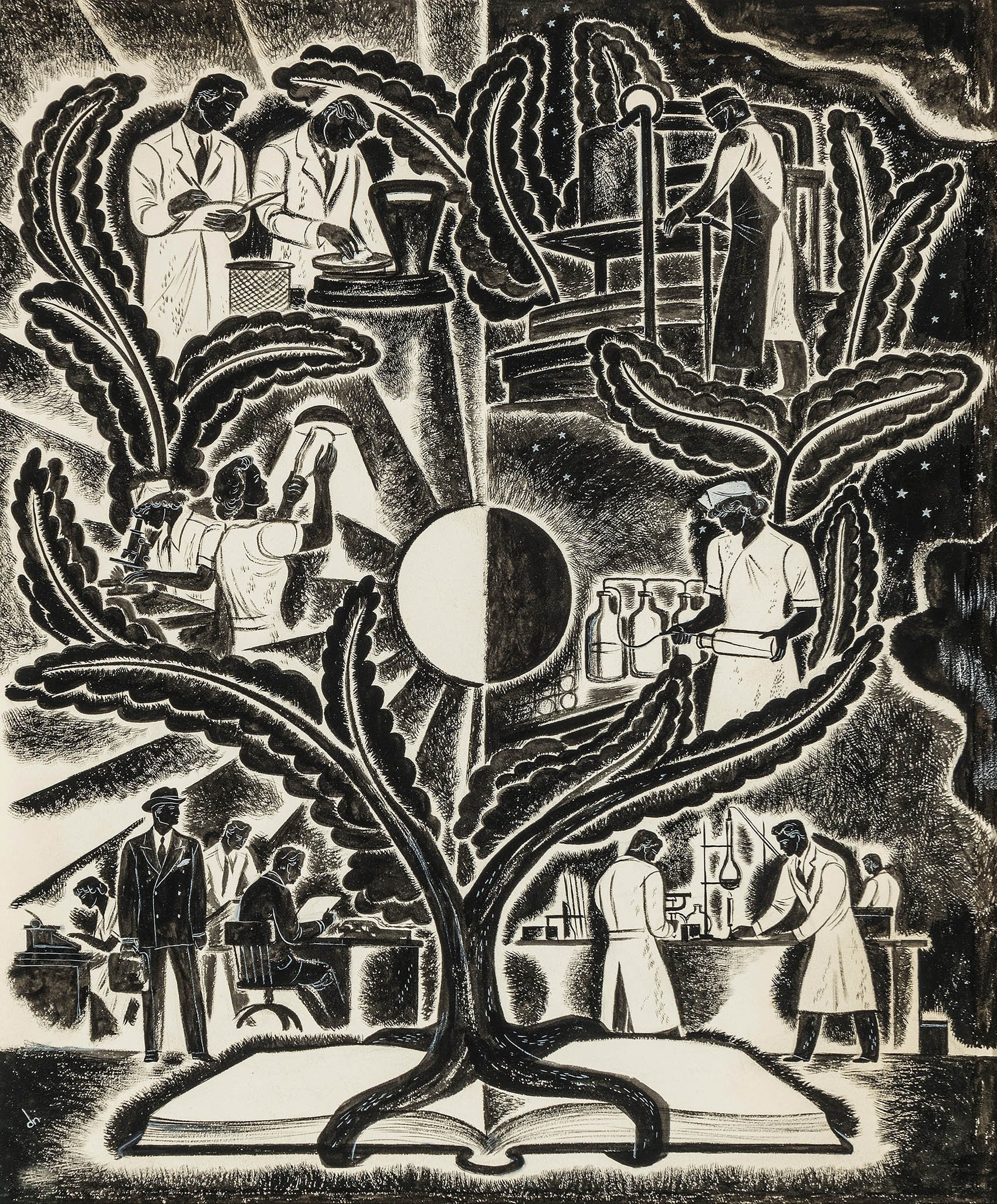
In 1933 Jonson visited the Century of Progress Exposition in Chicago and was impressed by mathematically-derived constructions he saw at the Hall of Science. He incorporated what he saw into his own mural commission for the University of New Mexico library in 1933, a part of the Public Works of Art Project. Inspired by the Hall of Science, Jonson created six large murals that make up The Cycle of Science: Mathematics, Biology, Astronomy, Engineering, Chemistry, and Physics. Jonson painted the murals in Albuquerque while commuting from Santa Fe. Also in 1933, Jonson was included in a three-person exhibition with Agnes Pelton and Cady Wells at the Museum of New Mexico. In 1934 Jonson added teaching one day a week at the University to his schedule. Mural painting caused Jonson to return to landscape subjects in three series titled Interlocking Forms in 1934, Universal Series in 1935, and the Cosmic Series in 1936. In our exhibition Synthesis Three demonstrates Jonson looking at the landscape and abstracting it into symbolic imagery. As he tried to release himself from land locked subjects, Jonson visited Agnes Pelton in Cathedral City, California in 1936. Both artists were working out how to express themselves with symbols and how to bring into focus an emotion. Pelton and Jonson connected through the painting subjects that interested them- space, color, shapes, and the sexual quotient in life. Jonson continued working on color relationships to explore the dissonance achieved through chromatic contrasts in series such as Dramatic Figuration and Prismatic Figuration. Jonson discovered that dissonance could be simple, subtle, complex, incidental, or central to a motif.

Working with ideas of how to move his art forward, Jonson met Alexander Archipenko and Laszlo Moholy-Nagy in Chicago during his solo exhibition at the Katherine Kuh Gallery in 1938. This meeting may have caused Jonson to abandon titling his works as paintings after 1938 are simply designated by medium, number, and year. The same year, Jonson joined the faculty of Arsuna School of Fine Arts in Santa Fe and began to use an airbrush for tempera and watercolor paintings. With Emil Bisttram in 1938, Jonson founded The Transcendental Painting Group of nine artists concerned with the development and exhibition of non-representational painting. The seven other artists in the group were: Robert Gibbroek, Lawren Harris, Bill Lumpkins, Florence Miller (later Pierce), Agnes Pelton, H. Towner Pierce, and Stuart Walker. While Pelton was not based in New Mexico, she had frequent correspondence with Jonson about the group’s formation and sent paintings for exhibition. The Transcendental Painting Group was invited to exhibit at the Golden Gate International Exposition in San Francisco in 1939, which brought them national recognition. Hilla Rebay saw the exhibition and invited The Transcendental Painting Group to exhibit at the Guggenheim Museum in New York the following year.

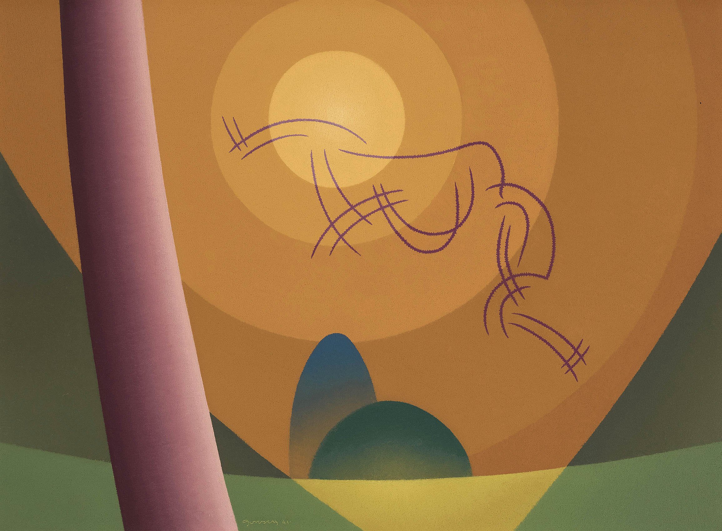
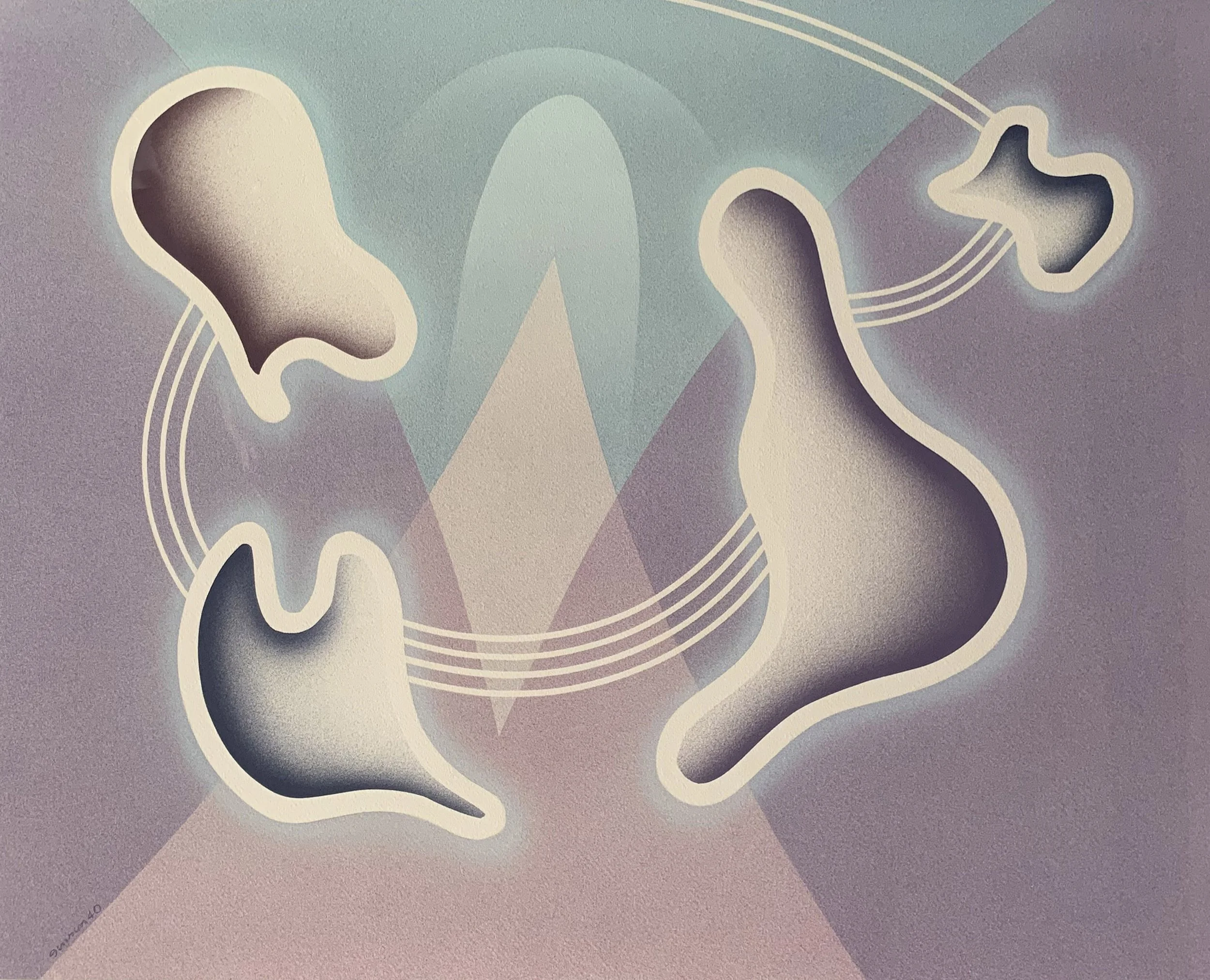
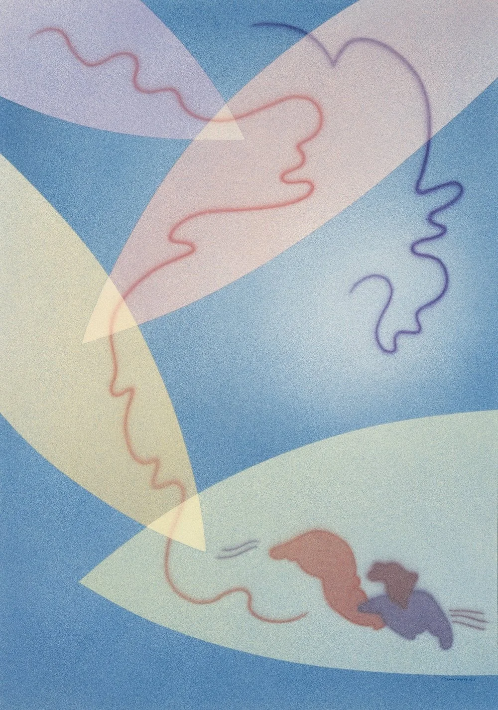
At this high point in his career, Jonson became fully abstract, a shift partially brought on by his use of the airbrush. This artist tool facilitated the simultaneous movement of his ideas and emotions to execution. The airbrush also facilitated reliable luminous color without time-consuming brush work to augment color when oil paint had not dried as expected. The airbrush became a property of Jonson’s style in 1938 and led him to develop a new principle of color as the airbrush’s sprayed colors needed to be more closely related to attain unity. In painting with the airbrush, Jonson found he must pay close attention to the order, variation of shapes, and the rhythm of a painting’s intervals. The spacing, recurrence, and regularity in a painting also gained new importance in the late 1930s. These developments freed his abstraction to connect his paintings with Native art with symbolized themes by way of acknowledging the lineage of an idea. In these paintings Jonson began to express relationships found in Native art that connect the human world to animals, plants, places, and living and non-living spiritual elements.

The 1940s were a period of culmination for Raymond Jonson in his ability to fully express abstractly the New Mexico landscape, people, and their history. Our exhibition offers photographs from 1940 and 1941 of Raymond Jonson posed in front of his paintings which evidence his connection to Native art and design. This connection can be seen in numerous watercolors too, such as Watercolor #11, 1940, which connects earth and sky. In it four floating shapes of different sizes are connected by wind symbols above an abstracted design, which hints at a mountain rising below. Plant forms, figuration, and landscapes are merged in compositions such as Oil #2, 1941, an image of free invention with petal-like shapes connected by lines evocative of Native petroglyph symbols. Watercolor #21, 1941 in our exhibition has at its center a loosely rendered tall Indian figure facing a small cowboy figure. Both figures are composed of colored biomorphic shapes contained within the abstract background design of arabesques and ascending circles. The transparency achieved with airbrush in Watercolor #21 allows Jonson to express the interrelationship of things. The invention in Jonson’s 1940s art encourages a free interpretation of it. More obvious references to Native design began to be incorporated by Jonson in reaction to the art he saw. A series titled Pictographical Compositions in 1946-1947 demonstrates Jonson thinking about pictographs and petroglyphs in a series of seventeen paintings. There are also textural connections to Native design in the series with the use of an incised line and an admixture of sand with the paint in certain shapes. Jonson’s arrangements, adjustments, additions, and subtractions from Native American motifs made them his own and more about design organization than symbolic meaning.

The years 1947-1948 saw Raymond Jonson planning and financing the Jonson Gallery at the University of New Mexico in Albuquerque. In 1949 Jonson began teaching full-time at the University with the rank of professor. The following year the Jonsons moved to Albuquerque and the Jonson Gallery opened with a retrospective exhibition. Jonson’s painting practices once again changed in 1950. His improvisational approach to painting would in time lead him to gestural abstraction that grew out of his concern with the rhythm in a painting’s composition. Texture and artist tools became more important than subject to Jonson. The paintings that Jonson executed from 1950 until his last work in 1974 will be the subject of a future exhibition on how his use of new materials and new ideas connect to Postwar art. Over his lifetime Jonson had fifteen solo exhibitions at the Museum of New Mexico, Santa Fe. Jonson became an emeritus professor of art at the University of New Mexico in 1954, but continued as the Director of the Jonson Gallery until his death. The Archives of American Art microfilmed Jonson’s documents, manuscripts, catalogues, letters, and paintings in 1965. In 1971 the University of New Mexico conferred an honorary degree, Doctor of Humane Letters, on Raymond Jonson.

Emil Bisttram was born in Hungary in 1895 and immigrated at eleven years old with his family to New York in 1906. He began his career as a commercial artist and took night classes at the National Academy and the New York School of Fine and Applied Art. He married a Cooper Union graduate in 1920 and taught at the Parsons School of Design until 1925. At that time, Bisttram was offered a position at The Master Institute of United Art in New York by its founder, Nicholas Roerich. The Master Institute was dedicated to the translation of art into a spiritual and visionary language using order, rhythm, harmony, and unity and taught that everything an artist created must have quality to achieve the spiritual. In 1930 Bisttram and his wife spent three months in Santa Fe. The experience made Maryion Bisttram comfortable enough to set up a home there in 1931, renting the Eanger Irving Couse (1865-1936) home and studio while she awaited Bisttram’s return from Mexico City. Bisttram had won a Guggenheim Fellowship to work with Diego Rivera on the National Palace mural.

In Mexico Bisttram mixed paint and assisted in mural making in fresco. In scaling up Diego Rivera’s large figure drawings, Bisttram saw how they worked together in a geometrically conceived space. Rivera used both Dynamic Symmetry and the mathematics being promulgated in Paris by the Cubists to plan the composition of his realist paintings. Rivera designed his compositions in divisions ruled off to balance all the elements, following the principles of Dynamic Symmetry. Bisttram appreciated and understood that this system of designing a composition would work for both abstraction and realism. Rivera was focused on the renewal of Classicism to portray the history of the Mexican people in a symbolic way. His neoclassical figuration was similar to the figures Pablo Picasso was painting in Paris in the style of Ingres. Bisttram’s time with Rivera provided a new sense of clarity in form and pictorial organization. It completely transformed his ability to conceive and execute major figural works.

Bisttram rejoined his wife in New Mexico and set up a home in Taos in 1932. He immediately gave a series of lectures on his experience with Diego Rivera. Bistram set up an art school in Taos where Dynamic Symmetry was taught to give artists an approach to painting using mathematical divisions of the compositional space to achieve balance in weight, mass, and volume of the elements. Under the sway of Classicism, Bisttram painted portraits and figurative subjects rooted in symbolic, religious, and mystical concerns. As part of his teaching, he took his students to sketch at Pueblo ritual events. Bisttram’s work remained representational in the early 1930s as he painted portraits to examine the inner strength of individuals, choosing to focus on both Native Americans and Mexicans. These works took their inspiration from Diego Rivera and other Mexican epic painters. Bisttram attracted students to his school because he had numerous mural commissions. To complete his Guggenheim Fellowship, Bisttram had suggested creating a mural movement in the Southwest. Bisttram’s first mural commission was for the Taos County Courthouse. It was funded by the Treasury Relief Art Project in 1933 and resulted in Bisttram being offered the position of supervisor for the Treasury Relief Art Project in New Mexico, a position he held from 1933 to 1934. Bisttram won mural commissions in 1936 for both the Justice Department in Washington D.C. and the Courthouse in Roswell, New Mexico, as well as a mural for a post office in Ranger, Texas in 1937.

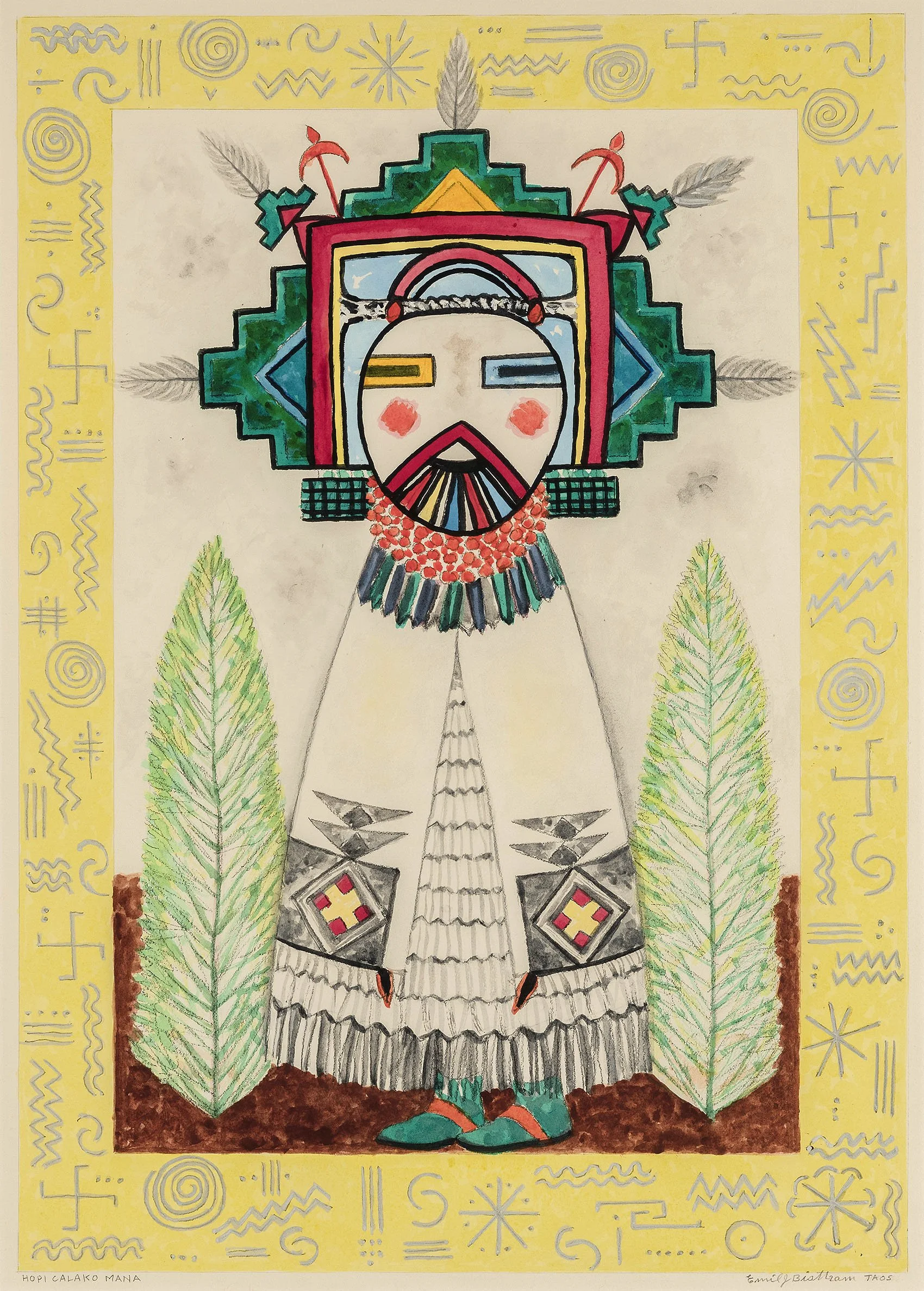
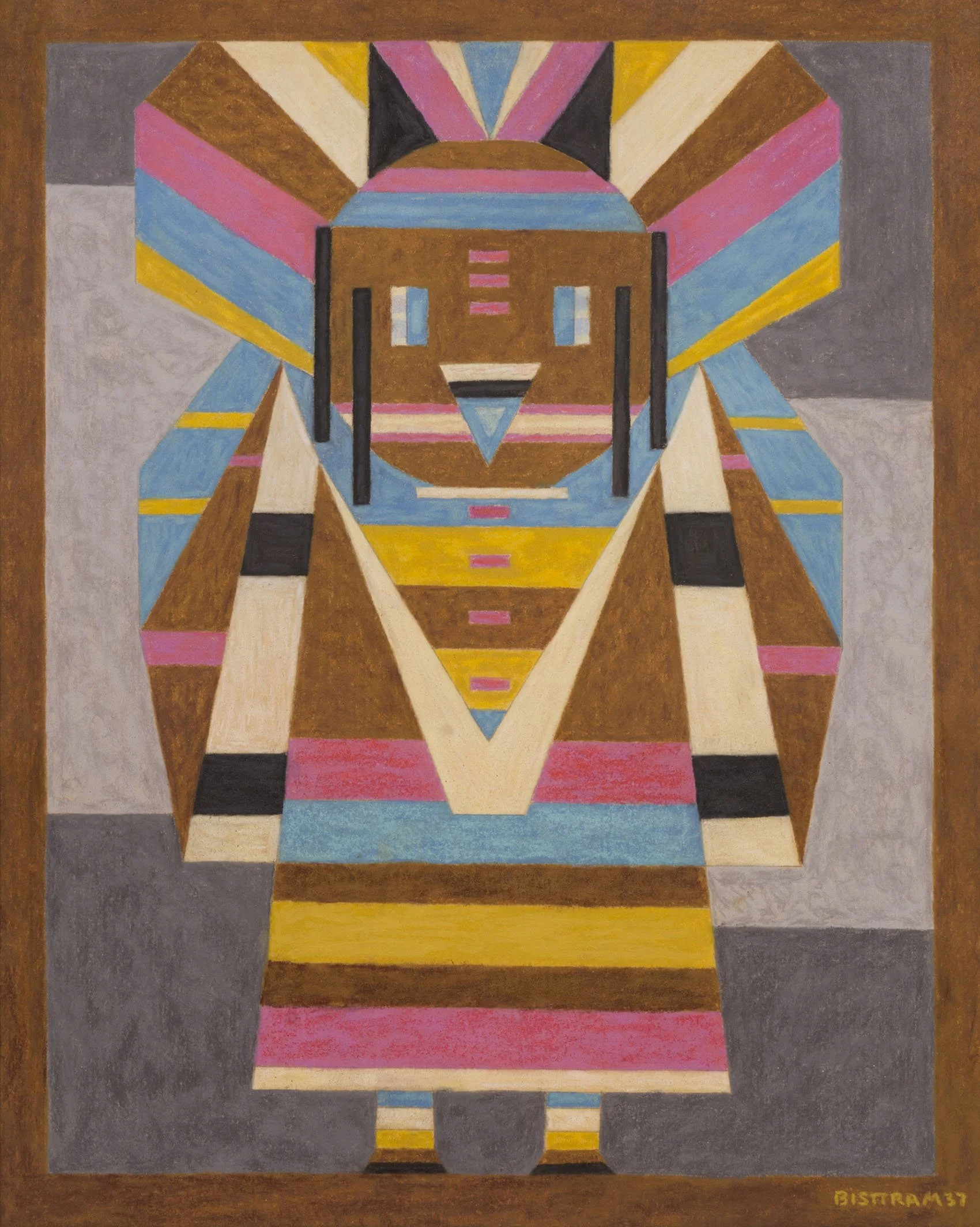
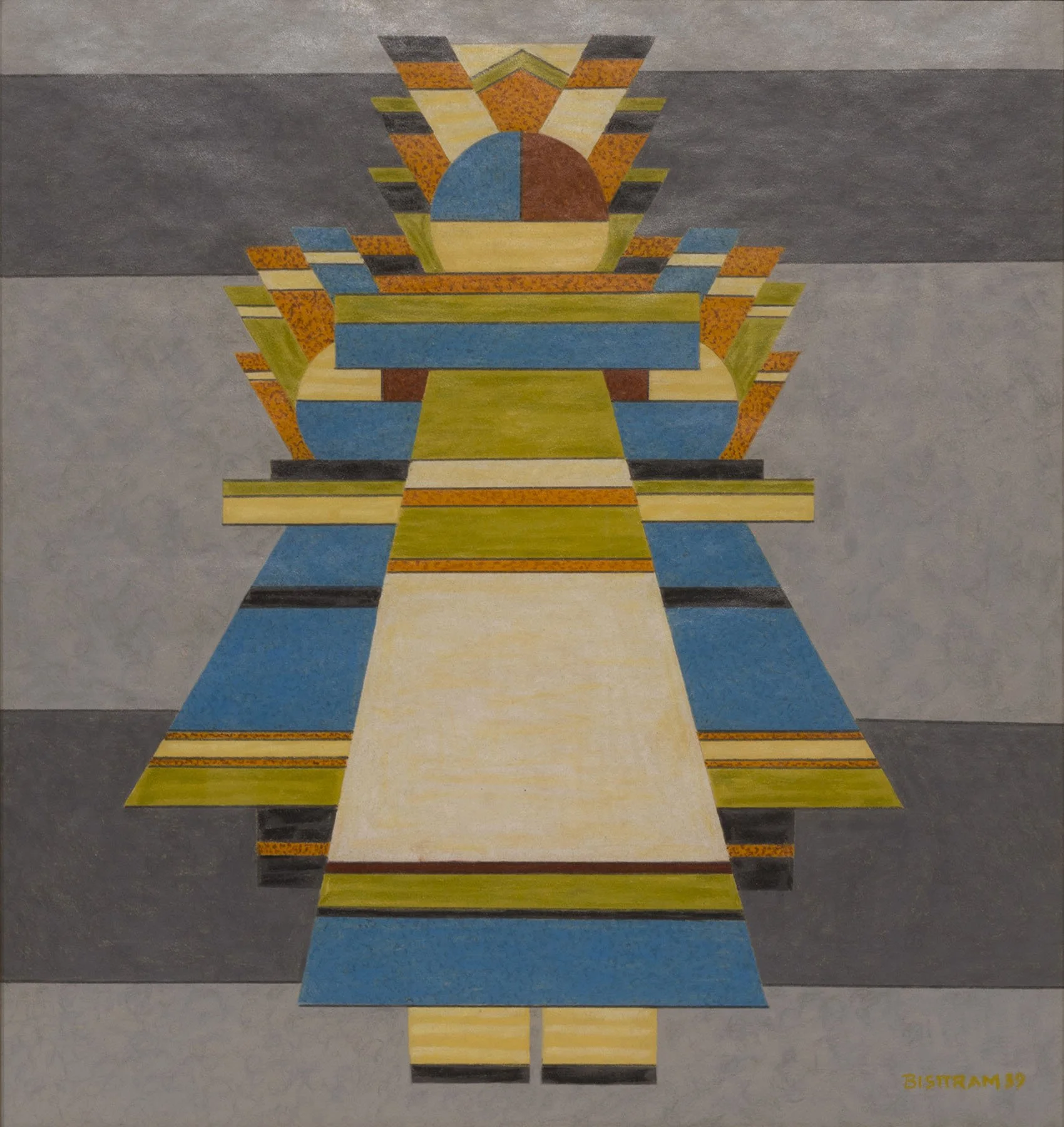
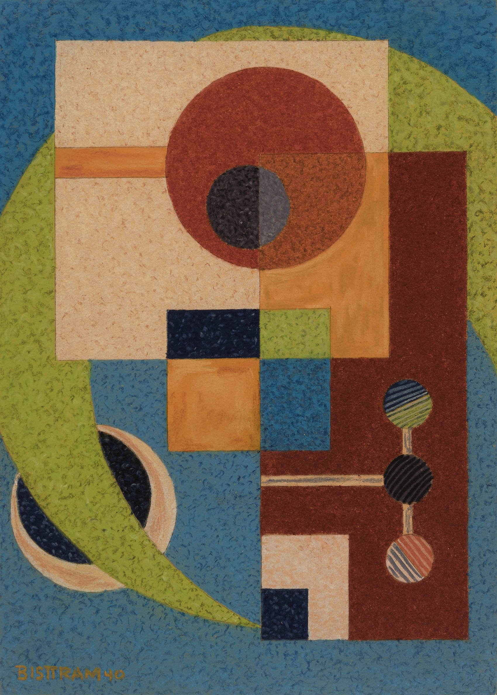
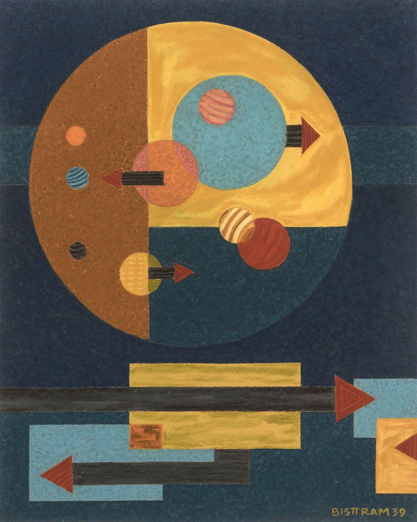
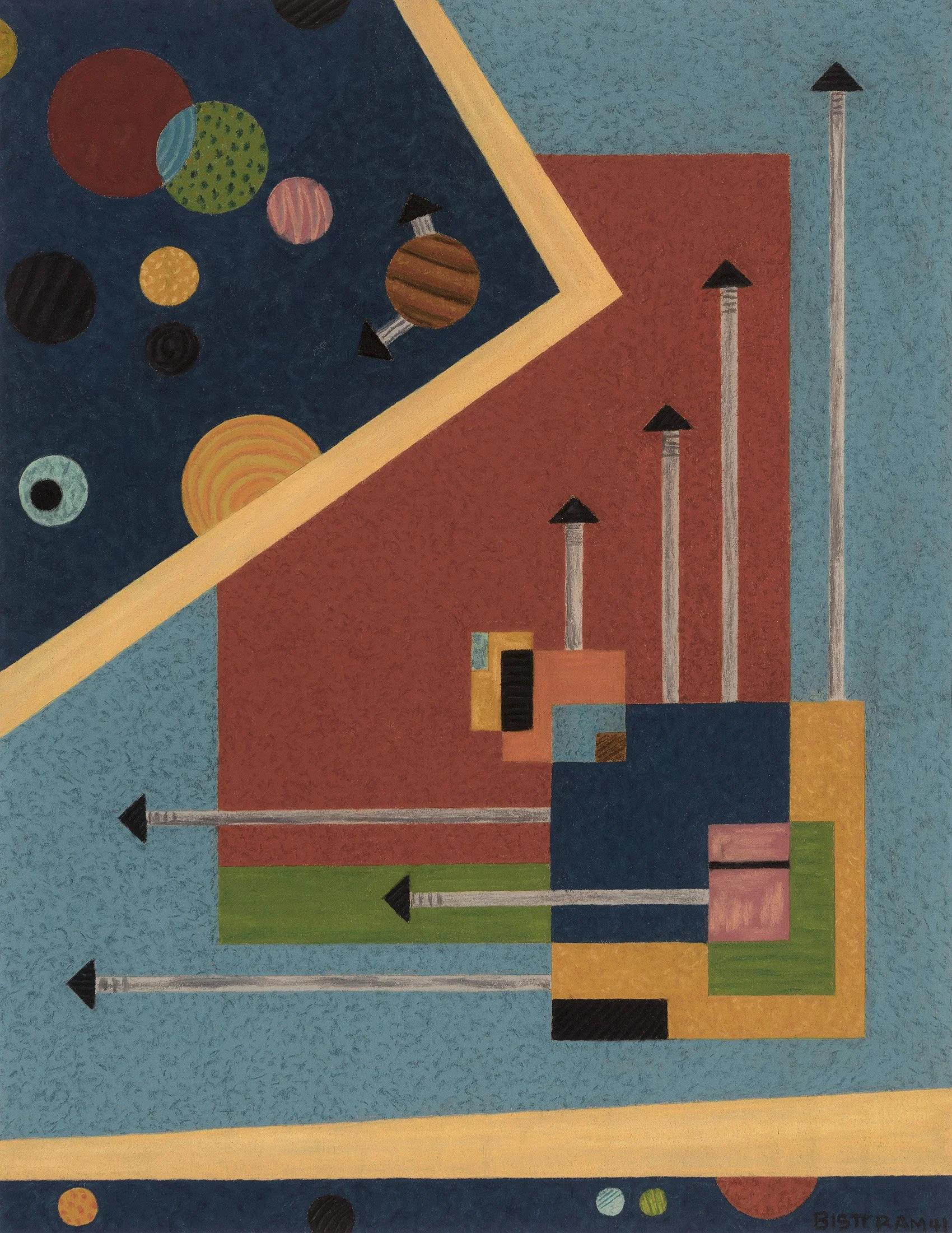
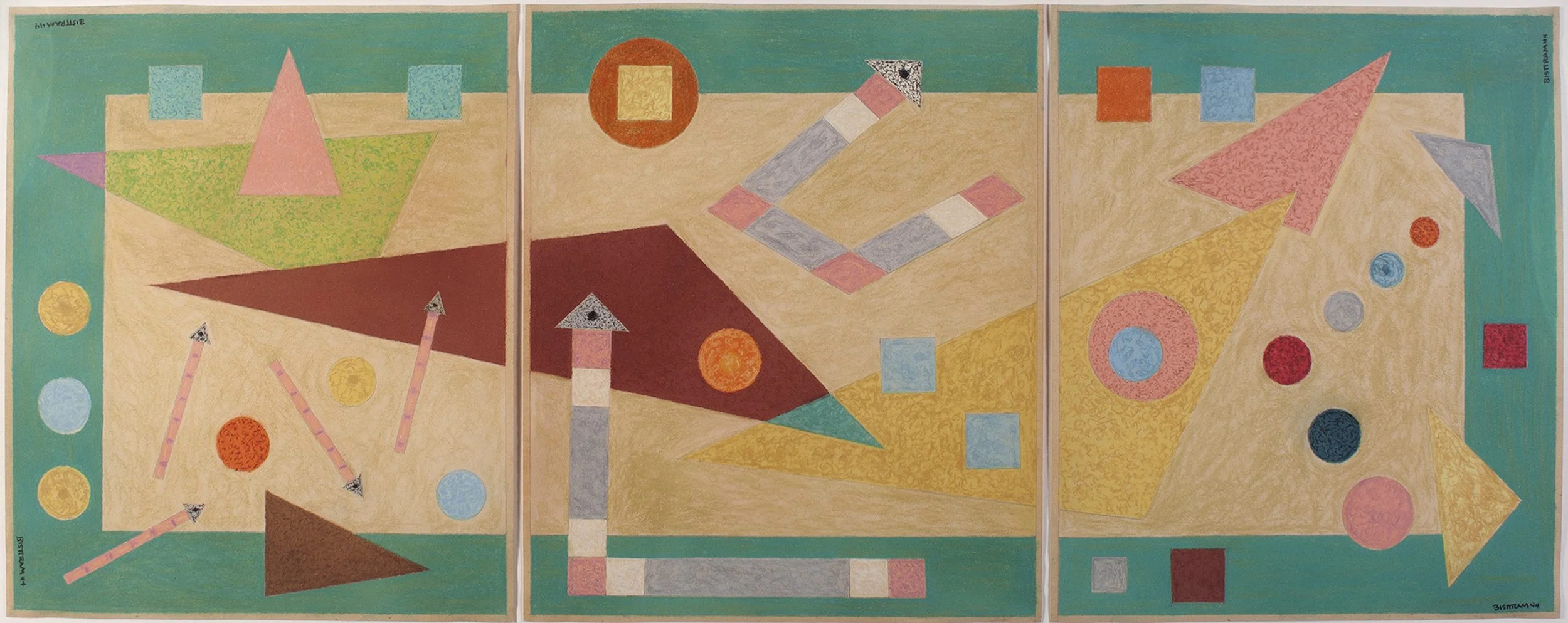
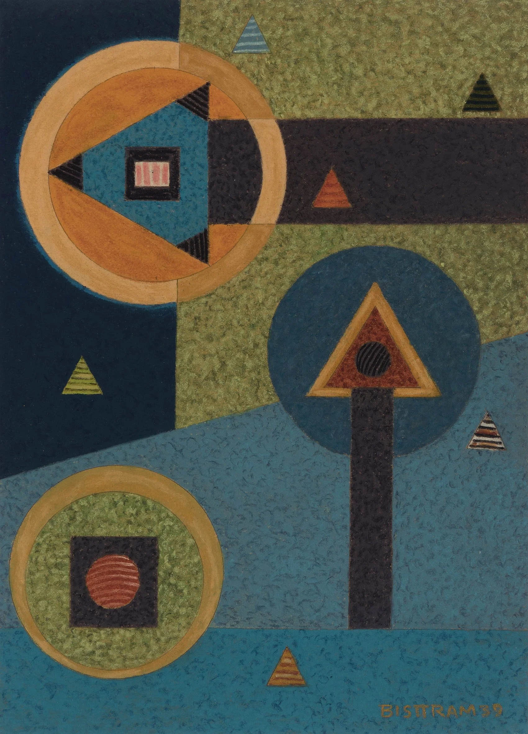
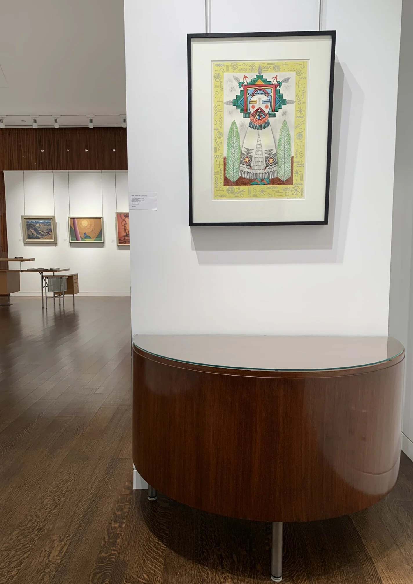
Bisttram had a solo exhibition of watercolors at Delphic Gallery in New York in 1933. The Delphic Gallery supported artists with metaphysical interests and held an exhibition for Raymond Jonson the year before. Agnes Pelton also had an exhibition there in 1932. Bisttram exhibited a series of watercolors titled The Dancing God Series. Hopi Calako Mana, c. 1933 in our exhibition may be from this series. The central Kachina figure in Hopi Calako Mana is surrounded by a border of Hopi sand painting symbols, marking Bisttram’s early interest in Native American imagery. By 1936 however Bisttram began to see Native art differently- as paintings about the human spirit that used symbolism derived from an abstract concept of nature and their gods to transcend the visible. Bisttram borrowed books on Indian ceremonial life from Dr. Edgar Hewett (1865-1946), the director of the School of American Archeology and the Museum of New Mexico. Reading and new thinking caused Bisttram’s paintings to become more abstract in order to give Native religious symbolism greater emphasis in his work. He toured the rugged Navajo country in western New Mexico making thumbnail sketches and learning how to reduce the landscape elements to a bare minimum. His approach to painting the landscape was less about the beauty of the earth’s surface and more about probing the structure that integrated mountain and mesa into a living whole. Bisttram, like Raymond Jonson, discovered that abstraction was a way of dealing with the brilliant Southwestern sunlight and overwhelming landscape. Bisttram credited his use of symbols to tell a story or portray an emotion as something that came out of exposure to Southwest’s Native American paintings combined with Wassily Kandinsky’s influence. An expression of Bisttram’s new kind of symbolism is found in the logo for The Transcendental Painting Group he created in 1938. The motif of the logo is a circle within a circle at the top of the logo, symbolic of the eye of animals and represents the hypnotic influence of nature and the priority of primitive art for the Group. Our exhibition offers examples of Bisttram’s Native American inspired abstraction in works like Connecting Rhythms, 1936, as well as figurative abstractions such as Kachina Dancer, 1939.

From 1936 to 1947, Bisttram worked in the encaustic medium, a wax/resin mix that is referred to in Ancient Greek writings, for his works on paper. Little is written about Bisttram’s use of this medium but he may have learned to work in encaustic during his three months with Diego Rivera. Rivera turned to encaustic after he failed to find the ingredients to make Italian fresco painting work in Mexico. Rivera had seen fresco painting while in Italy and then studied Renaissance artist Cennino Cennini’s writings on the medium. Rivera turned to encaustic, which called for heating beeswax and mixing pigments into the liquid paste, for his first mural commission: the Bolivar Amphitheater in the National Preparatory School in Mexico City. Rivera believed encaustic to be a durable and long lasting medium to match the significance of his commission. It was an intensive process that required his assistants use blowtorches to keep the wax warm while Rivera worked. Eventually Rivera found a local alternative to Italian fresco in the ancient Mexican city of Teotihuacan. While Rivera gave up the encaustic technique for his murals, he continued to use it in easel paintings. Thirteen of 56 paintings in Rivera’s 1931 solo exhibition at the Museum of Modern Art in New York were encaustics. Bisttram liked created a drawing stick of wax and powdered pigment for the crisp lines and clear block-lettered signature that appears on all the encaustic works. In his encaustics, Bisttram broke with Dynamic Symmetry to offer an all-over design rather than a balanced linear arrangement. Our exhibition has three further works executed in encaustic on paper in 1939: Kachina Moon, Combat, and Geometric Divisions. We offer numerous encaustic paintings executed by Bisttram from 1940 to 1947 to show his continued interest in Native American culture and design as a source for his art.

At the time of founding the Transcendental Painting Group in 1938, Raymond Jonson and Emil Bisttram had both progressed to full abstraction for the purpose of carrying paintings beyond the physical world through new concepts of space, color, light, and design. Our gallery exhibition has focused on art by the founders of the Transcendental Painting Group to tell the story of their journey from realism to abstraction. The Transcendental Painting Group lasted as a group of nine until 1941. Bisttram moved his Bisttram School of Art seasonally to Phoenix, Arizona in 1941 as World War II came on and then to Los Angeles in 1945. The Bisttram School located at 636 South Ardmore at Wilshire Boulevard was redesigned to teach young artists serving in the armed forces or those working in defense plants. The School offered a four year course in Fine Art, Advertising, and Illustration, as well as summer sessions in Taos, New Mexico. Bisttram taught and painted both realist and abstract styles using his paintings to explain points he made in his teaching. Four of The Transcendental Painting Group- Gibbroek, Miller, Pierce, and Lumpkins- followed Bisttram to Los Angeles and worked in his school. At the war’s end Bisttram returned to Taos. Bisttram, like Raymond Jonson, continued to be productive in the 1950s. In 1952 he founded the Taos Artists Association. The Association honored Bisttram in 1968 with an exhibition Taos Collects Bisttram of fifty-six oils and watercolors at the Stables Gallery. In 1970 Bisttram was named to the New Mexico Arts Commission by the governor of New Mexico. In 1975 the governor of New Mexico proclaimed an annual Emil J. Bisttram Day in New Mexico. Bisttram died in 1976.

[ TOP ]